The New York City Map collection makes the city’s five-borough structure easier to read by showing how Manhattan, Brooklyn, Queens, the Bronx, and Staten Island fit around rivers and coastal waters. Three versions are included: a color-coded borough map, a black-and-white labeled map, and a blank outline map. They provide a practical alternative to street maps when the goal is to study administrative geography rather than routes or transit lines.
New York City is especially well suited to this kind of simplified map. Staten Island is separated from the other four boroughs, Manhattan occupies a long narrow island, Brooklyn and Queens share the western end of Long Island, and most of the Bronx lies on the mainland. The collection keeps those relationships visible without covering the page with roads, neighborhood names, or transportation symbols.
Table of Contents
Why the Five-Borough Layout Benefits from a Map
The five boroughs are both familiar names and formal parts of New York City, but their arrangement can be confusing when encountered only in text. Manhattan sits between the Hudson River and the East River. The Bronx extends north of Manhattan, while Brooklyn and Queens occupy adjoining sections of Long Island to the southeast. Staten Island appears across the harbor, apart from the other boroughs.
Each borough also corresponds to a New York State county: the Bronx to Bronx County, Brooklyn to Kings County, Manhattan to New York County, Queens to Queens County, and Staten Island to Richmond County. A New York City Map focused on borough boundaries is therefore useful for understanding city administration, but it should not be mistaken for a neighborhood or community-district map. Those systems use additional internal boundaries not displayed here.
Water is not just background space here. The Hudson River forms the western edge of Manhattan, the East River separates parts of Manhattan and the Bronx from Brooklyn and Queens, and Long Island Sound appears beyond the northeastern side. The Atlantic Ocean is labeled to the south. These labels explain why boroughs that appear close together are physically separated.
Reading the New York City Map at a Glance
The composition centers the five boroughs while retaining limited surrounding context. New Jersey is shown to the west, and Nassau County is labeled east of Queens. These references help readers distinguish the municipal edge from a shoreline: not every outer line marks open water.
Small islands and intricate shorelines are retained where they help preserve the city’s recognizable shape, but streets, bridges, tunnels, parks, and neighborhoods are omitted. The result is best used for borough-level orientation, not navigation, property research, or exact address-level boundary checks.
Three Map Versions and Their Different Roles
The New York City Map set uses the same general extent in all three images, which makes it easy to compare versions without relearning the layout. The important difference is how much visual guidance each image provides. One emphasizes borough separation, one prioritizes labels and linework, and one leaves the geography open for the reader’s own additions.
Color Borough Map for Immediate Comparison
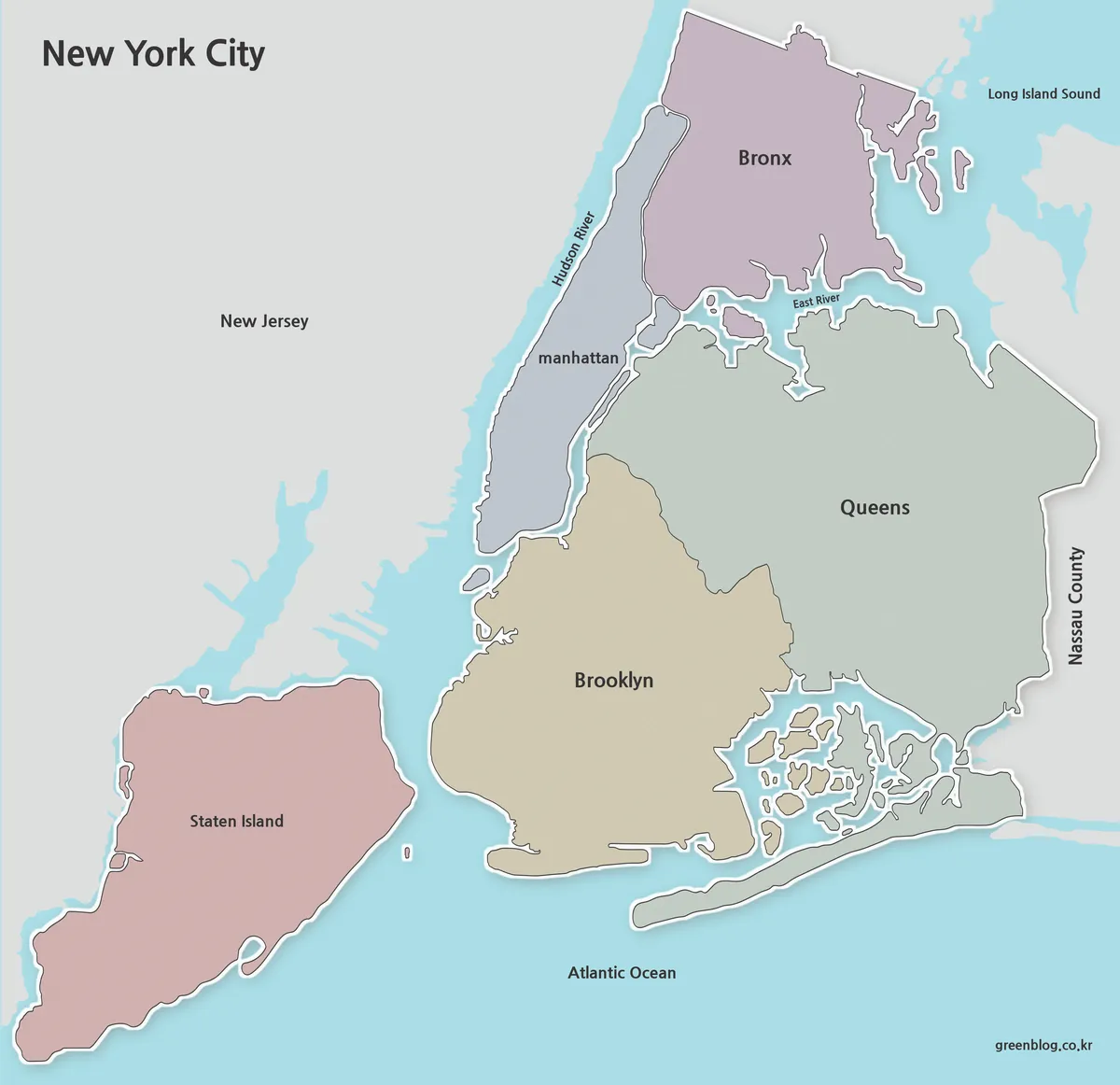
The color New York City Map assigns a separate muted fill to each borough. This makes the narrow shape of Manhattan, the shared Brooklyn–Queens landmass, the northern position of the Bronx, and the detached position of Staten Island understandable at a glance. Light blue water creates a clear contrast with both the borough fills and the pale surrounding land.
Because the colors do most of the separating, this version suits presentation slides, introductory geography lessons, and citywide comparison graphics. The restrained palette keeps the labels legible without the density of a tourist or transportation map. New Jersey, Nassau County, and major waters remain visible as orientation points.
Black-and-White Labeled Reference
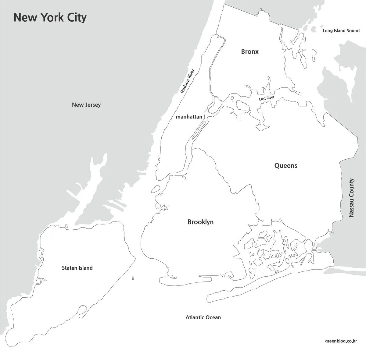
The monochrome version removes the colored borough fills but retains borough names, major water labels, and neighboring-area labels. Thin boundary lines carry more of the visual work, making the image suitable for documents in which color would distract from surrounding text or reproduce inconsistently. It can also serve as an answer key beside a blank student worksheet.
This edition helps when readers need names as well as shapes. Manhattan’s long form contrasts with the broader outlines of Brooklyn and Queens, while Staten Island remains easy to identify at lower left. With no roads or neighborhood labels, added notes do not have to compete with a dense base map.
Blank Outline for Labels and Data
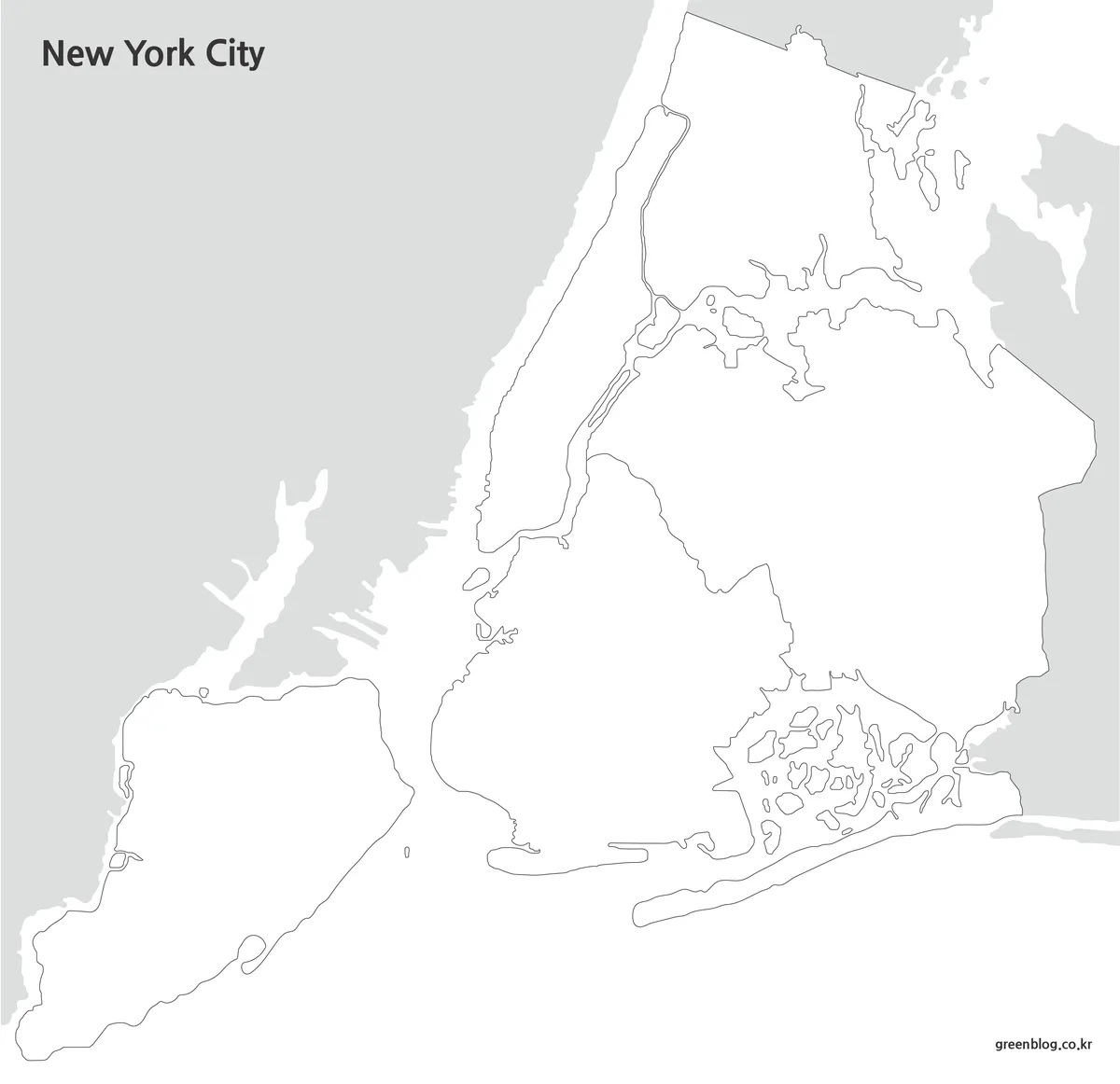
The outline edition removes borough and waterbody labels while keeping the principal borough boundaries and coastal shapes. It gives students space to identify all five boroughs themselves, color each area, or add directional notes. A teacher might ask learners to mark the boroughs that share Long Island, locate the borough primarily on the mainland, or draw arrows toward New Jersey and Nassau County.
For design work, the blank base can support a borough-level dataset, service-area sketch, or travel-story annotation. Because the supplied image is a raster map rather than a confirmed vector source, edits should be made as image annotations or overlays. It is intended for broad citywide communication, not parcel-level analysis.
Choosing the Right Version
Choose the color map when viewers need to distinguish all five boroughs quickly, especially on a screen or at a distance. Select the black-and-white map when labels are necessary but the surrounding document has a restrained visual style. Use the outline map when the reader is expected to supply the information through labeling, coloring, symbols, or a small amount of borough-level data.
The best New York City Map for a classroom activity may differ from the best one for a presentation. A lesson can begin with the blank map and use the monochrome version for checking answers. A slide deck can introduce the color edition, then reuse the outline as a neutral background for highlighting selected boroughs.
Practical Ways to Use the Files
In geography lessons, students can compare the Bronx’s mainland position with Manhattan and Staten Island, or observe that Brooklyn and Queens meet on the same island despite having distinct borough identities. These tasks build spatial understanding without requiring a crowded street map.
Writers can use the New York City Map as a locator before moving to a neighborhood or transit graphic. Designers can add numbered markers, short labels, or a legend to the outline edition. The simplified image is most effective when the subject is borough-level organization.
The layout keeps complex shorelines visible while giving the five main labels breathing room. Preserve the image’s square proportions so borough shapes are not stretched. At small sizes, the labeled black-and-white map will generally remain clearer than an outline crowded with notes.
Frequently Asked Questions
What does the New York City Map collection show?
It shows the boundaries and relative positions of Manhattan, Brooklyn, Queens, the Bronx, and Staten Island. Depending on the version, it also identifies major surrounding waters and nearby areas such as New Jersey and Nassau County. Roads, subway lines, neighborhoods, and attractions are not part of this simplified set.
Are boroughs and counties the same in New York City?
Each borough corresponds to a county, but some names differ. Brooklyn is Kings County, Manhattan is New York County, and Staten Island is Richmond County; Queens and the Bronx share their borough names with their counties. The maps use the better-known borough labels because the collection is organized around citywide orientation.
Which New York City Map is most suitable for a classroom worksheet?
The blank outline is the most flexible choice for labeling, coloring, and location exercises. The black-and-white labeled version can be printed separately as a reference or answer sheet. For an introductory explanation projected on a screen, the color map makes the five areas easiest to distinguish immediately.
Can I use the outline to plot routes or statistics?
Yes, for simplified borough-level information. You can add broad travel paths, event locations, totals by borough, or category colors. Because the image does not show streets, neighborhoods, or precise address boundaries, use a detailed official map instead when the task depends on exact locations or navigation.
Why are rivers and coastal waters important on this map?
They explain much of the city’s separated form. Manhattan lies between major waterways, Staten Island is detached across the harbor, and Brooklyn and Queens occupy western Long Island. Keeping the Hudson River, East River, Long Island Sound, and Atlantic Ocean visible makes the borough arrangement easier to understand.
Map File Information
Download the three-map collection for borough-level reference, classroom activities, presentations, and image-based design projects.
- Included Versions: Color borough map, black-and-white labeled map, and blank outline map
- File Type: JPG and PNG image files grouped in a ZIP archive
- Intended Use: Printing, lessons, presentations, annotations, blog graphics, and design layouts
Related Maps
Additional Resources
- New York City Counties – NYC311: This official city page explains how each of New York City’s five boroughs corresponds to a New York State county.
Green Map creates custom-edited map images using open geographic data sources such as geoBoundaries, Natural Earth, OpenStreetMap, and government open data.
These maps are edited visual materials, not raw data files, and are provided for education, documents, presentations, and graphic reference.