Female mortality attributed to unintentional poisoning varies widely across countries and areas in 2021. In World Bank series SH.STA.POIS.P5.FE, 185 of 217 country and area rows contain a reported value and 32 are source-missing. Among reported observations, the median is 0.29 deaths per 100,000 female population and the simple mean is 0.53. Lesotho has the highest value at 3.10, followed by Nepal at 3.00. Malta and Singapore are reported at 0.00.
The World Bank definition describes this indicator as the number of female deaths from unintentional poisoning in a year per 100,000 female population. Unintentional poisoning can involve household chemicals, pesticides, kerosene, carbon monoxide and medicines, as well as environmental contamination or occupational chemical exposure. The map therefore combines a broad cause-of-death category; it is not a map of exposure to one chemical or one poisoning mechanism.
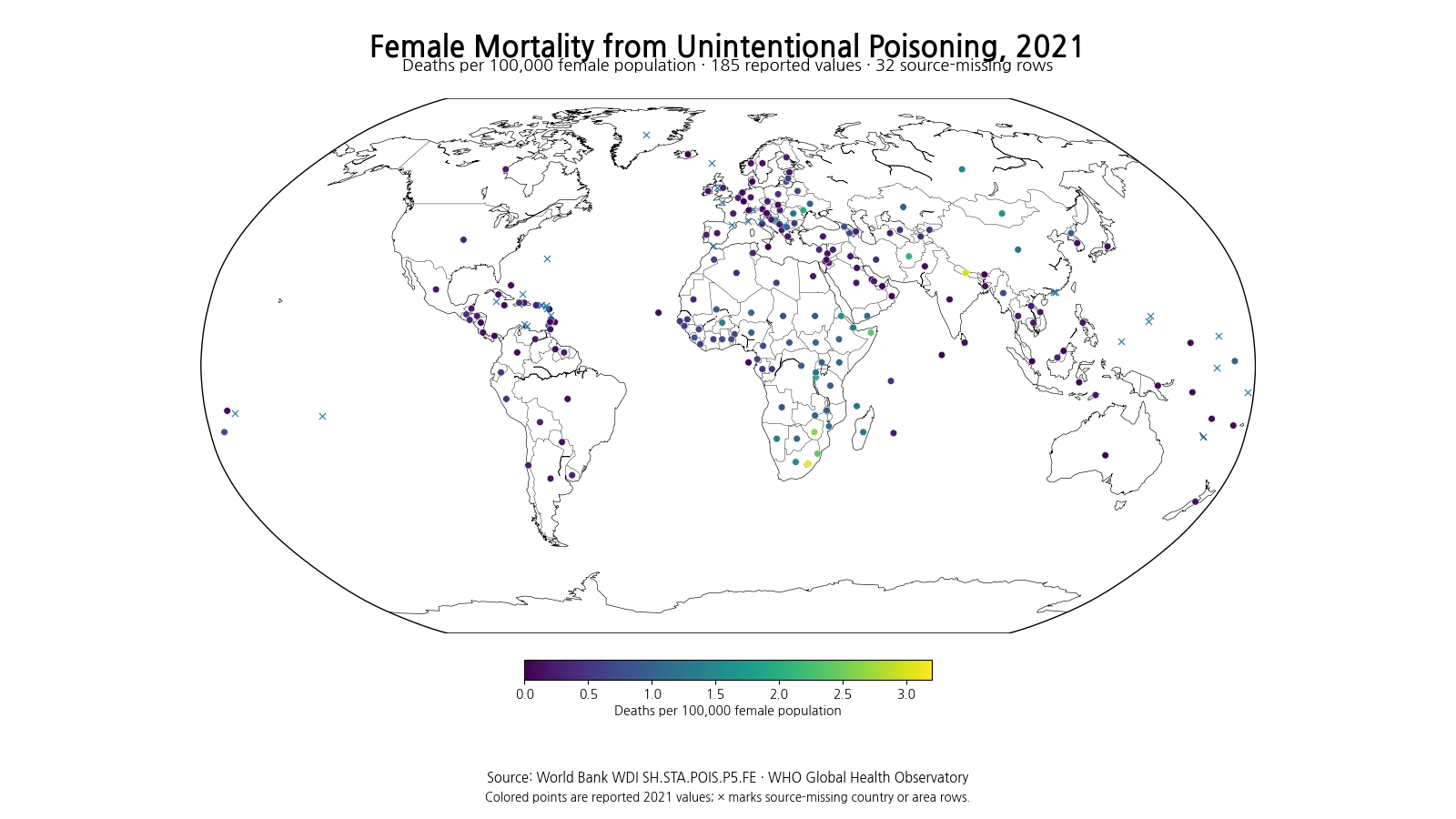
Table of Contents
The highest values appear in Southern Africa and several parts of Asia and Eastern Europe
The ten highest observations are Lesotho, Nepal, Zimbabwe, Eswatini, Somalia, Afghanistan, Moldova, Burundi, Bosnia and Herzegovina, and Eritrea. Lesotho reaches 3.10 deaths per 100,000 female population and Nepal reaches 3.00. Zimbabwe and Eswatini are also well above 2. Southern Africa contains a visible cluster: Lesotho, Eswatini and Zimbabwe are all near the top, while South Africa at 1.56 and Namibia at 1.33 remain far above the overall median.
| Rank | Country or area | Deaths per 100,000 female population |
|---|---|---|
| 1 | Lesotho | 3.100 |
| 2 | Nepal | 3.000 |
| 3 | Zimbabwe | 2.640 |
| 4 | Eswatini | 2.420 |
| 5 | Somalia, Fed. Rep. | 2.380 |
| 6 | Afghanistan | 2.110 |
| 7 | Moldova | 1.960 |
| 8 | Burundi | 1.950 |
| 9 | Bosnia and Herzegovina | 1.810 |
| 10 | Eritrea | 1.650 |
High values are not confined to one region. Nepal stands out sharply within South Asia: its 3.00 rate contrasts with India at 0.074, Bangladesh at 0.100, Bhutan at 0.052 and Pakistan at 0.110. Afghanistan is also high at 2.11. In Eastern and Southeastern Europe, Moldova at 1.96 and Bosnia and Herzegovina at 1.81 contrast with Serbia at 0.25 and Croatia at 0.36. These neighboring differences show why regional averages alone can hide much of the pattern.
Very small reported values are different from missing data
At the lower end, Malta and Singapore are recorded at exactly 0.000. Denmark is 0.0005, Luxembourg 0.001, and Brunei and Iceland 0.002. Across all 185 reported observations, 36 are below 0.1 per 100,000 and 2 are exact zeros. These are numeric source observations, not missing rows, and should not be merged with the 32 countries and areas that have no reported 2021 value.
| Rank | Country or area | Deaths per 100,000 female population |
|---|---|---|
| 1 | Malta | 0.000 |
| 2 | Singapore | 0.000 |
| 3 | Denmark | 0.001 |
| 4 | Luxembourg | 0.001 |
| 5 | Brunei Darussalam | 0.002 |
| 6 | Iceland | 0.002 |
| 7 | Antigua and Barbuda | 0.005 |
| 8 | St. Vincent and the Grenadines | 0.006 |
| 9 | Maldives | 0.016 |
| 10 | Switzerland | 0.024 |
A very small rate means that deaths classified in this category were extremely rare relative to the size of the female population in that year. It should not be expanded into a claim that poisoning exposure does not occur. Nonfatal poisonings, emergency-department visits and minor exposures are outside the numerator. Cause-of-death coding and the completeness of mortality registration can also differ across countries.
The median is 0.29, and the distribution has a long upper tail
Across the 185 reported values, the median is 0.29, the first quartile is 0.13, and the third quartile is 0.77 deaths per 100,000 female population. The simple mean, 0.53, is higher than the median because the upper tail contains a number of values above 1.0. There are 32 observations at or above 1.0 and 6 at or above 2.0.
| Rate band | Countries and areas |
|---|---|
| 0–0.099 | 36 |
| 0.100–0.249 | 47 |
| 0.250–0.499 | 35 |
| 0.500–0.999 | 35 |
| 1.000–1.999 | 26 |
| 2.000 or higher | 6 |
This mean is not a population-weighted global mortality rate. A small country and a country with tens of millions of women each contribute one observation to the simple average calculated here. A global female mortality rate would need to aggregate deaths and female population, or otherwise weight national rates by the relevant female population. The unweighted mean is useful for describing the cross-country distribution, not for replacing a global aggregate.
Nepal is a pronounced outlier relative to nearby countries
Nepal’s rate of 3.00 is striking when compared with several nearby South Asian observations. India is 0.074, Bangladesh 0.100, Bhutan 0.052 and Pakistan 0.110. Afghanistan, however, is also high at 2.11. The large contrasts are visible on the map, but the indicator cannot identify whether pesticides, medicines, carbon monoxide, household chemicals or occupational exposures account for the difference.
The World Bank metadata explicitly covers multiple possible poisoning agents and exposure pathways. Explaining one country’s high value would require cause-specific toxicology or mortality data, occupational exposure evidence, pesticide and chemical regulation data, household fuel information, and emergency-care context. The map identifies where mortality is high relative to female population; it does not supply a single causal explanation.
Southern Africa forms a high-value cluster, but the cluster is not uniform
Southern Africa contains several rates well above the global country median: Lesotho at 3.10, Zimbabwe at 2.64, Eswatini at 2.42, South Africa at 1.56 and Namibia at 1.33. Geographic proximity makes this one of the clearest clusters on the map. Still, the values differ materially across countries, and proximity does not prove that the same toxic agents, industries or household exposures are responsible.
Mortality can be influenced not only by how often poisoning occurs but also by the toxicity of the exposure, speed of treatment, availability of antidotes, emergency transport and hospital access. Registration and cause-of-death assignment also matter. A spatial cluster is therefore best treated as a prompt for deeper investigation rather than as evidence for one shared cause.
The denominator is the female population
The unit is deaths per 100,000 female population. A rate of 1.0 means roughly one female death from unintentional poisoning during the year for every 100,000 females in the population. Male deaths are not included in the numerator or denominator. Comparisons with all-sex or male mortality require the corresponding indicators rather than mixing denominators.
The indicator title and definition do not identify it as age-standardized. Countries have different female age structures, so if poisoning mortality varies strongly by age, demographic structure can influence crude cross-country rates. Separating that effect would require age-standardized or age-specific mortality data. This is one reason not to interpret small rank differences as precise differences in underlying exposure risk.
Mortality is not the same as poisoning incidence
This series counts deaths, not all poisoning events. Two countries could have similar numbers of poisoning incidents but different mortality if treatment access, toxic substances, severity or response times differ. Conversely, a country with a low mortality rate can still have a meaningful burden of nonfatal poisoning. Describing the ranking as “countries with the most poisoning accidents” would therefore change the meaning of the indicator.
A fuller assessment of poisoning burden would combine mortality with emergency visits, hospital admissions, poison-center reports, occupational incidents, substance-specific exposures and measures of disability. Mortality captures the most severe outcome but not the entire spectrum of harm.
WHO estimates can differ from national published figures
World Bank metadata identifies the WHO Global Health Observatory and WHO Global Health Estimates as the underlying source. For countries with high-quality vital registration and cause-of-death data, WHO uses information submitted to the WHO Mortality Database and applies adjustments where needed for under-registration, unknown age or sex, and ill-defined causes. Where high-quality death registration is unavailable, estimates may draw on verbal autopsy, sample or sentinel registration, household surveys and special studies.
The purpose of those methods is to improve international comparability, but the resulting estimates may not be identical to figures published by national authorities. Uncertainty can be greater where death registration systems are incomplete. For cross-country reading, broad gaps and persistent geographic patterns are more informative than tiny differences between adjacent ranks.
The 32 missing rows remain missing
Thirty-two of the 217 country and area rows do not contain a reported 2021 value. They do not represent zero mortality. The map marks them separately and they are excluded from the mean, median, quartiles and rankings. Replacing missing rows with zero would create false low-mortality observations and materially distort the distribution.
At the same time, the exact zeros for Malta and Singapore are preserved as numeric observations. Very small positive values such as Denmark’s 0.0005 are also retained at sufficient precision rather than rounded to zero in the ranking table. That distinction is important for a low-rate mortality indicator.
A 2021 snapshot cannot establish whether mortality is improving
The map is a single-year cross-section. It cannot show whether female unintentional-poisoning mortality is rising or falling in a country. Trend analysis requires multiple years from the same indicator, with attention to changes in WHO methods and underlying input data. A revised estimate may reflect better mortality registration or model inputs rather than only a change in real-world poisoning risk.
Even when a trend is clear, explaining it requires additional evidence. Pesticide regulation, medicine safety, household energy use, occupational chemical exposure, emergency medicine and death-registration quality can change at the same time. A single annual rate should not be used to attribute improvement or deterioration to one policy without supporting data.
Three checks make the map easier to interpret
First, the unit is annual female deaths per 100,000 female population. Second, the category covers multiple unintentional poisoning agents and pathways, so a high national rate cannot be assigned to one substance from this dataset alone. Third, the indicator measures mortality rather than incident poisonings or overall health-system performance. Keeping those distinctions clear prevents the ranking from becoming a broader claim than the data support.
World Bank WDI series SH.STA.POIS.P5.FE draws on WHO mortality estimates and is the female-disaggregated series associated with the unintentional-poisoning mortality indicator used for international monitoring. Every map value, ranking, quartile and distribution count in this article is calculated from the same 185 reported observations dated 2021. The 32 source-missing rows remain missing throughout the analysis.
Frequently Asked Questions
What does the female unintentional-poisoning mortality rate measure?
It is the number of female deaths from unintentional poisoning in a year per 100,000 female population.
Can this indicator identify which poison or chemical caused a high national rate?
No. The category can include household chemicals, pesticides, kerosene, carbon monoxide, medicines, environmental contamination and occupational chemical exposure.
Were the 32 missing 2021 rows treated as zero?
No. Source-missing rows remain missing and are excluded from rankings and summary statistics.
Related Maps
Green Map creates custom-edited map images using open geographic data sources such as geoBoundaries, Natural Earth, OpenStreetMap, and government open data.
These maps are edited visual materials, not raw data files, and are provided for education, documents, presentations, and graphic reference.