Urbanization looks very different across countries when every observation is held to the same year. The 2025 World Bank World Development Indicators series SP.URB.TOTL.IN.ZS reports the percentage of the population living in areas classified as urban by national statistical offices. After World Bank regional, income-group, and other aggregate rows are removed, the comparison contains 217 countries and separately reported economies, and all 217 have a numeric 2025 observation.
The middle observation is 64.2%, while the simple unweighted mean is 63.1%. A majority of the country/economy rows are already predominantly urban by this statistical definition: 154 of 217 are at or above 50%. At the high end, 58 are at or above 80% and 31 are at or above 90%. At the other end, 21 observations are below 30%, including five below 20%. These are distribution statistics across rows, not a population-weighted world urbanization rate.
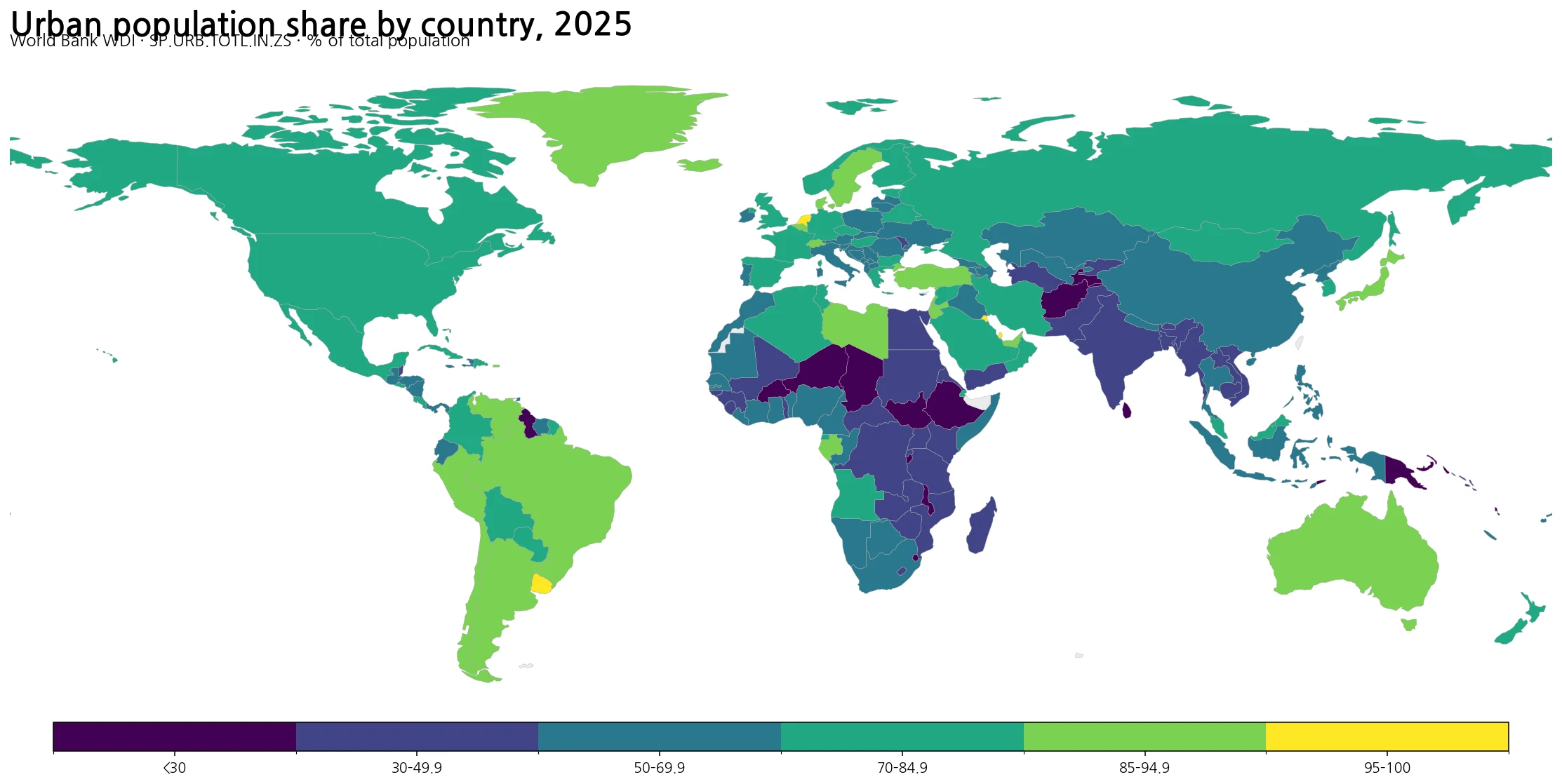
Table of Contents
The 2025 distribution spans a much wider range than one average suggests
The first quartile is about 44.6% and the third quartile is about 80.5%, so the middle half of the observations stretches across roughly 36 percentage points. That is a broad range even before the most urbanized and least urbanized observations are considered. The median of 64.2% is useful for locating the center of the country/economy distribution, but it should not be confused with the share of the world population that lives in urban areas. A small territory and a very populous country each count as one row in the median and simple mean.
The map makes the large spatial contrasts easier to see. High urban shares occur across many economies in the Americas and Western Europe, along with several Gulf and East Asian economies. Lower shares remain visible in parts of Sub-Saharan Africa, South Asia, and the Pacific. Those broad patterns are descriptive rather than causal. The dataset contains the urban share itself; it does not contain the explanatory variables needed to show why a particular country has a high or low value.
The 50% threshold is also easy to interpret but should not be given more meaning than it has. A value above 50% means that more than half of the population is classified as living in urban areas under that country’s statistical definition. In the 2025 table, 154 rows meet that condition and 63 do not. Two countries with the same 60% value can still have very different settlement systems: one may concentrate people in a few large metropolitan areas, while another may have many smaller cities and towns.
Twelve country or economy rows report 100% urban population
Exactly 12 observations are 100.0% in the 2025 data. They include Bahrain, Bermuda, the Cayman Islands, Gibraltar, Hong Kong SAR, Kuwait, Macao SAR, Monaco, and Singapore. Qatar is just below a full 100% at 99.4%, San Marino is 97.2%, the Netherlands is 95.9%, and Malta and Uruguay are both close to 95.7%. In total, 31 observations are at or above 90%.
A reported value of 100% does not mean that every square kilometer is physically built up. It means that the entire population is classified as urban for this indicator. The measure does not directly describe developed land area, building density, impervious surface, or the physical footprint of cities. That distinction matters especially for small economies and territories, where statistical classification and land form can produce a very high urban population share without implying uniform urban land cover.
The high end also mixes very different kinds of places. Large countries such as the Netherlands and Uruguay sit above 95%, while city-oriented economies such as Singapore, Macao, and Monaco are at 100%. The common statistic is the share of people in nationally defined urban areas, not a common urban form. Reading the map as a land-cover map would therefore turn a population classification into a physical-geography claim that the source data do not support.
The lowest observations show why national definitions matter
| Country or economy | Urban population, 2025 |
|---|---|
| Liechtenstein | 14.6% |
| Papua New Guinea | 15.8% |
| Samoa | 17.5% |
| Malawi | 17.6% |
| Niger | 18.4% |
| Sri Lanka | 20.5% |
| Tonga | 21.2% |
| South Sudan | 21.7% |
| Vanuatu | 22.3% |
| Micronesia, Fed. Sts. | 22.5% |
Liechtenstein is the lowest observation at 14.6%, followed by Papua New Guinea at 15.8%, Samoa at 17.5%, Malawi at 17.6%, and Niger at 18.4%. Those are the five rows below 20%. Expanding the threshold to below 30% produces 21 observations. This ranking should not be renamed a ranking of the “most rural landscapes” or the “least developed countries.” It only ranks the percentage of population counted as urban under the source indicator.
Liechtenstein is a particularly useful reminder that the indicator cannot be read as a visual urban-form score. The World Bank metadata explicitly cautions that countries use different criteria to distinguish urban from rural areas. Definitions can depend on settlement size or characteristics, infrastructure and services, or administrative designation. A place that looks urban to a casual observer is not necessarily classified in the same way by two national statistical systems.
The dataset also does not identify the causes of a low urban share. It contains no direct measures of household income, agricultural employment, road access, migration, housing costs, governance, or service availability. Those factors may be relevant to separate research questions, but adding them as explanations here without matched evidence would go beyond what the 2025 urban-population series can support.
Selected major economies occupy very different positions on the same scale
| Country | Urban population, 2025 |
|---|---|
| Argentina | 92.4% |
| Japan | 92.3% |
| Brazil | 88.2% |
| Canada | 82.9% |
| Germany | 82.1% |
| Korea, Rep. | 81.2% |
| United States | 80.2% |
| Mexico | 80.0% |
| France | 78.8% |
| China | 66.3% |
| Indonesia | 59.4% |
| India | 35.7% |
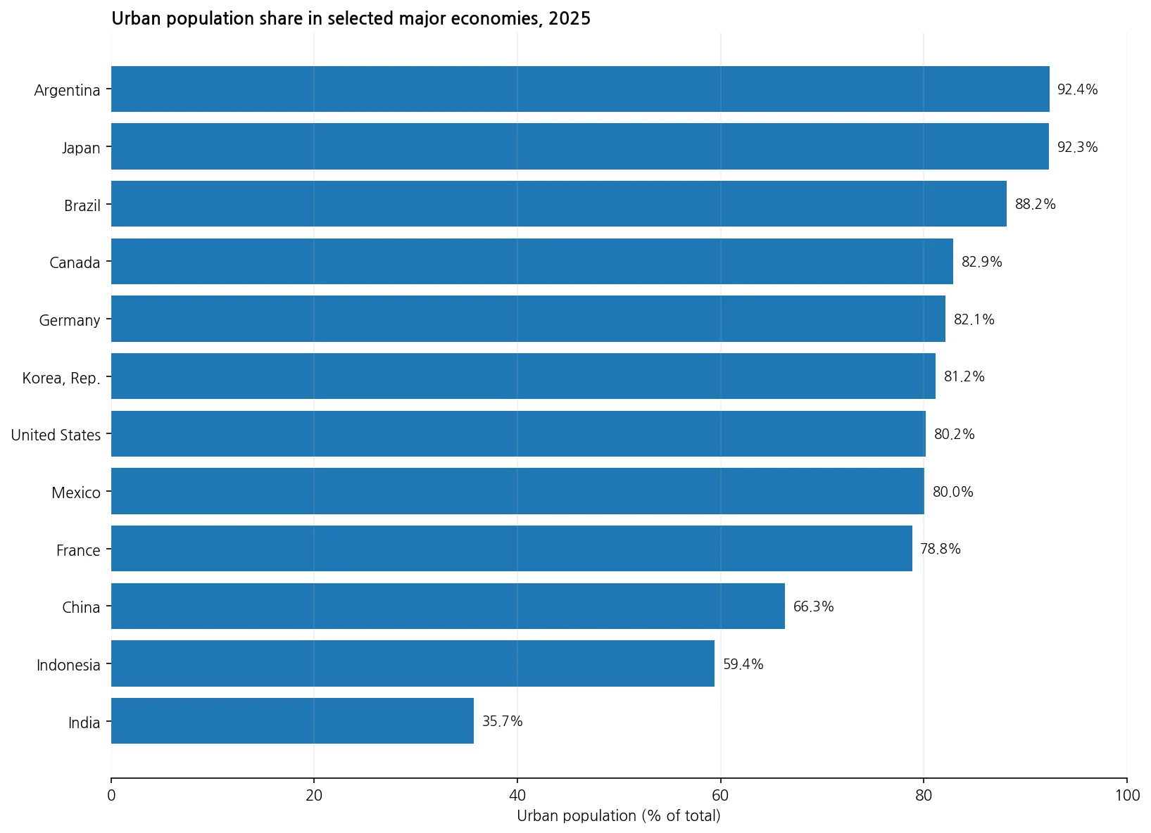
Argentina and Japan are both just above 92%, while Brazil is at 88.2%. Canada, Germany, Korea, the United States, and Mexico cluster around 80–83%. France is 78.8%, China 66.3%, Indonesia 59.4%, and India 35.7%. Putting these economies on one scale shows that very large national economies do not converge on a single level of urban population share.
Close percentages do not imply close urban systems. Korea at 81.2% and the United States at 80.2% are only about one percentage point apart, yet this statistic says nothing about metropolitan concentration, suburban development, city boundaries, or national land area. Japan and Argentina are similarly close at roughly 92%, but their settlement geographies need separate evidence. The indicator is useful precisely because it answers a narrow question; problems start when that narrow answer is treated as a complete description of urban form.
China and India provide one of the largest contrasts among the selected high-population economies, at 66.3% and 35.7% respectively. The difference is substantial in this indicator, but it should not be converted into a direct ranking of living standards or economic development. To test relationships with GDP per capita, Internet adoption, electricity access, or other outcomes, those variables would need to be joined on a compatible geography and period and then analyzed separately.
Urbanization rate is not the same as population density
Urban population share and population density answer different questions. Urban share asks what percentage of residents live in places classified as urban. Population density asks how many people live, on average, within a unit of land area. A large country can have a high urban share while maintaining a low national average density because much of its territory is sparsely populated. A smaller or more compact country can have high density without producing an equally high urban share under its national classification rules.
This distinction is useful when reading the urbanization map beside a population-density map. Density highlights how tightly population is distributed over land, whereas urban share describes how that population is classified between urban and rural areas. Treating the two measures as interchangeable can produce incorrect shortcuts such as “high urbanization means high density” or “low density means most residents are rural.” Neither statement follows from the definitions.
Urban share is also different from the absolute number of urban residents. India’s 35.7% is low relative to many of the selected major economies, but that percentage alone cannot tell us how many people live in Indian cities. The current dataset contains the percentage indicator, not a total-population field. Ranking absolute urban population would require an urban-population count series or a compatible total-population series, not an inference from percentages alone.
Cross-country comparison needs a definition caveat, not just a ranking
The most important interpretation note comes directly from the World Bank metadata: there is no single universally applicable definition of urban and rural areas. The WDI series follows urban areas as defined by national statistical offices, with the underlying urbanization information collected and smoothed by the United Nations Population Division. Countries can classify settlements using different population thresholds, settlement characteristics, infrastructure or service criteria, and administrative rules.
That makes broad gaps more informative than tiny rank differences. Germany at 82.1% and Korea at 81.2%, for example, are close enough that it would be unwise to make a strong claim from their ordering alone. The map is better used to identify wide bands—such as above 90%, around 50–70%, or below 30%—and to see the geographic distribution of those bands. Small differences can be real observations while still being less comparable in substantive terms because the national classifications are not identical.
Administrative urban boundaries also do not necessarily match functional metropolitan areas. A statistically urban area can include lower-density land, while a place classified as rural can still have commuting relationships or suburban characteristics. For national planning questions, the most useful next step is often to pair this international indicator with the country’s own official definition, finer administrative geography, and land-use or settlement data.
What the map can show—and what it cannot
The map reliably supports a same-year comparison of large differences in the 2025 urban population share. It can show which country/economy observations exceed 90%, which remain below 50%, and where high and low values appear geographically. The accompanying table also allows major economies to be compared on a common 0–100% scale without mixing years or filling missing observations.
It cannot by itself measure housing affordability, congestion, urban productivity, poverty, service quality, carbon emissions, land consumption, or the speed of urban expansion. A high urban share and a high GDP per capita are not the same claim, and this single dataset cannot establish whether one causes the other. Those questions require additional indicators and a design that matches geography and time.
The 2025 snapshot also does not show urbanization speed. A country at 70% may have reached that level after decades of gradual change or after faster recent growth. To measure change, multiple years of SP.URB.TOTL.IN.ZS would need to be compared directly. This map is therefore a level comparison for 2025, not a growth-rate or trend map.
Data source and calculation method
The values come from the World Bank World Development Indicators API, series SP.URB.TOTL.IN.ZS, titled Urban population (% of total population). The unit is percent of total population. The comparison keeps a single common year, 2025, and excludes World Bank aggregate regions and income groups. All 217 retained country/economy rows have numeric observations, so no earlier-year values are carried forward and no missing values are imputed.
The median, simple mean, quartiles, threshold counts, and ranked values shown above are calculated directly from those 217 observations. The 63.1% simple mean assigns equal weight to every row. It is not a substitute for a population-weighted World aggregate, because a small separately reported territory and a country with hundreds of millions of residents each contribute one observation to that calculation.
Indicator interpretation follows the World Bank official metadata glossary. The metadata defines urban population through national statistical-office classifications and warns that urban/rural definitions differ among countries. That limitation is why this analysis emphasizes broad distribution patterns, preserves the exact 2025 source values, and avoids treating small cross-country differences as a universal ranking of how “urban” the physical landscape is.
Frequently Asked Questions
What does the urbanization rate mean here?
It refers to World Bank indicator SP.URB.TOTL.IN.ZS: the percentage of the population living in areas classified as urban by national statistical offices.
Does a higher urbanization rate mean higher population density?
No. Urban population share measures the percentage of residents in urban-classified areas. Population density measures people per unit of land area. A country can be highly urbanized without having high national average density.
Can countries be ranked precisely by urbanization rate?
Broad differences are useful, but small rank differences should be interpreted cautiously. The World Bank notes that countries use different definitions and criteria to distinguish urban from rural areas.
Is 63.1% the population-weighted world urbanization rate for 2025?
No. It is the simple unweighted mean of the 217 country/economy observations in this comparison. A population-weighted world rate requires weighting by population or using the official World aggregate.
Related Articles
- Global Population Density Map – 2023 Country Comparison
- Global Population Growth Map – Country Patterns in 2025
- Global GDP per Capita Map – Country Levels in 2025
Green Map creates custom-edited map images using open geographic data sources such as geoBoundaries, Natural Earth, OpenStreetMap, and government open data.
These maps are edited visual materials, not raw data files, and are provided for education, documents, presentations, and graphic reference.