Employment among people ages 15–24 varies much more across countries than a single global headline can show. In the 2025 World Bank series SL.EMP.1524.SP.ZS, 182 countries and reporting areas have a value for the same reference year. Their median youth employment-to-population ratio is 33.20%, while the simple unweighted mean is 35.67%. The Netherlands is at 75.94% and Iceland at 75.02%, while Djibouti is at 3.12%, Libya at 8.36%, and Somalia at 10.42%. Those differences are large, but they are not a league table of labor-market quality.
The denominator is the entire population ages 15–24, not just young people who are in the labor force. That makes this measure different from youth unemployment and labor-force participation. A student who is not working still remains in the age-group population, even if that person is not classified as unemployed. The map below therefore needs to be read as a measure of how much of the youth population is employed, not as a direct score of job availability, wages, or job quality.
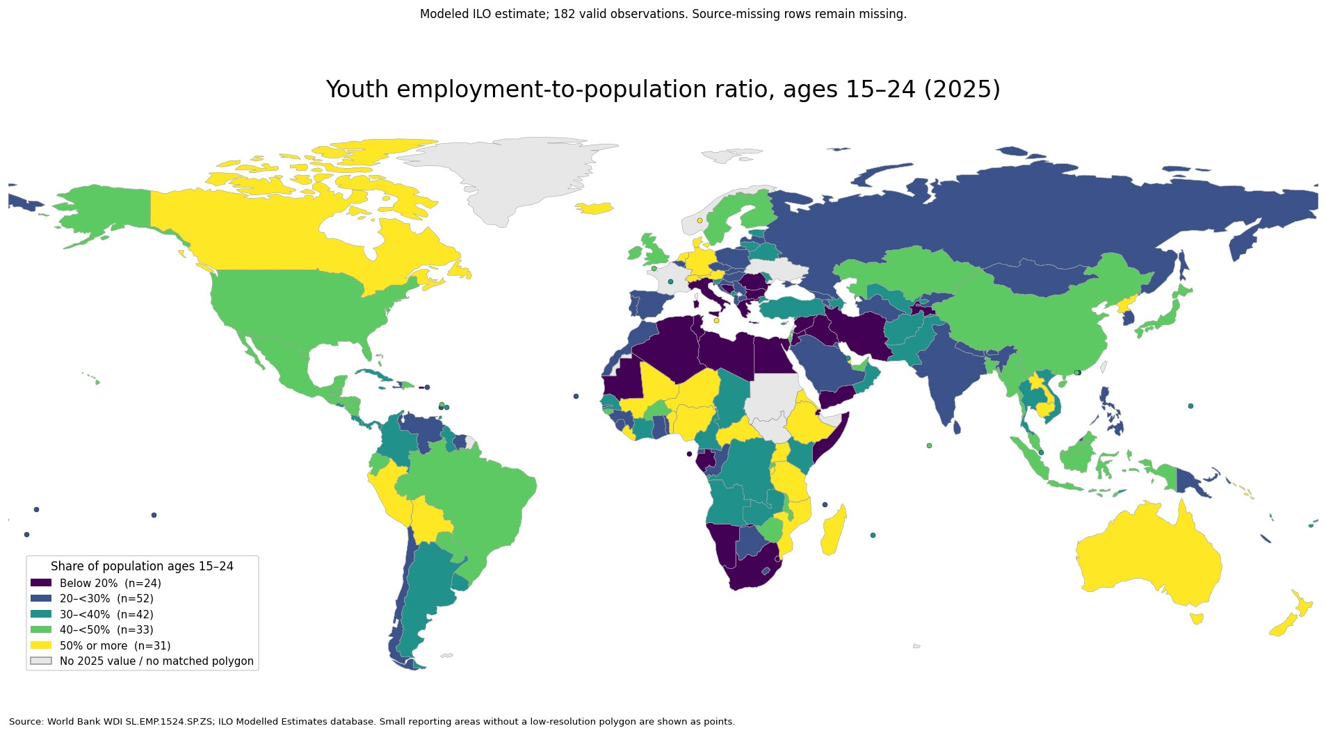
Table of Contents
What the youth employment-to-population ratio actually measures
The World Bank defines the employment-to-population ratio as the proportion of a defined population group that is employed; for this series the group is ages 15–24. Employment follows international labor-statistics concepts and covers people who worked for pay or profit during a short reference period as well as some people temporarily absent from a job. It is not limited to permanent employees, full-time workers, or formal payroll jobs.
This definition makes the indicator especially sensitive to the transition between education and work. A country where many people remain in full-time education through their early twenties can have a lower youth employment ratio without necessarily having unusually high youth unemployment. A country where work and study are commonly combined can record a higher ratio. In other settings, high employment among teenagers and young adults may reflect earlier entry into work or the need to earn income rather than a particularly favorable labor market.
The series is labeled a modeled ILO estimate. That matters because the international dataset combines harmonized national observations with statistical modeling where direct information is incomplete. The ILO has warned that imputed observations can carry substantial uncertainty and should not be used for precise country rankings. Broad bands and large geographic differences are more defensible than treating a one-percentage-point gap as a meaningful ordering.
Most observations are between 20% and 50%, but the range is much wider
Across the 182 valid 2025 observations, the median is 33.20% and the mean is 35.67%. The first quartile is 25.18% and the third quartile is 43.80%, so the middle half of country and area observations lies within a roughly 19-point band. The full spread is far larger: 3.12% at the low end and 75.94% at the high end. These are unweighted country summaries, not an estimate of the share of all young people in the world who are employed.
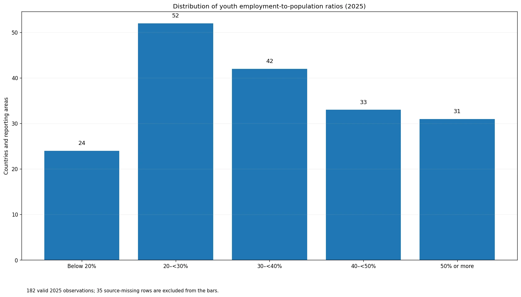
The distribution is thickest in the 20% to under 30% range, which contains 52 observations. Another 42 fall between 30% and 40%, and 33 between 40% and 50%. There are 24 observations below 20% and 31 at 50% or above. Only 13 reach 60% or more. The pattern is therefore not concentrated around one universal youth-employment level; it spans several very different education and labor-market settings.
Northern and Western Europe sit next to much lower values in Southern Europe
Europe contains one of the clearest examples of why regional averages can hide important differences. The Netherlands reaches 75.94% and Iceland 75.02%. Denmark is at 60.97%, Switzerland 59.71%, Norway 57.20%, and Germany 50.88%. Farther south, Italy is at 19.57% and Greece at 18.74%, while Bulgaria is 17.56%. France is at 34.48%, Spain 25.41%, Sweden 43.06%, and the United Kingdom 44.76%.
Those contrasts can be associated with many different mechanisms, including the age at which young people leave education, the prevalence of apprenticeships and part-time work, and the strength of labor demand. The map identifies where the differences are; it does not isolate which institution or policy caused them. A high youth employment ratio can reflect successful work-study integration, but it can also arise in a setting where young people enter paid or family work earlier because continued schooling is less common.
Sub-Saharan Africa contains both very high and very low youth employment shares
Several African observations are among the highest in the dataset. Niger is at 70.44%, Tanzania 69.06%, Madagascar 68.61%, Uganda 66.86%, and Nigeria 61.33%. Yet South Africa is only 10.75%, Gabon 11.34%, Eswatini 12.59%, and Djibouti 3.12%. The sharp contrast inside the continent is more informative than treating Africa as one labor-market category.
A high ratio in a lower-income economy should not automatically be read as evidence of strong job quality. Youth may enter farming, family enterprises, self-employment, or informal work at young ages. A low ratio can have different meanings as well: it may coincide with high school enrollment, limited job opportunities, or both. To distinguish those possibilities, this indicator needs to be paired with school participation, youth unemployment, NEET rates, hours worked, and information on employment status.
Asia and the Pacific show large differences even among nearby economies
Cambodia is at 70.05%, Australia 63.42%, New Zealand 56.33%, and Japan 49.16%. China records 41.50%, Indonesia 40.03%, Viet Nam 38.52%, Thailand 37.80%, Singapore 30.88%, the Philippines 29.46%, and India 26.20%. These values occupy several different map bands despite geographic proximity and extensive trade links, underscoring that youth employment is shaped by domestic education and labor-market structures rather than geography alone.
The Americas are also mixed. Canada is at 54.35%, the United States 46.08%, and Mexico 42.44%. In South America, Peru reaches 50.01% and Brazil 47.00%, compared with Colombia at 35.60%, Argentina 31.32%, and Chile 23.57%. Because the indicator is a percentage, it supports structural comparison across differently sized populations, but it does not show how many young people are employed in absolute numbers.
Selected 2025 values show the scale of the spread
The examples below are reference points chosen from different regions and parts of the distribution. They are not presented as a precise ranking, which would be a poor use of a modeled series.
| Country | Youth employment-to-population ratio | Position in the distribution |
|---|---|---|
| Netherlands | 75.94% | Highest valid 2025 observation |
| Niger | 70.44% | High West African example |
| Cambodia | 70.05% | High Southeast Asian example |
| Australia | 63.42% | Well above the median |
| Germany | 50.88% | Just above the 50% threshold |
| United States | 46.08% | 40% to under 50% band |
| China | 41.50% | Low 40s |
| India | 26.20% | 20% to under 30% band |
| Italy | 19.57% | Just below 20% |
| South Africa | 10.75% | Low band |
| Djibouti | 3.12% | Lowest valid 2025 observation |
All rows use the same 2025 reference year, but the amount of direct national information and model-based estimation can differ. The source provides values to several decimal places; those digits are useful for reproducible calculations, not proof that the estimates are accurate enough to order countries separated by tiny gaps. Large differences are much more informative than small ones.
Employment, unemployment, participation, and NEET answer different youth questions
The youth employment-to-population ratio asks what share of everyone ages 15–24 is employed. The youth unemployment rate asks what share of the youth labor force is unemployed. Labor-force participation adds employed and unemployed people together and compares that total with the youth population. The NEET rate identifies young people who are outside education, employment, and training. None of those measures can be substituted for another.
A non-employed student illustrates the difference. That person lowers the employment-to-population ratio but may not be unemployed if not actively seeking and available for work, and is not NEET while participating in education. A young person outside both work and education who is not seeking a job may be NEET without appearing in the unemployment rate. Looking at the measures together separates lack of employment from education participation and labor-force attachment.
Data source and mapping method
The statistical source is the World Bank World Development Indicators series Employment to population ratio, ages 15-24, total (%) (modeled ILO estimate), indicator code SL.EMP.1524.SP.ZS. The World Bank identifies the ILO Modelled Estimates database as the underlying source. This comparison uses only rows dated 2025: 182 have a numeric value and 35 remain source-missing.
ISO-3 codes were joined to a simplified world boundary layer. A total of 161 valid observations matched country polygons directly. Twenty-one small or separately reported statistical areas without a usable polygon in that low-resolution layer were added as point markers, so the map still represents all 182 valid values. Missing observations were not converted to zero. The mean, median, quartiles, and band counts are simple unweighted summaries across the 182 valid rows.
This is a cross-section, not a trend chart. Whether youth employment has risen or fallen requires a consistent multi-year series, and revisions to modeled estimates can alter historical values. For detailed country analysis, the modelled comparison should be checked alongside the latest national labor-force survey and ILOSTAT country series.
Frequently Asked Questions
What does a youth employment-to-population ratio of 33% mean?
It means about 33 of every 100 people ages 15–24 are employed. The denominator is the full youth population in that age group, not only people in the labor force.
Does a higher youth employment ratio always indicate a better labor market?
No. Education participation, work-study arrangements, labor demand, informal work and early labor-market entry can all affect the ratio. It does not directly measure wages or job quality.
Are all values on the map from 2025?
Yes. The map and summary statistics use the 182 observations dated 2025. Thirty-five source-missing rows remain missing rather than being treated as zero.
Why should modeled ILO estimates not be treated as a precise country ranking?
The modeled series can include imputed observations where direct data are incomplete. Those estimates carry uncertainty, so broad differences are more appropriate than ranking countries by small gaps.
Related Articles
Global Employment-to-Population Ratio Map – Ages 15+ in 2025
Youth NEET Rate by Country – Ages 15–24 in 2025
Labour Force Participation Rate 2025
Green Map creates custom-edited map images using open geographic data sources such as geoBoundaries, Natural Earth, OpenStreetMap, and government open data.
These maps are edited visual materials, not raw data files, and are provided for education, documents, presentations, and graphic reference.