A world map of the share of people ages 15 and older who are employed reveals a labor-market pattern that unemployment alone cannot show. World Bank indicator SL.EMP.TOTL.SP.ZS measures employed people as a percentage of the population ages 15+, using modeled ILO estimates. Restricting the dataset to the 182 economies with a 2025 observation gives a median of 57.7% and a simple country mean of 56.9%. That mean is unweighted: it describes the distribution of country observations, not the employment share of the world population.
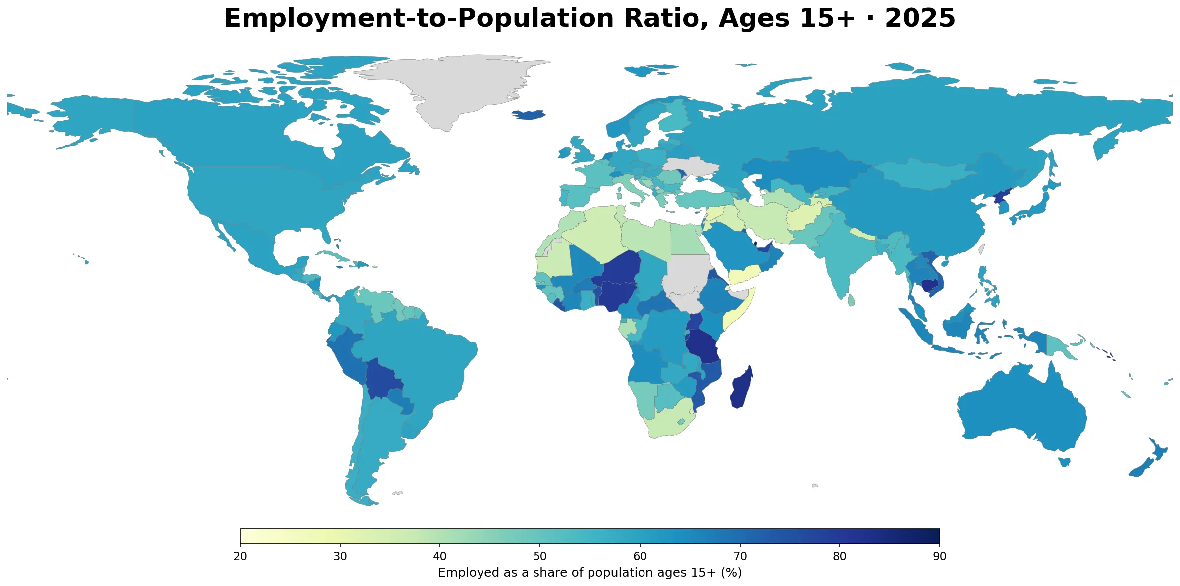
Table of Contents
The strongest map pattern is variation within regions, not one continental divide
The Gulf illustrates how sharply nearby economies can differ on this measure. Qatar is at 86.9%, the United Arab Emirates at 76.9%, Kuwait at 71.8%, and Bahrain at 69.7%. Farther across the same broad Middle Eastern region, Jordan is at 33.4%, Iraq at 35.1%, and Yemen at 27.4%. The map therefore does not support a simple regional label such as “high employment” or “low employment.”
Eastern and southern Africa show an equally wide spread. Tanzania is at 82.4%, Madagascar 82.9%, Uganda 77.8%, Burundi 77.5%, and Mozambique 73.5%. Yet Djibouti is 23.5%, Somalia 27.4%, Eswatini 33.7%, and South Africa 37.6%. These contrasts are useful for locating where the indicator differs, but the dataset does not establish why the differences exist. Industry mix, demographics, participation, informality, and many other factors would require separate evidence.
Europe occupies a narrower middle range than the global extremes, though the differences are still substantial. Iceland is at 72.2%, the Netherlands 64.6%, Norway 62.6%, Germany 58.3%, France 51.2%, Greece 47.5%, and Italy 46.2%. Asia is also heterogeneous: Cambodia is at 82.2% and Viet Nam at 71.7%, while Nepal is 35.1% and Afghanistan 32.5%.
Most 2025 observations sit in the middle of a very broad distribution
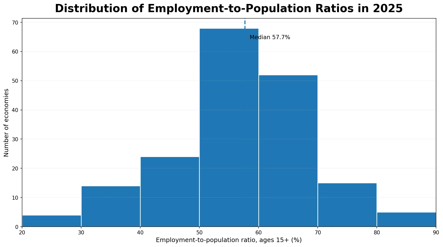
Among the 182 same-year observations, 20 are at or above 70%, 72 are at or above 60%, and 18 are below 40%. Five observations exceed 80%: Qatar, Solomon Islands, Madagascar, Tanzania, and Cambodia. Four are below 30%: Sao Tome and Principe, Djibouti, Yemen, and Somalia. These are useful markers for the width of the distribution, not a league table of “best” and “worst” labor markets.
That distinction matters because the series is built from the ILO Modelled Estimates database. The World Bank metadata explains that modeled observations can include imputations where national data are missing and warns that uncertainty can be high. Small differences between countries should therefore not be treated as precise rankings. Broad bands and clearly separated values are more defensible uses of the map than interpreting a one-percentage-point gap as meaningful.
Selected economies show why the indicator needs its own interpretation
The table below is a cross-section of economies from different regions rather than a ranking. South Korea is at 62.6%, China 61.6%, the United States 59.1%, Germany 58.3%, India 53.3%, and France 51.2%. South Africa is much lower at 37.6%, while Qatar and Tanzania are above 80%. The values answer one specific question: what share of the population ages 15+ is employed under the modeled ILO framework?
| Economy | Employment-to-population ratio, ages 15+ (2025) |
|---|---|
| Qatar | 86.9% |
| Tanzania | 82.4% |
| Cambodia | 82.2% |
| South Korea | 62.6% |
| China | 61.6% |
| United States | 59.1% |
| Germany | 58.3% |
| India | 53.3% |
| France | 51.2% |
| South Africa | 37.6% |
| Jordan | 33.4% |
| Yemen | 27.4% |
Why this measure can look very different from the unemployment rate
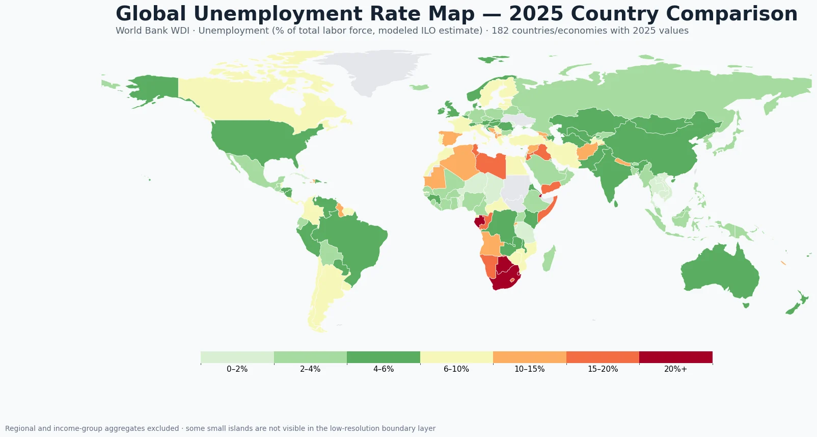
The denominator is the key. The employment-to-population ratio divides employed people by the population ages 15 and older. The unemployment rate, by contrast, is calculated within the labor force. Someone who is not working and is outside the labor force is not simply counted as unemployed, but that person still remains in the population denominator used by the employment-to-population ratio.
As a result, an economy can report low unemployment while still having a relatively low employment-to-population ratio when many adults are outside the labor force. The reverse caution also applies: a high employment-to-population ratio does not prove that wages, hours, job security, productivity, or working conditions are strong. Labor-force participation, unemployment, underemployment, earnings, and informality answer different questions and should be examined separately.
Five older latest observations were excluded from the 2025 map
The supplied source has a latest non-empty observation for 187 economies, but five do not reach 2025. Ukraine is latest in 2021; Sudan and West Bank and Gaza in 2022; Lebanon and South Sudan in 2023. Mixing those years into a single cross-sectional color scale would blur the difference between a time gap and a country gap, so the map and distribution use only the 182 observations dated 2025.
This same-year choice sacrifices a small amount of coverage in exchange for a clearer snapshot. A different article focused on recent change should use the full time series for each economy rather than forcing all countries into one cross-section.
What the map can tell you—and what it cannot
The map is most useful for finding large geographic contrasts. Economies above 70% and below 40% appear in several parts of the world, and neighboring countries can fall into very different bands. That makes the indicator a useful companion to unemployment and labor-force participation when the goal is to understand how much of the adult population is actually employed.
It should not be converted into a general score of economic wellbeing. The ratio says nothing directly about pay, hours, job quality, social protection, output per worker, or household living standards. Because modeled estimates are used, precise country ranking is also a poor use of the series. A high value means a larger share of people ages 15+ are employed under this statistical framework—nothing more by itself.
Data source and mapping method
The statistical source is the World Bank World Development Indicators series Employment to population ratio, 15+, total (%) (modeled ILO estimate), indicator code SL.EMP.TOTL.SP.ZS. The World Bank defines the indicator as the proportion of a country’s population that is employed and identifies the ILO Modelled Estimates database as the underlying source. The unit is percent of the population ages 15+ and the series is annual.
For the map, only observations dated 2025 were retained, leaving 182 economies. Values were joined to a low-resolution world country boundary layer by country code. Very small islands and special statistical areas may not have a matching polygon at this scale, so a gray area can reflect a geometry mismatch rather than a missing statistical row. The mean and median reported here are unweighted across economies, not population-weighted global estimates.
The interpretation notes were checked against the World Bank metadata and the International Labour Organization explanation of the employment-to-population ratio.
Frequently Asked Questions
What does the employment-to-population ratio measure?
World Bank indicator SL.EMP.TOTL.SP.ZS measures employed people as a percentage of the population ages 15 and older, using modeled ILO estimates.
Are all values on this map from 2025?
Yes. The map and distribution keep the 182 economy observations dated 2025. Older latest observations for Ukraine, Sudan, West Bank and Gaza, Lebanon, and South Sudan are excluded from the same-year comparison.
Is a high employment-to-population ratio the same as a low unemployment rate?
No. The employment-to-population ratio uses the population ages 15+ as its denominator, while unemployment is measured within the labor force. The two indicators can move differently.
Should these modeled estimates be used for precise country rankings?
No. The modeled ILO series can include imputed observations where national data are limited, so small country differences carry uncertainty. Broad patterns are more appropriate than precise rankings.
Related Articles
Employment-to-population ratios become easier to interpret when they are placed next to unemployment and other labor-market measures. These Green Map pages provide closely related comparisons and official-data context.
- Global Unemployment Rate Map – Country Patterns in 2025
- U.S. County Employment Growth Map – 2025 QCEW
- ONS Explore Local Indicators Guide – UK Local Statistics
Green Map creates custom-edited map images using open geographic data sources such as geoBoundaries, Natural Earth, OpenStreetMap, and government open data.
These maps are edited visual materials, not raw data files, and are provided for education, documents, presentations, and graphic reference.