The Polk County Florida Land Cover Map does not have a single land-cover class that overwhelms the rest of the 2025 map. Wetlands lead at 31.77%, but agriculture is close behind at 25.13% and developed land accounts for another 20.75%. Water covers 7.69% and forest 6.23%, with shrubland and grassland adding smaller pieces. The result is a central Florida county where wet ground, working land, built areas, and numerous lakes repeatedly meet rather than falling into a simple urban-versus-rural split.
This page pairs four views of that landscape: the 2025 land-cover overview, a forest-and-farmland map, an impervious-surface map, and a 1985–2025 classification-difference map. The WebP images are displayed for quick comparison, while the four original JPG maps are bundled in one download below. They are most useful when the reader keeps current cover, hard-surface intensity, and two-date change as separate questions.
Table of Contents
Polk County Florida Land Cover Map: three large classes share the county
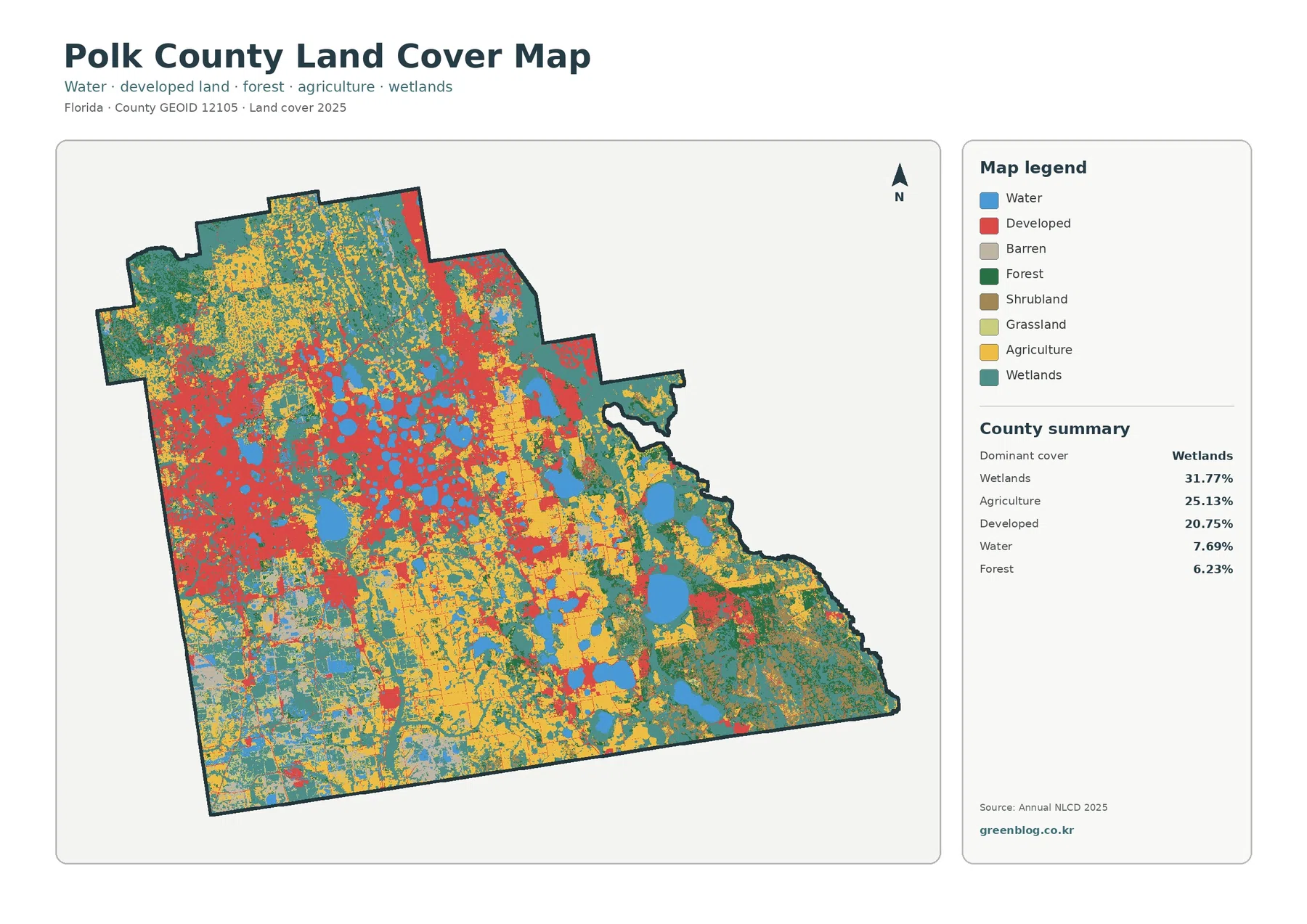
Wetlands are the largest class at 31.77%, yet they do not appear as one uninterrupted block. Teal areas extend broadly across the north and east, continue through the southeast, and reappear between lakes, farms, and developed areas in the center. This scattered-but-extensive distribution is one reason the county summary needs a map beside it: the percentage tells how much wetland is present, while the image shows how frequently it meets other land-cover types.
Agriculture accounts for 25.13%, nearly one quarter of the county. Yellow and light agricultural colors are widespread through the central, southern, and eastern portions, with additional areas farther north. The agricultural pattern is not a single continuous district. It is broken by wetlands, water, developed land, and smaller natural-cover patches, giving the interior a pronounced mosaic rather than a uniform field landscape.
Developed land is the third major class at 20.75%. Red cover is especially prominent in the west and west-central part of the county, with another strong concentration toward the northeast and smaller developed traces connecting other areas. The southeast is much less dominated by developed color. This contrast matters because a countywide percentage can hide how unevenly development is distributed from one part of Polk County to another.
Open water makes up 7.69%, a substantial share for an inland county. Blue lakes are numerous through the central and eastern map, and additional water bodies appear toward the south. Water and wetlands should remain separate in any explanation. Open water is mapped where water itself is the dominant surface, while wetland classes can include vegetation and saturated or seasonally wet ground that may not look like an open lake.
Forest covers 6.23%. The darkest green is easier to follow in the northwest and north, with smaller forest sections along the eastern and southeastern margins. Shrubland is 3.60% and grassland 1.61%. These smaller classes do not control the countywide picture, but they help explain transitions between farmed, wet, forested, and developed surfaces.
Land cover is a description of the physical surface inferred from mapped data; it is not a zoning code, ownership record, or statement about what a parcel may legally be used for. A developed cell can contain trees, lawns, and open space as well as pavement. An agricultural cell does not identify a specific owner or crop. The map is therefore appropriate for county-scale surface comparison, not parcel-level legal decisions.
Agriculture is nearly as extensive as development, but it occupies a different pattern
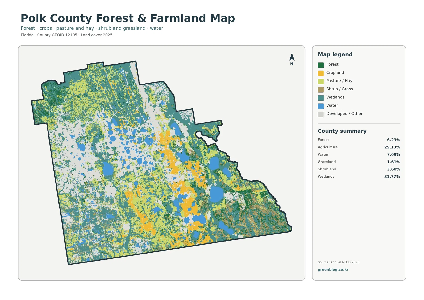
The forest-and-farmland view makes the 25.13% agricultural share easier to see because developed and miscellaneous surfaces are visually subdued. Cropland and pasture-or-hay colors spread through broad parts of the center, south, and east, with additional agricultural patches in the north. Wetlands weave through many of these areas instead of forming a clean boundary between farmed and natural land.
The legend distinguishes cropland from pasture or hay, but the supplied county summary provides one verified agriculture total rather than separate percentages for those subclasses. That distinction is important. The map can support a statement about where each color appears, but it would be misleading to estimate exact cropland and pasture shares by eye and present them as measured statistics.
UF/IFAS Extension Polk County maintains agriculture programs that include commercial citrus, small farms, livestock and forages, and horticulture. Its commercial-citrus program specifically serves the Polk/Hillsborough area. This confirms that agriculture remains a meaningful part of the county’s local context, but it does not mean every agricultural cell on the NLCD map is citrus. Crop-specific land use requires a different dataset.
Forest at 6.23% is much smaller than agriculture, yet the focused view reveals where it matters most. Larger dark-green areas remain toward the northwest and north, while smaller forest patches occur around wetland and agricultural sections farther east and southeast. A countywide percentage alone could make forest seem negligible; the map shows that its location is more concentrated and therefore more noticeable in some parts of the county than others.
The focused map is useful for comparing working land with natural cover, but its colored edges are not surveyed farm boundaries. Raster classification simplifies a real landscape into cells, so narrow tree lines, drainage features, roads, mixed vegetation, and small developed areas can be generalized into the surrounding pattern. Use it to describe broad location and relative extent, not to identify a particular farm property.
Polk County’s lake network and Green Swamp setting add useful context to the wet classes
The number of blue shapes in the county is one of the clearest visual features in the map set. Large and small lakes are concentrated through the central portion and continue eastward and southward. Many sit close to teal wetland areas. That relationship does not mean every wetland is connected to a mapped lake, but it does show why a discussion of Polk County land cover is incomplete if water is treated as a minor background detail.
The Southwest Florida Water Management District describes the Green Swamp as a large central Florida natural system that includes portions of Polk County. Its official overview highlights cypress swamps, marshes, forests, pine flatwoods, and other wet landscapes. This regional context helps explain why wetland and forest cover are important in the northern part of the county. The land-cover image, however, does not draw the legal Green Swamp boundary, so individual teal or green cells should not be labeled as protected Green Swamp land without a separate boundary layer.
The same agency identifies important river headwaters connected with the Green Swamp and Polk County, including the Peace River system through Lake Hancock, the Winter Haven chain of lakes, and Lake Hamilton. Those names provide geographic context for the lake-rich interior. They do not turn this land-cover map into a hydrography map. Stream names, flow direction, flood limits, and regulatory water boundaries require dedicated water-resource data.
Polk County’s own Water Resources Program also monitors lakes and streams and uses the results to guide water-quality work. That official program is relevant background because the countywide map contains so much water and wetland cover. Still, color on the land-cover map says nothing about water quality. A blue lake cannot be classified as clean or impaired from this image, and a wetland color does not by itself describe ecological condition.
The 1985–2025 layer records 28.90% classification difference, not one kind of change
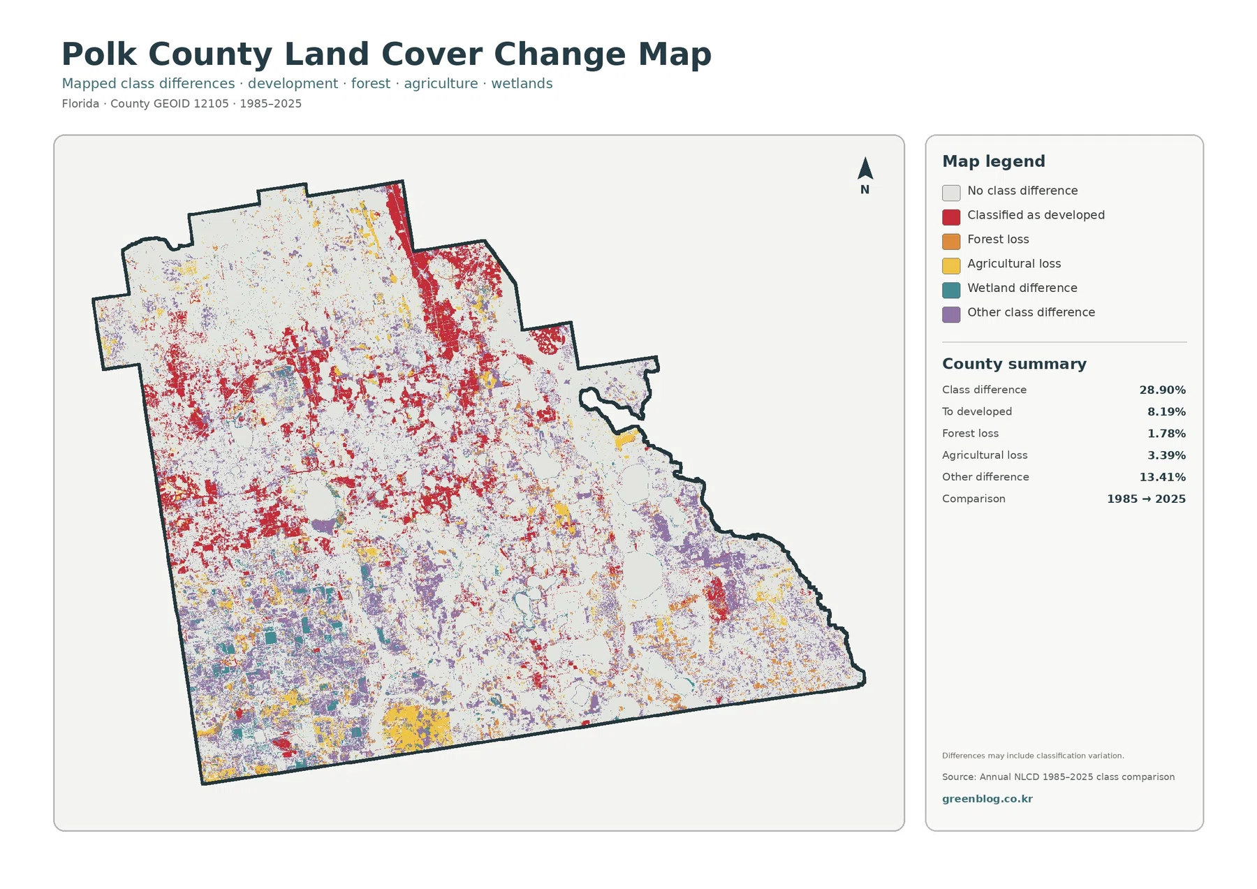
The comparison map reports 28.90% total class difference. Within the supplied summary, 8.19% is listed as classified to developed, 1.78% as forest loss, 3.39% as agricultural loss, and 13.41% as other difference. Wetland difference is also a legend category, but the map does not provide a separate verified percentage for it. The safe approach is to describe its visible locations without inventing a number.
Red developed-conversion marks are widespread through the west and center and form another pronounced area toward the northeast. Some of those locations are close to present-day high-impervious concentrations, but spatial overlap alone does not establish the cause of change. A road, subdivision, industrial project, or other event should not be named as the reason unless another source documents it.
Purple “other difference” marks are extensive through parts of the south, east, and interior, while yellow agricultural-loss patches are visible in several southern and central areas. Forest-loss marks are smaller and more scattered. This mixture explains why the 28.90% total should not be summarized as if it represented one process. Several highlighted categories, plus potential classification variation, contribute to the total.
The map itself warns that differences may include classification variation. Imagery, seasonal conditions, mixed pixels, and classification rules can influence the category assigned to a cell. A place can also change more than once between 1985 and 2025 and end in a class similar to its starting class. The layer is therefore best used to identify areas for closer investigation rather than to prove that 28.90% of the county was physically transformed.
Hard-surface intensity is much lower than the 20.75% developed share
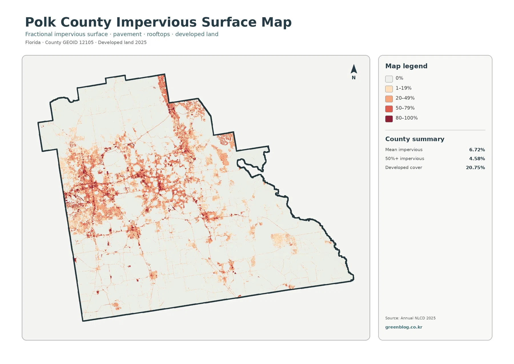
Polk County’s mean impervious cover is 6.72%, and only 4.58% of the county is mapped at 50% or greater impervious surface. Both figures are far below the 20.75% developed-land share. The difference is expected because a developed land-cover class may contain permeable lawns, trees, landscaped areas, and open ground along with rooftops and pavement.
The darkest impervious colors are most frequent in the western and central developed belt. Another noticeable concentration appears toward the northeast, and thin higher-value traces extend between some built-up areas. Much of the southeast remains near the lightest end of the scale. This distribution shows that built surfaces are concentrated rather than spread evenly across all land mapped as developed.
Narrow dark traces can resemble roads, but the product is not a transportation map. It does not provide route names, lane counts, traffic volumes, or pavement condition. Likewise, a high impervious percentage is not a direct flood-risk score. Rainfall, elevation, soil, drainage infrastructure, wetlands, and nearby water bodies all affect runoff and flooding in ways that this single layer cannot resolve.
For an urbanization discussion, the general land-cover and impervious maps work best as a pair. The first identifies where developed cover is broad; the second shows where hard surfaces within that broader class are more intense. In Polk County, the contrast between 20.75% developed cover and a 6.72% mean impervious value is a clear reminder that “developed” and “paved” are not interchangeable terms.
Cross-map comparisons keep current cover, intensity, and history separate
The first useful comparison is wetlands versus agriculture. They occupy 31.77% and 25.13% respectively, making them the county’s two largest classes. Yet the maps show different arrangements: wet cover is especially broad in the north and east, while agriculture spreads strongly through the center, south, and east and repeatedly meets wetland and water. The location pattern is more informative than simply stating that the two percentages are close.
A second comparison is developed cover versus impervious intensity. Developed land reaches 20.75%, but mean impervious cover is only 6.72% and the area at 50% or more impervious surface is 4.58%. This prevents a common overstatement in which every developed cell is described as dense urban pavement. Some developed areas are much more permeable than others.
A third comparison separates present condition from two-date difference. The 2025 map says what class a cell currently belongs to, while the change map asks whether the 1985 and 2025 classifications differ. Current developed cover of 20.75% is not interchangeable with the 8.19% “to developed” change category. These numbers come from different measurements and answer different questions.
For a classroom sequence or county profile, begin with the general map, move to the vegetation view for farms and forest, then use the impervious map to discuss hard-surface intensity. Introduce the change layer after those present-day categories are clear. This order helps an audience understand the distinction between area, location, intensity, and historical comparison without turning the legend into a long list of disconnected numbers.
Image size and raster classification set practical limits on the download
The original JPG maps in the package are 2480 × 1754 pixels. The asset manifest does not mark them as meeting its A3 high-resolution reference. They remain suitable for screen use, ordinary prints, classroom handouts, and presentation graphics, but enlarging them far beyond the source dimensions will not reveal new geographic detail.
Annual NLCD is raster data, meaning the landscape is represented by grid cells. A real cell can contain pavement, grass, trees, water, bare soil, and other surfaces at the same time, yet the land-cover product assigns a class and the impervious product reports a percentage. Boundaries between wetlands, farms, developed land, and water are therefore simplified compared with a field survey or parcel map.
The 2025 map represents the supplied observation year. Development after that date, agricultural conversion, vegetation recovery, water-management work, or other later changes may not appear. The 1985–2025 product is also a two-date comparison, not an annual history of every transition. Current planning, regulatory, or property decisions should be checked against newer authoritative sources.
Those limits define the maps’ strongest uses. They work well for county-scale comparisons, educational graphics, broad land-cover descriptions, and screening areas where more detailed research may be useful. They should not be used to determine property ownership, wetland jurisdiction, building rights, exact shoreline position, or flood risk for an individual site.
Choosing the right JPG from the four-map download
The download contains the four original JPG maps used on this page. Choose the 2025 overview when a single figure needs to summarize Polk County’s wetlands, agriculture, development, lakes, and forest. Use the forest-and-farmland view when the relationship between working land and natural cover is the main subject. The impervious map is better for discussing development intensity, while the change map is designed for screening two-date classification differences.
When several maps are used together, keep their measurements clearly labeled. A presentation should not mix the 31.77% wetland share with the 6.72% mean impervious value or the 28.90% class-difference figure as though all three were the same kind of percentage. Each number describes a different property of the county. Maintaining those definitions makes the map set much more useful for comparison.
Frequently Asked Questions
What is the largest land-cover class in Polk County in 2025?
Wetlands are the largest class in the supplied summary at 31.77%. Agriculture follows at 25.13%, developed land at 20.75%, water at 7.69%, and forest at 6.23%. The map shows wetlands broadly distributed across the north, east, southeast, and interior rather than confined to one isolated area.
Why is Polk County’s developed share 20.75% while mean impervious cover is 6.72%?
Developed land is a broad land-cover category that may include lawns, trees, landscaped areas, and open space along with buildings and pavement. Impervious cover measures only hard surfaces that resist water infiltration, such as roofs, roads, and parking areas. The two percentages therefore describe different aspects of the same developed landscape.
Does 28.90% class difference mean that 28.90% of Polk County was physically changed?
No. It is the share of cells classified differently in the 1985 and 2025 comparison. The supplied summary includes 8.19% classified to developed, 1.78% forest loss, 3.39% agricultural loss, and 13.41% other difference. Classification variation may be included, so determining physical causes requires additional imagery and local records.
Sources and Reference Data
- MRLC Annual NLCD Data — source data for the 2025 land-cover products and the 1985–2025 comparison.
- USGS Annual NLCD Land Cover Classification — definitions and background for developed, agricultural, forest, wetland, and other classes.
- U.S. Census Bureau TIGER/Line Shapefiles — official geographic boundary reference for Polk County.
- Southwest Florida Water Management District – Green Swamp — official regional context for wetlands, forests, and water resources that extend into Polk County.
- UF/IFAS Extension Polk County – Agriculture Programs — local information on commercial citrus, small farms, livestock and forages, and other agricultural programs.
- Polk County Natural Resources and Environment — county information on lake and stream monitoring and water-resource management.
Map File Information
The Polk County package contains the four original JPG land-cover maps shown in this article.
- Included Files: Use only the versions confirmed in the article and supplied images
- File Type: Use the confirmed download contents
- Intended Use: Printing, education, presentations, and map-based projects
Related Maps
- Alachua County Florida Land Cover Map
- Baker County Florida Land Cover Map
- Bay County Florida Land Cover Map
Green Map creates custom-edited map images using open geographic data sources such as geoBoundaries, Natural Earth, OpenStreetMap, and government open data.
These maps are edited visual materials, not raw data files, and are provided for education, documents, presentations, and graphic reference.