Orange County Florida Land Cover Map data show a county split between a broad developed core and a very different eastern landscape of wetlands, agriculture, and forest. In the supplied 2025 summary, developed land is the largest class at 44.42%, followed by wetlands at 30.36%, water at 9.62%, agriculture at 8.92%, forest at 5.37%, shrubland at 0.54%, and grassland at 0.25%. The contrast is visible immediately: dense urban cover dominates much of the west and center, while the eastern side remains much wetter and less built.
This page compares four related views: 2025 land cover, forest and farmland, impervious surface and developed land, and a 1985–2025 class-difference map. The WebP images make it easy to compare the county on screen, and the four original JPG maps are available together in one ZIP download below. Use the general map for the overall pattern, then switch to the focused views when the question is about vegetation, hard surfaces, or long-term classification differences.
Table of Contents
A 44.42% developed share does not make the whole county look urban
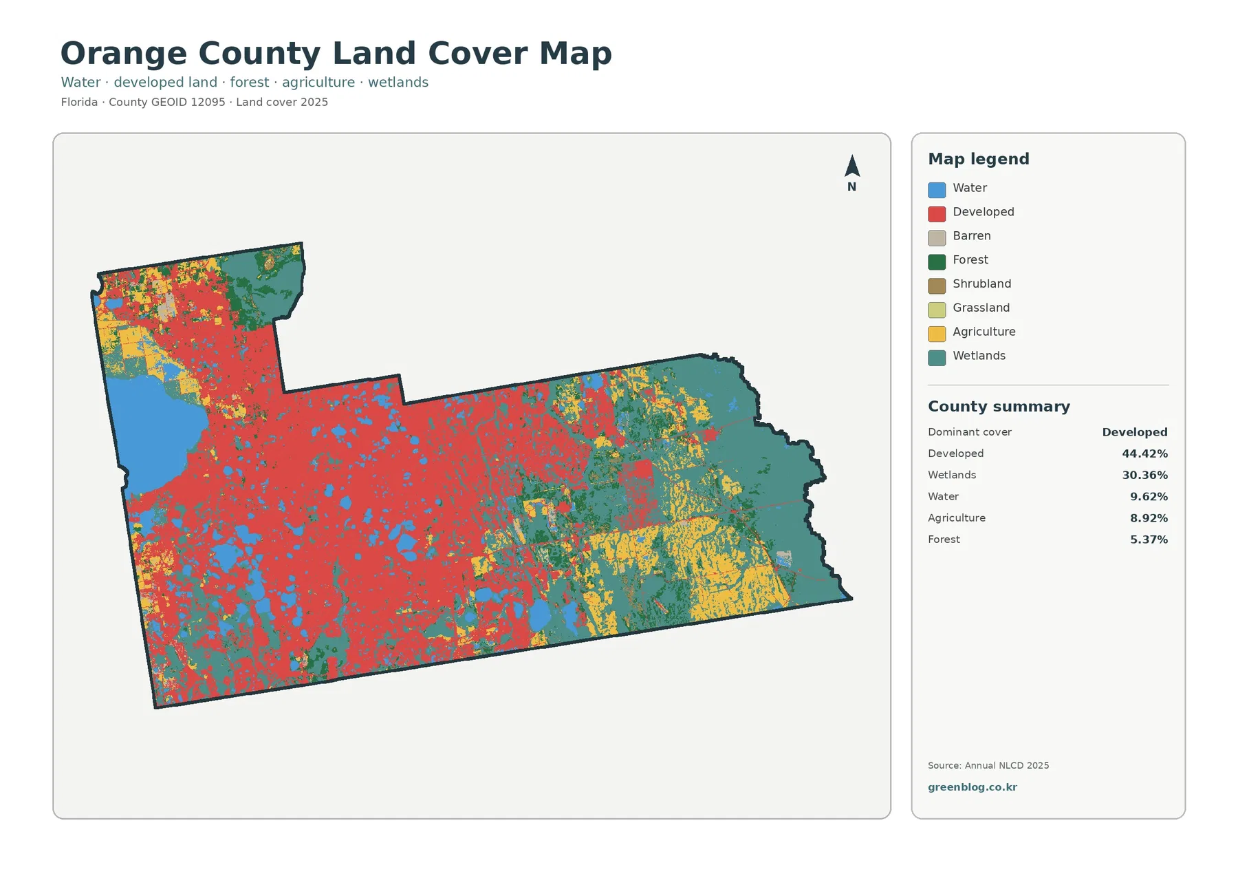
The western and central portions of the county are strongly colored by developed land. Large built-up areas extend across the middle of the map and reach toward the southwest and northwest. Numerous blue lakes interrupt that developed cover, so the urbanized part of Orange County is not a single uninterrupted block. Water, small natural areas, and lower-intensity surfaces repeatedly break up the red areas and make the county’s urban pattern more complex than the 44.42% total alone suggests.
Move east and the map changes quickly. Wetland colors occupy broad areas, agriculture becomes more visible, and forest appears in larger pieces than it does in the central developed zone. Wetlands account for 30.36% of the county, making them the second-largest class by a wide margin. That number matters because it prevents a common oversimplification: Orange County is a major metropolitan county, but a very large part of its mapped surface is still wetland rather than developed land.
Water covers 9.62% of the supplied summary. One of the most obvious blue features lies in the northwest and corresponds to Lake Apopka, while many smaller lakes are scattered through the developed core and the less developed east. The St. Johns River Water Management District describes Lake Apopka as a large lake spanning northwestern Orange County and southeastern Lake County and as the headwaters of the Ocklawaha Chain of Lakes.
Those water bodies provide useful reference points when reading the map. Some lakes sit inside heavily developed surroundings, while others are bordered by wetlands, agriculture, or forest. Comparing the cover immediately around each blue area is more informative than treating all water as one landscape type. The land-cover map, however, does not show lake depth, water quality, flood risk, ownership, or regulatory boundaries; those questions require separate hydrologic and planning sources.
Land cover describes the surface, not zoning or property rights
Land cover classifies what is physically covering the ground as interpreted from remotely sensed data. A developed cell can contain rooftops, pavement, lawns, trees, and open space, while an agricultural cell does not identify the crop, the owner, or the legal use of a parcel. Wetland classification also should not be substituted for a regulatory wetland determination. The map is a county-scale description of surface conditions, not a legal land-use document.
That distinction is especially important in Orange County because developed and wet surfaces often meet at close range. A wetland color next to developed land does not tell a reader whether construction is allowed, whether a permit is required, or where a protected boundary falls. Orange County’s Environmental Protection Division maintains separate wetland and surface-water rules and permitting information. Those official regulatory materials answer different questions from the Annual NLCD classification used here.
For practical use, treat this map as a first layer. It can show where a countywide pattern deserves closer study, help a class compare urban and natural cover, or provide background for a presentation. If a project depends on parcel boundaries, future land use, conservation restrictions, or site-specific wetlands, add the appropriate county or agency map rather than trying to extract those answers from this image.
Forest and farmland stand out most clearly on the eastern side
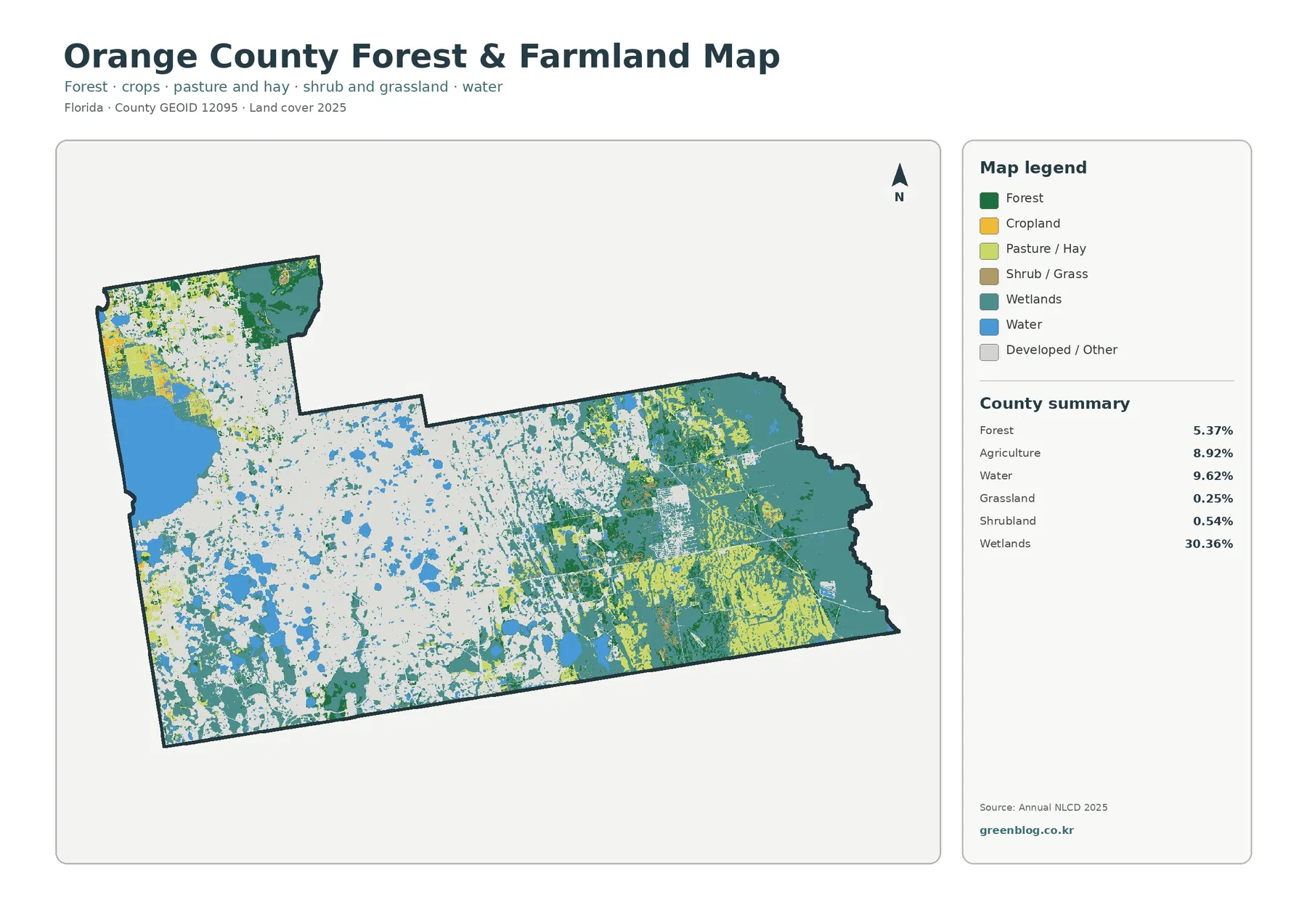
The forest-and-farmland view removes much of the visual competition from the general map. Forest totals only 5.37% countywide, yet dark green areas are easy to follow in the northeast and east, with additional forest in the northwest. Because wetlands dominate much of the eastern natural landscape, forest often appears beside or within a wider wet setting rather than as one continuous county-spanning block.
Agriculture accounts for 8.92% and is most noticeable in the east and southeast. Yellow agricultural areas occur in broad sections among wetlands, and smaller agricultural areas also appear toward the northwest. Some shapes have straight edges, but the raster classification should not be mistaken for a surveyed farm boundary. Roads, drainage features, mixed vegetation, and small developed surfaces can be simplified into the dominant class assigned to each cell.
Shrubland is 0.54% and grassland is 0.25%, both small shares in the county summary. Those low percentages do not mean that grass or shrubs are absent on the ground. A developed neighborhood can contain lawns, and an agricultural area can include grassy surfaces without being counted in the standalone grassland class. The legend describes dominant mapped cover, not every surface present within a cell.
Orange County’s official natural-lands information provides useful background for the eastern side. The county lists places such as Hal Scott Preserve, Econlockhatchee Sandhills Conservation Area, Crosby Island Marsh Preserve, and other conservation properties. That context helps explain why natural cover remains important outside the urban core, but the colors in this map are not preserve boundaries. Use the county’s official conservation maps when an exact protected-property boundary is needed.
A 19.44% mean impervious cover reveals the intensity of the built-up core
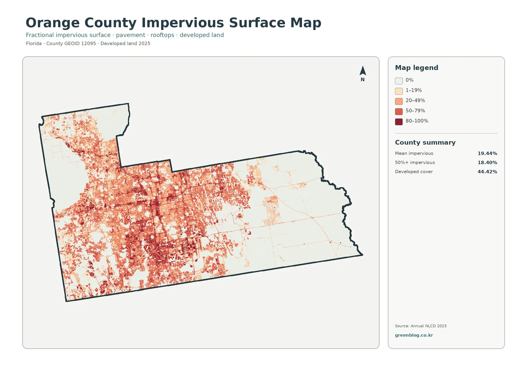
The impervious-surface map makes urban intensity much easier to see. Mean impervious cover is 19.44%, and 18.40% of the county is mapped at 50% or greater impervious surface. Those are substantial values compared with many more rural Florida counties. Darker tones spread across the central and western built-up areas, while the eastern half becomes much lighter except for a few developed corridors and concentrated sites.
The difference between 44.42% developed cover and 19.44% mean impervious cover is important. Developed land can include lawns, trees, landscaped open space, and other permeable surfaces together with buildings and pavement. Impervious data isolate the hard fraction. A neighborhood can therefore be classified as developed without every part of it being paved, and the map can distinguish low-intensity developed areas from places where hard surfaces are much more concentrated.
Lakes produce obvious breaks in the urban pattern. The hard-surface colors stop around large water bodies, and many smaller lakes create gaps within the developed core. That relationship is useful for explaining why urban Orange County has a highly fragmented shape when viewed from above. It also shows why a simple developed-percentage statistic cannot describe the entire surface arrangement.
Thin impervious lines can resemble roads, but this is not a transportation map. It does not name routes, show lane counts, measure traffic, or identify pavement condition. Likewise, high impervious cover does not by itself establish flood risk. Drainage systems, rainfall, soils, elevation, lake levels, and wetland connections all matter. Use this layer to discuss surface hardness, then add specialized data for transportation or flood questions.
Lake Apopka and hundreds of smaller lakes interrupt the developed landscape
Water is a defining part of Orange County even though it is not the largest class. The supplied land-cover summary gives water a 9.62% share, and the map shows blue features throughout the county. Lake Apopka dominates the northwest, while many smaller lakes sit inside and around the built-up core. Orange County planning and sustainability materials describe the county as having more than 600 named lakes, which is consistent with the repeated blue gaps visible across the map.
Lake Apopka also has a distinctive restoration history. The St. Johns River Water Management District reports that parts of the lake’s north shore were historically drained for agriculture and later acquired for wetland restoration and water-quality work. That official history is useful context for the mixture of water, agriculture, and wetlands near the lake. It should not be used to assign a cause to every change-map color, but it explains why this corner of the county deserves more careful interpretation than a simple urban-versus-rural label.
Smaller lakes within developed areas require a different kind of reading. A blue cell may be surrounded by high impervious cover, lower-intensity neighborhoods, parks, or other land classes. The county-scale image cannot describe individual shoreline condition or water quality. For lake-specific questions, Orange County’s Lakes and Rivers resources or the relevant water-management agency provide more appropriate information.
The 1985–2025 comparison reports 36.86% class difference
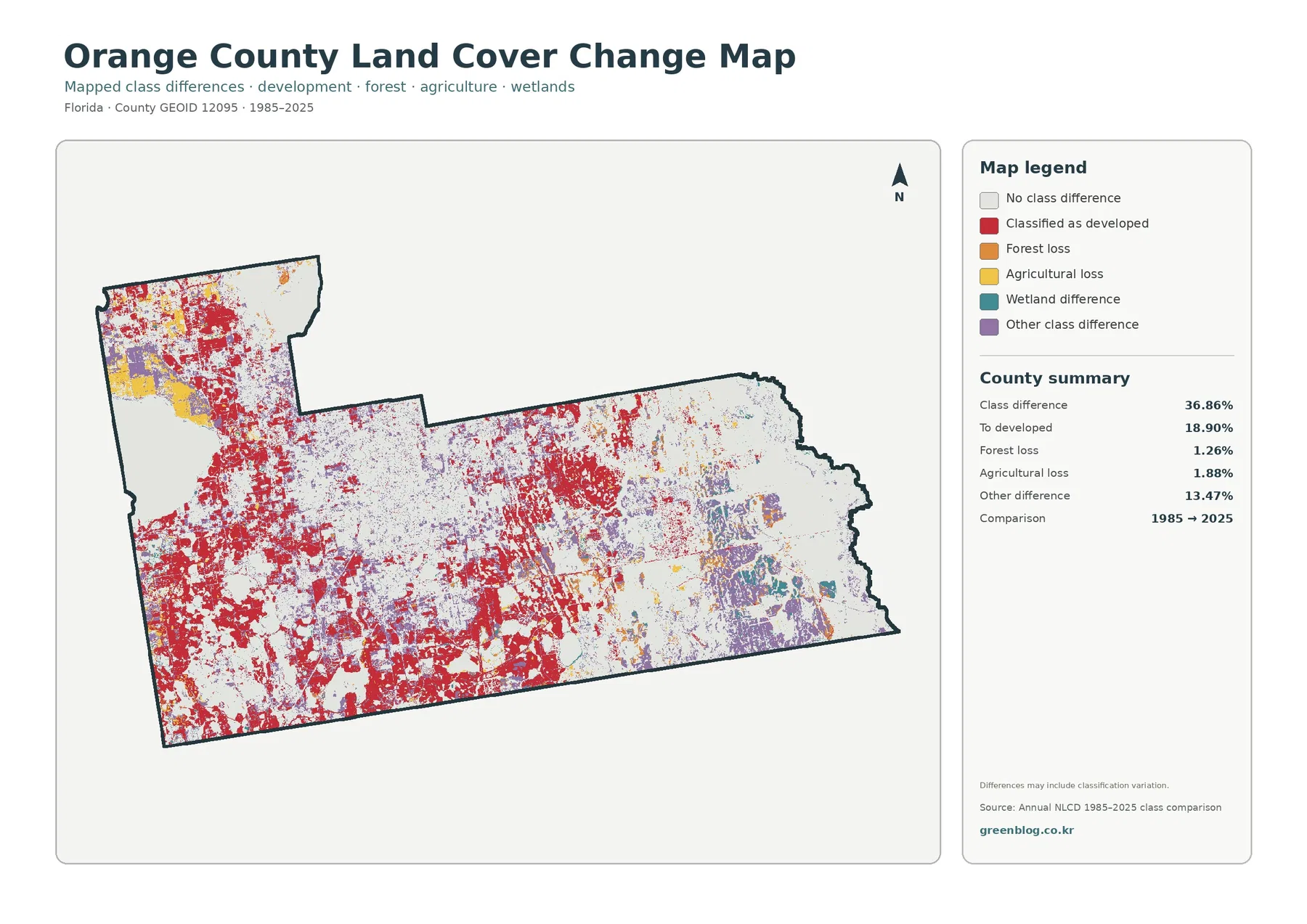
The total class difference is 36.86%, a large share of the county. It would be misleading, however, to say that 36.86% of Orange County was necessarily destroyed, urbanized, or permanently transformed. The figure measures cells assigned different classes in 1985 and 2025. Real land change can contribute to that result, but imagery, classification methods, seasonal conditions, and mixed edge cells can also affect a two-date comparison.
Change to developed is the largest highlighted category at 18.90%. Red appears widely across the west and center, especially around areas that are developed in the current map. Large red sections also occur toward the northwest. When the 18.90% value is viewed together with the current 44.42% developed share, it provides a strong reason to examine long-term urban expansion, but the map alone cannot establish the date, project, or cause of a particular conversion.
Forest loss is summarized at 1.26% and agricultural loss at 1.88%, while other class difference accounts for 13.47%. The legend also contains a wetland-difference category, visible mainly in parts of the east and southeast, but the supplied summary does not give it a separate percentage. It is appropriate to describe where that color appears; it is not appropriate to invent a precise wetland-change number from the image.
The safest use of the change map is as a screening tool. Compare the red areas with the current developed layer, then compare eastern purple or wetland-difference areas with the 2025 wetland and agricultural pattern. Places with dense change colors can be selected for closer study using intermediate aerial photography, planning records, permits, or historical land-cover data. The map identifies differences; it does not prove cause or responsibility.
Three comparisons explain Orange County better than the legend alone
The first comparison is developed land versus impervious surface. Developed cover reaches 44.42%, but the countywide mean impervious value is 19.44%, and 18.40% of the county is at least 50% impervious. The gap shows why developed land should not be described as fully paved. It also helps distinguish lower-intensity residential or landscaped development from the hardest urban surfaces.
The second comparison is west and center versus east. Development and high impervious cover dominate much of the western and central map, while wetlands, agriculture, and forest become more important to the east. Water appears in both settings, so the transition is not a simple straight boundary. Looking at the lakes and agricultural areas between the two zones produces a more accurate description than dividing the county into only “urban” and “natural” halves.
The third comparison is current condition versus two-date difference. The 2025 map answers what the latest supplied classification looks like, while the 1985–2025 layer answers where two classifications disagree. A cell shown as changed is not a current land-cover class, and a current developed cell does not necessarily mean it changed during the comparison period. Keeping those questions separate prevents the most common interpretation error.
Choosing the right map for a lesson, presentation, or county comparison
Use the general 2025 map when the audience needs the complete county in one frame. It shows the developed core, eastern wetlands, Lake Apopka, smaller lakes, agricultural areas, and forest together. The focused vegetation view is better when the discussion centers on where agriculture and forest remain, because developed land is visually reduced and the natural-cover classes become easier to follow.
For urbanization, the impervious map is more informative than the developed class alone. It separates the presence of development from the intensity of hard surfaces. A classroom exercise can ask why 44.42% developed land produces a 19.44% mean impervious value, or where the 50%+ impervious areas are concentrated. Those questions turn the map into an explanation of urban form rather than a list of percentages.
For long-term comparison, place the 2025 map beside the change map. The current developed pattern can then be compared directly with the 18.90% change-to-developed category, while eastern wetland and agricultural areas can be checked against other change colors. The comparison is much more useful when the two maps are read together than when the change layer is shown without the present-day reference.
The 2480×1754 JPGs are county-scale references, not site surveys
Each supplied original JPG is 2480×1754 pixels. That size works well for documents, classroom materials, slides, and general county reference, but the asset manifest does not mark the files as meeting the A3 high-resolution reference. Enlarging the image can make the legend and broad pattern easier to see, but it cannot reveal parcel lines, narrow drainage features, tiny buildings, or other detail that is not present in the source.
Annual NLCD-style land cover is raster data, meaning the landscape is divided into cells and each cell receives a dominant class. A real cell can contain trees, lawn, pavement, water, and bare ground at the same time. Boundaries between lakes and development, wetlands and agriculture, or forest and developed land can therefore be more complicated on the ground than the map colors suggest.
The 2025 map represents the supplied observation and classification year. Construction, vegetation recovery, shoreline work, agricultural changes, or other events after that date may not appear. The 1985–2025 comparison is also a two-date snapshot, not a year-by-year history. A location could change several times between those years and still end in a class similar to where it began.
Frequently Asked Questions
What is the largest land-cover class in Orange County?
Developed land is the largest class in the supplied 2025 summary at 44.42%. Wetlands follow at 30.36%, with water at 9.62%, agriculture at 8.92%, and forest at 5.37%. Development is concentrated most strongly in the west and center, while wetlands and other natural cover are much more extensive in the east.
Why is developed cover 44.42% while mean impervious cover is 19.44%?
Developed land can include lawns, trees, landscaped open space, and other permeable surfaces along with buildings and pavement. Impervious cover isolates hard surfaces such as rooftops, roads, and parking areas. Orange County also has 18.40% of its area mapped at 50% or greater impervious cover, showing that very hard urban surfaces are concentrated rather than spread evenly across all developed land.
Does the 36.86% 1985–2025 class difference equal the county’s development growth rate?
No. The 36.86% value is the total share of cells classified differently between the two dates. Change to developed is a separate 18.90% category, while forest loss is 1.26%, agricultural loss 1.88%, and other class difference 13.47%. Determining actual causes or timing requires intermediate imagery and additional official records.
Sources and Reference Data
- MRLC Annual NLCD Data — source data information for the 2025 land-cover and 1985–2025 comparison views.
- USGS Annual NLCD Land Cover Classification — official explanations of developed, forest, agricultural, wetland, and other classes.
- U.S. Census Bureau TIGER/Line Shapefiles — official geographic boundary reference for Orange County.
- Orange County Environmental Protection Division — official county information about lakes, wetlands, natural lands, and environmental protection.
- St. Johns River Water Management District – Lake Apopka — official background on Lake Apopka, its watershed setting, and restoration work.
Map File Information
The ZIP contains the four original JPG land-cover maps used in this Orange County article.
- Included Files: Use only the versions confirmed in the article and supplied images
- File Type: Use the confirmed download contents
- Intended Use: Printing, education, presentations, and map-based projects
Related Maps
- Alachua County Florida Land Cover Map
- Baker County Florida Land Cover Map
- Bay County Florida Land Cover Map
Green Map creates custom-edited map images using open geographic data sources such as geoBoundaries, Natural Earth, OpenStreetMap, and government open data.
These maps are edited visual materials, not raw data files, and are provided for education, documents, presentations, and graphic reference.