Hillsborough County’s 2025 land-cover map is dominated by developed land, which accounts for 44.36% of the county. That development is not spread evenly. The broadest urban footprint occupies the west and west-central part of the county around Tampa Bay, while the eastern side contains much more agriculture and wetland cover. Wetlands account for 26.55% and agriculture for 18.21%, making the east-west contrast one of the clearest patterns in the map set.
Four map views are included on this page: general land cover, forest and farmland, impervious surface, and mapped class differences from 1985 to 2025. The original four JPG maps are available together in one ZIP below. These are county-scale reference maps, not parcel surveys, zoning maps, property records, or regulatory wetland determinations.
Table of Contents
Developed land covers 44.36%, but the strongest urban footprint is concentrated in the west
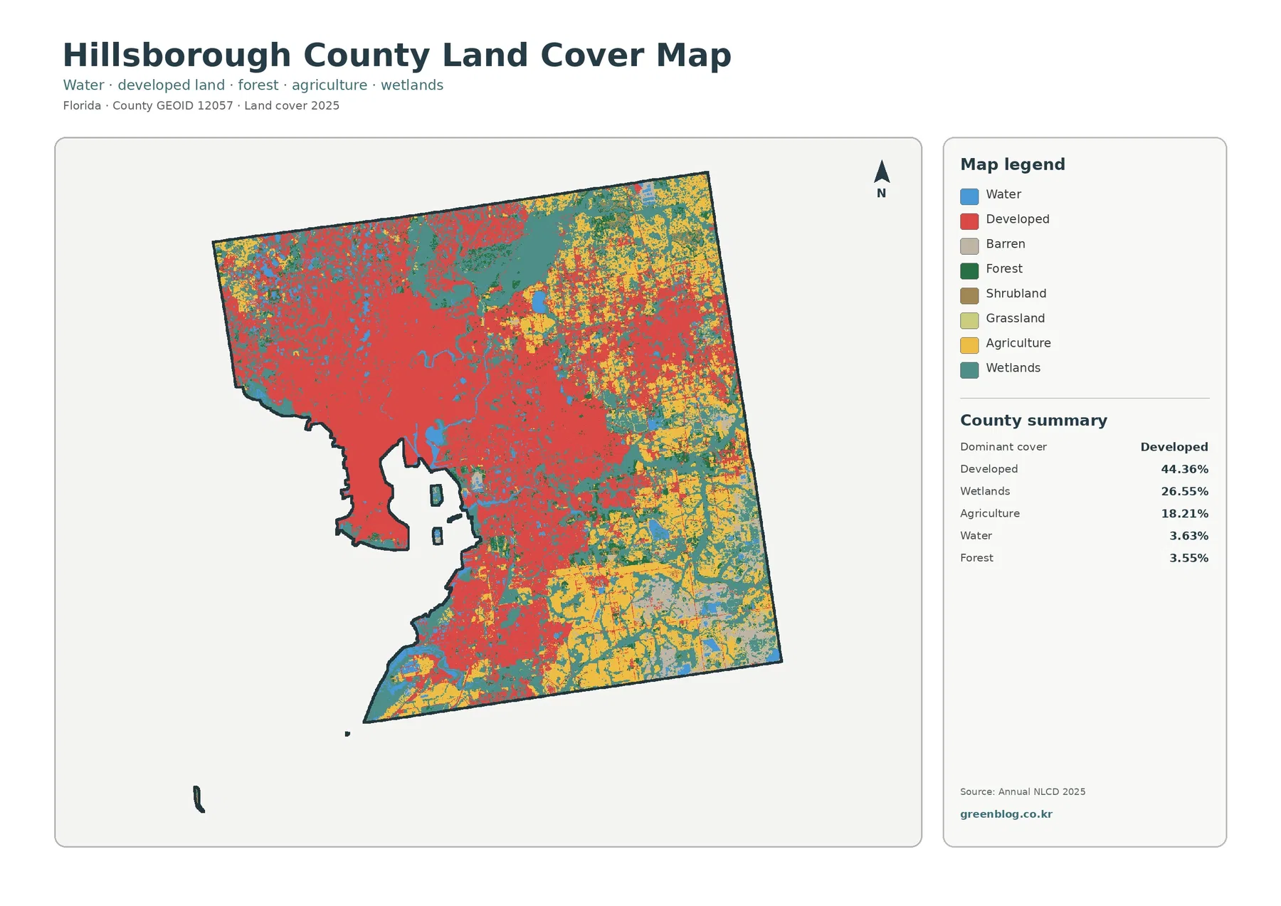
The general map makes the western concentration of developed land immediately visible. Red cover fills much of the west and west-central county and wraps around the large water spaces associated with Tampa Bay. Development also extends eastward through several corridors, but it becomes less continuous toward the eastern boundary. That spatial pattern matters because a countywide value of 44.36% can otherwise suggest a more uniform urban landscape than the map actually shows.
Wetlands are the second-largest class at 26.55%. Teal cover becomes especially prominent in the northeast, east, and southeast, although smaller wetland areas also remain near the western coast and waterways. The scale of the wetland share is important in a county that also contains a major metropolitan area. Even with developed land ranked first, more than a quarter of the mapped county remains classified as wetland cover in the 2025 summary.
Agriculture accounts for 18.21% and is much more visible in the eastern half. Yellow areas form large blocks in the east and southeast and appear among wetland and developed cover farther toward the center. The western urban area contains far less agricultural color. This distribution creates a practical way to read the county: the west is primarily developed, while the east has a stronger mixture of agriculture, wetlands, and smaller developed areas.
Water is listed at 3.63% and forest at 3.55%. Those shares are much smaller than the three leading classes, but they are not evenly distributed either. Large water areas shape the western edge, and forest is more noticeable in parts of the northeast and eastern interior. The general map is therefore best used to compare both percentage and location rather than treating the county summary as a complete description by itself.
Impervious cover reveals where pavement and rooftops are concentrated inside the developed class
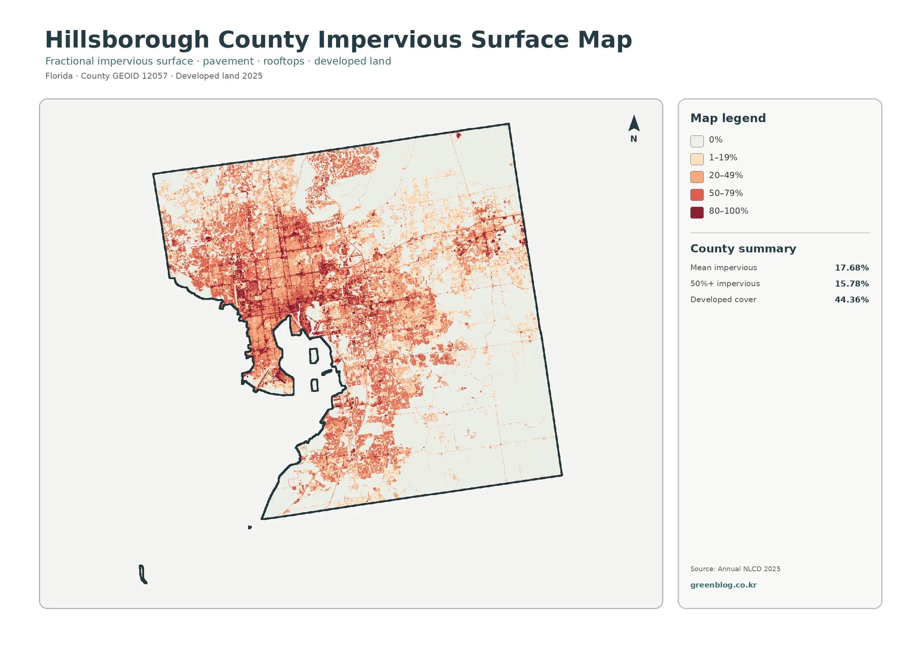
Impervious surface means hard cover such as pavement, parking areas, and rooftops that does not readily absorb rainfall. Across the county, mean impervious cover is 17.68%, while 15.78% of the area is mapped at 50% impervious or higher. Both values are far below the 44.36% developed-land share because developed land can also include lawns, trees, soil, and other permeable surfaces.
The darkest impervious colors are heavily concentrated in the west and west-central county. Large red and dark-red areas appear around the broad urban footprint, with additional strong lines and clusters extending inland. The east is much paler overall. Agricultural and wetland areas there contain fewer high-impervious cells, although roads and developed centers remain visible as narrower lines or smaller patches.
This view is especially useful when the question concerns hard surfaces rather than the broader developed category. A neighborhood can be classified as developed even if much of it is covered by grass and trees, while a commercial or transportation area may have a very high hard-surface percentage. The impervious map separates those conditions more clearly than the general land-cover map.
Impervious cover should not be treated as a direct flood-risk map. Drainage systems, soil, elevation, rainfall, nearby wetlands, and watershed connections all affect how water moves. The map can support a first look at urban surface patterns, but site-specific stormwater or engineering decisions require more detailed local data.
Agriculture and wetlands become easier to compare when development is simplified
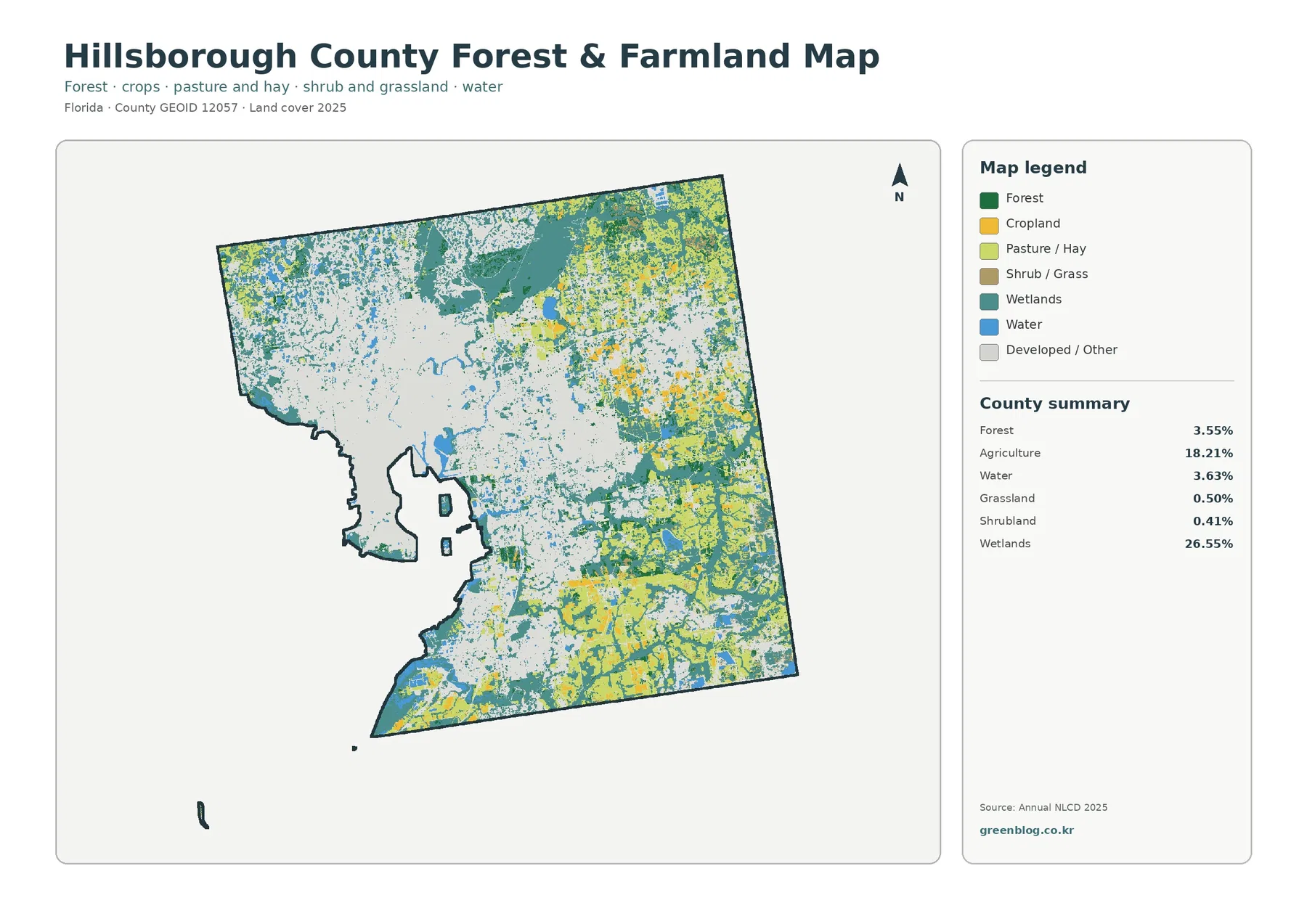
The forest-and-farmland view reduces the visual dominance of the developed classes and makes the eastern landscape easier to read. Agriculture remains 18.21%, with the largest yellow areas in the east and southeast. Wetlands remain the largest natural-cover category at 26.55%, and teal areas repeatedly border or break up agricultural blocks. The result is not a simple division between farms and natural land; the two covers are mixed across much of the eastern county.
Forest accounts for 3.55%, grassland for 0.50%, and shrubland for 0.41%. These smaller classes do not form a countywide background. Forest is most noticeable in the northeast and selected eastern tracts, while grass and shrub cover appear in smaller scattered pieces. Water at 3.63% remains easy to identify along the large western bays and in smaller inland water bodies.
The gray developed-or-other category covers much of the western half. Comparing this map with the general map makes the county’s two broad landscape settings clearer: a dense metropolitan side in the west and a more mixed agricultural-wetland side in the east. The maps do not imply that every agricultural cell is legally zoned for farming or that every forest or wetland cell is protected land. Land cover describes what is mapped on the surface, not the legal status of a parcel.
Local conservation programs provide useful context for the natural areas shown across the county. The county reports more than 63,000 acres of preserved land in its conservation system, and the Lower Hillsborough Wilderness Preserve includes extensive river, wetland, and forest habitat. Those protected lands help explain why natural cover remains important in the county, but the land-cover colors should not be used as a substitute for official preserve boundaries.
The 1985–2025 comparison highlights a large developed transition while retaining a classification caveat
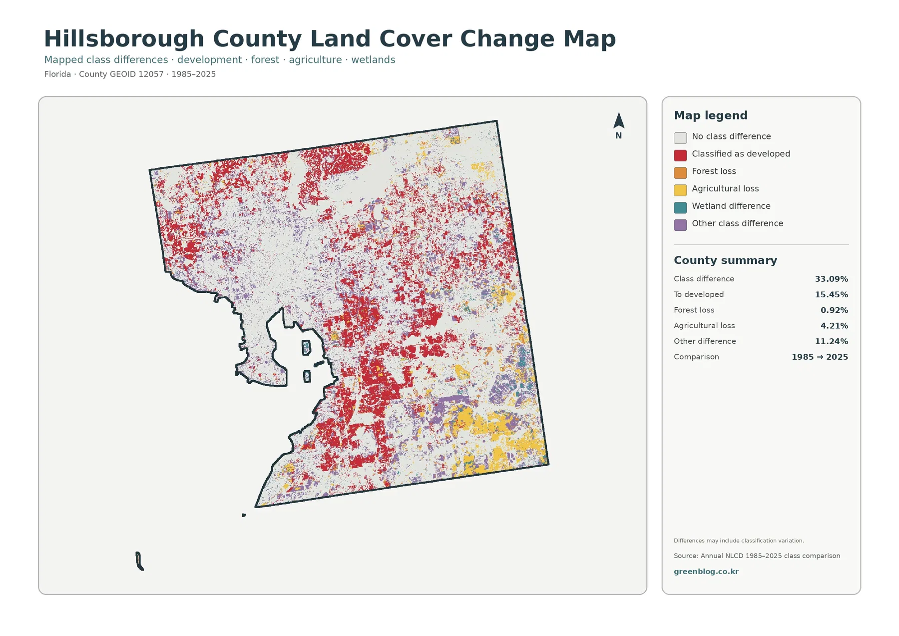
Between 1985 and 2025, mapped class differences cover 33.09% of the county. The largest listed component is transition to developed at 15.45%. Red change cells are widespread through the west and center and also appear around eastern developed areas. When paired with the current 44.36% developed share, this map gives a long-term comparison that emphasizes the importance of development in the county’s mapped landscape.
Agricultural loss is listed at 4.21%, forest loss at 0.92%, and other class difference at 11.24%. Yellow agricultural-loss patches are especially visible in parts of the east and southeast. Purple other-difference areas occur across several eastern sections. The map legend also includes wetland difference, but the summary does not provide a separate percentage for that category, so no unsupported value is added here.
A note on the map states that differences may include classification variation, an important warning when interpreting the 33.09% figure. It should not be described as a pure real-world land-change rate. Satellite conditions, classification methods, mixed raster cells, and other mapping differences can cause a location to receive a different class even when the physical change is more complicated.
The two-date comparison also does not show the sequence of events between 1985 and 2025. A location may have changed several times during that period, and the map only compares the classes assigned at the two endpoints. For detailed change analysis, this map works best as a screening layer that identifies places worth checking with additional years of imagery or local records.
Tampa Bay development and the eastern agricultural-wetland landscape should be read together
A major urban area and large nonurban landscapes share the same county boundary. The western side is defined by broad developed and high-impervious cover, while the eastern side is more strongly shaped by agriculture and wetlands. That contrast is more informative than a single countywide ranking because it explains why different parts of the county can look so different on the same 2025 dataset.
The county’s official conservation information adds another layer of context. An extensive network of conservation parks and nature preserves includes the Lower Hillsborough Wilderness Preserve, where the Hillsborough River, wetlands, pine flatwoods, and riverine forest are important features. These sources confirm that protected natural lands are an important part of the county. They do not mean, however, that every forest or wetland cell on the land-cover map falls within a protected property.
Planning and land-cover questions should also remain separate. Land cover classifies the surface using remotely sensed data. Zoning and future land use define legal or planning rules, and property ownership is another dataset entirely. A red developed cell does not establish what a parcel is legally allowed to become, and a yellow agricultural cell does not prove that the parcel has an agricultural zoning designation.
Choose the map according to the question instead of treating all four views as interchangeable
For a quick county overview, the general 2025 map is the best starting point. It combines the main classes and makes the 44.36% developed share, 26.55% wetland share, and 18.21% agricultural share easy to compare. It is useful in presentations, classroom material, and introductory reports where the first goal is to show the county’s overall surface pattern.
The forest-and-farmland map is better when the subject is agriculture, wetlands, forest, or water. The impervious map is the stronger choice for pavement and rooftop concentration within the urban area. For long-term comparison, the change layer identifies places where the 1985 and 2025 classifications differ. Using the four maps together prevents a current-cover question from being confused with a hard-surface or long-term change question.
A simple teaching sequence is to begin with the general map, switch to forest and farmland to isolate the eastern nonurban pattern, then compare impervious cover in the west. Adding the change layer last shows where the two endpoint years differ. This order keeps the current 2025 distribution separate from the historical comparison and makes the meaning of each legend easier to explain.
Download the original JPG maps with the scale and classification limits in mind
The download ZIP contains the 2025 land-cover map, forest-and-farmland map, impervious/developed-land map, and 1985–2025 land-cover-change map. Each original JPG is 2480×1754 pixels. The JPG files are more convenient than the page previews for zooming, inserting into documents, or preparing presentation graphics, although the pixel dimensions are below what is normally required for a full A3 print at 300 dpi.
Annual NLCD is raster data, which means the surface is represented with a grid of cells rather than exact parcel boundaries. A single cell may contain pavement, grass, trees, roofs, or water at the same time, so a mapped class or percentage simplifies the real surface. Boundaries between colors should therefore be treated as generalized map boundaries, not survey lines or precise field edges.
The observation year is another limitation. The maps describe the supplied 2025 classification and the supplied 1985–2025 comparison. Development, vegetation, water conditions, and land management can change after the mapped year. Anyone using the maps for a current project should verify important locations with newer local imagery or official site-specific information.
Frequently Asked Questions
What is the largest 2025 land-cover class in Hillsborough County?
Developed land is the largest class at 44.36%. Wetlands follow at 26.55%, and agriculture accounts for 18.21%. The distribution is uneven, however. Development is concentrated in the west and west-central county, while agriculture and wetlands become much more prominent toward the east.
Why is developed land 44.36% when mean impervious cover is only 17.68%?
The two measurements describe different things. A developed land-cover class can contain lawns, trees, soil, and other permeable surfaces, while impervious cover focuses on hard surfaces such as pavement, parking areas, and rooftops. A developed area can therefore have a much lower impervious percentage than its developed classification might suggest.
Does the 33.09% 1985–2025 class difference equal the actual land-change rate?
No. The map specifically notes that classification variation may be included. The value identifies cells assigned different classes at the two endpoints, but satellite conditions, classification methods, and mixed cells can contribute to the difference. Additional years of imagery or local records are needed before assigning a specific cause to a mapped change. Map File Information Download the four original Hillsborough County land-cover JPG maps together in one ZIP file.
Map File Information
Download the map files associated with this page for reference, printing, and compatible visual projects.
- Included Files: Use only the versions confirmed in the article and supplied images
- File Type: Use the confirmed download contents
- Intended Use: Printing, education, presentations, and map-based projects
Related Maps
- Alachua County Florida Land Cover Map
- Baker County Florida Land Cover Map
- Bay County Florida Land Cover Map
Sources and References
- MRLC Annual NLCD Data – official access to Annual NLCD land-cover and related datasets.
- USGS Annual NLCD Land Cover Classification – official description of the mapped land-cover classes.
- U.S. Census Bureau TIGER/Line Shapefiles – official geographic data used for county-boundary reference.
- Hillsborough County Conservation Lands – county information about conservation parks, nature preserves, and environmentally sensitive lands.
- Hillsborough County Wilderness Parks – official information about the Lower Hillsborough Wilderness Preserve and Hillsborough River corridor.
Green Map creates custom-edited map images using open geographic data sources such as geoBoundaries, Natural Earth, OpenStreetMap, and government open data.
These maps are edited visual materials, not raw data files, and are provided for education, documents, presentations, and graphic reference.