Hamilton County’s 2025 land-cover pattern is divided among several major classes rather than dominated by one. Forest is the largest at 29.97%, followed closely by wetlands at 26.12% and agriculture at 16.14%. The western side contains the strongest concentration of farmland, while wetlands become much more prominent toward the east and southeast. Forest occupies broad areas between and around those contrasting zones. The four maps on this page make it easier to compare the county from those different angles.
The WebP images in the article are convenient for on-screen viewing. The four original JPG maps are available together in one download below: general land cover, forest and farmland, impervious surface and developed land, and the 1985–2025 class-difference map. Land cover is not the same as zoning, ownership, or a legal land-use designation. It classifies the surface into broad categories such as forest, agriculture, wetlands, water, and developed land.
Table of Contents
A county split among forest, wetlands, and working land
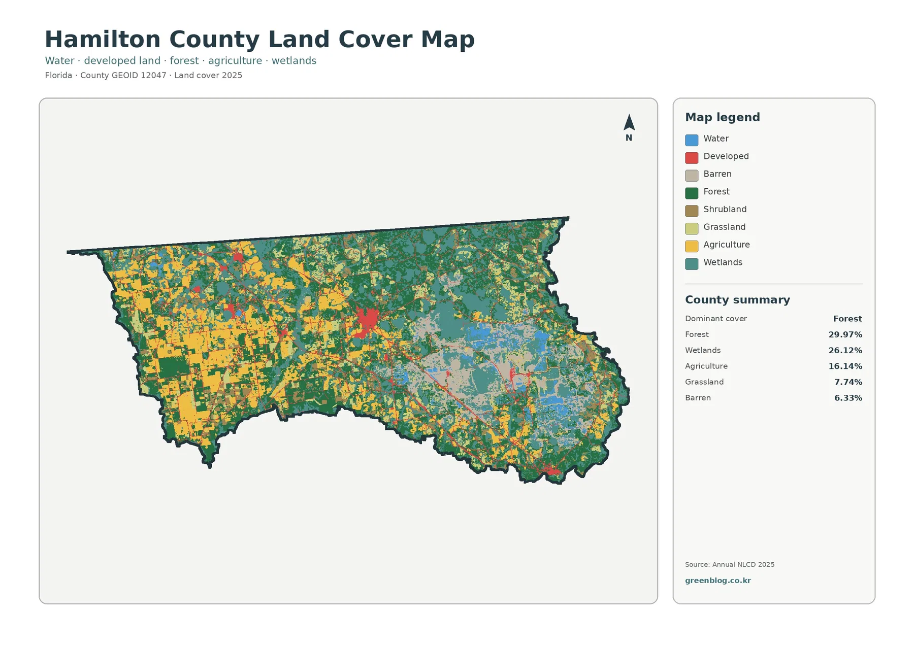
Forest accounts for 29.97% of Hamilton County, making it the largest single class in the 2025 summary. It does not form one uninterrupted block. Green areas extend across much of the central and northern county and also appear along parts of the southern edge. In the west, large agricultural patches interrupt the forest more often. Farther east, forest is mixed with extensive wetlands and other classes, so the pattern becomes more fragmented.
Wetlands cover 26.12%, only 3.85 percentage points less than forest. Their distribution is especially important because it changes the character of the eastern half of the county. Teal wetland areas are broad in the east and southeast, with additional patches through the central area. The western agricultural zone contains wetlands too, but they are less dominant there. Looking at the percentages and the map together gives a more accurate picture than describing Hamilton County as simply forested.
Agriculture represents 16.14% of the county and has a much stronger western concentration. Yellow agricultural areas form large blocks in the west, while smaller pieces extend toward the center among forest, grassland, and shrubland. This is a useful example of why countywide percentages do not tell the whole story. Agriculture is about one-sixth of the total area, but it is visually much more important within the western part of the county.
The remaining classes complete the picture. Grassland is 7.74%, barren land 6.33%, developed land 6.25%, shrubland 5.19%, and water 2.26%. Barren or other lightly vegetated areas are particularly visible in parts of the east and southeast. Grassland and shrubland appear in smaller pieces between the larger forest, farm, and wetland areas. Water occupies a modest share overall but is still visible in scattered blue features.
These percentages describe mapped surface cover, not the legal status of the land. A green forest cell is not automatically protected land, a yellow agricultural cell is not necessarily zoned for agriculture, and a developed cell does not establish what can be built on a parcel. The map is most useful for comparing broad surface patterns and deciding where a more detailed source may be needed.
Sparse hard surface provides a useful contrast to the developed class
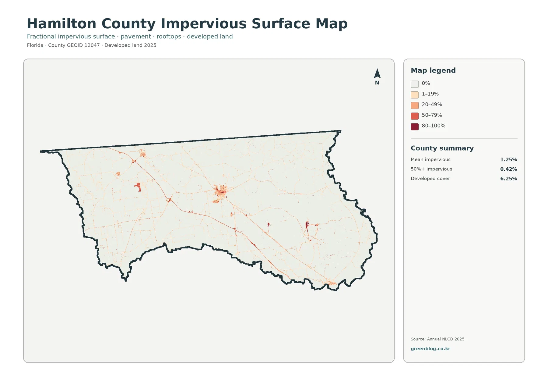
Hamilton County has a mean impervious surface of 1.25%. Impervious surface means pavement, rooftops, parking areas, and similar hard materials that do not readily absorb water. Only 0.42% of the county is mapped at 50% or more impervious. Those values are low compared with the 6.25% developed-cover share, and that difference is important when interpreting how settled areas appear on the land-cover map.
The impervious map is mostly pale, with the strongest cluster near the central part of the county. Thin lines and small spots extend away from that cluster, and a few additional concentrations appear elsewhere. The overall pattern is not a continuous urban surface. Instead, the hardest surfaces are concentrated in limited locations while most of the county remains at very low impervious percentages.
Developed land and impervious surface answer related but different questions. A developed land-cover class can include lawns, soil, trees, and other surfaces within a settled setting. The impervious percentage focuses on the portion covered by hard materials. That is why a county can have 6.25% developed cover but only 1.25% mean imperviousness. Reading both maps prevents the developed class from being mistaken for solid pavement or dense construction.
For watershed education or a first review of runoff-sensitive areas, the impervious map can help identify where harder surfaces are concentrated. It should not be used to measure an individual road, building, parking lot, or parcel boundary. The source is a generalized raster product, so small features are summarized within grid cells. Site design, permitting, drainage engineering, and property decisions require more detailed information.
Forest and farmland become easier to compare on the second map
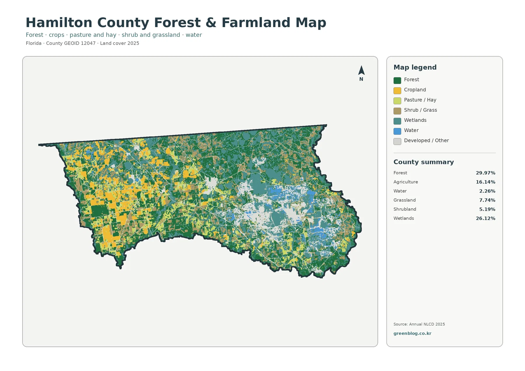
The forest-and-farmland view simplifies the visual competition among classes and makes the west-to-east contrast easier to follow. Agriculture is prominent across the west, where large yellow areas are mixed with forest and grass-related cover. Moving toward the center, farm patches become smaller and forest becomes more continuous. In the east, wetlands occupy far more space and agriculture is comparatively limited.
Forest remains 29.97% and agriculture 16.14%, but their spatial patterns are very different. Forest is distributed across several parts of the county rather than confined to one sector. Agriculture has a clearer western focus. This distinction can be useful in a presentation because it shows how the same countywide percentage can represent either a dispersed pattern or a concentrated one.
Wetlands at 26.12% are essential to this comparison. Their large eastern presence means that a simple forest-versus-farm description would leave out more than one-quarter of the county. The map also shows grassland at 7.74%, shrubland at 5.19%, and water at 2.26%. These smaller categories often occur near the boundaries of the larger classes and add variety to the transition between western working land and eastern wetland-dominated areas.
A visible association on a map is not proof of cause. Forest next to agriculture does not show why the boundary exists, and wetland next to developed or other cover does not establish that development changed the wetland. The map is descriptive. It helps locate patterns that may deserve further study, but historical imagery, field observations, hydrologic information, or land-management records are needed to explain how those patterns developed.
The 1985–2025 map is a class comparison, not a simple change-rate map
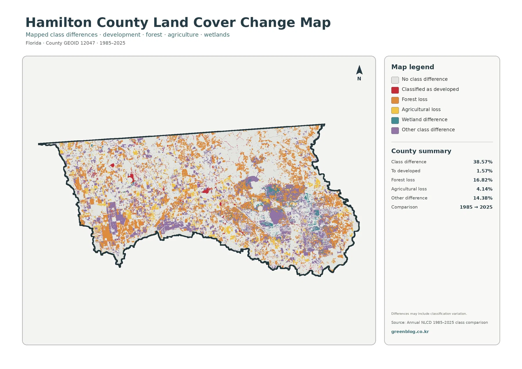
The 1985–2025 comparison reports class differences across 38.57% of Hamilton County. Forest loss is the largest named component at 16.82%. Other class differences account for 14.38%, agricultural loss for 4.14%, and areas classified as developed for 1.57%. The legend also includes a wetland-difference category, but the package does not provide a separate percentage for that class, so no value is inferred here.
Orange forest-loss cells are scattered across much of the county, with numerous patches in the north and east as well as other areas. Agricultural-loss colors are more evident within and around the western farm landscape. Purple other-difference areas occur in multiple parts of the county and form some larger patches through the central and eastern sections. The map is useful because it directs attention to places where the two classifications do not match.
The 38.57% figure should not be read as proof that 38.57% of the ground physically changed between 1985 and 2025. The map itself notes that differences may include classification variation. Imagery, class definitions, mixed pixels, seasonal conditions, and edge treatment can cause a cell to receive a different label even when the real-world change is subtler. The safest interpretation is that the map identifies locations where the two mapped classes differ.
The same caution applies to the 16.82% forest-loss category. It indicates cells that moved out of a forest class in this comparison, not a verified acreage of permanent clearing or timber harvest. Agricultural loss at 4.14% likewise shows a classification transition away from agriculture, not necessarily abandonment or development. Aerial photography and additional annual observations are better suited to confirming the history of a specific location.
Using the four maps as a sequence
For a quick county overview, begin with the general land-cover map. It establishes the near balance between forest and wetlands, the strong western agricultural presence, and the relatively small developed share. From there, choose the second map when forest, farming, grassland, and wetlands are the main topic. It reduces visual complexity and makes the western farm concentration easier to explain.
Use the impervious map when the question is about hard surface rather than the broader developed class. The 1.25% county mean and the 0.42% area at 50% or greater imperviousness provide a numeric frame for the sparse dark areas on the map. This is especially helpful when explaining why developed land does not equal pavement. It can also support introductory discussions of runoff, watershed context, or settlement density.
The change map works best after the current pattern is understood. A viewer can first see where forest, agriculture, wetlands, and development are mapped in 2025, then look for the locations where the 1985 and 2025 classifications differ. Keeping those questions separate avoids a common mistake: treating a present-day class as evidence of what was there four decades earlier.
In classroom or presentation use, the maps do not have to be shown at the same size. A general overview can be followed by a larger crop of the forest-and-farmland or impervious map, then the change map can close the sequence. Always keep the map title, year, and legend visible. Colors that look similar across different maps do not necessarily carry the same meaning.
Land cover should not be substituted for Hamilton County zoning
Hamilton County’s official Planning, Land Use & Zoning site provides a separate system for administrative land information. Its interactive county map can be searched by address or Parcel ID and includes zoning classification and future land-use information. Those layers serve a different purpose from the land-cover maps on this page. Zoning describes regulatory categories and permitted uses, while land cover describes the mapped condition of the surface.
That distinction matters for real property questions. A location mapped as agriculture in Annual NLCD is not automatically in an agricultural zoning district. A forested cell is not proof of conservation status. A developed cell does not confirm that additional construction is allowed. Anyone making a parcel, permitting, purchase, or development decision should consult Hamilton County’s official zoning and land-use records rather than relying on surface-cover colors.
The two types of information can still complement each other during preliminary research. Land cover is useful for recognizing broad forest, wetland, farm, and development patterns. The official county map can then answer parcel-level administrative questions. Treating them as separate layers allows each source to be used for what it actually represents.
Scale, raster cells, and classification limits
Annual NLCD is a raster land-cover product, meaning the landscape is represented by a grid of cells. Each cell summarizes a portion of the ground rather than tracing every tree line, driveway, pond edge, or field boundary exactly. A cell can contain more than one surface type, which creates mixed-pixel situations. At county scale, this generalization is useful because it makes broad patterns clear, but it limits parcel-level interpretation.
The maps on this page are designed to show Hamilton County as a whole. They work well for comparing the farm-heavy west with the wetter east, seeing where forest remains widespread, and locating the small clusters of harder surface. They are less suitable for deciding what lies within a particular property boundary. Higher-resolution aerial imagery, field observations, and official parcel data should be used for fine-scale questions.
Time is another limitation. The main maps describe the 2025 classification, so later clearing, construction, cropping, flooding, or vegetation change will not appear automatically. The historical map compares 1985 with 2025 and should not be treated as a continuous record of every year in between. When a specific site or recent event matters, check newer imagery or additional annual land-cover data.
Map classes also simplify complex real-world conditions. A wetland class does not by itself define a regulated wetland boundary, and a water class is not a survey of legal water lines. Barren or lightly vegetated land may represent several different surface situations that require closer inspection. The legend is a starting point for interpretation, not a substitute for specialized environmental or legal determinations.
Choosing a map for a report, lesson, or comparison
A report that needs one representative image should generally use the full 2025 land-cover map because it contains the complete set of major classes and the county summary. For an agriculture or forestry topic, the forest-and-farmland map is easier to read because it emphasizes the natural and working-land categories. The impervious map is the better choice for a section on settlement or hard surface.
The change map is most useful when the goal is to identify areas for follow-up rather than to state a single change rate. Its 38.57% class-difference total can be paired with the named categories, but the note about classification variation should remain visible in any presentation. A careful caption can say that the map highlights mapped differences between 1985 and 2025 without claiming that every colored cell represents a verified physical conversion.
When comparing Hamilton County with another county, use the same map type, year, and metric. Comparing Hamilton County’s 1.25% mean impervious surface with another county’s developed-cover percentage would mix different measures. Likewise, compare current land-cover shares with current shares, and historical class differences with the same kind of historical comparison. Consistent definitions make county-to-county comparisons much more meaningful.
Download the four original JPG maps
The ZIP below contains four Hamilton County JPG files: the 2025 land-cover map, the forest-and-farmland map, the impervious and developed-land map, and the 1985–2025 land-cover change map. Each image is 2480×1754 pixels. The set is suitable for documents, classroom materials, presentation slides, and moderate-size print use where the full county pattern and legend need to remain visible.
Before making a large print, test the legend and small labels at the intended output size. The 2480×1754 files are useful high-resolution graphics for many common purposes, but they do not contain the pixel dimensions required for a full A3 sheet at 300 dpi. The change map in particular contains many small patches, so excessive enlargement can make the classification pattern look less precise than it is.
Keep the title, year, and source information with the image whenever practical. Those details prevent the 2025 current-cover maps from being confused with the 1985–2025 comparison. They also make it easier for a reader to return to the MRLC or USGS documentation and check the classification definitions used by Annual NLCD.
Frequently Asked Questions
What is the largest land-cover class in Hamilton County in 2025?
Forest is the largest at 29.97%, followed closely by wetlands at 26.12%. Agriculture accounts for 16.14%, grassland 7.74%, barren land 6.33%, developed land 6.25%, shrubland 5.19%, and water 2.26%. The map shows that agriculture is especially prominent in the west, while wetlands are much more extensive in the east and southeast.
Why is developed cover 6.25% while mean impervious surface is only 1.25%?
The developed class can include lawns, soil, trees, and other pervious surfaces within settled areas. Impervious surface measures the share covered by hard materials such as pavement and rooftops. Hamilton County also has only 0.42% of its area mapped at 50% or greater imperviousness, which matches the limited dark clusters visible on the impervious map.
Does the 38.57% class difference mean that much of the county physically changed?
No. It is a mapped comparison between the 1985 and 2025 classifications, and the map notes that classification variation may be included. The named categories include 16.82% forest loss, 4.14% agricultural loss, 1.57% classified as developed, and 14.38% other differences. Use the map to locate areas for follow-up, then verify specific changes with other time-series or site information.
Map File Information
Download all four original Hamilton County land-cover JPG maps together in one ZIP file.
- Included Files: Use only the versions confirmed in the article and supplied images
- File Type: Use the confirmed download contents
- Intended Use: Printing, education, presentations, and map-based projects
Related Maps
- Alachua County Florida Land Cover Map
- Baker County Florida Land Cover Map
- Bay County Florida Land Cover Map
Sources and References
- MRLC Annual NLCD Data – official access point for Annual NLCD land-cover data and related products.
- USGS Annual NLCD Land Cover Classification – official documentation for the land-cover classes and their interpretation.
- U.S. Census Bureau TIGER/Line Shapefiles – official geographic boundary data used for county-level mapping context.
- Hamilton County Planning, Land Use & Zoning – official county information for zoning, land-use planning, regulations, and related documents.
- Hamilton County Interactive County Map – official instructions for parcel, zoning, and future land-use lookup, which are separate from land-cover classification.
Green Map creates custom-edited map images using open geographic data sources such as geoBoundaries, Natural Earth, OpenStreetMap, and government open data.
These maps are edited visual materials, not raw data files, and are provided for education, documents, presentations, and graphic reference.