Franklin County has an unusually wet land-cover profile in the 2025 data. Wetlands account for 77.45% of the mapped county, while forest makes up 8.07%, developed land 7.41%, water 4.26%, and barren cover 1.84%. That balance gives the county a very different visual character from a heavily urbanized coastal county: broad teal wetland areas dominate the mainland and coastal margins, while developed patches remain comparatively small and concentrated.
This page uses four maps to separate those patterns. The general land-cover map shows the full countywide mix, the forest-and-farmland map makes natural and agricultural classes easier to compare, the impervious-surface map isolates harder developed surfaces, and the 1985–2025 map highlights endpoint classification differences. The original JPG versions of all four maps are included in one ZIP below. These are land-cover products, not parcel, zoning, ownership, permitting, or legal land-use maps.
Table of Contents
Low imperviousness reveals how limited the hardest developed surfaces are
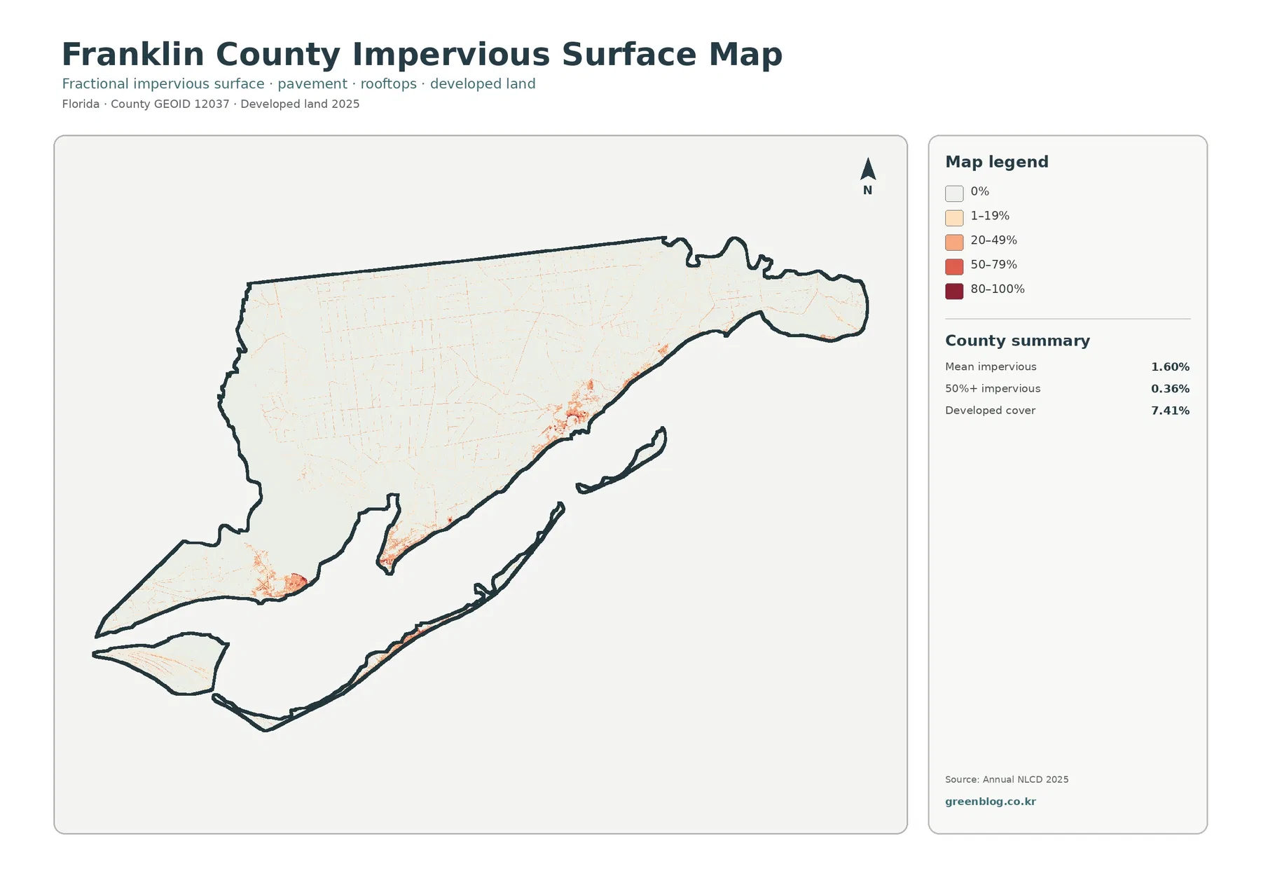
Franklin County’s mean imperviousness is 1.60%, and only 0.36% of the mapped area is at least 50% impervious. Those figures are much lower than the county’s 7.41% developed-cover share. The difference matters because developed land can contain grass, trees, exposed soil, yards, and other permeable surfaces along with pavement and buildings. Imperviousness measures the hard-surface component rather than treating every developed cell as fully paved.
The stronger orange and red tones are concentrated in a few coastal population centers, along road corridors, and on limited portions of the barrier-island landscape. Large stretches of the mainland remain very pale on this layer. That contrast is one of the clearest ways to understand Franklin County: developed places are visible and locally important, but they occupy small islands of harder surface within a much larger wetland-dominated setting.
A countywide mean of 1.60% should not be read as if every neighborhood has the same surface condition. A compact town center can be much more impervious than the county average, while marshes, forests, and open water contribute almost no hard surface. The map therefore works best when the percentage is read together with the location and intensity of the colored patches.
For environmental education, this layer is useful for explaining why developed cover and impervious cover are related but different measurements. It can also be paired with the wetland map to compare where hard surfaces are concentrated relative to broad natural areas. It is not a runoff, drainage, storm-surge, or flood-risk model. Those questions require additional topographic, hydrologic, drainage, rainfall, and coastal-hazard information.
The small 0.36% share above 50% imperviousness is especially useful in presentations. It shows that the most heavily hardened surfaces occupy only a very small fraction of the county. On a slide, showing this map before the general land-cover map makes the later 7.41% developed-cover figure easier to interpret without assuming that all developed land is paved.
The 2025 countywide map is dominated by wetlands rather than development
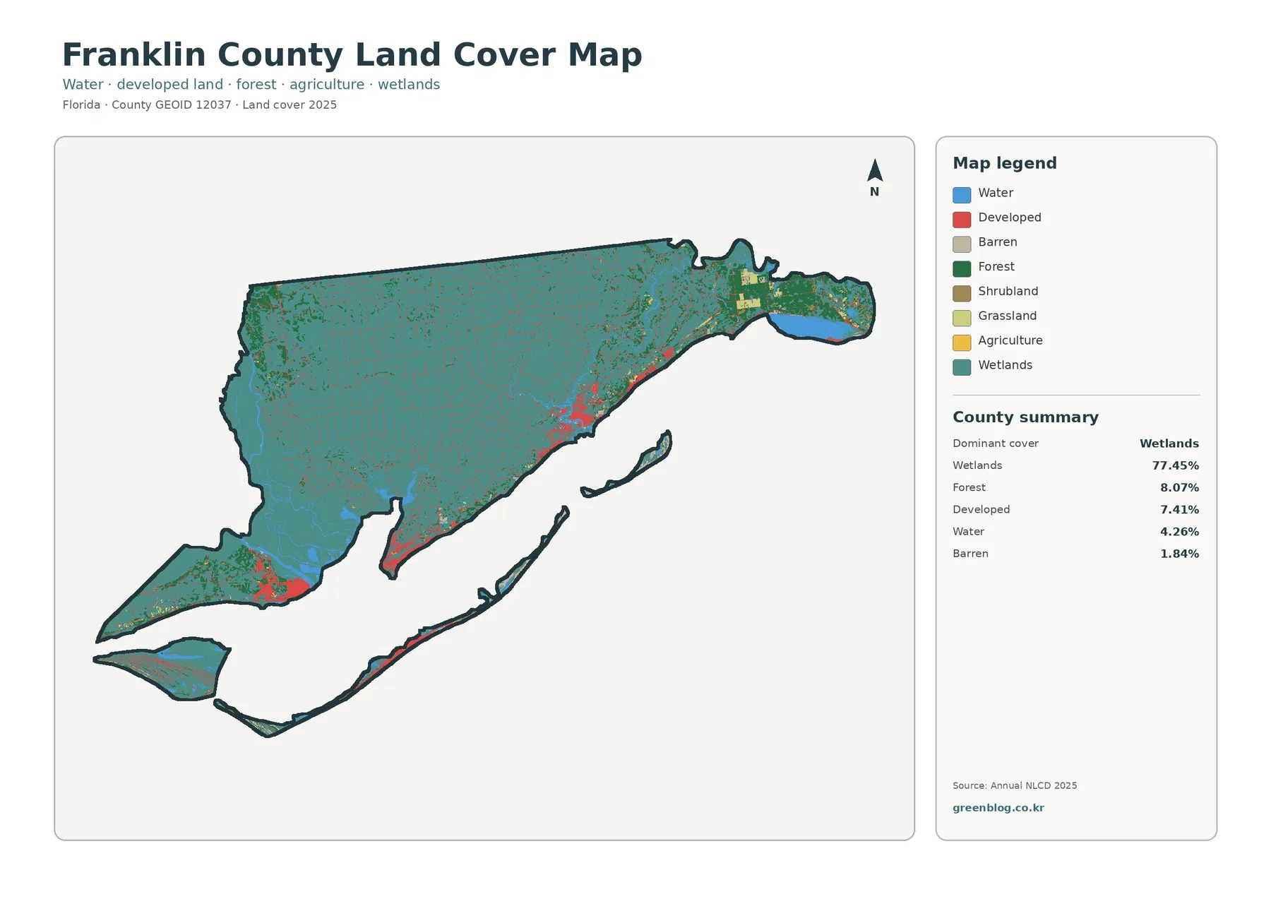
Wetlands are the defining class in Franklin County, covering 77.45% of the mapped area. Teal stretches across most of the mainland and appears repeatedly around the coast and island areas. Rather than forming one isolated block, wetlands occupy a broad network that meets water, forest, developed land, and small areas of other cover. The result is a county where the land-cover pattern is strongly shaped by low-lying and water-influenced environments.
Forest is the second-largest listed class at 8.07%. Dark green appears in patches and bands within the much larger wetland matrix. The forest percentage should not be treated as a complete measure of every wooded environment, because some wetland classes can also contain trees. The safest reading is to compare the mapped categories exactly as classified rather than translating them into broader ecological labels that the map does not provide.
Developed land accounts for 7.41%. Red is not spread evenly across Franklin County. It gathers around several coastal settlements, transportation corridors, and portions of the island chain, with much larger natural areas between those developed concentrations. This distribution explains why development can be visually noticeable on the map even though it remains a relatively small countywide share.
Open water contributes 4.26%. Blue areas outline bays, river channels, coastal waters, and other exposed water surfaces. Water and wetlands are separate classes: open water is mapped where water itself dominates the surface, while wetlands can include saturated soils and water-influenced vegetation. Keeping those classes separate is essential in Franklin County because both are widespread and often directly adjacent.
Barren cover is 1.84%. Small gray areas occur along parts of the coast, islands, and a few mainland locations. The category indicates limited vegetation or other exposed surface, but it does not identify a specific cause. A barren pixel could reflect sand, exposed soil, or another sparsely vegetated condition. Determining the exact local surface would require higher-resolution imagery or field information.
Forest and farmland are small compared with the wetland matrix
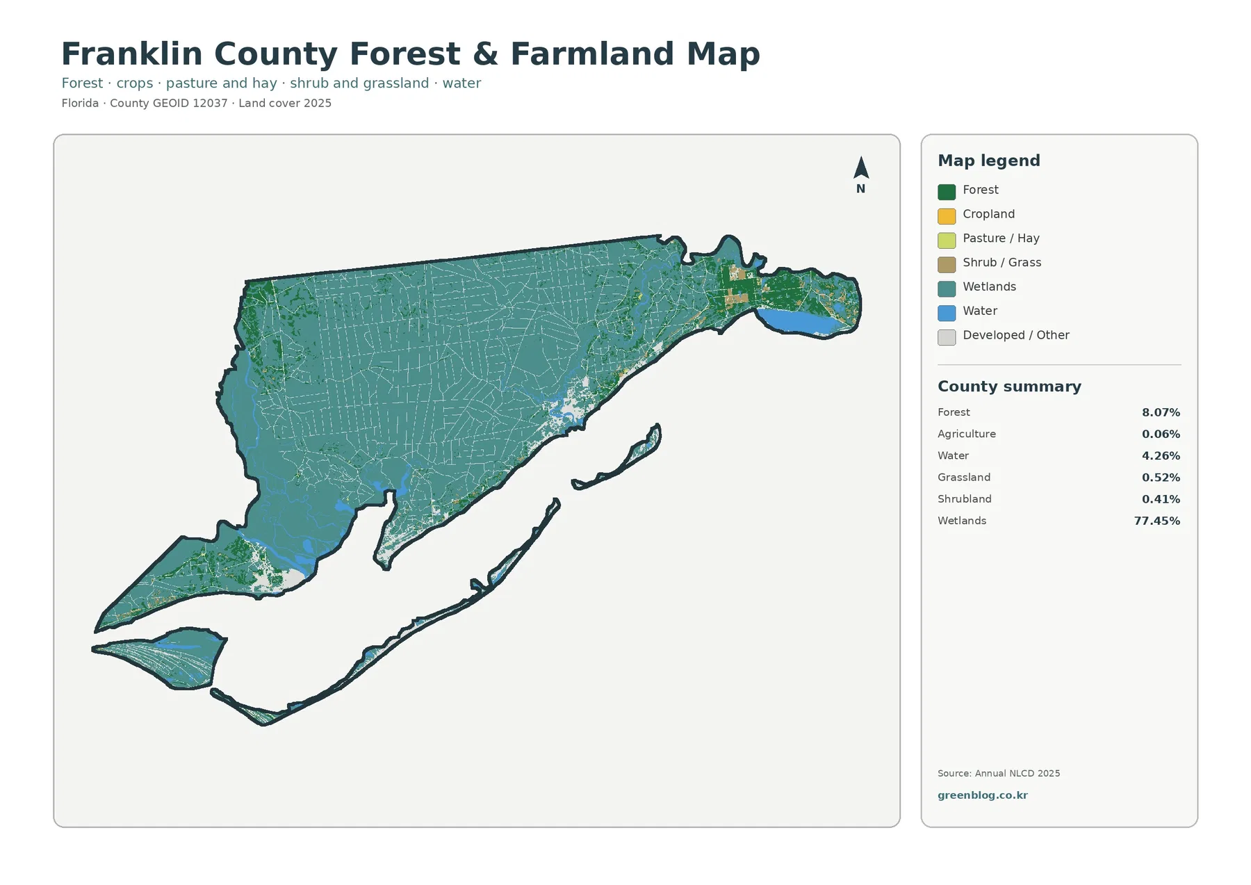
The forest-and-farmland map makes Franklin County’s imbalance between natural wetland cover and agriculture especially clear. Forest remains visible at 8.07%, but agriculture is only 0.06%. Yellow agricultural pixels are therefore very limited and should not be treated as a defining countywide feature. The map is useful precisely because it shows how little mapped agricultural cover exists beside the much larger wetland and forest areas.
Grassland contributes 0.52% and shrubland 0.41%. These small classes appear in scattered patches rather than broad continuous zones. At page scale they can be difficult to separate from nearby categories, especially where narrow strips or mixed cells occur. The downloadable JPG versions make the legend easier to read, but enlarging the image does not create finer land-cover detail than the source classification contains.
Wetlands remain the visual background at 77.45% even on a map designed to emphasize forest and farming. Dark-green forest patches are repeatedly embedded in or bordered by teal wetland areas. That arrangement is more informative than the percentages alone because it shows how the county’s upland and wetter surfaces are interwoven rather than separated into simple north-south or coast-interior zones.
The Florida Department of Environmental Protection’s Franklin County coastal guide describes the Apalachicola River and Bay system, the Apalachicola National Estuarine Research Reserve, St. Vincent National Wildlife Refuge, and Tate’s Hell State Forest. Those official resources provide useful regional context for the broad wetland and natural-cover pattern visible in the maps. They should not be used to convert a land-cover color into a legal preserve boundary; management boundaries and land-cover classes are different datasets.
For a classroom or environmental presentation, this map works well after the general countywide view. The first map establishes that wetlands dominate, and the forest-and-farmland version then reveals how forest, tiny agricultural patches, shrub or grass cover, and water fit inside that broader pattern. The sequence keeps a small agricultural area from being visually exaggerated simply because it is highlighted with a contrasting color.
The 1985–2025 comparison shows 7.57% endpoint class difference
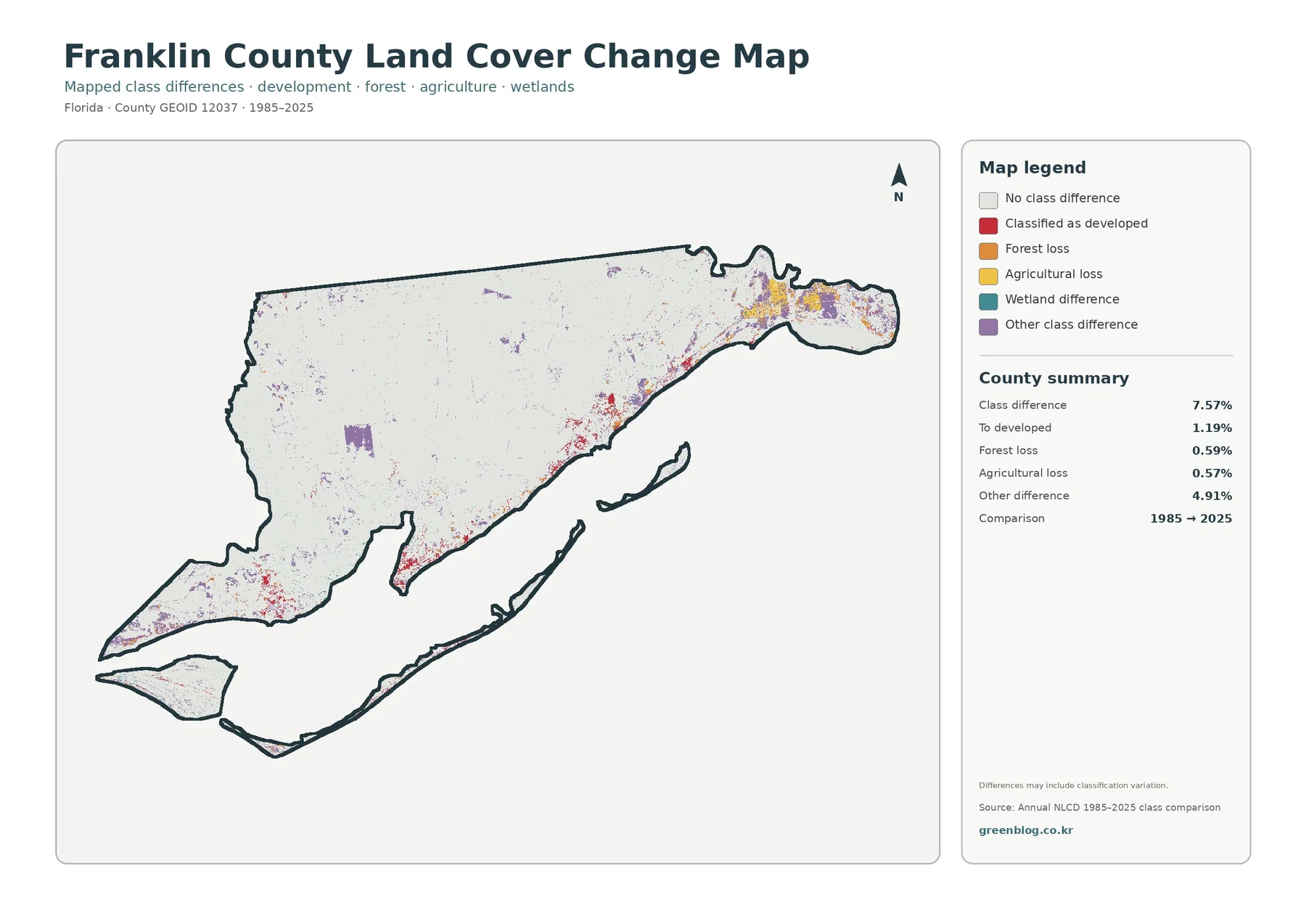
The supplied change map reports a 7.57% class difference between 1985 and 2025. Of the mapped county, 1.19% is listed as changed to developed, 0.59% as forest loss, 0.57% as agricultural loss, and 4.91% as other difference. The majority of cells therefore retain the same endpoint class in this comparison, although the map does not describe every change that may have occurred during the forty-year interval.
The map includes an important warning that differences may include classification variation. That caution should stay with any interpretation of the percentages. Sensor conditions, seasonal appearance, mixed pixels, and classification methods can cause two endpoints to receive different labels even when the physical change is more subtle than the legend suggests. A 7.57% class difference should not be restated as an exact 7.57% physical land-change rate.
Red developed-change cells are concentrated near existing settlement and transportation areas rather than spread uniformly through the county. They show where the 2025 endpoint is classified as developed relative to 1985, but they do not identify the year, project, permit, or development type responsible for a particular cell. County planning records, historical aerial imagery, and intermediate land-cover years would be needed to establish a specific local history.
Forest loss is listed at 0.59% and agricultural loss at 0.57%. Those labels describe endpoint class differences, not necessarily permanent removal. Timber harvest and regrowth, wetland reclassification, field rotation, temporary clearing, or mixed-cell effects can all complicate a simple loss narrative. The very small 0.06% agricultural share in 2025 also means that even modest historical agricultural differences can stand out in the change legend.
A practical way to use this figure is to identify clusters of difference first, then compare those places with the 2025 general map and impervious layer. That sequence answers three separate questions: where the endpoint classifications differ, what class is present in 2025, and whether hard developed surfaces are concentrated there now. Keeping those questions separate reduces the risk of assigning a cause that the map itself does not prove.
Coast, bay, islands, and inland wetlands belong to one connected landscape
Franklin County’s shape is part of the story. The mainland borders a deeply indented coastal system, while long, narrow islands lie offshore. The Florida Department of Environmental Protection notes that the Apalachicola National Estuarine Research Reserve includes the lower Apalachicola River and floodplain as well as most of Apalachicola Bay. That regional setting helps explain why water and wetland classes occupy so much of the mapped county.
DEP’s Franklin County coastal guide also describes Tate’s Hell State Forest between the Apalachicola and Ochlockonee rivers, with wet prairie, wet flatwoods, strand swamp, bottomland forest, baygall, and floodplain swamp communities. Those descriptions are ecological context, not a direct translation of the NLCD legend, but they reinforce the importance of wet environments in the county. The map’s 77.45% wetland share should still be interpreted strictly as the supplied land-cover classification.
Franklin County’s Comprehensive Plan provides a different kind of official source. It addresses wetlands, natural drainage, shorelines, and protection of Apalachicola Bay in land-use policy. That document should not be confused with the land-cover map. Planning policy describes how land may be regulated or reviewed, while the map classifies the surface condition observed by a remote-sensing product. Using both can provide context, but one cannot substitute for the other.
This distinction is especially important for coastal and island land. A teal wetland pixel does not automatically mean public ownership, conservation designation, or a building prohibition. A red developed pixel does not prove a particular zoning category. Anyone making a parcel-level or regulatory decision should consult official property, zoning, wetland-jurisdiction, flood, permitting, and survey information rather than relying on a countywide land-cover raster.
How to use the four maps without overstating their precision
These maps are best suited to county-scale comparison, education, presentation graphics, and broad environmental context. The general map answers which cover types dominate. The forest-and-farmland map helps isolate relatively small upland and agricultural classes. The impervious layer distinguishes developed cover from hard surface, and the change map points to areas where endpoint classifications differ. Giving each map a separate question makes the four-image set easier to understand.
Annual NLCD is a raster product built from grid cells rather than parcel polygons. At roughly 30-meter cell size, narrow roads, individual buildings, small marsh edges, and mixed shorelines can be combined with surrounding cover. A larger JPG makes labels and colors easier to see, but it does not turn those cells into parcel-scale observations. Detailed site analysis requires higher-resolution imagery, surveys, and authoritative local datasets.
The 2025 map also represents a dated observation. Development, shoreline movement, storms, vegetation recovery, forestry activity, restoration, or other changes after that classification year may not appear. Coastal counties can change quickly in localized areas, so the map should be treated as a 2025 reference rather than a permanent description of every shoreline or developed edge.
When printing or preparing slides, choose the figure that matches the topic instead of shrinking all four onto one page. A wetland or habitat discussion can lead with the general map and forest view. A development discussion can pair the general map with imperviousness. A historical comparison can use the change figure last, with the classification-variation warning visible in the caption or notes.
The original JPG files are 2480 by 1754 pixels. They provide more room for the legend and small color patches than the page previews, but they are below an A3 300-dpi pixel target. Print sharpness will therefore depend on physical output size. The source map resolution and the image pixel dimensions are separate limits, and enlarging either one does not create new geographic detail.
Download the four original JPG maps
The ZIP download contains all four Franklin County map files: the 2025 land-cover map, forest-and-farmland map, impervious/developed-land map, and the 1985–2025 land-cover-change map. The WebP versions on the page are convenient for quick viewing, while the original JPG files are better when the legend needs to be larger in a document, classroom handout, or presentation.
If only one figure is needed, select it according to the question being asked. Use the general map for the overall county pattern, the forest-and-farmland map for natural and agricultural comparison, the impervious map for hard-surface concentration, and the change map for endpoint class differences. Keeping the map purpose explicit helps prevent the four products from being treated as interchangeable.
Frequently Asked Questions
What is the largest 2025 land-cover class in Franklin County?
Wetlands are the largest class at 77.45%. Forest follows at 8.07%, developed land at 7.41%, water at 4.26%, and barren cover at 1.84%. The wetland class extends across much of the mainland and coastal setting, while developed cover is concentrated in relatively small settlement and transportation areas.
Why is developed cover 7.41% when mean imperviousness is only 1.60%?
Developed land can include lawns, trees, soil, and other permeable surfaces along with roads, parking areas, and rooftops. Imperviousness measures the harder surfaces separately. Only 0.36% of the mapped county is at least 50% impervious, so the most heavily hardened surfaces are concentrated inside a much larger developed footprint.
Does the 7.57% 1985–2025 class difference equal the county’s exact physical change rate?
No. The supplied map explicitly warns that classification variation may be included. It lists 1.19% changed to developed, 0.59% forest loss, 0.57% agricultural loss, and 4.91% other difference, but those endpoint labels do not establish the timing or cause of every physical change. Intermediate-year data, historical imagery, and local records are needed for that level of interpretation.
Map File Information
The four original JPG land-cover maps for Franklin County, Florida are included together in one ZIP file.
- Included Files: Use only the versions confirmed in the article and supplied images
- File Type: Use the confirmed download contents
- Intended Use: Printing, education, presentations, and map-based projects
Related Maps
- Alachua County Florida Land Cover Map
- Baker County Florida Land Cover Map
- Bay County Florida Land Cover Map
Sources and references
- MRLC Annual NLCD Data – official access to Annual NLCD land-cover products
- USGS Annual NLCD Land Cover Classification – definitions and documentation for developed, forest, wetland, water, and related classes
- Florida DEP Franklin County Coastal Access Guide – official context for Apalachicola Bay, coastal resources, Tate’s Hell State Forest, and nearby protected lands
- Franklin County Comprehensive Plan – county policy context for wetlands, shorelines, drainage, and protection of Apalachicola Bay
- U.S. Census Bureau TIGER/Line Shapefiles – official geographic boundary reference
Green Map creates custom-edited map images using open geographic data sources such as geoBoundaries, Natural Earth, OpenStreetMap, and government open data.
These maps are edited visual materials, not raw data files, and are provided for education, documents, presentations, and graphic reference.