Collier County’s 2025 land-cover pattern is dominated by wetlands on a scale that shapes nearly every map in this set. The supplied summary places wetlands at 72.64% of the county, followed by developed cover at 10.41%, agriculture at 7.44%, forest at 5.25%, and water at 3.83%. Development is concentrated strongly in the west, while the broad eastern and southern interior is overwhelmingly wetland.
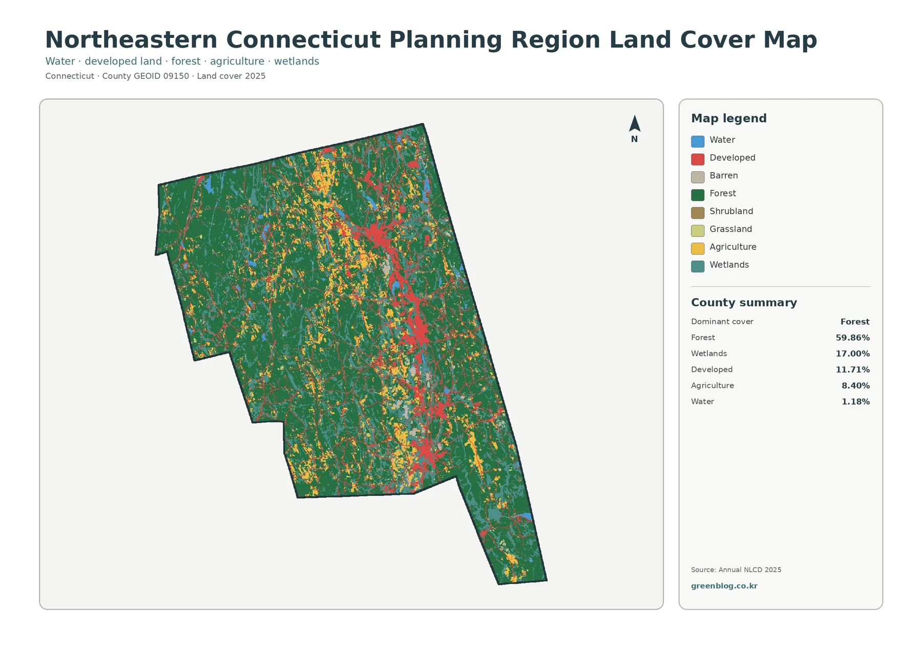
This page provides four complementary views: current land cover, forest and farmland, impervious surface, and a 1985–2025 class comparison. The four original JPG maps are also available together in one ZIP file for printing, classroom use, presentation graphics, and county-scale comparison. Each map uses the same county outline but emphasizes a different question.
Table of Contents
Built surfaces are concentrated in a small part of a very large county
One of the clearest lessons from Collier County is that a countywide percentage can hide a strong local concentration. Developed land accounts for 10.41%, which is modest compared with the wetland share, yet the western side contains a broad and visually prominent developed area. Most of the eastern interior is nearly the opposite, with very little hard-surface intensity.
The impervious map makes that contrast even easier to see. Impervious surface means pavement, rooftops, parking areas, and similar hard surfaces that do not readily absorb rainfall. The countywide mean is 4.02%, and 3.26% of the county is mapped at 50% impervious or higher. Those values are not the same as the 10.41% developed-cover share because developed classes can contain lawns, trees, soil, and other permeable surfaces.
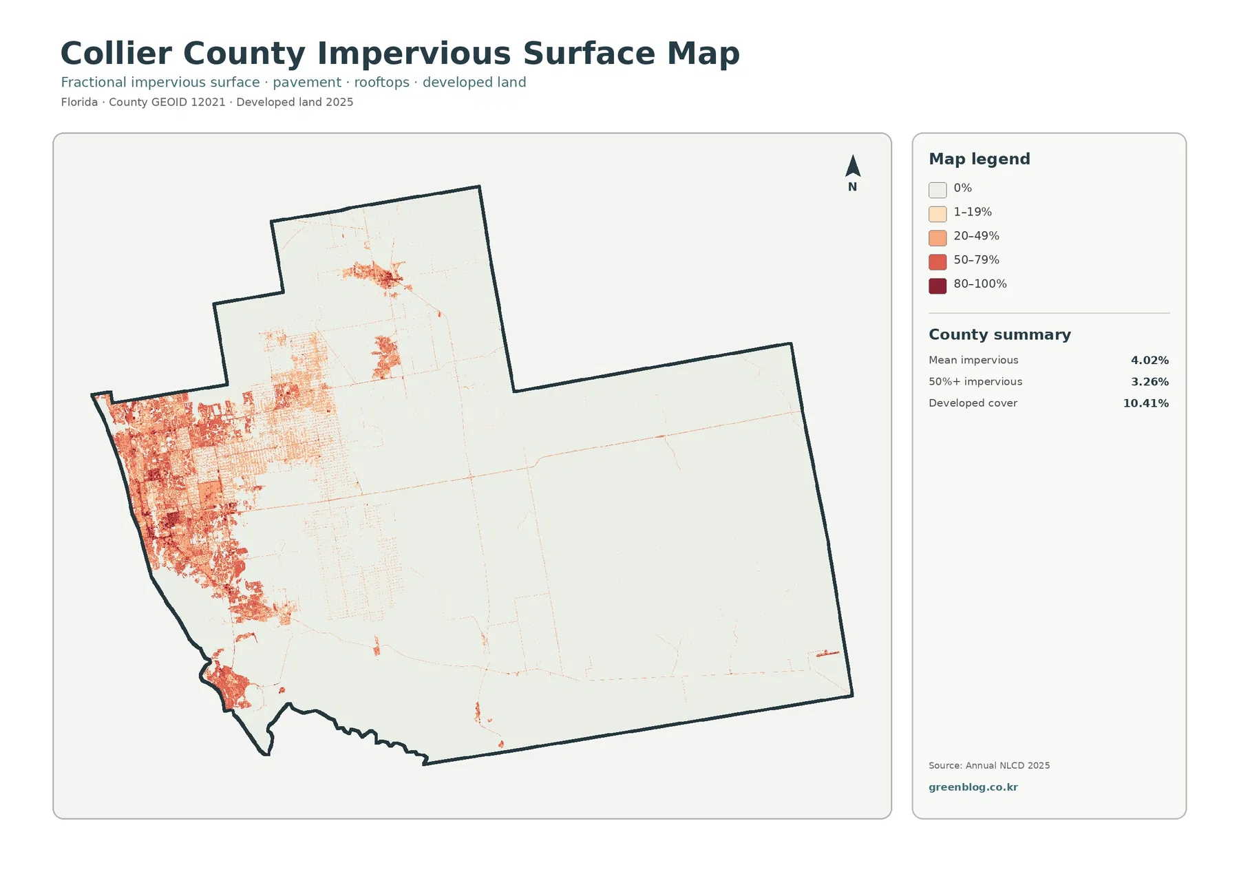
The darkest impervious values form a dense western cluster, with smaller concentrations farther inland and toward the north. Large portions of the county are almost blank on this map because wetlands and other natural cover occupy so much land. That visual imbalance explains why a relatively low county mean can coexist with locally intense development.
Imperviousness should not be treated as a flood-risk map. Hard surfaces can affect runoff, but actual flooding depends on rainfall, elevation, drainage, groundwater, tidal conditions, canals, wetlands, and other factors. Anyone making a flood, evacuation, or property decision should use current hazard information from the appropriate county and federal agencies instead of relying on this map alone.
The wetland majority is more than one uniform landscape
Wetlands cover 72.64% in the supplied 2025 summary, making them the defining land-cover category. The broad teal area extends across most of the central, eastern, and southern county. Even where forest, water, agriculture, or development interrupts that pattern, wetlands remain the dominant background over a very large area.
That percentage should not be read as one identical wetland type. The National Park Service describes Big Cypress National Preserve as a roughly 729,000-acre freshwater swamp ecosystem containing cypress swamps, pinelands, prairies, hardwood hammocks, and mangroves. The variety described by NPS is a useful reminder that one broad land-cover class can include many distinct ecological settings.
Everglades National Park also extends into Collier County. NPS states that the park spans Miami-Dade, Monroe, and Collier counties and protects extensive wetland, forest, and marine habitats. That information provides regional context for the southern part of the county, but the supplied land-cover map does not draw the legal boundaries of either Everglades National Park or Big Cypress National Preserve.
For that reason, a teal cell should be read only as a land-cover classification at this scale. It does not establish ownership, protected status, a regulatory wetland boundary, or the limits of a conservation area. Those questions require agency maps, parcel records, surveys, or wetland delineation data designed for that purpose.
Forest and agriculture become easier to see when development is deemphasized
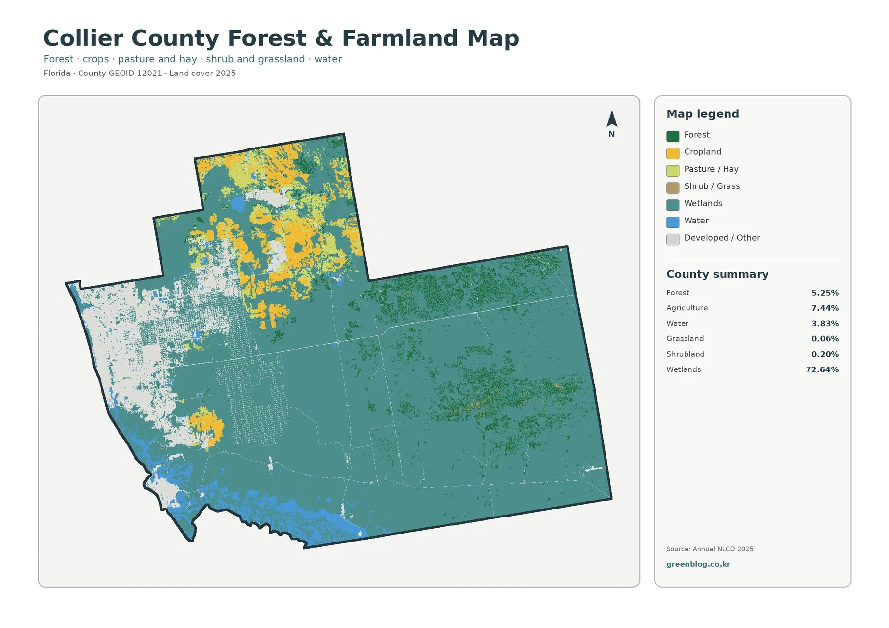
Agriculture accounts for 7.44% of Collier County in the 2025 summary, and its location matters more than the countywide number alone suggests. Yellow agricultural areas are most conspicuous in the north, where several large blocks and irregular patches stand out against wetlands and forest. Smaller agricultural areas also appear closer to the western developed zone.
UF/IFAS Extension Collier County maintains programs in agriculture and sustainable food systems, providing a useful local source for readers who want to move beyond the map into current agricultural information. The land-cover map itself does not identify crops, farm ownership, production totals, or parcel boundaries, so those details should come from agricultural statistics or local extension resources rather than visual guesswork.
Forest is 5.25%, slightly smaller than agriculture. Dark-green forest appears in scattered blocks around the northern interior and within the much larger wetland landscape farther east. The pattern is not a single continuous forest belt, which makes the forest-and-farmland view especially helpful for finding smaller wooded areas that are less obvious on the full land-cover map.
Grassland is listed at only 0.06% and shrubland at 0.20% in the supplied summary. Those small shares help keep the interpretation focused: Collier County is not primarily a grassland or shrubland county in this classification. Wetlands, agriculture, forest, developed cover, and water account for the visually meaningful categories.
The pale background on this specialized map does not mean “no data.” Developed and other classes are intentionally pushed back so forest and working-land categories can stand out. When a location is unclear, compare it with the full 2025 map rather than treating the simplified view as a complete inventory.
The full 2025 map ties the separate patterns back together
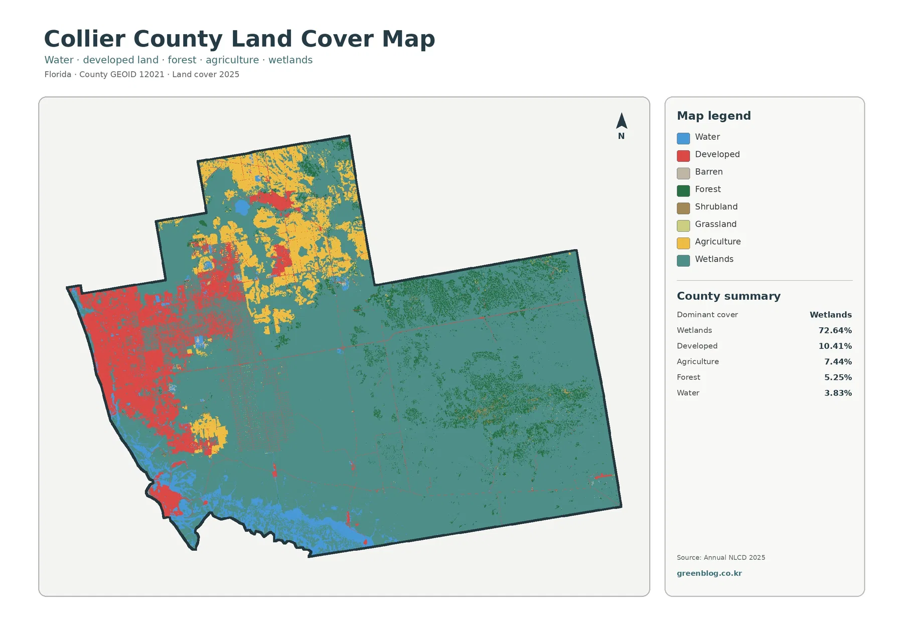
The general land-cover map is the best place to verify how the specialized views relate to one another. Red developed cover is concentrated in the west, yellow agriculture is strongest in the north, and the broad teal wetland system stretches over most of the remainder. Blue water is most noticeable along the southern and southwestern edges and in smaller interior areas.
The 10.41% developed share looks much larger on the western side than it does in the county summary because development is geographically clustered. Conversely, the 72.64% wetland share is spread over an enormous interior area. Putting those two patterns on the same map prevents a misleading conclusion based only on countywide percentages.
Agriculture is another example of why location matters. At 7.44%, it occupies less than one tenth of the county, but northern blocks are large enough to form a distinct regional pattern. The forest share of 5.25% is smaller and more fragmented, appearing among wetlands and agricultural areas rather than dominating a single side of the county.
Water at 3.83% is separate from wetlands. Blue open-water areas and teal wetland areas frequently touch, especially toward the south and southwest, but they represent different classes. Keeping that distinction visible is particularly important in a county where wetlands are so extensive that open water can otherwise be overlooked.
The map is useful for broad geographic comparison, but it should not be read as a zoning map. A red developed cell does not identify residential, commercial, or industrial zoning, and a yellow agricultural cell does not prove a parcel’s legal agricultural use. Land cover describes the observed surface classification, not the legal rules attached to a property.
A 15.65% class difference does not mean one simple 40-year transformation
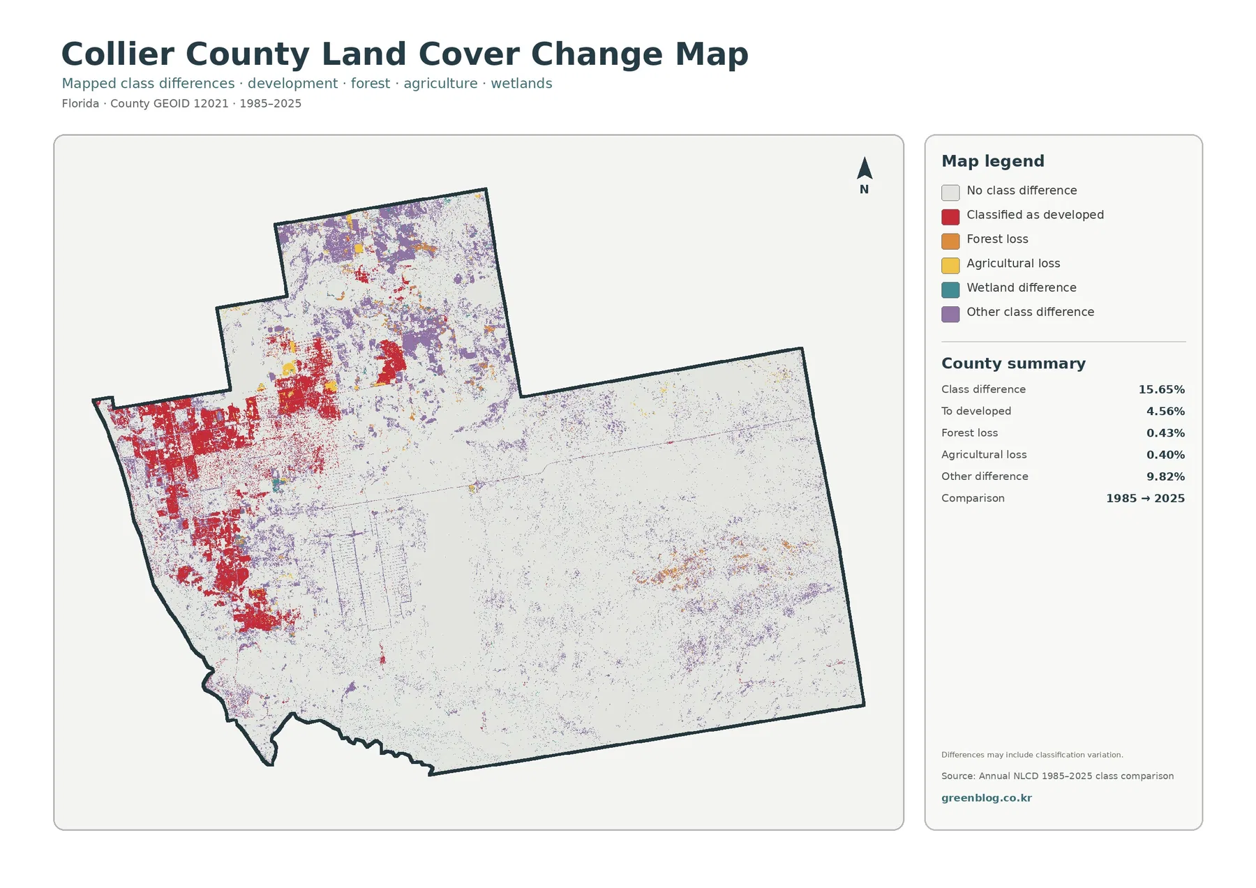
The change map compares classifications at the 1985 and 2025 endpoints. Its county summary reports a total class difference of 15.65%. That number describes cells assigned to different classes at the two endpoints; it should not automatically be interpreted as a measured physical transformation of exactly 15.65% of the county.
Cells classified to developed cover account for 4.56%. The strongest red concentrations occur in and around the western developed area, with additional patches in the north. Comparing those red areas with the current impervious map is useful because it shows where a long-term class difference and present-day built intensity occur in similar parts of the county.
Forest loss is 0.43%, while agricultural loss is 0.40% in the supplied summary. These are much smaller than the developed-transition and other-difference values. Small orange and yellow areas can help identify places for closer study, but the colors do not explain why a classification changed or whether a specific land-management action caused it.
The largest detailed category is “other difference” at 9.82%. Purple areas are scattered widely, especially through parts of the northern and eastern landscape. Because that category does not represent one single process, it is important not to describe all 15.65% of the class difference as urban growth or wetland loss.
The map also marks wetland differences. Wetland edges can be sensitive to water conditions, vegetation, image timing, and mixed pixels, so a different classification at two endpoints may reflect both real change and classification variation. The supplied map itself warns that differences may include classification variation.
Two endpoints also leave out the path between them. A location could have changed more than once between 1985 and 2025, and an endpoint map would not show each intermediate state. Researchers who need timing should consult additional Annual NLCD years, aerial imagery, or local records rather than treating the comparison as a complete history.
Frequently Asked Questions
What is the dominant land-cover class in Collier County?
Wetlands are the dominant 2025 class at 72.64%. Developed cover is 10.41%, agriculture 7.44%, forest 5.25%, and water 3.83%. The wetland majority is concentrated across the broad interior, east, and south, while development is much more concentrated on the western side.
Why is developed cover 10.41% while mean imperviousness is only 4.02%?
Developed land is a land-cover category that can include buildings, roads, lawns, trees, and other surfaces. Imperviousness measures the hard surfaces that resist water infiltration, such as pavement and rooftops. A developed area can therefore contain substantial permeable cover, so the two percentages are expected to differ.
Does the 15.65% 1985–2025 class difference equal the amount of real land change?
Not necessarily. It is the share of cells classified differently at the two endpoints, and the map notes that classification variation may be included. The 4.56% transition to developed cover and the other highlighted categories are useful for locating change candidates, but causes and timing require additional evidence.
Map File Information
The ZIP contains the four original JPG maps used on this page for Collier County.
- File Type: four JPG files in one ZIP
Related Maps
Ways to present Collier County without reducing it to one statistic
A classroom exercise can begin by asking students to identify the largest color area before looking at the summary. The teal wetland expanse makes the 72.64% figure visually understandable. Students can then locate the contrasting western development and northern agriculture to see why countywide numbers do not describe every part of the county equally.
An environmental presentation can separate wetlands from open water and forest instead of grouping all natural cover together. Wetlands are 72.64%, water 3.83%, and forest 5.25%, and each occupies a different pattern. NPS information on Big Cypress and Everglades can add ecological context while the land-cover map supplies the countywide spatial comparison.
A development-oriented slide can pair the 10.41% developed-cover share with the 4.02% mean impervious surface. Showing both numbers next to the impervious map explains that a developed class does not mean every square meter is paved. The dense western cluster also prevents the countywide average from being mistaken for a uniform condition.
For an agriculture-focused comparison, the 7.44% county share should be shown together with the northern concentration. That approach is more informative than presenting the percentage alone because agriculture is locally prominent even though wetlands dominate the countywide total. Local extension resources can then provide current information that the land-cover map does not contain.
When preparing a print handout or slide deck, use the original JPG files in the ZIP below instead of screenshots. Each file includes the title, legend, and county summary in a consistent layout. Image quality helps presentation, but it does not turn county-scale raster data into parcel-level evidence.
Related Maps
- Alachua County Florida Land Cover Map
- Baker County Florida Land Cover Map
- Bay County Florida Land Cover Map
Sources and References
- MRLC Annual NLCD Data – source portal for Annual NLCD land-cover and comparison data
- USGS Annual NLCD Land Cover Classification – definitions and classification guidance for land-cover categories
- U.S. Census Bureau TIGER/Line Shapefiles – county boundary data
- Big Cypress National Preserve – official NPS background on the freshwater swamp ecosystem in southwest Florida
- Everglades National Park Directions – official NPS information confirming that the park extends into Collier County
- UF/IFAS Extension Collier County – local agriculture and natural-resources information
Green Map creates custom-edited map images using open geographic data sources such as geoBoundaries, Natural Earth, OpenStreetMap, and government open data.
These maps are edited visual materials, not raw data files, and are provided for education, documents, presentations, and graphic reference.