Northeastern Connecticut Planning Region is dominated by forest, with wetlands forming a second major part of the mapped landscape. The 2025 summary reports 59.86% forest, 17.00% wetlands, 11.71% developed land, 8.40% agriculture, and 1.18% water. Four map views on this page let you compare that overall pattern with forest and farmland, impervious surfaces, and mapped class differences between 1985 and 2025.
The WebP images are intended for quick viewing in the article. The four original JPG maps are also available together in one ZIP download for presentations, class materials, documents, or offline reference. These maps describe land cover—the physical surface seen by the classification—not zoning, ownership, parcel boundaries, or permission to develop a property.
Table of Contents
A region where forest remains the main land cover
The first impression is the amount of green. Forest covers 59.86% of the planning region, and it is not confined to one corner. Large forested areas extend across the north, west, center, and southern portions of the boundary. Developed areas interrupt that cover around several population and transportation centers, but they do not form one continuous urban sheet. This makes the region visually different from Connecticut planning regions where development occupies a much larger share of the map.
Wetlands account for 17.00%, the second-largest mapped class. They appear repeatedly as narrow bands and irregular patches within or beside forested areas rather than as a single large wetland complex. Because wetlands are so widely distributed, the general land-cover map can be useful for identifying places where forest and wetland cover occur close together. It should not be used as a legal wetland map, however. Regulatory wetland boundaries are created for different purposes and require separate official data.
Developed land represents 11.71%. Red areas are concentrated around a limited number of centers and along narrower connecting routes, while much of the planning region remains lightly developed. Agriculture contributes another 8.40% and appears as scattered yellow patches, often surrounded by forest. Water is 1.18% of the region. The relatively small water percentage does not mean streams and ponds are unimportant; many water features occupy narrow or small areas that cover little of the total boundary.
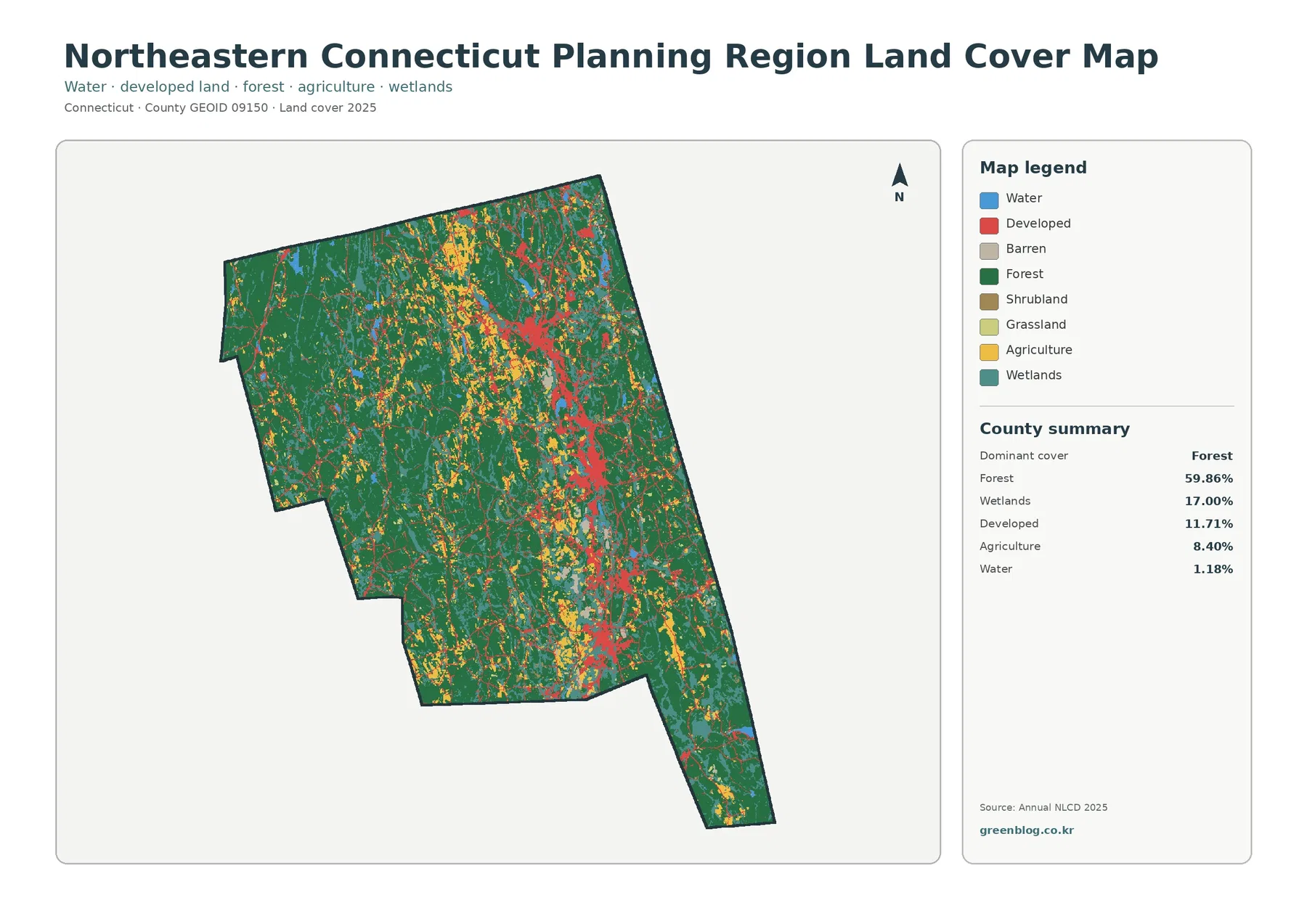
The official Northeastern Connecticut Council of Governments, or NECCOG, serves 16 municipalities: Ashford, Brooklyn, Canterbury, Chaplin, Eastford, Hampton, Killingly, Plainfield, Pomfret, Putnam, Scotland, Sterling, Thompson, Union, Voluntown, and Woodstock. The supplied land-cover maps do not draw those municipal boundaries, so a colored patch should not be treated as a town-level statistic. The percentages on this page summarize the planning region as a whole.
Forest and farmland are easier to separate in the second map
The forest-and-farmland view reduces the visual emphasis of developed and other land so natural cover and agriculture stand out more clearly. The broad forest pattern becomes especially obvious here. Large green areas remain connected across much of the region, while agricultural cover appears as smaller yellow fields and clusters within that forested setting. There is no single large agricultural plain. Instead, farmland is distributed through a landscape in which woods are still the dominant cover.
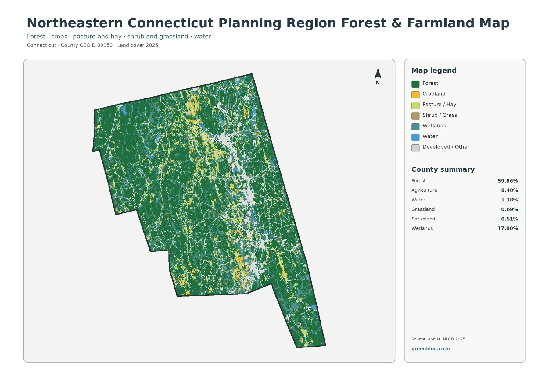
The summary for this map lists forest at 59.86%, agriculture at 8.40%, water at 1.18%, grassland at 0.69%, shrubland at 0.51%, and wetlands at 17.00%. Grassland and shrubland therefore occupy very small shares of the overall region. At full-map scale they are not the main visual story, even though individual patches may matter locally. Small categories become especially easy to overinterpret when a map is enlarged, because a raster classification simplifies complicated ground conditions into cells.
Agriculture should also be read carefully. A cell classified as agricultural cover is not the same thing as a parcel enrolled in a farmland-preservation program, a soil rated as prime farmland, or a property legally zoned for agriculture. NECCOG planning documents describe agriculture as a continuing part of the northeastern Connecticut economy and landscape, which helps explain why agricultural patches are meaningful here. The map itself only shows the 2025 surface classification.
The wetland pattern remains prominent even after developed land is visually muted. Teal areas appear throughout the forest, reinforcing the fact that wetland cover is not restricted to a single edge of the region. For watershed study or environmental education, this view makes it easier to discuss forest, farmland, water, and wetlands together. For permitting, conservation status, or property-level decisions, a dedicated wetland or open-space dataset is still necessary.
Impervious cover is low on average but concentrated in a few places
Impervious surface means hard cover such as rooftops, paved roads, and parking areas where water does not readily soak into the ground. The 2025 map reports a mean impervious value of 2.39% across Northeastern Connecticut Planning Region. Cells with at least 50% impervious cover make up 1.36% of the region. Those figures are much lower than the 11.71% developed-land share because a developed land-cover class can also include lawns, trees, and other permeable surfaces around buildings and roads.
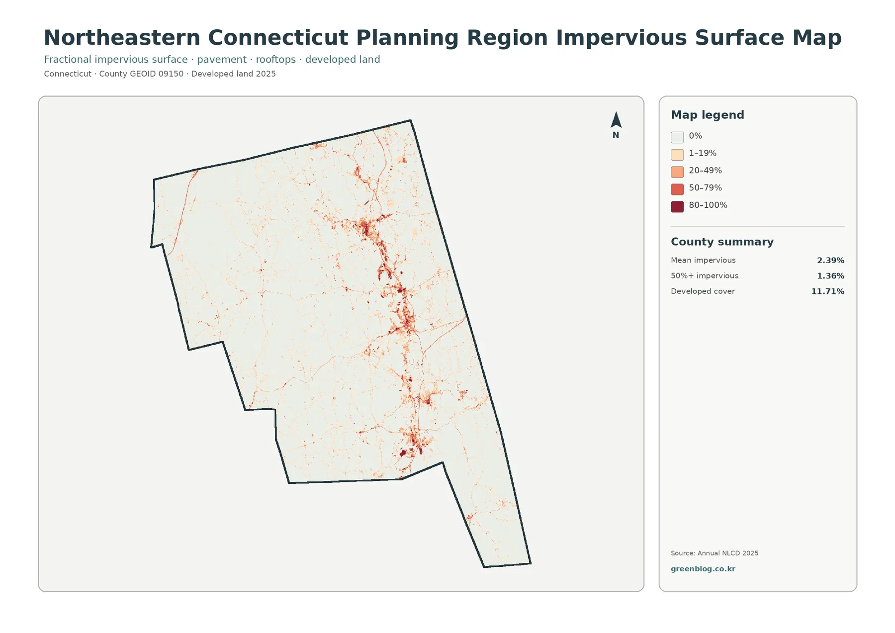
The darkest impervious values form compact clusters rather than covering the planning region evenly. The strongest concentrations appear around several central and eastern settlement areas, with thinner lines extending along transportation routes. Large forested sections are mostly in the zero or low-impervious classes. Comparing this map with the general land-cover map is useful because it separates the broad footprint of developed land from the places where pavement and buildings are most concentrated.
A low regional average should not be converted into a flood or water-quality conclusion. Runoff depends on rainfall, slope, soils, drainage infrastructure, stream position, and many other conditions. The 2.39% figure is also a regional average, not the value for Putnam, Killingly, Plainfield, or any other individual municipality. Town-level analysis would require the impervious data to be summarized again within each municipal boundary.
Agriculture and settlement occur within a largely rural landscape
NECCOG’s regional planning material describes northeastern Connecticut as a place where agriculture and forestry remain important outside the more developed river and highway corridors. That context is consistent with the supplied maps: forest occupies most of the region, agricultural cover appears repeatedly among wooded areas, and developed land is concentrated rather than continuous. The maps do not prove why those patterns formed, but they provide a clear way to see where the broad land-cover differences occur today.
Regional documents also discuss the Quinebaug River corridor and major routes such as I-395 and Route 12 as important parts of the area’s settlement and economic geography. On the land-cover and impervious maps, stronger development is visible in a narrower north-south pattern through parts of the region and around several centers. It is reasonable to compare those locations with transportation or river maps, but this land-cover package alone does not establish that a road or river caused a particular development pattern.
Connecticut Route 169 is another useful piece of regional context because NECCOG planning materials treat the scenic byway and its historic villages as part of the area’s rural identity. The supplied maps do not label Route 169, village names, or tourist sites, so they should not be used for navigation. Their value is different: they show that large forest areas and dispersed agricultural cover remain visible across the same broader region.
What changed between 1985 and 2025
The change map compares the 1985 and 2025 classifications. A class difference is mapped across 9.45% of the planning region. The summary breaks that figure into 2.09% classified toward developed land, 1.80% forest loss, 0.47% agricultural loss, and 4.68% other class differences. Most of the map remains in the no-class-difference category, while colored changes appear as many small patches scattered across the region.
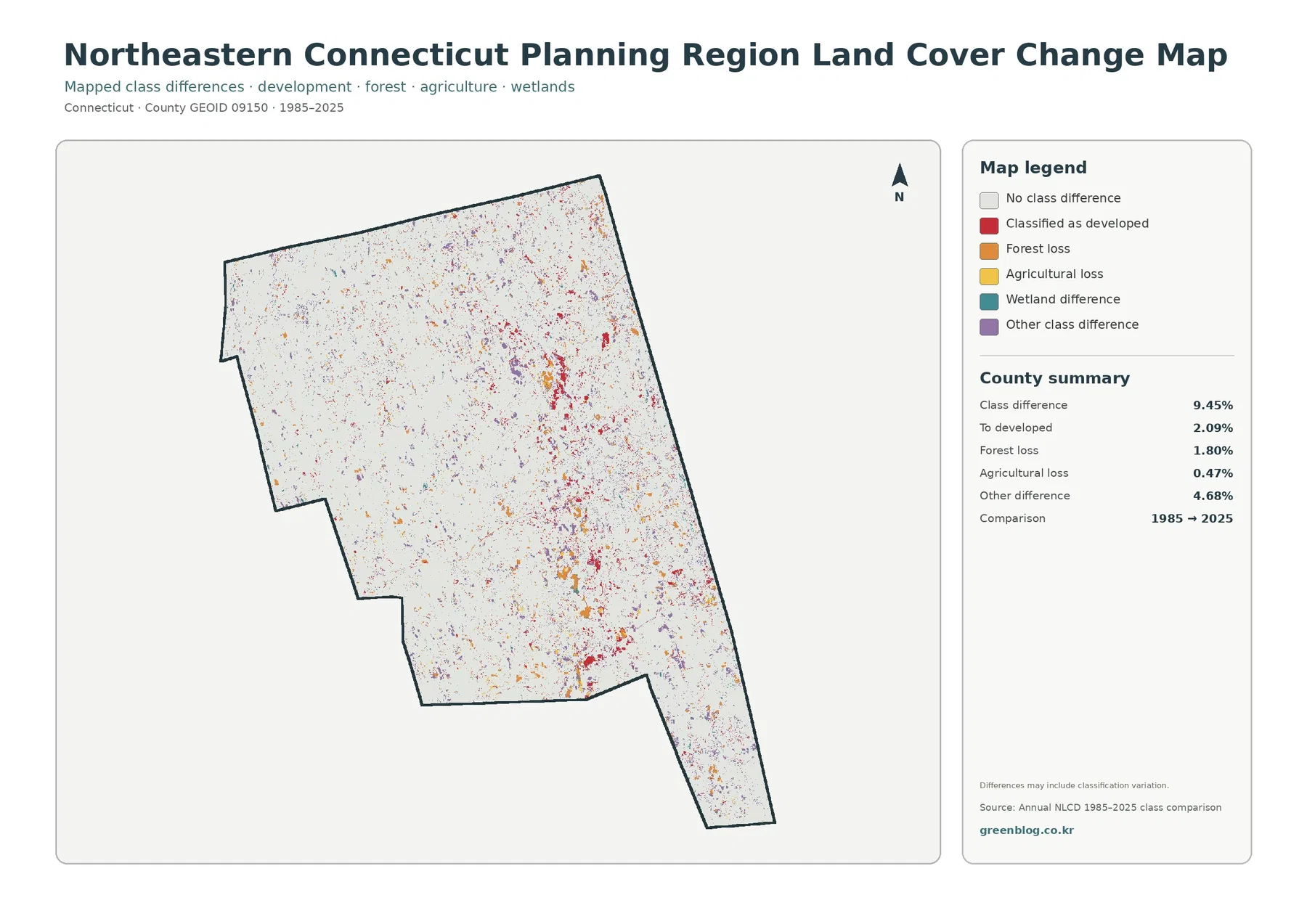
The 2.09% ‘to developed’ value should not be confused with the current 11.71% developed-land share. The larger number describes all land classified as developed in 2025. The smaller number identifies places where the two comparison years differ in a way categorized toward development. A place that was already developed in 1985 may remain developed in 2025 and therefore show no class difference.
The same caution applies to the 1.80% forest-loss and 0.47% agricultural-loss categories. The map notes that differences may include classification variation. Satellite observations, classification methods, and mixed cells can produce differences that are not identical to a documented on-the-ground event. A colored change cell is best treated as a location to investigate further, not as proof of a specific logging project, subdivision, or farm conversion.
For a more reliable change review, start with the change map to locate clusters, then compare those places with the 2025 land-cover map. Historical aerial imagery, municipal records, or other dated datasets can then be used to determine what actually happened. This sequence keeps the map useful without asking it to answer questions that require evidence beyond land-cover classification.
Why the Planning Region boundary matters
Connecticut now uses its nine planning regions as county-equivalents for Census geography. Northeastern Connecticut Planning Region is identified with county code 150 and GEOID 09150. That boundary should not be assumed to match the full extent of an older county such as Windham County. When comparing population tables, historic maps, land-cover summaries, or other county-level products, checking the geographic identifier and year helps prevent a boundary mismatch.
This distinction is especially important for northeastern Connecticut because the 16-member NECCOG region is a modern planning geography assembled from municipalities. The land-cover statistics in this package were summarized within that current regional boundary. They should not be copied into a table labeled with an older county name unless the boundaries have been independently verified.
Choosing the right map for a project
Use the general land-cover map when the goal is to explain the region in one view. It is the best choice for showing the contrast between extensive forest, frequent wetlands, scattered agriculture, and relatively compact development. If the project is focused on farms, forests, or natural cover, the forest-and-farmland map removes some competing visual detail and makes those categories easier to compare.
Use the impervious-surface map when the question is about hard developed surfaces rather than the entire developed land-cover class. Its 0%, 1–19%, 20–49%, 50–79%, and 80–100% ranges help distinguish lightly developed areas from places where pavement and rooftops are more concentrated. For time-based comparison, choose the 1985–2025 change map and keep the current land-cover map nearby so present condition and mapped change are not confused.
For classroom use, a clear sequence is to begin with the general map, then move to either forest and farmland or impervious cover depending on the topic. Environmental lessons can compare the 59.86% forest share with the 17.00% wetland share, while planning discussions can compare 11.71% developed land with the much lower 2.39% mean impervious value. A change lesson can use the 9.45% class-difference figure as a starting point and then discuss why classification differences need verification.
Map scale, raster cells, and other limits
Annual NLCD products are based on remotely sensed land-cover classification. The ground is much more complicated than the map legend: trees, lawns, farm fields, rooftops, pavement, small streams, and wetlands can occur within a short distance of one another. Raster cells generalize that complexity. A mixed pixel may contain more than one surface type even though the map must assign a class or impervious percentage.
That means enlarging the image does not turn it into a parcel survey. Narrow wetlands, forest edges, small fields, and roads can look simplified compared with current aerial photography. The map is well suited to regional pattern comparison, environmental education, presentation graphics, and preliminary study. It is not designed to determine property ownership, legal boundaries, zoning, regulated wetland limits, or building eligibility.
Dates matter as well. The current land-cover and impervious views are labeled 2025, while the change product compares 1985 with 2025. Development, clearing, regrowth, or agricultural changes after the observation period may not be represented. For a current site question, recent local GIS or aerial imagery should be consulted in addition to this regional map set.
Download the four original JPG maps
The ZIP download contains the four original JPG maps described above: general land cover, forest and farmland, impervious and developed land, and 1985–2025 land-cover change. They are useful when the WebP previews are too small for a document or presentation. Keep the original aspect ratio so the map, legend, and summary remain readable.
When citing a percentage, include the map year and note that the number summarizes Northeastern Connecticut Planning Region as a whole. When using the change map, identify it as a 1985–2025 classification comparison rather than a current land-cover percentage. These small labels make it much easier for readers to understand what each number represents.
Frequently Asked Questions
Why is developed land 11.71% while mean impervious cover is only 2.39%?
Developed land can include lawns, trees, and other permeable surfaces around homes, businesses, and roads. Impervious cover measures hard surfaces such as rooftops and pavement, so the two percentages describe different things.
Does 17.00% wetland cover mean that 17% of the region is legally protected wetland?
No. The map classifies surface cover from land-cover data. Regulatory wetland boundaries, ownership, and protected status come from different official datasets and should be checked separately for legal or property decisions.
Does the 9.45% class difference from 1985 to 2025 equal exact physical land conversion?
Not necessarily. It is the share where the two mapped classifications differ, and the map notes that classification variation may be included. Historical imagery or local records are needed to verify the cause of a change.
Map File Information
Download the four original JPG maps: general land cover, forest and farmland, impervious/developed land, and the 1985–2025 land-cover change map.
- Included Files: 4 JPG maps
Related Maps
- Capitol Planning Region Connecticut Land Cover Map
- Greater Bridgeport Planning Region Connecticut Land Cover Map
- Lower Connecticut River Valley Planning Region Connecticut Land Cover Map
Sources and References
- MRLC Annual NLCD Data – source for land-cover and impervious-surface products
- USGS Annual NLCD Land Cover Classification – land-cover class definitions
- U.S. Census Bureau TIGER/Line Shapefiles – county-equivalent and planning-region boundaries
- NECCOG 2024–2025 Work Plan and Budget – official 16-municipality regional organization information
- NECCOG Regional Hazard Mitigation Plan – regional river, transportation, agriculture, and forestry context
- Connecticut OPM Planning Regions Overview – Connecticut planning-region framework
Green Map creates custom-edited map images using open geographic data sources such as geoBoundaries, Natural Earth, OpenStreetMap, and government open data.
These maps are edited visual materials, not raw data files, and are provided for education, documents, presentations, and graphic reference.