Franklin County in northeast Georgia has an unusually balanced countywide land-cover mix. The 2025 summary places forest at 40.41% and agriculture at 38.85%, so neither category overwhelms the other. Developed land accounts for 11.82%, while wetlands, grassland, water, and shrubland make up smaller shares. The four maps on this page let you compare that overall pattern with rural cover, hard surfaces, and differences between the 1985 and 2025 classifications.
WebP versions are shown in the article for convenient viewing. A single download box farther down the page provides the four original JPG maps together in one ZIP file. They can be useful for county reference, classroom comparison, presentations, and broad environmental context, but they are land-cover products rather than parcel, zoning, ownership, or legal land-use maps.
Table of Contents
A county where forest and working land are almost evenly matched
The general 2025 map reads as a tight patchwork of green forest and yellow agricultural cover. Large wooded pieces appear across the west, south, and other outer parts of the county, yet agricultural land repeatedly interrupts those blocks rather than being confined to one corner. The result is a landscape that looks mixed at nearly every scale. Franklin County is therefore quite different from a county dominated by one continuous urban area or one broad agricultural plain.
The summary values reinforce that first impression: forest 40.41%, agriculture 38.85%, developed land 11.82%, wetlands 3.47%, grassland 2.83%, water 1.31%, and shrubland 1.27%. Forest leads agriculture by only 1.56 percentage points. That narrow gap is more informative than simply calling forest the dominant class, because the map shows agricultural cover occupying a similarly important part of the county.
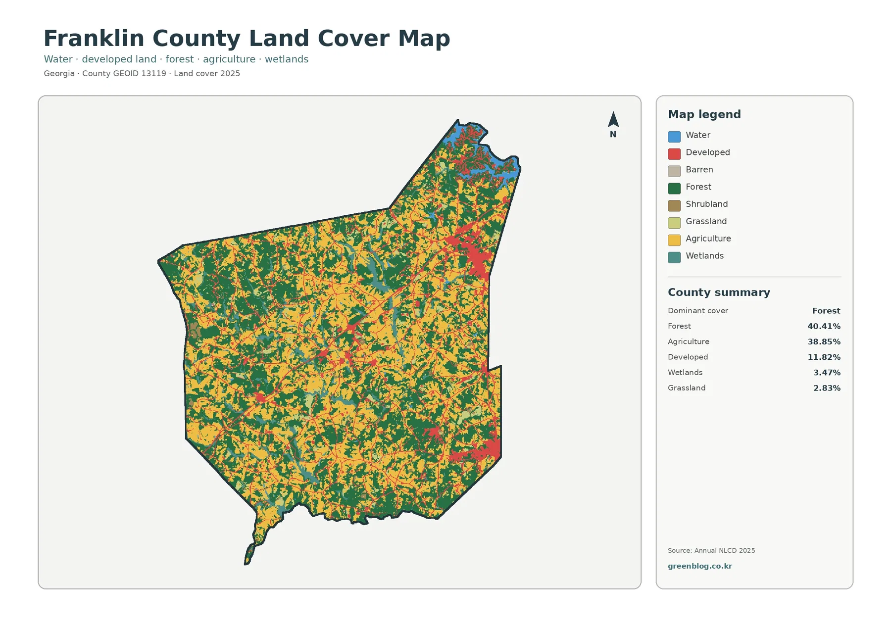
Developed pixels form a different kind of pattern. Instead of covering a large continuous portion of the county, they cluster in several places and trace narrower connections between them. The northeast has the strongest built concentration, another noticeable cluster appears toward the southeast, and smaller developed areas occur through the central part of the county. This arrangement matters because a countywide percentage of 11.82% can sound modest even though local built surfaces are visually prominent within the main communities.
Land cover should not be confused with how a property is legally used. Annual NLCD classifies the physical surface observed from satellite-based information into broad categories such as forest, agriculture, developed land, wetlands, and water. A developed pixel does not establish a zoning designation, and an agricultural pixel does not identify a particular farm, owner, crop, or tax status. Those questions require current local parcel and planning records.
Town clusters and the I-85 corridor stand out more clearly than the countywide percentage suggests
Franklin County’s official website lists five municipalities—Carnesville, Canon, Franklin Springs, Lavonia, and Royston—and identifies Carnesville as the county seat. Those names provide useful reference points for the built patches seen on the maps. The strongest northeastern concentration corresponds to the Lavonia area, while the southeast has a separate concentration around the Royston and Franklin Springs area. Carnesville adds another smaller center within the broader rural pattern.
Georgia DOT’s I-85 strip map shows the interstate crossing Franklin County, with exits serving Lavonia and Carnesville and routes toward Royston and nearby communities. On the impervious-surface image, a narrow southwest-to-northeast line of higher values closely follows this major transportation corridor. The maps establish a spatial association, not a cause-and-effect claim; they show that a transportation route and built surfaces occupy the same general corridor, not that the road alone produced every nearby development.
This distinction is useful when comparing Franklin County with more heavily suburban counties. Here, urban cover remains concentrated around specific places and connections while forest and agriculture continue to dominate most of the county. A map reader can therefore identify both the rural background and the built network without treating one as a substitute for the other.
Separating forest from farmland reveals the rural mosaic in greater detail
The forest-and-farmland view reduces the visual weight of developed and miscellaneous cover so the rural classes are easier to compare. Dark green forest blocks are substantial, particularly across the west and south, but cropland and pasture or hay appear repeatedly between them. The county does not break cleanly into a forest half and a farm half. Instead, the two major covers meet along many irregular edges and alternate over short distances.
Agriculture accounts for 38.85% of the 2025 summary, but the map separates that broad category into cropland and pasture or hay. Some areas appear as larger agricultural fields, while others form smaller pieces embedded within wooded surroundings. This is helpful for describing the county’s broad working-land pattern without claiming that the map identifies a particular crop or farm operation. Individual fields can change between seasons, and a 30-meter raster naturally simplifies narrow boundaries.
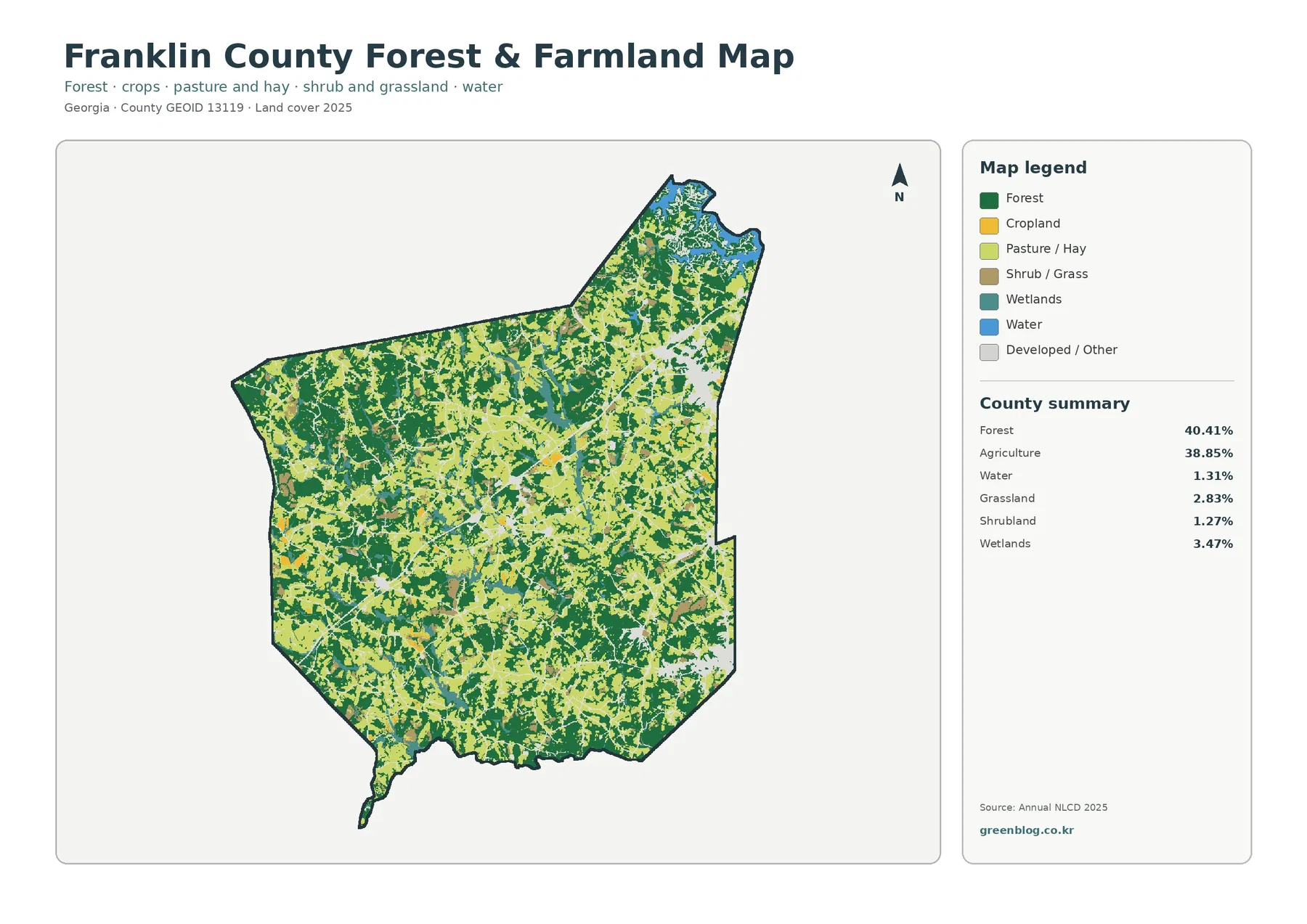
Wetlands at 3.47% and water at 1.31% occupy smaller shares, but they still matter for reading local landscape context. Water is most noticeable near the northeastern edge. Franklin County’s official material references Hartwell Lake, and the U.S. Army Corps of Engineers describes Hartwell Lake as a large reservoir along the Georgia–South Carolina river system. That named water feature helps place the northeastern blue areas in a recognizable regional setting without implying that every small mapped water cell belongs to the lake.
For habitat or watershed discussions, this map is most useful at the county scale. Forest, agriculture, wetlands, and water can be compared as broad cover patterns, but the image does not map wildlife habitat quality, stream condition, conservation ownership, or agricultural management. Those topics need their own datasets. Keeping that boundary clear makes the land-cover map more useful because it answers a specific question: what type of surface was predominantly classified in each location in 2025?
Hard surfaces occupy a much smaller share than the developed class
The impervious map measures a different property from the developed-land class. Impervious surface refers to processed or constructed surfaces such as pavement, concrete, and rooftops that limit direct infiltration. Franklin County’s mean impervious value is 2.61%, and only 1.56% of the county is mapped at 50% impervious or greater. Those values are much lower than the 11.82% developed-land share because many developed areas also contain lawns, trees, bare soil, and other surfaces that are not fully impervious.
The strongest impervious values cluster around the same communities that stand out on the general map. The northeast is especially clear, the southeast contains another compact group, and a thin higher-value line extends diagonally across the county along the major travel corridor. Wide portions of the west and southwest remain near zero or in the lowest impervious categories even where scattered homes and local roads may be present.
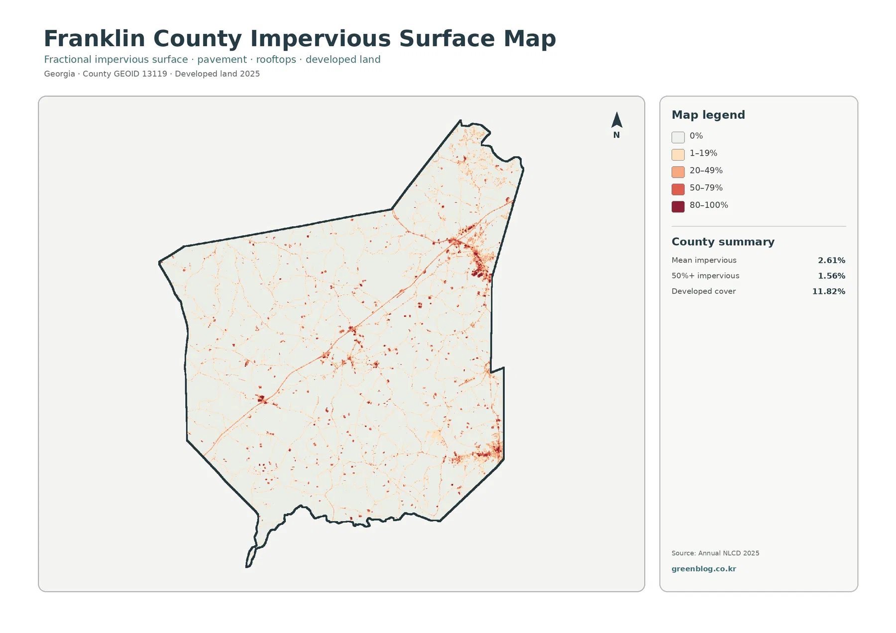
Putting the general map beside the impervious map prevents a common reading error. The land-cover map answers where developed classes occur, while the impervious product is better for distinguishing how much of a 30-meter pixel is occupied by hard constructed surfaces. A lower-density residential area can be classified as developed while still containing substantial vegetation. A smaller commercial or transportation site can show a higher impervious percentage even though it occupies less land.
Impervious cover is relevant to runoff, but this image is not a flood-risk map. Flooding depends on rainfall, slope, soil, streams, drainage infrastructure, and many other conditions. The safest use is to compare the concentration of hard surfaces, then bring in hydrology or hazard datasets if the actual question concerns drainage or flood exposure.
The 1985–2025 map records classification differences, not a single story of development
The change image compares the 1985 and 2025 land-cover classifications. Its summary reports a class difference across 26.01% of the county. Within the displayed categories, 4.11% is shown as change to developed, 9.32% as forest loss, 2.07% as agricultural loss, and 10.05% as other difference. These labels are useful for locating broad change patterns, but the total class-difference percentage must not be treated as an exact measure of land physically cleared, built, or abandoned.
The mapped colors are dispersed across the county. Orange forest-loss cells and purple other-difference cells appear in many western, central, and southern areas, while red change-to-developed cells are easier to notice near town clusters and along some connecting routes. The northeast contains a mix of change categories rather than a single dominant color. The overall image therefore suggests a complicated set of endpoint differences rather than one uniform wave moving across Franklin County.
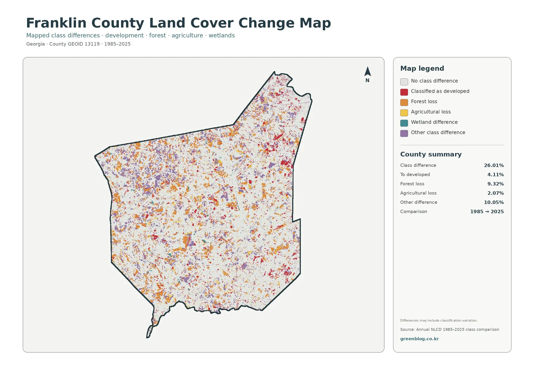
The map itself warns that differences may include classification variation. Annual NLCD is a 30-meter raster product, meaning each cell receives a representative class. A single cell can contain trees, grass, pavement, and buildings at the same time. Differences in imagery, observation conditions, or classification methods can therefore change the assigned class even when the real-world transition is more complicated than the legend label suggests.
Anyone trying to establish when a particular site changed should use more than the two endpoints. Intermediate Annual NLCD years, dated aerial photography, and local parcel or planning records can help verify timing and type of change. The 1985–2025 image works best as a screening map: it points to areas worth examining, while the current 2025 map establishes what the broad surface classification looks like at the later endpoint.
Hartwell Lake and Franklin County’s municipalities provide useful geographic anchors
Named places help turn a countywide raster into a map that readers can relate to the ground. Franklin County’s five municipalities are spread through a landscape where forest and agriculture remain the dominant background. Lavonia anchors the northeastern built cluster, Carnesville is the county seat, and Royston and Franklin Springs help explain the separate southeastern concentration. Canon is another municipal reference within the rural network. The maps do not label every town, but official local information makes these patterns easier to discuss without inventing place names.
Hartwell Lake is another useful anchor because water otherwise represents only 1.31% of the county summary. The lake is regionally significant even though water occupies a small countywide share. The U.S. Army Corps of Engineers notes that Hartwell Lake spans a much larger Georgia–South Carolina river setting. For Franklin County, the important map-reading point is that water is geographically concentrated rather than evenly distributed, and nearby forest, agriculture, wetlands, and developed areas meet within a relatively compact northeastern context.
Local planning information and land-cover information should still be kept separate. Planning documents can describe future growth, land-use policy, infrastructure, or community goals. NLCD classifies what the surface looked like during a mapping year. A planning category cannot be read directly from the NLCD color, and the color cannot substitute for a zoning decision. Using each source for its intended purpose prevents a visually convincing map from being given more authority than it actually has.
Which of the four maps works best for a particular task?
Use the general land-cover map when the goal is to summarize Franklin County in one image. It puts forest, agriculture, developed land, wetlands, water, and smaller classes in the same frame. That makes the near-even forest and agricultural shares immediately understandable while still showing that development is locally concentrated. It is the strongest starting point for a county profile or a side-by-side comparison with another county using the same 2025 classification scheme.
Choose the forest-and-farmland map when rural land is the main subject. By muting development, it makes the many boundaries between forest blocks, cropland, pasture or hay, wetlands, and water easier to follow. For a presentation about built intensity, the impervious map is more appropriate because it distinguishes hard-surface concentration from the broader developed class. The difference between 11.82% developed cover and a 2.61% mean impervious value is a useful example of why those two products answer different questions.
For long-term comparison, pair the 1985–2025 image with the current land-cover map rather than showing the change image alone. White areas on the change map mean no class difference between the two endpoints, not untouched natural land. Red areas mean cells classified as change to developed, not every currently developed pixel. Keeping the current map, legend, and comparison years visible makes the meaning much harder to misread.
Two-map combinations can also work well in classrooms and slide decks. General land cover beside impervious surface highlights the difference between a developed category and hard-surface density. Forest and farmland beside the change map lets the reader compare today’s rural pattern with locations where the endpoint classifications differ. In either case, the maps support broad geographic explanation rather than parcel-level decisions.
Download files, image size, and practical display considerations
The article images are WebP previews intended for efficient browser display. The ZIP archive contains the four original JPG files: general land cover, forest and farmland, impervious surface, and 1985–2025 land-cover change. Each JPG measures 2480×1754 pixels. Using the JPGs rather than screenshots preserves the original map layout and gives more flexibility for resizing in documents or presentations.
The asset manifest does not mark these files as meeting the package’s A3 high-resolution reference. They should therefore not be advertised as guaranteed A3 300-dpi print files. For large physical output, test the intended print size and make sure the title, legend, and small text remain readable. For ordinary reports, handouts, and on-screen slides, scaling the original JPG down is generally preferable to enlarging a web preview.
Avoid cropping away the legend or comparison year when those elements explain the map. The impervious map uses percentage bands that differ from land-cover classes, and the change map uses colors for endpoint differences rather than present-day cover. Keeping the legend visible preserves the context a reader needs to interpret the image correctly after it has been copied into another document.
Scale, date, and interpretation limits
Annual NLCD is raster based and is distributed at 30-meter spatial resolution. That scale is well suited to regional and countywide patterns but does not trace every property boundary or narrow feature. A mixed residential cell can contain a house, trees, lawn, and pavement while still receiving one principal land-cover class. Small stream edges, field margins, and thin wooded strips can also be simplified. Parcel surveys, zoning maps, and local GIS records are the appropriate tools when exact boundaries matter.
The current maps use the 2025 classification year. Construction, vegetation growth, clearing, agricultural rotation, or other changes after that period may not appear. The change map uses 1985 and 2025 as endpoints, so it cannot show every transition that occurred in between. A site could change more than once over four decades and still end with a class that looks simple in a two-date comparison.
Franklin County’s balanced forest-and-agriculture pattern makes it especially important to use more than one view. Start with the general map to understand the countywide mix, use the rural map to examine how forest and agricultural cover interlock, move to impervious surface for built intensity, and use the change map last to locate endpoint differences. That sequence keeps each dataset tied to the question it is designed to answer.
Frequently Asked Questions
Is Franklin County more forested or more agricultural in 2025?
Forest is the largest single class at 40.41%, but agriculture is close behind at 38.85%. The 1.56-point difference is small enough that the map is better described as a mixed forest-and-agriculture landscape than as a county dominated by only one of those covers. Developed land is more locally concentrated and accounts for 11.82% countywide.
Why does the impervious map look much lighter than the developed-land map?
Developed land can include lawns, trees, and other permeable surfaces around homes and lower-density development. Impervious surface measures constructed hard cover more directly. Franklin County has 11.82% developed cover, but the mean impervious value is only 2.61%, with 1.56% of the county mapped at 50% impervious or higher.
Does the 26.01% class difference prove that one-quarter of Franklin County was physically transformed?
No. It means that 26.01% of mapped cells have different land-cover classes at the 1985 and 2025 endpoints. The map warns that classification variation can be part of those differences. Confirming actual clearing, construction, or agricultural conversion requires intermediate imagery, additional Annual NLCD years, or local records.
Sources and reference material
- USGS Annual NLCD Collection 1.2 Land Cover – 2025 coverage, classification context, and 30-meter raster resolution
- MRLC Annual NLCD Data – access to land-cover and related products
- Franklin County, Georgia Resident Services – official list of municipalities and county seat
- Georgia DOT Interstate 85 Strip Map – I-85 route and Franklin County exits
- U.S. Army Corps of Engineers Hartwell Dam and Lake – official regional lake context
- U.S. Census Bureau TIGER/Line Shapefiles – county boundary data
Map File Information
The four original JPG land-cover maps for Franklin County are provided together in one ZIP file.
- Included Versions: General land cover, forest and farmland, impervious surface, and 1985–2025 land-cover change
- Printable Size: 2480×1754 pixels each
- File Type: ZIP containing four JPG files
Related Maps
- Appling County Georgia Land Cover Map
- Atkinson County Georgia Land Cover Map
- Bacon County Georgia Land Cover Map
Green Map creates custom-edited map images using open geographic data sources such as geoBoundaries, Natural Earth, OpenStreetMap, and government open data. These maps are edited visual materials, not raw data files, and are provided for education, documents, presentations, and graphic reference.