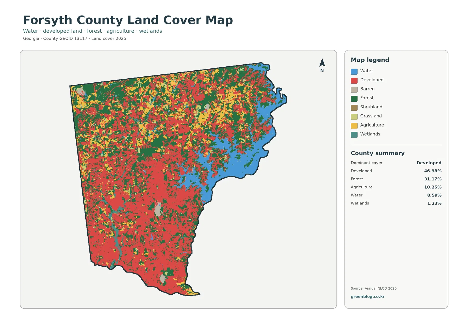
Forsyth County, Georgia, has a land-cover pattern shaped by two strong contrasts. Developed cover accounts for 46.98% of the county in the 2025 summary, while forest remains substantial at 31.17%. Along the eastern side, the broad water area of Lake Lanier breaks up the developed and forested landscape, creating a very different pattern from the more heavily built southern and southwestern portions of the county.
This page brings together four views of the same county: general land cover, forest and farmland, impervious surface, and mapped class differences from 1985 to 2025. The WebP maps can be viewed directly in the article, and the four original JPG maps are available together in one ZIP download below. They are useful for county-scale comparison, classroom work, presentations, and environmental context, but they are not parcel, zoning, ownership, or development-permit maps.
Table of Contents
A county that is heavily developed but still holds large forest and water areas
The 2025 land-cover map is dominated by developed land across the south, southwest, and much of the central area. Red cells form broad connected patches rather than a few isolated urban spots. Moving north, that pattern becomes less continuous and more forest and agricultural cover appears between developed areas. The result is not a uniform suburban surface: the northern portion contains a noticeably greater mix of green and yellow land-cover classes.
The eastern edge changes the picture again. A large blue water body occupies a substantial share of the boundary, with forest wrapping around many of its irregular coves and shoreline sections. Forsyth County’s current comprehensive plan identifies Lake Lanier, along with the Chattahoochee and Etowah Rivers, as important regional water resources. That local context helps explain why water is such a visible part of a county whose largest mapped class is otherwise developed land.
The county summary lists 46.98% developed cover, 31.17% forest, 10.25% agriculture, 8.59% water, and 1.23% wetlands. Grassland is 1.15% and shrubland 0.05%. Those numbers are most useful when read with the map rather than as a ranking alone. Development is the largest class, yet Lake Lanier and the forest around the eastern and northern parts of the county occupy enough space to shape the overall appearance of the map.
Land cover should not be confused with legal land use. A developed class can include neighborhoods with trees and lawns as well as more intensely built commercial areas. Likewise, a forest class does not say who owns the land or whether the property is protected. Annual NLCD groups the observed ground surface into generalized classes, which makes the map well suited to broad county comparisons but not to legal or parcel-level decisions.
Lake Lanier gives the eastern side a different land-cover mix
Water makes up 8.59% of the 2025 summary, an unusually visible share on the map because much of it is concentrated in one large, complex feature. The lake cuts into the county boundary through long coves, so water, forest, and developed cover repeatedly meet over short distances. When the map is reduced to page size, this can look like one blue block with a green fringe. A closer view shows a much more irregular shoreline pattern.
The lake is also useful as an orientation point when comparing the four maps. On the forest-and-farmland map, it separates the wooded eastern shoreline from the more developed interior. On the impervious-surface map, the open water area remains largely blank while harder surfaces appear in clusters around developed shoreline areas. On the change map, it provides a stable geographic reference for judging where class differences are concentrated elsewhere in the county.
Forsyth County’s comprehensive plan places the county on the northern edge of the Atlanta region and discusses Lake Lanier as one of its major natural resources. That planning document and the NLCD maps serve different purposes: one provides policy and regional context, while the other classifies observed surface cover. Using them together can add useful background, but the planning categories should never be treated as if they were the same as the map’s land-cover classes.
Forest and farmland become easier to see when developed land is muted
The forest-and-farmland view reduces the visual weight of developed areas so that natural and agricultural cover stands out. Forest is most prominent across the north and around the eastern lake edge, where larger green patches remain connected in several places. The southern half contains much more gray developed or other cover, although pockets of forest still remain between built areas.
Agriculture accounts for 10.25% of the county. On this map, cropland and pasture or hay appear most often as scattered yellow and light-green patches rather than one continuous agricultural belt. They are more noticeable toward the north and northwest, with smaller pieces elsewhere. This distribution is useful for showing where open agricultural cover remains within a county that is otherwise strongly influenced by development.
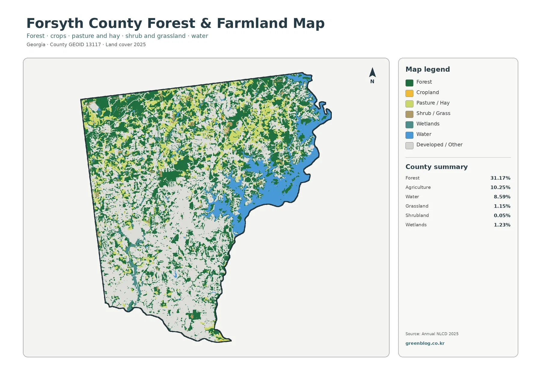
The agricultural colors should be interpreted at the same broad scale as the rest of the dataset. They do not identify individual farms, ownership, crop type, or active agricultural management. Raster land-cover data assigns a representative class to each mapped cell, so a field edge, tree line, house, and road may fall close together. For county-wide environmental or landscape comparison, however, this simplified view makes the remaining forest and open land much easier to locate.
Impervious surfaces show where development is most physically concentrated
Impervious surface means pavement, rooftops, and other hard surfaces that do not readily absorb water. Forsyth County’s mean impervious value is 13.30%, while 8.76% of the county is mapped with impervious cover of 50% or more. Those figures are much lower than the 46.98% developed-cover share because a developed land-cover class can still contain grass, trees, soil, and other permeable surfaces.
The map places the strongest concentrations in the south and southwest, where orange and dark red areas form large clusters. A band of higher values also extends through parts of the central county. Farther north, pale tones and low-value areas become more common. Around Lake Lanier, hard surfaces appear in smaller pieces near developed shoreline areas rather than as one continuous high-impervious zone.
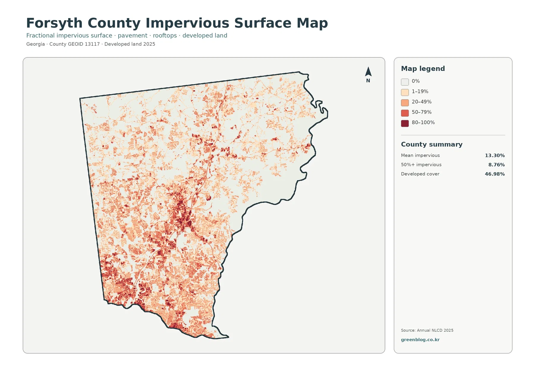
Comparing this map with the general land-cover map prevents a common misunderstanding. The general map answers where land is classified as developed; the impervious map asks how much of the surface within each area is actually covered by hard materials. A low-density neighborhood may therefore be clearly developed on one map but relatively light on the other. That distinction is useful in presentations about urban form or surface conditions.
Impervious cover alone should not be used as a flood-risk map. Hard surfaces can influence runoff, but actual flooding also depends on rainfall, terrain, soils, streams, drainage systems, and other factors. This layer is best used to describe the physical concentration of built surfaces and to identify areas where a more detailed hydrology or stormwater study may be worth consulting.
The 1985–2025 map records class differences, not a complete development history
The change map compares the mapped land-cover classes for 1985 and 2025. It reports a class difference across 43.02% of the county. Of the county area, 33.26% is shown as changed to developed, 2.18% as forest loss, 0.56% as agricultural loss, and 6.97% as other class difference. These categories describe how the two mapped endpoints differ; they should not be read as a complete record of every event that occurred during the forty-year period.
Red areas classified as changed to developed are widespread across the south and west, and sizable patches also appear through the central and northern portions. White areas indicating no class difference are more common around parts of the eastern lake side and in some remaining forest areas. The pattern is broadly consistent with the present-day map’s large developed share, but the two maps answer different questions: one describes 2025 conditions, while the other compares two classification dates.
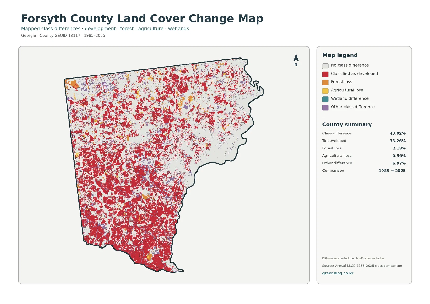
The map itself notes that differences may include classification variation. Satellite-based land-cover products divide the landscape into raster cells, and each cell receives a representative class. Mixed surfaces, differences in source imagery, and changes in classification methods can affect how a cell is labeled. A small colored patch therefore should not be treated as proof of a specific subdivision, road project, or clearing event without additional evidence.
For a location-specific history, use intermediate-year imagery or annual land-cover products and compare them with county planning, permit, or parcel records. The 1985 and 2025 endpoints are useful for locating broad areas of change, but they do not reveal the exact year of a transition. That limitation is especially important in a fast-changing county, where several rounds of development or vegetation change may have occurred within the same period.
Choosing the right map for a report, lesson, or local comparison
For a quick overview, start with the general land-cover map. It puts development, forest, agriculture, water, and wetlands in one frame and makes the contrast between the developed south and the lake-and-forest east immediately visible. It is the best single image when a presentation needs one county-wide summary or when comparing Forsyth County with another county using the same land-cover categories.
Use the forest-and-farmland map when the question is about green space, agricultural cover, or where open land remains. The impervious-surface map is better for comparing the intensity of hard surfaces inside developed areas. For long-term change, pair the 1985–2025 change map with the current land-cover map so viewers can distinguish present conditions from differences between the two dates.
These maps can also work well in environmental education. Students can compare the lake edge with the heavily developed south, examine where forest remains continuous, and then see how the impervious layer changes the interpretation of developed land. The key is to keep the map legend visible and state clearly what each layer measures. That avoids turning a simple land-cover classification into a claim about zoning, habitat quality, flood risk, or property status.
Scale, image resolution, and other limits to keep in mind
The maps are designed for county-scale viewing. Annual NLCD is raster data, meaning the landscape is represented as a grid of cells rather than exact parcel polygons. A boundary between colors may therefore cut across a real-world lot or combine several nearby surface types into one generalized class. Parcel ownership, zoning, building permissions, and legal boundaries require the appropriate local government records.
The 2025 maps represent the supplied dataset year and may not include changes that happened afterward. New construction, vegetation removal, forest regrowth, or changes in agricultural cover can appear on the ground before they are reflected in a land-cover product. When a decision depends on the current condition of a specific location, recent aerial imagery and official county data should be checked alongside these maps.
The article images are WebP versions for convenient viewing online. The download ZIP contains the four original JPG maps at 2480×1754 pixels each: general land cover, forest and farmland, impervious surface, and 1985–2025 land-cover change. The package does not mark these source images as meeting an A3 300 dpi high-resolution reference, so print sharpness should be checked at the intended physical size before producing a large-format print.
For documents and slides, keep the title, legend, and year visible whenever possible. The general map and the change map both use strong colors, but they describe different things. Preserving those labels makes it much less likely that a viewer will mistake a 1985–2025 class-difference area for a current land-cover class.
Frequently Asked Questions
Does 46.98% developed cover mean that nearly half the county is paved?
No. Developed land cover includes areas where buildings and roads are mixed with lawns, trees, soil, and other permeable surfaces. The county’s mean impervious value is 13.30%, which is much lower than the developed-cover share. Use the general land-cover map to see the extent of developed classes and the impervious map to see where hard surfaces are most concentrated.
Why is Lake Lanier important when reading these maps?
Water accounts for 8.59% of the 2025 county summary, and much of that area is concentrated along the eastern side in Lake Lanier. The lake creates a strong contrast with the developed south and west and is bordered by a mix of forest and developed shoreline. It also provides a useful fixed reference point when comparing all four map layers.
Can the 43.02% class difference from 1985 to 2025 be treated as measured development area?
No. The 43.02% figure covers all cells whose mapped class differs between the two endpoints, and the map notes that some differences may reflect classification variation. Although 33.26% is categorized as changed to developed, confirming actual development area or timing requires intermediate imagery and local records.
Map File Information
The four original Forsyth County land-cover JPG maps are provided together in one ZIP file.
- Included Versions: general land cover, forest and farmland, impervious surface, and 1985–2025 land-cover change
- Printable Size: 2480×1754 pixels each
- File Type: ZIP containing four JPG files
Related Maps
- Appling County Georgia Land Cover Map
- Atkinson County Georgia Land Cover Map
- Bacon County Georgia Land Cover Map
Sources and further reference
- MRLC Annual NLCD Data – annual land-cover and related datasets
- USGS Annual NLCD Land Cover Classification – definitions and classification guidance
- Forsyth County Foster Forsyth Comprehensive Plan 2022–2042 – county planning context and major water resources
- U.S. Census Bureau TIGER/Line Shapefiles – county boundary data
Green Map creates custom-edited map images using open geographic data sources such as geoBoundaries, Natural Earth, OpenStreetMap, and government open data. These maps are edited visual materials, not raw data files, and are provided for education, documents, presentations, and graphic reference.