Naugatuck Valley Planning Region has an unusually close split between forest and developed land. The 2025 summary places forest at 47.44% and developed cover at 40.67%, so neither wooded land nor built-up areas alone defines the region. The four maps on this page let you compare that broad pattern with forest and farmland, impervious surfaces, and mapped class differences between 1985 and 2025.
The WebP images are intended for quick viewing on the page, while the four original JPG maps are available together in one ZIP download. They are useful when you need a regional reference for the Waterbury-centered valley, want to separate developed cover from hard surfaces such as pavement and rooftops, or need a long-term comparison map. Land cover describes what is physically covering the ground; it is not a zoning map, ownership map, or statement about what may legally be built on a parcel.
Table of Contents
A region where forest and development occupy nearly equal shares
The Naugatuck Valley Planning Region sits in west-central Connecticut and contains nineteen municipalities. NVCOG describes Waterbury as both its largest municipal member and its geographic center, while the wider planning area includes urban, suburban, and rural communities. That mix is visible in the 2025 land-cover map. Large developed areas occupy the middle of the region and appear again toward the south and at the northern end, but broad forested tracts remain around and between those concentrations. The result is a map with two dominant colors rather than one cover type spreading almost continuously from edge to edge.
Forest accounts for 47.44% of the mapped area, only 6.77 percentage points more than developed land at 40.67%. Agriculture is much smaller at 4.96%, wetlands make up 4.43%, and water covers 1.72%. The distribution matters as much as the totals. Yellow agricultural patches are easier to find in parts of the western half and southwest, while wetland and water colors tend to appear as smaller, irregular features. Forest is broad in several outer sections, yet the central developed zone interrupts that green cover and creates a strong contrast through the middle of the planning region.
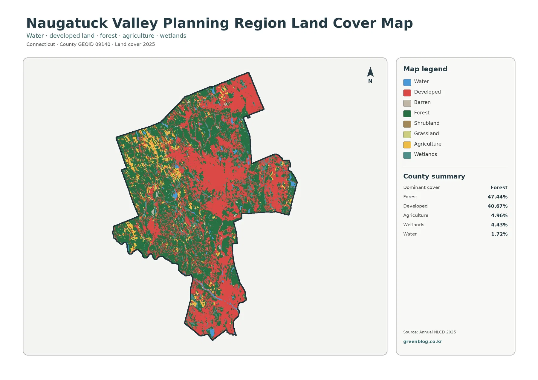
The general map is the best place to start because it keeps all major classes visible at the same time. It shows that development is not confined to one isolated city footprint, and forest is not restricted to a single remote corner. Developed cover forms a substantial central concentration and continues in other clusters, while forest remains extensive around much of the region. The western side also contains more visible agricultural patches than many of the heavily developed sections. Wetlands and water are present throughout the map but occupy a much smaller share, so they require closer inspection than the dominant red and green classes.
NVCOG lists Ansonia, Beacon Falls, Bethlehem, Bristol, Cheshire, Derby, Middlebury, Naugatuck, Oxford, Plymouth, Prospect, Seymour, Shelton, Southbury, Thomaston, Waterbury, Watertown, Wolcott, and Woodbury as the nineteen member municipalities. The supplied land-cover images do not draw or label all of those municipal boundaries, however. A red patch should therefore not be assigned to a particular town solely from this map. For town-level comparisons, add a municipal boundary layer or consult a local GIS source. The page is designed first to explain the planning region as one county-equivalent geography.
The valley setting helps explain what to look for, without turning the map into a road atlas
Regional planning material from NVCOG identifies the Naugatuck River as a major north-south river through the region and the Housatonic River as an important feature along the western side. Those waterways provide useful geographic context for a planning region whose settlement pattern has long been associated with valleys and transportation corridors. They should not be treated as an explanation for every red area on the map, but they give the reader a practical way to orient the central and southern parts of the region before comparing forest, developed land, and wetlands.
Waterbury is especially useful as a reference point because the official regional profile identifies it as the largest city and geographic center. A broad developed concentration is visible near the middle of the map, with additional developed cover extending into the southern portion. At the same time, large forest blocks remain immediately outside the strongest concentrations. This side-by-side pattern is important: the planning region is neither uniformly urban nor uniformly wooded. A single regional percentage can hide the sharp local changes that occur over relatively short distances.
Some developed strips may appear to follow transportation routes, but the land-cover map does not identify road names or the dates when roads and neighborhoods were built. It would be an overreach to say that a particular highway caused a visible development pattern based on this image alone. A better use is to identify where developed cover is concentrated, then compare that observation with a transportation map or a municipal plan when the relationship matters. Keeping the datasets separate makes the land-cover interpretation more reliable.
Removing the red developed layer brings forest and small agricultural areas forward
The forest and farmland view changes the visual emphasis. Developed and other cover becomes a pale background, while forest, cropland, pasture or hay, shrub and grass cover, wetlands, and water remain highlighted. Forest at 47.44% becomes much easier to follow across the western side, around the central developed core, and through several outer sections of the region. Instead of seeing green as the second major color competing with red, the reader can focus on where wooded cover remains broad and where it is broken into smaller pieces.
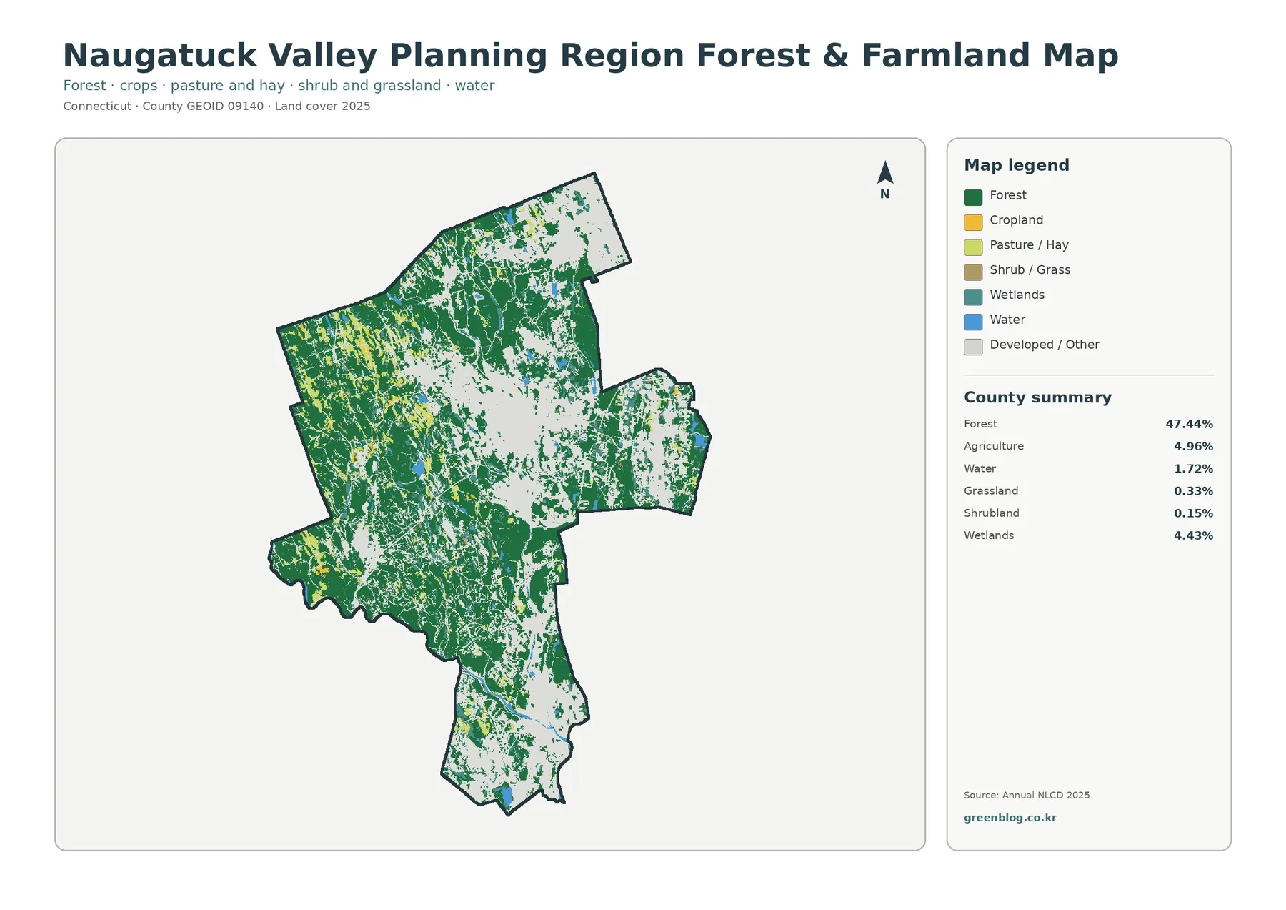
Agriculture represents 4.96% of the region and appears as scattered yellow areas rather than one continuous farming belt. Several of the more noticeable patches lie toward the western half, mixed among forest and other open cover. Grassland is only 0.33% and shrubland 0.15%, so neither forms a major regional block on the map. These small percentages are a reminder that a bright local patch can be visually noticeable even when its share of the entire planning region is modest. The map is most useful for locating broad concentrations, not for measuring individual farms or fields.
Wetlands account for 4.43% and water for 1.72%. Their shapes are generally narrower and more fragmented than the large forest and developed areas, which makes them easier to miss at first glance. Because land-cover classification is based on mapped surface conditions, a wetland-colored cell is not automatically the same thing as a legally regulated wetland boundary. The same caution applies to agriculture: a cell classified as agricultural cover does not establish ownership, tax status, preservation status, or zoning. Those questions require parcel or regulatory data from the relevant municipality or state agency.
Forest cover also has limits as a category. The green areas do not tell you tree species, stand age, public access, ownership, or legal protection. NVCOG maintains a separate Regional Open Space Inventory for questions about protected land and ownership-related attributes. The forest map here serves a different purpose: it makes the broad distribution of wooded cover easy to compare with agriculture, wetlands, water, and developed areas. Using the right dataset for the right question avoids confusing land cover with land management.
An average impervious surface of 10.77% reveals a different side of development
Impervious surface means hard cover that does not readily absorb water, such as pavement, parking lots, and rooftops. The regional mean is 10.77%, and 7.46% of the mapped area falls in cells that are at least 50% impervious. Those values are much lower than the 40.67% developed-cover figure, and that difference is expected. A developed land-cover class can include lawns, scattered trees, and other permeable surfaces around buildings, while the impervious layer measures the hard portion more directly.
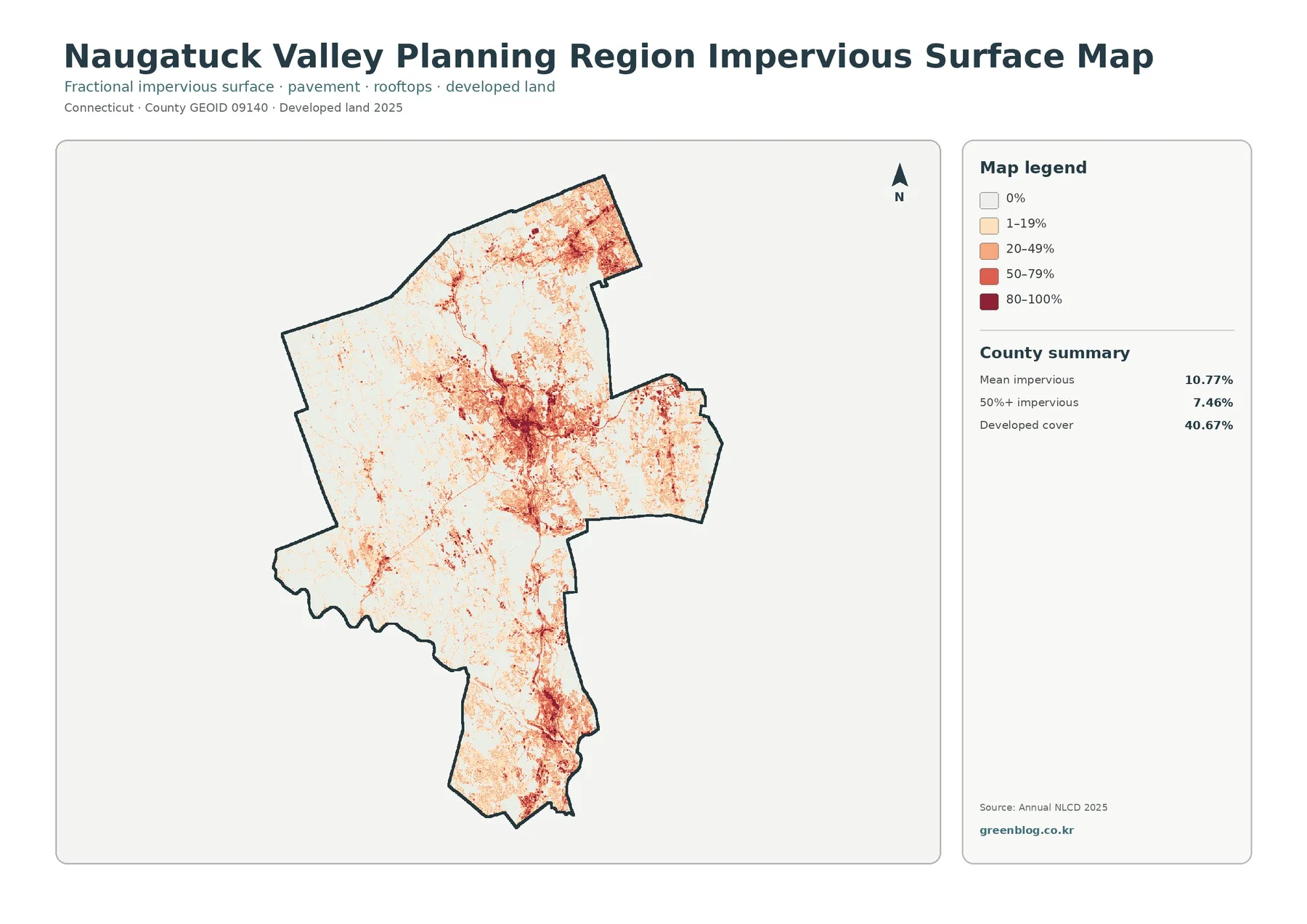
The strongest impervious values are concentrated around the large developed area in the center and repeat through several southern clusters. Another noticeable concentration appears toward the northern end, while much of the more forested west and southwest stays white or pale. The pattern is more selective than the general developed layer. A neighborhood may be classified as developed because homes and streets are present, yet still contain enough yards and tree cover to have a moderate impervious percentage. A commercial or dense urban block can fall into a much darker category.
This map can help identify places where hard surfaces are concentrated, but it is not a flood-risk map. Runoff also depends on rainfall, slopes, soil, drainage systems, stream conditions, and many other factors. The 10.77% mean is a planning-region average as well, not the value for Waterbury or any other individual municipality. If a project requires a town-specific number, the impervious data need to be summarized within that town’s boundary rather than copied from the regional total.
Comparing the first and third maps side by side is particularly useful in this region because developed cover is so extensive. The first map answers where the broader developed class is found. The impervious map answers where the hard surface component is strongest within and around those developed areas. Seeing both prevents a common mistake: treating every developed pixel as if it were completely paved or built over.
The 1985–2025 comparison flags class differences across 11.34% of the region
The change map compares the 1985 and 2025 land-cover classifications. It reports a class difference across 11.34% of the planning region. Areas classified to developed account for 5.85%, forest loss for 0.63%, agricultural loss for 0.20%, and other class differences for 4.54%. Most of the map remains in the pale no-class-difference category, but red change marks are visible across the central and southern developed areas and in smaller clusters elsewhere.
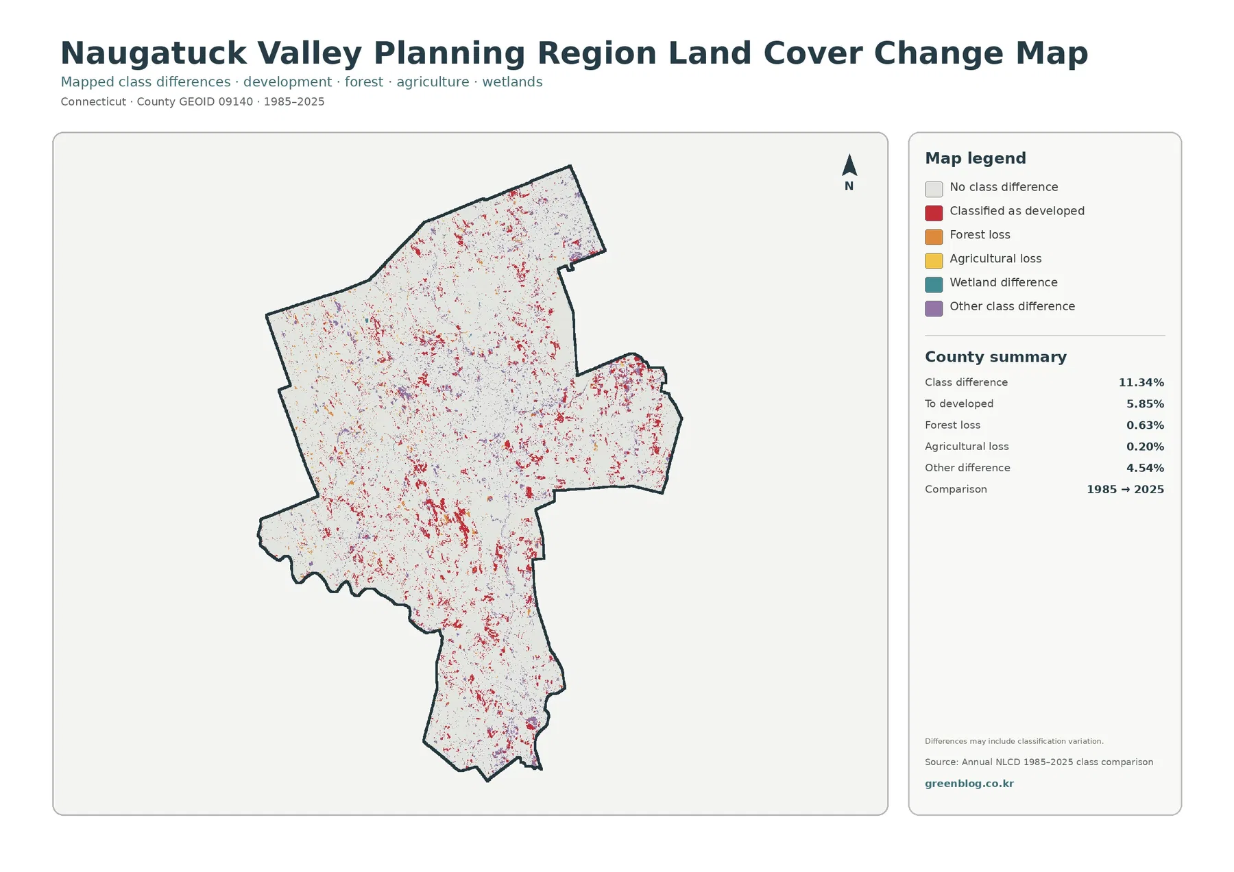
The 5.85% change-to-developed figure should not be confused with the current developed share of 40.67%. The larger number describes all land classified as developed in 2025. The smaller number describes places where the 1985 and 2025 classes differ in the direction shown by the change legend. A long-established downtown can therefore be developed today without appearing as a new red change area. Likewise, a small red mark identifies a classification difference, not the exact date or cause of a construction project.
The map itself warns that differences may include classification variation. Satellite observations, classification procedures, mixed land-cover cells, and boundary effects can all contribute to differences between years. For that reason, 11.34% should be described as mapped class difference rather than as a precise statement that exactly 11.34% of the physical landscape was transformed. When a particular location matters, historical aerial imagery, municipal records, or a more specialized environmental dataset should be checked before assigning a cause.
The forest-loss and agricultural-loss categories are relatively small as percentages of the entire planning region, but regional totals can hide locally important changes. The change map works well as a screening tool because it points to areas that deserve closer attention. Pairing it with the 2025 land-cover map then shows the present classification, while older imagery or local records can help determine what happened between the two dates. That sequence is more informative than trying to read a development history directly from the change colors.
Why the boundary is labeled a Planning Region rather than a traditional Connecticut county
Connecticut now uses its planning regions as county-equivalent areas for current Census geography. Census TIGERWeb lists Naugatuck Valley Planning Region with GEOID 09140 and county code 140. That distinction matters when older maps still use the state’s historic county names. The nineteen municipalities in this planning region came from areas that were historically associated with more than one county, so the boundary on this page should not be interpreted as the complete boundary of an old county such as New Haven or Litchfield.
NVCOG’s regional profile describes the planning area as approximately 422 square miles with a 2020 Census population of 450,376. It also notes that the region contains the entire Census-defined Waterbury urban area and portions of other urban areas in Connecticut. Those facts help explain why a single map can contain a large central developed concentration, smaller developed clusters, extensive wooded land, and scattered agricultural cover. They provide context rather than a formula: population and urban-area boundaries do not directly determine a land-cover class.
The planning-region boundary is useful because it allows all nineteen municipalities to be summarized as one current Census county-equivalent geography. It can also make comparisons confusing when a reader expects the old county system. If you combine this map with population, transportation, or environmental data, verify that the other dataset uses the same 09140 boundary. A mismatch between planning-region and historic-county geography can produce totals that look plausible but refer to different areas.
Reading the colors at the right scale prevents parcel-level mistakes
Annual NLCD is a classified raster dataset, meaning the landscape is represented through a grid rather than through surveyed parcel boundaries. Real places often contain several surfaces within a small area: trees behind houses, lawns beside streets, narrow streams, parking lots, and small fields can all sit close together. A map cell must still be represented by a class or a percentage, so fine details are simplified. Enlarging the image makes the pixels larger on screen but does not turn them into parcel surveys.
Mixed settings are especially important in the Naugatuck Valley because forest and development frequently sit near each other. A suburban cell can be developed in the land-cover map while showing only a modest impervious percentage. A narrow wetland or stream edge can also be generalized where several cover types meet. These are normal characteristics of regional land-cover mapping, not necessarily errors. Use the map to compare broad patterns first, then move to local GIS or field information when exact boundaries matter.
The dates also set a limit on interpretation. The current land-cover, forest and farmland, and impervious maps summarize 2025 conditions, while the change map compares 1985 with 2025. Construction, clearing, regrowth, or other changes after 2025 will not be represented in those current layers. For a present-day parcel decision, recent municipal GIS and aerial imagery are more appropriate. For regional reference, education, and broad environmental comparison, the four-map set provides a consistent way to view the same planning-region boundary from complementary angles.
Choosing the right JPG map for a report, class, or regional comparison
Use the general land-cover map when the goal is to explain the whole region in one figure. It keeps the 47.44% forest and 40.67% developed shares visible alongside agriculture, wetlands, and water. The forest and farmland version is better when wooded land and the smaller agricultural patches are the subject, because the developed background is visually reduced. This is useful for comparing the western open and wooded areas with the more strongly developed parts of the region without losing the regional outline.
Choose the impervious map when the amount of hard surface matters more than the broad developed class. Its categories run from 0% through 80–100%, so it distinguishes lightly developed areas from locations where pavement and rooftops occupy a much larger share of the ground. Use the 1985–2025 map for historical comparison, but pair it with the current map whenever readers also need to know what the land is classified as today. The two maps answer different questions and are clearer together than when either is forced to do both jobs.
The download contains all four original JPG files. For printing or presentation work, keep the original aspect ratio and make the map large enough for the legend to remain readable. A report can introduce the general land-cover map first, then add the impervious or change map only where that extra detail supports the discussion. When quoting numbers, label the 2025 values as current mapped cover and the 1985–2025 values as class differences. Also note that all percentages refer to the full Naugatuck Valley Planning Region rather than to any single municipality.
Frequently Asked Questions
Why is developed cover 40.67% while mean impervious surface is only 10.77%?
Developed land is a broad cover class that can include lawns, trees, and other permeable surfaces around homes and businesses. Impervious surface measures the harder portion such as pavement, parking areas, and rooftops, so the two percentages are not expected to match.
Is Naugatuck Valley Planning Region the same as one of Connecticut’s historic counties?
No. Current Census geography uses Connecticut planning regions as county-equivalent areas. Naugatuck Valley Planning Region is GEOID 09140, county code 140, and combines nineteen municipalities rather than reproducing one historic county boundary.
Does the 11.34% class difference mean exactly 11.34% of the landscape physically changed?
Not necessarily. The change layer compares the 1985 and 2025 classifications, and the map notes that some differences may reflect classification variation. Historical imagery or local records are needed before assigning a specific physical cause to a mapped change area.
Sources and Reference Data
- MRLC Annual NLCD Data – land-cover and impervious-surface data
- USGS Annual NLCD Land Cover Classification – classification reference
- U.S. Census Bureau TIGERWeb – Connecticut Counties – current planning-region county-equivalent geography and GEOID
- Naugatuck Valley Council of Governments – Our Towns – the nineteen member municipalities
- NVCOG Naugatuck Valley Regional Profile – regional size, population, and urban-suburban-rural context
- NVCOG Multi-Jurisdictional Hazard Mitigation Plan – Naugatuck and Housatonic river context
Map File Information
Download the four original JPG maps described on this page: general land cover, forest and farmland, impervious/developed land, and 1985–2025 land-cover change.
- Included Files: 4 JPG maps
Related Maps
- Capitol Planning Region Connecticut Land Cover Map
- Greater Bridgeport Planning Region Connecticut Land Cover Map
- Lower Connecticut River Valley Planning Region Connecticut Land Cover Map
Green Map creates custom-edited map images using open geographic data sources such as geoBoundaries, Natural Earth, OpenStreetMap, and government open data.
These maps are edited visual materials, not raw data files, and are provided for education, documents, presentations, and graphic reference.