The Capitol Planning Region combines one of Connecticut’s strongest urban concentrations with broad forested areas around its outer towns. In the 2025 land-cover summary, forest is the largest class at 42.83%, while developed land is close behind at 37.16%. That near balance is the main story of the region: Hartford and the surrounding urban belt occupy a large share of the center and southwest, but extensive woods remain across the east, northeast, and parts of the western side.
This page includes four views of that pattern: current land cover, forest and farmland, impervious surface and developed land, and mapped change from 1985 to 2025. The WebP images are useful for quick viewing in the article, and the four original JPG maps are available together in one ZIP below for printing, classroom work, presentations, or side-by-side reference.
Table of Contents
A region where the Hartford urban core meets large wooded edges
The full land-cover view makes the central contrast easy to see. Developed land forms a broad, connected area around Hartford, East Hartford, West Hartford, and the communities extending toward New Britain. Farther north, development continues in smaller clusters and corridors toward Windsor and Enfield. The eastern side changes quickly: forest becomes much more continuous around communities such as Tolland, Mansfield, Willington, and Stafford, with roads and settled areas appearing as thinner breaks through the green.
This mix fits the character of the Capitol Planning Region itself. Connecticut uses planning regions as a framework for municipalities to address shared regional issues, while the Capitol Region Council of Governments serves communities with urban, suburban, and rural development patterns. The map therefore should not be read as a single metropolitan surface. It contains a dense capital-city core, older urban centers, suburban belts, river-valley agriculture, and large outer landscapes where forest remains the dominant cover.
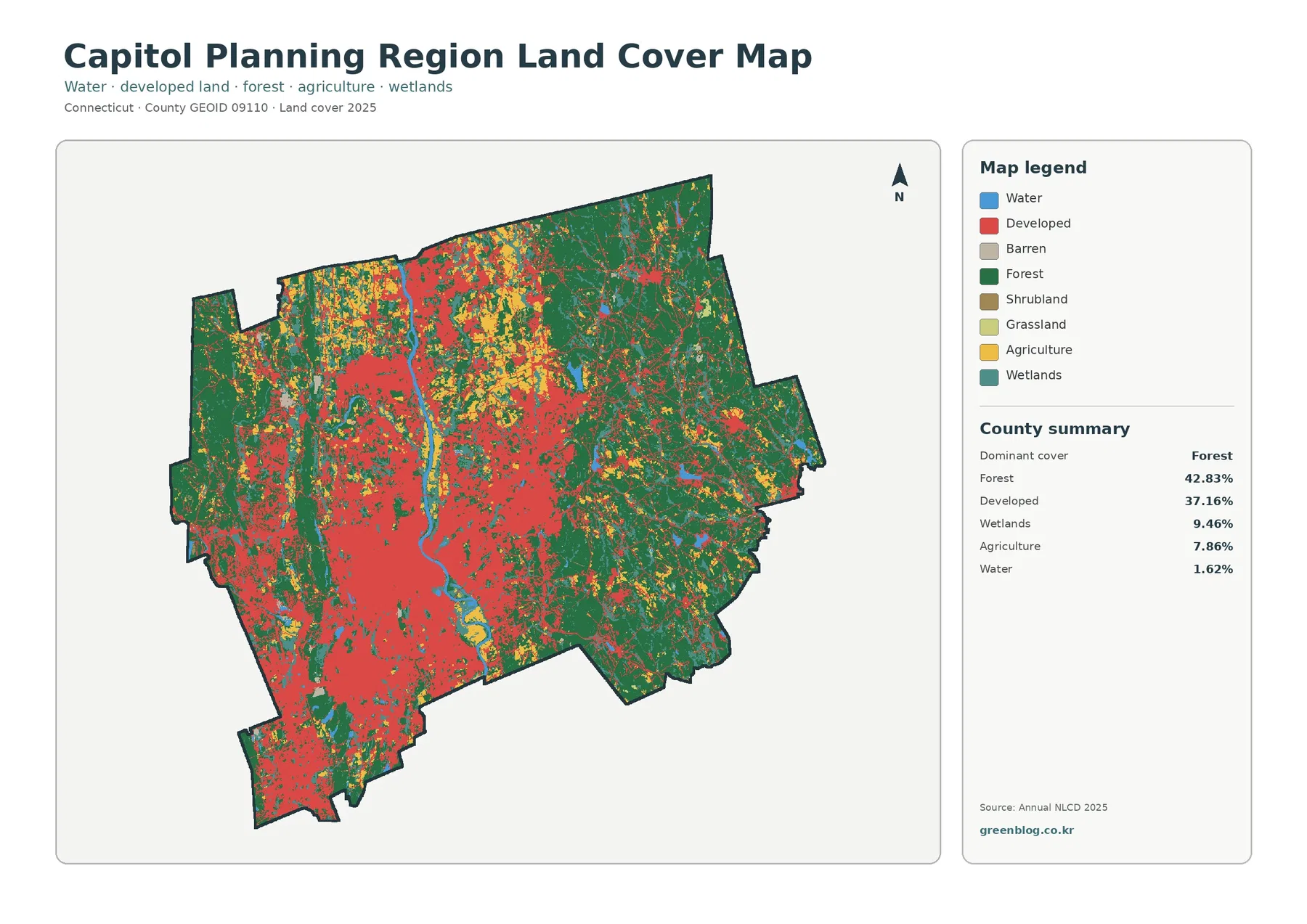
Forest and developed land account for most of the mapped area, but the smaller classes help explain why the landscape looks so varied. Wetlands make up 9.46%, appearing in many narrow and irregular patches rather than as one single block. Agriculture accounts for 7.86% and is especially visible north of Hartford and along parts of the Connecticut River valley, with additional pockets in the eastern towns. Water is only 1.62% by area, yet the river and scattered lakes provide strong landmarks for orienting the other cover types.
Forest dominates many eastern and outer communities
The forest-and-farmland view removes much of the visual weight of developed land, making the green areas easier to compare. The broadest forest cover lies across the eastern and northeastern part of the planning region. Around Mansfield, Tolland, Willington, and Stafford, large wooded areas connect across town boundaries even though roads and small developed centers interrupt them. Forest is also important west of Hartford around Simsbury, Canton, Avon, and nearby communities, but the western pattern is more interwoven with suburban development.
A 42.83% forest share is notable in a region anchored by Connecticut’s capital and several sizable urban communities. The figure does not mean that nearly half of every municipality is wooded. Instead, the large forested outer towns offset much denser development closer to Hartford and New Britain. This distinction matters when the map is used for regional comparisons: a planning-region average can describe the whole area accurately while still hiding sharp differences between individual towns.
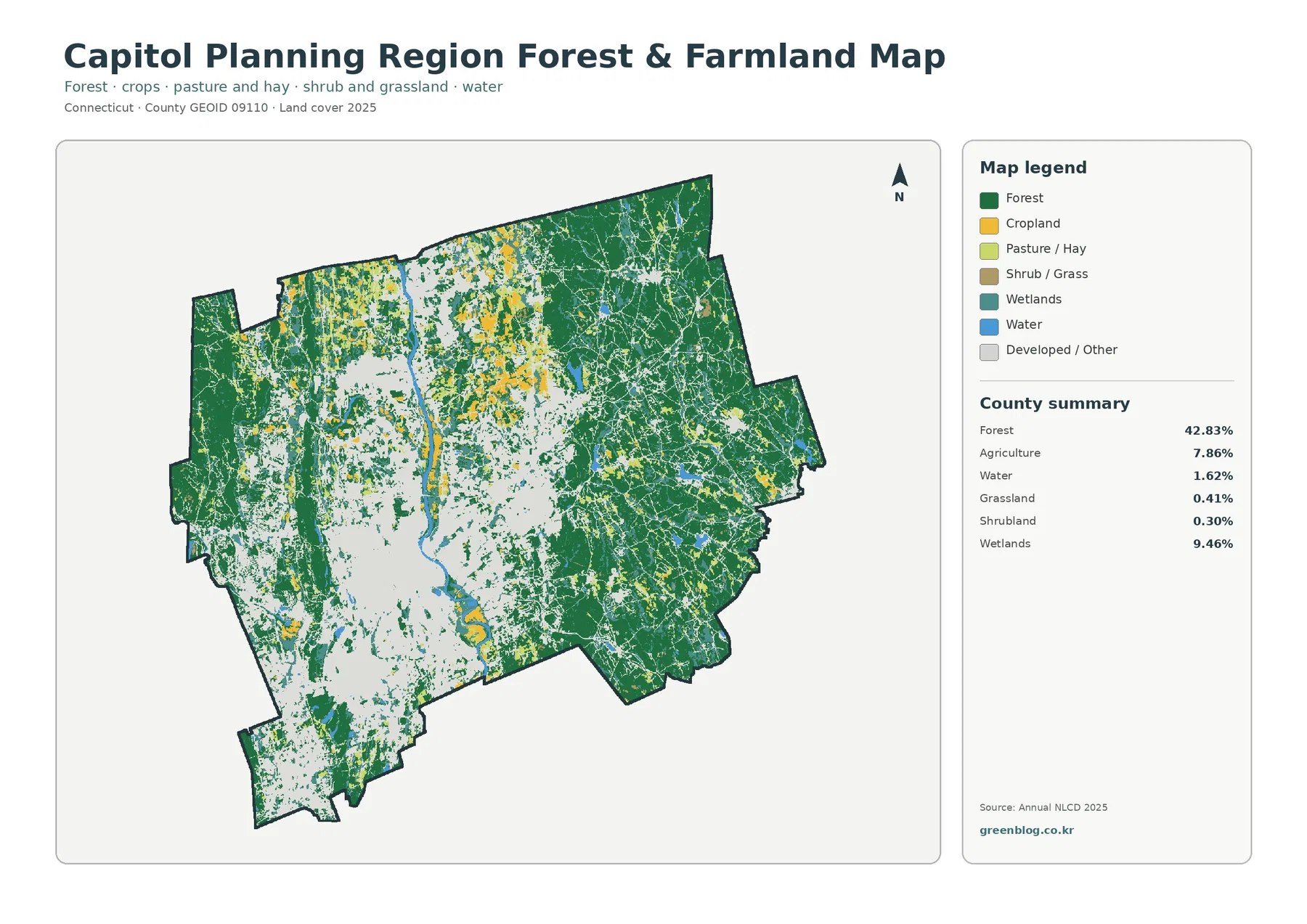
Agriculture is distributed differently from forest. It appears in patches rather than in a continuous regional block, with some of the clearest concentrations in the northern Connecticut River valley around Suffield, East Windsor, and Enfield. Cropland and pasture also appear in smaller openings farther east. South of Hartford, agricultural cover becomes less prominent where developed land occupies more of the landscape, although isolated fields remain near the river and on the edges of suburban communities.
Grassland is only 0.41% and shrubland 0.30% in the county summary, so neither should be treated as a defining regional cover type. On the map they tend to appear as small pieces within a much larger forest-agriculture-development mosaic. Wetlands are far more significant at 9.46%. Their scattered pattern is useful when comparing wooded areas with stream corridors and low-lying land, especially in the eastern half where forest and wetland colors frequently occur close together.
Impervious cover separates dense centers from lower-density development
Developed land is a broad classification. It can include a dense downtown, a commercial corridor, suburban neighborhoods, and lower-density areas with lawns and trees. The impervious-surface view adds another layer by estimating surfaces such as pavement and rooftops where water does not readily soak into the ground. Across the Capitol Planning Region, mean impervious cover is 10.50%, while 7.49% of the area falls in the 50% or greater impervious category. Both values are much lower than the 37.16% developed-land share because developed areas are not uniformly paved.
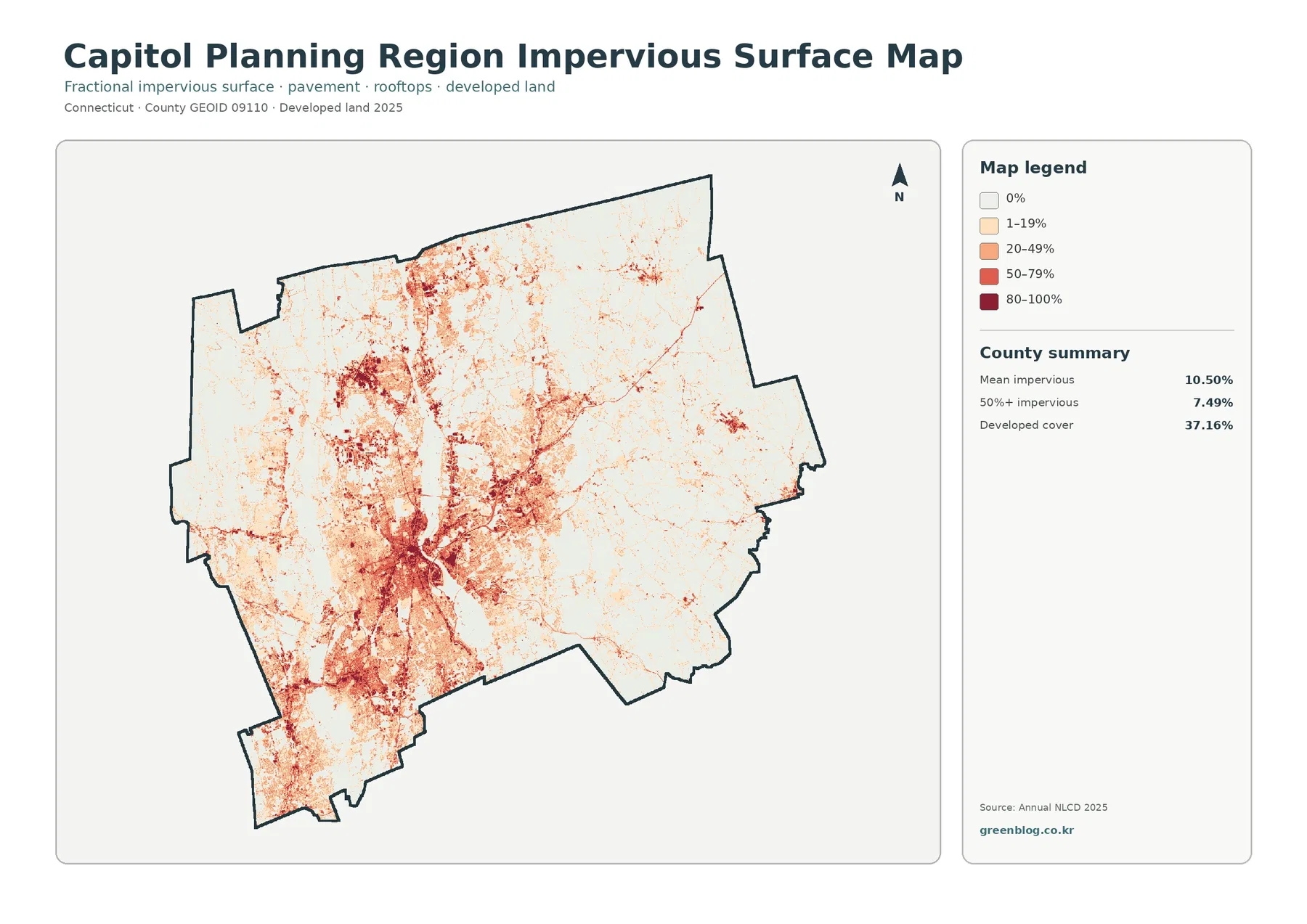
The darkest concentrations cluster around Hartford and East Hartford, then extend into the surrounding urban and suburban belt. New Britain stands out to the southwest, and additional built-up nodes appear northward around Windsor and Enfield. Between those centers, many roads and settlement corridors form thinner lines of impervious cover. In the eastern towns, the darkest classes become sparse and isolated, which matches the much larger forest share seen in the previous map.
This map can support a basic watershed or stormwater discussion because pavement and rooftops shed water differently from forest or fields. It does not, however, provide a flood-risk result on its own. Flooding depends on terrain, drainage systems, soils, rainfall, stream conditions, and other factors. A responsible use of the impervious map is to identify where hard surfaces are concentrated and then combine that information with hydrology or municipal drainage data if the project requires a more detailed assessment.
The 1985–2025 map records scattered change rather than a wholesale shift
The change view compares mapped classes in 1985 and 2025. A class difference appears across 12.66% of the region. The largest single category is change to developed land at 5.50%, followed by 5.71% in other class differences. Forest loss is summarized at 0.92%, and agricultural loss at 0.35%. Most of the map remains very light, indicating no class difference for the majority of 30-meter cells between the two comparison years.
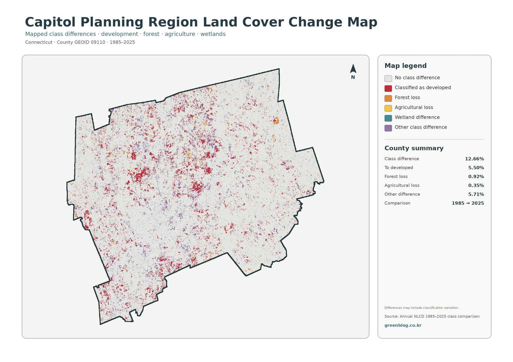
Cells classified as changing to developed land are spread across the established metropolitan area and many of its outer communities rather than concentrated in one single expansion front. Patches occur around the edges of Hartford-area development, near suburban centers, and in smaller clusters farther north and east. That distribution is consistent with a region containing many separate municipalities and town centers. The map supports a statement that development-related change is widespread, but it does not support a claim that one road, policy, or project caused the pattern.
Change colors also require caution because Annual NLCD is a classified raster product. A difference between two dates can reflect a real change on the ground, but it can also include classification variation, especially along boundaries where trees, grass, buildings, and pavement share the same 30-meter cell. The map itself notes that differences may include classification variation. For a parcel-level history, local assessor records, municipal GIS, historic aerial photography, or permit information are more appropriate sources.
The Connecticut River corridor brings several cover types close together
The north–south water corridor through the center of the region provides one of the clearest geographic references on all four maps. Around Hartford and East Hartford, developed land approaches both sides of the Connecticut River. Moving north toward Windsor, East Windsor, Suffield, and Enfield, the surrounding pattern becomes more mixed: development remains visible, but agricultural patches and open areas become easier to distinguish. This transition is especially clear when the general land-cover map is compared with the forest-and-farmland version.
Wetlands do not appear only along the main river. Numerous smaller wetland patches occur around tributaries, low areas, and wooded landscapes across the planning region. In the east, teal wetland colors repeatedly sit within or beside large forest blocks. Smaller wetland cells also remain within suburban and developed parts of the region. That distribution helps explain why wetlands reach 9.46% of the regional summary even though there is no single wetland complex dominating the entire map.
Water covers 1.62% of the mapped area, a modest percentage that still has outsized value for orientation. The Connecticut River helps locate the Hartford core, while smaller lakes and reservoirs create recognizable reference points within forested areas. For detailed stream names, drainage networks, or floodplain boundaries, a dedicated hydrography map should be used instead. The land-cover maps are best for showing how water and wetland classes sit next to forest, agriculture, and development.
Choosing the right map for a specific question
For a quick overview of the region, the current land-cover map is the strongest starting point because it keeps all major categories visible at once. It shows how the Hartford–New Britain urban belt fits within a much larger landscape of forest, wetlands, farmland, and water. The forest-and-farmland version is better when the goal is to compare open and wooded land without dense development colors dominating the page. Northern agricultural patches and the broad eastern forest stand out more clearly in that simplified view.
The impervious map answers a different question: where are the hardest, most continuously built surfaces within the broad developed class? It is useful for comparing Hartford with lower-density suburban areas and the lightly developed eastern towns. The change map shifts the focus from present condition to a forty-year comparison. If the question is where development-related classification appeared between 1985 and 2025, that map provides the most direct visual evidence, while the current land-cover map shows what those places look like in the latest classification.
Using the four maps together also prevents an easy misunderstanding. A place can be classified as developed without having very high impervious cover, and a forested town can still contain roads, subdivisions, and commercial centers. Likewise, a change cell does not tell the full history of everything that happened between the two dates. Matching the map to the question keeps the interpretation close to what the data actually show.
Ways to use the maps for regional comparison and teaching
For a classroom or presentation, begin with the simple contrast between forest and developed land. Students can locate the Hartford core, trace the Connecticut River, and then compare the outer eastern towns with the more urbanized center and southwest. The regional percentages give that visual exercise a useful numerical anchor: forest 42.83%, developed land 37.16%, wetlands 9.46%, and agriculture 7.86%. A follow-up comparison with the forest-and-farmland map makes it easier to discuss why a metropolitan planning region can still contain extensive wooded and agricultural landscapes.
For environmental planning context, the impervious map can be paired with watershed, stream, or drainage information. It helps identify where pavement and rooftops are concentrated before a more detailed hydrologic analysis is performed. For historical comparison, the 1985–2025 map can serve as an index of places worth examining with aerial photography. These uses stay within the strengths of the data: regional pattern recognition, comparison, and communication rather than parcel-scale legal or engineering decisions.
The JPG files are also useful when the four views need to be arranged in a report or printed side by side. Because each map uses the same planning-region boundary, the reader can compare the location of a forest block, an agricultural patch, an impervious cluster, and a change area without re-learning the shape each time. Keep the legends visible in any cropped layout, since the colors have different meanings from one map to another.
Map File Information
Each downloadable JPG is 2480 × 1754 pixels. The supplied asset manifest does not mark these files as meeting its A3 high-resolution reference, so anyone planning a large print should check text and legend readability at the intended output size first. The in-article WebP previews are 1800 × 1273 pixels and are better treated as screen-friendly views for browsing and comparison.
What the classification can and cannot tell you
Land cover describes what is physically covering the ground in the classification: forest, developed surfaces, agriculture, wetlands, water, and related classes. It is not the same as zoning, ownership, legal land use, or a parcel boundary. A forest-colored cell is not automatically public open space, and a developed cell does not identify whether the property is residential, commercial, industrial, or institutional. Municipal GIS and land records are the appropriate next step when the question is about a specific property.
Annual NLCD is raster data derived from Landsat imagery at 30-meter resolution. In practical terms, the surface is divided into grid cells and each cell receives a representative classification. Mixed pixels can occur along edges where trees, lawns, roofs, roads, fields, or water share the same cell. Small ponds, narrow roads, and thin wetland strips may therefore look simplified compared with an aerial photograph or a detailed local map.
The 2025 map represents the classification for that mapping year, so later construction, clearing, restoration, or other surface changes will not appear. The 1985–2025 comparison also summarizes the difference between the two mapped years rather than documenting every intermediate event. For current site conditions or a detailed development chronology, use recent imagery and local records alongside these regional maps.
Frequently Asked Questions
Why can the Capitol Planning Region be both heavily developed and heavily forested?
The planning region contains the dense Hartford-area urban core and several other developed centers, but it also extends across large suburban and rural towns where forest remains widespread. That contrast produces a 2025 regional summary of 42.83% forest and 37.16% developed land.
What does the 50%+ impervious figure mean on this map?
It means 7.49% of the planning region is mapped with impervious cover of at least 50% within the relevant raster cells. Impervious surfaces include pavement and rooftops, so the measure is narrower than the full developed-land class, which covers 37.16% of the region.
Does the 1985–2025 change map show zoning or parcel development history?
No. It compares Annual NLCD land-cover classifications and does not show zoning, ownership, permits, or exact parcel-level construction dates. Some differences can also reflect classification variation, so local records and aerial imagery are better for site-specific history.
Map File Information
Capitol Planning Region Land Cover — 4 JPG Maps
- Included Files: 4 JPG maps
Related Maps
Sources and References
- MRLC Annual NLCD Data — official access to annual U.S. land-cover and change products.
- USGS Annual NLCD Land Cover Classification — explanation of the land-cover classes and product design.
- Connecticut OPM Planning Regions — official background on Connecticut planning regions and regional councils of governments.
- Capitol Region Council of Governments — regional planning information for the Capitol Region and its member municipalities.
- U.S. Census Bureau TIGER/Line Shapefiles — official geographic boundary and identification data.
Green Map creates custom-edited map images using open geographic data sources such as geoBoundaries, Natural Earth, OpenStreetMap, and government open data.
These maps are edited visual materials, not raw data files, and are provided for education, documents, presentations, and graphic reference.