Lower Connecticut River Valley Planning Region follows the Connecticut River south toward Long Island Sound and contains a mix of wooded interior land, river and coastal wetlands, developed centers, and smaller agricultural areas. The 2025 summary is led by forest at 58.39%, while developed land accounts for 21.61%. This page brings together four views so you can compare present land cover, forest and farmland, impervious surfaces, and mapped differences between 1985 and 2025.
The WebP images are convenient for reading the maps online, and the four original JPG maps are available in one ZIP download later on the page. They work well for regional reference, classroom discussion, documents, and presentations. The maps describe what covers the ground; they do not show zoning, property ownership, legal development rights, or parcel boundaries.
Table of Contents
A river-centered region where forest remains the largest cover
RiverCOG, the Lower Connecticut River Valley Council of Governments, represents seventeen municipalities: Chester, Clinton, Cromwell, Deep River, Durham, East Haddam, East Hampton, Essex, Haddam, Killingworth, Lyme, Middlefield, Middletown, Old Lyme, Old Saybrook, Portland, and Westbrook. Its regional plan describes the Connecticut River and Long Island Sound as defining natural features. The river crosses the region from north to south before reaching the Sound, giving the land-cover maps a clear geographic reference that can be followed through the center of the mapped area.
Forest is the dominant 2025 class at 58.39%. Developed land is second at 21.61%, followed by wetlands at 10.61%, water at 4.44%, and agriculture at 3.65%. Those numbers become more useful when paired with the map itself. Broad green areas cover much of the interior, especially away from the larger developed concentrations. Red developed cells become denser around the northwestern urban area and along parts of the southern shoreline. Water and wetland colors trace the Connecticut River, its surrounding low areas, and coastal settings near Long Island Sound.
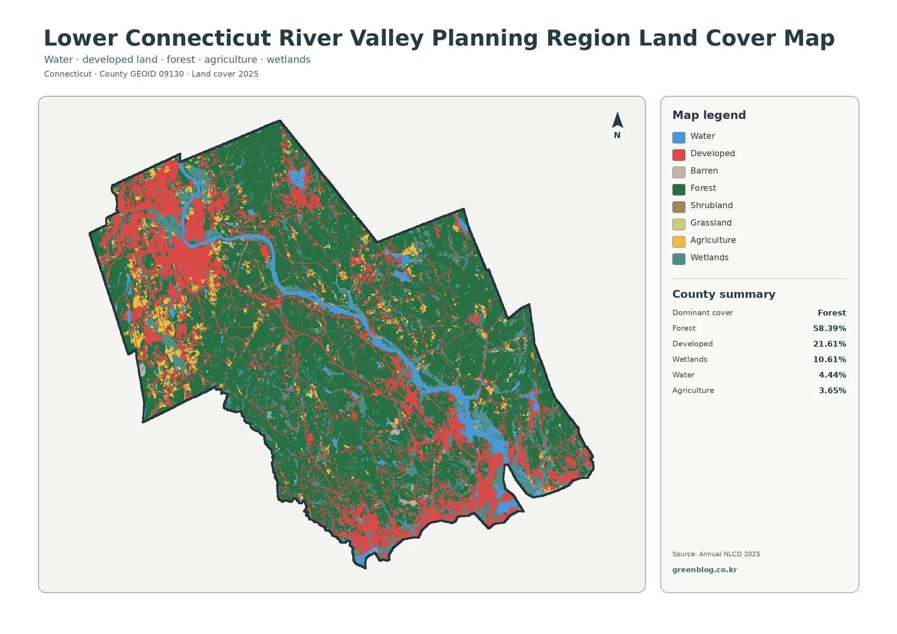
The Connecticut River is one of the easiest features to use when reading the general map. Follow the blue river south and compare the land immediately beside it with the larger forest blocks farther from the channel. Some stretches have wetlands close to the water, while other sections bring developed land nearer to the river. At the southern end, open water becomes a larger part of the scene as the river meets Long Island Sound. The shoreline also contains several developed concentrations, so the coastal part of the region looks quite different from the more heavily wooded interior.
Developed land does not appear as a single continuous city. RiverCOG identifies Middletown as the region’s only city, and the map shows a substantial developed concentration in the northwestern part of the planning region where Middletown and nearby communities are located. Developed cells also cluster along the southern coastal corridor around communities such as Old Saybrook, Westbrook, and Clinton. Smaller settlement patterns appear between those larger concentrations. The map supports a regional description of where developed cover is concentrated, but it does not prove that any specific highway, project, or policy caused the pattern.
Wetlands deserve separate attention because they occupy 10.61% of the planning region, a much larger share than agriculture. Teal areas appear along river corridors, around low-lying water features, and near the coast. In places they sit between forest and open water, while elsewhere they occur near developed land. A land-cover wetland class should not be treated as a regulatory wetland boundary. It describes the mapped surface classification. Local wetland regulations, protected-area boundaries, and site-specific permits require more detailed state or municipal sources.
The forest and farmland view makes the wooded interior easier to see
The forest and farmland map removes much of the visual competition from developed areas by placing developed and other cover in a pale background. The result makes the region’s 58.39% forest share immediately clear. Large green areas extend across much of the central and eastern interior, with additional forest on both sides of the Connecticut River. Near settlement centers and the shoreline, the green cover breaks into smaller pieces more often. This view is useful when the question is not simply “how much forest is there?” but “where does the forest remain broad and connected at the regional scale?”
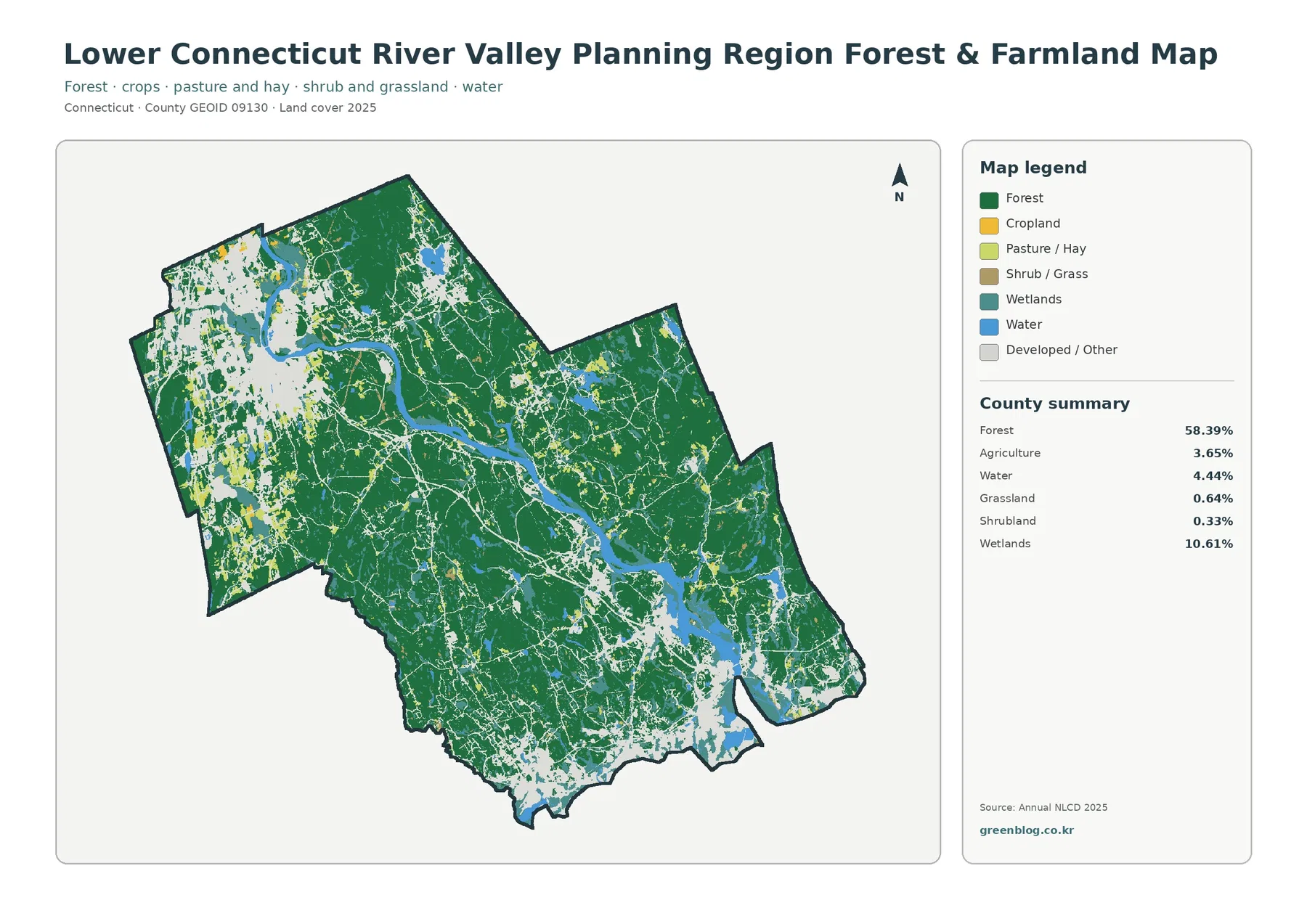
Agriculture covers 3.65% of the planning region. Yellow agricultural cells are scattered rather than forming one broad farm belt. They appear in small clusters in several interior and western locations and in some relatively open areas near the river. RiverCOG treats local agriculture as one of the region’s important resources, but this map should not be read as a parcel-level inventory of farms. It identifies land-cover classes, not ownership or farmland-preservation status. A farm boundary can contain several mapped classes, and an agricultural class can extend across land that is managed in different ways.
Grassland is 0.64% and shrubland is 0.33%, so neither class occupies a large share. Their colors appear as small patches mixed among forest, agriculture, wetlands, and developed or other cover. These minor classes are easy to overlook on the general map but become easier to find in this simplified view. Wetlands at 10.61% and water at 4.44% remain much more prominent. Along the Connecticut River and near the southern estuary, the combination of blue water, teal wetlands, and green forest gives a clearer picture of how natural cover types meet one another.
This map is a good starting point for environmental education, broad habitat comparison, or a discussion of open land, but it cannot tell you forest age, tree species, conservation ownership, or management condition. Two green areas with the same land-cover class can be very different on the ground. The same caution applies to agricultural cells. Use the map to locate broad patterns first, then turn to forestry, conservation, or agricultural records if the question requires field-level or parcel-level detail.
Impervious cover reveals where hard surfaces are actually concentrated
Impervious surface means pavement, rooftops, parking areas, and other hard surfaces that do not readily let water soak into the ground. The regional mean on the supplied map is 4.77%, and cells with at least 50% impervious cover make up 2.79% of the region. The same map reports developed cover at 21.61%. These figures should not be treated as competing estimates of the same thing. A developed land-cover class can include lawns, trees, and other pervious surfaces within a developed setting, while the impervious product measures the hard-surface fraction.
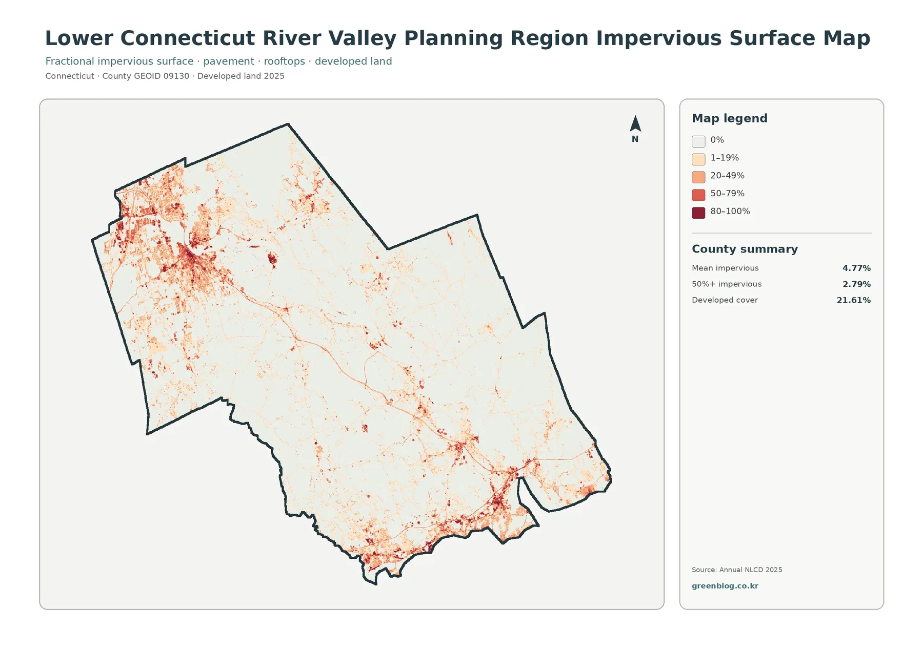
The darkest impervious values are concentrated most clearly around the developed northwestern area and in several southern shoreline centers. Smaller lines and clusters also appear along settlement corridors between those larger nodes. In contrast, broad forested parts of the interior are dominated by white or very light values. This makes the impervious map especially useful for separating a lightly built landscape from a place with extensive pavement and roofs. Two areas can both be classified as developed on the standard map but have very different impervious percentages.
Because the Connecticut River and many wetlands are prominent in the region, it is tempting to use the impervious map as a direct flood or runoff-risk map. It should not be used that way. Flooding depends on rainfall, topography, soil, drainage systems, river levels, and many other conditions that are not included here. The map can identify where hard surfaces are concentrated and can support a watershed discussion when paired with other data. It cannot by itself determine whether a neighborhood or parcel will flood.
The 4.77% mean is also a planning-region average, not the percentage for Middletown, Old Saybrook, Lyme, or any other individual municipality. The same is true for the 58.39% forest and 21.61% developed summaries. A town-level comparison would require clipping or recalculating the data with municipal boundaries. Keeping the scale clear is particularly important here because the seventeen communities include urban, suburban, rural, agricultural, river, and coastal settings within one county-equivalent boundary.
Most cells keep the same broad class between 1985 and 2025
The change map compares the 1985 and 2025 classifications. A class difference is mapped across 7.96% of the planning region. The largest named component is change to developed at 3.82%, followed by other class differences at 2.87%, forest loss at 0.89%, and agricultural loss at 0.13%. The first point to notice is the large amount of pale background. Most of the region is not flagged as a broad class difference in this comparison, while colored change cells are scattered through many smaller locations.
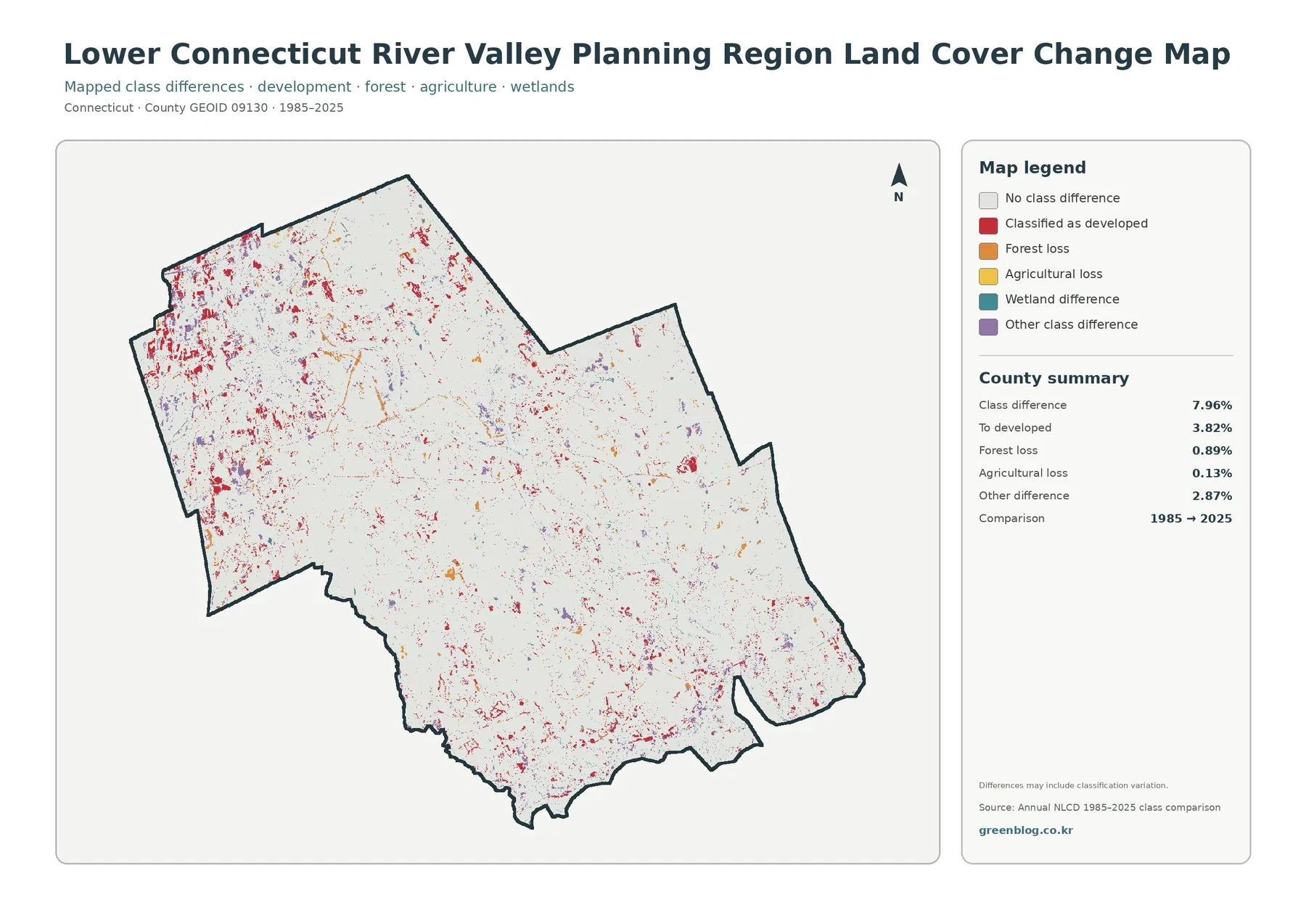
Red cells classified as developed are visible in the northwestern developed area, along parts of the river corridor, near the southern shoreline, and in many smaller scattered locations. They do not represent all developed land in 2025. A long-established urban area can appear as no class difference if it was already in a similar broad class in 1985. The current developed share of 21.61% therefore answers a different question from the 3.82% change-to-developed value. One describes the present map; the other describes mapped differences across the comparison period.
The note on the supplied change map warns that differences may include classification variation. Satellite conditions, mixed pixels, and differences in classification can produce a mapped change even when the physical change on the ground is subtle. That is why a single colored cell should not be described as confirmed construction, clearing, or wetland conversion without follow-up evidence. Use the map to identify areas that deserve a closer historical look, then compare aerial imagery, local planning records, or other time-specific sources when the cause and exact year matter.
Forest loss at 0.89% and agricultural loss at 0.13% are small regional shares, but a small percentage can still be locally noticeable along a river edge, near a village, or beside a larger forest block. The map is better at showing where differences occur than at explaining why they occurred. Pairing it with the 2025 land-cover map helps: the change view identifies a location with a class difference, while the current map shows the broad class assigned there now.
Why the county-equivalent boundary matters in Connecticut
Lower Connecticut River Valley Planning Region is not simply another name for the former Middlesex County geography. Connecticut now uses planning regions as Census county-equivalents, and current Census TIGER records list this planning region with GEOID 09130 and county code 130. RiverCOG’s seventeen municipalities make up the regional planning area. Its plan notes that the area covers all of the former Middlesex County geography plus Lyme and Old Lyme from the former New London County context. That history can create confusion if an older county map is compared directly with a newer planning-region map.
For this page, the boundary in the supplied map package is the Lower Connecticut River Valley Planning Region boundary. Percentages refer to that entire county-equivalent area. They should not be copied into a table labeled “Middlesex County” or assigned to one of the member towns. When comparing Connecticut maps from different years, checking the area name and GEOID is a simple way to avoid mixing old county geography with the current planning-region system.
RiverCOG describes the region as a mix of rural, agricultural, suburban, and urban settings anchored by Middletown, with the Connecticut River valley and shoreline shaping its identity. The land-cover maps match that broad description without needing to turn it into a causal claim. Dense developed areas, extensive forest, significant wetlands, scattered agriculture, and open water all appear within the same regional boundary. This variety is one reason the four-map set is more informative than a single summary percentage.
Reading raster classes without treating them as parcel surveys
Annual NLCD land-cover products use a raster grid, which means the surface is divided into cells and each cell receives a class or a percentage value. The standard land-cover product is commonly represented at 30-meter resolution. A narrow stream, roadside tree strip, small parking lot, or individual property line can therefore be generalized within a cell. Enlarging the image on a screen makes the pixels bigger, but it does not create parcel-level detail that was not present in the source data.
Mixed pixels are common where several surface types meet. A cell near a neighborhood edge might contain a roof, lawn, trees, pavement, and bare ground. The land-cover map assigns a broad class according to its classification method, while the impervious product can express a separate hard-surface percentage. That distinction is important when comparing 21.61% developed cover with a 4.77% mean impervious value. They describe different characteristics of the same region.
The observation year also matters. The current maps are labeled 2025, and the comparison spans 1985 to 2025. Development, vegetation change, shoreline work, or land management after the observation period may not appear. An unchanged cell on the comparison map does not mean “nothing happened”; it means the broad mapped class did not differ in the comparison used here. For current regulatory, engineering, or property decisions, newer local information is necessary.
Choosing the right map for a report, class, or presentation
Start with the general land-cover map when the goal is a one-page regional overview. It places forest, development, wetlands, water, and agriculture in the same frame and makes the river-to-coast setting easy to explain. Choose the forest and farmland view when the subject is wooded continuity, open land, or the small agricultural share. Since developed and other cover fade into a light background, the large interior forest blocks become much easier to discuss.
The impervious map is the better choice for a discussion of hard-surface intensity. Its percentage classes separate lightly developed areas from places where pavement and roofs occupy much more of a cell. The 1985–2025 map is for long-term comparison rather than a present-day inventory. In a presentation, placing the change map beside the 2025 general map helps an audience connect a changed location with its current broad land-cover class.
The downloadable archive contains all four original JPG maps, while the WebP versions on the page are optimized for online viewing. Keep the original aspect ratio when inserting a map into a document so the boundary and legend do not become distorted. Color matters because several classes are distinguished by hue, so a color display or color print is preferable when the legend needs to be interpreted precisely. If you quote the summary numbers, label them clearly as values for the entire Lower Connecticut River Valley Planning Region.
Frequently Asked Questions
Is Lower Connecticut River Valley Planning Region the same as Middlesex County?
No. Connecticut now uses planning regions as Census county-equivalents. Lower Connecticut River Valley Planning Region is GEOID 09130 and follows the RiverCOG regional boundary, so it should not be treated as identical to the former county geography.
Why can forest be 58.39% while developed land is still 21.61%?
The two classes are concentrated in different parts of the region. Large forest blocks cover much of the interior, while developed land is denser around the northwestern urban area, the southern shoreline, and smaller settlement centers. Both percentages describe the full planning region.
Does every colored cell on the 1985–2025 change map prove development or forest clearing?
No. The map reports class differences and notes that classification variation can be included. Use the colored cells as locations for follow-up, then check historical imagery or local records if the exact cause and timing matter.
Map File Information
The ZIP contains the four original JPG maps discussed on this page: general land cover, forest and farmland, impervious/developed land, and the 1985–2025 land-cover change map.
- Included Files: four JPG maps
Related Maps
- Capitol Planning Region Connecticut Land Cover Map
- Greater Bridgeport Planning Region Connecticut Land Cover Map
- Connecticut Map
Sources and References
- MRLC Annual NLCD Data – land-cover and impervious-surface products
- USGS Annual NLCD Land Cover Classification – land-cover classes and interpretation guidance
- U.S. Census Bureau TIGER/Line Shapefiles – county-equivalent boundary data
- Lower Connecticut River Valley Council of Governments (RiverCOG) – official regional and member-municipality information
Green Map creates custom-edited map images using open geographic data sources such as geoBoundaries, Natural Earth, OpenStreetMap, and government open data.
These maps are edited visual materials, not raw data files, and are provided for education, documents, presentations, and graphic reference.