Lawrence County, Arkansas, has a clear split in its 2025 land-cover pattern. Agriculture accounts for 65.43% of the county, but that countywide figure hides a major geographic contrast: broad agricultural cover dominates the east, while the west contains much more forest, wetland, and water mixed with smaller farm areas. The four maps on this page make that contrast easy to compare without treating the county as a single uniform landscape.
The page includes a general 2025 land-cover view, a forest-and-farmland view, an impervious-surface map, and a 1985–2025 class-difference map. WebP images are provided for quick viewing in the article, and the four original JPG maps supplied with the package are available together in one ZIP download. Each map answers a different question, so the sections below keep current cover, hard surfaces, and long-term class differences separate.
Table of Contents
Start with the countywide split: wooded west, agricultural east
The strongest pattern in Lawrence County does not require a detailed legend to notice. The western part of the county is a patchwork of dark forest, agriculture, wetlands, and water. Moving toward the center, winding wetland and water features become more prominent. East of that transition, agricultural cover spreads across a much larger and more continuous area, with developed land and small wetland patches interrupting the farm landscape rather than replacing it.
This east–west contrast matters because the 65.43% agriculture statistic describes the county as a whole. It does not mean that roughly two thirds of every part of Lawrence County is agricultural. The western side looks much more wooded, while the eastern side is much more strongly agricultural. Reading the percentage together with the location of the colors gives a more accurate picture than either the number or the image alone.
Agriculture also has a county-specific context beyond the map. The Lawrence County Cooperative Extension Service’s 2024 report includes work on corn, soybeans, rice, wheat, cotton, cattle, and forage. Those programs help show the breadth of local agricultural activity, but they should not be used to label individual pixels on the land-cover map. A yellow agricultural cell does not identify a crop, farm operator, or production level.
Developed cover is much smaller than agriculture or forest, yet it has a recognizable pattern. A large developed cluster appears near the center of the county, with another distinct cluster farther north. Fine linear traces extend away from those concentrations and continue across the agricultural east. Because the map preview does not label towns or road names, the safest interpretation is to describe the concentration and corridor pattern rather than attach an unverified place name to each red area.
The 2025 map shows why 65.43% agriculture does not tell the whole story
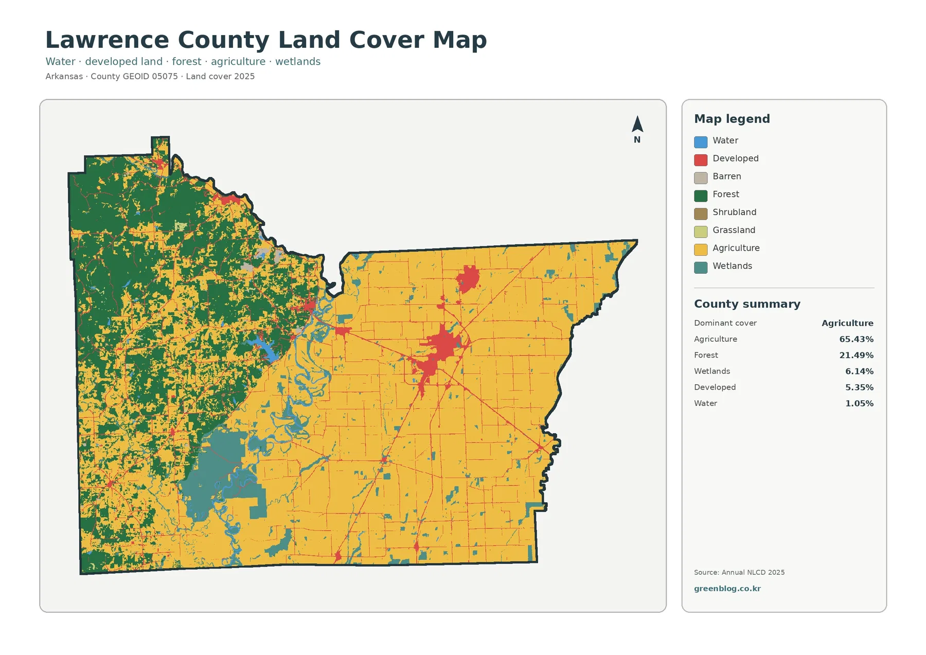
The general map combines water, developed land, barren land, forest, shrubland, grassland, agriculture, and wetlands. Agriculture is the dominant countywide class at 65.43%. On the map, that dominance is especially obvious across the eastern half, where yellow cover forms large blocks with relatively few interruptions. Smaller wetlands and developed corridors are present, but agriculture remains the main visual element from the central transition toward the eastern boundary.
Forest accounts for 21.49%. Most of that forest is concentrated in the west, where dark green areas form large connected patches and surround smaller agricultural openings. Forest becomes more fragmented near the center, where wetlands, water, agriculture, and developed cover meet. The result is not a gradual, even distribution of forest across the county. Its concentration on one side makes the western landscape look very different from the countywide percentage alone.
Wetlands cover 6.14% and are another important part of the western and central pattern. Teal areas follow winding channels and appear as broader patches in several parts of the map. Small wetland pieces also occur in the east, but they are less visually dominant there. The map supports a statement about where wetlands are classified, not a conclusion about legal wetland boundaries, flood frequency, or the condition of a wetland.
Developed land is listed at 5.35%, while water is 1.05%. The developed share is modest in area, but its red color forms a conspicuous central cluster and a network of thin linear features. Water occupies a smaller percentage, yet narrow channels and small water bodies are useful reference features because they extend through areas where forest, agriculture, and wetlands meet. Barren, shrub, and grass classes appear in the legend, but the package does not supply verified countywide percentages for them, so none are invented here.
Simplify the legend to see the forest–farmland boundary more clearly
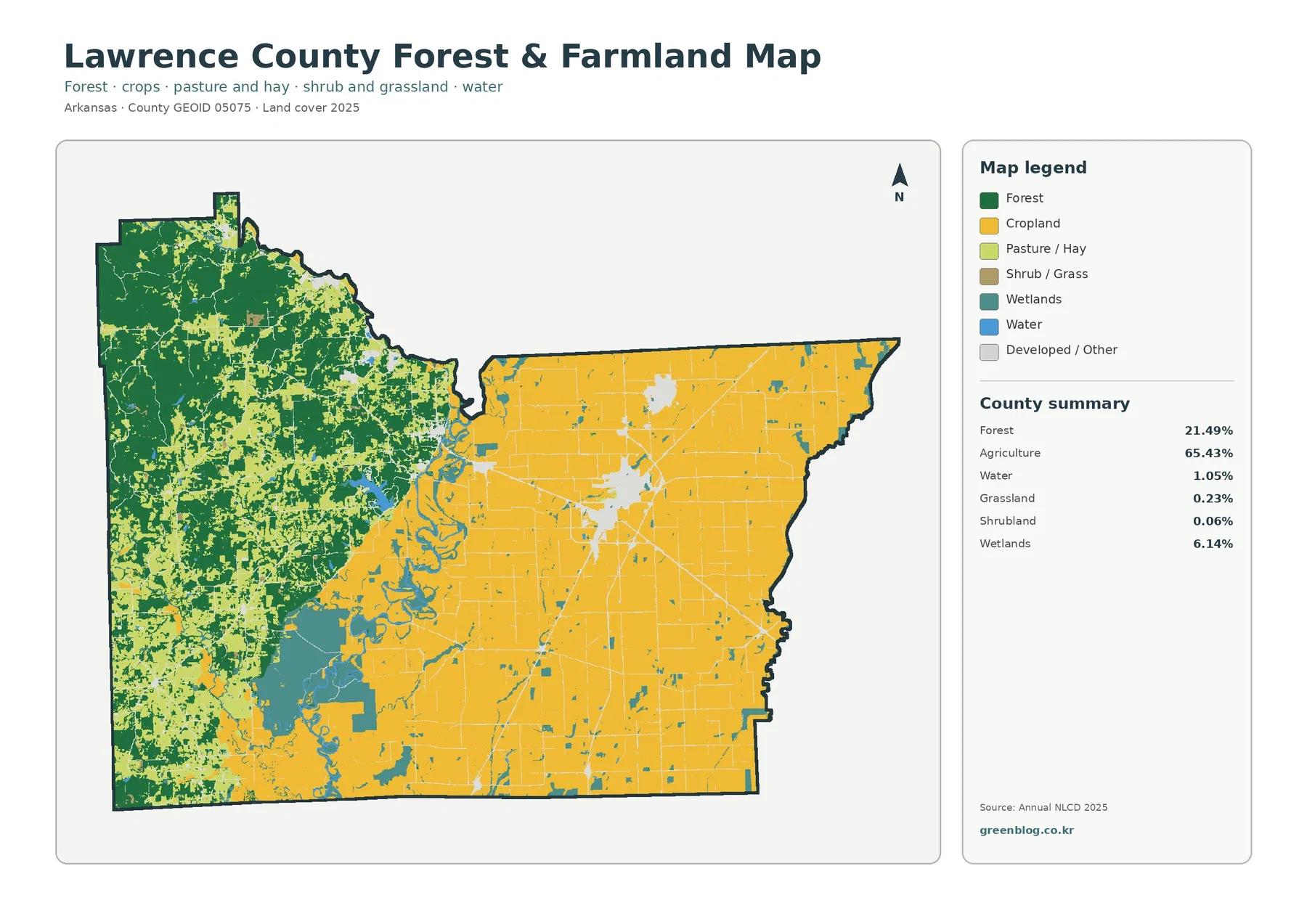
The forest-and-farmland map removes much of the visual competition from the general view. Dark green forest fills much of the west, while cropland dominates the east. Winding wetland and water features sit between and within those broad areas. This simplified display is useful when the main question is not “What is every mapped cover type?” but “Where does the county change from a wooded patchwork to a farm-dominated landscape?”
The county summary still reports agriculture as 65.43%, but the legend separates cropland from pasture/hay. The supplied summary does not provide a verified percentage for each of those two agricultural subclasses. For that reason, the article does not estimate how much of the 65.43% belongs to crops versus pasture. The map can show where the colors occur, but an exact subclass acreage or percentage would require data that is not included in the package.
Forest at 21.49% should also be interpreted as surface cover rather than a statement about forest ownership or management. NLCD classifies what is on the ground from remotely sensed data. A forest-colored cell does not identify tree species, public versus private ownership, harvesting status, or a legal forestry boundary. The map is useful for seeing the general extent and continuity of wooded cover, while those other questions require separate records.
Wetlands and water make the western half more complicated than a simple forest-versus-farm division. Wetland colors often follow curved water features, and agriculture or forest may sit immediately beside them. That makes this map useful for watershed or environmental education, because students can compare adjoining surface types without needing to read every developed class. It does not, however, provide water quality, stream flow, flood stage, or habitat-condition measurements.
A 5.35% developed share can coexist with only 1.42% mean imperviousness
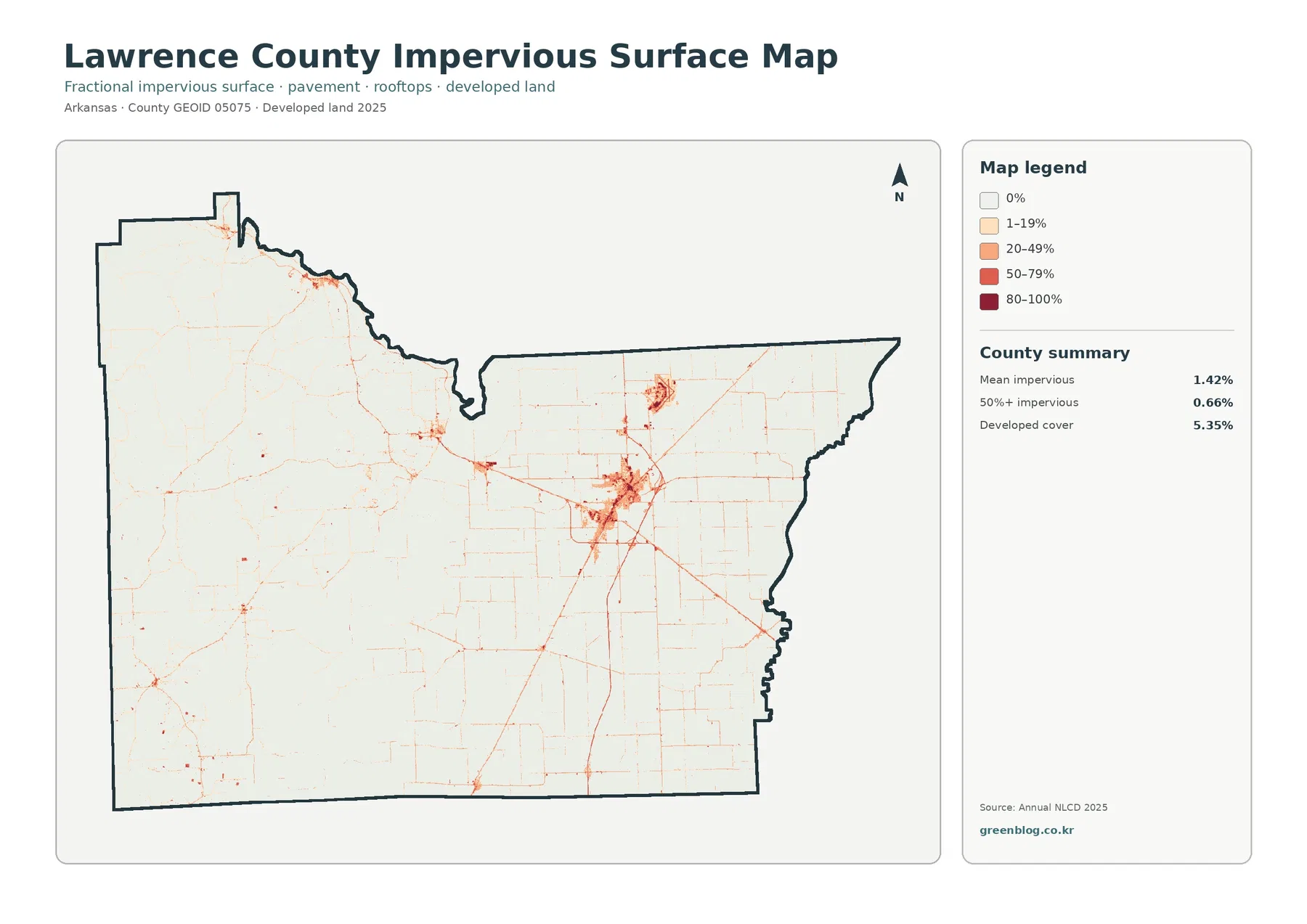
Impervious surface means hard cover such as pavement, parking areas, and rooftops where water does not readily soak into the ground. Lawrence County has a mean impervious value of 1.42%, and 0.66% of the county is summarized as having at least 50% impervious cover. Those figures are much smaller than the 5.35% developed-cover value because a developed land-cover class can also contain lawns, trees, soil, and other surfaces that still absorb water.
The impervious map is mostly pale, which fits a county where hard surfaces occupy a small average share. The strongest colors occur in the central developed cluster, with a second concentration farther north. Thin lines extend across the east and connect with smaller spots elsewhere. These features are consistent with a network of roads and built areas, but the preview does not provide road labels, so individual lines should not be assigned specific names without another source.
Pairing this map with the general land-cover view is more informative than using either alone. The general map identifies developed land as a class within agriculture, forest, wetlands, and water. The impervious view then shows where the harder components of that developed landscape are concentrated. A place can therefore be mapped as developed without appearing as 80–100% impervious, and there is no contradiction between the two summaries.
This layer can support lessons about urban versus rural surfaces or provide background for stormwater discussions, but it is not a flood-hazard map. Flooding depends on rainfall, elevation, drainage, soils, stream levels, and infrastructure in addition to impervious cover. The map can identify one surface characteristic; it cannot by itself establish where flooding will occur or how severe it will be.
Only 6.19% is mapped as a different class between 1985 and 2025
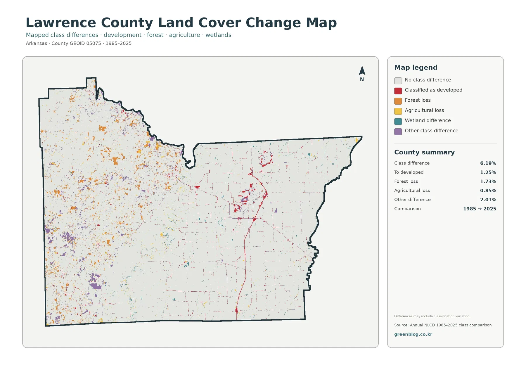
The long-term map reports that 6.19% of Lawrence County has a different mapped class in the 1985-to-2025 endpoint comparison. Most of the county is therefore shown as “No class difference.” The large white background is not missing data in the way the map is designed; it indicates cells whose class did not change between the two mapped endpoints according to this comparison.
The summary separates 1.25% as “to developed,” 1.73% as forest loss, 0.85% as agricultural loss, and 2.01% as other class difference. Wetland difference also appears in the legend, but the summary does not list a verified standalone percentage for it. The difference between the 6.19% total and the listed categories should not be converted into an invented wetland value. Only the values actually supplied are reported.
Spatially, forest-loss and other-difference colors are scattered through much of the west. Red development-change marks are more noticeable around the central built-up pattern and along some thin corridors. The eastern agricultural area is largely unchanged in class according to the endpoint map, although small agricultural-loss and other-difference pixels occur throughout it. The variation in colors makes it clear that the 6.19% total is not a single type of change.
A forest-loss cell does not explain why the forest classification changed. Timber activity, conversion to another cover, disturbance, regrowth, mixed pixels, imagery conditions, or classification differences can all require further investigation. The map itself notes that class differences may include classification variation. The same caution applies to agricultural loss: it is a change in mapped class, not a direct percentage change in farm income, crop output, or number of farms.
Choose map pairs by question instead of treating all four as interchangeable
For the broad agricultural east, start with the general map and then use the forest-and-farmland view. The first map preserves wetlands, water, and developed cover, while the second makes the farm–forest boundary easier to trace. This pairing works well for a presentation about current surface cover because both maps describe the 2025 landscape, just with different levels of detail.
For the central developed area, combine the general map with the impervious-surface layer. The general map shows the developed class in relation to surrounding agriculture and wetlands. The impervious map narrows the question to hard surfaces such as pavement and rooftops. It helps explain why developed cover and mean imperviousness should not be quoted as though they were two estimates of the same percentage.
For the wooded west, the change map can be added after the current-cover views. It identifies locations where the 1985 and 2025 classifications differ, including forest-loss and other-difference pixels. A colored change pixel should be treated as a prompt for closer examination rather than proof of a specific cause. Annual imagery or local records are needed when the history of a particular site matters.
In a slide deck or classroom handout, one or two large maps are usually easier to read than all four reduced to small thumbnails. Use the current-cover pair when explaining present land cover, the impervious map when built surfaces are the subject, and the change layer only when the time comparison is relevant. The original JPG files are better suited to larger display than the page-preview WebP images.
Download the four original JPG map files
The ZIP archive contains the four original JPG maps supplied for this Lawrence County package: 2025 general land cover, forest and farmland, impervious/developed land, and 1985–2025 land-cover class differences. The asset manifest records each JPG at 2480×1754 pixels. The WebP images embedded above are article previews; the JPG files are the better choice when you want to retain the supplied map image or place it in a larger presentation layout.
Select the file according to the question you are trying to answer. Use the general map for an overview, the forest/farmland map for the east–west contrast, the impervious map for built surfaces, and the change map for the endpoint comparison. Keeping those purposes separate prevents a current 2025 percentage from being confused with a 1985–2025 class-difference percentage.
Use the maps as generalized surface-cover data, not parcel or zoning maps
Land cover describes what is on the surface—forest, agriculture, water, wetland, developed land, and similar classes. It is not a map of zoning, property ownership, tax parcels, or legal development rights. An agricultural pixel does not mean that a parcel is legally restricted to farming, and a developed pixel does not identify the type of building or the owner of the land.
Annual NLCD is raster data, so the landscape is represented by grid cells. A cell can contain part of a road, tree canopy, grass, a building, or water at the same time and still receive one generalized class. These mixed pixels can make narrow roads, stream edges, forest boundaries, and small parcels appear simpler than they are on the ground. A colored boundary on the map should never be treated as a surveyed property line.
The current-cover maps use the supplied 2025 classification. Construction, vegetation change, farming changes, timber activity, or water changes after that observation period may not appear. The change layer compares 1985 with 2025, so it does not show every intermediate event. When a recent site condition matters, use newer imagery or annual data and check local records rather than relying on the endpoint map alone.
Finally, spatial association is not the same as causation. Developed cover may line up with road-like features, but the map does not prove that a specific road caused development. Wetlands may occur next to agriculture, but adjacency alone does not establish an environmental impact. The maps are strongest when used to describe where categories are located and how they differ, while causal questions are reserved for sources designed to answer them.
Frequently Asked Questions
What is the largest 2025 land-cover class in Lawrence County?
Agriculture is the largest class in the supplied county summary at 65.43%. Its distribution is especially extensive in the east, while the west contains much more forest, wetland, water, and smaller agricultural patches.
Why is developed cover 5.35% while mean imperviousness is only 1.42%?
Developed land can contain both hard and permeable surfaces, including buildings, pavement, lawns, trees, and soil. Imperviousness measures the hard surfaces that do not readily absorb water, so its countywide average can be much lower than the developed land-cover share.
Does the 6.19% class difference mean that exactly 6.19% of the county was physically transformed?
Not necessarily. Real landscape change can contribute, but imagery differences, mixed pixels, and classification variation can also affect an endpoint comparison. Use the change map to locate areas for closer review, then verify the cause with annual imagery, aerial photography, or local records.
Map File Information
The ZIP contains four original Lawrence County JPG maps: 2025 land cover, forest and farmland, impervious/developed land, and 1985–2025 land-cover change.
- Included Files: Use only the versions confirmed in the article and supplied images
- File Type: Use the confirmed download contents
- Intended Use: Printing, education, presentations, and map-based projects
Related Maps
- A Craighead County Arkansas Land Cover Map
- Arkansas County Arkansas Land Cover Map
- Ashley County Arkansas Land Cover Map
Sources and References
- MRLC Annual NLCD Data — official access point for Annual NLCD land-cover data and related products.
- USGS Annual NLCD Land Cover Classification — definitions and background for land-cover classes used in Annual NLCD.
- U.S. Census Bureau TIGER/Line Shapefiles — official U.S. geographic boundary data, including county boundaries.
- Lawrence County Cooperative Extension Service 2024 Report — University of Arkansas System material documenting county agriculture and natural-resources programs.
Green Map creates custom-edited map images using open geographic data sources such as geoBoundaries, Natural Earth, OpenStreetMap, and government open data.
These maps are edited visual materials, not raw data files, and are provided for education, documents, presentations, and graphic reference.