The Hempstead County Arkansas Land Cover Map shows a county where forest, agriculture, wetlands, and developed land all matter to the 2025 surface pattern. Forest is the largest class at 40.50%, while agriculture accounts for 29.09%. Those two covers do not form simple halves of the county. They appear in a broad patchwork, with a large wetland-and-water setting along the western side and a more concentrated developed footprint in the southeastern part of the county.
This page compares four views: overall 2025 land cover, a simplified forest-and-farmland view, impervious surface, and mapped class differences from 1985 to 2025. The four original JPG files are also available together in one download. They can be used for county comparisons, classroom work, environmental background, reports, and presentation graphics, but they do not show parcel ownership, zoning, building permission, or legal wetland boundaries.
Table of Contents
The 2025 Cover Pattern at a Glance
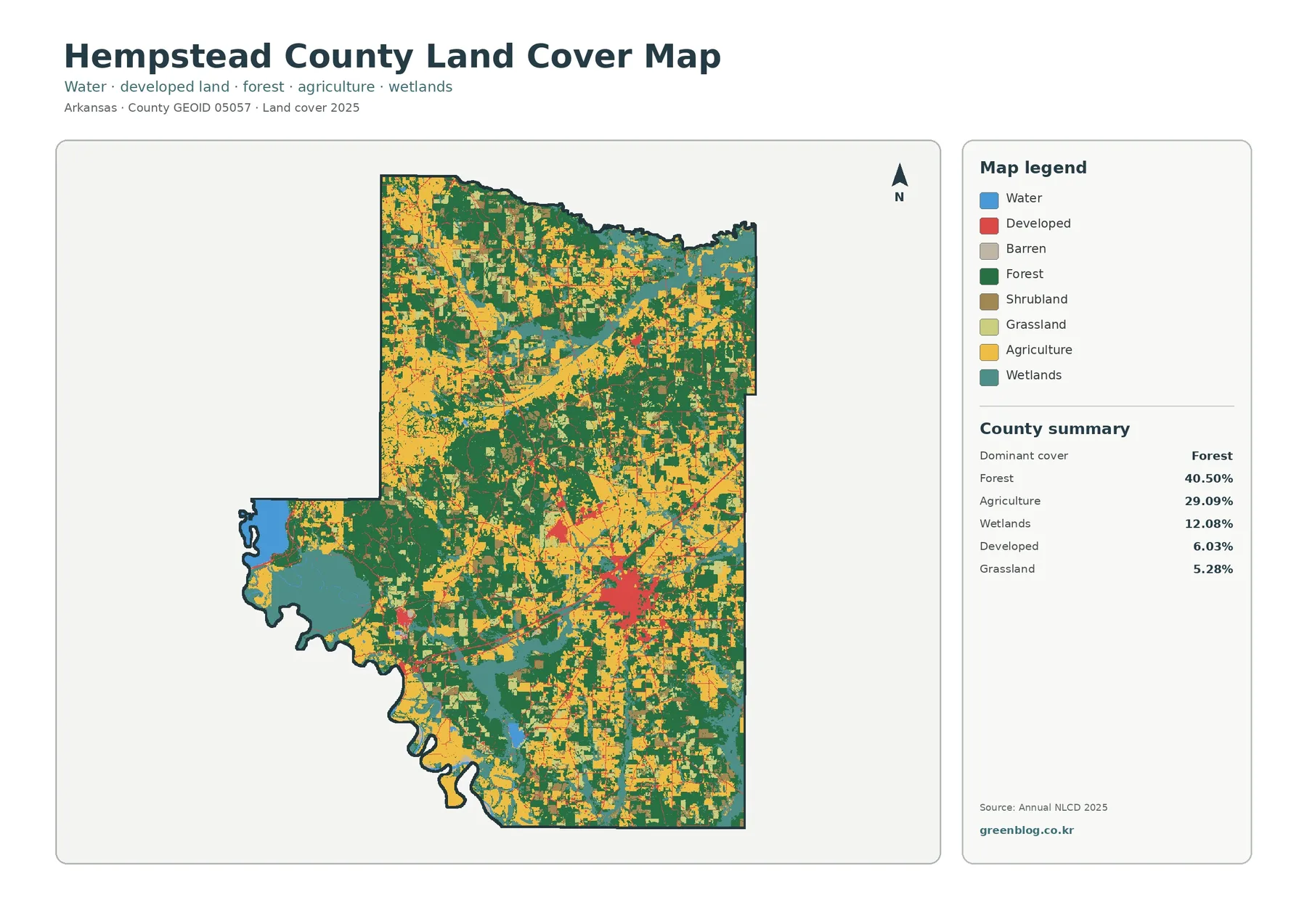
The county summary lists forest at 40.50%, agriculture at 29.09%, wetlands at 12.08%, developed cover at 6.03%, and grassland at 5.28%. Forest leads the ranking, but it does not dominate so completely that the county can be described as one continuous wooded block. Yellow agricultural areas break into the green forest across much of the county, and wetlands occupy enough land to create a third major component. The result is a mixed landscape rather than a simple forest-versus-farm division.
Large wooded patches are common through the northern and central portions, yet agricultural and open-cover cells interrupt them repeatedly. Farm cover also appears in several substantial blocks instead of one single plain. That difference matters when comparing Hempstead County with another county that might have a similar percentage of forest or agriculture. Percentages tell how much of a class is present; the image shows whether that class is continuous, fragmented, or interwoven with other surfaces.
The western projection stands apart because blue water and teal wetlands occupy a much larger share of the local view. The Arkansas Game and Fish Commission describes Little River Wildlife Management Area as lying on the Little River north of Fulton in Hempstead County, with bottomland hardwood habitat that is frequently inundated. That official description helps explain why wetland and water cover are an important part of the western county landscape, although the land-cover image does not draw the management-area boundary itself.
Developed land is only 6.03% countywide, but its location makes it visually important. The largest concentration is in the southeastern half, with smaller clusters and thin developed traces elsewhere. A countywide percentage can therefore understate how distinct a town or transportation corridor looks against nearby forest and farmland. For general reference, it is useful to read the development pattern as a concentration rather than assume that the same level of development extends across the county.
Forest and Farmland Form a Patchwork
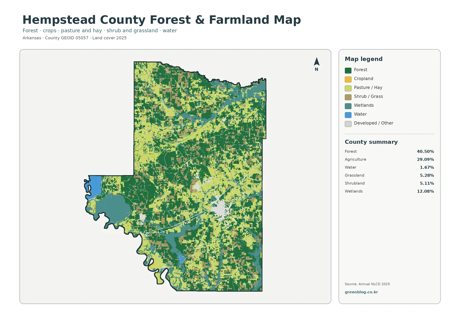
The forest-and-farmland view reduces the number of competing categories so the relationship between wooded and agricultural ground is easier to follow. Its summary gives forest 40.50%, agriculture 29.09%, wetlands 12.08%, grassland 5.28%, shrubland 5.11%, and water 1.67%. Those values show why the county cannot be explained only as forest and cropland. Open grass and shrub cover plus wet lowlands create meaningful transition areas between the two largest classes.
Agriculture is distributed across several parts of Hempstead County. Broad yellow blocks are visible in the northwest, southeast, and other interior areas, but forest repeatedly divides or borders them. The central and southwestern portions contain many smaller transitions where green and yellow patches meet. Along the western lowland, wetlands replace much of the farm-and-forest pattern. This makes the simplified view useful for locating edges where one broad land-cover setting changes into another.
The image should not be treated as a crop map. Agriculture combines mapped agricultural cover and does not identify a particular crop in an individual field. Forest pixels likewise do not report tree species, stand age, ownership, timber status, or conservation designation. A dark-green patch means the surface was classified as forest in the dataset, not that every management or ecological characteristic of that woodland is known.
Hempstead County’s official website lists communities including Hope, Fulton, Washington, Blevins, Ozan, and others. Those names provide useful local context, but the supplied land-cover image itself does not label city limits or roads. For a presentation, a careful approach is to describe the broad pattern shown here first and add city or transportation labels only when a verified boundary or road layer is available. That prevents a colored patch from being mistaken for an exact municipal boundary.
Impervious Surface Reveals a More Compact Human Footprint
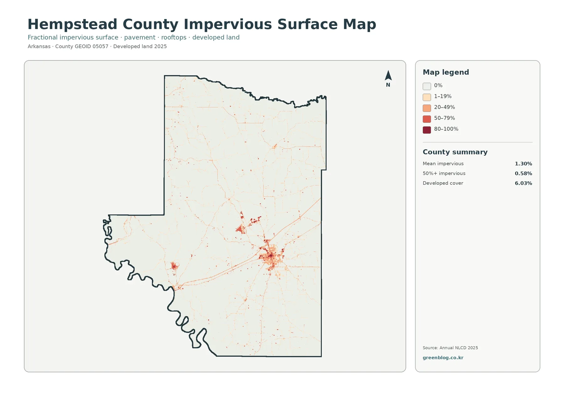
Impervious surface means pavement, rooftops, parking areas, and similar hard surfaces that do not readily absorb rainfall. Hempstead County’s mean impervious value is 1.30%, and cells with at least 50% impervious cover account for 0.58%. Developed land, by comparison, covers 6.03% of the county. These numbers are not supposed to match because developed classes can include lawns, trees, vacant ground, and other surfaces that still allow water to enter the soil.
The most obvious dark cluster sits in the southeastern half of the county. Thin lines extend away from it in several directions, and smaller points or clusters appear elsewhere. Large forest, farm, and wetland areas are much lighter. For a reader trying to understand settlement intensity, this view is more precise than the general developed-land class because it emphasizes hard surface rather than the full developed category.
It is tempting to treat a strong impervious signal as a direct measure of traffic, drainage problems, or flood risk, but the layer does not provide those answers. It only describes the share of hard surface within mapped cells. Stormwater behavior also depends on rainfall, slope, soil, drainage infrastructure, and nearby channels. The most defensible use here is to identify where pavement and structures are concentrated before consulting those other datasets for a specific planning or environmental question.
The county’s official offices are located in Hope, and the county website lists Hope among its communities. That is useful background for understanding the county’s principal service area, but the supplied impervious image has no place labels. When using the image alone, phrases such as “the largest southeastern developed concentration” remain more precise than drawing an exact city boundary from the red pixels. A labeled municipal or road layer can be added separately when that level of detail is needed.
What Changed Between 1985 and 2025
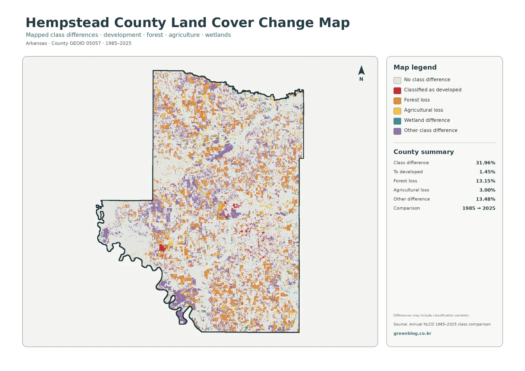
The 1985–2025 comparison reports class differences across 31.96% of the county. The summary separates 1.45% classified as a change to developed land, 13.15% forest loss, 3.00% agricultural loss, and 13.48% other class difference. The key point is that 31.96% is not a statement that nearly one-third of Hempstead County was urbanized. Development is only one category within the total, while forest, agriculture, wetlands, and other classification differences make up the rest.
Orange forest-loss cells and purple other differences are scattered broadly across the northern and central parts of the county. Red cells representing change to developed land are more concentrated near the southeastern developed footprint, with smaller clusters elsewhere. Agricultural-loss cells appear in many small patches around agricultural areas. Wetland differences are visible as well, especially where wet lowlands meet other classes, but the image alone cannot identify the process behind every changed cell.
A forest-loss label should not automatically be translated into permanent clearing. A cell can differ between two years because of real land conversion, timber harvest and regrowth, agricultural change, construction, water conditions, image characteristics, or classification variation. The change graphic itself notes that differences may include classification variation. For any site where the cause matters, historical aerial photography, management records, or field observations are needed before making a stronger claim.
The change layer works best as a screening tool. A reader can compare current forest blocks with orange loss cells, examine agricultural areas beside yellow changes, or look at the southeastern developed cluster beside red conversion cells. That comparison helps identify locations worth a closer look. It does not prove why the change occurred, and percentages from the change layer should not be added directly to current land-cover percentages as though they described the same measure.
The Little River Lowlands Add a Distinct Wet Landscape
The western part of Hempstead County deserves separate attention because water and wetlands occupy a much stronger share of the surface there than in most of the interior. Countywide wetlands account for 12.08%, while water adds 1.67% in the simplified forest-and-farmland summary. The visible concentration near the western edge means those percentages are not evenly spread. A relatively compact area contributes a large part of the county’s wetland character.
Arkansas Game and Fish Commission describes Little River WMA as bottomland hardwood habitat on the Little River north of Fulton and notes that the area is frequently inundated. That description provides useful ecological context for the wet western pattern. It also shows why a land-cover class can be informative without being a complete ecological inventory. The NLCD layer identifies broad surface classes, while the AGFC page adds information about habitat and flooding conditions at a specific managed area.
Wetland color should not be confused with a regulatory wetland determination. The layer is appropriate for regional comparison, environmental education, or identifying areas that may deserve more detailed study. A legal or engineering decision requires site-specific delineation, current hydrology, soils, jurisdictional rules, and other records. The same caution applies to water edges, which can vary with observation date and water level.
Choosing the Right View for a Question
For a general county overview, begin with the 2025 cover view. It places forest, agriculture, wetlands, development, and water in one frame, making the broad contrasts easy to recognize. Move to the forest-and-farmland view when the main question is how 40.50% forest and 29.09% agriculture interlock across the county. Because the legend is simpler, boundaries and transition zones are easier to see.
Use the impervious layer when the question concerns hard surfaces rather than developed land as a whole. Comparing 6.03% developed cover with a 1.30% mean impervious value is a useful way to explain that a developed cell can still contain permeable ground. The image also makes the largest southeastern concentration stand out without the distraction of forest and agricultural colors.
The change layer is best read after the current-cover layers. Once a reader knows where forest, agriculture, wetlands, and development are located in 2025, the orange, red, yellow, teal, and purple change categories have a clearer geographic meaning. Starting with the change graphic alone can be confusing because it identifies differences rather than the complete current landscape.
In a classroom or report, two images are often enough. Pair overall cover with forest-and-farmland for a rural landscape discussion, overall cover with impervious surface for a settlement discussion, or current cover with the change layer for a time comparison. Keeping the selection tied to one question helps readers understand the message without forcing them to decode every legend at once.
Reading the Classification at the Right Scale
Annual NLCD land cover is raster data built from 30-meter cells. A raster divides the ground into a regular grid and assigns a representative class to each cell. One cell can contain trees, grass, pavement, and a narrow stream at the same time, yet the land-cover product must summarize that mixed surface. This is why the displayed color boundary may not match a fence line, road edge, stream bank, or parcel boundary exactly.
Mixed pixels matter most where cover changes quickly, such as the edge of the western wetlands, the boundary between forest and agriculture, or the fringe of the southeastern developed concentration. Small roads, narrow channels, and isolated buildings may be weakly represented or absorbed into a neighboring dominant class. The data are strong for county and regional context but are not a substitute for a parcel survey.
Land cover also differs from land use. An agricultural pixel describes the visible surface category, not the legal zoning of the property. A developed pixel does not prove a building permit or ownership status. A wetland pixel does not establish jurisdiction under federal or state wetland rules. Property, zoning, construction, and regulatory questions require the relevant county, state, or federal records.
The 2025 view is a snapshot of a mapped year, not a promise that every location still looks the same today. Crop rotation, forest management, construction, seasonal water, and other changes can alter the ground after the observation period. For current decisions, use these images as background and check newer aerial imagery, field conditions, and official records when the exact present-day condition matters.
Download the Four Original JPG Files
The download archive contains one original JPG for each view: 2025 overall land cover, forest and farmland, impervious surface and developed land, and 1985–2025 land-cover change. Each supplied original is 2480 × 1754 pixels. The files are kept at their source size rather than enlarged to imply a higher print resolution. They are useful for documents, slides, comparison layouts, classroom handouts, and reference graphics.
Frequently Asked Questions
Does 40.50% forest mean most of Hempstead County is one continuous woodland?
No. Forest is the largest single class, but the image shows agriculture, grassland, shrubland, wetlands, development, and water repeatedly interrupting or bordering wooded areas. The county is better described as a mixed forest-and-farm landscape with a distinct wet western lowland than as one continuous forest block.
Why is developed cover 6.03% while mean impervious surface is only 1.30%?
Developed classes can contain lawns, trees, open ground, and other permeable surfaces in addition to roofs and pavement. Impervious data focus more directly on hard surfaces within each cell, so the countywide average is expected to be lower than the full developed-land percentage.
Does the 31.96% class difference mean 31.96% of the county was developed?
No. Only 1.45% is listed as change to developed land. The total also includes 13.15% forest loss, 3.00% agricultural loss, wetland differences, and 13.48% other class difference. The graphic identifies where classifications differ between 1985 and 2025; it does not describe a single development rate.
Map File Information
The ZIP contains the four original Hempstead County JPG views used on this page for cover, forest/farmland, impervious surface, and mapped change.
- Included Files: Four original JPG maps
Related Maps
- A Craighead County Arkansas Land Cover Map
- Arkansas County Arkansas Land Cover Map
- Ashley County Arkansas Land Cover Map
Sources and Reference Links
- MRLC Annual NLCD Data — annual land-cover data access
- USGS Annual NLCD Land Cover Classification — class definitions and documentation
- Hempstead County official website — county information and community list
- Arkansas Game and Fish Commission: Little River WMA — county-specific bottomland and habitat context
- U.S. Census Bureau TIGER/Line — county boundary reference
Green Map creates custom-edited map images using open geographic data sources such as geoBoundaries, Natural Earth, OpenStreetMap, and government open data.
These maps are edited visual materials, not raw data files, and are provided for education, documents, presentations, and graphic reference.