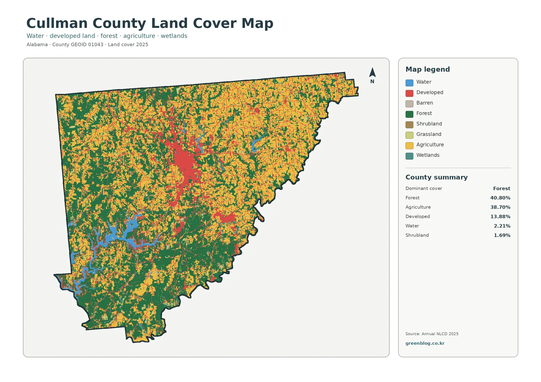
Cullman County’s 2025 land-cover pattern is unusual in one important way: forest and agriculture are almost evenly matched. Forest accounts for 40.80% of the county and agriculture for 38.70%, while developed land reaches 13.88%. Water covers 2.21%, with smaller shares of shrubland, grassland, and wetlands. The four maps on this page separate those broad classes, the forest-and-farm pattern, impervious surfaces, and mapped class differences between 1985 and 2025.
The WebP images are designed for quick viewing in the article. A single download farther down the page contains the four original JPG maps for classroom work, regional presentations, reference sheets, and side-by-side county comparisons. Land cover describes what is visible on the ground surface, not parcel ownership, zoning, development rights, or legal land use, so the maps should be treated as regional reference graphics rather than property maps.
Table of Contents
A county where forest and farmland carry nearly equal weight
The general land-cover map is dominated by two colors rather than one. Forest is strongest across much of the western and southwestern part of the county, while agricultural cover appears repeatedly across the north, east, and many interior areas. Neither category forms a single uninterrupted block. Fields, wooded tracts, developed patches, and small water features are interwoven, so Cullman County reads more like a broad rural mosaic than a county divided into a simple forest side and farm side.
The official Cullman County website places the county in north Alabama along Interstate 65 between Huntsville and Birmingham and describes it as part of the Cumberland Plateau. That geographic context helps explain why the central developed cluster matters when reading the maps, but the land-cover image itself does not label roads or topographic units. The safe interpretation is that development is concentrated in the central part of the county and along several narrow corridors, while farm and forest cover expand quickly outside those concentrations.
Developed land makes up 13.88% of the 2025 classification, a substantial share compared with the agricultural and wooded countryside around it. The class is broader than pavement or rooftops. Low-density neighborhoods can contain lawns, street trees, open lots, and other permeable surfaces while still being classified as developed land. That distinction becomes important later when the impervious-surface map narrows the view to harder surfaces and reveals a smaller, more concentrated footprint.
The forest-and-farmland view makes the rural pattern easier to follow
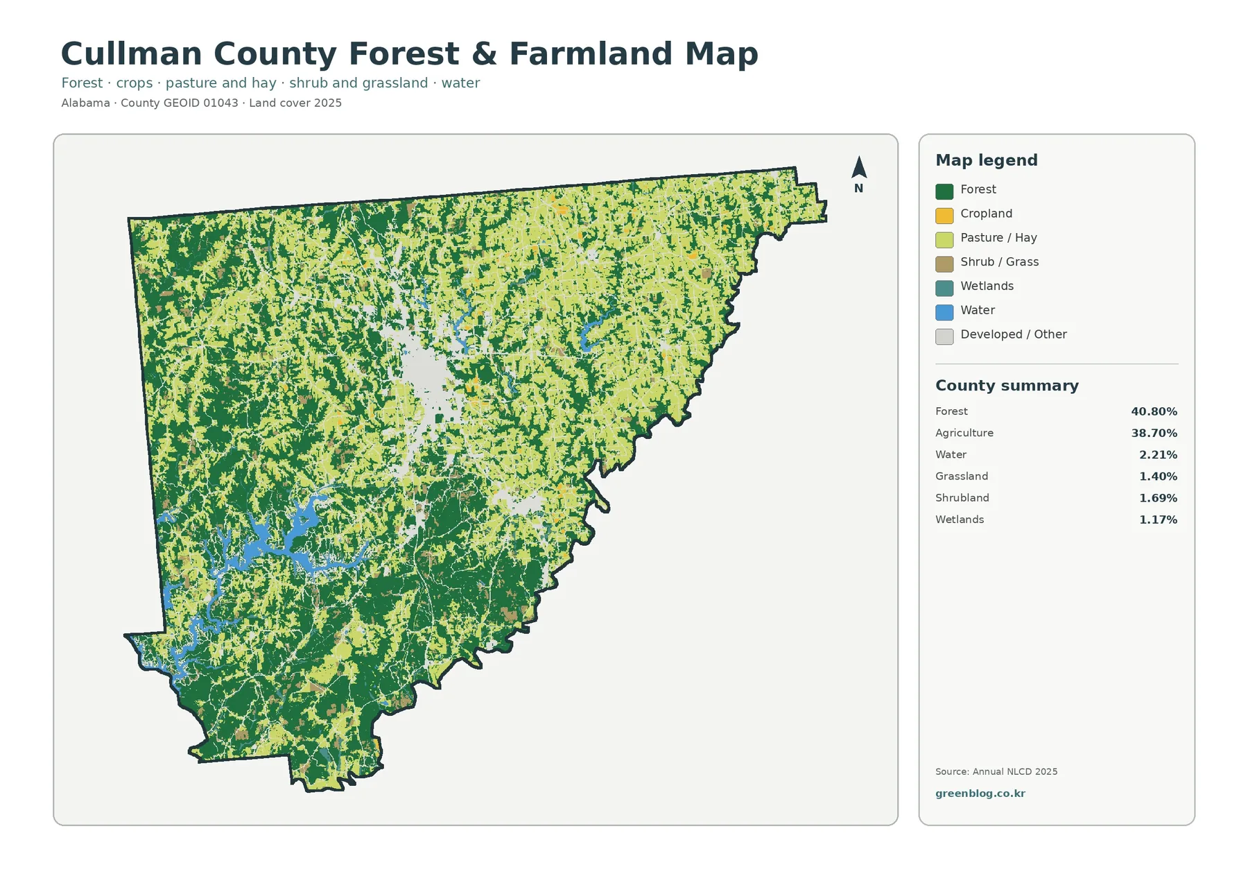
Simplifying the legend changes what stands out. On the forest-and-farmland map, western and southwestern wooded areas read as larger connected zones, while agricultural cover becomes especially noticeable across the northern and eastern portions of the county. Small breaks in both colors show that the landscape is mixed at a fairly fine scale. Farms are not confined to one open plain, and forest is not limited to one corner. The two major covers repeatedly meet each other across the county.
Agriculture’s 38.70% share should not be read as the percentage of land that belongs to farms or as a measure of one crop. Annual NLCD classifies the surface visible in raster cells and groups agricultural covers such as cultivated crops and pasture or hay. A farm can contain woodland, buildings, ponds, and other classes, while an agricultural-colored cell does not provide parcel ownership or management information. The map is strongest when it is used to compare the location and extent of visible agricultural cover.
Grassland accounts for 1.40% and shrubland for 1.69%. Those are small countywide shares, but the scattered patches help explain why some open areas do not match the agricultural color. A viewer who treats every pale open patch as farmland would lose useful detail. The same applies to developed and other areas shown in the simplified map. Reading the legend first prevents the bright rural pattern from being reduced to a two-class forest-versus-farm picture.
For practical comparison, start with this simplified map when studying a rural location. Identify whether the surrounding cover is primarily wooded, agricultural, or mixed, and then return to the general map to separate wetlands, water, development, shrubland, and grassland. This two-step method works especially well in Cullman County because the two dominant classes are so close in percentage. It provides a clearer sense of local context before the smaller classes are added back into the picture.
Smith Lake gives the southwest a very different land-cover character
The broad blue water in the southwest is one of the clearest features on both current land-cover maps. Cullman County’s official website identifies Smith Lake as a major local attraction, giving a reliable name to the large water feature visible there. The lake’s branching shoreline sits beside extensive forest cover, creating a pattern that looks very different from the more agricultural north and east or the strongly developed center of the county.
Water represents 2.21% of the county. That percentage is modest, yet the concentration of water in a large, irregular lake makes it visually important. A concentrated class can shape the appearance of a local area much more than its countywide percentage suggests. The forest-and-farmland map is useful here because it strips away some competing classes and makes the wooded shoreline context easier to compare with agricultural openings and developed or other cover nearby.
Wetlands account for 1.17% and appear much less extensively than open water. They should still be kept separate from the lake and other water bodies. Wetlands can include vegetated, seasonally wet, or saturated surfaces that do not look like open water from above. Narrow wetland features may also be generalized by the raster grid. For habitat or regulatory questions, the NLCD class is a useful regional clue but not a substitute for dedicated wetland mapping or a site investigation.
Impervious surfaces isolate the built-up core from the broader developed class
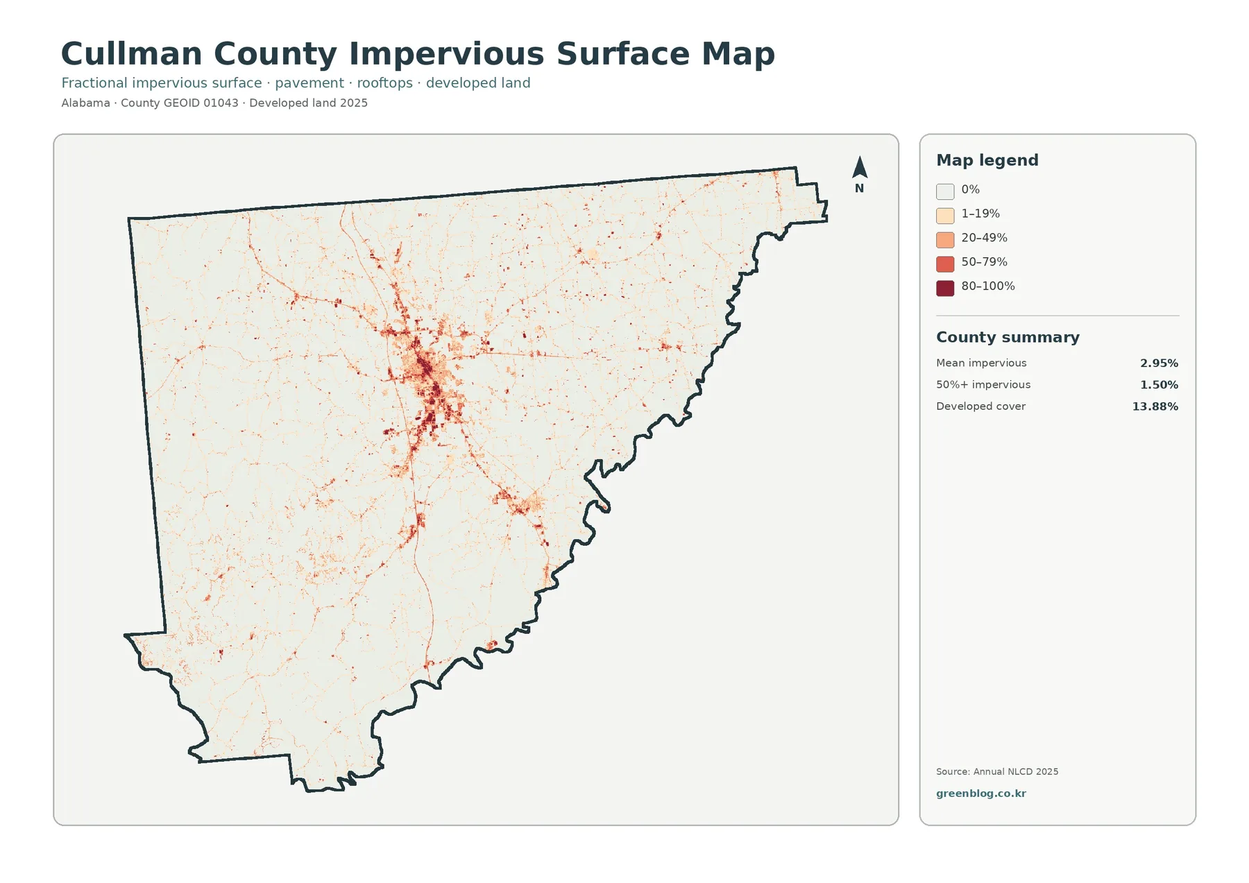
Impervious surface means pavement, rooftops, parking areas, and other hard surfaces that do not readily absorb rainfall. Cullman County’s mean impervious value is 2.95%, and 1.50% of the county falls in the 50%-or-greater impervious category. Most of the map stays pale, while the central area forms the strongest dark concentration. Narrow red lines extend away from that core and trace the pattern of more heavily surfaced transportation and settlement corridors.
The county’s official description of its position on Interstate 65 provides useful regional context for the north-south concentration visible through the middle of the map. Still, the impervious map does not label individual roads, so every line should not be assigned a road name from the image alone. A better workflow is to identify where hard surfaces are concentrated and then compare those areas with a separate transportation map if exact road identification is needed.
The gap between 13.88% developed cover and 2.95% mean impervious surface is expected. Developed land is a land-cover class that can include lawns, trees, open spaces, and low-density residential areas. Imperviousness measures the fraction of each cell occupied by hard surfaces. A lightly developed neighborhood may therefore appear within the developed class but remain pale on the impervious map. Dense commercial or street areas can produce much stronger impervious values inside the same general developed footprint.
This distinction matters for environmental interpretation. Impervious concentration can be relevant when exploring runoff, watershed conditions, or the difference between rural and built surfaces, but it does not measure flood risk by itself. Rainfall intensity, slope, soil, drainage infrastructure, stream position, and storage areas all matter. The map is best used to locate hard-surface concentrations that may deserve a closer look with those additional datasets.
What the 1985–2025 class-difference map does—and does not—say
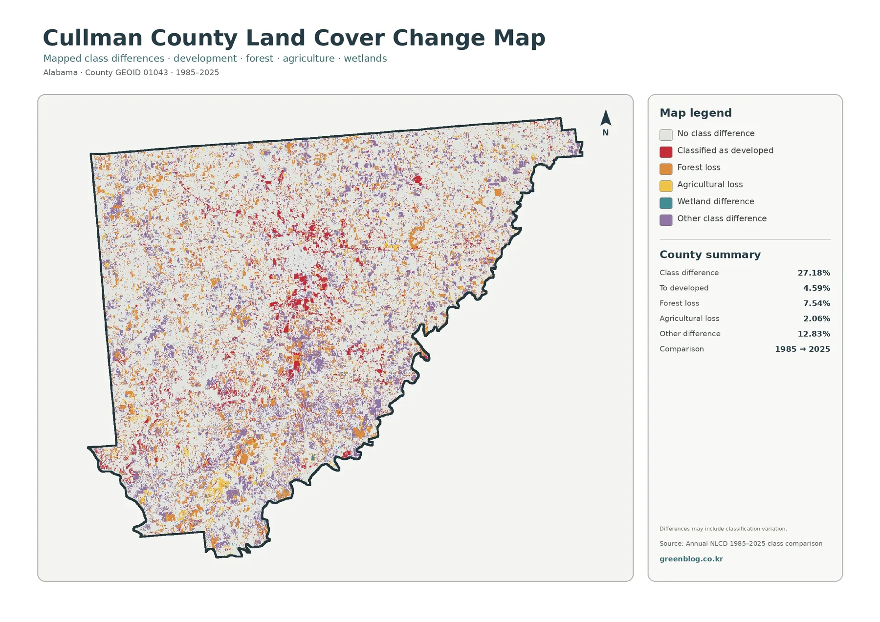
The change map compares classified raster cells from 1985 with those from 2025. Its summary reports a 27.18% class difference. Within that comparison, 4.59% is mapped as change to developed, 7.54% as forest loss, 2.06% as agricultural loss, and 12.83% as other class difference. Red change cells are especially noticeable around the central developed area, while orange and purple differences are scattered across much broader parts of the county.
A 27.18% class difference is not the same as saying that 27.18% of Cullman County physically changed land use in a simple one-for-one way. Older and newer imagery can differ in quality, season, pixel alignment, and classification method. Mixed pixels near forest edges, narrow roads, small fields, wetlands, and shorelines can also receive different labels at different dates. The map therefore identifies places where the classification differs, not a complete explanation of why each difference occurred.
The most useful reading method is comparison. Where red “to developed” cells cluster near the center, compare them with the 2025 impervious map to see whether current hard-surface concentrations occupy the same general area. Where forest-loss colors appear, compare the current forest-and-farmland map to see what class is present now. If the current map remains strongly forested in a location with many difference cells, that is a reason to avoid assuming a simple permanent forest-loss story from the change color alone.
Explaining cause requires evidence outside this map set. Historical aerial photographs, forestry records, agricultural statistics, subdivision records, and transportation data can help test whether a visible difference reflects development, timber management, agricultural change, shoreline activity, or classification variation. The class-difference map is valuable because it narrows the search area. It should be the start of a historical question, not the final proof of a historical claim.
Three useful ways to compare the four maps at the same location
The central Cullman area is a good first comparison point. The general land-cover map shows a broad developed footprint, the impervious map reduces that footprint to the harder-surfaced core and corridors, and the forest-and-farmland view makes the edge between settlement and surrounding rural cover easier to see. The class-difference map adds a historical comparison without replacing the current maps. Looking at the same central area in all four images keeps “what is there now” separate from “where the classification differs over time.”
The southwest offers a second type of comparison. Smith Lake is prominent on the current maps, and forest is extensive around much of the visible water. The impervious map is much lighter there than in the county’s central built-up area, which helps separate shoreline landscape from the main urbanized concentration. The historical comparison can then be checked for differences around the lake, but any colored cell needs additional evidence before it is described as shoreline development or forest removal.
A northern or eastern agricultural area provides a third perspective. Start with the forest-and-farmland map, identify a large agricultural patch, and then use the general map to see nearby developed, grass, shrub, wetland, or water classes. The impervious map reveals whether hard surfaces are sparse or concentrated nearby. Finally, the difference map can show whether the location received a different label in 1985. This sequence turns four separate images into one structured reading exercise.
Using the downloadable JPG set in classes, reports, and presentations
The download contains the four original JPG maps shown in the article. Each file is 2480 × 1754 pixels, which is practical for slides, ordinary reports, handouts, and county-scale reference graphics. The asset manifest does not mark this size as meeting the package’s A3 high-resolution reference, so very large-format printing should be approached cautiously. The images are best when the full county pattern, legend, and broad spatial relationships matter more than tiny boundary details.
- Use the general 2025 land-cover map when one image must summarize forest, agriculture, development, water, wetlands, shrubland, and grassland.
- Use the forest-and-farmland map when the nearly even forest–agriculture balance is the main topic and smaller rural classes need a simpler legend.
- Use the impervious-surface map to discuss where pavement and rooftops are concentrated within the broader developed footprint.
- Use the 1985–2025 class-difference map as a starting point for historical comparison, then verify any proposed explanation with additional sources.
For a classroom activity, the nearly equal forest and agriculture percentages create a useful question: how can two classes with similar countywide shares produce different-looking local patterns? Students can compare the wooded southwest, agricultural north and east, the central developed area, and Smith Lake before discussing why a countywide percentage does not describe every neighborhood. The impervious map also provides a clear example of why “developed” and “mostly paved” are not equivalent categories.
For reports and presentations, keeping all four maps at the same scale is helpful. A viewer can hold the county outline in memory while the topic changes from current cover to rural cover, hard surfaces, and historical difference. Place the general map first, because it establishes the legend and the broad pattern. Follow with the simplified rural map and the impervious map, then use the class-difference image last so current conditions are not confused with change categories.
Raster classification, scale, and other limits to remember
Annual NLCD is raster data, which means the landscape is divided into grid cells and each cell receives a representative class or value. Real places are more complicated. A single cell can contain trees, lawn, a building, a road, and bare ground. Small streams, narrow roads, field edges, and scattered houses may therefore be simplified or blended into nearby classes. The boundary between two map colors should not be treated as a surveyed property or regulatory line.
The 2025 date is equally important. New construction, vegetation growth, timber harvest, agricultural rotation, shoreline work, or other changes after the observation period may not appear. The map is a snapshot of a classified year, not a live land-status service. Property transactions, zoning questions, building permits, engineering design, wetland determinations, and parcel measurements require the appropriate current agency records and, when necessary, field verification.
At county scale, however, the generalization is also what makes the set useful. It turns a large and complicated landscape into comparable classes that can be read quickly. In Cullman County, the method captures a strong countywide story without claiming parcel-level precision: forest and agriculture are nearly balanced, development is strongly centered, hard surfaces occupy a smaller core, and a large lake changes the character of the southwest. Those are the kinds of regional patterns these maps are designed to communicate.
Frequently Asked Questions
What is the largest land-cover class in Cullman County?
Forest is the largest 2025 class at 40.80%, but agriculture is close behind at 38.70%. Developed land accounts for 13.88%, water 2.21%, shrubland 1.69%, grassland 1.40%, and wetlands 1.17%. Because forest and agriculture are so close, the county is better understood by comparing where the two classes occur rather than focusing only on which one ranks first.
Why is developed cover 13.88% while mean imperviousness is only 2.95%?
The measurements describe different things. Developed land is a land-cover category that can include low-density neighborhoods with trees and lawns. Imperviousness measures the share of a raster cell covered by hard surfaces such as pavement and rooftops. A place can therefore be classified as developed while still having a relatively low impervious percentage.
Does the 27.18% class difference mean 27.18% of the county definitely changed?
No. It means 27.18% of the compared cells received different classification labels in 1985 and 2025. Some differences can reflect real land-cover change, while others may be influenced by image quality, classification rules, seasonal conditions, pixel alignment, or mixed pixels. A historical claim should be checked against aerial imagery or other independent records.
What are the downloaded JPG maps best used for?
They work well for county reference pages, school lessons, presentations, reports, and broad comparisons of forest, farmland, development, water, and change categories. They are not parcel surveys, zoning maps, wetland determinations, or engineering plans. When a decision depends on exact boundaries or current site conditions, use the appropriate detailed official data and field information.
Map File Information
Cullman County land cover map files The ZIP contains the four original JPG maps: 2025 general land cover, forest and farmland, impervious surface and developed land, and the 1985–2025 class-difference map.
- Included Files: Use only the versions confirmed in the article and supplied images
- File Type: Use the confirmed download contents
- Intended Use: Printing, education, presentations, and map-based projects
Related Maps
- Autauga County Alabama Land Cover Map
- Baldwin County Alabama Land Cover Map
- Barbour County Alabama Land Cover Map
Sources and references
- MRLC Annual NLCD Data — official access point for Annual NLCD land-cover and related products.
- USGS Annual NLCD Land Cover Classification — official explanation of classes such as forest, agriculture, developed land, wetlands, and water.
- U.S. Census Bureau TIGER/Line Shapefiles — official geographic boundary resources, including county boundaries.
- Cullman County Official Website – About — county context for its north Alabama location, Interstate 65, the Cumberland Plateau, and Smith Lake.
Green Map creates custom-edited map images using open geographic data sources such as geoBoundaries, Natural Earth, OpenStreetMap, and government open data.
These maps are edited visual materials, not raw data files, and are provided for education, documents, presentations, and graphic reference.