Forest leads Autauga County’s 2025 land-cover summary at 45.03%, followed by agriculture at 20.05%, wetlands at 11.25%, and developed land at 9.21%. The clearest contrast is between the broad wooded west and north and the much stronger concentration of developed cover in the southeast. Water and wetland corridors also break up the interior, especially toward the Alabama River along the county’s southern edge.
Four views are provided here: general land cover, forest and farmland, impervious surface, and a 1985–2025 class comparison. You can inspect the web previews first, then download the four original JPG maps together in one ZIP for printing, classroom work, presentations, or side-by-side local comparison.
Table of Contents
Forest dominates much of the county while development concentrates in the southeast
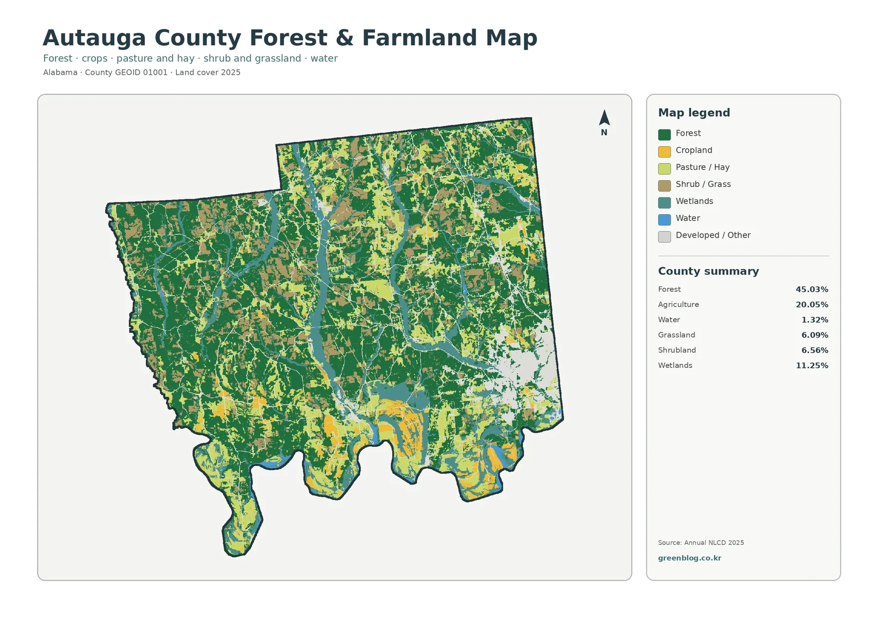
The general 2025 map is dominated by dark green across much of western Autauga County and large parts of the north. Forest also continues through the center in broad blocks, but it is repeatedly interrupted by agriculture, wetlands, shrubland, and small developed patches. The 45.03% forest figure therefore describes the countywide balance without implying that the county is one continuous woodland.
Agriculture accounts for 20.05% of the mapped cover. Yellow areas are especially noticeable in the south and south-central portion of the county, with additional farmed areas scattered through the center and northeast. These agricultural patches often meet forest or wetland colors directly. The map does not identify crop type, farm ownership, or legal agricultural zoning, so the safest interpretation is simply that those cells were classified as agricultural cover in the supplied 2025 dataset.
Wetlands make up 11.25%, which is large enough to be a major part of the county pattern rather than a minor legend category. Teal areas trace irregular corridors and patches through the interior and are common near the southern boundary. Open water is shown separately in blue. Keeping those two categories separate matters because a wetland pixel is not the same thing as an open river or pond.
Developed cover is 9.21%, but its distribution is highly uneven. The southeast contains the broadest red concentration, while much of the west remains lightly developed. Narrow red lines and smaller clusters extend away from the southeastern concentration. Prattville is the county seat and largest city, so the strong southeastern developed pattern is easier to understand when read alongside that local context. The land-cover map itself does not label every road or neighborhood, however, so individual red lines should not be assigned names without a separate reference map.
Shrubland is listed at 6.56% among the county summary values. It appears in smaller pieces mixed with forest, agriculture, and grass-covered areas rather than forming one dominant region. Those transitional colors are useful because they prevent a simple forest-versus-farm reading from hiding the variety of open and semi-wooded surfaces across the county.
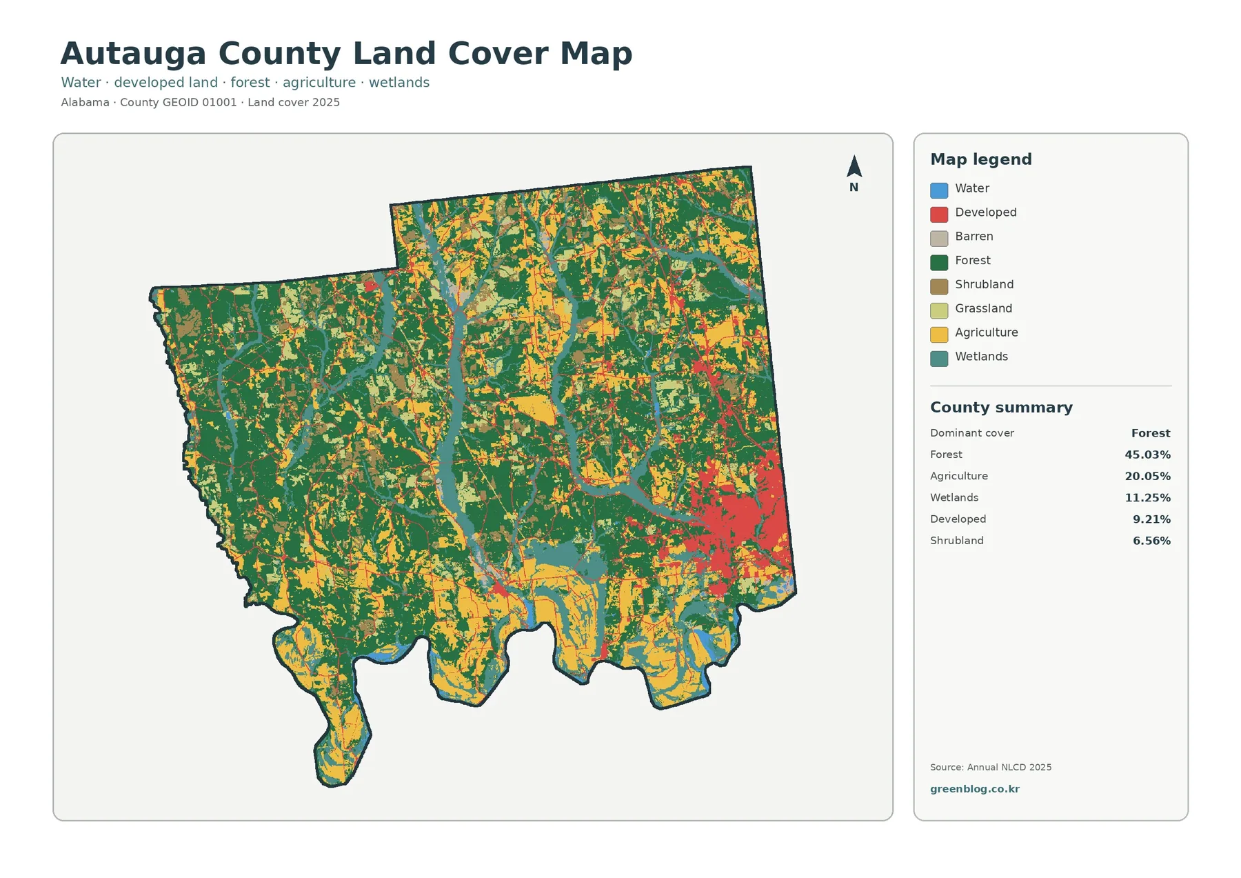
Hard surfaces cluster near Prattville but cover less area than the developed class
Impervious surface means pavement, rooftops, parking areas, and similar surfaces that do not readily absorb water. Autauga County’s mean impervious value is 1.84%, and 0.72% of the county is mapped at 50% impervious or greater. Those numbers are much lower than the 9.21% developed-cover figure because developed land can contain lawns, trees, open ground, and other surfaces that are not impervious.
Hard-surface intensity creates a very different visual balance from the general land-cover map. Most of the county is pale, while the southeast contains the strongest orange and red concentration. That compact area is surrounded by thinner linear traces and smaller spots. The contrast makes it clear that hard surface is concentrated in a limited part of the county even though developed land appears over a somewhat wider area.
Prattville provides a useful geographic reference for this map because it is the county seat and largest city. The strongest cluster lies in the same southeastern part of the county where the general map shows its largest developed area. That is a spatial association, not proof that any particular road, project, or building caused the pattern. The preview does not label streets or municipal boundaries, so a transportation or parcel map is needed for that level of detail.
Major routes serving Autauga County include I-65, U.S. 31, U.S. 82, and State Route 14 according to trusted local reference material. Thin impervious lines on the map may align with transportation corridors, but the layer itself classifies surface cover rather than road hierarchy. A line that looks like a roadway should therefore be verified before it is identified in a report or presentation.
As a screening layer, impervious-surface data helps locate concentrations of hard cover, but it is not a runoff or flood-risk map. Drainage depends on terrain, soils, rainfall, streams, and infrastructure in addition to pavement and rooftops. For environmental work, this map is best used as one layer that helps locate areas for closer study rather than as a stand-alone risk assessment.
Wetlands and the Alabama River provide clear reference points
Along the southern edge, the Alabama River forms a major water boundary, while local references also identify Autauga Creek and other streams within the county. That geography gives useful context for the blue and teal patterns visible on the land-cover maps. Water occupies 1.32% in the forest-and-farmland summary, while wetlands account for 11.25%, so wet ground covers a much larger mapped area than open water alone.
The difference between water and wetlands is easy to lose when the map is viewed at a small size. Blue marks open water, while teal represents land classified as wetland. In the south and along interior corridors, the two colors often occur near one another, yet they should not be merged into a single category. A wetland can contain vegetation and seasonally saturated ground even where a broad open water surface is absent.
Agricultural colors frequently approach wetland corridors in the southern half of the county, while forest surrounds many wetland patches farther west and north. The map only establishes that the classes are adjacent. It does not show whether agriculture changed a wetland, whether forest conditions created it, or how water moves through the site. Those questions require hydrology, elevation, soils, and site-specific records.
For a classroom or environmental overview, a good reading sequence is to locate the Alabama River boundary first, then follow the interior wetland colors northward and compare the surrounding cover. This approach gives readers a geographic anchor and avoids a paragraph that merely lists legend colors. It also highlights why the 11.25% wetland share is an important county characteristic.
Forest and agricultural cover create a varied interior landscape
The forest-and-farmland map removes much of the visual competition from the developed class and makes the county’s rural cover easier to compare. Forest remains the largest category at 45.03%. Agriculture is 20.05%, grassland 6.09%, shrubland 6.56%, wetlands 11.25%, and water 1.32% in the supplied summary. These values show that open land is divided among several classes rather than being one uniform agricultural surface.
Dark green is strongest in the western portion of the county, where large forest blocks remain relatively continuous. The north also contains extensive woodland, although agricultural and open-land colors break it into smaller pieces in places. In the south, yellow and lighter green agricultural colors become more prominent, and wetlands appear repeatedly near low-lying or water-connected corridors visible in the map.
Cropland and pasture or hay are separated in the legend, which is useful when the broad agriculture percentage would otherwise hide internal variety. A field-colored area and a pasture-colored area both contribute to the agricultural landscape, but they are not the same mapped surface. At presentation scale, some of the smaller patches can disappear, so the original JPG is preferable when those distinctions matter.
Grassland and shrubland together represent a noticeable part of the map. They often occur at the edges of forest or agriculture and in irregular interior patches. Their presence is another reason not to describe every light-colored rural area as farmland. When a project needs a simplified story, it is still better to say that the county contains a mixture of forest, agriculture, grass, shrub cover, wetlands, and development than to collapse all open land into one category.
Nothing in this layer identifies whether forest is public or private, protected or managed, and agricultural color does not establish a parcel’s legal land use. Land cover describes what the surface was classified as, not who owns it or what regulations apply. That distinction is especially important when a countywide map is used in planning discussions or local reports.
Read the 1985–2025 class comparison as a classification difference, not a direct change rate
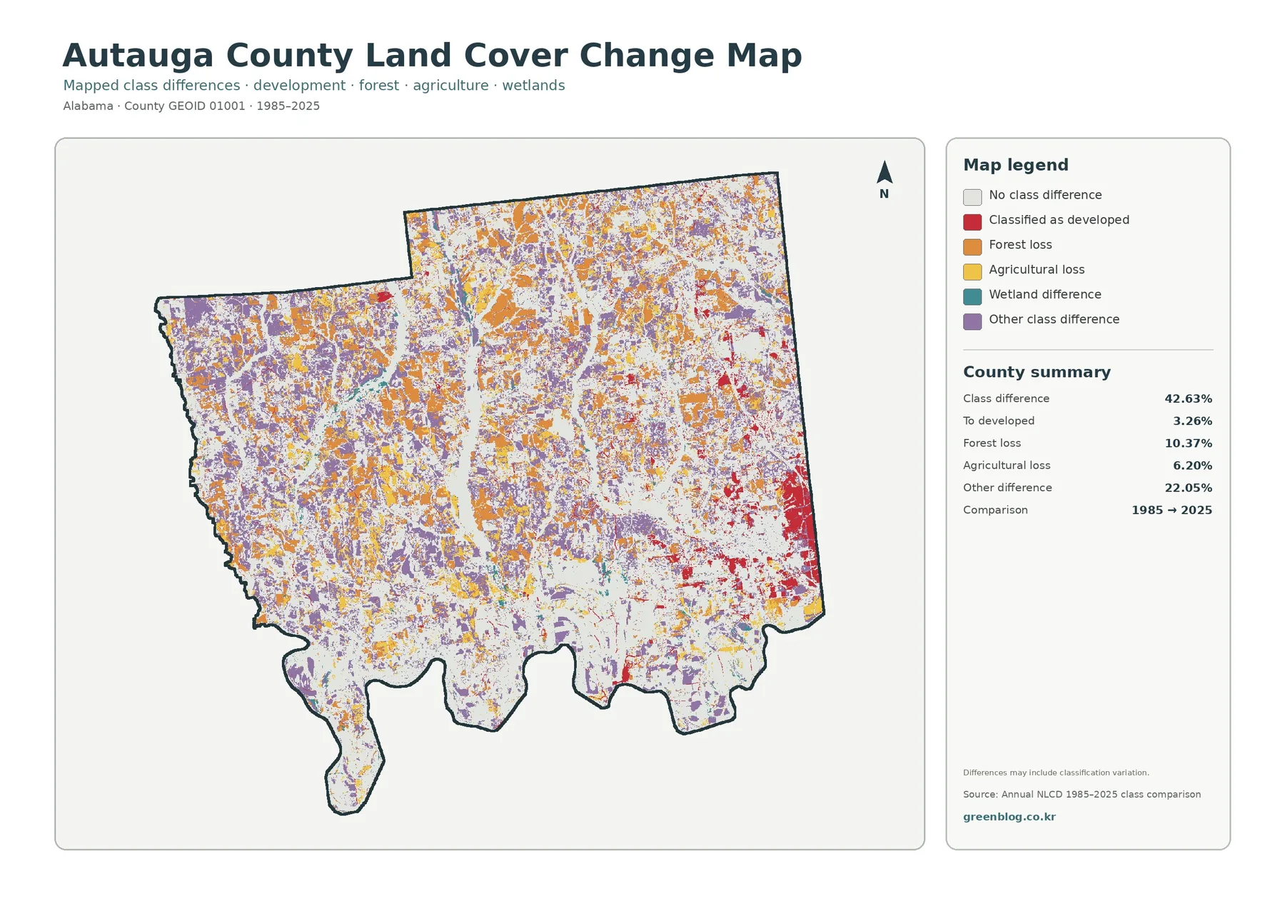
The class-comparison map reports 42.63% of cells with a different classification between 1985 and 2025. The summary breaks that total into 3.26% classified to developed, 10.37% forest loss, 6.20% agricultural loss, and 22.05% other difference. A number this large needs careful wording because the map itself warns that differences may include classification variation.
Red pixels associated with classification to developed are strongest in the southeast, with smaller examples scattered elsewhere. That location corresponds broadly with the county’s strongest current developed and impervious pattern. Still, the layers answer different questions: the comparison shows a difference between two dates, while the impervious map estimates hard surface in 2025. Similar geography does not make the two measurements interchangeable.
Orange forest-loss pixels are distributed across the north, center, and west rather than forming one single block. Agricultural-loss colors also occur in many places, while purple “other class difference” is widespread and is the largest component at 22.05%. Because the other-difference category is so large, the total 42.63% cannot reasonably be summarized as one story of development, forest clearing, or farm loss.
A class difference can arise where mapped boundaries shift, where vegetation conditions differ between observation years, or where a mixed cell is assigned differently. The comparison is valuable for locating areas that deserve closer inspection, but a small isolated pixel should not be treated as confirmed clearing, construction, or conversion without additional evidence.
For site-level follow-up, start with the change map to identify a cluster, then check the same location on the 2025 general map and the forest/farmland or impervious layer. When the comparison matters for a decision, add older aerial imagery, recent imagery, or official local records. That sequence separates the question of current cover from the question of how classification differs across time.
Prattville and the Alabama River add context without making this a parcel map
In central Alabama, Autauga County includes Prattville as its county seat and largest city. The official county website describes a gently rolling landscape and highlights Autauga Creek, while the Encyclopedia of Alabama notes the Alabama River along the southern boundary and several interior streams. Those named features help readers connect the unlabeled land-cover colors to real county geography without inventing place names for every patch.
The southeast developed concentration, the river-side wetlands, and the wooded west are three useful reference patterns for comparing the four maps. They make the page easier to read because a visitor can return to the same parts of the county instead of treating each map as a completely new image. The goal is not to reduce the county to three zones, but to use clear anchors before examining smaller local variations.
The gently rolling regional setting does not mean elevation can be measured from these maps. No contour lines or elevation values are provided here. Forest, agriculture, and wetland colors may relate to terrain and drainage in the real landscape, but this package does not supply enough evidence to assign a specific slope or elevation to a mapped patch.
The same restraint applies to settlement patterns. Developed and impervious colors can show where built surfaces are concentrated, but they do not measure population, traffic, property value, or municipal services. A land-cover layer is most useful when it is allowed to answer the question it was designed for: what kind of surface is mapped here, and how does that surface pattern differ across the county?
Compare the four maps by asking a different question of each one
For a county overview, begin with the general 2025 map. It gives the fastest picture of forest, agriculture, wetlands, development, water, and other cover in one frame. More specific questions are better handled by switching layers instead of forcing the general map to answer everything. The forest-and-farmland version is better for rural cover, while the impervious map is better for hard surfaces.
A practical comparison can start in the southeast near the main developed concentration. On the general map, identify the extent of developed land. On the impervious map, note where the highest hard-surface values sit within and around that area. Then use the 1985–2025 comparison to see where class differences occur. The three layers complement one another, but none of them replaces the others.
The wooded west is another useful test area. Forest dominates the current maps, yet wetland, grass, shrub, and agricultural patches remain visible inside or along its edges. The impervious layer stays mostly pale there, while the change comparison contains scattered orange and purple pixels. Looking at the same place in several layers prevents an overly simple description such as “unchanged forest” or “pure woodland.”
For education, ask a different question of each map: What covers the ground now? How are forest and agriculture divided? Where are hard surfaces concentrated? Where do the 1985 and 2025 classifications differ? That method teaches map interpretation more effectively than asking students to memorize every color in the legend.
For planning or environmental background work, use the countywide maps to identify areas that need more detailed sources. A wetland question may require regulatory wetland and hydrologic data. A development question may require current roads, structures, zoning, or parcel records. A land-ownership question needs cadastral or assessor information. The maps here are a consistent regional reference, not a substitute for those purpose-built datasets.
Scale, classification, and date are part of the map—not footnotes
Land-cover products generalize the ground into grid cells so large areas can be compared consistently. Real landscapes contain field edges, narrow roads, small buildings, ditches, tree lines, and other features smaller than a county-scale cell. A colored boundary in the map should therefore not be treated as a surveyed property line or an exact feature edge.
Mixed cells are common where several surfaces meet. A single area can contain trees, grass, pavement, and roof cover within a small space. Classification still has to assign a category or estimate a fraction. Small isolated patches at class boundaries are less reliable for strong conclusions than broad, repeated patterns that continue across many neighboring cells.
The current-cover maps in this package are labeled 2025. Later construction, vegetation recovery, crop rotation, clearing, or changes in visible water may not appear in that snapshot. Projects that depend on today’s condition should also check recent imagery or field information alongside the 2025 layer.
The 1985–2025 comparison deserves even more caution because it combines two time points. Its 42.63% class-difference figure includes a large 22.05% other-difference category, and the map explicitly notes possible classification variation. Readers should report those categories as mapped differences rather than converting them into an unsupported estimate of physical land transformation.
Finally, land cover is not zoning, ownership, development permission, a regulated-wetland boundary, or a flood-zone determination. A forest-classified cell simply indicates forested surface in the land-cover product. Legal and administrative questions must be answered with the official data created for those purposes.
Download the four original Autauga County JPG maps
The ZIP below contains the four original JPG maps described on this page: 2025 general land cover, forest and farmland, impervious/developed land, and the 1985–2025 land-cover class comparison. They are useful when the web previews are too small for a printed handout, when a legend needs to remain readable on a slide, or when several county layers must be compared at the same scale.
After downloading the ZIP, you can extract and use only the JPG files needed for your project. Keep the displayed year and source context with the image when possible. For parcel-level boundaries, current legal status, or a decision that depends on precise local conditions, add the appropriate official local dataset or recent imagery rather than relying on the countywide land-cover map alone.
Frequently Asked Questions
What is the largest 2025 land-cover class in Autauga County?
Forest is the largest class in the supplied 2025 summary at 45.03%. Agriculture follows at 20.05%, wetlands at 11.25%, and developed land at 9.21%. The map shows broad woodland across the west and north, more agricultural cover in the south and interior, and the strongest developed concentration in the southeast around the Prattville area.
Does the 42.63% class difference mean 42.63% of Autauga County was physically transformed?
No. The comparison identifies cells whose 1985 and 2025 classifications differ. The summary includes 3.26% classified to developed, 10.37% forest loss, 6.20% agricultural loss, and 22.05% other difference. The map also states that classification variation may be included, so a physical land change should be confirmed with additional imagery or records before a site-specific conclusion is made.
Why is developed cover 9.21% while mean impervious surface is only 1.84%?
They measure different things. Developed land is a land-cover class that can include vegetation and other permeable surfaces. Impervious mapping estimates hard surfaces such as pavement and rooftops. In Autauga County, 0.72% of the area is mapped at 50% impervious or greater, and the strongest hard-surface concentration is in the southeast.
Map File Information
Autauga County land-cover maps – four original JPG files
- Included Files: Use only the versions confirmed in the article and supplied images
- File Type: Use the confirmed download contents
- Intended Use: Printing, education, presentations, and map-based projects
Related Maps
Sources and references
- MRLC Annual NLCD Data – official access to the Annual NLCD products used for the supplied current and comparison maps.
- USGS Annual NLCD Land Cover Classification – reference material for land-cover classes and the classification framework.
- U.S. Census Bureau TIGER/Line Shapefiles – official geographic boundary resources, including county boundaries.
- Autauga County Official Website – official county information and local geographic context.
- Encyclopedia of Alabama – Autauga County – trusted background on Prattville, the Alabama River, county waterways, and transportation.
Green Map creates custom-edited map images using open geographic data sources such as geoBoundaries, Natural Earth, OpenStreetMap, and government open data.
These maps are edited visual materials, not raw data files, and are provided for education, documents, presentations, and graphic reference.