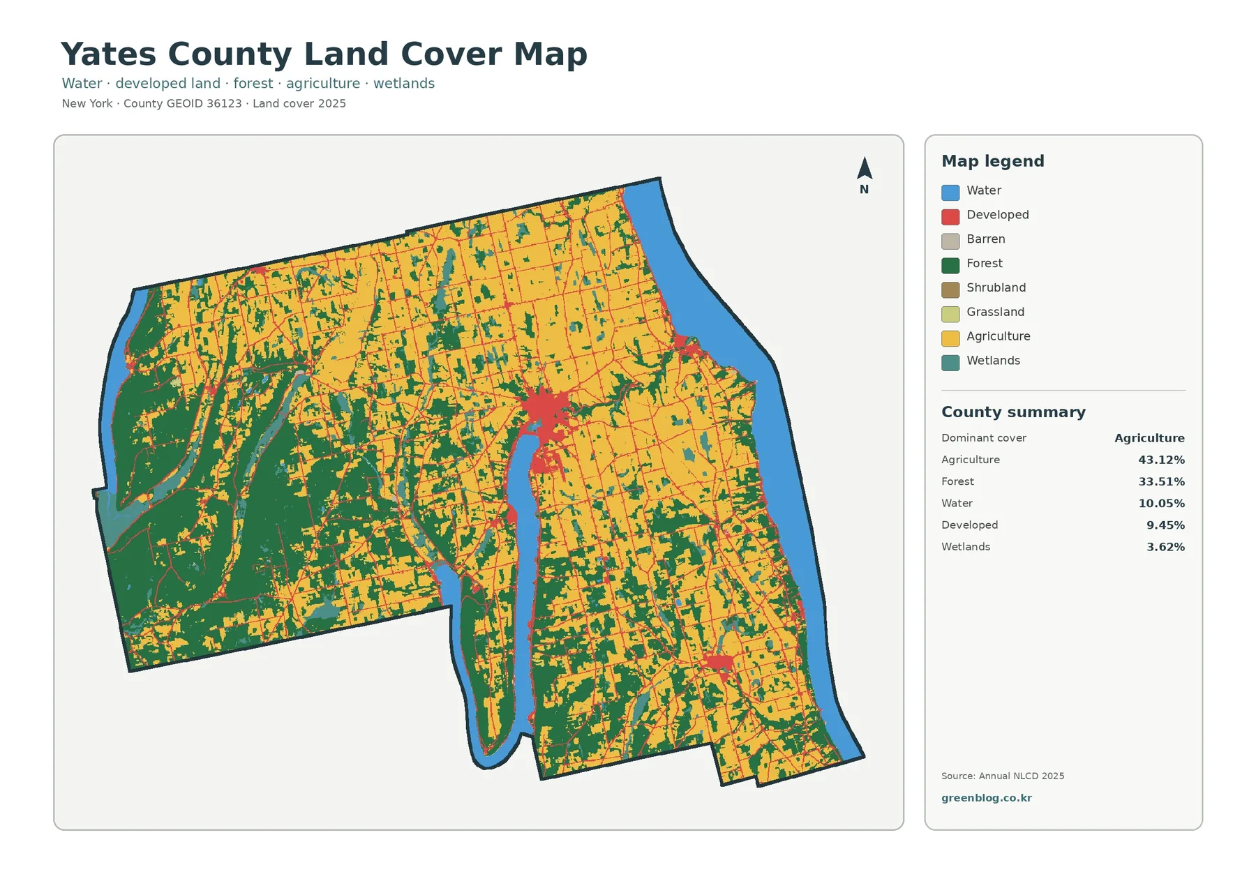
Yates County’s 2025 land-cover pattern is led by agriculture at 43.12%, followed by forest at 33.51%. The map does not look like one continuous farm block, however. Yellow agricultural areas spread broadly across the north, east, and much of the interior, while larger dark-green forest blocks stand out in the west and southwest. Water accounts for 10.05%, and the long interior water body plus the broad water edge on the east give the county a distinctive arrangement of shorelines, farm areas, wooded land, and small developed centers.
This page brings together four views of the same county: general 2025 land cover, forest and farmland, impervious surface, and mapped class differences from 1985 to 2025. You can compare the web previews first and then download the four original JPG maps in one ZIP for printing, classroom work, presentations, or side-by-side local reference.
Table of Contents
A 2025 landscape where farms, woods, and large water areas share the frame
The general land-cover map makes agriculture the first pattern most readers will notice. Yellow covers large sections of the northern tier and eastern half, extends along both sides of the long central water body, and appears again through the south. The pattern is broken repeatedly by forest, wetland, and developed classes, so the county is better described as a patchwork than as a single uninterrupted agricultural zone.
Forest covers 33.51% of the county and is especially prominent in the west and southwest, where several green areas connect into larger blocks. Smaller wooded patches also appear among fields in the center and east. That distribution matters because the countywide percentage alone cannot show where forest is concentrated. Looking at the map reveals a clear difference between heavily farmed sections and areas where woods occupy more of the visible surface.
Water makes up 10.05% of the mapped summary, a large enough share to shape how the rest of the map is read. A narrow, elongated water body extends deep into the county’s interior, while a much broader blue area follows the eastern edge. Farm, forest, and developed classes meet these shorelines in different combinations. The water therefore serves as an easy visual reference when comparing land cover on opposite sides of the county.
Developed land is 9.45% and wetlands are 3.62%. Red developed pixels form several compact concentrations, most visibly near the northern end of the long interior water body and at smaller eastern and southeastern locations. Thin red lines also connect parts of the county. Wetlands appear as smaller teal patches and strips, often near water or along transitions between farm and forest. These categories describe surface cover, not zoning, property ownership, building rights, or legal wetland boundaries.
Forest and farmland become easier to compare when other classes fade back
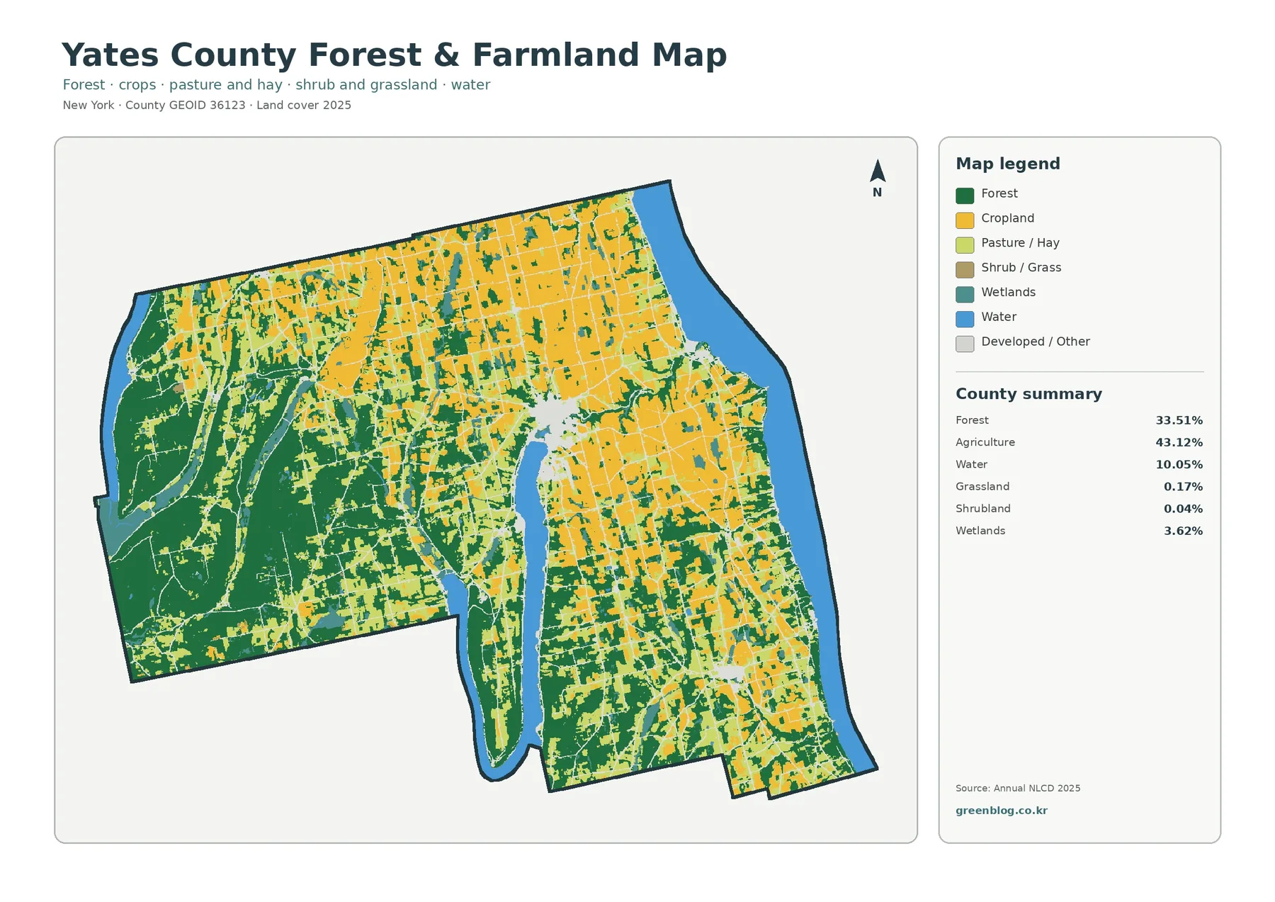
The forest-and-farmland map removes much of the visual competition from developed and other classes. In this view, the broad agricultural coverage across the north and east becomes clearer, but so do the forest blocks that cut into it. Western Yates County reads differently: dark green occupies more of the map there, and agricultural colors enter as smaller fields and corridors along its edges and through openings.
Agriculture is summarized at 43.12%, but the legend separates cropland from pasture and hay. That distinction is useful because an agricultural percentage does not mean every farmed pixel represents the same surface. Yellow cropland and the lighter pasture/hay category appear together across many parts of the county. Readers comparing land-cover types should therefore use both the summary number and the more detailed legend rather than treating agriculture as one uniform block.
The 33.51% forest share also has internal variation in its shape. Some wooded areas form broad connected patches, particularly toward the west, while other green pieces are narrow or isolated inside farmland. This is a good map for explaining fragmentation without needing technical vocabulary: some woods are large and connected, and others are small pieces surrounded by a different cover class. The map shows that visual condition directly.
Wetlands account for 3.62% and remain visible as teal areas in this simplified view. They are much smaller than the 10.05% open-water share, but they add another layer along shorelines and low-looking corridors. Open water and wetlands should not be merged into one category. The map treats them separately because visible water surfaces and vegetated or saturated wetland surfaces are different land-cover classes.
Grassland is 0.17% and shrubland is 0.04% in the county summary. Those values are so small that the corresponding colors can be difficult to see at web-preview size. If a project depends on those minor classes, use the larger original JPG and read the legend carefully. A tiny patch should not be generalized into a countywide characteristic simply because it is visually distinctive at one location.
Impervious surface is sparse countywide but strong in a few compact clusters
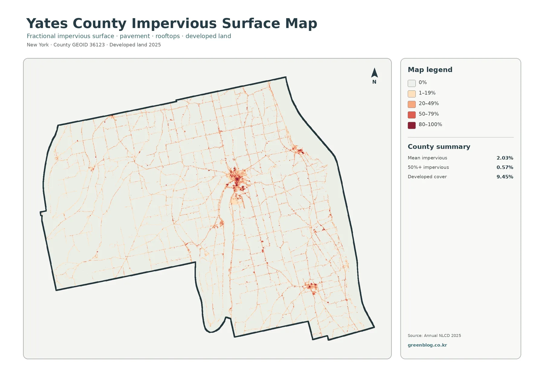
Impervious surface means hard cover such as pavement and rooftops where water cannot easily soak into the ground. Yates County’s mean impervious value is 2.03%, while only 0.57% of the mapped area is summarized as 50% or more impervious. Those figures are much smaller than the 9.45% developed-land share because a developed land-cover class can include vegetation and other surfaces that are not fully paved or roofed.
The darkest impervious colors do not spread across a large continuous urban area. They concentrate most strongly near the north end of the long interior water body, with smaller clusters to the east and southeast. Fine reddish lines extend between these areas and through the agricultural background. Their shape is useful for locating hard-surface corridors, but the map does not label roads or identify the use of individual buildings, so those functions should not be guessed from color alone.
Large farm and forest sections remain very pale in the impervious map. Comparing them with the general land-cover map helps separate two questions: where land is classified as developed, and where hard surfaces occupy a high fraction of the ground. The two patterns overlap in some places, but they are not interchangeable. This distinction is especially important when a developed class looks broader than the strongest pavement and rooftop concentrations.
Impervious mapping can be a useful screening layer for environmental or planning discussions, yet it should not be treated as a flood or drainage map. Runoff depends on terrain, soil, rainfall, drainage systems, and nearby water as well as hard surfaces. A practical workflow is to identify the strongest impervious clusters here and then compare those locations with purpose-specific official data if a project needs a more detailed assessment.
Why the county’s 10.05% water share matters when reading the surrounding cover
Water is not a small background class in this map set. The long interior water body creates two opposing shorelines deep inside the county, and the broad eastern water edge forms another major boundary. Those blue areas make it easier to orient yourself when comparing the four maps. Farm fields dominate many nearby sections, while forest and developed pixels reach the shoreline more strongly in other places.
Open water and wetlands should be read as separate features. Water covers 10.05%, whereas wetlands account for 3.62%. The teal wetland patches are smaller and more irregular than the large blue water surfaces. Keeping the categories separate prevents a common mistake: describing every wet area as open water or assuming that a land-cover wetland class is identical to a legally regulated wetland boundary.
The map can show that agriculture, forest, development, and wetlands occur near water, but it cannot establish cause and effect among them. A farm-colored area beside a shoreline does not by itself explain drainage, water quality, or land-management history. The same caution applies to developed areas. If a project needs to answer those questions, the land-cover map should be paired with hydrology, soils, local planning, or other official records.
The 1985–2025 change layer is a class comparison, not a single story of development
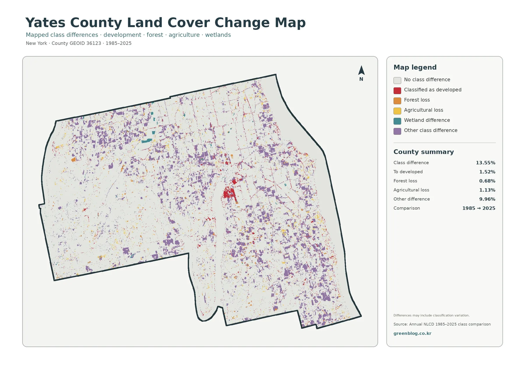
The change map reports a 13.55% class difference between 1985 and 2025. Within that total, 1.52% is categorized as classified to developed, 0.68% as forest loss, 1.13% as agricultural loss, and 9.96% as other difference. Because “other difference” is by far the largest component, it would be inaccurate to describe the entire 13.55% as new development, deforestation, or farmland loss.
Purple other-difference pixels are scattered across broad parts of the county. Red classified-to-developed pixels are more concentrated, especially in one central cluster and at smaller locations, while orange forest-loss and yellow agricultural-loss pixels appear in more limited patches. These colors identify where the two classifications differ; they do not automatically explain why the difference occurred or how significant it was on the ground.
The map itself warns that differences may include classification variation. That matters at boundaries where one grid cell can contain several real-world surfaces or where two source dates produce slightly different class edges. A small colored patch may represent genuine land-cover change, a classification shift, or a combination of effects. For an important site, the change layer is best used to identify a place that deserves a closer look with more detailed imagery or local records.
Used with that caution, the comparison map becomes more useful rather than less. Start by finding a cluster of change colors, check the same location in the 2025 general map, and then compare it with the forest/farmland and impervious layers. This sequence keeps present-day cover, hard-surface concentration, and long-term classification differences as three separate pieces of evidence.
Reading one location across all four maps
The area near the north end of the long interior water body is a useful example. In the general land-cover map, developed pixels form a noticeable concentration surrounded by agriculture and forest. The impervious map shows one of the county’s darkest hard-surface clusters in the same general area. The change layer also contains red and purple pixels nearby, but those colors represent a comparison between classifications rather than the current extent of development.
Western Yates County provides a different comparison. The forest/farmland map shows larger connected forest blocks there, while the general map reveals smaller agricultural and wetland areas mixed into the wooded background. On the impervious map, much of that same western area stays pale. The maps therefore show a strong spatial association between broader forest cover and low visible impervious values, without proving any causal relationship.
In the east and southeast, agricultural colors cover larger areas but remain interrupted by woodland fragments and narrow developed patterns. The countywide agriculture figure of 43.12% is useful for ranking the major classes, yet the map prevents that number from becoming an oversimplification. Agriculture is dominant overall, but its density and continuity vary considerably from one part of the county to another.
A classroom exercise can make these differences clear. Pick one small area and ask four different questions: What is the current cover? How are farms and woods divided? Where are hard surfaces concentrated? Where do the 1985 and 2025 classifications differ? The answers come from different maps, which helps prevent students or readers from treating four related layers as if they were interchangeable.
What to remember about colors, grid cells, and scale
These land-cover maps generalize the ground into grid-based classes so a large area can be compared consistently. Real landscapes contain finer boundaries than the map can show: field edges, narrow roads, small buildings, thin streams, tree lines, and mixed vegetation may all occur within or across mapped cells. The colored boundary on the screen is therefore not a parcel survey line or an exact facility boundary.
A single grid cell can also contain more than one surface, such as trees beside pavement or a field beside a wet strip. Classification must still assign a category or estimate a surface fraction. This is one reason small color changes at class edges should be interpreted carefully, particularly in the 1985–2025 comparison. The strongest conclusions should come from broad repeated patterns, not from a single isolated pixel.
The 2025 map represents the supplied data year. Construction, crop conditions, vegetation recovery, clearing, or changes in visible water after that date may not appear until a later dataset is available. If a task depends on current on-the-ground conditions, use recent imagery or field information in addition to this countywide land-cover view.
Land cover also should not be confused with legal land use. A pixel classified as agriculture does not confirm that a parcel is zoned for agriculture, and a developed pixel does not establish what may legally be built there. The map does not determine ownership, zoning, regulated wetland status, flood zones, or development rights. Those questions require the official data created for those specific purposes.
Choosing the right map for print, classwork, or local comparison
Use the general 2025 land-cover map when you need one page that explains the county’s overall surface pattern. It includes agriculture, forest, water, development, and wetlands together, so it works well for an overview or for introducing the major percentages. The forest-and-farmland map is better when the main question is how the county’s two largest land classes meet and divide the landscape.
Choose the impervious map when the focus is hard surface rather than the broader developed class. Its pale background and compact red clusters make it easier to see where pavement and rooftops are concentrated. This map should be paired with other information if the goal is to discuss runoff, transportation, or built form, because impervious percentage alone does not describe those systems.
The 1985–2025 comparison is most useful beside a current map. First find where class differences appear, then check what the same place looks like in 2025. That simple sequence avoids describing a change pixel as if it were the current land-cover class. It also makes the large 9.96% “other difference” category easier to explain without forcing it into a single environmental story.
For slides or printed handouts, avoid shrinking the maps so far that wetland patches, narrow developed lines, and small change pixels disappear. The original JPG files are more useful when the legend must remain readable or when a local section needs to be enlarged. If several maps are shown together, keep the same orientation and a similar display size so readers can compare locations without re-learning the map each time.
Download the four original Yates County JPG maps
The ZIP below contains the four original JPG maps described on this page: 2025 general land cover, forest and farmland, impervious/developed land, and the 1985–2025 land-cover class comparison. They are useful when the web previews are too small for a printed handout, a classroom display, a presentation, or a project that compares the same county through several map layers.
You can extract the ZIP and use only the JPG files needed for your project. Keep the displayed year and source context with the map when possible, especially when using the change comparison. For parcel-level boundaries, current legal status, or other decisions that require precise local information, use the relevant official dataset in addition to these generalized county maps.
Frequently Asked Questions
What is the largest 2025 land-cover class in Yates County?
Agriculture is the largest class in the supplied 2025 summary at 43.12%, followed by forest at 33.51%. Water is 10.05%, developed land is 9.45%, and wetlands are 3.62%. The map shows broad agricultural coverage in the north and east, larger forest blocks in the west, and major water areas that divide the county into visually distinct sections.
Does the 13.55% class difference mean 13.55% of the county was physically transformed?
No. The comparison reports cells with different 1985 and 2025 classifications. It breaks the 13.55% total into 1.52% classified to developed, 0.68% forest loss, 1.13% agricultural loss, and 9.96% other difference. The map also notes that classification variation may be included, so a detailed site should be checked with additional imagery or records before a physical change is confirmed.
Why is developed cover 9.45% when mean impervious surface is only 2.03%?
The two measures describe different things. Developed land is a land-cover class that can include vegetation and other non-hard surfaces, while impervious mapping estimates pavement, rooftops, and similar surfaces that block infiltration. In Yates County, the mean impervious value is 2.03% and the area at 50% or more impervious is 0.57%, so the strongest hard-surface cover is concentrated in a much smaller part of the county.
Map File Information
Yates County land-cover maps – four original JPG files
- Included Files: Use only the versions confirmed in the article and supplied images
- File Type: Use the confirmed download contents
- Intended Use: Printing, education, presentations, and map-based projects
Related Maps
- Albany County Land Cover Map
- Allegany County New York Land Cover Map
- Bronx County New York Land Cover Map
Sources and references
- MRLC Annual NLCD Data – official data access for the Annual NLCD products used as the basis for the mapped land-cover information.
- USGS Annual NLCD Land Cover Classification – reference information for the land-cover classes and classification framework.
- U.S. Census Bureau TIGER/Line Shapefiles – official geographic boundary data, including county mapping resources.
Green Map creates custom-edited map images using open geographic data sources such as geoBoundaries, Natural Earth, OpenStreetMap, and government open data.
These maps are edited visual materials, not raw data files, and are provided for education, documents, presentations, and graphic reference.