Wyoming County’s 2025 land-cover pattern is led by agriculture at 47.57%, with forest covering another 35.76%. Developed land accounts for 8.32% and wetlands for 7.55%, while open water is only 0.59%. On the map, farmland and forest form an interlocking patchwork rather than two cleanly separated zones, and the smaller developed and wetland classes create additional detail along corridors and edges.
This page provides four views of the same county: general 2025 land cover, a forest-and-farmland view, impervious surface, and a 1985–2025 class comparison. The four original JPG maps are available together in one ZIP, so the set can be used for printing, classroom work, presentations, or side-by-side local comparison.
Table of Contents
Start with the countywide pattern, not a single color
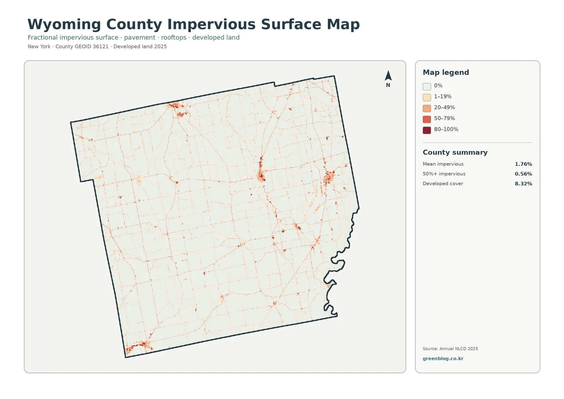
The general map makes one point clear immediately: Wyoming County is neither a solid farm block nor a continuous forest landscape. Yellow agricultural areas occupy broad portions of the county, but dark green forest repeatedly interrupts them. Larger forest patches are especially noticeable through parts of the west, center, and south, while extensive agricultural color remains visible across the north, east, and many interior areas.
The summary values put numbers behind that visual impression. Agriculture is the dominant class at 47.57% and forest is second at 35.76%. Those two categories together represent most of the mapped surface, yet their boundaries are irregular and closely mixed. That matters because a countywide percentage cannot tell a reader whether a class is concentrated in one corner or broken into many patches.
Developed land is much smaller at 8.32%. Red areas appear as compact clusters and thin connections rather than a broad continuous field. Wetlands, at 7.55%, are nearly as large a share as developed land and are visible as teal areas along the eastern edge and in elongated interior features. Water is only 0.59%, so small blue features should not be mistaken for the much broader wetland class.
Land cover describes what the ground surface is classified as, not what a parcel is legally allowed to be used for. A cell classified as agriculture does not establish zoning, ownership, tax status, or development rights. The same distinction applies to forest and wetlands. For parcel-level or regulatory questions, the land-cover map should be paired with the appropriate official administrative data.
Impervious surface reveals where hard surfaces are actually concentrated
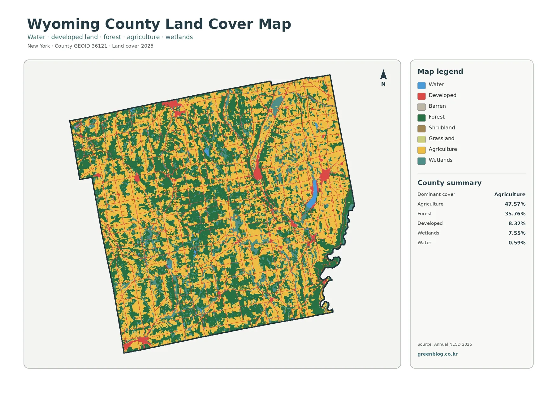
The impervious-surface map is useful early in the comparison because it separates the idea of developed land from the amount of hard surface on the ground. Impervious surface means pavement, rooftops, parking areas, and similar surfaces that water does not readily soak through. Wyoming County has a mean impervious value of 1.76%, and only 0.56% of the mapped area is at least 50% impervious.
Those numbers are far below the 8.32% developed-land share because the two measures are not equivalent. A developed land-cover class can include lawns, trees, soil, or other pervious surfaces around homes and buildings. The impervious map estimates the harder part of that developed setting, so a reader should not convert the developed percentage directly into a paved-area percentage.
Visually, most of the county is very light on the impervious map. Stronger oranges and reds occur in a few compact concentrations, including a north-central cluster, a central-eastern cluster, and an area near the southwest edge. Thin lines connect many of the smaller points. The pattern is well suited for identifying where paved corridors and built surfaces are concentrated, but it does not provide road names or building functions.
A high impervious value can be relevant to runoff studies, but this map alone does not establish flood risk or drainage performance. Water movement also depends on terrain, soils, rainfall, drainage infrastructure, and the surrounding stream network. A practical use is to identify higher-value areas first and then compare them with more detailed hydrologic or planning information.
Forest and farmland become easier to compare when development is muted
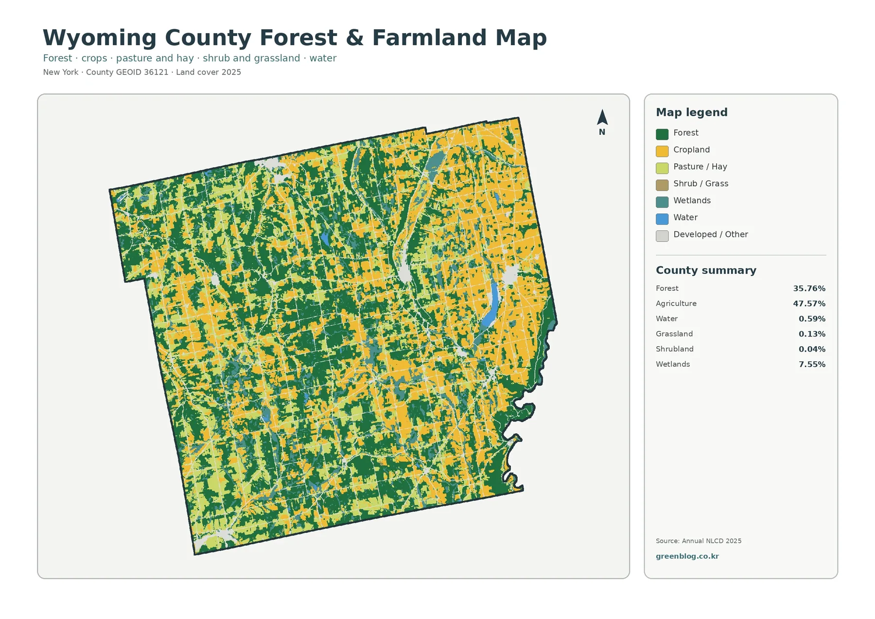
The forest-and-farmland map removes much of the visual competition from developed and other classes. That makes the county’s agricultural character especially obvious, but it also shows how substantial the forest network remains. Yellow cropland and lighter pasture or hay areas extend through large parts of the county, while green forest occupies both broad blocks and smaller patches between agricultural areas.
Agriculture in the summary is 47.57%, but the legend separates cropland from pasture and hay. This is an important reading detail. A yellow agricultural landscape is not necessarily one uniform kind of farming surface, and the map can show different agricultural classes within the overall total. When the original JPG is enlarged, those differences are easier to see than in a small web preview.
Forest covers 35.76%. Some of the largest green areas appear in the western and southern portions of the county, although forest patches occur throughout the map. The edges of these patches are irregular, and many agricultural openings sit close to wooded areas. The result is a mosaic in which farms and woods repeatedly meet rather than a simple east-versus-west split.
Wetlands remain visible in teal even on this simplified map. Their 7.55% share is large enough to affect the local pattern, especially where elongated wet features border farmland or forest. Grassland is only 0.13% and shrubland 0.04%, so those classes should be treated as small components rather than major countywide themes.
This view is especially useful for environmental education and land-cover comparison. A lesson can begin with the countywide percentages, then ask students to identify places where forest is continuous, places where agriculture dominates, and places where wetlands interrupt either class. The exercise teaches why a percentage and a map answer different questions.
Wetlands matter more to the map than the small water percentage suggests
Open water makes up just 0.59% of the 2025 summary, yet wetlands cover 7.55%. The general map uses separate colors for the two, and that distinction is essential. Blue water represents open-water surfaces, while the teal wetland class represents wet ground with vegetation or other wetland characteristics captured by the land-cover classification.
Along the eastern boundary and in several narrow interior features, teal areas are much more visible than blue water. A reader who groups both colors under a single idea of “water” would miss that difference. The wetland class can border agriculture and forest without being the same as a mapped stream or pond.
The classification also should not be read as a legal wetland boundary. Land-cover mapping generalizes surface conditions from imagery, while regulatory wetland determinations can use different definitions, field evidence, and mapped boundaries. For any permit or parcel decision, an appropriate official wetland source is necessary.
The small water percentage is also a reminder to avoid exaggerating tiny map features. At county scale, narrow water bodies may occupy few raster cells and can be difficult to see after the image is reduced. The downloadable JPG is more useful when a reader needs to enlarge those fine features while keeping the legend visible.
What the 1985–2025 map actually says about change
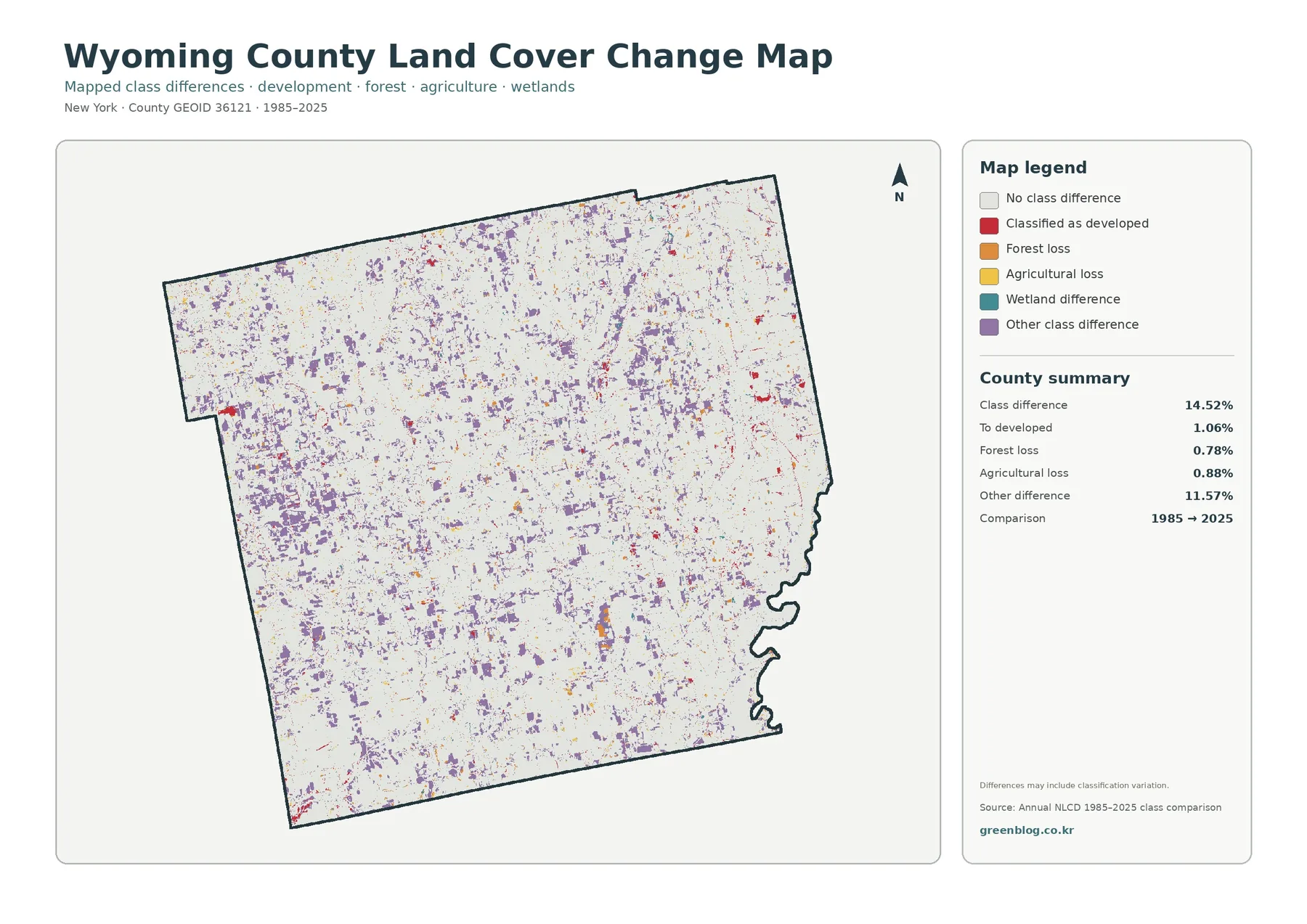
The change map reports a total class difference of 14.52% between 1985 and 2025. Within that total, 1.06% is labeled as classified to developed, 0.78% as forest loss, 0.88% as agricultural loss, and 11.57% as other class difference. Because the largest component is the broad “other difference” category, the total should not be described as 14.52% development, deforestation, or agricultural conversion.
Purple cells representing other class differences are scattered across much of the county and form many of the largest visible patches. Red cells classified to developed are smaller and more localized, while the mapped forest-loss and agricultural-loss colors are also limited compared with the purple category. The map is therefore better for locating where classifications differ than for making a single dramatic statement about one type of change.
A note on the map warns that the differences may include classification variation. That qualification is important. Satellite observation conditions, mixed pixels, small shifts at class boundaries, and classification methods can all affect whether a cell receives the same label at two dates. A colored change cell is a reason to investigate a place, not automatic proof of a specific land-use event.
A useful workflow is to mark a cluster on the class-difference map and then return to the 2025 general map. That shows what the location is classified as now. The impervious map can then indicate whether the current surface contains a concentration of pavement or rooftops. This sequence keeps present-day cover, hard-surface intensity, and long-term class difference as three separate pieces of information.
Frequently Asked Questions
What is the largest 2025 land-cover class in Wyoming County?
Agriculture is the largest class in the supplied 2025 summary at 47.57%, followed by forest at 35.76%. Developed land is 8.32%, wetlands are 7.55%, and water is 0.59%. The map shows agriculture and forest interwoven across the county rather than divided into two simple blocks.
Why is developed land 8.32% while mean impervious surface is only 1.76%?
They measure different things. A developed land-cover class can include lawns, trees, soil, and other pervious surfaces around buildings. Impervious surface estimates pavement, rooftops, and similar hard surfaces, so the countywide mean can be much lower than the developed-land share.
Does the 14.52% class difference mean that 14.52% of the county physically changed?
Not necessarily. The value identifies cells with different classifications between 1985 and 2025. The map notes that classification variation may be included, and 11.57% of the total is labeled as other class difference. Important locations should be checked with more detailed imagery or records before a specific physical change is claimed.
Can these maps be used for zoning or parcel decisions?
No. They show generalized surface cover and mapped class differences, not ownership, zoning, development rights, regulated wetland boundaries, or surveyed parcel lines. Use the appropriate official administrative data for those decisions.
Reading the statistics without flattening local variation
County summary values are useful for comparison, but every percentage is an average over the whole county. Agriculture at 47.57% means it is the largest mapped class overall; it does not mean every part of Wyoming County is nearly half agricultural. The image shows areas where forest is locally stronger and places where wetlands or developed features become more noticeable.
The same caution applies to forest at 35.76%. A county with more than one-third forest cover can still contain broad agricultural areas, and small forest patches can be important even where farming dominates locally. Looking at the shape and continuity of green areas adds information that a table cannot provide.
Developed land at 8.32% and mean impervious surface at 1.76% are particularly good examples of why definitions matter. One number describes a land-cover class and the other estimates the fraction of hard surface. They can both be correct while differing substantially because they are measuring different things.
Wetlands at 7.55% and water at 0.59% also should stay separate in any written summary. Combining them would erase the distinction between open water and wetland surfaces. The two maps that show both categories make that difference visible and help prevent an overly simple description of the county’s hydrologic landscape.
Using the map set for print, classwork, and local review
A printed county overview usually works best with the general land-cover map. Keep the legend large enough to distinguish agriculture, forest, developed land, wetlands, and water. If the print is reduced too far, the small wetland and developed patches can become difficult to separate, even though the larger agricultural and forest fields remain obvious.
For classroom work, one practical activity is to choose the same location on all four maps. Students can record the current land-cover class, whether the area is mainly agricultural or forested, whether impervious surface is concentrated there, and whether the 1985–2025 comparison marks a class difference. Each answer comes from a different map, which makes the purpose of the set clear.
For presentation graphics, the forest-and-farmland map can simplify a slide about rural surface cover, while the impervious map can support a separate slide about the concentration of built surfaces. The change map should include a short explanation that its colors represent class differences and may include classification variation. That note prevents an audience from assuming every colored cell records a confirmed physical conversion.
For local research, use the maps to select places that deserve closer inspection. A boundary between farm and forest, an elongated wetland feature, a concentrated impervious cluster, or a group of change cells can become a follow-up area. More detailed imagery, parcel data, wetland information, soils, or planning records can then be used for the specific question.
Limits of a 30-meter raster map
Annual NLCD land cover is a raster product designed to compare broad surface patterns over large areas. The land-cover classification is generalized to 30-meter cells, so narrow roads, small buildings, thin streams, hedgerows, and fine field boundaries may not match a high-resolution aerial image exactly. The map is appropriate for county-scale pattern analysis, not property surveying.
Mixed pixels are another limitation. A single cell can contain trees, grass, a roof, pavement, and bare ground, yet a land-cover layer still needs to assign or summarize that cell. This can produce a boundary that looks slightly different from the real-world edge visible in detailed imagery. Impervious data handles the hard-surface component separately, which is one reason it should be read alongside the categorical land-cover map.
The 2025 map represents the classification for that data year. Construction, cropping changes, tree removal, regrowth, or water-level changes that happen later may not appear until newer data are available. A time-sensitive planning or field task should therefore use recent imagery and current local information in addition to this map set.
Finally, none of the four maps establishes ownership, zoning, building permission, regulated wetland limits, or parcel boundaries. They are reference maps for surface-cover patterns and mapped class differences. Legal or administrative decisions require the relevant official records.
Download the four Wyoming County land-cover JPG maps
The ZIP below contains the four original JPG files described on this page: the 2025 general land-cover map, forest-and-farmland map, impervious-surface and developed-land map, and the 1985–2025 land-cover class-difference map. The set is convenient when a larger image is needed for print, teaching, a report, or a presentation.
After downloading the archive, you can use only the map needed for a particular project or keep all four together for comparison. When reusing a map, include the map year and data source shown on the graphic. For parcel, regulatory, or current-condition questions, consult the appropriate official source in addition to these generalized maps.
Map File Information
Wyoming County land-cover maps – four original JPG files
- Included Files: Use only the versions confirmed in the article and supplied images
- File Type: Use the confirmed download contents
- Intended Use: Printing, education, presentations, and map-based projects
Related Maps
- Albany County Land Cover Map
- Allegany County New York Land Cover Map
- Bronx County New York Land Cover Map
Sources and reference data
- MRLC Annual NLCD Data – Annual NLCD data products and year-based land-cover resources
- USGS Annual NLCD Land Cover Classification – definitions and interpretation of land-cover classes
- U.S. Census Bureau TIGER/Line Shapefiles – reference source for county boundaries
Green Map creates custom-edited map images using open geographic data sources such as geoBoundaries, Natural Earth, OpenStreetMap, and government open data.
These maps are edited visual materials, not raw data files, and are provided for education, documents, presentations, and graphic reference.