Hernando County’s 2025 land-cover pattern is unusually balanced among three large classes rather than being dominated by one. Developed land accounts for 28.87%, forest for 26.42%, and wetlands for 23.39%. The strongest developed footprint sits in the western and southwestern part of the county, while forest and wetland colors become more prominent toward the east. Agriculture adds another 15.28%, especially through the central and northern interior.
This page compares four views of that pattern: general land cover, forest and farmland, impervious surface, and mapped class differences from 1985 to 2025. The original four JPG maps are available together in one ZIP below. The maps are designed for countywide comparison; they do not show parcel ownership, zoning approval, survey boundaries, or a regulatory wetland determination.
Table of Contents
A strong western development footprint gives way to forest and wetlands farther east
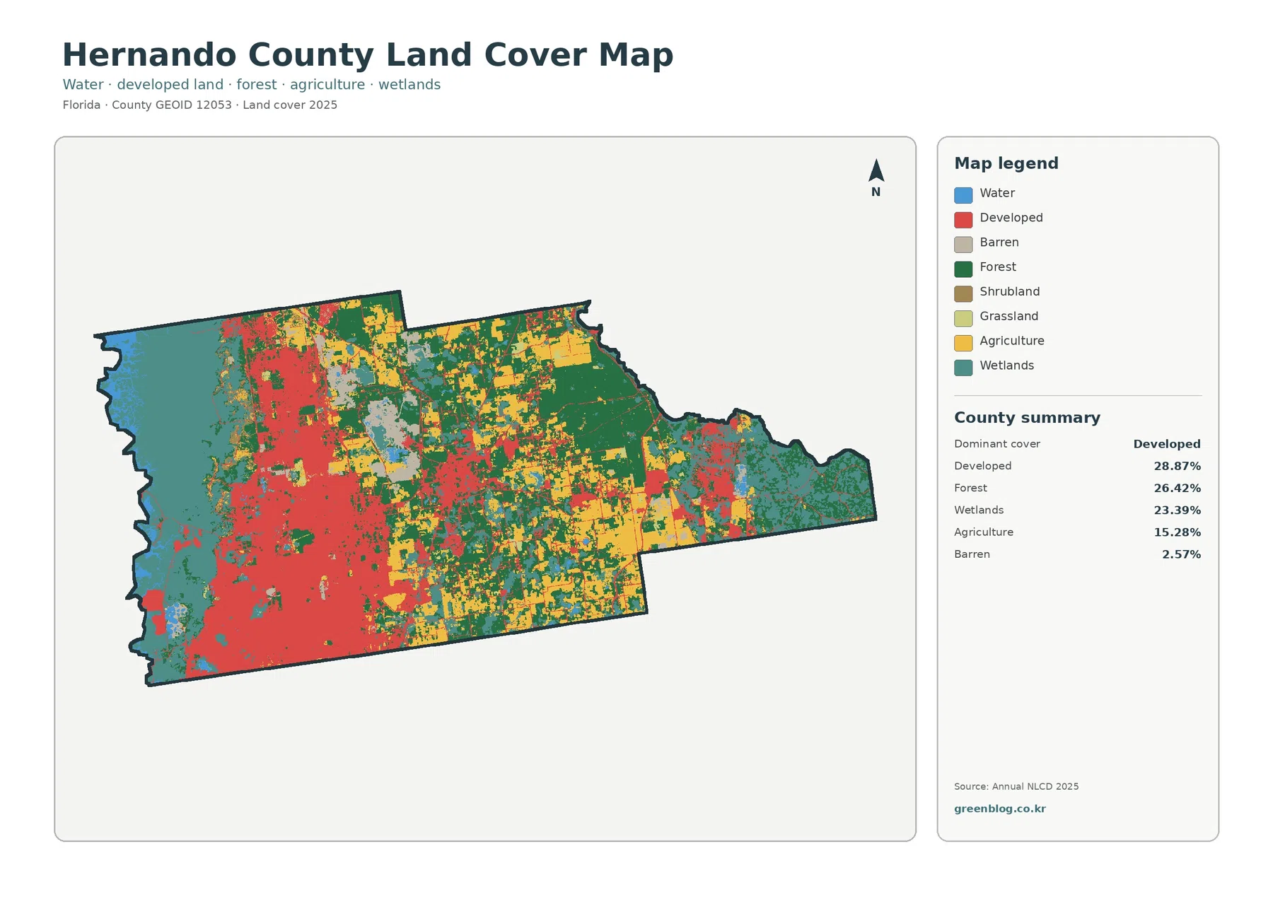
Developed land is the largest single class at 28.87%, but its geography matters as much as the ranking. Red cover is broad across the west and southwest, with additional developed areas extending through the central part of the county. The eastern extension looks very different: large sections are green or teal, indicating much more forest and wetland cover. A countywide percentage therefore hides a clear west-to-east contrast.
Forest is only 2.45 percentage points behind developed land, at 26.42%. Large forested areas appear through the central-east and eastern side, while smaller green pieces remain within the more developed west. That distribution makes the county look less urban when viewed from east to west than the 28.87% developed share might suggest on its own.
Wetlands make up 23.39% and form another major part of the map. Broad teal areas occupy the far western edge as well as substantial eastern sections. In the middle of the county, wetland cover is more fragmented and mixes with forest, agriculture, and developed land. The map is easiest to understand as a sequence of contrasting areas rather than a uniform countywide landscape.
Agriculture represents 15.28%. Yellow areas are especially visible in the central and northern interior, where they often sit between forested tracts and developed cover. Barren land is listed at 2.57% in the summary and appears as smaller gray patches. Water is shown in the legend but the general-map summary does not provide a separate percentage, so no unsupported value is added here.
Impervious cover is concentrated much more tightly than the developed class
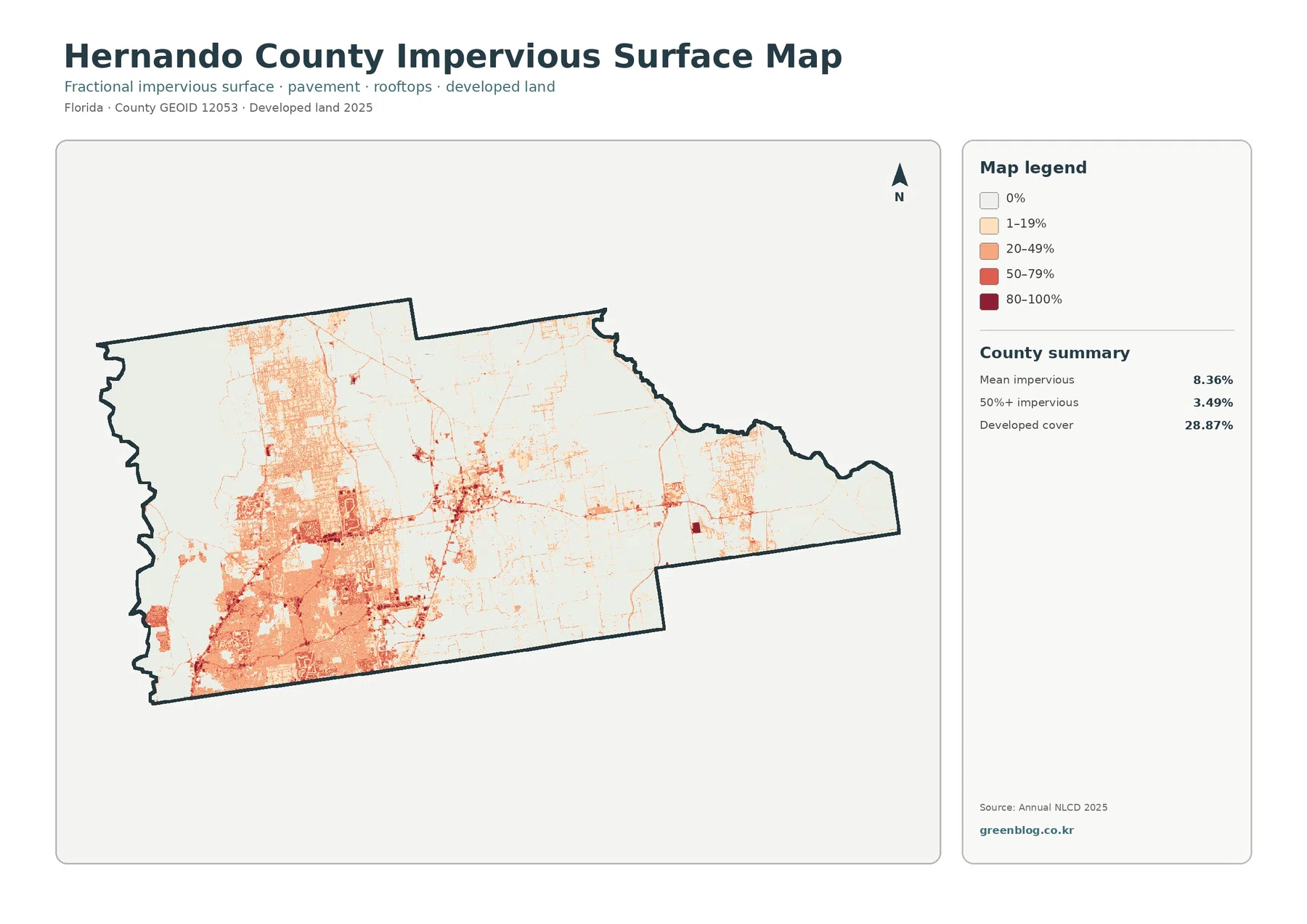
Mean impervious cover is 8.36%, and 3.49% of the county is mapped at 50% impervious or higher. Those numbers are much smaller than the 28.87% developed-land share because the two measures describe different things. A developed cell can include lawns, trees, soil, or other permeable surfaces, while impervious mapping focuses on hard cover such as pavement and rooftops.
The darkest impervious colors are concentrated in the southwest and western interior, where the general map also shows its broadest developed areas. Strong lines and smaller high-value patches extend into the center, while most of the east remains pale. This view is useful when the question is not simply “Where is development?” but “Where are hard surfaces most concentrated within and around developed areas?”
The difference also prevents a common reading error. A location classified as developed does not automatically have a high impervious fraction. Residential areas can contain considerable grass, tree canopy, or exposed soil, and low-density development may remain mostly permeable. Conversely, a narrow road can carry a high impervious value even though it occupies only a small part of the countywide developed class.
The forest-and-farmland view makes the interior mix easier to separate
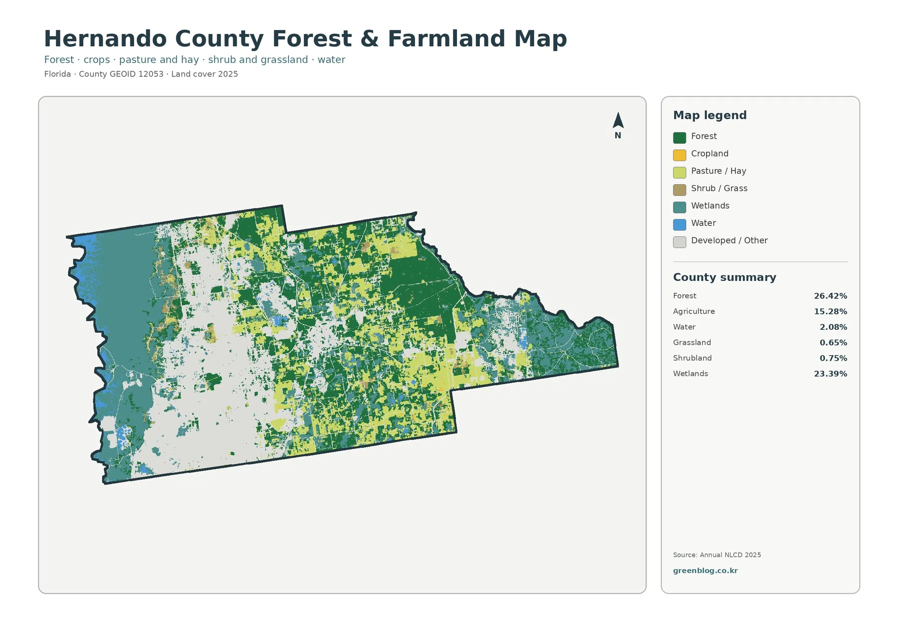
By combining development and several minor classes into a lighter background, this map makes the county’s working and natural lands easier to compare. Forest remains 26.42%, agriculture 15.28%, and wetlands 23.39%. Water is listed at 2.08%, grassland at 0.65%, and shrubland at 0.75%. The smaller categories are visible but do not form the broad continuous areas seen in forest, agriculture, and wetlands.
Forest is especially noticeable across the central-east and eastern side. Agricultural cover appears in larger blocks through the north-central interior and in additional pieces farther east. Wetlands remain important at both ends of the county and also break up the forest-and-farm pattern through the middle. That mix is one reason the simplified map is useful: it shows that the interior cannot be reduced to either farmland or forest alone.
The county’s Environmentally Sensitive Lands program provides useful local context. The county identifies Chinsegut Hill, Cypress Lakes, Fickett Hammock, Lake Townsen, and Peck Sink among its preserves. Those official preserve listings confirm that conservation lands are part of the county’s landscape, but the land-cover colors on this page should not be treated as preserve boundaries. Forest and wetland classes extend well beyond any single protected property.
The 1985–2025 comparison highlights a 7.36% shift into the developed class
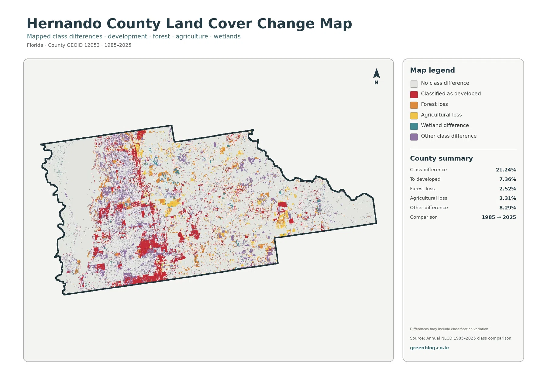
The mapped class-difference total is 21.24%. Within that total, 7.36% is categorized as changing to developed, 2.52% as forest loss, 2.31% as agricultural loss, and 8.29% as other class difference. Wetland difference has its own legend color, but the summary does not provide a separate percentage for it, so the map should be used visually rather than supplemented with a guessed number.
Red change cells are common through the western and southwestern portion of the county and continue into parts of the center. Orange forest-loss cells, yellow agricultural-loss cells, and purple other differences are scattered more broadly. Large pale areas remain as well, indicating no mapped class difference between the two endpoints. Looking at both changed and unchanged areas keeps the comparison from becoming visually exaggerated.
The note printed on the map is essential: differences may include classification variation. A 21.24% class-difference value is not the same as saying that 21.24% of the physical landscape unquestionably changed. Sensor conditions, mixed raster cells, classification methods, and boundary treatment can contribute to differences. The 7.36% developed category is best used to identify areas for further review, not as a direct measure of construction acreage or permits.
For a local change question, compare this map with the 2025 general map first. Places that are currently developed can be checked against red change cells, while forest and agricultural areas can be compared with orange or yellow difference cells. If the reason for a change matters, aerial photographs or additional years of land-cover data are better follow-up evidence than a two-date comparison alone.
County planning and conservation maps answer legal questions that land cover cannot
The official Hernando County GeoHub includes land-use information, wetlands, conservation lands, flood zones, and development standards. Those layers serve a different purpose from this countywide land-cover set. The maps on this page describe the surface cover seen in a classified raster dataset; they do not determine whether a parcel may be developed, whether it has a particular zoning designation, or where a regulated boundary falls.
The county’s 2040 Comprehensive Plan also treats future land use, conservation, coastal management, transportation, and other policy subjects separately. For example, county planning documents discuss Hernando Beach in the context of waterfront community planning. That is valuable geographic background, but a policy designation should not be inferred from a red, green, or teal pixel on the land-cover map.
This distinction is especially important in a county where developed, forested, agricultural, and wetland cover meet within relatively short distances. A land-cover map can quickly show where those broad surfaces are concentrated. Parcel records, zoning maps, conservation boundaries, flood information, and permitting rules should be checked in their own official systems when a property-specific decision is involved.
Use each map for one clear question, then compare the results
Start with the general 2025 map when you need the overall balance among developed land, forest, wetlands, and agriculture. It is the best single image for explaining the county’s west-to-east contrast. Move to the forest-and-farmland view when the focus is on natural cover or agricultural land because its simplified categories make the central and eastern pattern easier to see.
Choose the impervious map for questions about hard surface. Its 8.36% countywide mean and 3.49% share above 50% impervious help separate dense paved or roofed areas from lower-density developed land. Use the change map last when the question concerns how the 1985 and 2025 class labels differ. Keeping present-day condition and two-date comparison separate avoids treating every current developed area as a mapped change.
The downloadable ZIP contains four original JPG files at 2480×1754 pixels: 2025 land cover, forest and farmland, impervious/developed land, and 1985–2025 land-cover change. They work well for documents, classroom materials, presentations, and moderate-size prints. Because 2480×1754 pixels is below the pixel count normally associated with full A3 output at 300 dpi, check legend readability before making a very large print.
Keep each legend and year visible when reusing a map. Similar greens and teals do not mean exactly the same thing across every map, impervious colors represent percentage ranges rather than land-cover classes, and red on the change map means a shift into a developed classification rather than simply “developed land in 2025.” Those distinctions are small but important when the maps are placed in reports or presentations.
Annual NLCD-style products are raster data, so the county is represented by a grid of cells rather than parcel polygons. A cell can contain pavement, trees, lawns, water, or soil at the same time, yet still receive a representative class or impervious percentage. Countywide patterns are meaningful, but a sharp map edge should not be assumed to match a fence, lot line, road shoulder, or legal wetland boundary exactly.
Frequently Asked Questions
Which 2025 land-cover classes are largest in Hernando County?
Developed land is largest at 28.87%, followed closely by forest at 26.42% and wetlands at 23.39%. Agriculture adds 15.28%. Because the three largest classes are relatively close in size, the county is better understood by looking at where each class is concentrated rather than by treating the largest class as a countywide description.
Why does the west side look more developed while the east side looks greener?
The supplied 2025 maps show a broad developed footprint in the west and southwest, while forest and wetland cover become more prominent toward the east. The forest-and-farmland view reinforces that contrast by simplifying the developed background. The maps show the pattern itself; they do not by themselves establish the historical or policy reasons for it.
Does the 21.24% class-difference value equal the amount of land that physically changed?
No. The comparison map explicitly warns that mapped differences may include classification variation. The value is useful for locating cells whose 1985 and 2025 labels differ, but confirming physical land-cover change requires additional evidence such as aerial imagery or a longer time series.
Map File Information
Download the four original Hernando County land-cover JPG maps together in one ZIP file.
- Included Files: Maps described in this article
- File Type: ZIP archive available from the download link below
- Intended Use: Printing, education, presentations, and map-based projects
Related Maps
- Alachua County Florida Land Cover Map
- Baker County Florida Land Cover Map
- Bay County Florida Land Cover Map
Sources and References
- MRLC Annual NLCD Data – official access to land-cover datasets and related products.
- USGS Annual NLCD Land Cover Classification – official descriptions of land-cover classes and classification.
- U.S. Census Bureau TIGER/Line Shapefiles – official geographic boundary resources for county reference.
- Hernando County Environmentally Sensitive Lands – official county information on preserves and the ESL program.
- Hernando County GeoHub – official county mapping for land use, wetlands, conservation lands, flood zones, and development standards.
Green Map creates custom-edited map images using open geographic data sources such as geoBoundaries, Natural Earth, OpenStreetMap, and government open data.
These maps are edited visual materials, not raw data files, and are provided for education, documents, presentations, and graphic reference.