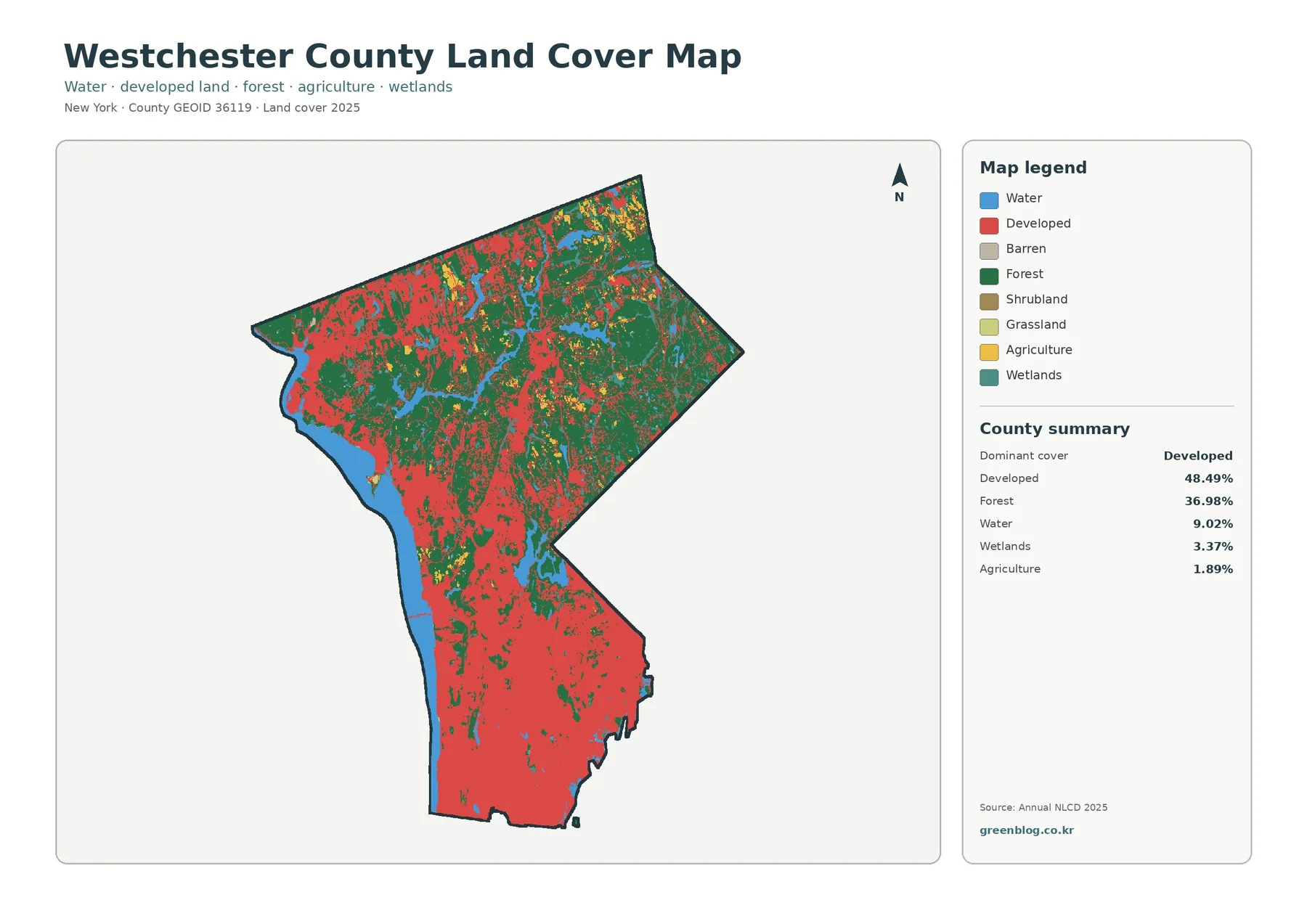
Westchester County’s 2025 land-cover map is dominated by developed cover at 48.49 percent, with forest close behind at 36.98 percent. The geography is not uniform: developed colors fill much of the narrow southern part of the county, while broad forest patches become much more prominent toward the north. Water accounts for 9.02 percent, wetlands 3.37 percent, and agriculture 1.89 percent, creating a useful countywide comparison between dense settlement, wooded land, and water-oriented landscapes.
This page includes four views of the same county: general land cover, forest and farmland, fractional impervious surface, and mapped class differences from 1985 to 2025. Looking at the set together makes it easier to separate the extent of developed land from the places where hard surfaces are actually concentrated, and to see how forest, water, wetlands, and small agricultural areas fit around them. The four original JPG maps are available together in one download near the bottom of the page.
Table of Contents
The clearest countywide pattern is a developed south and a greener north
Westchester has a distinctive outline, narrowing toward its southern end and widening across the northern half. On the 2025 map, the southern section is filled with a nearly continuous field of developed color. Moving north, that red pattern breaks into smaller clusters and larger forest areas take over. Water is also an important visual reference, appearing along the western edge and in several sizeable areas across the northern half.
Westchester County’s own environmental and planning GIS helps explain why a single land-cover number cannot describe the entire county. The county maintains layers for wetlands, watersheds, open space, steep slopes, lakes, streams, and parcel-based land use in addition to other planning information. The supplied land-cover maps show the same need for location-specific reading: a county average may say that developed land is the largest class, but the northern landscape looks very different from the highly developed south.
Land cover should also be kept separate from legal land use. Annual NLCD classifies the physical surface seen in satellite-based raster data, such as forest, developed land, water, wetland, or agriculture. It does not tell you who owns a parcel, what the zoning allows, whether a site is protected open space, or whether construction is permitted. Those questions require the county or municipal datasets created for legal and planning purposes.
Why 48.49% developed cover does not mean the whole county looks urban
Developed cover is the largest 2025 class at 48.49 percent. In the southern portion, the map makes that dominance obvious: red developed areas form broad connected patches with only smaller green and blue interruptions. The pattern remains strong through the central part of the county, although forest patches become larger and more frequent. Farther north, the balance changes substantially and green forest occupies much more of the map.
Forest accounts for 36.98 percent of the county, a large enough share to be a defining part of the landscape rather than a minor remnant. Large wooded areas are especially visible across the north and northeast, with additional forest patches scattered through the center and even into the developed south. This arrangement is a better description of Westchester than a simple urban-versus-rural split: settlement is extensive, but woodland remains a major cover class and becomes increasingly dominant away from the southern concentration.
Water makes up 9.02 percent. The long blue band on the western side and the larger inland water areas toward the north provide easy landmarks when comparing the four maps. Wetlands are smaller at 3.37 percent and appear as teal patches, often near water or in low-lying landscape settings. Water and wetland should not be treated as the same class; open water and vegetated wet ground are classified differently and have different meanings on the legend.
Forest and farmland become easier to separate on the simplified map
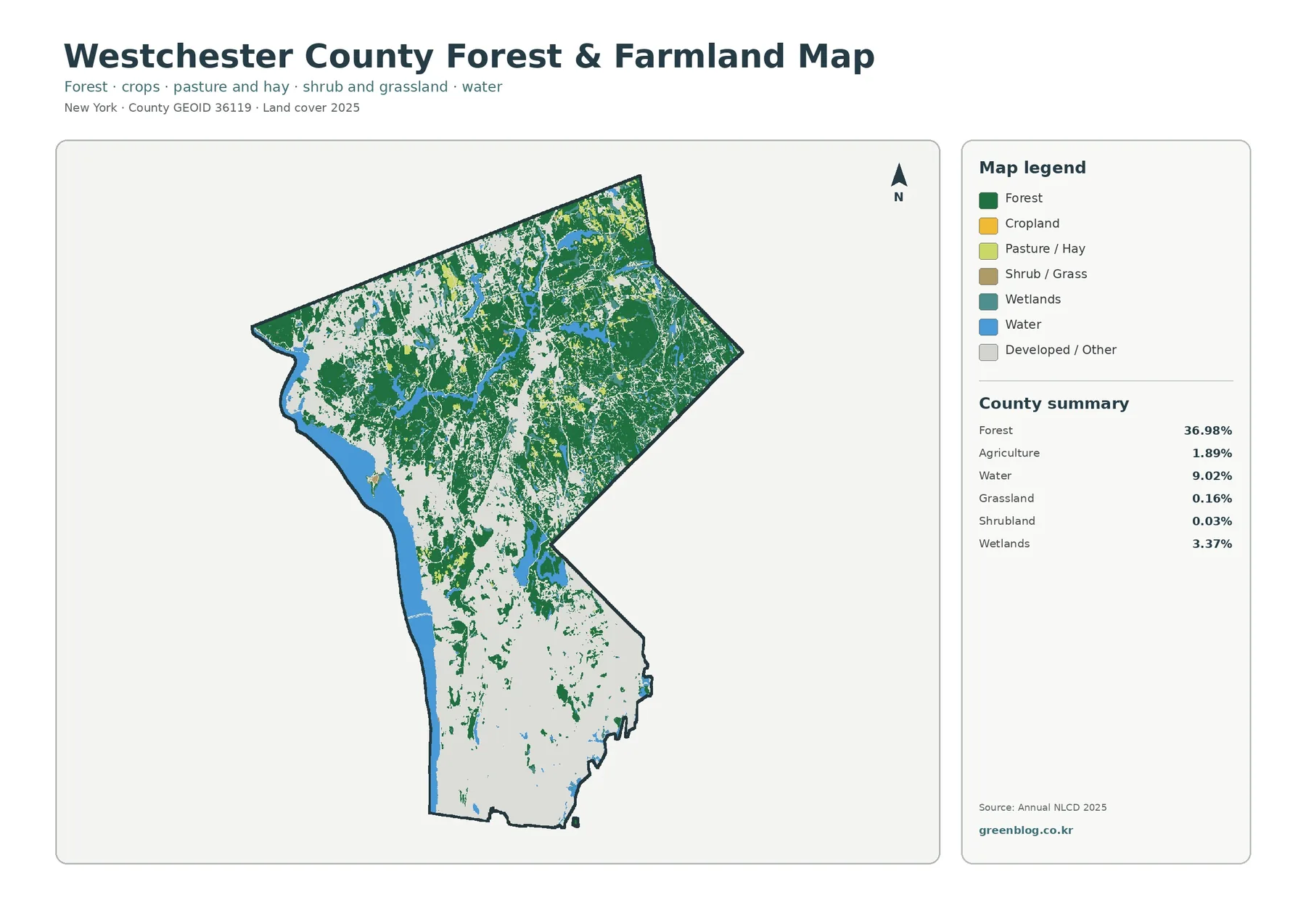
The forest-and-farmland view removes much of the visual weight of developed land, so the green woodland network becomes the main feature. Broad green areas occupy the northern half, surround water bodies, and extend southward in a broken pattern through the central county. Forest that can look like small interruptions inside the red developed pattern on the general map becomes much easier to follow when most developed land is shown in a neutral background.
Agriculture is only 1.89 percent of the county. Grassland is 0.16 percent and shrubland 0.03 percent. Those small totals match what is visible in the preview: agricultural colors appear as scattered patches rather than as the broad field blocks seen in major farming counties elsewhere in New York. Most of the mapped agricultural areas are in the northern and north-central parts of Westchester, where they sit among forest, wetlands, water, and lower-intensity developed land.
This map is useful when the subject is woodland continuity, open-land context, conservation education, or the contrast between the northern landscape and the developed south. It also helps prevent a common mistake. An area that is pale because it is classified as developed or other land should not be assumed to be farmland simply because the agricultural colors are limited. The legend needs to remain visible whenever the simplified map is printed or presented.
Green forest pixels do not automatically represent parks or permanently protected land. Land cover identifies tree-dominated surface, not ownership or conservation status. Westchester County provides separate open-space and parks information for questions about protected or publicly managed land. Using the two kinds of data together is much more reliable than treating every forest patch as a legal open-space boundary.
The impervious map shows where development is physically concentrated
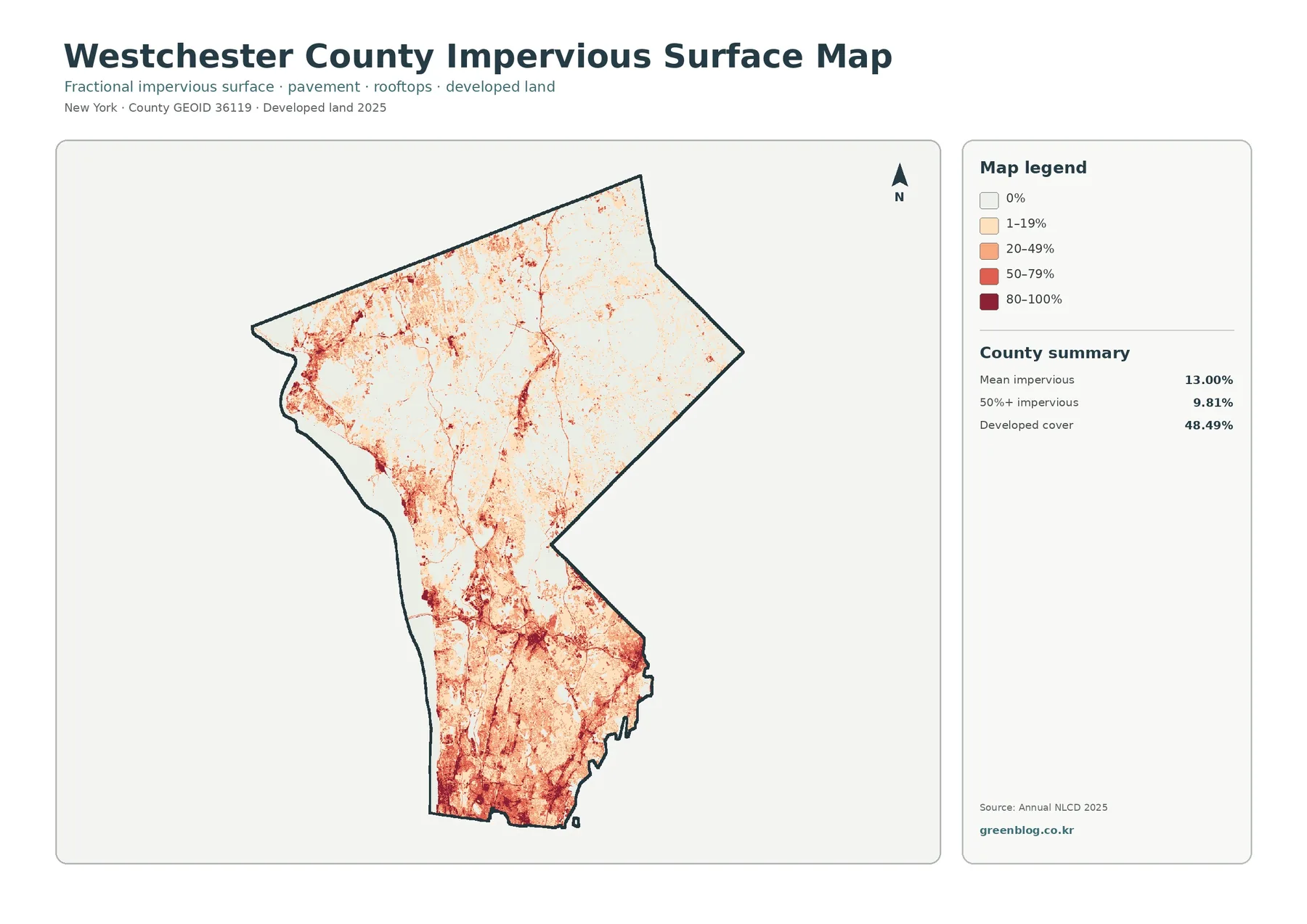
Impervious surface means pavement, rooftops, parking areas, and other hard cover that limits direct infiltration of rainfall into the ground. Westchester’s mean impervious value is 13.00 percent, and 9.81 percent of the mapped area is at least 50 percent impervious. Those figures are much lower than the 48.49 percent developed land-cover share because the two products measure different characteristics.
A developed land-cover class can include houses and roads together with lawns, trees, and other permeable surfaces in a settled setting. The impervious product estimates how much of each mapped cell is hard surface. A low-density residential area can therefore count as developed without being mostly pavement or roof. Comparing the two maps is a good way to explain why “developed” should not be translated into “completely paved.”
The spatial pattern is striking. Dark orange and red values are widespread across the southern county, where many high-impervious cells connect into broad clusters. Through the center, stronger values continue along narrower corridors and settlement concentrations. The north is much paler overall, but thin lines and local clusters remain visible around transportation and built-up areas. This makes the impervious view especially useful for showing variation within the much larger developed class.
Imperviousness can be relevant to stormwater and watershed discussions, but this map does not calculate flood risk or runoff by itself. Actual hydrologic behavior also depends on slope, soils, drainage infrastructure, rainfall, watershed configuration, and nearby streams or wetlands. For environmental planning, a better workflow is to identify high-impervious areas here and then compare them with Westchester County’s watershed, stream, floodplain, wetland, or drainage layers.
Water and wetlands matter even in a county dominated by development and forest
Water occupies 9.02 percent of the 2025 summary and is easy to spot because several water bodies are large relative to the county. The western edge is marked by a long water boundary, while the northern half contains additional blue areas that break up the forest pattern. These features are useful orientation points when moving between the four maps because they remain recognizable even when the surrounding land classes are simplified or recolored.
Wetlands account for 3.37 percent and appear as teal rather than blue. They are more fragmented than the major water bodies, occurring around parts of the northern landscape and near some water-oriented areas. Annual NLCD wetland classification is a land-cover category, not a regulatory determination. A parcel-level permit question requires the specific state, federal, or county wetland layer used for jurisdiction and planning.
For teaching or regional interpretation, keeping water and wetland separate improves the explanation. Open water represents a surface dominated by water, while wetland classes represent land with wet conditions and characteristic vegetation. On the forest-and-farmland view, the relationship between woodland, water, and wetlands becomes easier to see in the north. On the general map, the same areas can be compared with nearby developed patches.
The 1985–2025 map reports class differences across 8.03% of the county
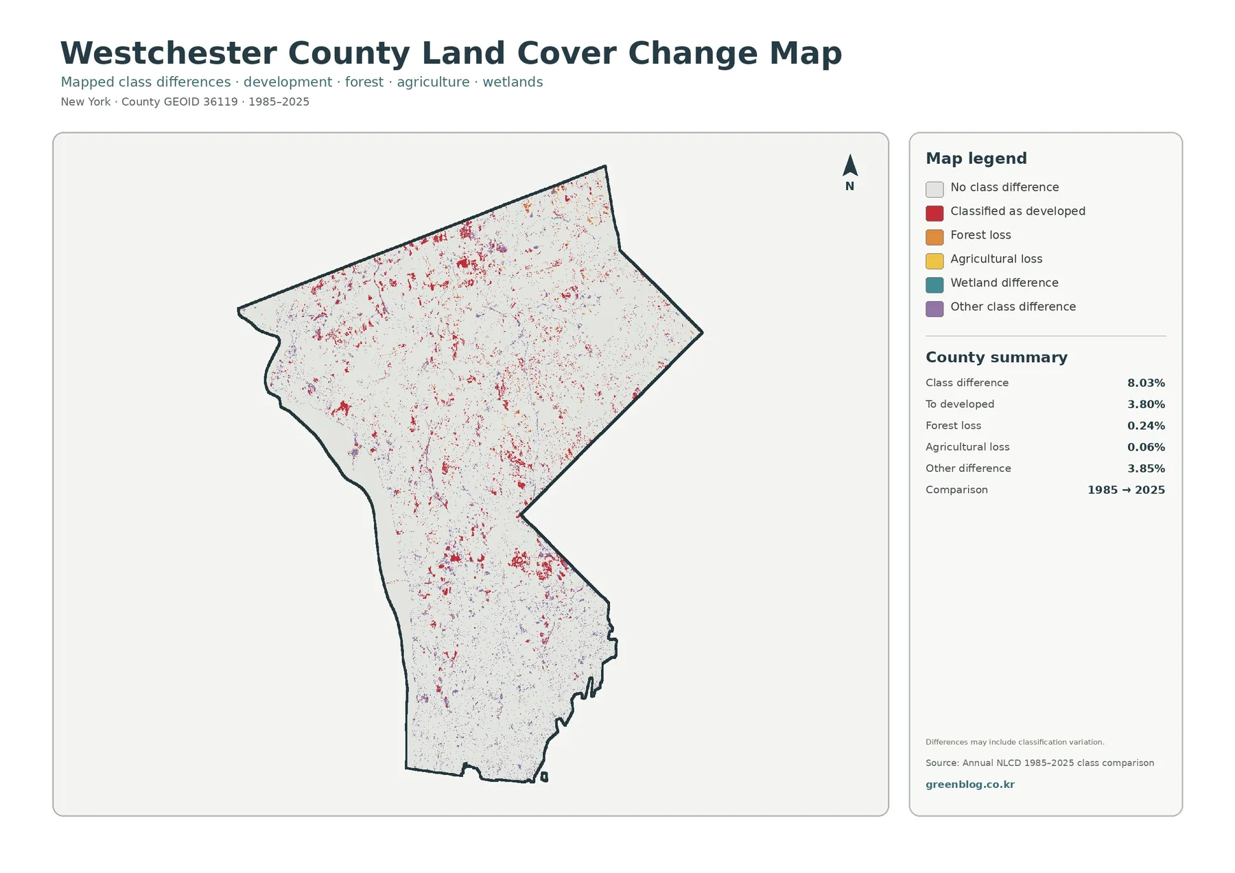
The class-difference map shows 8.03 percent of the county with a different mapped class between 1985 and 2025. The summary breaks that total into 3.80 percent classified to developed, 0.24 percent forest loss, 0.06 percent agricultural loss, and 3.85 percent other class difference. Wetland difference is also shown in the legend, but the supplied summary does not list a separate percentage, so it should not be invented or estimated from the image.
Red “classified as developed” pixels are scattered through the county and are noticeable in several northern and central clusters. The highly developed south also contains class-difference cells, but it is not covered entirely by change colors because the map is comparing classifications rather than mapping current urban density. A place can be heavily developed in 2025 yet show little difference if its mapped class was already similar in 1985.
The 8.03 percent figure should not be presented as proof that exactly 8.03 percent of the land physically changed. The preview notes that the comparison may include classification variation. Satellite conditions, mixed pixels, revised mapping methods, and small shifts along class boundaries can contribute to a difference. The safest interpretation is that these are locations where the two mapped classifications disagree and may deserve closer review.
That makes the layer a useful screening tool. A cluster of red pixels near the edge of a current developed area, a class difference inside a forest block, or a group of marks around water can be flagged for comparison with historic aerial imagery or local planning records. The map helps narrow the search area, while independent evidence is needed to explain what actually happened and when.
Using the same location across all four maps
Start in the southern county if you want a clear example of how the products differ. The general map shows a broad developed landscape. The impervious map then separates that landscape into places with higher and lower concentrations of hard surface. On the forest-and-farmland map, most of the same area becomes a light developed/other background, making remaining forest patches easier to identify. The class-difference map adds a time comparison without replacing the current-cover information.
In the north, reverse the process. Find a large forest patch on the simplified forest map, locate the same area on the general map, and note the water, wetland, or developed classes mixed into it. The impervious layer will usually appear much lighter than in the south but may still reveal local settlement or road-related concentrations. The change view can then identify the specific cells whose mapped classification differs between 1985 and 2025.
This side-by-side approach also explains the statistics. Developed cover at 48.49 percent and mean impervious surface at 13.00 percent are not contradictory; they describe different attributes. Forest at 36.98 percent feels more dominant in the north because its distribution is uneven. Water at 9.02 percent is important as a regional landmark even though it is much smaller than developed or forest cover. The maps turn those percentages into visible geographic patterns.
Choosing a map for printing, classwork, or local research
Use the general land-cover map when one image needs to introduce the county. It keeps developed land, forest, water, wetlands, and agriculture in a single legend and makes the north-south contrast immediately visible. The forest-and-farmland version is better for woodland, open-space, conservation, or rural-land discussions because it removes much of the visual dominance of development.
Choose the impervious map for questions about hard-surface concentration, settlement intensity, or a broad stormwater context. It is especially effective when comparing southern and northern Westchester. For time-based work, use the 1985–2025 class-difference layer together with the 2025 general map so viewers can distinguish current land cover from locations where the two classifications differ.
Keep the legend large enough to read when printing. Color is strongly recommended because several land-cover and change categories would be hard to distinguish in grayscale. If a report focuses on one part of the county, an enlarged crop with a clear caption may communicate more than shrinking the full county into a small panel. Always identify the data year when the map is used outside this page.
For local research, treat the four maps as a starting point rather than a final regulatory source. They can help identify a forest-development edge, a wetland near a water body, an impervious cluster, or an area with repeated class differences. From there, Westchester County’s environmental and planning GIS can provide purpose-specific layers for land use, watersheds, wetlands, open space, floodplains, steep slopes, and other features.
Resolution, mixed pixels, and legal limits
Annual NLCD land cover is a raster product based on Landsat imagery at 30-meter spatial resolution. Each cell represents an area roughly 30 meters across. Small buildings, narrow streams, individual driveways, thin tree lines, and exact parcel boundaries may therefore be generalized or absorbed into a neighboring class. The maps are designed for landscape-scale comparison, not property surveying.
Mixed pixels are common along edges. One cell can contain a house, lawn, trees, and pavement, while the land-cover map still has to assign a dominant class and the impervious product estimates a hard-surface fraction. This helps explain why an aerial photograph may show a more complicated boundary than the colored raster map and why the developed and impervious products should not be expected to match exactly.
The 2025 layer represents the mapped condition for that data year. Construction, vegetation recovery, clearing, flooding, shoreline change, or other events that happened later may not appear until newer data are incorporated. Anyone who needs the most current condition should compare the maps with recent aerial imagery, county GIS, or field information.
These files are not legal land records. They do not define ownership, zoning, building rights, park boundaries, regulated wetlands, flood-insurance zones, or permit requirements. A practical workflow is to use the land-cover maps to understand the landscape pattern and identify an area of interest, then move to the official dataset designed to answer the parcel, planning, or regulatory question.
Download the four Westchester County land-cover JPG maps
The ZIP below contains the four original JPG files shown on this page: the 2025 general land-cover map, the forest-and-farmland view, the fractional impervious/developed-land map, and the 1985–2025 class-difference map. The set is convenient when you need larger files for printing, class materials, slides, or a side-by-side county comparison.
You can keep all four as a compact reference set or use only the map that fits your project. When the files are reused in a report, website, or presentation, include the mapping year and data source. If your question involves current legal boundaries or parcel-level decisions, follow the official data links below rather than relying on the land-cover image alone.
Frequently Asked Questions
What is the largest land-cover class in Westchester County?
Developed cover is the largest class in the supplied 2025 summary at 48.49 percent, followed by forest at 36.98 percent. Water is 9.02 percent, wetlands 3.37 percent, and agriculture 1.89 percent. The distribution is uneven, with development strongest in the south and forest much more prominent across the north.
Why is developed cover 48.49% while mean impervious surface is 13.00%?
They measure different things. Developed land cover may include buildings and roads together with lawns, trees, and other permeable surfaces in a developed setting. Impervious percentage focuses on hard surfaces such as pavement and rooftops. A residential area can therefore be mapped as developed while still having a much lower hard-surface fraction.
Does an 8.03% class difference mean exactly 8.03% of Westchester physically changed?
No. It means the mapped class differs between the 1985 and 2025 comparison layers for 8.03 percent of the county. Real land conversion may be part of that total, but classification variation, mixed pixels, imagery conditions, and boundary effects can also contribute. Important locations should be checked with aerial imagery or local records.
Can these maps be used to check zoning, ownership, or a regulated wetland?
No. They are generalized raster land-cover reference maps, not parcel or regulatory records. Use Westchester County, municipal, state, or federal official GIS and planning sources for ownership, zoning, protected open space, regulated wetlands, building rights, or permit questions.
Map File Information
Westchester County land-cover maps – four original JPG files
- Included Files: Use only the versions confirmed in the article and supplied images
- File Type: Use the confirmed download contents
- Intended Use: Printing, education, presentations, and map-based projects
Related Maps
- Albany County Land Cover Map
- Allegany County New York Land Cover Map
- Bronx County New York Land Cover Map
Sources and reference material
- MRLC Annual NLCD Data – access to Annual NLCD land-cover products
- USGS Annual NLCD Land Cover Classification – class definitions and interpretation guidance
- U.S. Census Bureau TIGER/Line Shapefiles – county boundary reference data
- Westchester County Environment & Planning GIS – county land use, wetlands, watersheds, open space, steep slopes, and related environmental layers
Green Map creates custom-edited map images using open geographic data sources such as geoBoundaries, Natural Earth, OpenStreetMap, and government open data.
These maps are edited visual materials, not raw data files, and are provided for education, documents, presentations, and graphic reference.