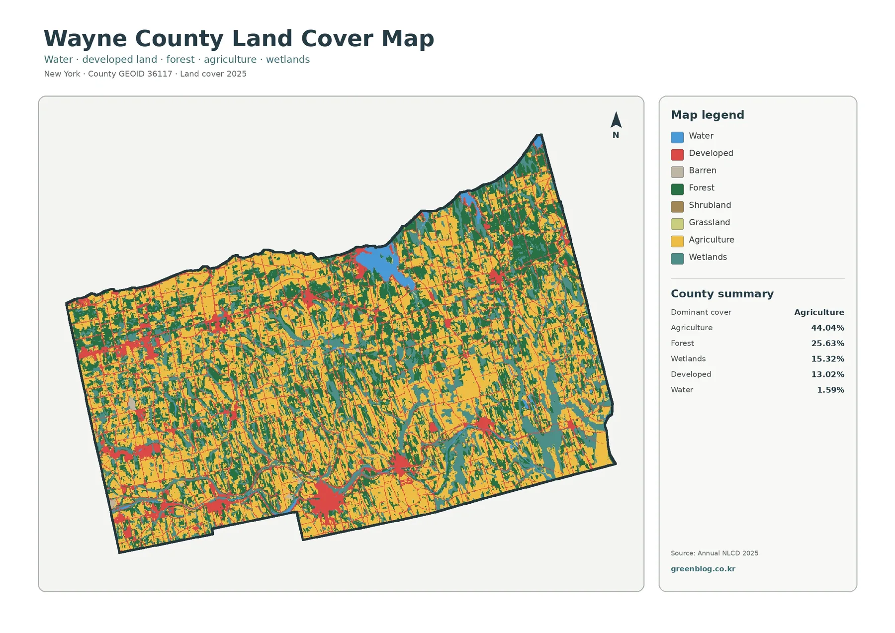
Wayne County, New York is a farm-dominated county on the south shore of Lake Ontario, but the 2025 land-cover map is not a simple block of cropland. Agriculture accounts for 44.04 percent of the mapped area, followed by forest at 25.63 percent, wetlands at 15.32 percent, developed cover at 13.02 percent, and water at 1.59 percent. The result is a patchwork of fields, woods, wet ground, villages, and shoreline features rather than one uniform rural surface.
This page pairs four views of the same county: general land cover, forest and farmland, fractional impervious surface, and mapped class differences from 1985 to 2025. The four original JPG maps are available in one download below. They are useful for printing, classroom comparisons, presentations, and regional reference when a web preview is too small.
Table of Contents
A farm county with a complicated shoreline and wetland pattern
New York State places Wayne County on Lake Ontario between Rochester and Syracuse in the northern Finger Lakes region. Sodus Bay cuts into the county’s northern shoreline and provides an easy landmark when reading the maps. Away from the bay, agricultural colors spread across much of the interior, while forest and wetland patches become especially noticeable toward the northeast and around low-lying areas.
The 44.04 percent agricultural share is the first number to keep in mind. Yellow agricultural classes cover broad parts of the center and south and continue into the northern half in a broken pattern. Forest is substantial but less dominant. Instead of forming one continuous countywide block, green areas repeatedly interrupt fields, widen in several northern and eastern sections, and create a strong field-to-woodland contrast at local scale.
Wetlands deserve equal attention because they occupy 15.32 percent of the supplied summary. Teal areas appear around Sodus Bay and across eastern and northern portions of the county, with smaller wetland pieces embedded in farm country elsewhere. Water itself is only 1.59 percent, so looking only for blue would understate the amount of land connected to wet conditions in the mapped classification.
Land cover describes what is on the ground surface, not what a parcel is legally allowed to be used for. A field-colored cell does not prove that a parcel belongs to an agricultural district, and a developed cell does not identify a zoning category or building right. For property, zoning, or regulatory questions, county and municipal parcel data must be consulted separately.
Reading the county from Sodus Bay to the southern towns
Sodus Bay stands out as the largest blue feature inside the northern shoreline. Around it, wetland, forest, agriculture, and developed classes meet over short distances. That makes the bay area useful for demonstrating why a countywide percentage is only the beginning of interpretation. Two places can contribute to the same 15.32 percent wetland total while having very different neighboring land cover.
The southern part of the county provides a different visual story. Agricultural classes remain widespread, yet developed patches become more noticeable along the east-west corridor that includes Macedon, Palmyra, Newark, Lyons, and Clyde. County material identifies Route 31 and the Erie Canal as links among these communities. The land-cover and impervious maps show settlement patches along the same general southern tier without implying that a road or canal alone caused the development.
Lyons, the county seat, sits in that southern network. Newark is another clearly developed center, while Palmyra and Macedon add smaller western concentrations and Clyde marks the eastern canal corridor. Between these places, agricultural cover remains extensive. A useful classroom exercise is to follow the southern belt from west to east and compare how each settlement interrupts or borders the surrounding farm pattern.
The northern transportation pattern is different. County planning material describes Route 104 running across the northern tier just south of Lake Ontario and connecting Ontario, Williamson, Sodus, Huron, and Wolcott. Smaller developed and impervious features appear across this part of the map as lines and clusters rather than one continuous urban area. The contrast with the more visible southern settlement chain is useful when explaining dispersed rural development.
Forest and farmland become clearer when other classes are muted
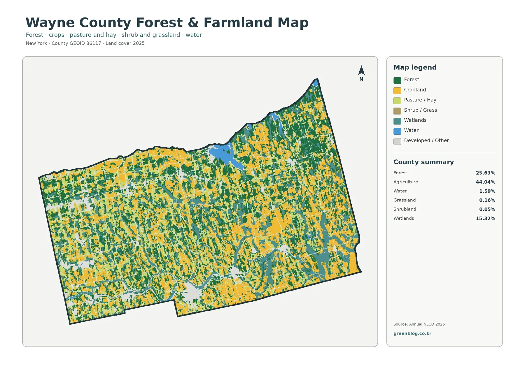
The forest-and-farmland version removes much of the visual competition from developed classes and makes the rural pattern easier to follow. Agriculture remains 44.04 percent and forest remains 25.63 percent. Grassland is only 0.16 percent and shrubland 0.05 percent in the summary, so the main comparison is between working agricultural cover, woodland, and the 15.32 percent wetland share.
Large agricultural pieces are especially common across the interior and southern half, but woodland is never far away. Green strips and blocks break up the fields, and the forest share increases in several northeastern and northwestern areas. This is helpful for presentations about rural landscape structure because the map does not reduce the county to either “farm country” or “forest country.” It shows both at the scale where they actually meet.
Wayne County’s official planning material treats agriculture as a major local land-use and economic concern. The county’s Agricultural District page reports about 11,425 parcels and 293,000 acres in Agricultural District Number 1. That legal district acreage should not be substituted for the 44.04 percent NLCD agricultural cover. The district can contain forested, residential, or other land, while NLCD classifies the physical surface seen by remote sensing.
New York State also highlights Wayne County’s orchards and agricultural economy. That context helps explain why the broad agricultural pattern matters, but the map does not identify crop type. A yellow cell should not be labeled as an apple orchard, vegetable field, grain field, or pasture unless another dataset provides that information. The forest-and-farmland view is best used for broad cover relationships, not crop inventories.
Wetlands are more than a narrow fringe around open water
The wetland color is easy to overlook when attention goes first to agriculture. Once isolated, however, it forms large patches and corridors across parts of eastern Wayne County and around northern water features. Sodus Bay is the obvious anchor, but mapped wetlands also extend inland. Their distribution makes the county useful for comparing water, wet ground, forest, and farmland within a single map frame.
The county’s 2023 Agricultural and Farmland Protection Plan discusses extensive state-regulated and federally mapped wetlands and notes their importance to farming, water quality, and flood-related functions. Those official wetland inventories are not the same product as the Annual NLCD wetland class. A regulatory boundary can differ from a remotely sensed land-cover boundary, so the two should be compared rather than treated as interchangeable.
For watershed or environmental education, start with the general map and trace where wetland colors touch agriculture. Then switch to the forest-and-farmland view to see whether the same wet areas sit beside woods, cropland, or open water. That sequence gives students a practical way to discuss surrounding land cover without making unsupported claims about water quality or ecological condition.
Impervious surface separates hard surfaces from the broader developed class
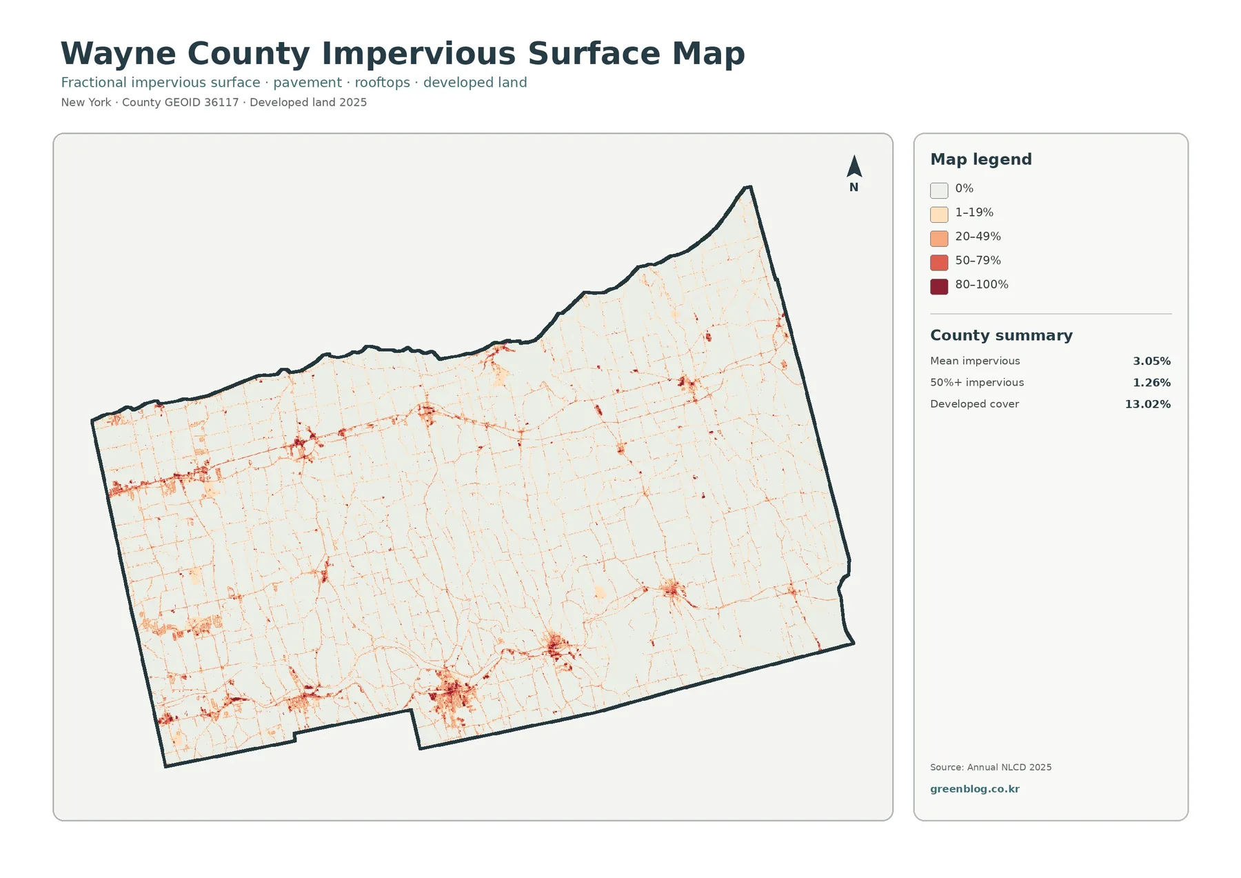
Impervious surface means hard material such as pavement, parking lots, and rooftops that does not readily absorb rainfall. The supplied Wayne County summary gives a mean impervious value of 3.05 percent. Only 1.26 percent of the mapped area reaches 50 percent or more impervious surface, even though the broader developed land-cover class accounts for 13.02 percent.
The difference is expected because developed land can include low-density neighborhoods with lawns, trees, and other permeable ground. A cell can therefore be classified as developed while containing far less than 50 percent hard surface. The impervious map is the better choice when the question concerns concentrated pavement and rooftops rather than the entire developed setting.
Higher values form compact knots around settlements and thin lines along transportation routes. The southern tier contains several of the clearest concentrations, including the general areas of Newark, Lyons, Palmyra, Macedon, and Clyde. Similar but smaller clusters appear in northern communities. Most agricultural and forest areas remain very pale, emphasizing how limited the high-impervious footprint is outside settlement centers.
This view is useful for discussing runoff context, settlement density, or the difference between a village core and surrounding countryside. It is not detailed enough to map individual driveways or building footprints. At county scale, a narrow road or small structure can be generalized within a 30-meter raster cell, so local engineering or drainage work requires more detailed data.
What the 1985–2025 class-difference map actually measures
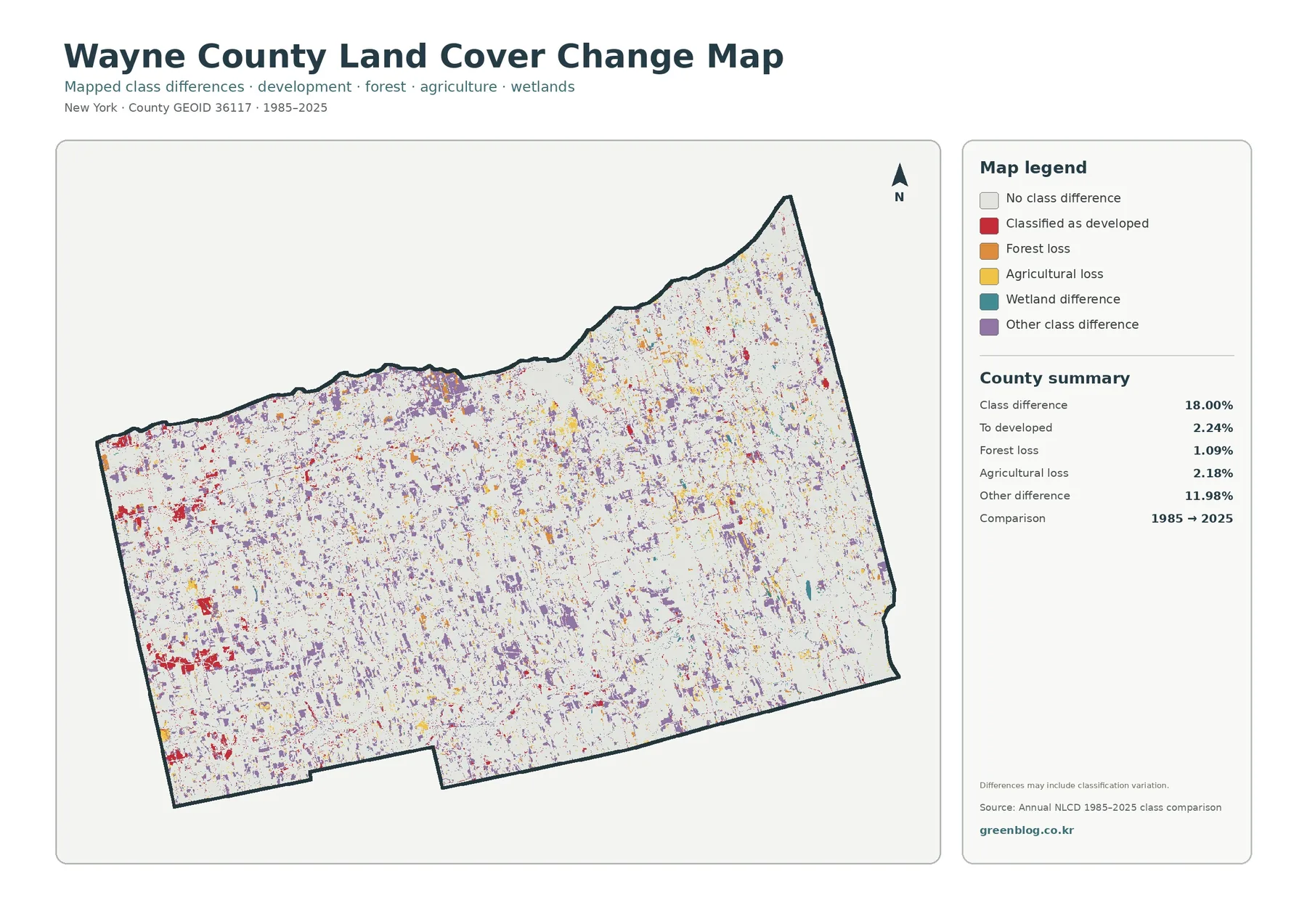
The change product compares mapped classes for 1985 and 2025 rather than providing a parcel-by-parcel history. Eighteen percent of the county is labeled as having a class difference. The summary identifies 2.24 percent as classified to developed, 1.09 percent as forest loss, 2.18 percent as agricultural loss, and 11.98 percent as other difference. A wetland-difference category is present in the legend, but its separate percentage is not printed in the summary.
Colored cells are scattered across the county. Red developed-change patches are easier to notice near several western and southern settlement areas, while agricultural-loss and other-difference colors appear through farm country in many smaller pieces. Forest-related differences also occur outside the developed centers. The pattern does not support a simple statement that one side of Wayne County changed and the other side did not.
The 11.98 percent “other difference” figure is especially important. It is much larger than any single named loss category in the summary. That means the 18 percent total should not be described as 18 percent development, deforestation, or farmland conversion. Some mapped differences can result from transitions among classes, mixed pixels, imagery conditions, or classification variation as well as real landscape change.
Use the change map as a screening tool. If a cluster near a village or agricultural edge matters to a project, compare it with current and historical aerial imagery, local planning records, or another time-series source. The map is very effective at showing where to look next, but it does not provide the date, cause, ownership, or legal meaning of a change.
Four-map comparisons that work well for Wayne County
A useful first comparison is the southern canal corridor. Begin with the general map to locate developed patches surrounded by agriculture. Move to the impervious map to see which parts contain the highest hard-surface fractions. Then use the 1985–2025 map to identify locations where the mapped class differs between the two dates. Each layer answers a different question without requiring the reader to infer more than the data provides.
Sodus Bay offers a second comparison. The general map shows open water, wetland, development, agriculture, and forest meeting around the bay. The forest-and-farmland map simplifies the surrounding land and makes wet areas easier to separate from fields and woods. The change layer can then highlight locations worth checking against shoreline imagery or wetland records if the project concerns long-term landscape change.
Eastern Wayne County is useful for a third exercise because wetland and agricultural colors repeatedly meet. Rather than asking whether one class “caused” another, examine the arrangement: where are broad agricultural blocks, where do wetland patches widen, and where does forest form a buffer or separate field groups? Describing location and adjacency keeps interpretation within what the maps can actually support.
For a countywide presentation, combine one statistic with one visible pattern in each section. Agriculture 44.04 percent can be paired with the broad central and southern farm mosaic; wetlands 15.32 percent with Sodus Bay and eastern wet areas; mean impervious 3.05 percent with compact settlement clusters; and the 18 percent class-difference total with a reminder that “other difference” is the largest named summary component.
Choosing the best file for print, class, or regional reference
For a single overview image, the general 2025 land-cover map is the strongest starting point because it keeps agriculture, forest, wetland, developed land, and water in one legend. The forest-and-farmland map is cleaner when the discussion centers on rural land, agriculture, conservation, or the relationship between woodland and open fields.
The impervious surface map is more specialized. Choose it for settlement patterns, hard-surface concentration, runoff context, or a visual comparison between village centers and rural surroundings. Its pale background makes roads and compact developed clusters easy to see, but it intentionally leaves out much of the color information that makes the general land-cover map useful.
The class-difference map belongs in time-comparison work. Pair it with a current map and clearly state that it records mapped class differences between 1985 and 2025. It is not a verified inventory of development permits, farm closures, logging events, or wetland alterations. A focused caption prevents viewers from assigning a cause that the pixels themselves cannot establish.
Keep the legend readable when printing. Color is strongly recommended because several land-cover and change classes would become difficult to separate in grayscale. For a slide or report page, enlarging one area of interest can be more useful than shrinking the entire county to a small panel, especially when the discussion concerns a narrow road corridor or small wetland patch.
Resolution and classification limits
Annual NLCD is a raster product based on Landsat imagery at 30-meter spatial resolution. Each cell summarizes an area roughly 30 meters across. Narrow streams, small buildings, farm lanes, hedgerows, and exact parcel edges can therefore be generalized, merged with neighboring cover, or missed at county display scale.
Mixed pixels are common near boundaries. One cell might contain a house, trees, lawn, and pavement, yet the land-cover product still assigns a class while the impervious product estimates a hard-surface fraction. This is one reason aerial photography may show a more complicated edge than the colored land-cover boundary.
The 2025 map represents the mapped condition for that data year. Construction, vegetation recovery, field changes, flooding, or other events occurring later will not appear until a newer dataset is available. For decisions that depend on present-day conditions, compare the map with recent county GIS, aerial imagery, or field observations.
These maps are reference products, not legal records. They do not define ownership, agricultural-district enrollment, zoning, wetlands jurisdiction, building rights, flood-insurance status, or permit requirements. Use the land-cover set to identify a landscape pattern or area of interest, then move to the official dataset designed for the legal or parcel-specific question.
Download the four Wayne County JPG maps
The ZIP below contains the four original JPG files shown on this page: the 2025 general land-cover map, forest-and-farmland map, fractional impervious/developed-land map, and 1985–2025 class-difference map. Downloading the set is convenient when you need a larger file for printing or want to compare all four views at the same time.
You can keep the full set as a compact county reference or use only the file that matches your project. For publication, classwork, or a formal presentation, include the map year and underlying data source so viewers understand what the colors represent. The source links below provide the Annual NLCD background and Wayne County context used to interpret the maps.
Frequently Asked Questions
What is the largest land-cover class in Wayne County?
Agriculture is the largest class in the supplied 2025 summary at 44.04 percent. Forest follows at 25.63 percent, wetlands at 15.32 percent, developed cover at 13.02 percent, and water at 1.59 percent. The broad farm pattern is especially visible across the center and southern part of the county.
Why is developed cover 13.02% while mean impervious surface is 3.05%?
They measure different things. Developed land cover can include buildings together with lawns, trees, and other permeable surfaces in a developed setting. Impervious percentage focuses on hard surfaces such as pavement and rooftops. Low-density development can therefore count as developed while still having a modest impervious fraction.
Does the 18.00% class-difference figure mean 18% of Wayne County was developed?
No. The 18.00 percent figure includes all mapped class differences between 1985 and 2025. The summary identifies 2.24 percent as classified to developed, 1.09 percent as forest loss, 2.18 percent as agricultural loss, and 11.98 percent as other difference, with a wetland-difference category also shown in the legend.
Can I use these maps to check a farm parcel, zoning district, or wetland permit?
No. The maps are 30-meter land-cover reference products, not parcel or regulatory maps. For agricultural-district enrollment, zoning, ownership, mapped regulatory wetlands, or permit questions, use Wayne County, municipal, and New York State official records designed for those purposes.
Map File Information
Wayne County land-cover maps – four original JPG files
- Included Files: Use only the versions confirmed in the article and supplied images
- File Type: Use the confirmed download contents
- Intended Use: Printing, education, presentations, and map-based projects
Related Maps
- Albany County Land Cover Map
- Allegany County New York Land Cover Map
- Bronx County New York Land Cover Map
Sources and reference material
- MRLC Annual NLCD Data – access to Annual NLCD land-cover products
- USGS Annual NLCD Land Cover Classification – definitions and interpretation of mapped classes
- New York State – Wayne County – county location, Lake Ontario and Sodus Bay context, and local overview
- Wayne County Agricultural District – county agricultural-district history and current program information
- Wayne County Farmland Protection – local agricultural and farmland-protection planning resources
Green Map creates custom-edited map images using open geographic data sources such as geoBoundaries, Natural Earth, OpenStreetMap, and government open data.
These maps are edited visual materials, not raw data files, and are provided for education, documents, presentations, and graphic reference.