Tompkins County is a mixed forest-and-farm landscape in the 2025 classification rather than a county defined by one cover alone. Forest accounts for 46.56% of the mapped area and agriculture for 32.62%, while developed land makes up 12.14%. A large central developed concentration stands out just south of the broad water body that enters the county from the northwest, and smaller developed clusters are scattered through more rural surroundings.
Four map views are provided so those percentages can be connected to actual locations: current land cover, forest and farmland, impervious surface, and a 1985–2025 class-difference comparison. The four original JPG files are available together in one download. These are land-cover maps, meaning they classify what physically covers the ground; they do not show legal ownership, zoning, parcel boundaries, or development rights.
Table of Contents
Current cover across Tompkins County
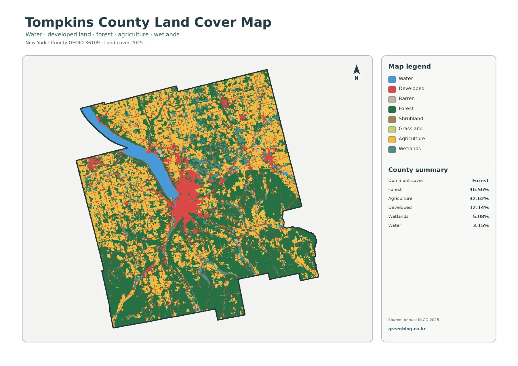
The countywide map is best read first at a broad scale. Dark green forest is the largest class at 46.56%, but yellow agricultural cover occupies enough of the north, west, and other open areas to prevent the county from appearing uniformly wooded. The two classes repeatedly meet along irregular edges, and the balance changes from one part of the county to another. Large wooded blocks are more obvious in the south and east, while agricultural colors are especially extensive in the northern and western portions.
Developed cover is 12.14%, a smaller share than either forest or agriculture, yet its clustering makes it visually prominent. The largest concentration occupies the middle of the county immediately south of the broad water feature. From that center, thinner developed traces extend in several directions. Additional small nodes are visible toward the north and west, although they do not approach the size or density of the central cluster.
Water is 3.15% of the county, and its value for map reading is greater than that percentage may suggest. The broad blue feature entering from the northwest provides a reliable landmark for aligning all four maps. Wetlands add another 5.08% and appear as smaller patches distributed among forest, agriculture, and water. Those wetland colors show surface classification, not surveyed wetland jurisdiction or a regulatory boundary.
Using the water feature to locate the central developed area
Hard surfaces are not the same as developed land
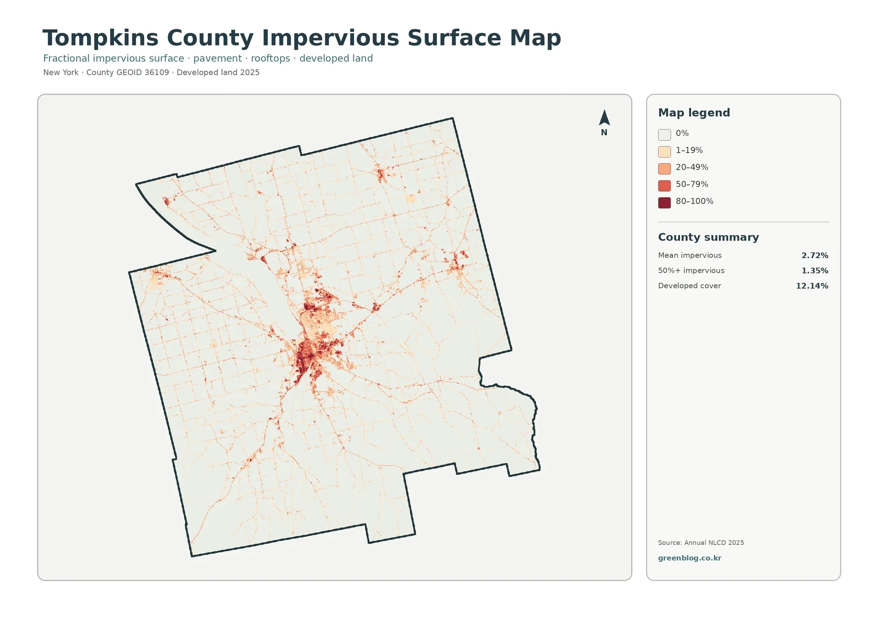
The impervious-surface map is much lighter than the general land-cover image because it measures a different characteristic. Mean impervious cover is 2.72% across the county, and only 1.35% of the mapped area falls in cells that are at least 50% impervious. The darkest colors are concentrated in the same central area that stands out as developed land, with smaller dense spots elsewhere.
Impervious surface means hard cover such as pavement and rooftops that does not allow water to soak in easily. Developed land is a broader land-cover category. A developed cell can still include lawns, trees, bare soil, or other permeable surfaces, so the county can have 12.14% developed cover while its mean impervious value is much lower. Treating the two figures as interchangeable would erase that distinction.
A clearer look at forest and farmland
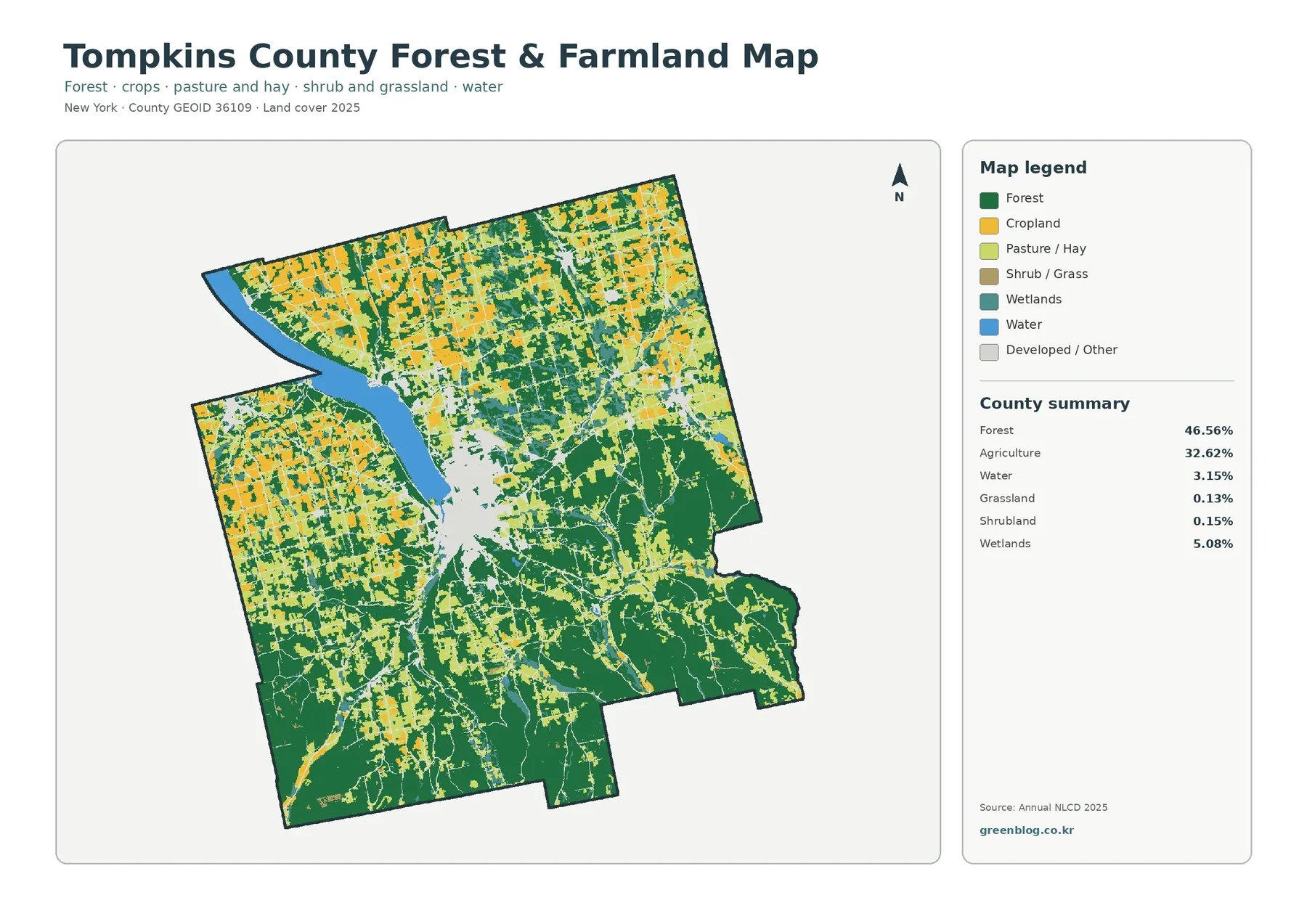
The forest-and-farmland view reduces the visual weight of developed cover, making the rural structure easier to follow. Green forest remains broad through much of the county, while cropland and pasture colors create a dense network in the north and west. In the south, forest blocks become larger and agricultural openings are more often separated by wooded areas. The central developed zone appears as a light gap, which makes the surrounding forest and agricultural edges easier to see.
What differs between the 1985 and 2025 classifications
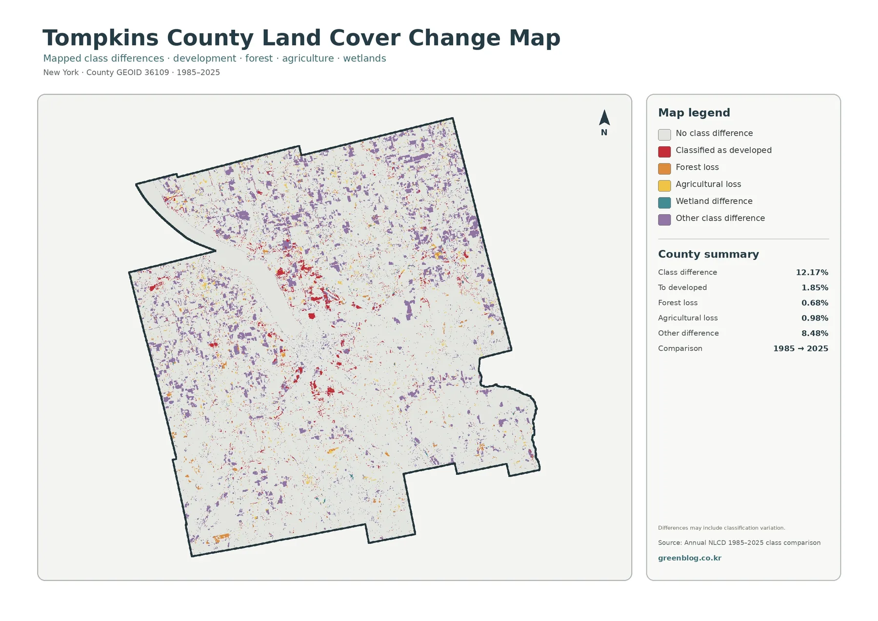
Between 1985 and 2025, the endpoint comparison reports a class difference on 12.17% of the county. Of that total, 1.85% is classified as a change to developed, 0.68% as forest loss, and 0.98% as agricultural loss. The largest summarized category is other class difference at 8.48%. Those figures make one point especially important: the 12.17% total cannot be described as urban growth, deforestation, or farmland loss by itself.
Red change-to-developed cells are visible in the central area and in several smaller clusters. Orange forest-loss and yellow agricultural-loss cells are more scattered. Purple other differences are widespread and account for the largest share in the summary. The map therefore presents a mixed pattern of endpoint differences rather than one dominant type of transition covering the county.
A two-date map cannot reconstruct everything that happened between those dates. A cell that changed during an intermediate year and returned to its original class by 2025 may appear unchanged at the endpoints. Small boundary shifts or differences in how a mixed cell is classified can also create a visible difference. A time series of intermediate Annual NLCD years would be more appropriate for reconstructing a detailed sequence.
Choosing the map that answers the question
For a quick county overview, start with the general land-cover map because it keeps all of the major classes together. It is the best choice for explaining the 46.56% forest, 32.62% agriculture, 12.14% developed land, 5.08% wetlands, and 3.15% water in one image. It also shows where the central development cluster sits relative to rural cover and the large water body.
Use the forest-and-farmland map when the question concerns rural cover. Its simplified palette makes the north-and-west agricultural concentration and the larger southern and eastern forest blocks easier to compare. The impervious map answers a different question: where hard surfaces are concentrated. The change map should be reserved for comparisons that explicitly involve the 1985 and 2025 endpoints.
Download the four original JPG maps
The download package contains four separate JPG files: the 2025 land-cover map, the forest-and-farmland map, the impervious/developed-surface map, and the 1985–2025 class-difference map. Each file includes its own title, legend, and county summary. They can be used for print reference, classroom handouts, presentations, environmental comparisons, and side-by-side county studies.
Each supplied original JPG measures 2480×1754 pixels. The package does not mark them as meeting an A3 high-resolution reference, so the page should not promise a print standard that the source does not guarantee. Before producing a large print, open the JPG at the intended size and check whether the legend and small text remain readable.
Important limits before using the maps
Annual NLCD land cover is raster data, which means the landscape is represented as a grid of cells rather than surveyed parcel polygons. Along a forest edge, narrow road, small wetland, shoreline, or field boundary, one cell can include more than one real surface. The classification generalizes that mixture, so the colored boundary should not be treated as an exact legal line.
Frequently Asked Questions
What is the largest land-cover class in Tompkins County in 2025?
Forest is the largest at 46.56%, followed by agriculture at 32.62%. Developed land accounts for 12.14%, wetlands 5.08%, and water 3.15%. The distribution is uneven. Agriculture is especially extensive in the northern and western portions, while larger forest blocks are more visible in the south and east. The strongest developed concentration is in the center near the broad water feature.
Why is developed cover 12.14% while mean impervious cover is only 2.72%?
They measure different characteristics. Developed land is a broad land-cover classification, while impervious percentage measures hard surfaces such as pavement and rooftops inside each cell. Developed areas can contain trees, lawns, and soil, so their full area is not necessarily hard surface. Cells with at least 50% impervious cover account for 1.35% of the county.
Does the 12.17% class difference mean that 12.17% of the county became developed?
No. The 12.17% value combines several categories. The summary identifies 1.85% as classification to developed, 0.68% as forest loss, 0.98% as agricultural loss, and 8.48% as other class difference. The categories must be kept separate, and the maps alone do not prove the cause of any individual change.
Map File Information
The ZIP contains four original Tompkins County JPG maps covering 2025 land cover, forest and farmland, impervious/developed surfaces, and mapped class differences from 1985 to 2025.
- Included Files: Tompkins County land cover, forest & farmland, impervious surface, and 1985–2025 class-difference maps
- File Type: One ZIP with four separate original JPG maps
- Intended Use: Print reference, lessons, presentations, environmental comparison, and map review
Related Maps
- Albany County Land Cover Map
- Allegany County New York Land Cover Map
- Bronx County New York Land Cover Map
Sources and references
- MRLC Annual NLCD Data — official access point for the Annual NLCD data family used for land-cover mapping.
- USGS Annual NLCD Land Cover Classification — official classification guidance for interpreting land-cover classes.
- U.S. Census Bureau TIGER/Line Shapefiles — official geographic boundary and identifier resources for U.S. counties.
Green Map creates custom-edited map images using open geographic data sources such as geoBoundaries, Natural Earth, OpenStreetMap, and government open data.
These maps are edited visual materials, not raw data files, and are provided for education, documents, presentations, and graphic reference.