Schuyler County, New York, is predominantly a forest-and-farm landscape in the 2025 land-cover summary. Forest accounts for 51.61 percent and agriculture for 31.63 percent, while developed land is concentrated in much smaller areas. Seneca Lake provides an easy geographic reference near the center-north of the county, and the strongest developed cluster appears at its southern end around Watkins Glen. The four maps on this page separate those broad patterns into current cover, forest and farmland, impervious surface, and 1985–2025 class differences.
The page previews use WebP images for quick viewing, while the four original JPG maps are available together in one ZIP download. They can be used for printing, classroom comparison, presentations, and county-scale reference work. Land cover describes what physically covers the ground—such as trees, crops, water, wetlands, or developed surfaces. It is not a zoning map, parcel map, ownership record, or legal determination of how a property may be used.
Table of Contents
Start with the 2025 countywide pattern
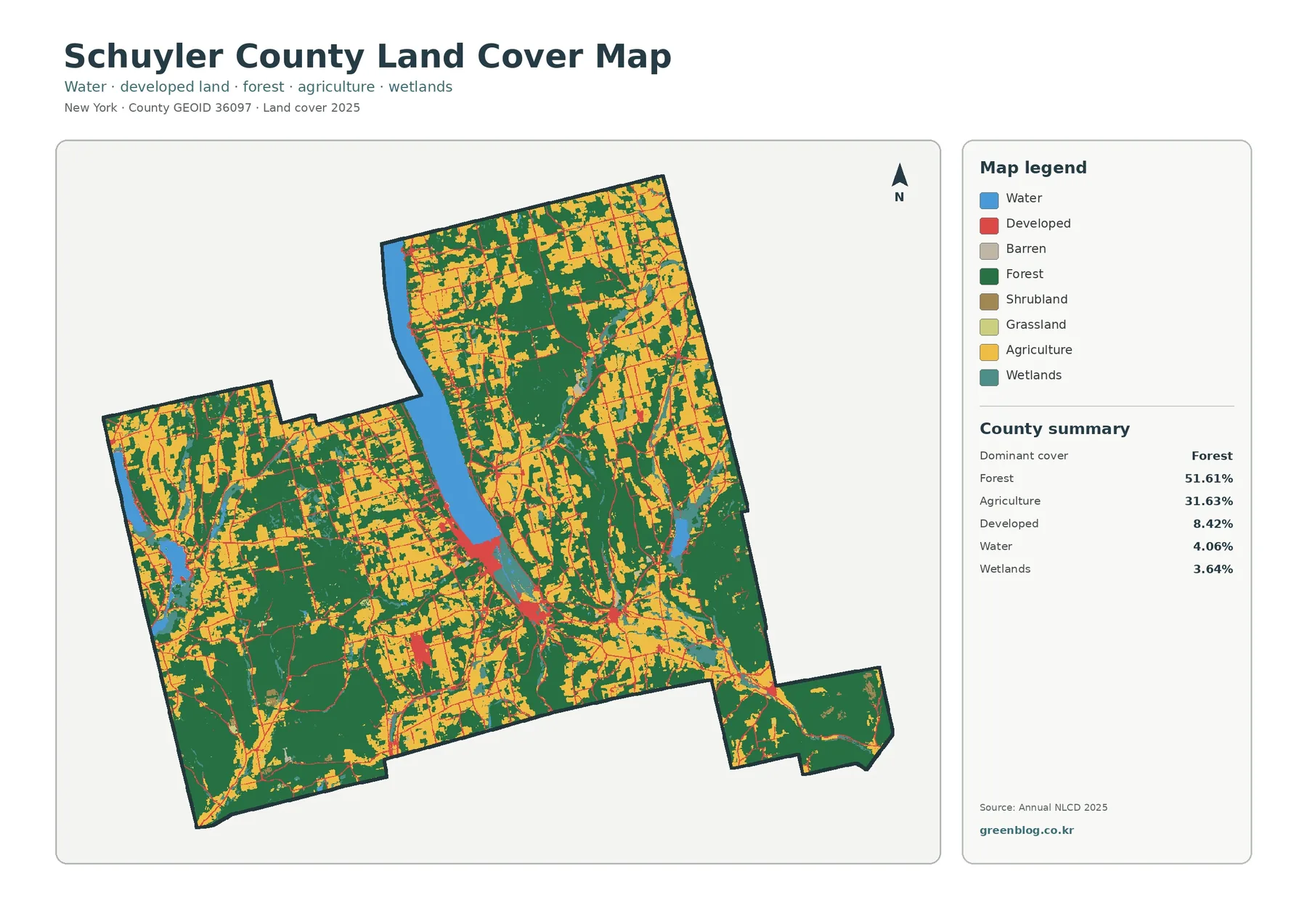
The countywide map is easiest to read by first separating the two dominant colors from everything else. Forest covers 51.61 percent of the county, forming broad green areas in the south, southwest, and parts of the east. Agriculture makes up 31.63 percent and appears repeatedly across the north, northeast, and central portions of the county. These two classes meet in many narrow and irregular boundaries, so Schuyler County does not divide neatly into a forest half and a farm half.
Developed land represents 8.42 percent of the 2025 summary. Its red tones are most obvious at the southern tip of Seneca Lake, where Watkins Glen forms the county’s clearest developed center, and along several roads extending away from that area. Smaller developed traces appear elsewhere as thin lines and compact patches. The pattern is useful because it shows how a relatively small percentage can still be geographically important when it is concentrated around settlements and transportation routes rather than spread evenly across the county.
Water accounts for 4.06 percent. Seneca Lake is the most recognizable blue feature and gives the reader a fixed point for comparing all four maps. Additional water bodies are visible in the western part of the county, but the large lake is the best orientation landmark. Schuyler County’s official page for Watkins Glen places the village at the southern tip of Seneca Lake, which matches the relationship seen between the blue lake surface and the compact developed area immediately below it.
Wetlands account for 3.64 percent and are more fragmented than the major forest and agricultural classes. Small wetland areas occur beside water, within forest, and near low-lying valley areas. County planning material identifies Queen Catharine Marsh and the Catharine Creek Wildlife Management Area in the valley between Watkins Glen and Montour Falls, providing useful local context for some of the wetland colors near the south end of Seneca Lake. The land-cover pixels, however, should not be treated as a regulatory wetland boundary.
Grassland and shrubland are minor categories in the county summary, at 0.25 and 0.27 percent respectively. They may appear as small patches at field edges, in openings, or among other classes. At county scale, those tiny areas are less important for orientation than the broad forest, agricultural, water, developed, and wetland patterns. Zooming into a small colored patch can be informative, but it does not turn a generalized raster cell into a surveyed parcel boundary.
Seneca Lake and the southern valley make useful reference points
A reader unfamiliar with Schuyler County can use Seneca Lake to establish orientation before interpreting smaller features. Watkins Glen lies at the lake’s southern end, and the county’s official village page notes that New York State Routes 14 and 414 meet there. On the land-cover map, the developed cluster at that location stands out sharply against surrounding forest, farmland, and water. Once that point is identified, it becomes easier to follow the same roads and settlement areas on the impervious-surface and change maps.
South of the lake, land-cover colors shift over short distances. Developed cells give way to forest, agriculture, wetlands, and other cover types rather than expanding into one broad urban area. This makes the southern valley a useful place to demonstrate that “developed” and “rural” are not separated by a single clean line. A classroom exercise can focus on a small box around Watkins Glen and ask students to record how many different land-cover categories appear within a short distance of the village center.
The county’s comprehensive planning material also describes the Queen Catharine Marsh in the valley between Watkins Glen and Montour Falls as part of a large undeveloped wetland and woodland setting. That source does not define the pixels on this map, but it helps explain why wetland and natural-cover colors are significant in the same broader valley where developed areas are also visible. Local context is most useful when it clarifies the map without pretending that one dataset replaces another.
Seneca Lake itself should be read only as mapped water cover on these figures. The land-cover image does not provide depth, water quality, flood probability, shoreline ownership, or boating access. Its value is in showing what surrounds the water. Forest, agriculture, wetlands, and developed surfaces can be compared around the lake’s southern end, and those patterns can later be combined with watershed or water-quality datasets for a more specialized study.
A separate forest-and-farmland view reveals the rural mosaic
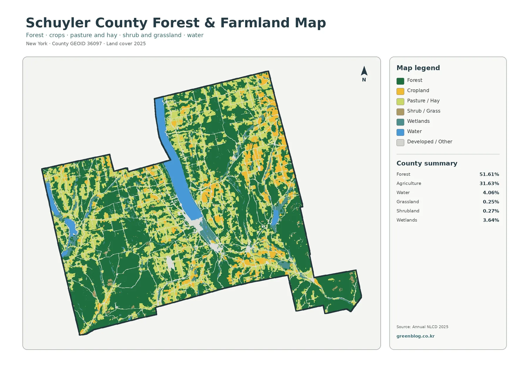
The forest-and-farmland map removes much of the visual competition created by developed colors, making the county’s rural pattern easier to compare. Large forest blocks remain prominent in the south and east, while agricultural cover becomes especially noticeable across northern and central areas. Rather than forming one uninterrupted farm belt, the agricultural colors repeatedly break around forest patches, wetlands, water, and developed or other surfaces.
The two dominant classes together account for more than four-fifths of the county summary, but their geography is not interchangeable. A high countywide forest percentage does not mean every town is equally wooded, and the 31.63 percent agricultural share does not mean fields are uniformly distributed. The map shows where the balance changes. Northern sections generally contain more frequent agricultural patches, while southern and southeastern areas contain larger areas of continuous forest.
Forest on this map is a cover class, not an ownership class. Public and private wooded land can look the same in the classification. The New York State Department of Environmental Conservation identifies the Finger Lakes National Forest in Hector, Schuyler County, and describes a landscape that includes woodlands, pasture, grassland, and shrubland. That local example is a reminder that even a named forest area can contain several cover types at the scale used for land-cover mapping.
Agricultural cover also should not be confused with an agricultural district or a parcel-level crop inventory. The map groups ground-cover conditions rather than legal designations. It is useful for seeing where agricultural surfaces are common and where they meet forest, wetlands, or settlement areas. Questions about protected farmland, farm ownership, taxation, or a specific crop require county agricultural records and other specialized sources.
For environmental education, the most informative locations are often the edges rather than the centers of the largest color blocks. A forest-farm boundary may also include a road, wetland, stream corridor, or a small developed area. Comparing those edges across the county helps show why a single percentage cannot describe the entire landscape. The simplified map is strongest as a county-scale overview, while detailed habitat or forestry work needs finer vegetation, ownership, and field data.
Impervious surface pinpoints where hard surfaces are concentrated
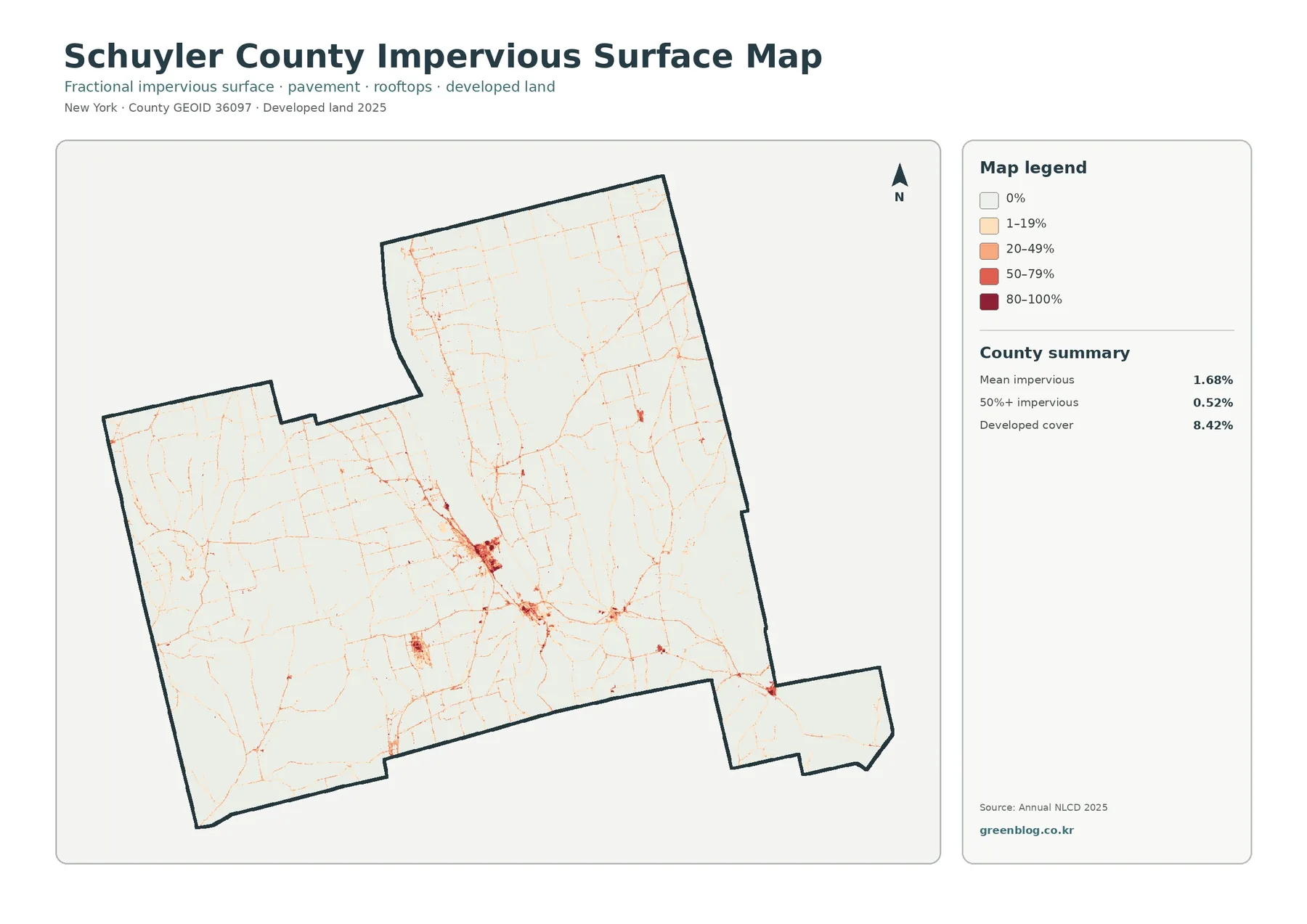
Impervious surface means pavement, rooftops, parking areas, and similar surfaces that do not readily absorb rainfall. Schuyler County’s mean impervious value is 1.68 percent, and only 0.52 percent of the county falls in cells with at least 50 percent impervious cover. Those numbers are much lower than the 8.42 percent developed-land share because a developed land-cover class can still include lawns, trees, soil, and other permeable ground.
The strongest impervious values cluster around Watkins Glen and follow narrow transportation and settlement patterns outward from the village. Most of the county remains white or very lightly shaded, which fits the forest-and-farm dominance seen on the other maps. Smaller concentrations occur as short lines and compact nodes instead of a continuous urban field. This difference between a countywide average and a few local hotspots is precisely why the map is more informative than the mean value alone.
Routes 14 and 414 meet in Watkins Glen according to the county’s official village information. The impervious map shows hard-surface concentrations in the same general developed center, but geographic overlap should not be turned into a causal claim. The map cannot establish why development occurred, when a road was built, or which project created a particular hard surface. Those questions require historical imagery, planning records, construction data, or local documents.
The impervious layer can support an introductory discussion of stormwater because hard surfaces reduce the amount of exposed soil available for direct infiltration. It does not, by itself, calculate flooding or water quality. Slope, soil, drainage infrastructure, rainfall, vegetation, and stream conditions all matter. The Schuyler County Soil and Water Conservation District works on water quality, erosion, and other natural-resource issues, illustrating why land-cover information is only one part of a broader watershed picture.
Placing the impervious map beside the general land-cover map also prevents a common misunderstanding. Not every developed pixel is mostly pavement, and not every road-width feature is resolved perfectly at county scale. Developed land answers a categorical question about the dominant cover in a cell, while the impervious layer estimates the hard-surface fraction. The two products complement each other rather than duplicating the same information.
What the 1985–2025 class-difference map does—and does not—say
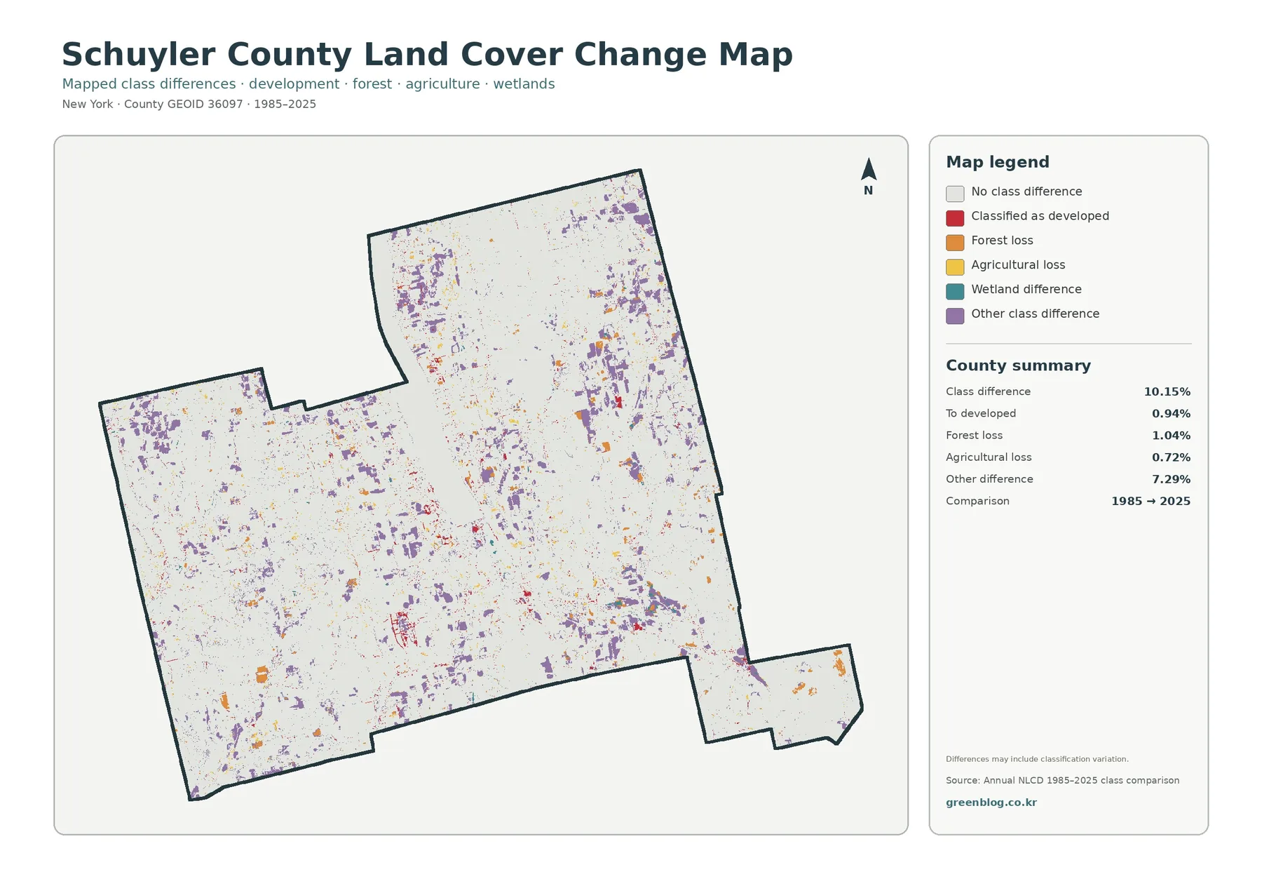
The change map compares the mapped class at the same location in 1985 and 2025. The county summary reports a 10.15 percent class difference. Within that total, 0.94 percent is classified as change to developed land, 1.04 percent as forest loss, 0.72 percent as agricultural loss, and 7.29 percent as other class difference. Most of the map remains in the no-class-difference category, so the colored areas are better treated as locations to investigate than as evidence that the whole county changed dramatically.
The red “to developed” cells are visible around some settlement and road areas, including portions of the southern valley, but they represent less than one tenth of the total class-difference percentage. It would therefore be incorrect to describe the full 10.15 percent as development. Forest loss and agricultural loss are separate categories, and the largest component is the broad “other difference” group.
Forest-loss and agricultural-loss colors appear in small patches across several parts of the county. Some are near existing farms, roads, or developed areas, while others are embedded in rural cover. Proximity does not identify a cause. A colored cell could reflect a real transition, but classification methods, image conditions, mixed pixels, or differences near class boundaries can also contribute. The map itself warns that differences may include classification variation.
The 7.29 percent other-difference category deserves attention because it prevents a simplistic narrative. Purple patches are dispersed rather than forming one large conversion zone. Multiple cover types can move between categories over a four-decade comparison, and a start-to-end map does not show every intermediate step. A field could have changed more than once between 1985 and 2025 without that sequence being visible in a two-date summary.
A practical workflow is to use this layer as a screening map. First locate a cluster of colored cells, then check the 2025 land-cover map to understand the current class. After that, examine intermediate Annual NLCD years, aerial imagery, or local records if the cause or timing matters. Areas with little or no class difference can also be useful, because they provide a contrast with locations where several categories changed.
Ways to use the four Schuyler County maps together
For a presentation or report, the general land-cover map works well as the opening figure because it combines all major classes. The forest-and-farmland map can then narrow the discussion to rural landscape structure without allowing developed colors to dominate attention. Next, the impervious map shows where hard surfaces are concentrated within the much smaller developed footprint. The change map should come last when the question shifts from “what is there now?” to “where do the two mapped years differ?”
The shared county outline makes location tracking straightforward. Choose the south end of Seneca Lake, for example, and follow the same area through all four figures. The first map identifies developed land beside water and other cover; the second emphasizes nearby forest and agricultural surfaces; the impervious layer shows where pavement and rooftops are densest; and the change map indicates which cells differ between 1985 and 2025. Repeating that process elsewhere builds a more careful interpretation than relying on one image.
In a classroom, students can compare a northern agricultural area with a southern forested area and record the differences visible on each layer. In a planning presentation, the maps can provide broad background before parcel or zoning data are introduced. For watershed education, the land-cover and impervious maps can be combined with streams and drainage boundaries. In every case, the maps are best used to establish context rather than to replace datasets designed for property, regulatory, or engineering decisions.
The figures also work well for county-to-county comparisons, provided the reader compares the same map type and year. Schuyler County’s 1.68 percent mean impervious value, for example, should be compared with the same impervious metric elsewhere rather than with another county’s developed-land percentage. Keeping the definitions consistent prevents an attractive visual comparison from becoming a misleading statistical one.
Download the four original JPG maps
The downloadable ZIP contains four original JPG files: the 2025 general land-cover map, the forest-and-farmland map, the impervious/developed-land map, and the 1985–2025 land-cover change map. Each image includes its own legend and county summary, so it can be used outside this webpage without losing the basic class definitions. The files are convenient for print layouts, slides, teaching handouts, and side-by-side county reference work.
Choose the file that matches the question. Use the general map for a broad overview, the forest-and-farmland map when rural cover is the subject, and the impervious map when hard surfaces around settlements and roads matter. The change map is for comparing the two mapped years rather than describing current conditions. Keeping those roles separate avoids treating four related images as though they were interchangeable.
When reusing a map in a report or slide, keep the year and legend visible whenever possible. The current-cover and impervious figures refer to 2025, while the change figure compares 1985 with 2025. Cropping away that context can make a correct map easy to misread. A short caption stating the map type and year is usually enough to preserve the distinction.
Read the pixels as generalized evidence, not parcel facts
Annual NLCD is a raster product, meaning the landscape is represented by a grid of cells. A single cell can contain more than one real-world surface, especially along forest edges, narrow roads, shorelines, small wetlands, and settlement boundaries. The assigned class or impervious value summarizes that cell rather than surveying every object inside it. This is why a colored edge on the map should not be interpreted as a surveyed line on the ground.
Land cover and land use are related but different. A developed class does not identify residential, commercial, or industrial zoning. Agricultural cover does not establish an agricultural district, and forest cover does not tell you whether land is private, county-owned, state-owned, or federal. Wetland pixels are not a substitute for mapped jurisdictional or regulatory wetlands. Parcel, zoning, ownership, permitting, and legal-boundary questions require the appropriate current government records.
County summary percentages are also averages over the entire mapped area. A mean impervious value of 1.68 percent does not mean every community has that amount of pavement, just as 51.61 percent forest does not mean every local area is half wooded. Schuyler County contains sharp local contrasts. The number answers “how much across the county,” while the map answers “where does it occur?” Both are needed for a meaningful reading.
The change product carries an additional limitation. A different class in 1985 and 2025 can represent real landscape change, but classification variation and mixed pixels can also contribute. A two-date comparison cannot reveal the full sequence of changes during the intervening years. If a specific site matters for research or decision-making, use the change map to locate it and then confirm the history with intermediate datasets and local evidence.
Finally, a 2025 map is a representation of that mapped year, not a guarantee of current field conditions. Buildings, vegetation, farming patterns, and local infrastructure may have changed afterward. County-scale land-cover maps are most useful for orientation, comparison, education, and preliminary analysis. Current site-specific decisions should be checked against newer imagery, field observations, and the appropriate official datasets.
Frequently Asked Questions
What is the dominant 2025 land cover in Schuyler County?
Forest is the largest class at 51.61 percent, followed by agriculture at 31.63 percent. Developed land accounts for 8.42 percent, water for 4.06 percent, and wetlands for 3.64 percent. The map shows large forest areas in the south and east, frequent agricultural cover in the north and center, and the clearest developed concentration at the southern end of Seneca Lake around Watkins Glen.
Why is developed land 8.42 percent when mean impervious cover is only 1.68 percent?
They measure different things. A developed land-cover class can contain lawns, trees, soil, and other permeable ground in addition to buildings and pavement. The impervious layer estimates the hard-surface fraction within cells, so the countywide mean can be much lower than the percentage of land assigned to a developed class. The highest impervious values are concentrated in small settlement and road areas rather than across every developed pixel.
Does the 10.15 percent class difference mean 10.15 percent of the county was developed?
No. The 10.15 percent figure includes every mapped class difference between 1985 and 2025. The “to developed” category is 0.94 percent, while forest loss is 1.04 percent, agricultural loss is 0.72 percent, and other class difference is 7.29 percent. Some differences may also reflect classification variation, so individual sites need additional evidence before a cause is assigned.
Can these maps be used to identify zoning, parcels, or legal wetlands?
No. These are generalized county-scale land-cover maps. They do not define property ownership, tax parcels, zoning districts, building rights, protected-area boundaries, or regulatory wetland lines. Those questions require the current official records from Schuyler County, local municipalities, New York State, or other agencies responsible for the specific legal boundary or decision.
Map File Information
The ZIP contains the four original Schuyler County JPG maps covering 2025 land cover, forest and farmland, impervious surface, and 1985–2025 class differences.
- Included Files: Land cover, forest & farmland, impervious/developed land, and land cover change maps
- File Type: ZIP containing four original JPG maps
- Intended Use: Printing, teaching, presentations, county comparison, and map reference
Related Maps
- Albany County Land Cover Map
- Allegany County New York Land Cover Map
- Bronx County New York Land Cover Map
Sources and references
- MRLC Annual NLCD Data – official access point for Annual NLCD land-cover and impervious-surface data
- USGS Annual NLCD Land Cover Classification – official explanation of the land-cover classes used in Annual NLCD products
- Schuyler County Planning Department – official county information on land-use planning, GIS mapping, infrastructure, and environmental planning
- Village of Watkins Glen – Schuyler County – official county page describing Watkins Glen at the south end of Seneca Lake and its major route connections
- Schuyler County Soil & Water Conservation District – local natural-resource information covering water quality, soil erosion, agriculture, and conservation programs
- NYSDEC Finger Lakes National Forest – New York State information on the forest, grassland, shrubland, and wildlife landscape in Hector, Schuyler County
Green Map creates custom-edited map images using open geographic data sources such as geoBoundaries, Natural Earth, OpenStreetMap, and government open data.
These maps are edited visual materials, not raw data files, and are provided for education, documents, presentations, and graphic reference.