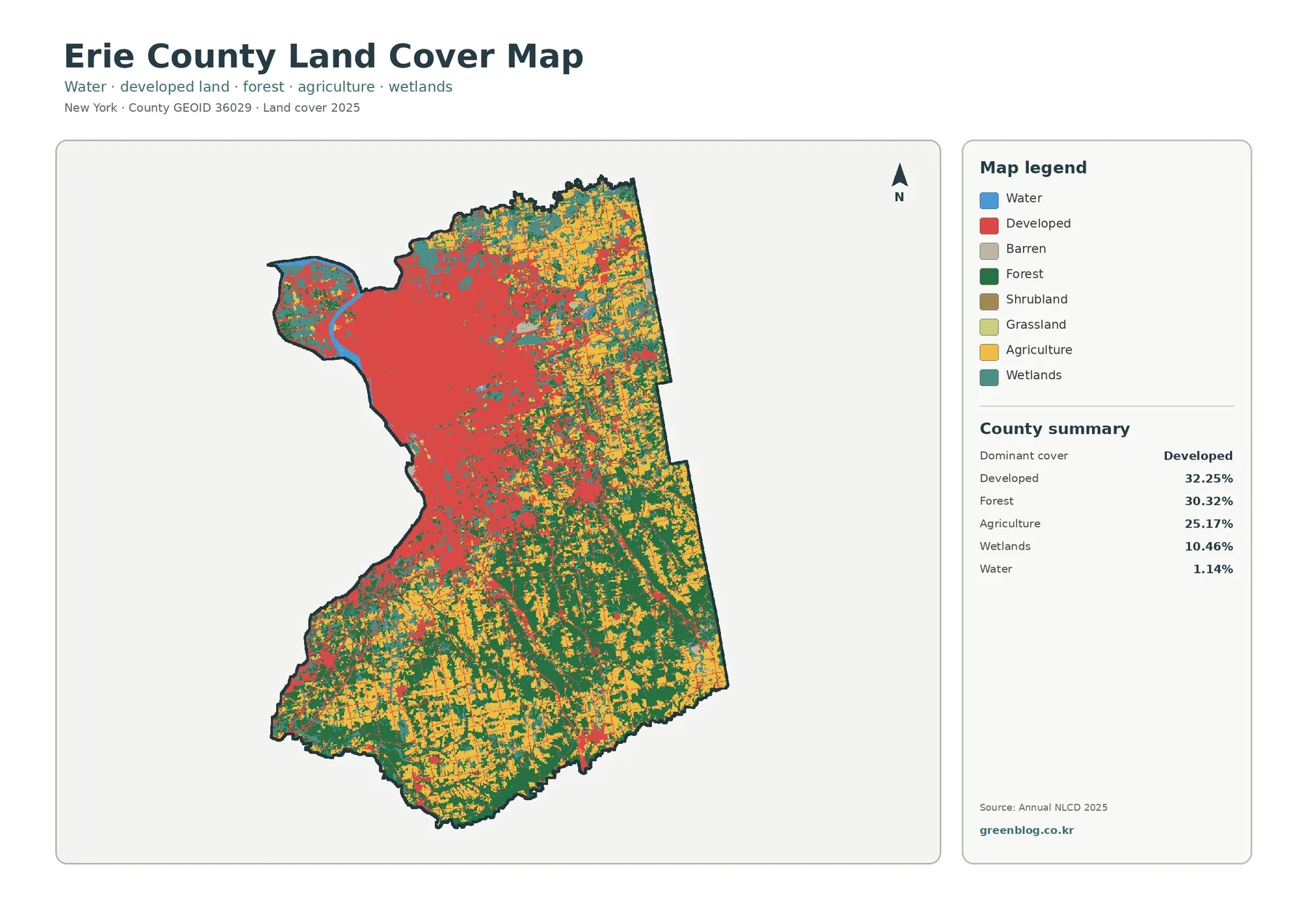
Erie County contains one of the clearest urban-to-rural land-cover contrasts in western New York. The 2025 map lists developed land at 32.25%, slightly ahead of forest at 30.32%. Agriculture accounts for 25.17%, while wetlands make up 10.46%. Those percentages become more meaningful on the map: the Buffalo-area landscape in the northwest is densely developed, while forest and farmland occupy much larger shares of the south and east.
The four maps on this page approach that contrast from different angles. The general land-cover map establishes the overall pattern. A forest-and-farmland view removes much of the urban detail so rural cover is easier to compare. The impervious map isolates hard surfaces such as pavement and rooftops. The change map then marks places whose mapped class differs between 1985 and 2025.
These layers describe land cover, not zoning, property ownership, or legal land use. They classify the surface visible in remotely sensed data. That makes them useful for regional comparison, environmental education, watershed context, and presentation graphics. They should not be treated as parcel surveys or as a substitute for local planning records.
Table of Contents
A county divided by development intensity
The strongest visual concentration on the 2025 land-cover map lies in the northwest. Buffalo and the surrounding urban area form a broad red zone near the Lake Erie side of the county. Development also extends outward in thinner branches, following the general pattern of suburban settlements and transportation corridors. Farther east and south, those red areas become smaller and more separated.
The southern half has a different character. Forest covers broad areas, especially toward the southeast, while agricultural classes appear between wooded blocks. The east also contains extensive farmland mixed with forest rather than one continuous agricultural plain. Smaller developed places are visible there, but they do not merge into a single high-density area comparable with the northwest.
Wetlands are another important part of the county map. They account for 10.46% of the classification and appear in scattered patches across the north, east, and south. Water represents 1.14%. Lake Erie is visible along the western edge, and smaller inland water features add another layer to the county’s landscape pattern.
Forest and farmland beyond the Buffalo area
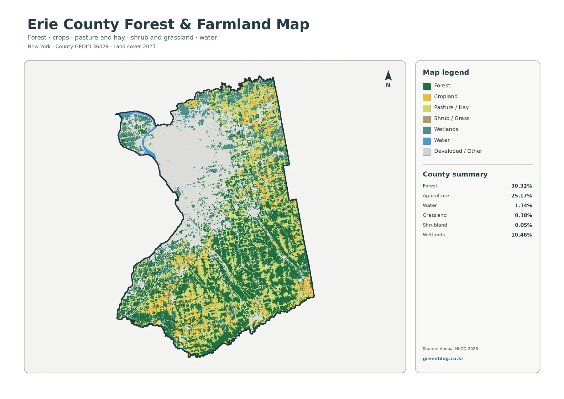
Removing the detailed developed classes makes the county’s rural pattern much easier to see. Forest covers 30.32% of Erie County and agriculture 25.17%. The southern and southeastern sections contain large forest blocks, broken by pasture, hay fields, cropland, and small developed areas. In the east and northeast, agricultural cover is more frequent and often sits beside wetlands and wooded parcels.
Cropland and pasture or hay are mapped separately, which is useful when reading the county’s open landscape. Yellow cropland appears in many small and medium patches, while lighter green pasture and hay form a broader network in several rural sections. These patterns identify where agricultural cover is concentrated, but they do not define individual farms or tell the reader which crops are being produced.
The contrast with the northwest is particularly useful. Once the Buffalo-area development is reduced to a neutral background, the transition from city and suburb to working farmland becomes easy to follow. The map also shows that rural Erie County is not simply open farmland: sizable forest blocks and wetlands remain integral parts of the same landscape.
For agricultural research, the map works best beside county-specific information. Erie County maintains an Agricultural and Farmland Protection Plan that addresses farmland, development pressure, and the agricultural economy. Pairing that kind of local documentation with the land-cover layer adds context that satellite classification alone cannot provide.
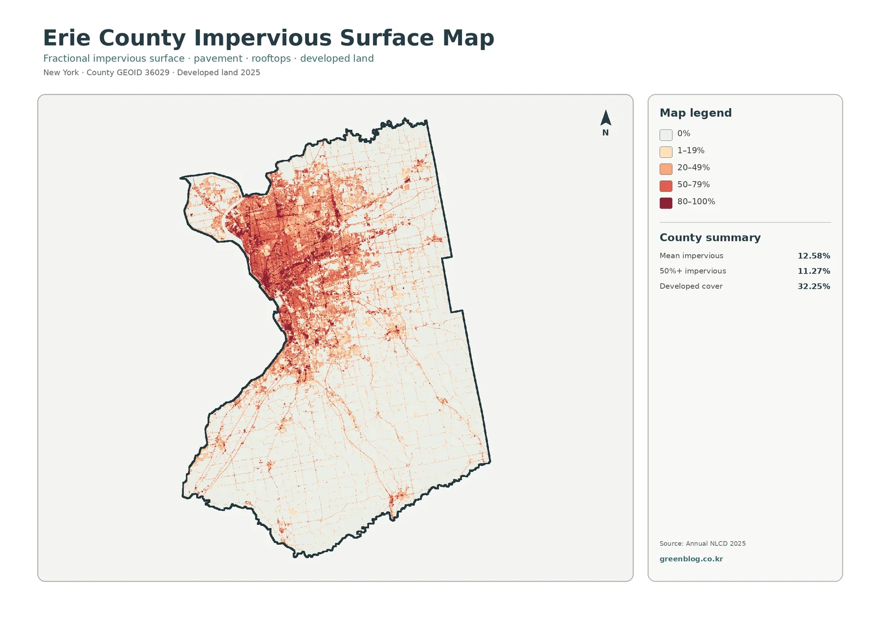
Impervious surfaces reveal the urban core
Impervious surface means pavement, rooftops, parking lots, and other hard surfaces that do not readily absorb water. Erie County’s mean impervious value is 12.58%, and 11.27% of the county is mapped at 50% impervious or greater. Developed land covers a larger 32.25% because developed classes can include lawns, trees, and other permeable surfaces.
The map makes the distinction immediately visible. High impervious values form a dense concentration in the northwest around Buffalo and nearby communities. Darker bands also follow major transportation corridors. Moving east or south, the pattern breaks into thinner lines and smaller clusters, with large areas returning to very low impervious values.
This layer is useful when discussing stormwater or watershed conditions because hard surfaces affect how rainfall moves across the ground. A high value does not by itself prove that a location has flooding or water-quality problems, however. Terrain, drainage infrastructure, soil, rainfall, and stream conditions all matter as well.
For planners or educators, the most useful comparison is often between this layer and the general developed class. A place can be classified as developed without having the same amount of pavement or rooftop coverage as central Buffalo. The two maps therefore answer related but different questions about the built landscape.
Mapped differences from 1985 to 2025
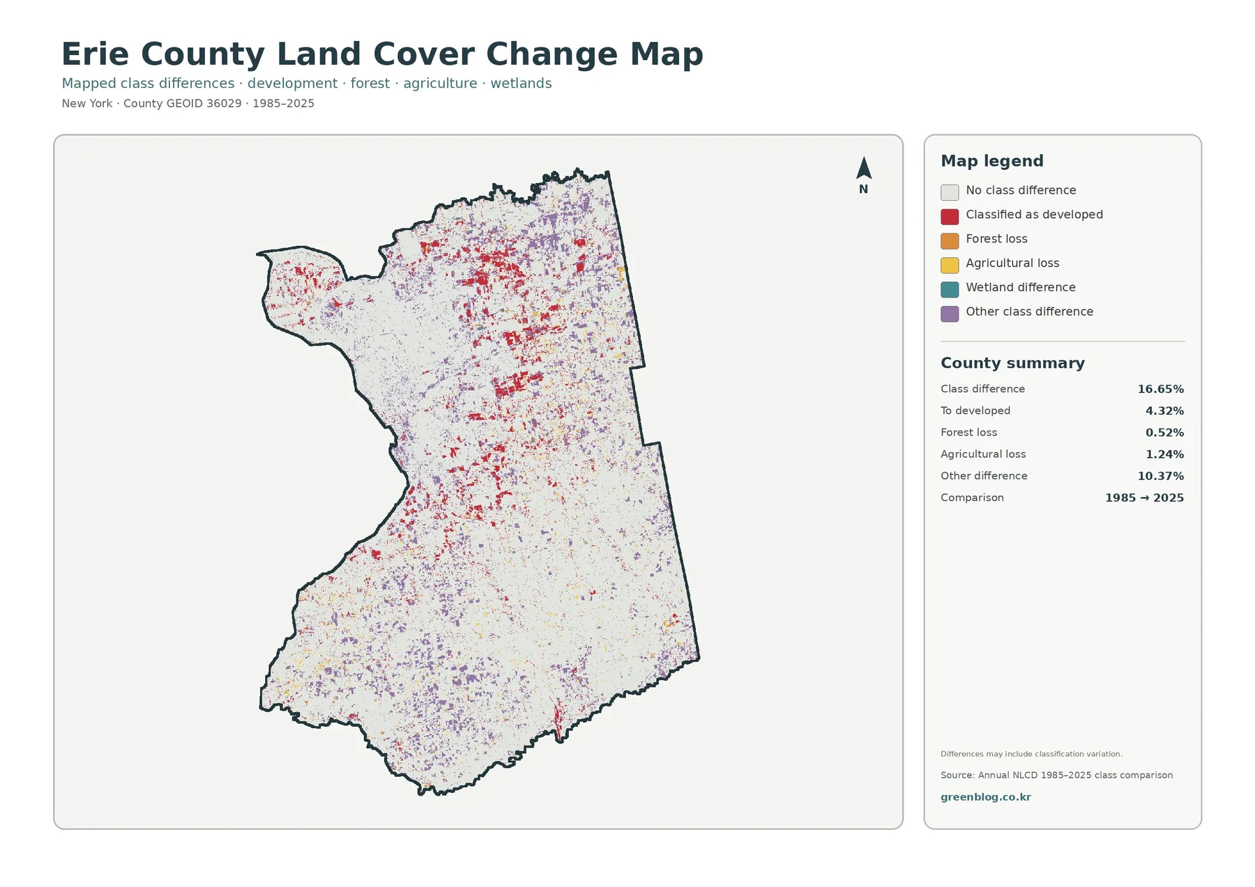
The change layer compares class assignments at two points in time. Overall class difference is 16.65%. Areas classified as developed account for 4.32% of the comparison, forest loss for 0.52%, agricultural loss for 1.24%, and other class differences for 10.37%. The large “other” category is a reminder that not every mapped difference represents one simple type of land conversion.
Red developed-change patches are especially noticeable around the northern urban and suburban belt. They occur along the edges of established development and in a number of smaller clusters farther east and south. The pattern is dispersed rather than confined to a single growth front.
Purple areas representing other class differences appear across many parts of the county, including rural sections. Some can reflect real changes between cover types, but a two-date classification comparison can also be affected by image conditions, mixed pixels, and classification variation. The map itself notes that such variation may be included.
For detailed investigation, the change layer should be treated as a starting point. A location marked as forest loss or agricultural loss deserves comparison with historical aerial imagery, local development records, or field information before a cause is assigned. The map is strongest as a countywide screen showing where differences are concentrated and how widespread they are.
Reading the four layers as one story
Start with the general map to establish the broad geography: dense development in the northwest, mixed forest and farmland through much of the south and east, and wetlands scattered across the county. The second map is then useful for focusing on rural cover without the visual weight of the Buffalo metropolitan area.
The impervious layer adds another level of detail. It shows which parts of the developed footprint contain the greatest concentration of hard surfaces. That distinction matters in a county where suburban neighborhoods, commercial corridors, villages, and a major urban center can all fall within a broad developed classification.
The change map adds time to the comparison. A red patch near an existing built-up area can be checked against current development and impervious intensity. A rural difference can be compared with the forest-and-farmland layer. Moving back and forth among the four maps helps prevent a single color or percentage from carrying more meaning than the data support.
Uses in classrooms, planning context, and environmental work
Erie County works well as a teaching example because the maps contain both a large urban area and extensive rural landscapes. Students can compare the Buffalo area with the southern part of the county, identify where agricultural cover becomes more prominent, and then use the impervious layer to see how the built environment changes in intensity.
Environmental presentations can pair the wetland pattern with development or impervious surfaces. Erie County’s Environment and Planning resources address natural resources, watershed management, habitat restoration, and stormwater, providing local context for questions that arise from the maps. The graphics themselves remain a broad overview rather than a site-specific assessment.
Agricultural presentations can focus on the eastern and southern farm pattern and then consult the county’s farmland protection materials for policy context. This is particularly useful when discussing development pressure, because the land-cover map identifies the spatial setting while the county plan explains local goals and programs.
The four-map set also works well in reports. Each graphic uses the same county boundary and a related visual layout. A presentation can begin with current cover, move to the rural landscape or impervious intensity depending on the topic, and end with the historical comparison.
Limits of the land-cover classification
These maps are based on raster data. A raster divides the landscape into small grid cells and assigns each cell a representative class or value. Fine roads, narrow streams, small buildings, and field edges may therefore be generalized. A crisp boundary between two map colors should not be mistaken for an exact property or ecological boundary.
Mixed pixels are another limitation. A single cell near a forest edge may contain trees, grass, and a road at the same time. The classification still has to assign a representative category. That is one reason small patches should be interpreted more cautiously than broad, continuous areas.
Date also matters. The current-cover layers reflect the supplied 2025 classification. Construction, vegetation change, agricultural rotation, or restoration after that observation period will not appear until a later dataset captures it. The historical map compares 1985 with 2025; it does not record every intermediate year as a continuous timeline.
Download the map files
The ZIP download contains four JPG maps for Erie County: general land cover, forest and farmland, impervious surface and developed land, and the 1985–2025 land-cover comparison. They can be used together in classroom handouts, slide decks, reports, and other visual projects.
Frequently Asked Questions
What is the largest mapped land-cover class in Erie County?
Developed land is the largest 2025 class at 32.25%. Forest is close behind at 30.32%, followed by agriculture at 25.17%. Most of the dense development is concentrated in the Buffalo-area northwest.
Why is developed cover 32.25% while mean impervious surface is 12.58%?
Developed land is a broad cover category that can include lawns, trees, and other permeable areas. Impervious surface measures hard materials such as pavement and rooftops, so the two percentages describe different aspects of the built environment.
Does the 16.65% class difference mean that 16.65% of the county was definitely converted to a new land use?
No. It indicates that the mapped class differs between 1985 and 2025 at those cells. Real land-cover change is part of the result, but image conditions, mixed pixels, and classification variation can also contribute.
Map File Information
Erie County Land Cover Map Files
- Included Files: Use only the versions confirmed in the article and supplied images
- File Type: Use the confirmed download contents
- Intended Use: Printing, education, presentations, and map-based projects
Related Maps
- Albany County Land Cover Map
- Bronx County New York Land Cover Map
- Cattaraugus County New York Land Cover Map
Sources and references
- MRLC Annual NLCD Data — official access to Annual NLCD land-cover products and supporting data.
- USGS Annual NLCD Land Cover Classification — descriptions of the land-cover classes used in Annual NLCD.
- Erie County Environment & Planning — local information on natural resources, watersheds, stormwater, and sustainability work.
- Erie County Agricultural and Farmland Protection Plan — county planning material on agriculture, farmland, and development pressure.
Green Map creates custom-edited map images using open geographic data sources such as geoBoundaries, Natural Earth, OpenStreetMap, and government open data.
These maps are edited visual materials, not raw data files, and are provided for education, documents, presentations, and graphic reference.