A drive away from Cortland quickly leaves the city grid and enters a landscape of fields, wooded slopes, and smaller road-linked communities. That contrast is the central feature of the Cortland County New York Land Cover Map collection. Rather than asking one image to explain everything, the set uses four maps to separate present-day cover, the farm-and-forest pattern, impervious surface, and mapped differences between 1985 and 2025.
Land cover is a description of what occupies the surface as classified from remotely sensed data. It can distinguish forest, agricultural cover, wetlands, water, and developed surfaces, but it does not establish parcel ownership, zoning, farm boundaries, conservation status, or the legal use of land. The maps are most useful for county-scale comparison, teaching, presentation work, and as a starting point for more detailed local research.
Table of Contents
Start with the city-to-countryside contrast
The supplied 2025 summary places forest at 54.12 percent of Cortland County. Agriculture is also extensive, while developed land, wetlands, and open water occupy much smaller shares. On the map, however, the most useful observation is not simply which class is largest. Forest and agriculture interlock across much of the county, while the largest continuous concentration of developed cover sits around Cortland and extends toward Homer.
Beyond that urban concentration, development becomes thinner and more linear. Roads and small settlements appear as narrow traces through a landscape that is otherwise dominated by fields and woods. Agricultural cover repeatedly follows broader valley floors and gentler terrain, while forest occupies larger tracts on surrounding hills. The transition is gradual: built land gives way to open fields, fields meet wooded slopes, and smaller developed sites reappear farther along the road network.
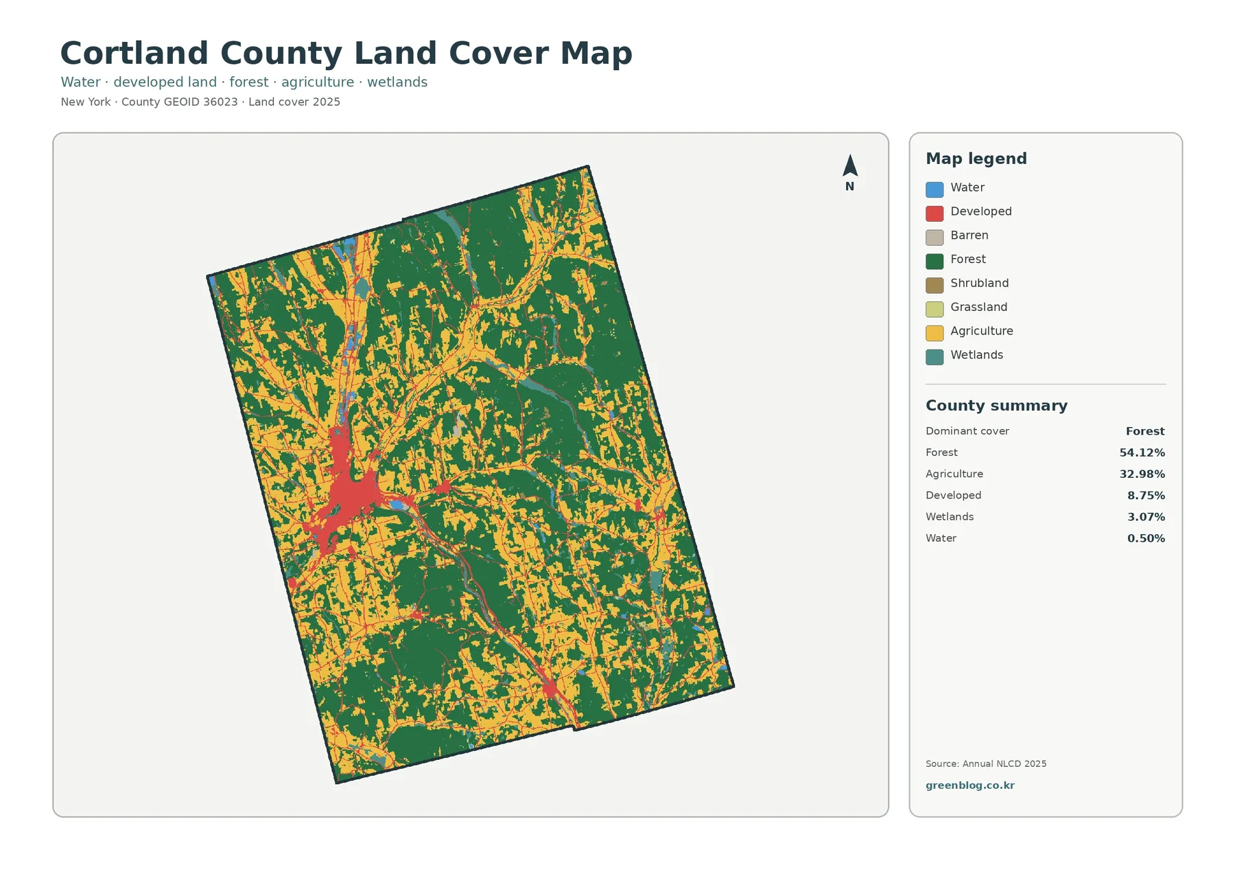
Wetlands and water are visible but do not dominate the county image. They occur in smaller patches and linear settings that are easier to understand when the map is viewed at full size. For a reader, the best approach is to compare where colors meet rather than treating each class as an isolated total. Those boundaries reveal how closely the city, agricultural valleys, and wooded uplands are arranged.
The forest-and-farmland view simplifies the rural pattern
Removing much of the visual weight of developed cover makes the rural landscape easier to read. Forest remains the dominant class in the supplied summary, while agricultural cover forms branching openings through it. The farm pattern is not one broad plain. It follows a network of valleys and gentler ground, especially in and around the more open country associated with Cortland, Homer, and routes extending away from them.
Wooded areas occupy broad blocks between and around those agricultural openings. In many places, the map changes from field to forest over a short distance, then returns to another pocket of farmland. This repeated edge pattern is important for understanding Cortland County: the county is neither uniformly forested nor uniformly agricultural, and the two covers remain closely interwoven across much of its area.
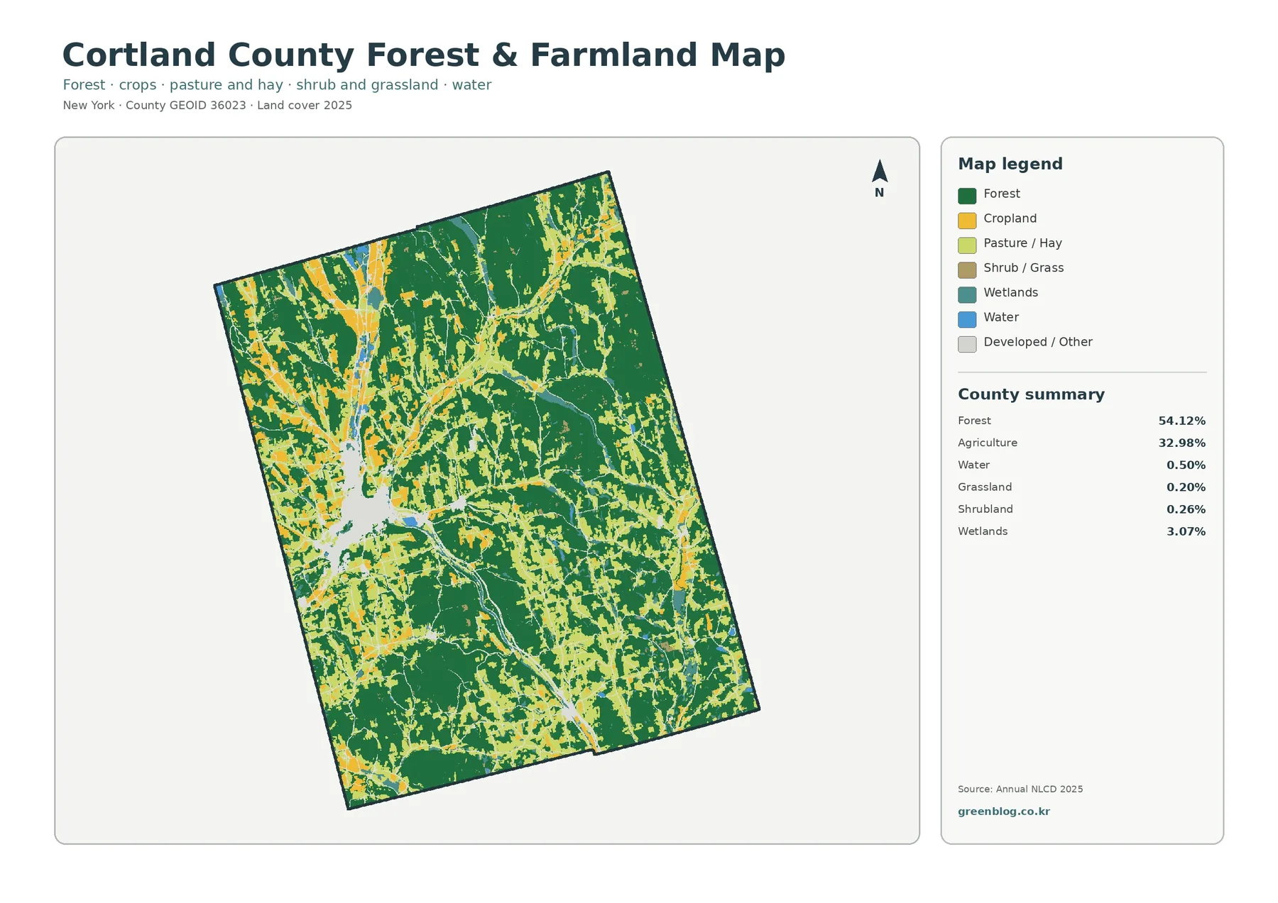
Agricultural pixels should not be read as farm-property boundaries. One farm can include cropland, pasture, woods, buildings, ponds, and driveways that fall into several map classes. Likewise, forest color says nothing about who owns the land or whether it is protected. The layer describes visible cover, not land tenure or regulation.
Local conservation information adds useful context. Cortland County Soil and Water Conservation District works with soil, water, agriculture, and related natural-resource concerns. Pairing those resources with the map can help a reader identify where farm ground, stream corridors, and forest edges occur near one another. It cannot substitute for water-quality measurements, soil surveys, or a site visit.
Impervious surface isolates the built footprint
The impervious-surface map answers a different question from the general land-cover map. It focuses on roofs, pavement, parking areas, and other surfaces that shed water rather than allowing it to infiltrate easily. Most of the county appears very light, but Cortland forms a pronounced cluster of higher values. Homer and the main transportation corridors add smaller concentrations and connecting lines.
The map summary reports mean imperviousness of 1.89 percent and shows 0.89 percent of the county at 50 percent impervious or greater. Developed cover is much broader than that. The difference makes sense because a developed land-cover cell may include lawns, trees, bare soil, or other permeable surfaces alongside buildings and pavement. Imperviousness isolates only the sealed portion of that developed setting.
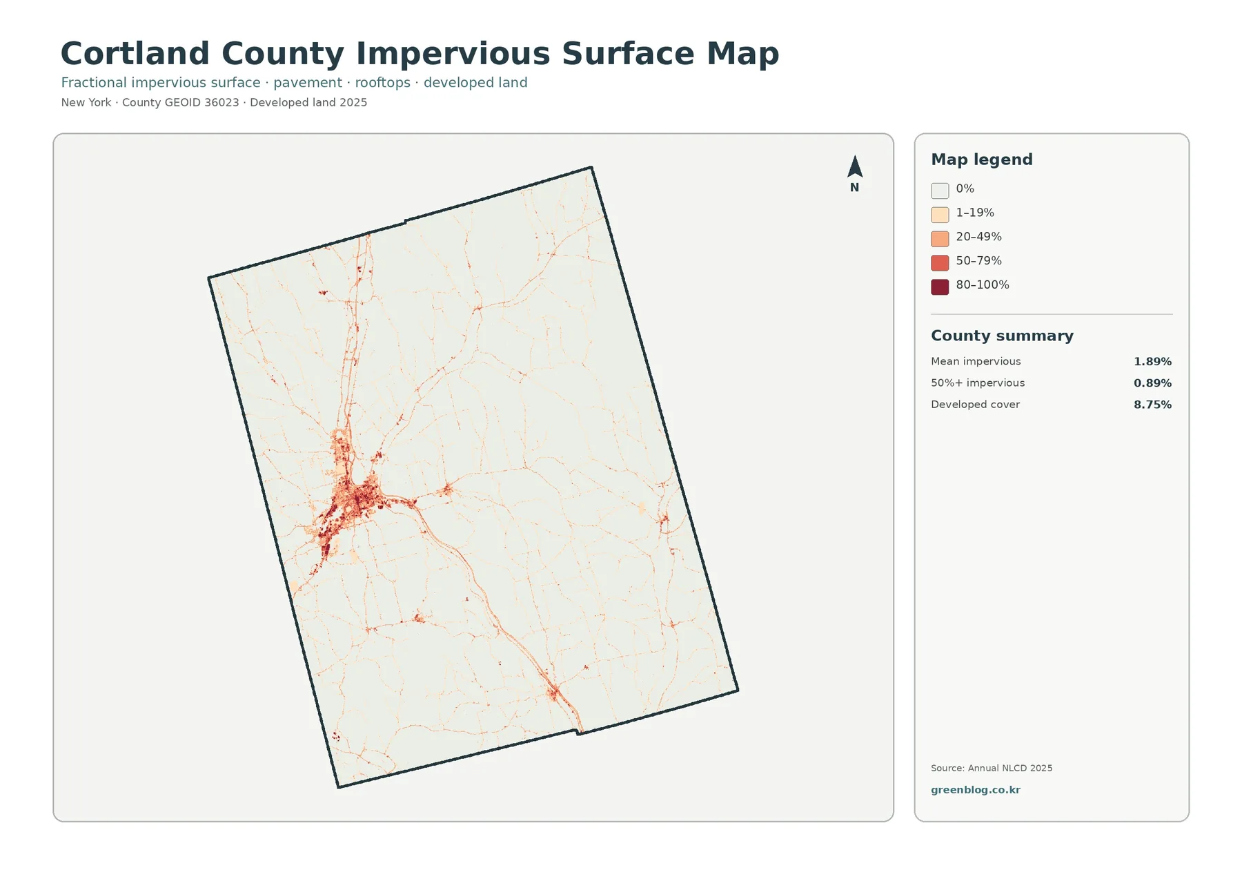
Outside the urban core, the layer is especially good at revealing the geometry of settlement. Thin road-linked lines and small nodes are visible against a mostly pale background. That does not make the image a road-centerline or building-footprint map. The underlying raster generalizes narrow features, so it should be used to understand concentration and pattern rather than to measure individual streets or structures.
For watershed lessons, impervious cover can be compared with streams to frame questions about runoff and water quality. The map alone cannot calculate stormwater volume or flood risk. Those analyses also require information about rainfall, slope, soils, drainage infrastructure, and channel conditions.
A two-date change map needs careful interpretation
The change layer compares the mapped class at each location in 1985 with the class mapped in 2025. The supplied county summary reports a 9.46 percent class difference. Within that total, 1.07 percent is categorized as change to developed land, 0.56 percent as forest loss, 0.91 percent as agricultural loss, and 6.82 percent as other class difference. Because “other difference” is by far the largest component, the overall percentage should not be presented as a measure of urban growth.
The colored pixels are scattered across the county rather than forming one sweeping conversion zone. Change-to-developed patches are more noticeable around the Cortland area and selected corridor locations, while other types of differences appear along farm and forest edges in many parts of the county. The spatial pattern argues for site-by-site investigation instead of a single countywide story.
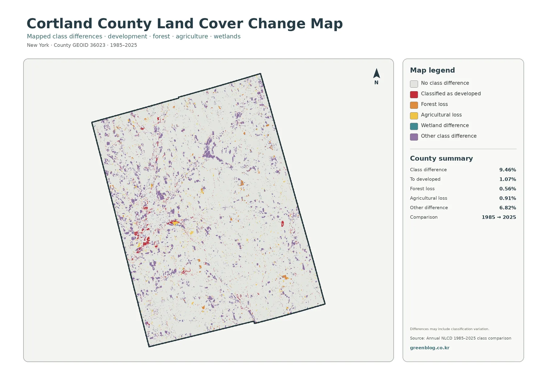
A different mapped class does not automatically prove a real-world land-use conversion. Source imagery, classification methods, mixed pixels, and slight boundary shifts can all contribute. A colored cell is therefore better treated as a place to check than as final historical evidence. Aerial photographs, local planning records, and field information are appropriate next steps when a specific site matters.
One practical workflow is to pick a patch on the change map and then locate the same area on the 2025 general map and the forest-farmland layer. That reveals what is mapped there now while keeping the two-date comparison separate from the current condition. The method also avoids implying that the map records every intermediate change between 1985 and 2025.
Use the four maps as a sequence, not as substitutes
The collection works well when each map is assigned a distinct job. The general map establishes the present landscape. The forest-farmland view clarifies the rural mosaic. The impervious layer isolates built surfaces. The change map adds a historical comparison. Moving through the maps in that order can make a classroom lesson or presentation easier to follow because the audience is not asked to interpret every variable at once.
The Tioughnioga watershed provides a useful local example. A reader can compare a wooded reach, an agricultural valley, and the developed area around Cortland, then consult Cortland County SWCD water-quality information for additional evidence. The maps help define questions and locations; they do not by themselves measure stream condition or identify causes of a water-quality problem.
Scale and date limit what the maps can prove
Annual NLCD-style land-cover products are designed for consistent mapping over large areas, not for parcel surveying. The classification is generally represented in raster cells about 30 meters across. A raster cell is a square grid unit that stores a mapped value. Where trees, grass, pavement, and buildings occur close together, the cell necessarily simplifies that mixture.
That generalization matters in Cortland County because narrow streams, field edges, farm lanes, small wetlands, and wooded strips can all occur within short distances. Their true boundaries may not align exactly with a pixel edge. The same caution applies to impervious percentages: they summarize the sealed share within a grid framework rather than tracing every parking lot or rooftop.
Date matters as well. The 2025 layer is a classified snapshot and does not automatically include later construction, clearing, agricultural conversion, or wetland change. Site-specific decisions should rely on current aerial imagery, local GIS or planning data, parcel records, and field observations in addition to this map set.
Download the four JPG map files
The ZIP download contains four original JPG maps: the 2025 land-cover overview, the forest-and-farmland map, the impervious-surface and developed-land map, and the 1985–2025 land-cover change map. WebP versions are used in the article for efficient browsing, while the JPG files are better suited to documents, classroom handouts, presentation slides, and offline comparison.
Choose the layer that matches the question. Use the forest-farmland map for rural landscape discussions, the impervious map for development form and sealed surfaces, and the change map only when the audience understands that it is a two-date class comparison. Keeping those purposes separate produces clearer graphics and more defensible explanations.
Frequently Asked Questions
Which land-cover class is largest in Cortland County?
Forest is the largest class in the supplied 2025 summary at 54.12 percent. Agriculture is also extensive, which is why much of the county appears as an alternating pattern of wooded hills and open agricultural ground.
Why does Cortland stand out so strongly on the impervious map?
The city concentrates roofs, streets, parking areas, and other sealed surfaces more densely than the surrounding countryside. Once forest and agricultural colors are removed, that built footprint becomes much easier to see.
Does every colored pixel on the change map represent confirmed land-use change?
No. The layer records a difference between the mapped classes for 1985 and 2025. Genuine landscape change may be involved, but imagery, classification variation, mixed pixels, and small boundary shifts can also contribute. Confirming a site requires additional evidence.
Map File Information
Download the map files associated with this page for reference, printing, and compatible visual projects.
- Included Files: Four original JPG maps: land cover, forest/farmland, impervious/developed land, and land-cover change
- File Type: JPG files packaged in one ZIP
- Intended Use: Printing, education, presentations, and map-based projects
Related Maps
- Albany County Land Cover Map
- Bronx County New York Land Cover Map
- Cattaraugus County New York Land Cover Map
Sources and references
- MRLC Annual NLCD Data — access to Annual NLCD land-cover products and supporting data.
- USGS Annual NLCD Land Cover Classification — official descriptions of the land-cover classes used in Annual NLCD products.
- U.S. Census Bureau TIGER/Line Shapefiles — geographic boundary resources used for county mapping.
- Cortland County Soil and Water Conservation District — local context for soil, water, agriculture, and natural-resource conservation.
- Cortland County Water Quality Assessments — local information about river and tributary monitoring in Cortland County.
Green Map creates custom-edited map images using open geographic data sources such as geoBoundaries, Natural Earth, OpenStreetMap, and government open data.
These maps are edited visual materials, not raw data files, and are provided for education, documents, presentations, and graphic reference.