The Albany County Land Cover Map set shows a county with two very different landscape signatures: a heavily developed eastern corridor around New York’s capital region and a much greener western and southwestern interior. Instead of treating Albany County as a single urban or rural landscape, the four maps separate current land cover, forest and farmland, impervious surface, and mapped class differences between 1985 and 2025. Used together, they make the county’s transition from the Hudson-side metropolitan area to forested and agricultural uplands much easier to read.
The strongest visual contrast is not a simple city-versus-country boundary. Developed cover spreads broadly across the east and northeast and follows transportation and settlement corridors toward the center, while forest dominates larger blocks farther west and south. Agricultural cover forms a patchwork between those wooded areas, and wetlands and water appear as smaller but locally important features. That mixture is why four thematic views are more useful than a single generalized map.
Table of Contents
Current land cover across Albany County
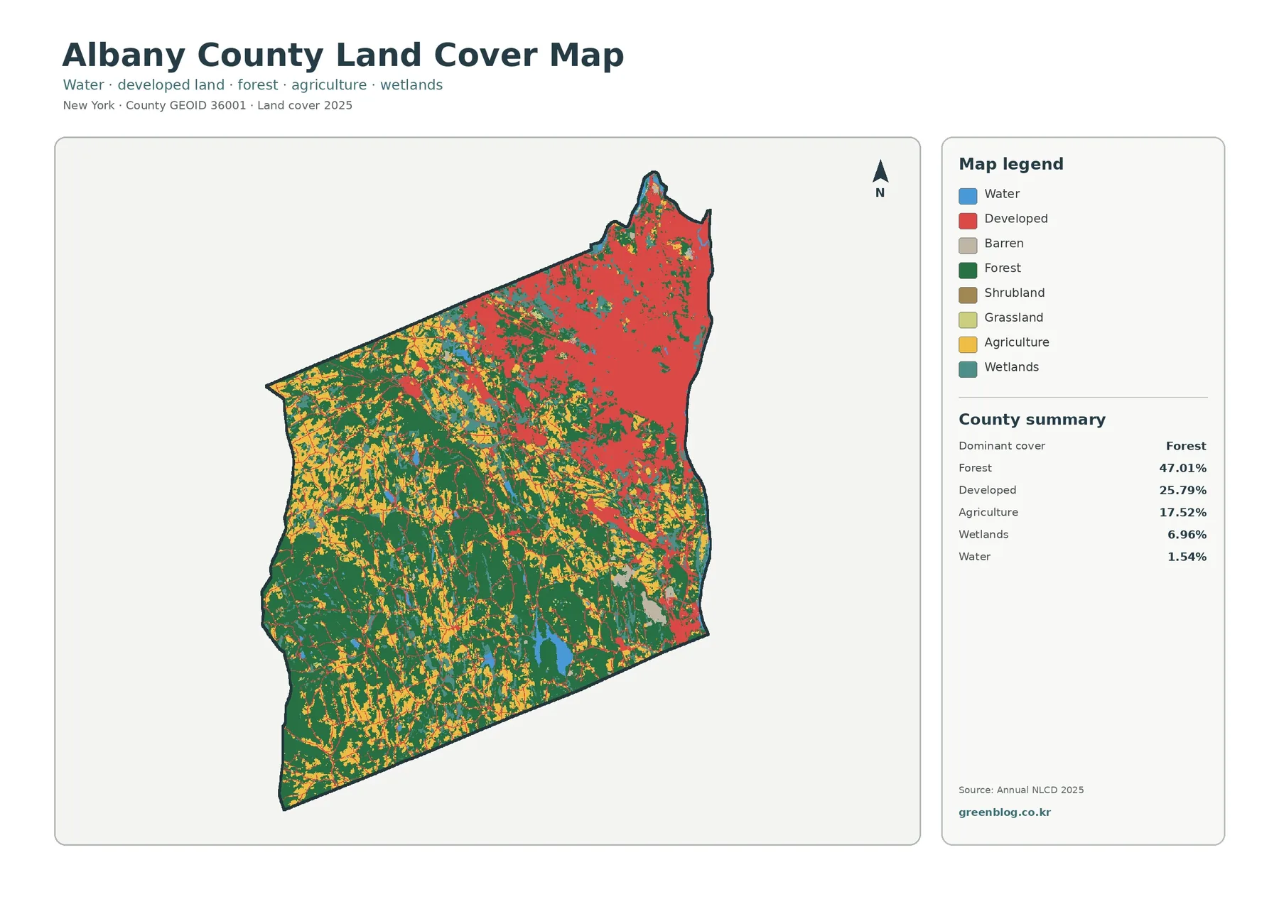
The general 2025 land-cover map groups the county into water, developed land, barren land, forest, shrubland, grassland, agriculture, and wetlands. Its summary identifies forest as the dominant mapped cover at 47.01 percent. Developed cover accounts for 25.79 percent, agriculture 17.52 percent, wetlands 6.96 percent, and water 1.54 percent. These are raster classification summaries rather than parcel, zoning, or ownership statistics, but they provide a useful first look at the physical surface of the county.
The map’s spatial pattern matters more than the countywide percentages alone. Developed classes occupy a broad, nearly continuous zone in the east and northeast, where Albany and its surrounding communities form part of the Capital District. Red developed pixels also extend westward in branches that resemble the county’s main transportation and settlement corridors. In contrast, the southwest contains large blocks of forest, with agriculture appearing as yellow patches and strips within a greener matrix. Wetlands are scattered through several parts of the county rather than forming one dominant zone.
Forest and farmland form the western landscape
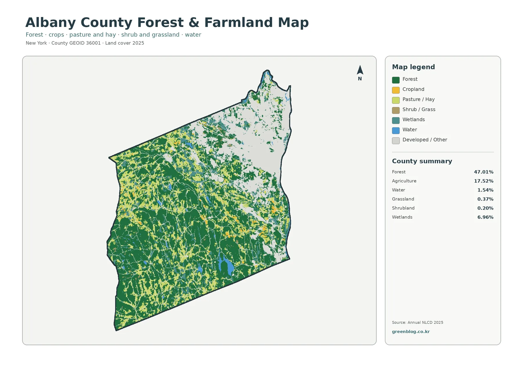
The forest-and-farmland version removes much of the visual competition from developed and miscellaneous classes. Forest remains dark green, while cropland, pasture and hay, shrub and grassland, wetlands, and water stay visible. This makes the western half of the county read as a connected but not continuous wooded landscape. Agricultural cover interrupts the forest in many narrow and irregular patches, especially through the west-central and southwestern portions of the county.
Those agricultural colors should not be interpreted as farm ownership or protected farmland boundaries. They represent surfaces classified as crop or pasture/hay categories in the land-cover dataset. A field can change management without changing its legal status, and a parcel inside an agricultural district can contain forest, buildings, wetlands, and other cover types. For local land-policy questions, the Albany County agricultural and farmland protection resources are a better companion source.
The map is particularly useful for seeing edges. Long forest-to-field boundaries, small wooded islands within agricultural areas, and strips of vegetation between developed places can all be identified at a regional scale. Those patterns can help frame questions about habitat connectivity, watershed protection, rural landscape change, or where more detailed aerial imagery would be worth examining.
Impervious surface traces the Capital District
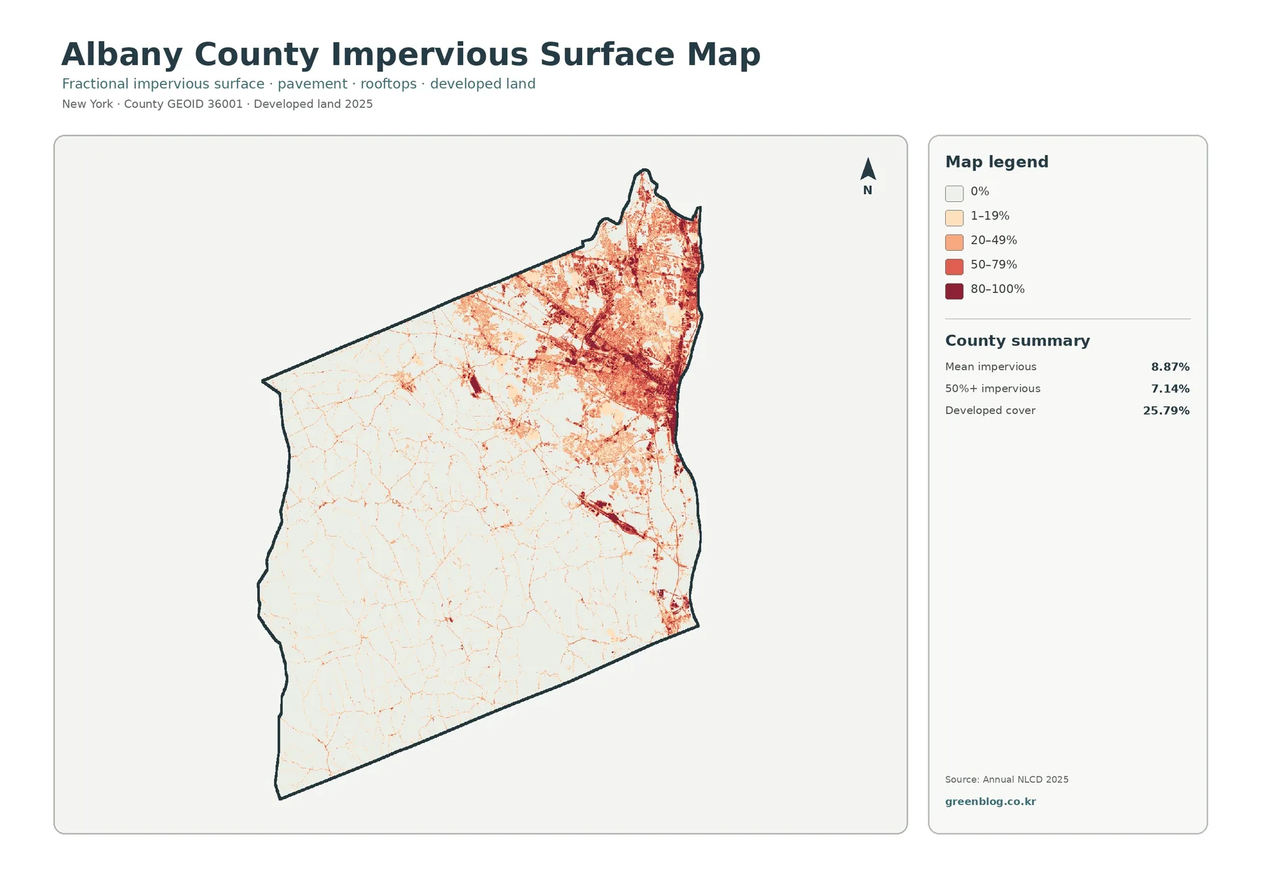
The impervious-surface map measures the fractional share of surfaces such as pavement and rooftops within each mapped cell. Its legend ranges from 0 percent to 80–100 percent impervious. The county summary gives a mean impervious value of 8.87 percent and shows 7.14 percent of the mapped area in cells that are at least 50 percent impervious. The same panel reports developed cover at 25.79 percent, which is a different measure: a developed land-cover class can include vegetation and open space as well as hard surfaces.
High impervious values are strongly concentrated in eastern Albany County. Darker red cells cluster around the urban core and extend through the northeastern suburban landscape, while linear bands follow major transportation corridors. Farther west, most of the county is white or pale, with thin road-like traces and small settlement clusters interrupting the low-impervious background. This distribution gives a clearer picture of built intensity than the broad developed class alone.
Impervious cover is useful in discussions of stormwater, stream response, urban heat, and development intensity, but it does not by itself measure flooding or drainage performance. Runoff depends on slope, soils, drainage infrastructure, vegetation, channel networks, and storm conditions. The map is best treated as a screening layer that shows where hard surfaces are concentrated and where additional hydrologic data may be most relevant.
What changed between 1985 and 2025
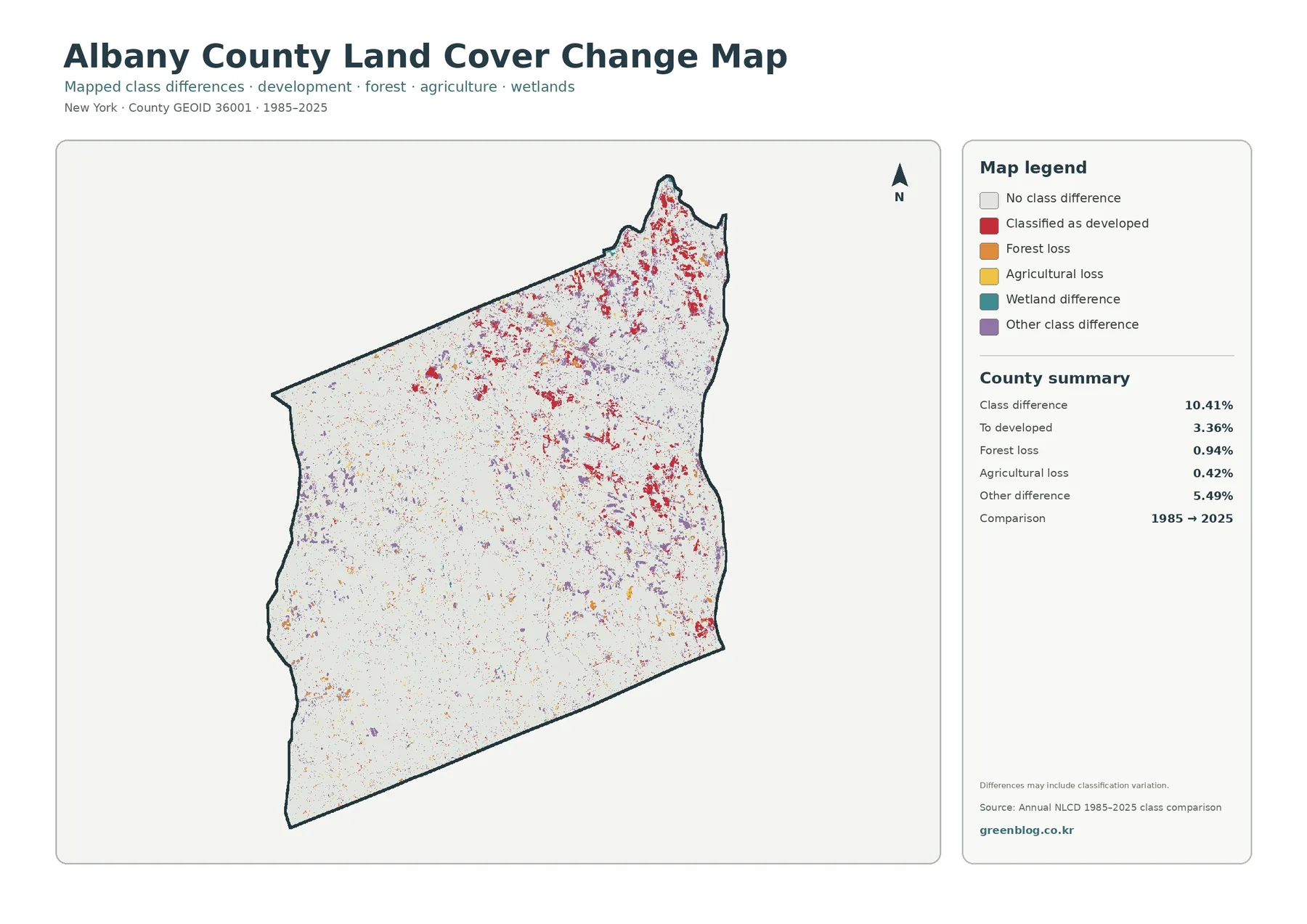
The change map compares the representative classified land-cover category at two endpoints, 1985 and 2025. Light gray marks cells with no class difference, while colored cells identify areas classified as developed, forest loss, agricultural loss, wetland difference, or another class difference. The summary reports a class difference across 10.41 percent of the county. Within that comparison, 3.36 percent is mapped as change to developed, 0.94 percent as forest loss, 0.42 percent as agricultural loss, and 5.49 percent as other class difference.
The largest clusters of red change-to-developed pixels appear in the eastern and northern parts of the county, with additional groups along central settlement and transportation corridors. Western areas show a more scattered pattern in which red, orange, yellow, purple, and occasional wetland-difference pixels are dispersed through otherwise unchanged terrain. The contrast is consistent with the current-cover maps: the metropolitan side of the county has a denser built footprint, while the west is characterized by a more fragmented rural and forest matrix.
A colored change cell does not identify the cause of the change. Forest loss could reflect development, timber activity, disturbance, or a classification shift. Agricultural loss does not prove permanent conversion of a legally defined farm parcel. Wetland differences can be affected by hydrology, seasonality, sensor conditions, and classification methods. The map is therefore most useful for locating candidate areas for closer investigation rather than assigning a specific event to every colored pixel.
That caution is especially important around complex natural communities such as the Albany Pine Bush. Pine barrens landscapes can contain forest, shrub, grassland, openings, wetlands, and managed areas in close proximity, and ecological management can intentionally shift the balance among those covers. A class difference in such a setting may need local ecological context before it can be described as degradation or recovery.
A practical way to compare all four maps
Start with the general land-cover map to establish the present-day pattern. Then use the forest-and-farmland map to separate the western rural matrix from developed and miscellaneous classes. The impervious map adds another dimension by showing where the built environment is physically concentrated. Finally, compare those three current-condition views with the change map to see whether areas of mapped change align with today’s developed corridors, forest edges, or agricultural patches.
For example, a cluster of red change pixels in the east can be checked against the impervious map to see whether it lies within a high-hard-surface zone. A yellow agricultural-loss pixel in the west can be compared with the forest-and-farmland map to see whether the surrounding landscape is mostly forest, active agricultural cover, or a mixed edge. This cross-map approach is more informative than reading a change color in isolation.
In classrooms, the set can illustrate land cover versus land use, urban-rural gradients, raster classification, and the importance of scale. In environmental or planning work, it can provide context for watershed screening, habitat connectivity discussions, or presentation graphics before a more detailed GIS analysis. The maps are overview products, not substitutes for local parcel data, engineering studies, or field verification.
Download the four original JPG maps
The download ZIP contains four original landscape JPG files: the general land-cover map, forest-and-farmland map, impervious-surface map, and 1985–2025 land-cover change map. Each source image is 2480 × 1754 pixels. The files are kept at their supplied resolution rather than being artificially enlarged or re-encoded. They work well for screen presentations, teaching materials, and general map comparisons; for large-format printing, check whether the legend remains readable at the final physical size.
Limits of the land-cover classification
Land cover describes the physical material at the surface; it is not the same as land use, zoning, ownership, or a cadastral boundary. A developed-class cell does not reveal the permitted use or construction date of a particular property. An agricultural-class cell does not establish that the parcel is enrolled in an agricultural district. A wetland-class cell is not a regulatory wetland delineation.
Annual NLCD products are generalized raster classifications. Small roads, narrow streams, individual buildings, and parcel-scale transitions can be blended into mixed pixels or represented differently at the edge of classes. A two-date comparison also hides changes that happened and later reversed between the endpoints. For a current or legally consequential decision, compare the map with recent imagery, field observations, and the latest records from the relevant municipal, county, state, or federal agency.
Frequently Asked Questions
Does every developed-change pixel represent a newly built parcel?
No. It shows a raster cell whose classification changed to a developed category in the comparison. It does not include parcel boundaries, building permits, project names, or construction dates.
Can the forest and farmland percentages be used as ownership statistics?
No. They summarize mapped land-cover classes, not property ownership, agricultural districts, conservation easements, or zoning. Those questions require separate authoritative records.
Does gray on the change map mean nothing changed for forty years?
No. Gray means the representative class matched at the two selected endpoints. Tree density, crop type, management, small structures, and other changes can occur without moving a cell into a different broad class.
Map File Information
Albany County Land Cover Maps
- Included Versions: Land cover, forest & farmland, impervious surface, and land-cover change
- Included Files: 4 original JPG maps
- Printable Size: 2480 × 1754 pixels each
Related Maps
Sources and further reading
- MRLC Annual NLCD — annual land-cover and change products used for broad classification context
- National Land Cover Database class legend and descriptions — definitions for developed, forest, agriculture, wetlands, and related classes
- Albany County Natural Resource Conservation and Sustainability — local natural-resource and planning context
- Albany County farms and agriculture resources — county agricultural and farmland-protection information
- Albany Pine Bush ecological communities — local pine barrens habitats and ecological processes
Green Map creates custom-edited map images using open geographic data sources such as geoBoundaries, Natural Earth, OpenStreetMap, and government open data.
These maps are edited visual materials, not raw data files, and are provided for education, documents, presentations, and graphic reference.