World Bank indicator SL.UEM.TOTL.ZS reports unemployment as a percentage of the total labor force using a modeled ILO estimate. Among the 182 countries and areas with a 2025 value in the supplied data, unemployment ranges from 0.13% to 34.20%. The median is 5.08% and the simple cross-country mean is 6.73%.
The denominator is the labor force, not the total population. People are counted as unemployed when they are without work but available for and seeking employment under the statistical definition. People outside the labor force are not automatically counted as unemployed, which is why a 10% unemployment rate does not mean that 10% of all residents are unemployed.
Cross-country unemployment comparisons are most useful when the focus stays on large gaps, distribution patterns and the shared indicator definition. Small decimal differences can be less meaningful because labor-market institutions, survey systems and the composition of the labor force differ across countries. The 35 country-or-area rows without a 2025 observation remain missing rather than being converted to zero.
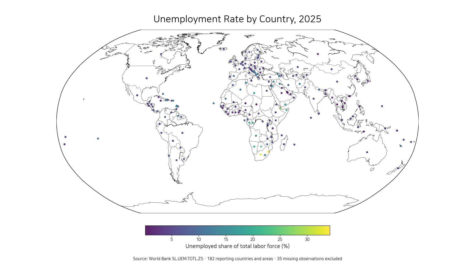
Table of Contents
Eswatini and South Africa exceed 30%
Eswatini has the highest reported 2025 value at 34.20%, followed by South Africa at 32.39%. Djibouti is at 26.02%, Botswana at 24.48%, and Gabon at 20.15%. The Republic of the Congo and Namibia are both above 19%, while Somalia and Libya are close to 19%.
| Rank | Country or area | Unemployment rate |
|---|---|---|
| 1 | Eswatini | 34.20% |
| 2 | South Africa | 32.39% |
| 3 | Djibouti | 26.02% |
| 4 | Botswana | 24.48% |
| 5 | Gabon | 20.15% |
| 6 | Congo, Rep. | 19.88% |
| 7 | Namibia | 19.29% |
| 8 | Somalia, Fed. Rep. | 18.95% |
| 9 | Libya | 18.76% |
| 10 | St. Vincent and the Grenadines | 18.00% |
Several of the highest values appear in Southern Africa and other parts of Africa. The cluster is visible on the map, but geography alone does not establish a cause. Unemployment can be shaped by economic conditions, demographics, labor-market institutions, industrial structure, informality and job-search behavior. Countries within the same region can therefore have very different outcomes.
The distance between the maximum and the median is about 29.12 percentage points. The upper tail is far from the center of the distribution, which is one reason a single average cannot describe the full range of national labor-market conditions.
At the low end, several rates are near 1% or below
Qatar has the lowest reported value at 0.13%. Cambodia is at 0.26%, Niger at 0.39%, Thailand at 0.78%, and Burundi at 0.92%. Chad and Bahrain are close to 1%, while Lao PDR, the Solomon Islands and Moldova also appear in the lowest 10.
| Rank | Country or area | Unemployment rate |
|---|---|---|
| 1 | Qatar | 0.13% |
| 2 | Cambodia | 0.26% |
| 3 | Niger | 0.39% |
| 4 | Thailand | 0.78% |
| 5 | Burundi | 0.92% |
| 6 | Chad | 1.06% |
| 7 | Bahrain | 1.10% |
| 8 | Lao PDR | 1.19% |
| 9 | Solomon Islands | 1.43% |
| 10 | Moldova | 1.50% |
A very low unemployment rate should not automatically be treated as proof of a high-quality labor market. The rate only covers people in the labor force who are without work and seeking employment. Low participation or a large informal sector can coexist with low measured unemployment. Employment quality, earnings, hours and informality require separate indicators.
The gap between the highest and lowest reported values is about 34.07 percentage points. The same international indicator therefore captures an exceptionally wide range across reporting economies in 2025.
Half of reported values fall between about 3.19% and 8.48%
The first quartile is 3.19%, the median is 5.08%, and the third quartile is 8.48%. Half of the 182 numeric observations therefore lie between roughly 3.19% and 8.48%. The mean of 6.73% sits above the median because unemployment rates above 20% and 30% extend the upper tail.
By broad bands, 40 observations are below 3%, 46 are from 3% to under 5%, 45 are from 5% to under 8%, 28 are from 8% to under 12%, and 23 are 12% or higher. Many countries cluster between 3% and 8%, but more than 20 reporting areas are above 12%.
This distinction also separates a cross-country average from a global unemployment rate. The simple mean used here gives each reporting row equal weight. A labor-force-weighted world rate would require the labor-force size of each country and would answer a different question.
Southern Africa forms the clearest high-rate cluster
The most visible geographic cluster is in Southern Africa, where Eswatini, South Africa, Botswana and Namibia all appear near the top of the ranking. Elevated values also appear in parts of North Africa and the Middle East. By contrast, several countries in Southeast Asia and some Gulf economies have very low reported rates.
Regional patterns should still be interpreted carefully. Neighboring countries can have different institutions, population structures and levels of informal employment. The map is useful for finding clusters and outliers, but it does not establish a regional explanation by itself.
Representative points are used so that small countries and territories remain visible at world scale. A point is not the location of unemployed people or a city-level labor market. It represents one national or area-level observation for the 2025 indicator.
Unemployment and labor-force participation answer different questions
A low unemployment rate does not necessarily mean that a large share of the population is working. Someone who is not employed and is not seeking work may be outside the labor force rather than unemployed. This is why labor-force participation is a critical companion measure.
A country can have low unemployment and low participation at the same time, while another can have high participation and higher unemployment because more people are actively trying to find work. Employment-to-population ratios add another perspective by showing the share of a defined population that is actually employed.
Using these indicators together prevents unemployment from being interpreted as a complete measure of labor-market utilization. Each statistic has a different denominator and captures a different part of the employment picture.
Modeled ILO estimates may differ from national headline figures
The official indicator name specifies a modeled ILO estimate. Harmonized estimates are designed to improve comparability across countries, but they do not have to match every national statistical office’s headline unemployment rate exactly. Differences can arise from reference periods, seasonal adjustment, population coverage, data revisions and the timing of source updates.
For the latest monthly situation in one country, the national statistical agency may be the more appropriate source. For a broad international comparison under a common framework, a harmonized series such as this one is useful. The important step is to avoid mixing figures with different definitions or periods without explaining the mismatch.
Thirty-five missing observations remain missing
The full country-and-area file contains 217 rows, but only 182 have numeric 2025 unemployment values. The other 35 rows are source-missing. They are excluded from the rankings, map and distribution statistics instead of being treated as 0%.
Missing data and an observed low rate are not the same thing. Qatar’s 0.13% is a numeric observation and belongs in the low end of the ranking. A source-missing row contains no 2025 rate and should not be placed below it. Preserving that distinction is essential for an accurate bottom-of-the-table comparison.
Unemployment alone does not measure job quality
The unemployment rate does not tell us whether employed workers have high or low wages, stable contracts, sufficient working hours or formal employment. A country can record low unemployment while still facing underemployment or widespread informal work. Conversely, a higher unemployment rate can coexist with active job search and stronger registration of labor-market status.
Age-specific outcomes can also differ sharply from the total rate. Youth unemployment may be much higher than total unemployment even when the overall rate looks moderate. Sex-specific and age-specific indicators are therefore important when the policy question concerns particular groups rather than the labor force as a whole.
What matters most in the 2025 comparison
Three features stand out. First, the spread is extremely wide, from 0.13% to 34.20%. Second, the median is 5.08%, far below the rates in the highest group. Third, 35 country-or-area rows have no 2025 observation and must not be interpreted as zero unemployment.
A useful reading sequence is to start with the map for spatial clusters, use the high and low tables for the extremes, and then use the quartiles to locate individual countries within the broader distribution. Labor-force participation, employment rates and youth unemployment provide the next layer of context needed to understand what the headline unemployment rate does and does not say.
Frequently Asked Questions
Does a 10% unemployment rate mean 10% of the total population is unemployed?
No. The denominator is the labor force, not the total population. The rate measures people without work who are available for and seeking employment as a share of the labor force.
Which reporting areas have the highest and lowest 2025 unemployment rates?
Among the 182 numeric observations, Eswatini is highest at 34.20% and Qatar is lowest at 0.13%.
Were the 35 missing 2025 observations treated as zero?
No. Source-missing rows remain missing and are excluded from the map, rankings and summary statistics.
Related Articles
Green Map creates custom-edited map images using open geographic data sources such as geoBoundaries, Natural Earth, OpenStreetMap, and government open data.
These maps are edited visual materials, not raw data files, and are provided for education, documents, presentations, and graphic reference.