World Bank indicator SP.POP.1564.TO.ZS measures the population ages 15–64 as a percentage of the total population. Across the 217 countries and areas in the 2025 dataset, the values range from 49.12% to 83.30%. The median is 64.49% and the simple mean is 64.06%.
A value of 65% means that about 65 of every 100 residents are between ages 15 and 64. This range is often used as a working-age population band, but the indicator does not count workers, employed people or labor-force participants. It is strictly an age-structure measure. Students, people outside the labor force and retirees below age 65 can all be included in the 15–64 population.
The remaining population is largely made up of children ages 0–14 and people age 65 or older. A low 15–64 share can therefore arise for different reasons. One country may have a very large child population, while another may have a large older population. The same percentage can describe very different demographic structures.
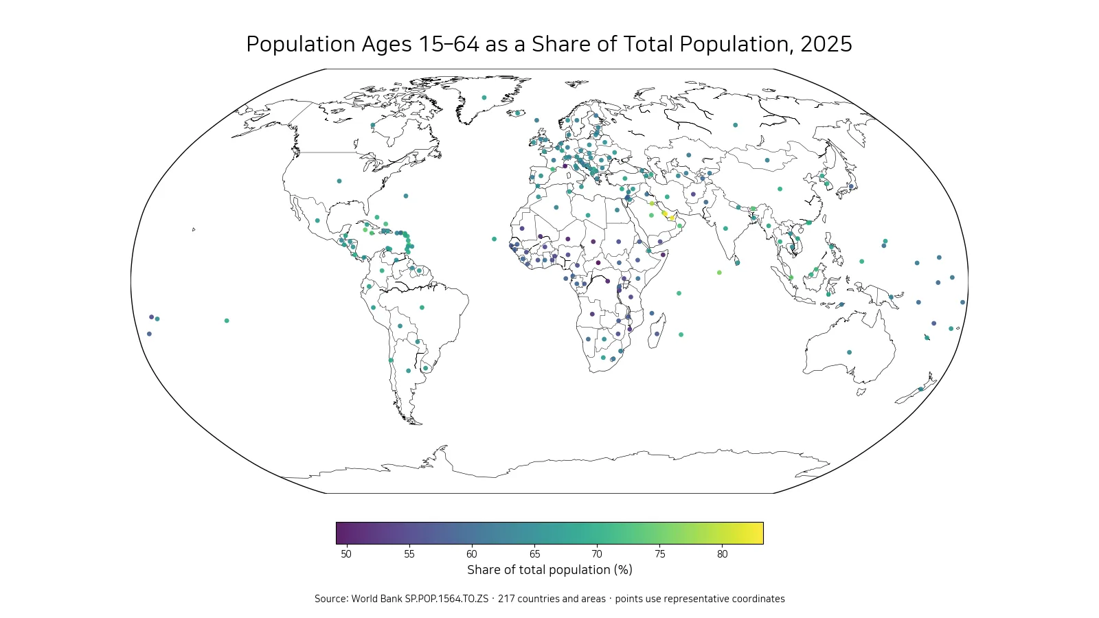
Table of Contents
Qatar and the United Arab Emirates exceed 80%
Qatar records the highest 2025 value at 83.30%, followed by the United Arab Emirates at 82.23%. Kuwait is at 78.85%, Bahrain at 77.56%, and the Maldives at 76.01%. The British Virgin Islands, Cayman Islands, Singapore, Saudi Arabia and Jamaica complete the highest 10 observations.
| Rank | Country or area | Population ages 15–64 |
|---|---|---|
| 1 | Qatar | 83.30% |
| 2 | United Arab Emirates | 82.23% |
| 3 | Kuwait | 78.85% |
| 4 | Bahrain | 77.56% |
| 5 | Maldives | 76.01% |
| 6 | British Virgin Islands | 75.81% |
| 7 | Cayman Islands | 74.43% |
| 8 | Singapore | 74.10% |
| 9 | Saudi Arabia | 73.32% |
| 10 | Jamaica | 73.14% |
Several Gulf economies appear near the top of the distribution. The indicator alone cannot establish why their shares are high. Age structure reflects births, deaths and migration, and international migration can be especially important where large numbers of working-age adults move across borders. A causal explanation would require age-specific migration and other demographic data beyond this single series.
Qatar’s 83.30% is about 18.81 percentage points above the global-country median in this dataset. The gap demonstrates how unusual the upper end is relative to the center of the distribution. A single average therefore hides substantial cross-country variation.
At the low end, the share falls to around 50%
The Central African Republic has the lowest reported value at 49.12%. Monaco is at 50.22%, Somalia at 50.83%, the Democratic Republic of the Congo at 50.97%, and Niger at 51.16%. Mali, Chad, Angola, Mozambique and Burundi also appear among the lowest 10.
| Rank | Country or area | Population ages 15–64 |
|---|---|---|
| 1 | Central African Republic | 49.12% |
| 2 | Monaco | 50.22% |
| 3 | Somalia, Fed. Rep. | 50.83% |
| 4 | Congo, Dem. Rep. | 50.97% |
| 5 | Niger | 51.16% |
| 6 | Mali | 51.84% |
| 7 | Chad | 51.92% |
| 8 | Angola | 53.01% |
| 9 | Mozambique | 53.10% |
| 10 | Burundi | 53.47% |
The lower group illustrates why the indicator must be interpreted with the rest of the age structure. Several countries have large child populations, which can reduce the 15–64 share. Monaco represents a different demographic pattern in which older ages are comparatively important. A similar headline percentage can therefore come from opposite ends of the age spectrum.
The difference between the maximum and minimum is about 34.18 percentage points. The ranking compares shares, not population counts, so a small territory and a large country each contribute one observation.
Half of the 217 values lie between about 60.42% and 67.50%
The first quartile is 60.42%, the median is 64.49%, and the third quartile is 67.50%. Half of all country-or-area observations therefore fall between about 60.42% and 67.50%. The simple mean of 64.06% is close to the median, although both very high and very low values remain important at the edges.
By broad bands, 13 observations are below 55%, 39 are from 55% to under 60%, 69 are from 60% to under 65%, 72 are from 65% to under 70%, and 24 are 70% or higher. Most reporting areas sit between 60% and 70%, but the tails are large enough to matter.
These bands should not be treated as universal thresholds for “good” or “bad” demographic structures. Countries are at different stages of demographic transition, and the economic meaning of a given working-age share depends on employment, productivity, education, health and institutions. The distribution is descriptive rather than evaluative.
The map highlights high Gulf shares and low values in parts of Sub-Saharan Africa
The clearest geographic pattern is the cluster of high shares in Qatar, the United Arab Emirates, Kuwait, Bahrain and Saudi Arabia. A number of lower values appear across parts of Sub-Saharan Africa. Yet there is substantial variation within each region, so regional labels should not replace country-level evidence.
The visualization uses representative points so that small countries and territories remain visible at world scale. The markers are not population centers and do not show subnational variation. Each point represents the same country-or-area indicator value used in the tables and calculations.
A high share should not automatically be described as a favorable economic condition. A large working-age population can create potential labor supply, but whether that potential translates into employment or income depends on many other factors. The map is a demographic structure map, not a ranking of economic performance.
Working-age population share is not the same as labor-force participation
The 15–64 share classifies people by age. Labor-force participation classifies people by economic activity: whether they are employed or actively seeking work within a defined population base. Many people ages 15–64 may be students, caregivers, people with disabilities, early retirees or otherwise outside the labor force.
For that reason, a country with a high 15–64 share does not necessarily have a high participation rate or employment rate. Labor-market analysis requires separate series for participation, employment, unemployment and often sex- and age-specific outcomes. This population indicator provides demographic context rather than a labor-market result.
Keeping these concepts separate also avoids overstating the idea of a “demographic dividend.” A favorable age structure can create an opportunity, but outcomes depend on jobs, education, health, capital formation and policy. The age share alone does not measure whether those conditions are present.
The measure is related to dependency ratios but is not identical to them
A lower 15–64 share means that the combined share outside the 15–64 range is larger, but formal dependency ratios use their own numerator and denominator definitions. Child dependency and old-age dependency can also be calculated separately. Those measures reveal whether the population outside working ages is concentrated among children, older adults or both.
Two countries can each have 60% of their population ages 15–64 while having very different remaining age structures. One may have a large child population and a small elderly population; another may have fewer children and more older residents. Those differences matter for schools, pensions, health systems and household structures.
Actual economic dependency also differs from demographic dependency. Many people under 15 or over 64 may not fit a simple dependent category, and many people ages 15–64 may not be employed. The indicator should therefore remain a demographic share rather than a direct measure of fiscal or household burden.
All 217 rows contain numeric 2025 values
Every row in the supplied dataset contains a numeric 2025 observation. No missing values were filled with zero, and no imputation was required for the rankings, mean, median or quartiles. The distribution is calculated directly from all 217 reported values.
The 217 rows should not be described as 217 sovereign states. World Bank datasets also contain territories and separately reported statistical areas, so “countries and areas” or “reporting units” is the more precise wording. The simple mean gives each row equal weight and is not a population-weighted global share.
A true world-population share would require weighting each country’s percentage by its population. That distinction matters because a small territory and a highly populous country have equal influence on the simple average used to summarize this cross-country dataset.
A time series is needed to understand demographic direction
This article compares one year, 2025. It cannot show whether the working-age share in a particular country is rising or falling. Connecting the same World Bank indicator across multiple years would reveal how the age structure is shifting over time as cohorts enter and leave the 15–64 range.
Long-run changes can reflect births decades earlier, mortality, population aging and migration. To explain those shifts, the 15–64 share can be combined with the shares ages 0–14 and 65+, population growth, fertility and net migration. Those additional series help distinguish the demographic forces behind the change.
What stands out most in the 2025 comparison
The 2025 snapshot shows a broad cross-country range. Qatar is at 83.30% and the United Arab Emirates at 82.23%, while the Central African Republic is at 49.12%. The median is 64.49%, and most country-or-area observations sit between 60% and 70%.
A useful way to read the data is to start with the map for geographic clustering, use the high and low tables to identify the extremes, and then use the quartiles to see where individual countries sit within the distribution. Adding the child and older-age shares provides the next layer needed to understand why a country’s 15–64 percentage is high or low.
Frequently Asked Questions
What does a 65% population ages 15–64 share mean?
It means about 65 of every 100 residents are between ages 15 and 64. It does not mean that 65% are employed or participating in the labor force.
Which reporting areas have the highest and lowest 2025 values?
In the supplied 217-row dataset, Qatar is highest at 83.30% and the Central African Republic is lowest at 49.12%.
Does a high working-age share automatically mean a stronger economy?
No. The indicator describes age structure only. Employment, productivity, education, health, migration and institutions must be analyzed separately.
Related Articles
Green Map creates custom-edited map images using open geographic data sources such as geoBoundaries, Natural Earth, OpenStreetMap, and government open data.
These maps are edited visual materials, not raw data files, and are provided for education, documents, presentations, and graphic reference.