The share of males ages 15–19 varies sharply across reporting countries and economies in 2025. In the World Bank series SP.POP.1519.MA.5Y, the Marshall Islands records the highest value at 13.36%, while Qatar records the lowest at 3.18%. The same five-year age group therefore represents more than one in eight males in one reporting economy but only about one in thirty-one in another.
This is a composition measure, not a headcount. The denominator is the entire male population of each reporting economy. A small island can post a high percentage while containing relatively few teenage males in absolute terms, and an economy with a very large adult male population can post a low percentage even when its 15–19 population is substantial. The map and tables should therefore be read as age-structure comparisons rather than rankings of the number of teenage boys and young men.
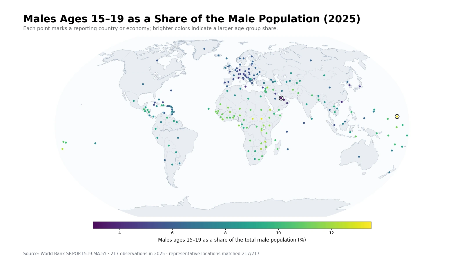
Table of Contents
The Marshall Islands and South Sudan both exceed 13%
The Marshall Islands leads at 13.36%, followed by South Sudan at 13.08% and the Central African Republic at 12.72%. Tonga is next at 12.17%, with Eritrea at 12.13%, Zimbabwe at 12.12%, and Malawi at 12.06%. Several African countries occupy the upper tail, but the presence of the Marshall Islands and Tonga shows that a high male 15–19 share is not confined to one continent.
The indicator does not identify a single cause for these values. Males who are 15–19 in 2025 broadly come from birth cohorts around 2006–2010, but their share today also reflects survival, migration, and the size of every other male age group in the denominator. A cross-sectional age-share map can locate unusual structures; it cannot by itself separate the demographic processes that produced them.
A broad African high-share cluster has Pacific exceptions
Beyond the first seven observations, Burundi records 11.90%, the Syrian Arab Republic 11.80%, Burkina Faso 11.74%, Kenya 11.63%, Uganda 11.63%, Liberia 11.58%, Sao Tome and Principe 11.55%, and Mali 11.45%. High values therefore extend across central, eastern, and western Africa rather than forming a single-country spike.
The Pacific exceptions matter because they prevent a simple continent-level story. The Marshall Islands and Tonga sit near or above many African observations despite very different population sizes and geographies. This is a reminder that percentages describe the relative thickness of a cohort. They do not tell us how many people are in the cohort or whether two places with the same percentage have similar population pyramids.
The lowest shares include Gulf economies as well as parts of East Asia and Europe
Qatar is the lowest observation at 3.18%, followed by the United Arab Emirates at 3.73%. Bahrain is at 4.64%, Oman at 4.70%, and Kuwait at 4.79%. The bottom group also includes Hong Kong SAR, China at 4.30%, Macao SAR, China at 4.43%, Japan at 4.84%, Germany at 4.79%, Malta at 4.32%, and Monaco at 4.33%. Similar low percentages can therefore arise in very different demographic settings.
The male denominator is especially important at the low end. If adult males form an unusually large part of a reporting economy’s male population, the 15–19 cohort can occupy a smaller share even without being small in headcount. The series itself does not prove why this happens, so migration or labor-market explanations require separate age- and sex-specific evidence rather than inference from this percentage alone.
The top-to-bottom gap is 10.19 percentage points
Across all 217 observations, the range runs from 3.18% to 13.36%. The gap between the Marshall Islands and Qatar is 10.19 percentage points, and the highest value is about 4.2 times the lowest. That is a large structural difference for a cohort only five years wide.
| Top | Country or economy | Share | Bottom | Country or economy | Share |
|---|---|---|---|---|---|
| 1 | Marshall Islands | 13.36% | 1 | Qatar | 3.18% |
| 2 | South Sudan | 13.08% | 2 | United Arab Emirates | 3.73% |
| 3 | Central African Republic | 12.72% | 3 | Hong Kong SAR, China | 4.30% |
| 4 | Tonga | 12.17% | 4 | Malta | 4.32% |
| 5 | Eritrea | 12.13% | 5 | Monaco | 4.33% |
| 6 | Zimbabwe | 12.12% | 6 | Macao SAR, China | 4.43% |
| 7 | Malawi | 12.06% | 7 | Korea, Rep. | 4.62% |
| 8 | Burundi | 11.90% | 8 | Bahrain | 4.64% |
| 9 | Syrian Arab Republic | 11.80% | 9 | Oman | 4.70% |
| 10 | Burkina Faso | 11.74% | 10 | Kuwait | 4.79% |
These are rankings of shares, not rankings of population counts. A large country at 6% can contain far more males ages 15–19 than a small island at 13%. School capacity, youth services, or labor-market entry questions usually need age-specific population counts in addition to this composition measure.
The median is 7.97%, with the middle half between 6.15% and 10.27%
The mean across the 217 observations is 8.14% and the median is 7.97%. The first quartile is 6.15% and the third quartile is 10.27%, so half of the observations lie within a band about 4.12 percentage points wide. The mean sits slightly above the median because the 11–13% upper tail pulls the average upward.
| Male ages 15–19 share band | Countries and economies | Share of 217 observations |
|---|---|---|
| Below 5% | 12 | 5.5% |
| 5% to under 6% | 34 | 15.7% |
| 6% to under 7% | 38 | 17.5% |
| 7% to under 8% | 25 | 11.5% |
| 8% to under 9% | 24 | 11.1% |
| 9% to under 10% | 25 | 11.5% |
| 10% to under 11% | 30 | 13.8% |
| 11% to under 12% | 22 | 10.1% |
| 12% or more | 7 | 3.2% |
The largest single band is 6% to under 7%, with 38 observations, followed by 5% to under 6% with 34. Thirty observations fall between 10% and 11%, and 22 fall between 11% and 12%. Only seven observations reach 12% or more. The extreme points are visually striking, but most economies are spread across the broad 5% to 11% middle.
Ages 15–19 is not the same as the entire youth population
This indicator includes only males ages 15–19. It excludes boys ages 10–14 and men ages 20–24, so it should not be treated as a complete measure of adolescents or youth. A broader youth-population question requires neighboring age bands or an age-specific headcount covering the intended definition.
The series also says nothing about school attendance, employment, unemployment, or labor-force status. A 16-year-old student and a 19-year-old worker are counted the same way because the indicator uses age and sex only. Education and labor-market questions require separate indicators for enrollment, attainment, participation, employment, and unemployment.
The denominator is male population, not total population
An 8% value means that roughly eight of every 100 males in that reporting economy are ages 15–19. It does not mean that 8% of all residents are males in this age band. Converting the measure to a total-population share would require additional information about the male share of the total population or, preferably, direct age-specific headcounts.
The same denominator issue applies when comparing the male and female versions of the indicator. Each percentage is normalized by a different sex-specific population. A higher male percentage does not automatically mean there are more 15–19-year-old males than females. That question is better answered with age-specific male and female counts or a sex ratio.
The 2025 cohort will move into the next age band
Age shares are temporary because cohorts age. Most males who are 15–19 in 2025 will move into the 20–24 group over the next five years, while today’s 10–14 cohort will replace them. A high or low value should therefore not be treated as a permanent national characteristic. Different-sized cohorts moving through the population pyramid can change the map substantially over time.
Trend analysis requires multiple years of the same indicator. Even then, percentage changes and headcount changes can move in opposite directions. The number of males ages 15–19 can fall while their share rises if the total male population falls faster, or the count can rise while the share falls if other male age groups expand more quickly.
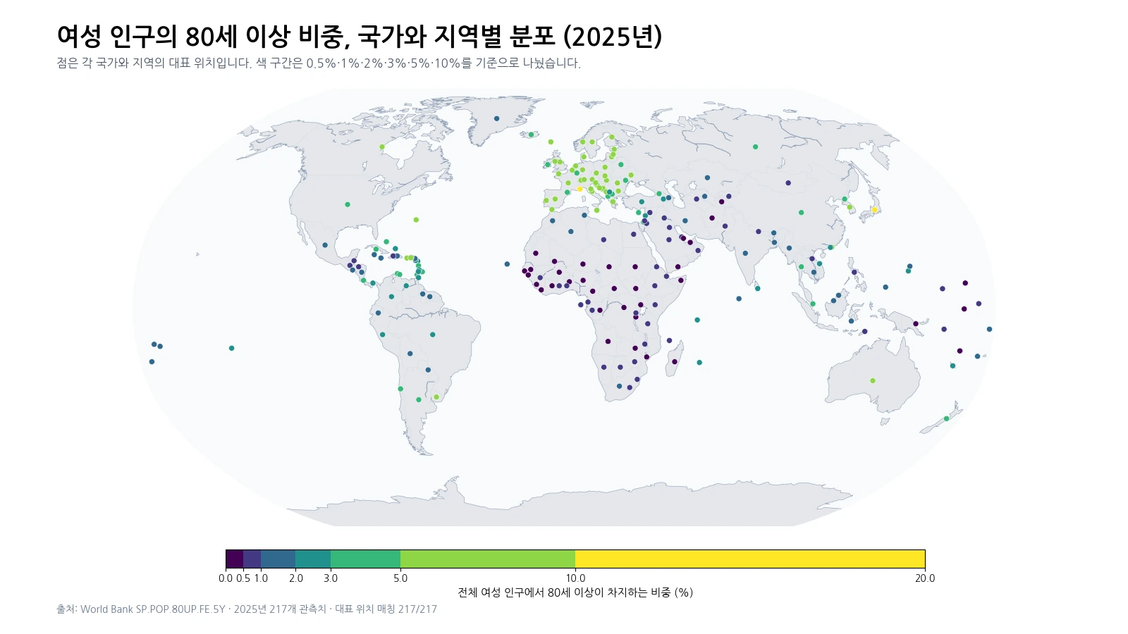
All 217 observations are retained on the map through representative points
World Bank country-and-economy series include sovereign states and separately reported territories. The total of 217 is therefore a statistical reporting count, not a count of sovereign countries. Small islands and territories can disappear when only coarse world polygons are used, so this visualization links every observation to a representative geographic point.
Marker size does not encode population. Comparable point sizes are used so that color carries the age-share comparison. Dense regions such as the Caribbean, Europe, and parts of the Pacific can show overlapping points at a global scale. Exact values are therefore better read from the tables, while the map is best for recognizing broad geographic clusters and outliers.
Data source and calculation
The analysis uses the 2025 observations from the World Bank API series SP.POP.1519.MA.5Y. The World Bank indicator page provides the country-level time series and definition. The unit is males ages 15–19 as a percentage of the total male population.
Regional and income aggregates are excluded. All 217 country-and-economy rows contain a 2025 value, so no missing observation is replaced with zero and no earlier year is substituted. The minimum, maximum, mean, median, quartiles, rankings, range, and percentage-band counts are calculated directly from the 217 values. Representative map coordinates are used only for visualization and do not affect any statistic.
Frequently Asked Questions
What does an 8% value mean for this indicator?
It means about 8 of every 100 males in that reporting economy are ages 15–19. It does not mean that 8% of the total population consists of males in that age group.
Does a higher share mean a larger number of males ages 15–19?
Not necessarily. This is a percentage of the male population, so a small economy can have a high share but a smaller headcount than a large country.
Can the 2025 value show whether the share is increasing?
No. A single-year cross-section cannot establish a trend. Multiple years of the same indicator are needed to determine whether the share is rising or falling.
Related Maps
Green Map creates custom-edited map images using open geographic data sources such as geoBoundaries, Natural Earth, OpenStreetMap, and government open data.
These maps are edited visual materials, not raw data files, and are provided for education, documents, presentations, and graphic reference.