The share of women aged 80 and older differs sharply across the 217 countries and areas with a 2025 World Bank observation for SP.POP.80UP.FE.5Y. Monaco has the highest value at 17.90%, while Nauru has the lowest at 0.07%. The median is 1.76% and the simple mean is 2.85%. The mean sits well above the median because a small number of places, especially Monaco and Japan, have unusually large shares at the top of the distribution.
The denominator is crucial. This indicator expresses women aged 80 or older as a percentage of the total female population. A value of 5% means that roughly five out of every 100 women are aged 80 or older. Men are not part of the denominator, and women aged 65–79 are not part of the numerator. The measure therefore describes the age composition of the female population rather than the absolute number of very old women or the total share of all residents aged 80 and above.
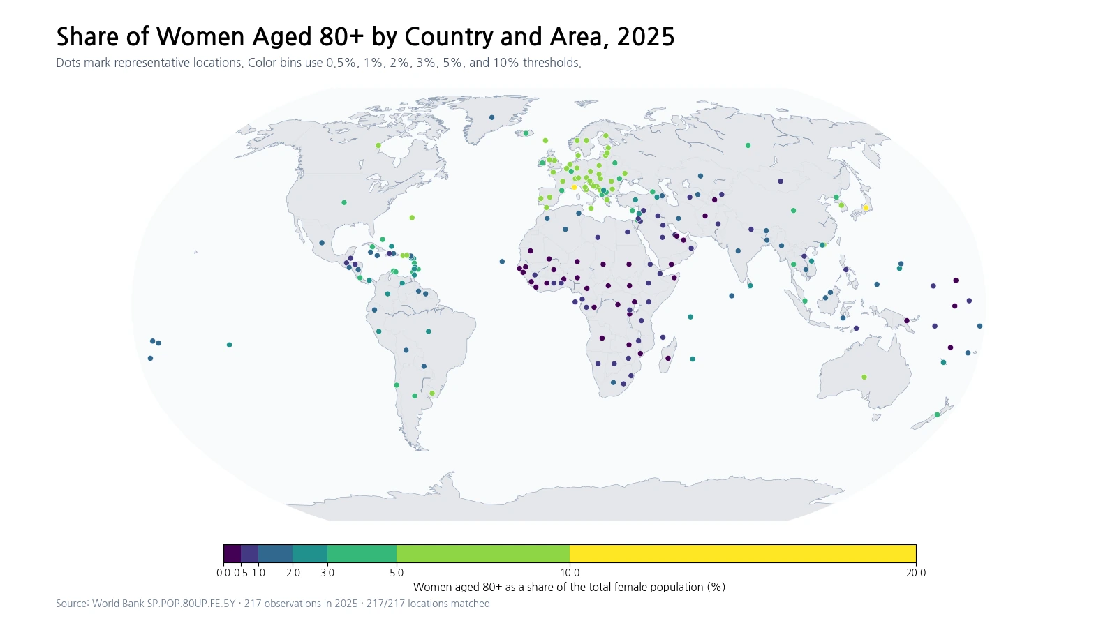
Table of Contents
Where women aged 80+ make up the largest share
The upper end of the ranking is dominated by several European countries and Japan. Monaco is far above the rest at nearly 18%, Japan exceeds 13%, and Italy, Greece, Germany and Portugal are all close to or above 9%. Latvia and Estonia also rank highly, while Puerto Rico and San Marino complete the top ten. These figures describe the relative size of the oldest female age group, not the absolute number of women aged 80 or older.
| Rank | Country or area | Women aged 80+ (%) |
|---|---|---|
| 1 | Monaco | 17.90% |
| 2 | Japan | 13.02% |
| 3 | Italy | 9.50% |
| 4 | Greece | 9.05% |
| 5 | Germany | 8.98% |
| 6 | Portugal | 8.73% |
| 7 | Latvia | 8.58% |
| 8 | Estonia | 8.52% |
| 9 | Puerto Rico | 8.31% |
| 10 | San Marino | 7.98% |
A small place can have a very high percentage without having a large absolute population of older women. Conversely, a large country can have a lower percentage but many more women aged 80 or older in absolute terms. The percentage is useful for understanding age structure, while counts are more relevant when estimating the scale of health, long-term care, housing or social-service demand.
Low shares can emerge from very different population structures
The lowest observations include Nauru, the Central African Republic, Zambia, Chad, Mali, Niger, Somalia and Mozambique. The United Arab Emirates and Qatar also sit near the bottom. Those places do not share one single demographic pathway. Some have very young population structures, while others have unusually large working-age populations relative to older residents.
| Rank | Country or area | Women aged 80+ (%) |
|---|---|---|
| 1 | Nauru | 0.07% |
| 2 | Central African Republic | 0.19% |
| 3 | Zambia | 0.24% |
| 4 | United Arab Emirates | 0.24% |
| 5 | Chad | 0.25% |
| 6 | Qatar | 0.25% |
| 7 | Mali | 0.30% |
| 8 | Niger | 0.31% |
| 9 | Somalia | 0.32% |
| 10 | Mozambique | 0.32% |
A country with a very large number of girls and younger women can have a small 80+ share even when some women live to very old ages. In another setting, inward migration concentrated among working-age adults can expand the denominator and reduce the percentage. The indicator by itself cannot identify whether fertility, mortality, migration or another factor is primarily responsible for a particular country value.
The distribution has a long upper tail
Across the 217 observations, the first quartile is 0.70%, the median is 1.76%, and the third quartile is 4.65%. Half of all observations therefore lie between roughly 0.70% and 4.65%. The maximum of 17.90% is far above the third quartile, which produces a long upper tail and pushes the mean to 2.85%.
Using the map bins, 35 observations are below 0.5%, 44 are between 0.5% and 1%, and 39 are between 1% and 2%. Another 23 fall between 2% and 3%, 28 between 3% and 5%, and 46 between 5% and 10%. Only two observations exceed 10%. This makes the median more representative of the middle of the country distribution than the mean alone.
The share is not a direct life-expectancy ranking
A high 80+ female share can be consistent with long survival, but it should not be read as a direct ranking of female life expectancy. Today’s population aged 80 and above reflects the size of cohorts born many decades ago as well as survival through different historical periods. The denominator also changes as younger female cohorts grow, shrink or move across borders.
The percentage can rise even if the number of women aged 80+ changes little when the younger female population contracts. It can also remain modest when the number of older women grows if the working-age female population expands more quickly. For that reason, differences across countries are best treated as outcomes of multiple demographic processes rather than as evidence for one isolated cause.
Female and male 80+ shares answer separate questions
Women and men can have different age structures at very old ages, so a female 80+ indicator should not be substituted for the corresponding male measure. Even within the same country, the two percentages use different denominators: total female population versus total male population. A gap between them can reflect both the sex composition of older cohorts and differences in the size of younger female and male populations.
A proper sex comparison therefore requires the male and female series for the same year and the same age threshold. Even then, the gap should not be attributed automatically to one biological or health-system factor. Long-run survival, cohort size, migration, war and other demographic experiences can all influence the observed percentages.
How to read the geographic pattern
The map shows a broad cluster of higher values across parts of southern, western and northern Europe, the Baltic region and Japan. Many countries in Sub-Saharan Africa fall in the lowest bins, while some Gulf economies also show very low shares. This spatial pattern is useful for seeing where the oldest female age group is relatively thick or thin, but the map does not establish a cause. Neighboring countries can differ because their historical cohort sizes, survival and migration patterns are not identical.
Small states and islands are displayed as representative points, so their visual footprint is necessarily much smaller than that of large countries. All 217 observations are still included equally in the statistical calculations. A point that is difficult to see on a world map has not been omitted from the ranking or distribution.
A 2025 snapshot cannot show the trend
This comparison uses one year. It cannot tell us whether a country’s 80+ female share has been rising rapidly, slowly, or not at all. Each year, new cohorts enter the 80+ group, some members of the group die, and the total female population also changes. A high 2025 value does not by itself demonstrate a recent acceleration in ageing.
Trend analysis requires a consistent time series of the same indicator. The share of women aged 75–79 can provide context about the cohort approaching age 80, but it is not a mechanical forecast because survival and migration continue to matter. This article therefore describes the 2025 cross-section rather than projecting future rankings.
Why 217 observations do not equal the number of sovereign states
World Bank country-level datasets include separately reported areas and territories as well as sovereign states. Puerto Rico, Hong Kong, the Isle of Man and several island territories can therefore appear as individual observations. The number 217 should not be interpreted as a count of sovereign countries. The analysis uses the separate country and area rows supplied for this indicator and excludes aggregate income or regional groups.
All 217 rows contain a 2025 value, so no missing observation was converted to zero and no earlier-year value was substituted. The map also matched all 217 rows to representative locations. Values close to zero are genuine positive observations from the source rather than placeholders for missing data.
Data source and calculation
The analysis uses the 2025 observations from the World Bank API series SP.POP.80UP.FE.5Y. The World Bank indicator page provides the definition and country time series. The official unit is women aged 80 and above as a percentage of the total female population.
The top and bottom tables, mean, median, quartiles and bin counts are all calculated from the same 217 observations. The map uses thresholds at 0.5%, 1%, 2%, 3%, 5% and 10% so that both low-share and high-share regions remain distinguishable. These bins are visualization choices, not World Bank policy thresholds or official ageing categories.
Frequently Asked Questions
What does a 5% female 80+ share mean?
It means that about five of every 100 women in that country or area are aged 80 or older. It does not mean that 5% of the total population are women aged 80+.
Does a high female 80+ share necessarily mean higher life expectancy?
No. The share reflects cohort size, survival, migration and changes in the total female population, so it is not a direct life-expectancy ranking.
Does a higher share mean more women aged 80+ in absolute numbers?
Not necessarily. A small area can have a high percentage but a small count, while a large country can have a lower percentage and a much larger number of older women.
Related Maps
Green Map creates custom-edited map images using open geographic data sources such as geoBoundaries, Natural Earth, OpenStreetMap, and government open data.
These maps are edited visual materials, not raw data files, and are provided for education, documents, presentations, and graphic reference.