In 2025, the share of the population age 65 or older ranges from very small single-digit percentages to more than one-third across the 217 countries and separately reported areas in the World Bank table. Monaco is highest at 36.01%, Japan follows at 29.99%, and Puerto Rico and Italy are both above 25%. Qatar is lowest at 1.70%, narrowly below the United Arab Emirates at 1.79%. A value of 20% means that about twenty of every one hundred residents are age 65 or older; the denominator is the total population, not the working-age population and not one sex only.
That denominator makes this series a broad age-composition measure. It is useful for seeing how much space older residents occupy in the population pyramid, but it does not explain why the share is high or low. Past fertility, survival to older ages, immigration, emigration, and the size of younger cohorts all affect the result. Two places with the same 65-plus share can therefore have different age distributions within the older population and very different demographic histories.
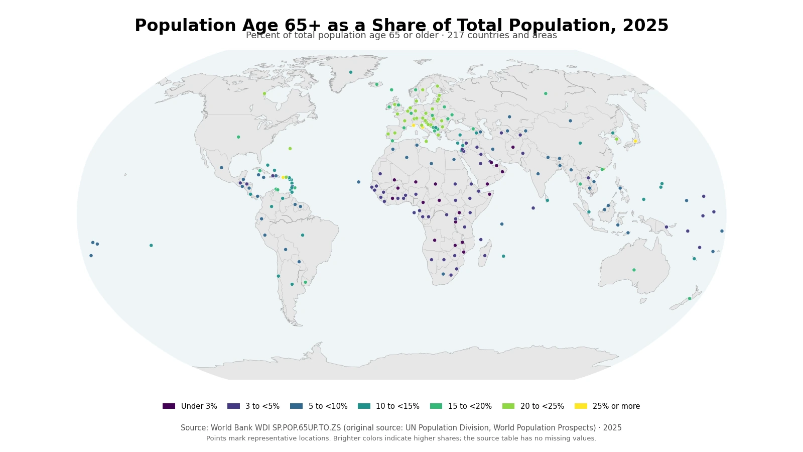
Table of Contents
The 2025 distribution stretches from below 2% to above 36%
Giving every country or area row equal weight, the simple mean is 10.86% and the median is 8.60%. The first quartile is 4.13% and the third quartile is 17.30%, so the middle half of observations lies across a wide thirteen-percentage-point span. The mean sits above the median because a group of European and East Asian observations exceeds 20%, and Monaco extends the upper tail to 36.01%. This simple mean is not the population-weighted share of the world population age 65 or older; it is a summary of the 217 country and area percentages.
| Share age 65+ | Countries/areas | Share of 217 |
|---|---|---|
| Under 3% | 19 | 8.8% |
| 3% to under 5% | 52 | 24.0% |
| 5% to under 10% | 47 | 21.7% |
| 10% to under 15% | 33 | 15.2% |
| 15% to under 20% | 28 | 12.9% |
| 20% to under 25% | 34 | 15.7% |
| 25% or more | 4 | 1.8% |
The largest band is 3% to under 5%, with 52 observations. Another 47 fall between 5% and 10%, so those two bands together contain 99 of 217 observations, or 45.6%. At the high end, 38 observations are at least 20%, and four are at least 25%. The map therefore does not describe a world centered on one typical age structure. It shows a broad continuum from very young population profiles to places where older residents account for roughly one-quarter or more of everyone living there.
Monaco and Japan lead, while several European countries cluster above 20%
Monaco records the largest 2025 share at 36.01%, followed by Japan at 29.99%. Puerto Rico is 25.27%, Italy 25.10%, Portugal 24.94%, Greece 24.40%, Finland 24.20%, Germany 23.70%, Hong Kong SAR, China 23.67%, and Croatia 23.61%. The top ten mix a microstate, a large East Asian country, a Caribbean territory, and several European countries. Their common feature is not population size but the relative weight of older residents within the total population.
| High rank | Country/area | Share | Low rank | Country/area | Share |
|---|---|---|---|---|---|
| 1 | Monaco | 36.01% | 1 | Qatar | 1.70% |
| 2 | Japan | 29.99% | 2 | United Arab Emirates | 1.79% |
| 3 | Puerto Rico (US) | 25.27% | 3 | Zambia | 2.00% |
| 4 | Italy | 25.10% | 4 | Chad | 2.12% |
| 5 | Portugal | 24.94% | 5 | Central African Republic | 2.20% |
| 6 | Greece | 24.40% | 6 | Uganda | 2.23% |
| 7 | Finland | 24.20% | 7 | Mali | 2.36% |
| 8 | Germany | 23.70% | 8 | Afghanistan | 2.43% |
| 9 | Hong Kong SAR, China | 23.67% | 9 | Yemen, Rep. | 2.55% |
| 10 | Croatia | 23.61% | 10 | Burundi | 2.55% |
A percentage ranking should not be turned into a ranking of older-person headcounts. Monaco can be first by share while containing far fewer people age 65 or older than a large country with a lower percentage. The same caution applies to small territories near the top. Percentages are especially useful for comparing age composition because they remove much of the effect of total population size, but the number of older residents must be examined separately when the question is health-care capacity, long-term care, housing, transport, pensions, or market size.
Low shares appear in parts of the Gulf and across many Sub-Saharan African countries
Qatar is the lowest observation at 1.70%, followed by the United Arab Emirates at 1.79%, Zambia at 2.00%, Chad at 2.12%, the Central African Republic at 2.20%, Uganda at 2.23%, Mali at 2.36%, Afghanistan at 2.43%, Yemen at 2.55%, and Burundi at 2.55%. Many Sub-Saharan African countries have very youthful age structures, so the number of children and younger adults in the denominator is large relative to the older population.
The Gulf cases show why a similar percentage does not imply the same mechanism. In Qatar and the United Arab Emirates, large working-age migrant populations can make the age distribution unusually concentrated in adult ages, reducing the share at 65 and above. In a high-fertility country, a small 65-plus share may instead reflect very large younger cohorts. The series describes the outcome of those processes but does not identify how much each cause contributes. A causal explanation needs fertility, survival, migration, and age-specific population data.
Large countries illustrate how age structure differs even at a common 2025 reference year
| Country | Population age 65+ in 2025 |
|---|---|
| Japan | 29.99% |
| Italy | 25.10% |
| Germany | 23.70% |
| France | 22.54% |
| Spain | 21.64% |
| Korea, Rep. | 20.33% |
| Canada | 20.26% |
| United Kingdom | 19.70% |
| United States | 18.39% |
| Australia | 18.09% |
| Russian Federation | 17.79% |
| China | 14.91% |
| Singapore | 14.21% |
| Brazil | 11.48% |
| Mexico | 8.52% |
| Indonesia | 7.54% |
| India | 7.38% |
| South Africa | 6.89% |
| Nigeria | 3.07% |
| United Arab Emirates | 1.79% |
| Qatar | 1.70% |
Japan stands near 30%, while Italy and Germany are above 23%. France and Spain are above 21%, and Canada, the United Kingdom, the United States, and Australia are in the high teens to roughly 20%. Korea, Rep. is 20.33%. China is 14.91%, Brazil 11.48%, Mexico 8.52%, Indonesia 7.54%, India 7.38%, South Africa 6.89%, and Nigeria 3.07%. The spread among large populations makes clear that geography or income level alone does not determine the age structure.
The common year improves comparability. International “latest available” tables often combine observations from different dates, which can make a ranking partly a comparison of time rather than population structure. Here every retained row is dated 2025. That does not make differences of a few hundredths of a percentage point substantively important, because the figures are annual demographic estimates. It does mean that broad bands, quartiles, and country-to-country differences are not being distorted by mixing older and newer reference years.
The 65-plus share is not the same as the old-age dependency ratio
This indicator uses total population as its denominator: people age 65 or older divided by everyone in the population. The old-age dependency ratio uses a different denominator, conventionally people ages 15–64. That difference matters. A country where 20% of the total population is age 65 or older will not necessarily have an old-age dependency ratio of 20, because children are excluded from the dependency-ratio denominator. Countries with different child shares can have similar 65-plus percentages but noticeably different old-age dependency ratios.
The total-population share answers a straightforward composition question: out of every 100 residents, how many are 65 or older? The dependency ratio asks how the older population compares with a conventional working-age group. Neither indicator measures actual financial dependency. Some people over 65 work, many people ages 15–64 are outside employment, and retirement ages vary. Matching the denominator to the question is essential before two aging statistics are compared.
A high percentage does not automatically mean the largest older population
A country with hundreds of millions of residents can contain tens of millions of older people even if its percentage is moderate. A small territory can have a much higher percentage but only a fraction of that headcount. This distinction becomes important as soon as the question shifts from demographic composition to service demand. Planning hospital beds, long-term-care staffing, age-friendly housing, transit, or pension administration requires the actual number of older residents and, often, their geographic distribution within the country.
The broad 65-plus category also hides differences inside older ages. Two countries can have the same overall share while one has a relatively large 65–69 cohort and the other has more people in their late seventies or eighties. Those profiles may imply different health and care needs. Five-year age bands, life expectancy, healthy life expectancy, disability, household structure, income, and care arrangements all add information that a single 65-plus percentage cannot provide.
Different demographic histories can produce the same 65-plus share
Today’s older-population share is the accumulated result of decades of demographic change. Large or small birth cohorts move through the age structure over time. Mortality determines how many people survive into older ages. Migration can change both the numerator and, more often, the size and composition of the younger denominator. A country that lost many young adults through emigration may see its older share rise even without an unusually large increase in the number of older residents.
Falling fertility can also raise the share through a denominator effect. If births remain low for many years, children and eventually younger adults form a smaller part of the population, so older groups occupy a larger fraction even if their headcount grows slowly. The reverse can occur in a rapidly growing population: the number of older people may increase, but the 65-plus percentage can stay low because younger cohorts expand faster. This is why the map should be treated as a description of age structure rather than a direct diagnosis of one demographic cause.
A single 2025 snapshot cannot show the speed or direction of aging
The map is a cross-section. It shows where countries and areas stand in 2025, not how quickly they arrived there. Two places at 18% could be on different trajectories: one may have risen rapidly from the low teens during the past decade, while another may have changed only gradually. Measuring the pace of population aging requires a time series of the same indicator, ideally paired with shifts in the full age distribution rather than a comparison of one-year ranks.
The age-65 threshold is also a statistical convention rather than a universal boundary between economically active and inactive life. Statutory pension ages, actual retirement behavior, employment at older ages, health status, and social protection systems vary across countries and over time. The 65-plus share is therefore a demographic measure. It should not be converted directly into pension burden, health expenditure, labor shortage, or fiscal pressure without additional evidence.
Source, definition, and map interpretation
World Bank WDI defines SP.POP.65UP.TO.ZS as the population age 65 and above expressed as a percentage of the total population. The population concept is de facto residence, counting residents regardless of legal status or citizenship. The official metadata identifies the United Nations Population Division’s World Population Prospects as the source, reports the unit as percentage, and lists annual periodicity. The formal definition is available in the World Bank WDI metadata.
All summary statistics, rankings, quartiles, and distribution counts in this article are calculated from the same 217 observations dated 2025. There are no source-missing values, no zero-filled records, and no older years substituted into the comparison. The map places each country or separately reported area at a representative geographic location so that very small islands and territories remain visible. The 217 rows should therefore be understood as country and area observations rather than 217 sovereign states.
Frequently Asked Questions
What does a 20% population share age 65+ mean?
It means about 20 of every 100 residents are age 65 or older. It is not the old-age dependency ratio, which uses ages 15–64 as the denominator.
Are all 217 observations from 2025?
Yes. Every country and area observation used in this comparison is dated 2025, and the source table has no missing values.
Does the highest 65+ percentage mean the largest number of older people?
No. The percentage measures composition. A large country with a lower share can contain far more people age 65 or older than a small territory with a high share.
Related Articles
- Old-age dependency ratio by country in 2025
- Men ages 65–69 as a share of the male population
- Women ages 65–69 as a share of the female population
Green Map creates custom-edited map images using open geographic data sources such as geoBoundaries, Natural Earth, OpenStreetMap, and government open data.
These maps are edited visual materials, not raw data files, and are provided for education, documents, presentations, and graphic reference.