Out-of-pocket payments account for very different shares of current health expenditure across countries and areas in 2023. In World Bank series SH.XPD.OOPC.CH.ZS, 192 of the 217 country and area rows have a reported 2023 value and 25 are source-missing. Among the reported observations, the median is 27.56% and the simple mean is 30.56%. Armenia has the highest value at 80.47%, while Tuvalu has the lowest at 0.04%.
This indicator is not the percentage of household income spent on health care. Its denominator is total current health expenditure. World Bank metadata defines it as the share of current health spending paid directly out of pocket by households, with the WHO Global Health Expenditure Database as the source. It is therefore best read as a health-financing composition measure: how large a role direct household payments play relative to all current health spending.
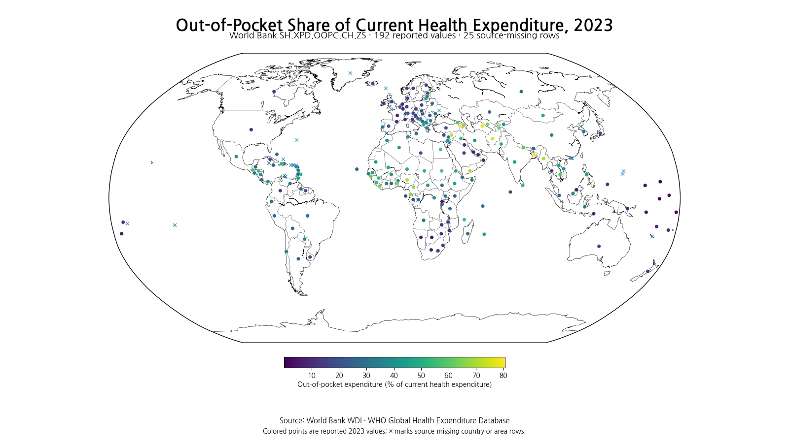
Table of Contents
The highest reported shares reach the 70–80% range
At the upper end, Armenia, Bangladesh, Turkmenistan and Afghanistan all exceed 77%. Syria, Nigeria and Myanmar are also above 70%. These percentages do not mean that the average household spent 70–80% of its income on medical bills. They mean that direct household payments accounted for that share of national current health expenditure. The denominator distinction is essential for interpreting the map correctly.
| Rank | Country or area | Out-of-pocket share |
|---|---|---|
| 1 | Armenia | 80.47% |
| 2 | Bangladesh | 79.31% |
| 3 | Turkmenistan | 77.39% |
| 4 | Afghanistan | 77.14% |
| 5 | Syrian Arab Republic | 72.40% |
| 6 | Nigeria | 71.90% |
| 7 | Myanmar | 71.13% |
| 8 | Yemen, Rep. | 69.13% |
| 9 | Cameroon | 67.65% |
| 10 | Equatorial Guinea | 65.98% |
A high out-of-pocket share can be consistent with a relatively small role for public or prepaid financing, but the indicator alone cannot diagnose the quality of a health system. Utilization, prices, public budgets, insurance arrangements, external financing and informal payments can all affect the numerator and denominator. People who need care but do not obtain it may also incur little recorded spending, so a financing share should not be treated as a complete measure of access or unmet need.
Low shares indicate less direct payment in the financing mix, not automatically better outcomes
At the lower end, several Pacific island countries and areas appear, including Tuvalu, Nauru, the Marshall Islands, the Federated States of Micronesia, Kiribati and the Solomon Islands. Rwanda and Botswana also record low shares. A low value means direct household payments make up a smaller portion of current health expenditure, but it does not automatically establish that coverage, access or outcomes are superior. Different combinations of public financing, insurance, external resources and service use can produce low shares.
| Rank | Country or area | Out-of-pocket share |
|---|---|---|
| 1 | Tuvalu | 0.04% |
| 2 | Naoero | 0.73% |
| 3 | Marshall Islands | 1.05% |
| 4 | Micronesia, Fed. Sts. | 2.58% |
| 5 | Kiribati | 2.91% |
| 6 | Solomon Islands | 3.16% |
| 7 | Rwanda | 4.10% |
| 8 | Botswana | 4.26% |
| 9 | Tonga | 5.86% |
| 10 | Oman | 6.31% |
The median is 27.56%, with the middle half between about 14.62% and 43.79%
Across the 192 reported values, the median is 27.56%, the first quartile is 14.62%, and the third quartile is 43.79%. The middle half of country and area observations therefore lies between roughly 14.62% and 43.79%. The simple mean, 30.56%, is above the median because observations in the 60–80% range extend the upper tail. This is an unweighted summary of country and area rows, not a population-weighted or expenditure-weighted world share.
That distinction matters. A very large country and a small island economy each contribute one observation to the simple mean calculated here. The mean should not be rewritten as “the world pays 30.56% out of pocket.” The distribution is better described by the median, quartiles and the range of country examples shown in the table and map.
Per-capita out-of-pocket spending answers a different question
An out-of-pocket amount per person and an out-of-pocket share of current health expenditure are not interchangeable. A high-income country can have a large per-capita out-of-pocket amount because medical prices and utilization are high, while direct payments still represent a modest share of total health spending. Conversely, a country can have a lower dollar amount per person but a high out-of-pocket share if public and prepaid financing are limited or total health spending is small.
For a fuller picture, this percentage can be read alongside per-capita out-of-pocket expenditure, government health spending, insurance financing, and measures that relate medical payments to household income or consumption. Those companion indicators answer different questions and prevent a single financing ratio from being interpreted as a complete measure of affordability.
A high financing share is not the same as catastrophic health spending
Out-of-pocket spending as a share of current health expenditure can be relevant to financial protection, but it is not the catastrophic-health-spending indicator. Catastrophic spending measures whether a household’s health payments exceed a specified share of household consumption or income. The present series describes the national health-financing mix. A country-level financing ratio and the economic shock experienced by individual households operate at different analytical levels.
The same caution applies to health-related impoverishment. The percentage of people pushed below a poverty line after direct medical payments cannot be inferred from this indicator alone. Two countries with the same 30% out-of-pocket share can differ substantially in income levels, service use, insurance coverage, disease burden and provider prices, producing very different household consequences.
Universal health coverage requires companion indicators
Universal health coverage combines access to needed services with protection against excessive financial hardship. The out-of-pocket share is one useful clue about the financing mix, but it does not show whether people can reach essential services or whether needed treatment is forgone. A low share can coexist with access gaps, while a country with some direct payment can still have strong public financing and insurance mechanisms that protect many households.
Country comparisons are therefore more informative when this series is combined with service-coverage indicators, catastrophic health spending, impoverishment due to medical payments, government health expenditure and insurance coverage. No single percentage should be converted into an overall score for the health system.
The map shows large differences within Eurasia, South Asia and Africa
High values are visible across parts of Eurasia, including Armenia, Turkmenistan, Azerbaijan, Uzbekistan and Tajikistan, as well as Bangladesh and Afghanistan in South Asia and Nigeria, Cameroon, Togo and Liberia in Africa. No region is uniform, however. Neighboring countries can have very different financing mixes, so a regional label cannot substitute for country-level evidence.
Low values are not confined to one region either. Pacific island economies feature prominently, but Rwanda, Botswana, Oman and South Africa also fall toward the lower end of the reported distribution. The map is useful for identifying clusters and exceptions; explaining them requires additional information on public budgets, insurance, donor financing, prices and health-care use.
Twenty-five missing rows must not be treated as zero
Although all comparisons use 2023 as the reference year, the source table does not contain a reported 2023 value for every row. Twenty-five countries and areas are source-missing and are excluded from the summary statistics and rankings. They are marked separately on the map. Converting those missing observations to 0% would falsely imply that households made no direct health payments.
Even a very low reported percentage should not be interpreted as proof that households face no financial burden. The denominator, total current health expenditure, differs greatly across countries, and people who forgo needed care may generate little observed spending. Extremely low or high values are best used as signals for closer examination of the country’s broader health-financing context.
Three checks make this indicator easier to read
First, the unit is a percentage and the denominator is current health expenditure. Second, the numerator captures direct household out-of-pocket payments, not all private financing or all insurance contributions. Third, the indicator describes financing composition; it does not directly measure quality, access, life expectancy or treatment outcomes. Keeping those distinctions clear prevents the map from becoming a simplistic ranking of health systems.
World Bank WDI identifies the WHO Global Health Expenditure Database as the underlying source. International health-expenditure accounts use a common System of Health Accounts framework, but country data systems and estimation quality can still differ. Every map value, ranking, quartile and summary statistic in this article is calculated from the same set of 192 reported 2023 observations, with the 25 missing rows left missing.
Frequently Asked Questions
Does a 40% out-of-pocket share mean households spend 40% of their income on health care?
No. The denominator is total current health expenditure, not household income. The value means direct household payments account for 40% of current health spending.
Does a high out-of-pocket share automatically mean catastrophic health spending is high?
No. Catastrophic health spending is a separate household-level measure based on health payments relative to household income or consumption.
Were the 25 missing 2023 rows treated as zero?
No. Source-missing rows remain missing and are excluded from rankings, averages and quartiles.
Related Articles
- How Much Is Paid Out of Pocket for Health Care per Person? (2023)
- Out-of-Pocket Health Spending Per Capita by Country: Latest Values
- Out-of-Pocket Health Spending and Relative Poverty
Green Map creates custom-edited map images using open geographic data sources such as geoBoundaries, Natural Earth, OpenStreetMap, and government open data.
These maps are edited visual materials, not raw data files, and are provided for education, documents, presentations, and graphic reference.