The Jay County Indiana Land Cover Map set covers a county where agriculture dominates the 2025 surface, yet the landscape is not uniform. Agriculture accounts for 80.30% of the mapped area, while Portland forms the largest developed cluster and smaller towns, wooded patches, wetlands, and stream corridors break up the farm grid.
Four map views are included here: current land cover, forest and farmland, impervious surface and developed land, and a 1985–2025 class-difference map. After reviewing the WebP images on the page, you can download the four original JPG maps together in one ZIP for printing, teaching, presentations, and county-level comparison.
Table of Contents
Portland stands out inside an 80.30% agricultural county
The 2025 summary gives agriculture 80.30%, developed land 9.43%, forest 8.79%, wetlands 1.18%, and water 0.14%. Grassland and shrubland each account for 0.02%. Those countywide numbers make Jay County look overwhelmingly agricultural, but the spatial pattern adds important detail: a large built concentration sits near the center, smaller developed pockets appear toward the southwest and elsewhere, and green forest cells remain scattered through the farm landscape.
Indiana’s official county directory identifies Portland as the county seat and lists Bryant, Dunkirk, Pennville, Portland, Redkey, and Salamonia among Jay County’s cities and towns. Using those verified place names as orientation points, the large developed area near the middle of the map corresponds to Portland. Smaller concentrations in the southwest fit the part of the county where Dunkirk and Redkey are located, although the land-cover colors do not represent legal municipal boundaries.
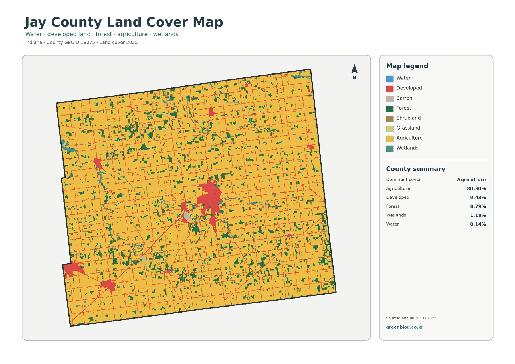
Yellow agricultural cover fills most of the county interior. The developed class forms thin lines along much of the road network and widens into larger patches at towns and built-up intersections. Forest is more fragmented: many green areas are small blocks within the farm grid, while some narrow bands follow low-lying or streamside settings. Water is difficult to see at county scale because it represents only 0.14% of the mapped area.
Land cover should not be confused with zoning, ownership, or parcel boundaries. Annual NLCD classifies the surface into raster cells according to the dominant cover detected for each cell. A yellow cell does not equal one farm parcel, and red developed cover does not tell you whether a site is residential, commercial, industrial, or public. Jay County GIS and Building & Planning information are better sources for those legal and administrative questions.
Wooded patches remain dispersed through the farm grid rather than forming one large forest block
The forest-and-farmland view removes much of the visual competition from developed classes and makes the contrast between cropland and trees easier to follow. Agriculture still occupies nearly every part of Jay County, but the 8.79% forest share appears as many separate green patches. Some are compact woodlots surrounded by fields; others are narrow, irregular shapes that line up with drainage features or stream corridors.
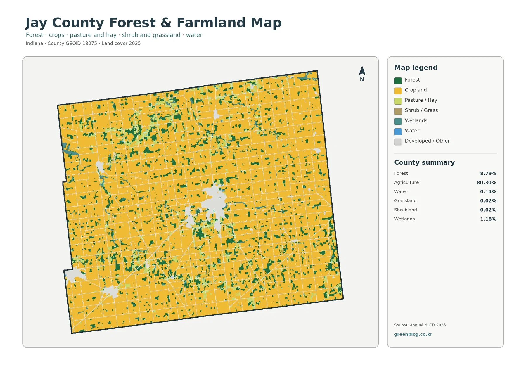
That fragmented pattern matters when comparing the county with places where forest covers a continuous upland or river bluff. In Jay County, most wooded cover is embedded in working farmland. The map therefore helps a reader locate where trees remain relative to fields, but it cannot identify who owns a woodlot, whether it is managed for timber, or whether public access is allowed.
The agricultural class also needs careful interpretation. It describes surface cover, not a crop census. Corn, soybeans, hay, and other field types are not separated in this simplified map, and a single raster cell can contain a mix of field edge, ditch, trees, and structures. For crop production, acreage by commodity, or farm economics, agricultural statistics should be used alongside the land-cover image rather than inferred from color alone.
The Upper Salamonie provides useful context for Jay County’s eastern streamside cover
An Indiana Department of Environmental Management watershed plan states that the Salamonie River begins near Salamonia, close to the Indiana–Ohio border in Jay County. The same source describes the upper watershed as draining major portions of Jay and Blackford counties through a landscape dominated by row-crop agriculture and pasture. That verified watershed context helps explain why narrow wetland, water, and wooded features deserve attention even in a county whose overall map is overwhelmingly agricultural.
Wetlands cover 1.18% of Jay County and open water only 0.14% in the 2025 summary. Those percentages are small, yet teal wetland cells and occasional blue water cells create locally distinct patterns, particularly where they align with greener streamside cover. A countywide percentage can therefore understate the importance of narrow water-related features when the purpose is to compare habitat, drainage settings, or riparian vegetation.
These colors are not regulatory wetland boundaries or surveyed stream lines. Satellite-based classification generalizes the surface, and a mixed cell can be assigned to whichever cover dominates that cell. Site-specific wetland delineation, floodplain work, drainage design, or property decisions require the appropriate field survey and official regulatory data.
Impervious cover is low countywide but strongly concentrated in Portland and town centers
Impervious surface means pavement, rooftops, parking areas, and other hard surfaces that do not readily absorb rainfall. Jay County’s mean impervious value is 2.77%, while 1.03% of the county is mapped at 50% impervious or greater. Developed land covers 9.43%, a larger figure because developed classes can also include lawns, trees, and other surfaces that still absorb some water.
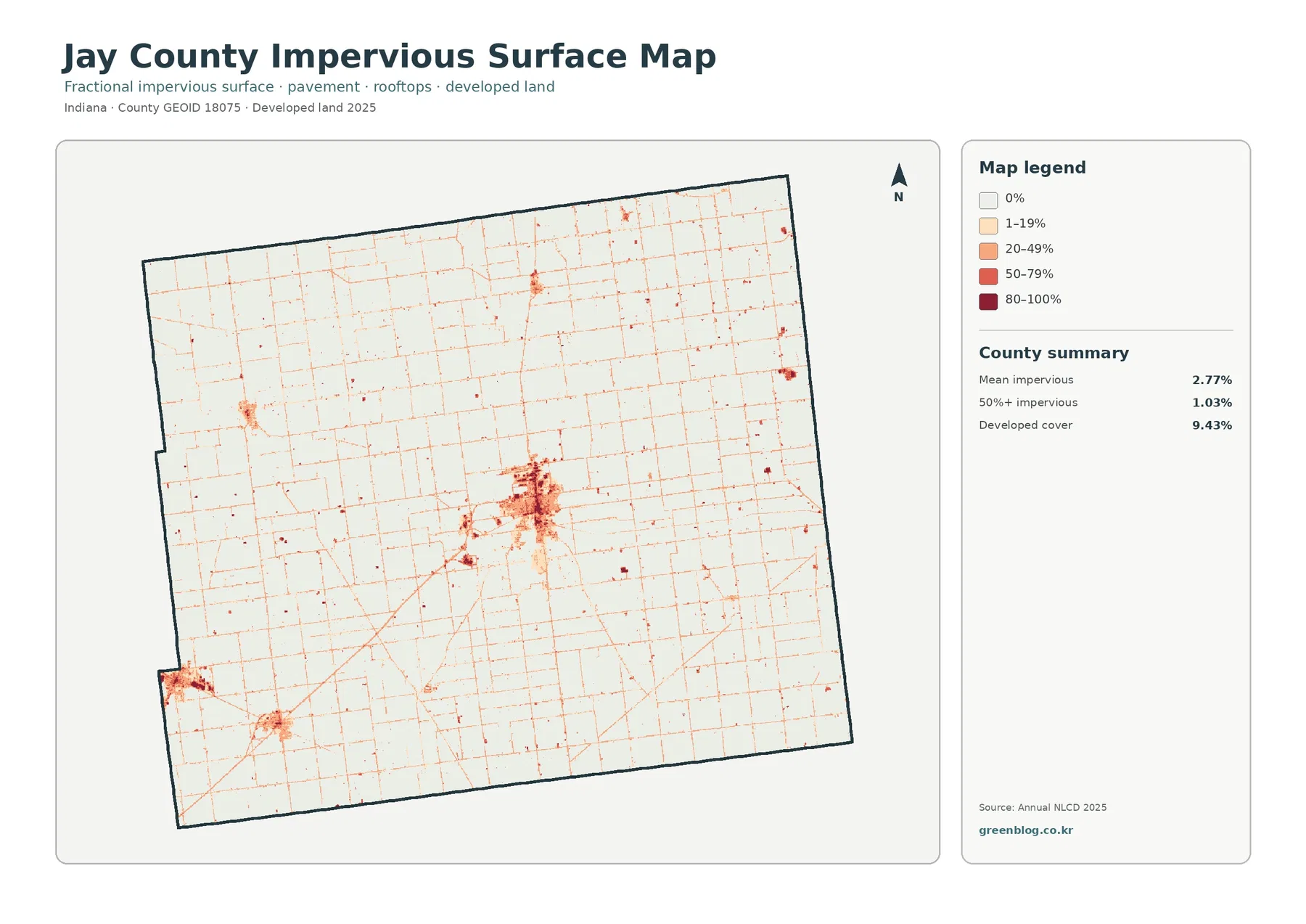
Portland is the clearest dark cluster on this map. The southwest also contains smaller high-impervious concentrations, and individual roads appear as thin orange or red lines across otherwise pale agricultural areas. Comparing this view with the general land-cover map helps separate the broader developed class from the more intensely paved and built surfaces inside it.
The county average of 2.77% should not be treated as a description of Portland itself. Vast agricultural areas pull the countywide mean downward, while individual blocks in Portland and other town centers reach much higher values. For local stormwater or development discussions, the spatial concentration is more informative than the average alone.
This is not a flood-risk map. Impervious surfaces can influence runoff, but flooding also depends on terrain, soil, drainage systems, rainfall, channel capacity, and water levels. Use this layer to identify hard-surface concentration, then consult elevation, drainage, and flood-hazard sources when the question involves water movement or property risk.
The 1985–2025 map records 7.50% class difference, not a single development rate
The change map compares the land-cover class assigned in 1985 with the class assigned in 2025. Jay County has 7.50% total class difference. Of that total, 1.40% is classified as a change to developed cover, 0.53% as forest loss, 0.99% as agricultural loss, and 4.50% as other class difference; wetland difference is also represented in the legend. These categories should be read separately rather than combined into one story of growth.
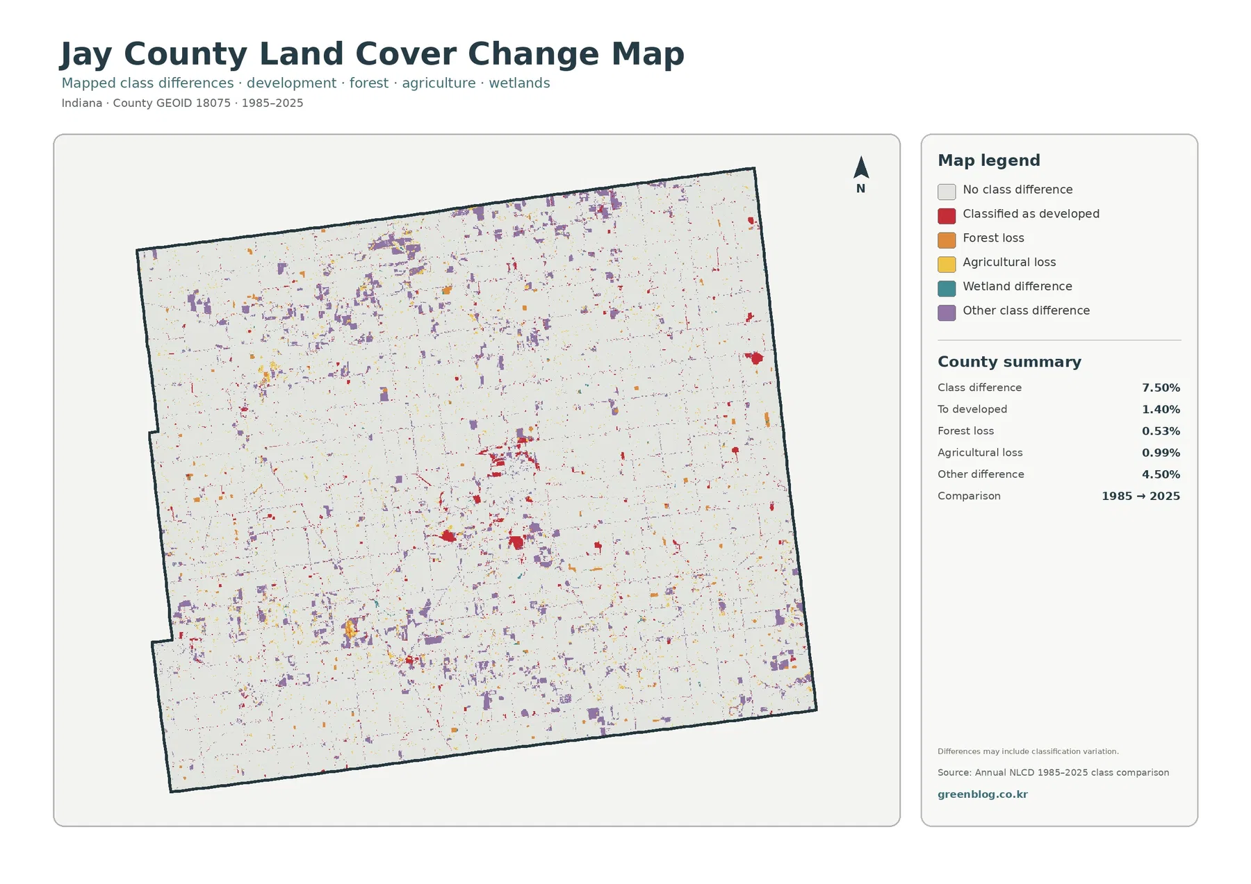
Red change-to-developed cells are most noticeable around Portland and other built concentrations, but they do not fill the entire present-day town. A place that was already developed in 1985 can remain in the same class and appear as no class difference. Purple other-difference cells are more widely scattered, especially in parts of the north and south, while smaller orange and yellow areas mark forest and agricultural loss.
The comparison does not give the exact year when a change happened, nor does it identify its cause. A cell may differ because of a real land-cover transition, because the dominant mix inside the cell changed, or because classification around a field edge, ditch, or wooded strip differed between the two dates. Aerial imagery, local permits, and more detailed time-series data are needed to explain a specific site.
Reading the current map beside the change map prevents a common mistake. Present-day developed land answers where developed cover exists in 2025. The change map answers where the assigned class differs from 1985. Those are related questions, but they are not interchangeable, and the same location can be prominent in one map while remaining light in the other.
A practical reading sequence starts with a place, then compares the same location across all four maps
Portland is the easiest reference point because it appears clearly in every view. Start with the general land-cover image to see the built area against the agricultural background. Move to the impervious map to find where pavement and rooftops are most concentrated, then check the class-difference map to see which nearby cells differ from their 1985 classification. This sequence separates current condition from surface intensity and long-term difference.
For a rural comparison, choose an eastern or northern agricultural area with visible wooded patches. The forest-and-farmland map makes those green patches easier to follow, and the general map adds wetlands and developed cover back into the picture. Near the Salamonia side of the county, the official Upper Salamonie watershed information provides a useful geographic reference for interpreting narrow water-related features without pretending that the land-cover image itself is a stream map.
This approach also works well in classrooms and presentations. Showing the same location four times is more informative than treating each map as an unrelated graphic. A viewer can see why 80.30% agriculture does not erase local differences, why developed cover is not the same as imperviousness, and why a 7.50% class difference should not be described as a 7.50% development increase.
Use the maps for county-scale comparison, then switch to parcel or regulatory data for site decisions
Annual NLCD is a raster dataset, meaning the ground is represented by a grid of cells and each cell receives a dominant class. Small ponds, narrow roads, field-edge trees, drainage ditches, and mixed residential lots can be simplified at that scale. The edge between two colors should therefore be read as a generalized land-cover boundary rather than a surveyed property line.
Time matters as well. The land-cover, forest-and-farmland, and impervious maps describe 2025 conditions, while the change view compares 1985 with 2025. Construction, clearing, planting, wetland change, or other surface changes after 2025 are not represented. Current Jay County GIS, planning records, and field observation should be added when a decision depends on present-day site conditions.
Each downloadable JPG is 2480 × 1754 pixels. The WebP images on the page are convenient for quick viewing, while the JPG set is useful for saving locally, inserting into slides, or printing at a size where the legend remains readable. Keeping all four maps together makes it easier to compare agriculture, forest, hard surfaces, and class difference without mixing their meanings.
Frequently Asked Questions
If agriculture is 80.30%, does most of Jay County look the same?
No. Agriculture dominates the countywide total, but Portland forms a large developed cluster, smaller towns create separate built pockets, and forest and wetland cells remain scattered through the farm grid. The percentage describes the total area; the map is needed to understand where the different covers are located.
Does the map label the Salamonie River directly?
No. This is a land-cover map, not a labeled hydrography map. IDEM identifies the Salamonie River headwaters near Salamonia by the Indiana–Ohio border in Jay County, so that official watershed information can be used as geographic context when reading eastern wetland, water, and wooded features. A dedicated hydrography map is better for exact stream lines.
Can the 7.50% class difference be reported as Jay County’s development growth rate?
No. The 7.50% total combines several categories, including 1.40% change to developed cover, 0.53% forest loss, 0.99% agricultural loss, 4.50% other class difference, and wetland differences. It measures changes in assigned land-cover classes between two dates, not one economic or development growth rate.
Map File Information
The ZIP contains four original JPG maps for Jay County: 2025 land cover, forest and farmland, impervious surface and developed land, and 1985–2025 land-cover class difference.
- Printable Size: 2480 × 1754 px each
- File Type: ZIP containing 4 JPG files
- Intended Use: printing, teaching, presentations, county land-cover comparison, and reference
Related Maps
- Adams County Indiana Land Cover Map
- Allen County Indiana Land Cover Map
- Bartholomew County Indiana Land Cover Map
Sources and References
- MRLC Annual NLCD Data – official source for Annual NLCD land-cover products
- USGS Annual NLCD Land Cover Classification – classification definitions and Annual NLCD background
- U.S. Census Bureau TIGER/Line Shapefiles – official geographic boundary source used for county reference
- Indiana – Jay County Government – county departments and local government context for Portland and Dunkirk
- Indiana Counties Directory – official county-seat, city, and town reference for Jay County
- IDEM – Upper Salamonie River Watershed Management Plan – watershed context for the headwaters near Salamonia and Jay County
Green Map creates custom-edited map images using open geographic data sources such as geoBoundaries, Natural Earth, OpenStreetMap, and government open data.
These maps are edited visual materials, not raw data files, and are provided for education, documents, presentations, and graphic reference.