Agriculture covers 71.44% of Daviess County in the supplied 2025 data, but the county is not a single uninterrupted farm grid. The winding White River edges on the west and south, Washington’s large developed center, forested areas in the northeast and south, and several wetland and water concentrations give the county a more varied surface pattern. This Daviess County Indiana Land Cover Map set makes those differences easier to compare without treating land cover as property or zoning information.
The page includes four views: current land cover, forest and farmland, impervious surface and developed land, and 1985–2025 class difference. WebP versions are used for quick reading on the page. The four original 2480 × 1754-pixel JPG maps are available together in one ZIP for county profiles, classroom work, presentations, and broad environmental comparison.
Table of Contents
Washington stands out inside a county that is otherwise dominated by working land
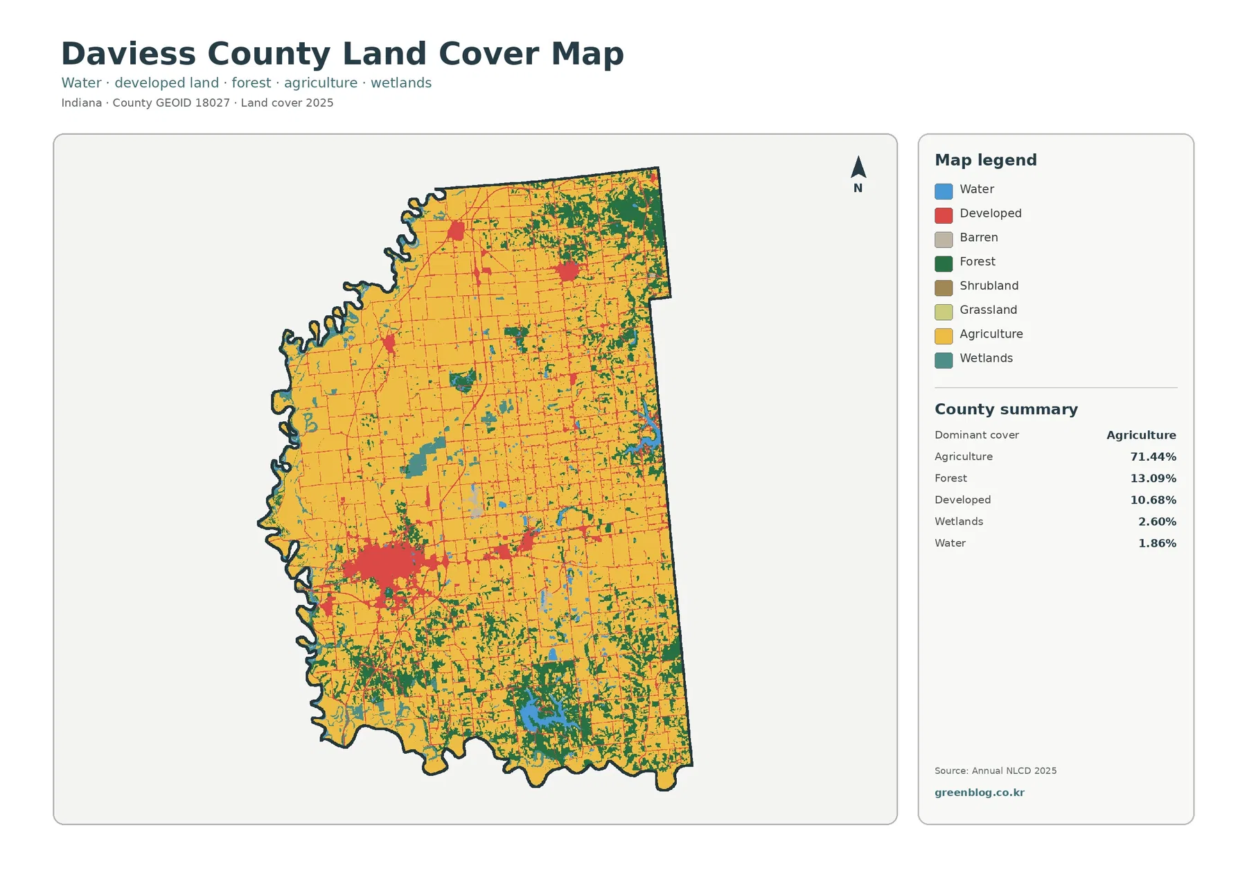
The county summary lists agriculture at 71.44%, forest at 13.09%, developed cover at 10.68%, wetlands at 2.60%, and water at 1.86%. Large yellow agricultural areas fill much of the center, northwest, and east. Dark-green forest becomes more common toward the northeast and across parts of the south, while small wetland and water cells interrupt the farm pattern in several places.
The largest red developed concentration lies in the southwest-central part of the county and matches the Washington area. Daviess County’s courthouse and government offices are in Washington, which provides a reliable local reference for that major built cluster. Development extends beyond the core in thinner traces and scattered patches, but the surrounding agricultural cells remain the dominant surface once the map moves away from the city.
Smaller developed concentrations appear farther north and east. Indiana’s county directory lists Elnora, Odon, Montgomery, Plainville, Cannelburg, Alfordsville, and Washington among the county’s incorporated places. The land-cover graphic does not label those towns, however, so a small red patch should not be assigned to a specific community by shape alone. A county road map or GIS layer is the better source when the exact place name matters.
Land cover describes what the surface was classified as from imagery. It is not a parcel map, ownership map, zoning plan, or statement that a site can be developed. A developed cell can contain lawns, trees, bare ground, and buildings. An agricultural cell can include more than a single crop field. That distinction is especially important in Daviess County because so much of the county is mapped as agriculture and the farm blocks can look deceptively similar to parcel boundaries.
A 2.90% impervious average hides a much stronger hard-surface center around Washington
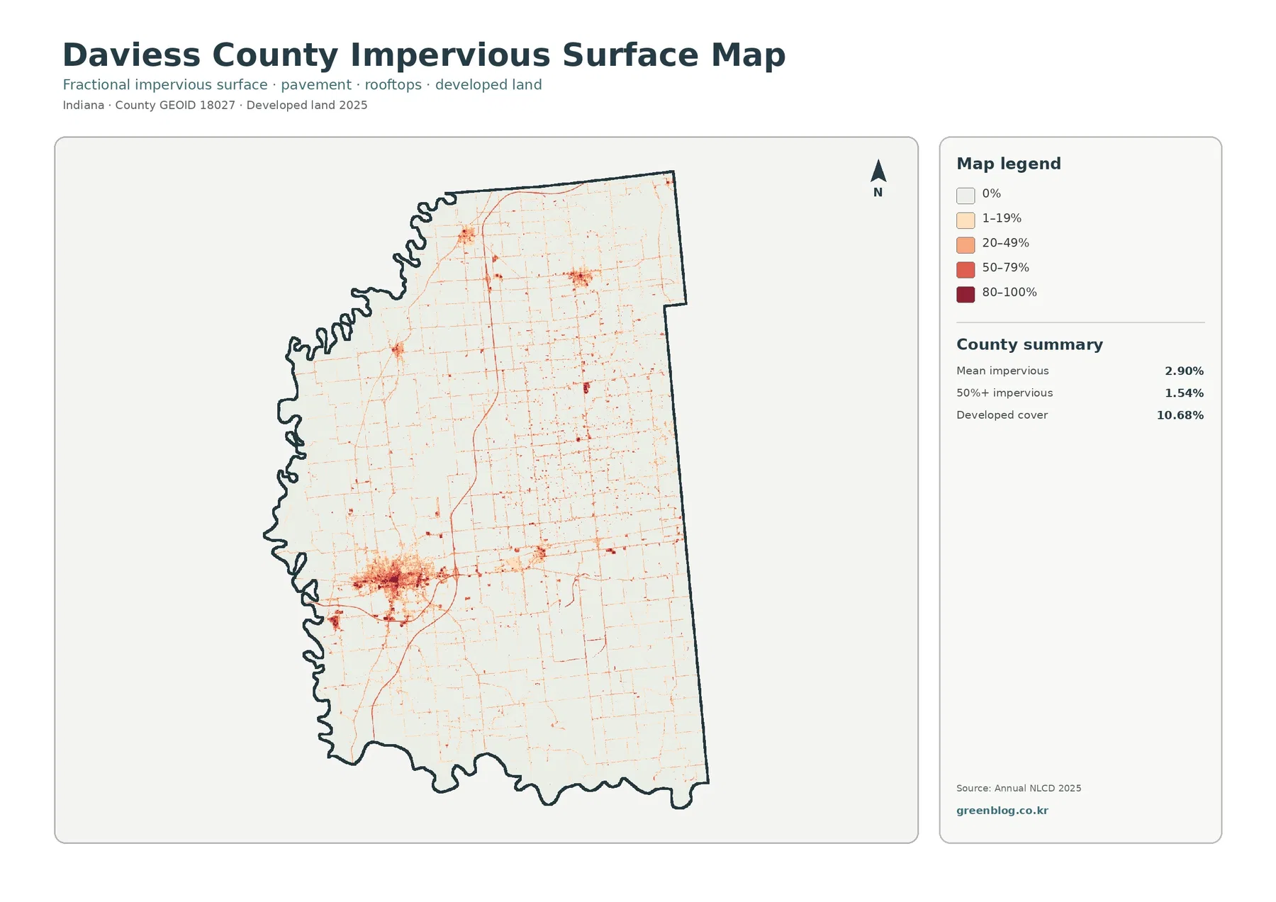
Mean impervious cover is 2.90%, and 1.54% of the county is mapped at 50% impervious or greater. Those numbers are far below the 10.68% developed share on the general map. The reason is simple: developed land-cover classes can include permeable surfaces around houses, businesses, and roads, while the impervious layer focuses on roofs, pavement, parking areas, and other surfaces that shed water rather than absorb it.
Washington forms the darkest and broadest cluster. The core contains many high-percentage cells, and finer linear marks extend outward through the agricultural landscape. Smaller hard-surface centers also appear in the north and northeast. The lines often resemble roads, but route names are not printed on the preview, so an apparent transportation line should be checked against an official road network before it is identified as I-69, US 50, US 231, or any other specific route.
A countywide average smooths together very different places. Large farm areas are close to zero impervious cover, while Washington and smaller settlements contain much higher values. For comparing development intensity, the size and continuity of darker cells are therefore as useful as the 2.90% average. The map can also help frame runoff questions, but it cannot determine flood risk by itself.
Daviess County’s river setting makes that limitation important. Runoff and flooding also depend on rainfall, soil, elevation, drainage, river stage, wetlands, and levees. The impervious layer tells the reader where hard surfaces are concentrated. It does not say whether a particular field, street, or parcel will flood during a storm.
The White River forks shape the county edge even though water is only 1.86% of mapped cover
The western side of Daviess County follows a strongly winding boundary, and the southern edge is also river-defined. USGS describes the West Fork and East Fork of the White River as meeting at the Knox-Daviess-Pike county boundary area. Daviess County historical material likewise places the West Fork on the west and the East Fork on the south. That geography explains why the county outline is much more irregular along those sides than along the straighter northern and eastern edges.
Open water accounts for 1.86% of the 2025 classification, but blue cells alone do not represent the full river environment. Wetlands account for 2.60% and appear in patches along river-adjacent areas, through the interior, and around some larger water bodies. A wetland cell can contain vegetation or seasonally saturated ground, while a water cell is closer to an exposed water surface. The two classes are related but should not be merged.
Neither class is a legal boundary. A teal wetland cell is not automatically a jurisdictional wetland, and a blue cell is not a floodplain or navigable-waterway line. Daviess County’s GIS site specifically warns that its online mapping is not a survey and that primary records should be consulted for verification. Property, floodplain, wetland-permit, and engineering questions therefore require current specialized sources beyond this land-cover set.
Forest and farmland become easier to separate once developed surfaces are faded
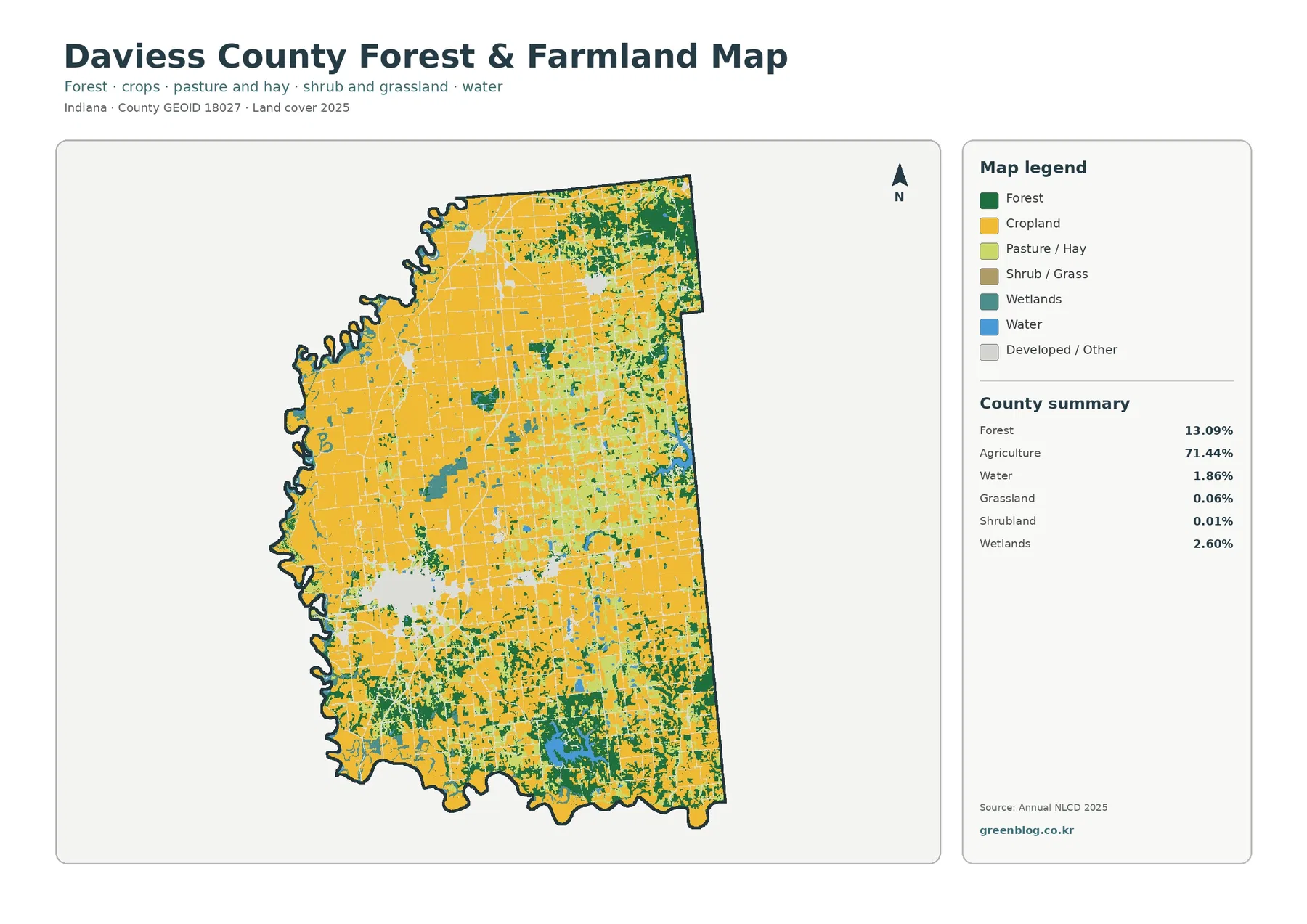
The forest-and-farmland view makes the 71.44% agricultural share visually unmistakable. Broad cropland blocks dominate the central and northwestern parts of the county and continue across much of the east. Forest, at 13.09%, is not evenly distributed. Larger dark-green concentrations appear in the northeast and south, while smaller tree-covered pieces occur along field edges and around wet or water-rich areas.
The southeast is particularly different from the open farm country farther north. A large water-and-forest concentration appears there, and Indiana DNR’s Glendale Fish & Wildlife Area provides useful local context. The property is based near Montgomery and includes more than 1,400 acres of lakes and impoundments within an 8,060-acre management area, including Dogwood Lake. That official description is consistent with the strong blue and dark-green presence in the southeast.
The land-cover map does not draw the Glendale property line, so the entire southeast should not be labeled as public wildlife land. The same caution applies to other natural-resource properties. The map classifies surface cover regardless of ownership. Public forest, private woodland, farm windbreaks, riparian trees, and other wooded areas can all appear in the same forest color.
Grassland is only 0.06% in the supplied summary and shrubland is 0.01%. Those tiny classes are visible only as scattered pieces and do not define the countywide pattern. For most readers, the useful comparison is among agriculture, forest, development, wetlands, and water. Keeping attention on those larger classes makes the map easier to read without losing the smaller categories when they matter locally.
Frequently Asked Questions
Does 71.44% agriculture mean nearly three-quarters of Daviess County is one type of farm field?
No. It means 71.44% of the 2025 land-cover cells are classified in agricultural categories. Forest, developed land, wetlands, water, and smaller classes remain mixed through the county, and the agricultural color does not identify a crop, farm operator, or parcel boundary.
Why does the southeast contain much more water and forest than most of the county?
Indiana DNR documents Glendale Fish & Wildlife Area near Montgomery, including Dogwood Lake and more than 1,400 acres of lakes and impoundments. That official setting is consistent with the strong water-and-forest concentration in the southeast, but the land-cover map does not show the property boundary, so not every nearby blue or green cell belongs to Glendale.
Is the 16.57% 1985–2025 class difference the amount of land that was developed?
No. Developed conversion is listed separately at 2.75%. Forest loss is 1.65%, agricultural loss is 1.20%, and other class difference is 10.75%. The total represents all endpoint classification differences, and the cause or timing of a specific change requires intermediate imagery and local records.
The 16.57% endpoint difference is driven mostly by the 10.75% “other” category
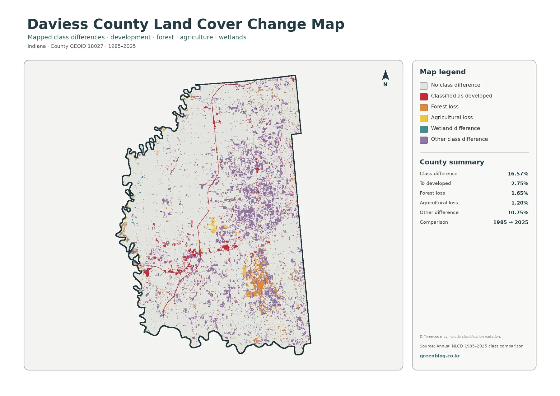
Total class difference between 1985 and 2025 is 16.57%. The listed components are 2.75% classified as developed, 1.65% forest loss, 1.20% agricultural loss, and 10.75% other class difference. Wetland difference appears in the legend but does not have a separate percentage in the summary. A residual value should not be invented and presented as an official wetland-change statistic.
Purple “other difference” cells are widespread across the central and eastern parts of the county and become especially noticeable in several southeastern areas. Because this category is the largest component, the 16.57% total cannot be described simply as urban growth or vegetation loss. A different endpoint class may reflect real surface change, but seasonal conditions, mixed cells, vegetation state, and classification variation can also affect the comparison.
Red developed-conversion cells are more concentrated around Washington and along some outward linear traces, with smaller clusters in other settlement areas. Orange forest-loss and yellow agricultural-loss cells appear in scattered pieces and in a few larger concentrations. The colors indicate that the endpoint labels changed; they do not identify the exact project, year, landowner, or cause.
Current cover and endpoint change also use different denominators and meanings. The 10.68% developed share describes what is developed in 2025. The 2.75% developed-conversion value describes cells that changed into a developed class between the two endpoints. Likewise, 71.44% current agriculture is not the opposite of 1.20% agricultural loss. Keeping those measures separate prevents a common reading error.
Use the 2025 maps first and add the change layer only after the present pattern is clear
For a general county profile, the current land-cover map is the best opening image. It shows the broad farm landscape, Washington’s built center, White River edges, forest concentrations, and the large southeast water-and-forest area in one frame. The forest-and-farmland view works well as the next step when the reader needs a cleaner comparison between working land and natural cover.
The impervious map answers a narrower question: where are hard surfaces concentrated? It explains why a county can have 10.68% developed cover while the mean impervious value is only 2.90%. The 1985–2025 layer should usually come later because its red and other colored cells represent change categories, not present-day land-cover classes.
A classroom or presentation can keep the distinction simple by assigning one question to each image. Use current cover for “what is here now,” forest and farmland for “how do fields and natural cover meet,” impervious surface for “where are roofs and pavement concentrated,” and endpoint difference for “where did the classification differ between 1985 and 2025.” That sequence reduces the chance that one legend will be read as another.
The 30-meter cell size is useful for county patterns but not for farm or parcel boundaries
Annual NLCD uses roughly 30-meter raster cells. Each cell receives a predominant land-cover label even when a field edge, tree line, ditch, road, lawn, and building share the same square. Zooming into the map enlarges the cells on screen but does not recover missing survey detail. Narrow features can be generalized into the surrounding class, especially where farms, roads, and riparian vegetation meet.
The current map is tied to the supplied 2025 observation year. Construction, harvest, crop rotation, tree clearing, vegetation recovery, storms, or water conditions after that observation may not be shown. The change product is also an endpoint comparison, not a continuous record of every year from 1985 through 2025. A cell can change during the interval and return to its original class without appearing as an endpoint difference.
Those limitations define the right scale of use. The maps are well suited to countywide agriculture, forest, development, water, wetland, and long-term comparison questions. They are not zoning maps, parcel surveys, flood-insurance products, wetland-jurisdiction determinations, or engineering plans. Site-specific decisions need current higher-resolution imagery and the appropriate official records.
Four original JPGs let one county story be told without forcing one map to do everything
The 2025 overview is the strongest single image for a county introduction because it puts all major classes in one frame. A farm or natural-resource lesson can add the forest-and-farmland view to emphasize field blocks, wooded areas, and water-rich zones. A development discussion can use the impervious map to isolate Washington and the smaller hard-surface centers from the surrounding agricultural landscape.
The endpoint-difference layer is useful when historical comparison is the subject, but its 16.57% total should be broken into the listed components rather than described as one type of change. The 10.75% “other difference” category is larger than the developed, forest-loss, or agricultural-loss components, so any explanation that treats the whole map as development would misrepresent the supplied data.
Each original JPG measures 2480 × 1754 pixels. The package does not mark the files as meeting an A3 high-resolution reference, so test a large print before committing to poster output. The WebP previews are convenient for reading the page, while the JPG files in the ZIP are better for saving, inserting into documents, or comparing side by side.
Map File Information
The ZIP contains four original JPG maps for comparing Daviess County’s 2025 farm-dominant cover, forest and water areas, Washington hard surfaces, and 1985–2025 class differences.
- Included Files: Four JPG maps described in this article
- File Type: JPG files bundled in one ZIP archive
- Intended Use: Printing, education, presentations, and map-based projects
Related Maps
- Adams County Indiana Land Cover Map
- Allen County Indiana Land Cover Map
- Bartholomew County Indiana Land Cover Map
Sources and Reference Data
- MRLC Annual NLCD Data – official access point for annual land-cover and comparison products
- USGS Annual NLCD Land Cover Classification – definitions and guidance for agriculture, forest, developed land, wetlands, and the raster framework
- U.S. Census Bureau TIGER/Line Shapefiles – official county-boundary reference for Daviess County
- Daviess County GIS Mapping – county mapping, public-record context, and the county’s map-use disclaimer
- Indiana DNR – Glendale Fish & Wildlife Area – official information on Dogwood Lake, lakes and impoundments, and natural-resource management near Montgomery
- Purdue Extension Daviess County – local Agriculture and Natural Resources programs and county extension information
Green Map creates custom-edited map images using open geographic data sources such as geoBoundaries, Natural Earth, OpenStreetMap, and government open data. These maps are edited visual materials, not raw data files, and are provided for education, documents, presentations, and graphic reference.