Gooding County has three large land-cover classes rather than one overwhelmingly dominant surface. The 2025 summary reports 36.61% shrubland, 29.28% agriculture, and 28.18% grassland. Developed land accounts for 5.23%, while water is 0.41%, wetlands 0.28%, and forest only 0.01%. Their locations matter as much as the percentages because the northern and southern halves of the county look noticeably different.
The page includes four views: general land cover, forest and farmland, impervious and developed surfaces, and a 1985-to-2025 class-difference map. You can inspect the WebP maps on the page and download the four original JPG files together in one ZIP for printing, comparison, classroom use, or reference.
Table of Contents
The county changes from broad northern shrubland to a more divided southern landscape
The northern half of Gooding County is the simplest part of the land-cover pattern. Large brown shrubland areas occupy most of the upper map, with lighter grassland entering more often toward the center. Roads and developed traces are sparse there. This broad, open appearance contrasts with the lower half, where agricultural blocks, grassland, shrubland, and developed lines form a much finer pattern.
Shrubland is the largest single class at 36.61%, but its geography is uneven. It forms the most continuous surface in the north and becomes more fragmented farther south. In the central zone, shrubland is repeatedly interrupted by grassland and agriculture. Reading that distribution prevents the countywide percentage from being mistaken for a uniform cover across every part of Gooding County.
Agriculture is almost as important at 29.28%. Yellow farm areas become extensive through the middle and lower portions of the county and appear in large blocks as well as smaller pieces. The southern part contains the most continuous concentration. The map does not show legal farm parcels, however, so the edge of a yellow raster patch should not be treated as a surveyed property boundary.
Grassland reaches 28.18%, only slightly below agriculture. Light green areas are especially noticeable across the center and remain mixed among agricultural blocks in the south. Because grassland and cropland can both look like open country from a distance, keeping the legend categories separate is important when the goal is to compare cultivated land with other herbaceous cover.
The forest-and-farmland view makes the agricultural grid easier to separate from open land
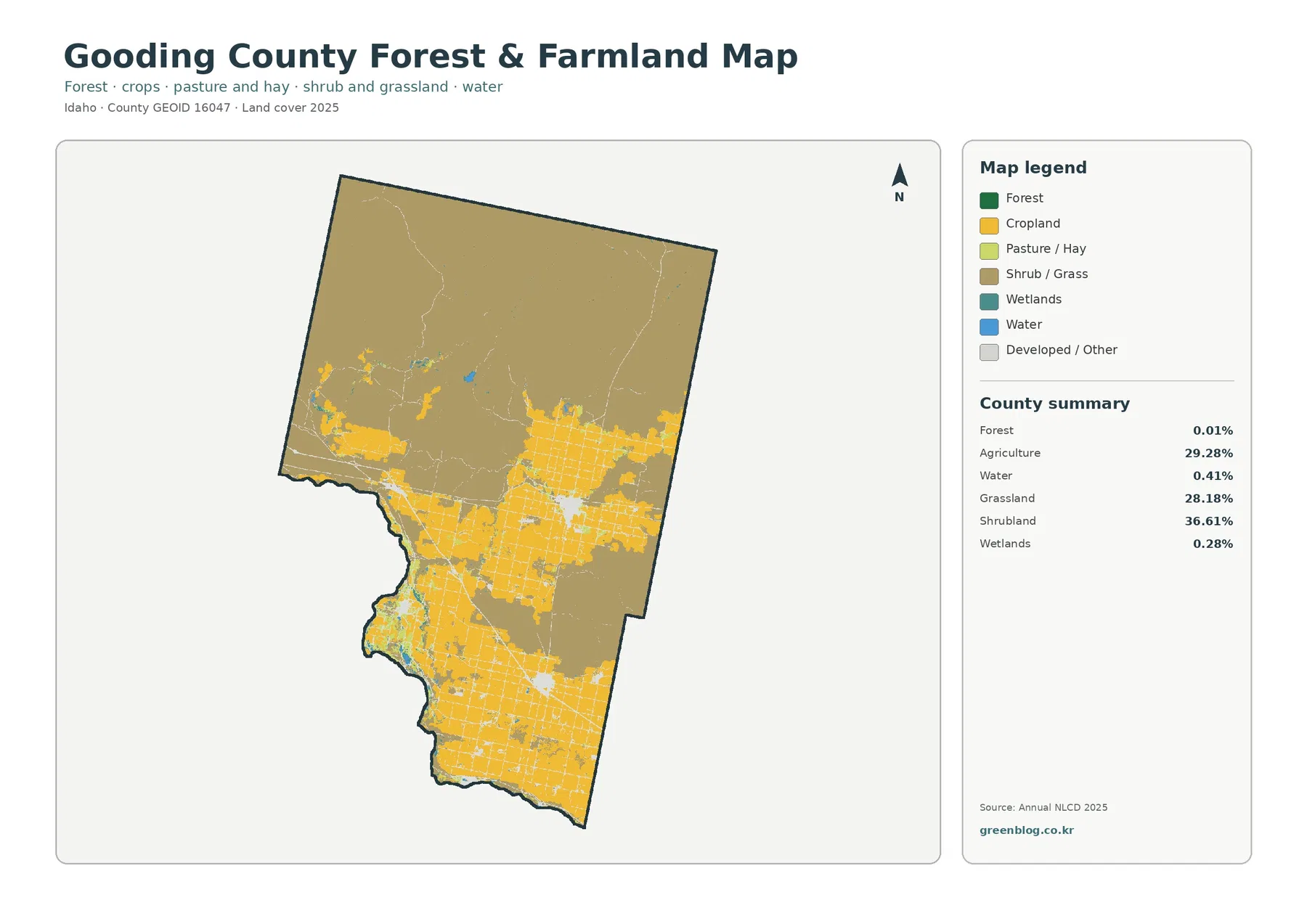
This simplified map emphasizes how strongly agriculture is concentrated in the middle and south. Cropland forms broad yellow blocks, and a dense grid of pale developed or other lines cuts across many of them. The north remains mostly shrub and grass. That difference is useful when a reader wants to understand where the 29.28% agricultural share is located rather than simply knowing the countywide percentage.
The farm-oriented legend also helps distinguish cropland from pasture or hay. Those classes can sit next to one another but should not be combined automatically. A field classified as cropland represents a different surface class from an herbaceous pasture or hay area. For countywide comparison, keeping those categories distinct avoids exaggerating the amount of cultivated ground.
Wetlands make up 0.28% and appear as small teal patches or narrow pieces, especially near the curved western and southwestern edge and around a few interior water features. Their small percentage means many patches become difficult to see when the map is reduced on screen. The map can indicate where wetland-class cells occur, but it does not determine legal wetland status or regulatory boundaries.
Forest is only 0.01% in the supplied 2025 summary. For that reason, the Gooding County article should not be framed as a forest map with a few farms. The forest category is present in the legend because the map uses a standard set of classes, yet it contributes almost nothing to the countywide total. That tiny share is itself a useful contrast with the large shrubland, agriculture, and grassland values.
The general land-cover map is the clearest starting point for the 2025 pattern
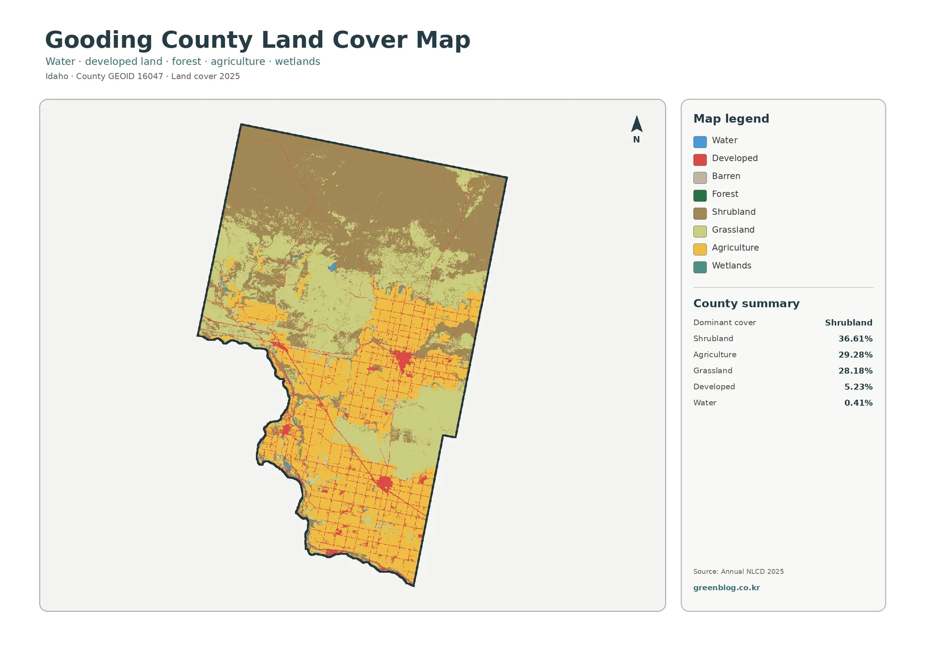
The general map is the best single image for understanding Gooding County as a whole. It shows the large shrubland mass in the north, the broad grassland transition through the center, and the agricultural concentration in the south in one frame. Developed red lines and clusters are superimposed on that pattern, so the reader can see how the built footprint is distributed without losing the surrounding land-cover classes.
Developed land accounts for 5.23%. The red class appears mostly as thin lines and compact clusters rather than as one large continuous block. Several of the strongest clusters lie in the central and southern portions, while the northern part contains much less red. A visually bright color can make development seem more extensive than its percentage, so the 5.23% figure should stay in view when interpreting the image.
Water represents 0.41% of the county. Blue features follow parts of the irregular western and southwestern edge and also appear at a few interior locations. The supplied map does not label those water bodies, so this article does not assign names that are not present in the package. Even without labels, the blue class is useful as a reference when comparing nearby agriculture, wetlands, and developed surfaces.
The map also shows why percentages alone are incomplete. Agriculture and grassland differ by only 1.10 percentage points, yet their shapes and locations are not interchangeable. Large farm blocks occupy specific parts of the middle and south, while grassland spreads more broadly through transition zones. The combination of area share and geographic placement gives a more useful picture than ranking the classes by percentage only.
Impervious surfaces reveal concentrated built points inside a mostly permeable county
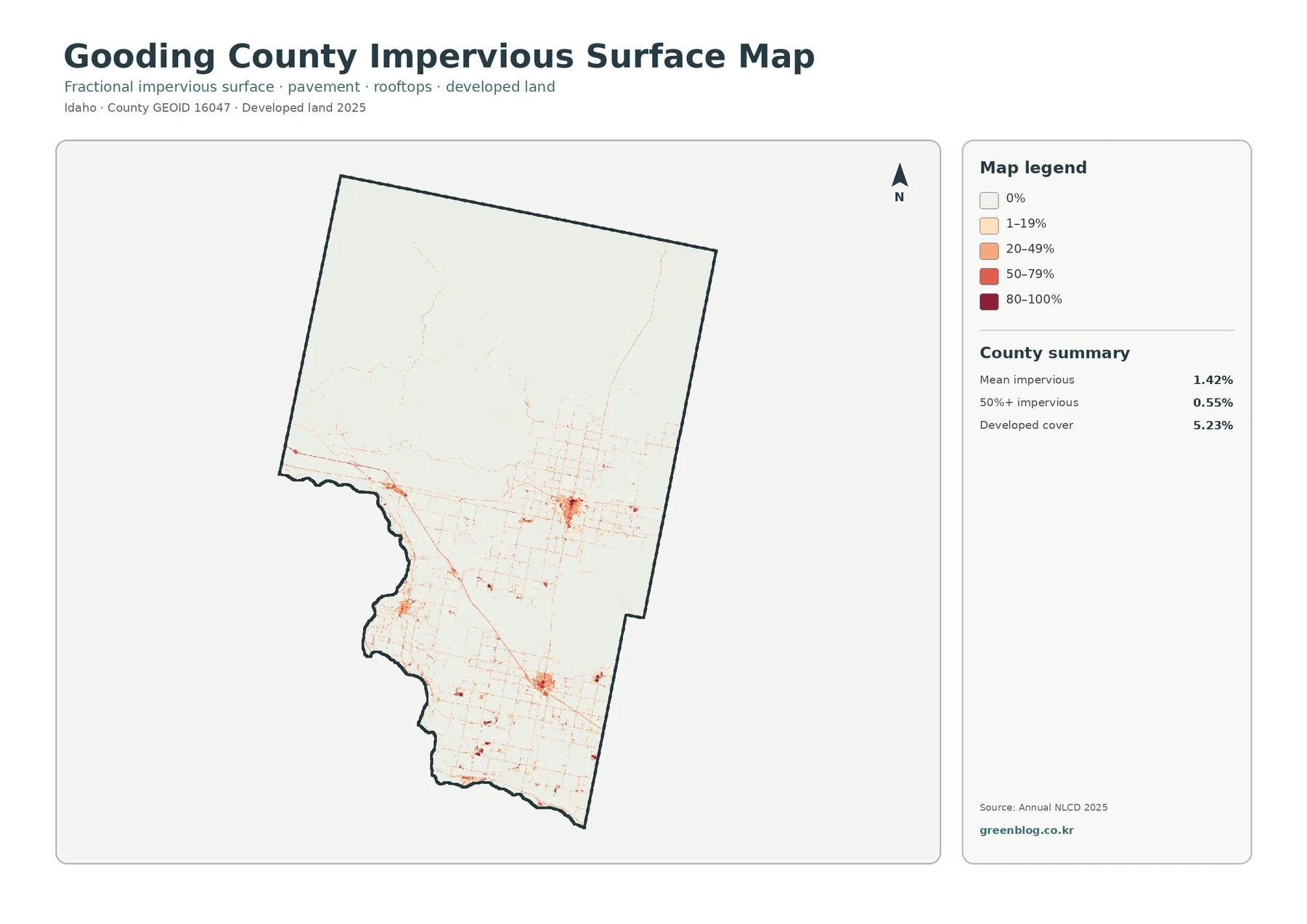
Impervious surface means pavement, rooftops, parking areas, and similar materials that do not readily absorb water. Gooding County has a mean impervious value of 1.42%, while cells with at least 50% impervious cover account for 0.55%. Those values are much smaller than the 5.23% developed-land class, illustrating that developed land is not the same thing as fully paved or built surface.
The darkest impervious concentrations occur at several compact points in the central and southern county. Thin lines connect many of them and create a noticeably denser grid in the lower half. Northern traces are much sparser. This distribution matches the broader contrast visible on the land-cover map without requiring a claim about why development occurs in any particular location.
A developed raster cell can contain a mix of pavement, buildings, vegetation, and exposed soil. For that reason, converting the 5.23% developed value directly into an estimate of roof or road area would be misleading. The 1.42% mean impervious measure addresses hard surfaces more directly, but even that value is a countywide summary rather than a building-by-building measurement.
The map is useful for identifying relative concentrations, not for measuring individual roads. A narrow road or small structure can occupy only part of a 30-meter cell and may be mixed with nearby ground. Parcel review, engineering, or site planning would require higher-resolution imagery and authoritative local data rather than this countywide visualization.
A 19.15% class difference highlights where the two mapped years do not agree
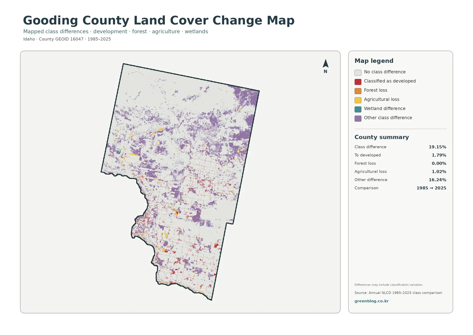
The long-term comparison reports a total class difference of 19.15%. White areas are cells assigned to the same broad class in both mapped years, while colored areas mark different classifications. Purple other-class differences are widespread through the north and center and continue in smaller pieces across the agricultural south. Red developed differences are more concentrated in the lower and central portions.
The summary lists 1.79% as classified to developed, 0.00% in the forest-loss category, 1.02% agricultural loss, and 16.24% other class difference. The legend also includes a wetland-difference color, but the supplied summary does not provide a separate wetland percentage. Rather than inventing a number, the article treats that category only as a visible legend class.
The 19.15% figure should not be described as a measured permanent conversion rate. The map itself warns that the differences may include classification variation. Changes in observation conditions, classification methods, mixed raster cells, or vegetation state can affect how two years compare. A colored cell therefore identifies a place to investigate, not a verified cause.
For a more careful time-series question, the intermediate Annual NLCD years are the logical next step. They can show whether a class difference appears abruptly, persists across many years, or changes back later. This approach is more defensible than assigning every colored patch to development, agricultural abandonment, or another specific process from the two-year image alone.
Use each map for a different question rather than treating the four views as duplicates
Start with the general land-cover map when the goal is a countywide overview. It keeps shrubland, agriculture, grassland, developed land, water, wetlands, and the tiny forest class in one visual system. That makes it the most practical first image for comparing Gooding County with another county using the same year and classification scheme.
Use the forest-and-farmland view when agricultural location matters more than the full legend. Its simpler categories make the southern farm blocks and surrounding shrub or grass easier to separate. The map is also useful for showing that a large agriculture percentage can be geographically concentrated instead of evenly distributed.
The impervious map answers a different question: where are paved and built surfaces concentrated relative to the rest of the county? It provides more detail about the road-and-settlement pattern than the general map. The change map should come last because it introduces a time comparison and needs the strongest caution about classification differences.
Land-cover colors describe surface classes, not ownership or zoning
Annual NLCD is a raster product. The ground is divided into cells, and each cell receives a representative land-cover class based on the mapping system. The general land-cover product uses 30-meter resolution, so one cell can contain more than one real-world surface. A sharp color boundary on the map should therefore not be treated as a surveyed fence or parcel line.
Land cover is also different from legal land use. A yellow agricultural cell does not establish a parcel’s zoning, and a red developed cell does not prove that every part of the cell is occupied by buildings or pavement. Ownership, development rights, zoning, and road jurisdiction must be checked in separate authoritative records.
Small classes need special care. Water at 0.41%, wetlands at 0.28%, and forest at 0.01% may almost disappear when the image is viewed at reduced size. Strong blue or red contrast can also make small features look more important than their actual area share. Reading the map together with the numeric summary keeps visual emphasis in perspective.
Keep the year and map type consistent when printing or comparing counties
For a printed reference sheet, the general land-cover map is the strongest first choice because the three major classes can be compared immediately. The forest-and-farmland view adds detail when the southern agricultural pattern is the subject, while the impervious map is more appropriate for a discussion of built surfaces. Using all four is most useful when each image has a distinct purpose rather than repeating the same explanation.
County comparisons work best when the same year and same map type are paired. Comparing Gooding County’s 2025 general map with another 2025 general map allows shrubland, agriculture, grassland, and developed shares to be compared on similar terms. Comparing a single-year map with a 1985-to-2025 difference map would mix two different concepts and can create misleading conclusions.
The set also provides a clear example for explaining the difference between land cover and land use. These maps classify the physical surface as shrubland, grassland, agriculture, water, wetlands, forest, or developed land. They do not show who owns the land, what legal activities are permitted, or whether a site can be developed.
Frequently Asked Questions
Which land-cover class is largest in Gooding County?
Shrubland is the largest class in the supplied 2025 summary at 36.61%. Agriculture follows at 29.28% and grassland at 28.18%. The percentages are close enough that location matters: shrubland is most continuous in the north, while agriculture and grassland become much more prominent through the center and south.
Why is developed land 5.23% when mean impervious cover is only 1.42%?
Developed land and impervious cover measure different things. A developed raster cell can still include vegetation, soil, or other permeable surfaces, while the impervious product estimates the share occupied by hard surfaces such as pavement and rooftops. That is why a county can have a larger developed-land percentage than its mean impervious value.
Can the 19.15% 1985-to-2025 difference be used as a permanent land-conversion rate?
No. The map compares classifications at two dates and explicitly notes that classification variation may be included. The colored cells identify places where the mapped class differs, but determining when, why, and whether a change persisted requires intermediate annual data and more specific local or thematic records.
Map File Information
The four original JPG maps for Gooding County are provided together in one ZIP file.
- Intended Use: printing, county comparison, classroom and presentation reference
Related Maps
Sources and references
- MRLC Annual NLCD Data – annual land-cover and impervious products represented in the map set
- USGS Annual NLCD Land Cover Classification – class definitions and 30-meter raster interpretation
- U.S. Census Bureau TIGER/Line Shapefiles – county boundary reference
Green Map creates custom-edited map images using open geographic data sources such as geoBoundaries, Natural Earth, OpenStreetMap, and government open data. These maps are edited visual materials, not raw data files, and are provided for education, documents, presentations, and graphic reference.