This article compares U.S. County Population Growth using the available data. Did the U.S. counties that grew fastest also become more expensive to live in? A county-by-county comparison of the 2019 and 2024 U.S. Census Bureau ACS 5-year estimates points to a qualified yes. Among 999 counties with at least 50,000 residents in the 2024 estimate, 324 grew by 5% or more. In 257 of those fast-growing counties (79.3%), median owner-occupied home value increased at least 20 percentage points faster than median household income. Rent pressure was less universal but still substantial: 151 fast-growing counties (46.6%) had median gross-rent growth at least 5 points above income growth.
That pattern does not prove that population growth caused the housing-cost increase. It shows where rapid growth and cost pressure overlapped, which is a different and more defensible question. Every ranking, threshold and comparison below was calculated from the verified Census datasets supplied in the package; no article or blog prose was used as evidence.
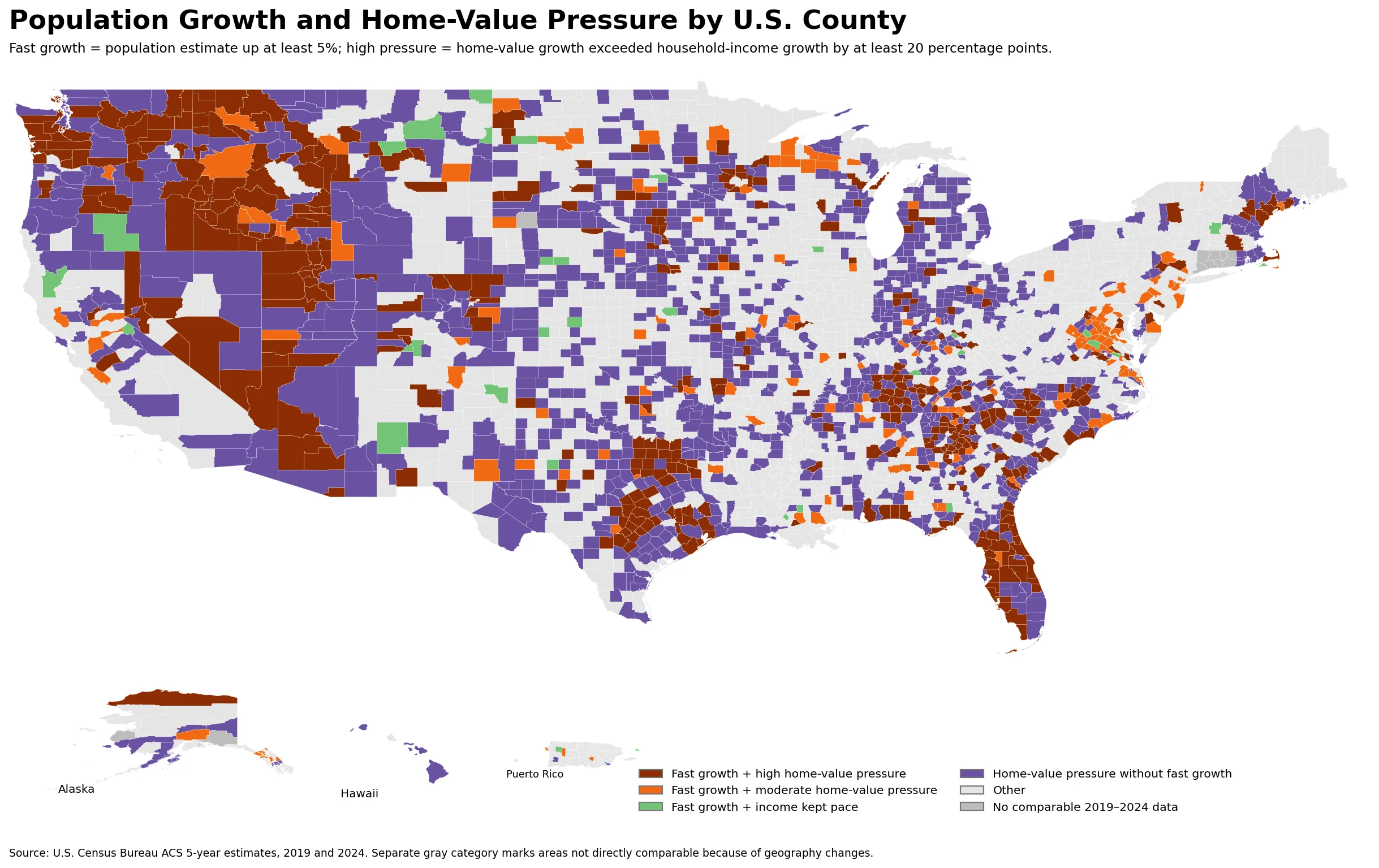
Table of Contents
U.S. County Population Growth — Where rapid growth and home-value pressure overlap
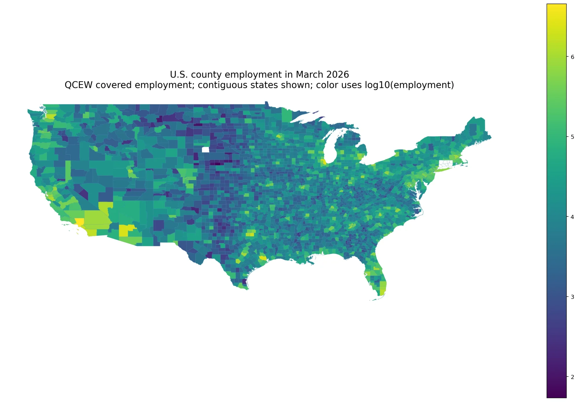
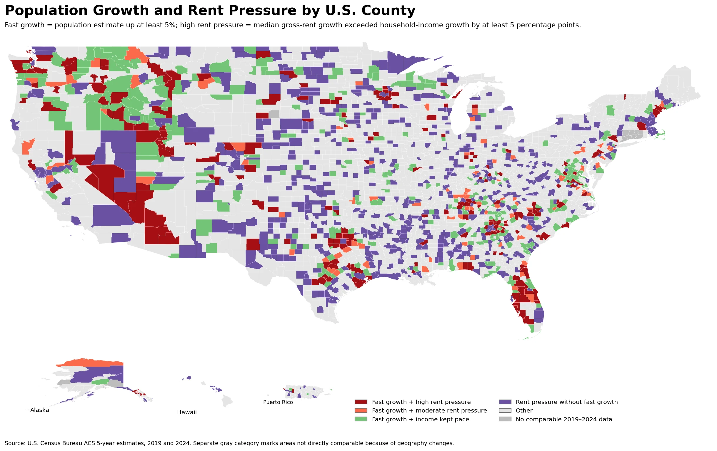
The map shows several broad clusters rather than one continuous national belt. Idaho and Utah stand out across the interior West, while Florida has a large concentration of high-overlap counties. Washington also has a high share of counties in the strongest category. The Southeast contains a more broken pattern across Tennessee, Georgia, the Carolinas and parts of Florida. Texas is especially useful for seeing why county detail matters: many rural counties were slow-growing or shrinking, while counties around the Dallas-Fort Worth, Austin and San Antonio growth corridors moved in the opposite direction.
| State | High-overlap counties | Share | Median county population growth | Median home-value minus income growth |
|---|---|---|---|---|
| Idaho | 32/44 | 72.7% | 8.7% | 49.4 pp |
| Washington | 25/39 | 64.1% | 5.6% | 36.9 pp |
| Utah | 15/29 | 51.7% | 7.2% | 41.7 pp |
| Florida | 33/67 | 49.3% | 6.1% | 34.7 pp |
| Nevada | 7/17 | 41.2% | 3.3% | 32.1 pp |
| Arizona | 5/15 | 33.3% | 2.3% | 31.3 pp |
| Tennessee | 28/95 | 29.5% | 4.1% | 33.3 pp |
| Montana | 16/56 | 28.6% | 3.6% | 31.5 pp |
| Oregon | 10/36 | 27.8% | 4.2% | 31.1 pp |
| Georgia | 42/159 | 26.4% | 2.1% | 23.2 pp |
“High overlap” is not a Census affordability index. It is a transparent classification created for this analysis: population had to rise by at least 5%, and median home-value growth had to exceed median household-income growth by at least 20 percentage points. The thresholds make the map readable, but they should not be interpreted as proof of a housing shortage, a policy effect or a causal mechanism.
The relationship is clearer among larger counties
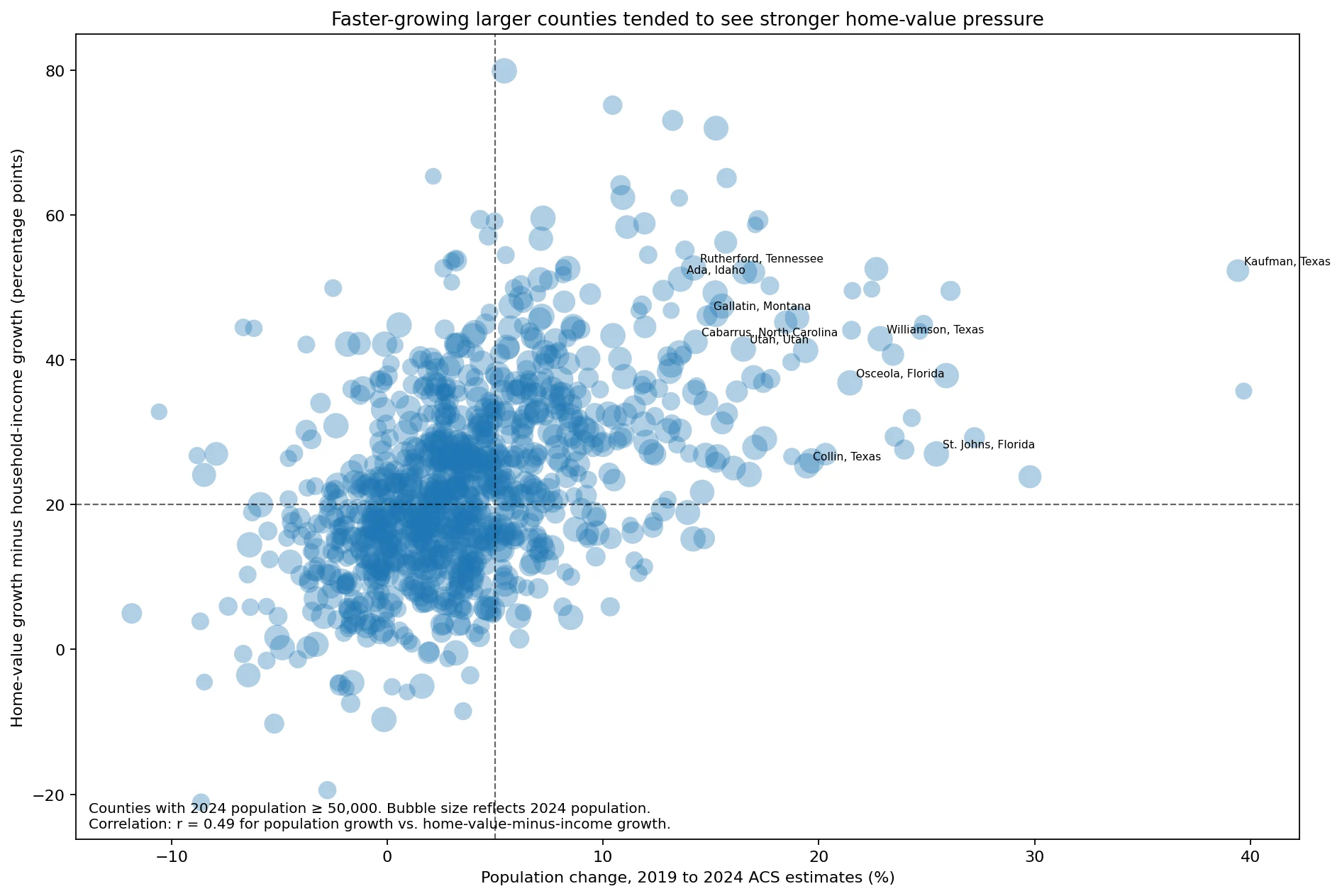
The contrast becomes sharper when very small counties are set aside. In the 324 counties with at least 50,000 residents and population growth of 5% or more, the median population increase was 8.4%. Housing-unit growth was also strong at a median 9.8%, but the median change in home value was much larger: 60.7%. Median household income rose 29.1%, leaving a median home-value-minus-income gap of 31.2 percentage points.
Among larger counties that grew by less than 5%, the median home-value-minus-income gap was 18.5 points. Housing-cost pressure therefore was not confined to boom counties, but it was generally stronger in the faster-growing group. Across all 999 counties in the 50 states and D.C. with at least 50,000 residents, the correlation between population growth and the home-value-minus-income gap was about r = 0.49. That is a meaningful association, not a one-to-one relationship.
County examples where growth and costs rose together
The table below is not simply a list of the largest home-value increases. It selects geographically varied counties that grew by at least 5% and also had home-value growth at least 20 points above income growth. Housing-unit change is shown alongside population change because rapid construction can coexist with strong price pressure, while in other places the housing stock may have expanded more slowly than population.
| County | Population change | Housing units change | Home value change | Income change | Home value-income gap | Rent-income gap |
|---|---|---|---|---|---|---|
| Kaufman County, Texas | 39.4% | 30.6% | 80.0% | 27.6% | 52.3 pp | 21.2 pp |
| St. Johns County, Florida | 25.4% | 24.5% | 60.6% | 33.5% | 27.0 pp | 13.0 pp |
| Williamson County, Texas | 22.8% | 36.4% | 70.4% | 27.5% | 42.9 pp | 7.9 pp |
| Walton County, Florida | 21.5% | 17.8% | 85.2% | 41.1% | 44.1 pp | 36.7 pp |
| Washington County, Utah | 18.5% | 19.5% | 80.0% | 34.7% | 45.2 pp | 19.5 pp |
| Maury County, Tennessee | 17.2% | 22.5% | 92.5% | 33.2% | 59.3 pp | 12.1 pp |
| Kootenai County, Idaho | 15.7% | 13.2% | 99.3% | 43.0% | 56.3 pp | 7.2 pp |
| Gallatin County, Montana | 14.8% | 16.4% | 87.0% | 40.9% | 46.1 pp | 16.9 pp |
| Berkeley County, South Carolina | 14.8% | 19.6% | 67.3% | 33.2% | 34.0 pp | 15.9 pp |
| Cabarrus County, North Carolina | 14.3% | 17.9% | 74.7% | 32.2% | 42.5 pp | 20.7 pp |
| Ada County, Idaho | 13.6% | 16.5% | 89.2% | 38.0% | 51.2 pp | 20.5 pp |
| Henry County, Georgia | 10.9% | 12.3% | 79.1% | 16.6% | 62.4 pp | 25.1 pp |
Kaufman County, Texas is one of the clearest examples in the data. Its population estimate rose 39.4% and housing units increased 30.6%, yet median home value increased 80.0% while median household income rose 27.6%. St. Johns County and Walton County in Florida, Washington County in Utah, and Maury County in Tennessee also combined strong population gains with large home-value gaps. Kootenai County and Ada County in Idaho show the same broad Mountain West pattern.
Rapid population growth is not required for home-value pressure, however. 1,047 counties in the 50 states and D.C. had population growth below 5% but still recorded home-value growth at least 20 points above income growth. That is a large counterexample to any simple claim that migration or population change alone explains the map. Existing housing stock, the pace and type of construction, local demand, land and development constraints, and many other factors can move differently from total population.
Rent pressure follows a weaker and more uneven pattern
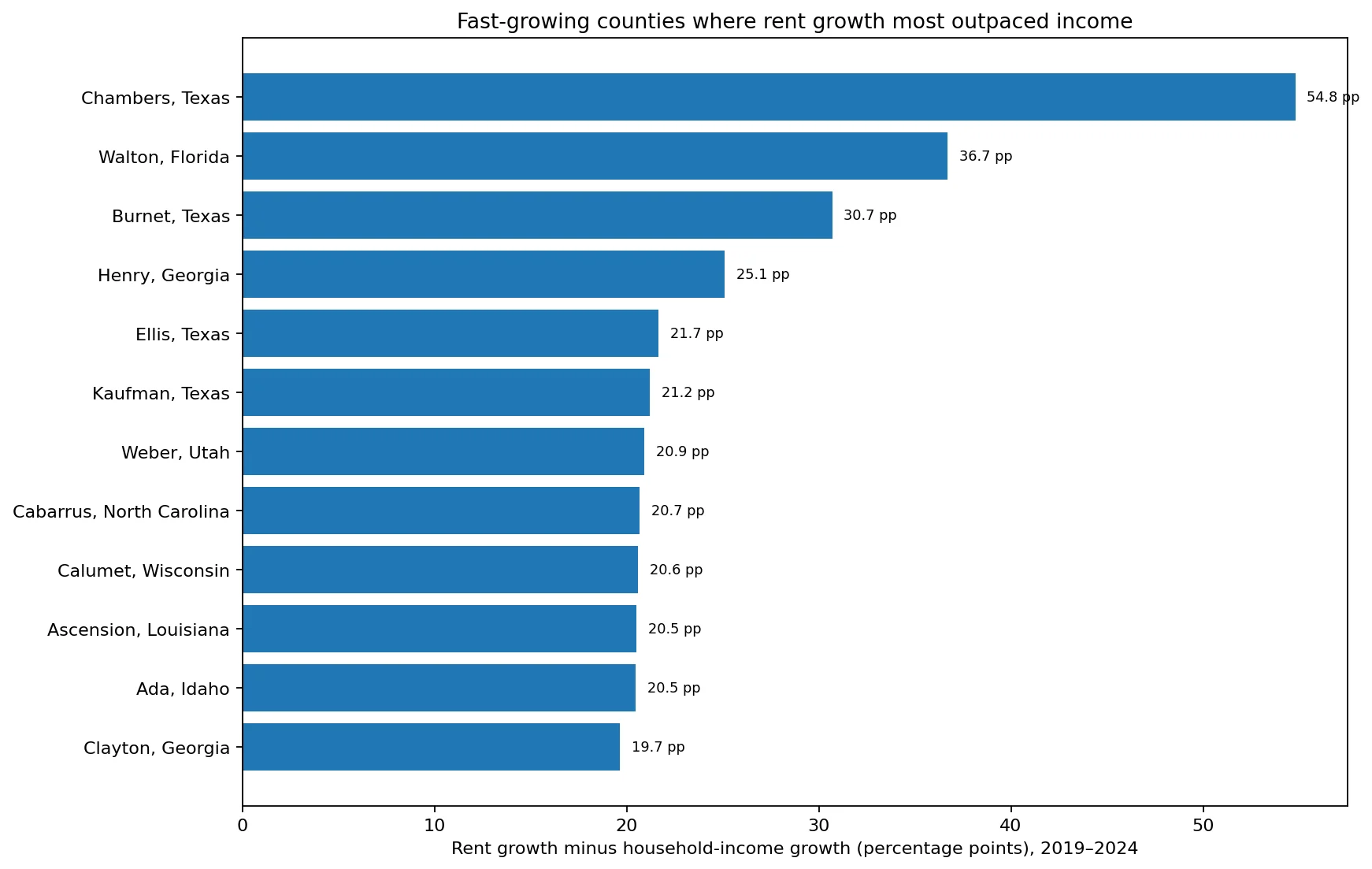
Rent tells a somewhat different story. Among the larger counties, the correlation between population growth and rent growth minus income growth was only about r = 0.25. For the fast-growing group, median gross rent increased 32.6%, and the median rent-minus-income gap was 4.0 points. In other words, rent growth did not outpace income everywhere that home values surged.
There are still striking exceptions. Chambers County, Texas had rent growth 54.8 percentage points above income growth. Walton County, Florida had a 36.7-point gap, and Burnet County, Texas had a 30.7-point gap. Henry County, Georgia and Cabarrus County, North Carolina also combined population growth with unusually large rent-income differences. These cases are a reminder that owner-occupied values and rents should be examined separately rather than treated as one housing-cost measure.
How the comparison was built
- Geography: the headline calculations use 3,133 counties and county-equivalent areas in the 50 states and Washington, D.C. that can be matched directly between 2019 and 2024 by geography code. Twenty Alaska and Connecticut records are excluded from change calculations because county statistical units changed during the period; the maps mark those areas as not directly comparable. Puerto Rico municipios remain in the package map data but are excluded from the quoted state-share calculations for a consistent state comparison.
- Period: the analysis compares the 2019 ACS 5-year estimate with the 2024 ACS 5-year estimate. These are two pooled estimates, not monthly market observations or a transaction-price index.
- Home value: the housing measure is ACS median value for owner-occupied housing units, not a repeat-sales price index.
- Rent: the rent measure is ACS median gross rent, not an asking-rent series for newly listed units.
- Pressure gap: percentage growth in home value or rent minus percentage growth in median household income. It is an original comparison measure, not an official affordability index.
- Correlation: geographic association does not establish causation. The analysis describes where measures moved together.
- Small counties: percentage changes can be volatile in small populations, so the scatter plot and the main group comparison separately focus on counties with at least 50,000 residents.
What the county map adds
A national average misses the most useful part of this housing story. Some states have broad clusters of counties moving in the same direction; others contain sharp differences between metropolitan fringes and rural areas. County geography makes those contrasts visible. The strongest takeaway is not that every growing county became unaffordable, but that rapid population growth and home-value pressure overlapped frequently among larger counties, while rent pressure was more selective and substantial housing-cost increases also appeared in many slower-growing places.
For a practical comparison, population change should be read together with housing-unit growth, home-value growth, rent growth and household-income growth. Looking at those measures side by side is much more informative than ranking counties on population growth alone.
Sources
- U.S. Census Bureau Data API — 2019 and 2024 ACS 5-year county population, housing, rent and household-income data
- ACS B25077 — 2024 median value of owner-occupied housing units
Frequently asked questions
Does population growth automatically make housing more expensive?
No. The association was stronger among larger counties, but many slower-growing counties also saw home values rise much faster than income. Population change is one part of the geographic pattern, not a complete causal explanation.
Is “home-value pressure” an official Census measure?
No. The underlying population, home-value and income figures come from Census ACS data, but the category used on the map is an original threshold for this analysis: at least 5% population growth and home-value growth at least 20 percentage points above income growth.
Why compare the 2019 and 2024 ACS 5-year estimates?
They provide broad county coverage for population, housing, rent and income in one consistent statistical system. The tradeoff is that a 5-year estimate is not a real-time market measure, so the changes should be read as changes between two ACS estimate periods rather than as exact annual price appreciation.
Related Articles
- Washington Population Density: Puget Sound Concentration and Franklin County Growth
- Iowa Population Density: Des Moines Concentration and Dallas County’s 50.7% Growth
- Wisconsin Population Density: Milwaukee’s Dense Core, Dane County Growth, and a Sparse North
- North Dakota Population Density: Fargo–Cass Concentration and Exceptional Western County Growth
Green Map creates custom-edited map images using open geographic data sources such as geoBoundaries, Natural Earth, OpenStreetMap, and government open data. These maps are edited visual materials, not raw data files, and are provided for education, documents, presentations, and graphic reference.