San Francisco County is an unusual land-cover case because nearly the entire county is urban. Developed cover accounts for 95.69% of the 2025 summary, while water, forest, barren ground, wetlands, grassland, agriculture, and shrubland occupy small pieces of the mapped area. The useful question here is not simply where development exists, but how hard-surfaced neighborhoods, parks, water, and small natural patches differ inside an overwhelmingly developed county.
This page brings together four views: overall land cover, forest and farmland, impervious surface with developed land, and a 1985–2025 class comparison. The on-page WebP images are quick previews, while the four original JPG maps are available together in one ZIP download below.
Table of Contents
Impervious surface reveals differences hidden inside 95.69% developed cover
Mean imperviousness is 62.75% across San Francisco County, and 77.96% of the mapped area falls at or above 50% impervious surface. Impervious surface means hard ground such as pavement, rooftops, and parking areas where water does not readily soak into soil. These numbers add detail that the broad developed class cannot provide by itself.
The impervious map contains many dark red areas across the mainland, especially through the denser eastern and northeastern portions. Lighter bands and patches interrupt that pattern in the west, southwest, and around larger open or vegetated spaces. Two places can therefore belong to the same developed land-cover class while having very different proportions of pavement, buildings, trees, lawns, and exposed soil.
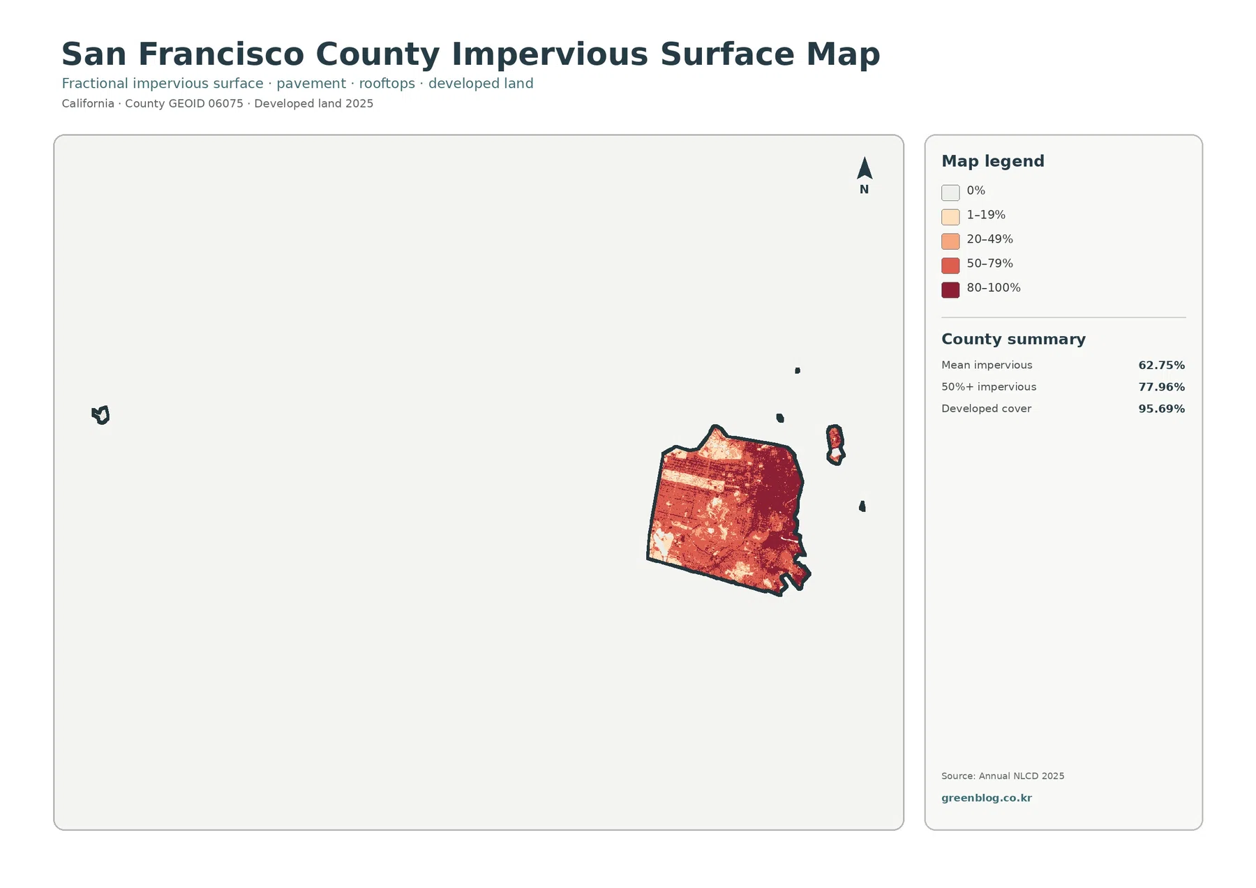
The difference between 95.69% developed cover and 62.75% mean imperviousness is important. Developed land in Annual NLCD can include yards, trees, planted areas, and other permeable surfaces mixed with buildings and streets. It would therefore be incorrect to say that 95.69% of the county is concrete or asphalt. The impervious layer is the better map for comparing how hard-surfaced different parts of the urban area are.
High imperviousness should not be treated as a flood-risk map. Drainage, terrain, rainfall, sewer infrastructure, shoreline conditions, and many other factors affect how water behaves. This layer is useful for describing surface intensity and urban form, but site-level stormwater or hazard decisions require dedicated engineering and hydrologic information.
The countywide map is almost all developed, so the small exceptions matter
The 2025 land-cover summary lists developed land at 95.69%. Water is 2.21%, forest 0.83%, barren land 0.79%, wetlands 0.23%, grassland 0.17%, agriculture 0.04%, and shrubland 0.04%. Those smaller classes add up to only a few percent of the county, yet their locations provide much of the geographic contrast visible on the map.
Most of the mainland appears as one broad red developed area. Small blue, green, teal, tan, and light-green patches interrupt it, particularly near larger parks, the southwestern side, and coastal or water features. The map also includes detached island components of the county, which appear as separate shapes to the east and far west. Their distance from the mainland forces the map frame to cover a much larger area than the urban peninsula alone.
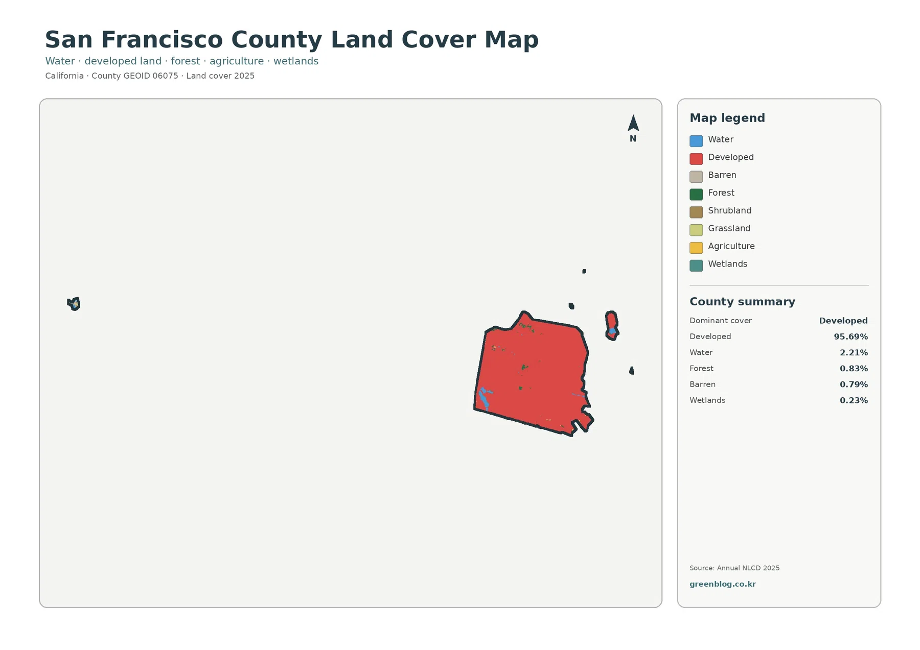
Because the developed class dominates so strongly, it is tempting to read the map as if every neighborhood had the same surface. The impervious map shows why that would be misleading. Parks, planted residential areas, street trees, slopes, and open spaces can all reduce the share of hard surface within an area that still belongs to a developed land-cover class.
Land cover should also be kept separate from zoning and legal land use. A red developed cell does not tell you what a parcel is zoned for, whether construction is allowed, who owns it, or whether it is inside a protected or managed open space. Those questions belong to planning, parcel, and regulatory datasets rather than this satellite-based classification.
Forest, grass, wetlands, and water form small but meaningful urban pockets
The forest-and-farmland view removes much of the visual weight of developed land so the smaller natural classes are easier to locate. Forest is 0.83%, grassland 0.17%, shrubland 0.04%, agriculture 0.04%, wetlands 0.23%, and water 2.21%. None of these classes is large countywide, but they help explain why an intensely built city can still contain distinct natural and semi-natural areas.
San Francisco Environment describes the city’s biodiversity as occurring among parklands, natural areas, urban forests, community gardens, and neighborhoods. Its official material specifically points to places such as the Presidio, Twin Peaks, Glen Canyon, Lake Merced, and Golden Gate Park. Those examples provide useful local context for the small non-developed patches visible on the land-cover maps, although the 30 m raster cells should not be mistaken for official park boundaries.
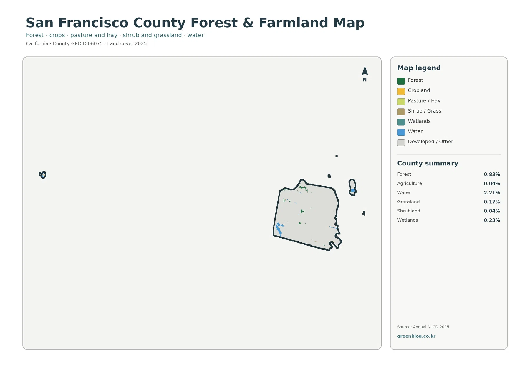
Water is the largest non-developed category in the summary. Blue features on the mainland and around detached county components can serve as orientation points, but the layer is not a legal shoreline, harbor boundary, or water-jurisdiction map. Likewise, a teal wetland cell is a generalized land-cover classification, not a regulatory wetland delineation.
Agriculture at 0.04% should be interpreted with particular caution. It is a raster class assigned to a very small number of cells, not evidence that agriculture is a major county land use or a count of operating farms. Small classes in a dense urban landscape are especially sensitive to mixed pixels, where one 30 m cell can contain several kinds of surface.
For an ecology-focused presentation, the forest-and-farmland map is often more informative than the general view because it separates these small patches from the overwhelming developed background. It still does not describe species, habitat quality, restoration status, or legal protection. San Francisco Environment’s biodiversity material is a better companion when those ecological questions matter.
A 6.37% class difference is mostly scattered rather than one large change zone
The 1985–2025 comparison maps a class difference across 6.37% of the county. Change to developed is 0.46%, forest loss is 0.00%, agricultural loss is 0.00%, and other class differences account for 5.88%. The mapped differences appear mainly as small scattered cells rather than a broad continuous belt of conversion.
Purple other-difference cells are dispersed through many parts of the mainland, with smaller red change-to-developed areas appearing in limited locations. In a city where developed cover is already 95.69% in 2025, this pattern makes sense as a comparison that is dominated by local class changes rather than a simple expansion from a rural edge into a large undeveloped interior.
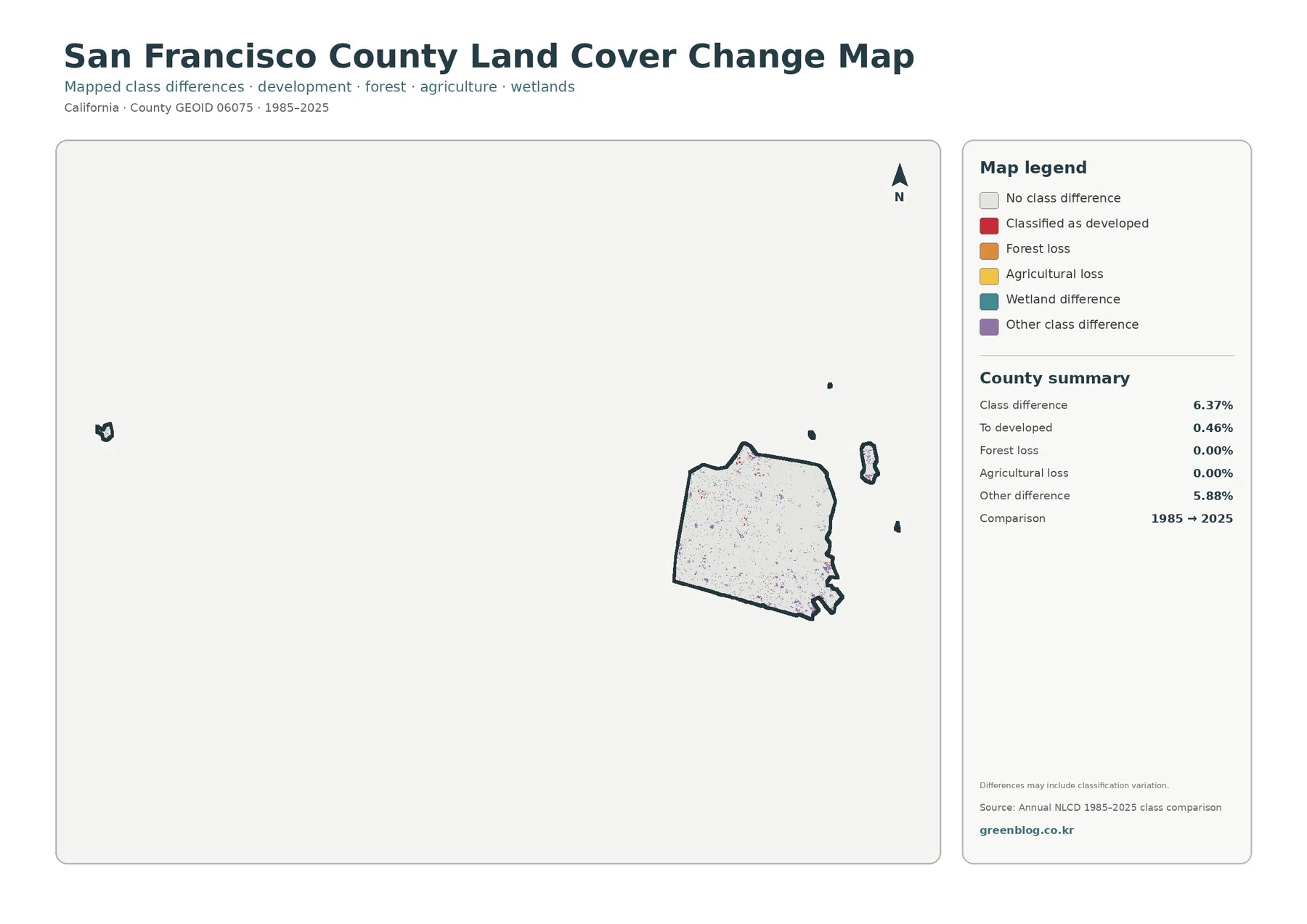
A class difference is not automatically a verified land-use change. Real redevelopment, vegetation shifts, shoreline work, or park changes can affect a cell, but sensor conditions, classification methods, and mixed surfaces can also move a cell from one broad class to another. The map itself notes that classification variation may contribute to the differences.
The 0.00% forest-loss and agricultural-loss summaries should not be read as statements that no tree or garden changed anywhere over forty years. They only report that those broad categories round to 0.00% in this particular comparison. Urban forestry, individual trees, landscaped areas, and small site changes operate at scales that may not be represented by the countywide class summary.
For a specific location, use the change map as a screening tool rather than a final explanation. A colored cell can identify a place worth checking with intermediate Annual NLCD years, higher-resolution aerial imagery, planning records, or park and habitat information. That additional evidence is necessary before assigning a cause to a mapped difference.
Detached islands change the map frame and the way small features appear
San Francisco County includes detached island components as well as the urban mainland. The preview therefore shows small county shapes east of the peninsula and another far to the west. Fitting all of them into one frame makes the mainland appear smaller than it would on a city-only map, and it can make small park or water features look tiny at first glance.
The original JPG files are more useful when you need to zoom into the mainland while still retaining the complete county boundary. Enlarging the image improves legibility of the colors and legend, but it does not create new spatial detail beyond the source data. A 30 m raster cell remains a 30 m generalized observation even when the JPG is displayed at a larger size.
Countywide percentages also combine the mainland and detached components. Forest at 0.83% or water at 2.21% cannot be converted directly into a percentage for Golden Gate Park, Lake Merced, the Presidio, or any individual island. Site-specific statistics require a separate analysis using the source raster and an appropriate local boundary.
Choose map pairs based on the question instead of showing all four at once
For a discussion of urban form, pair the general land-cover map with impervious surface. The first establishes that developed cover dominates the county, while the second shows how pavement and rooftops vary within that developed footprint. This pairing is useful for comparing a hard-surfaced district with a greener developed area without pretending that the land-cover class alone measures density.
For parks and urban nature, place the forest-and-farmland map beside the general map. Small forest, grassland, wetland, and water patches become easier to locate when the developed background is simplified. An official biodiversity or park source can then provide the ecological meaning that a satellite class by itself cannot supply.
For long-term comparison, use the 2025 land-cover image next to the 1985–2025 difference map. A purple cell is much easier to interpret when the current surrounding cover is visible. The pairing also discourages the common mistake of treating every difference cell as new development, because the change legend separates change-to-developed from other differences.
Map File Information
The download ZIP contains four San Francisco County JPG files: overall land cover, forest and farmland, impervious surface with developed land, and the 1985–2025 land-cover class comparison. They use the same county boundary, making it straightforward to compare the same location across different views in reports, lessons, presentations, or reference graphics.
For print layouts, two larger maps are usually easier to read than four small panels. Use overall cover plus imperviousness for an urban topic, overall cover plus forest and farmland for natural-area context, or current cover plus the change map for a time comparison. Keeping the legend readable is especially important in San Francisco because many non-developed classes occupy only small patches.
These JPGs are finished reference graphics, not analytical GIS files. If you need cell values, acreage calculations, neighborhood statistics, custom legends, or overlay analysis, download the source Annual NLCD data and combine it with an appropriate county or local boundary rather than measuring the image pixels directly.
Thirty-meter cells and planning boundaries set clear interpretation limits
Annual NLCD uses raster cells of about 30 meters. One cell in San Francisco can contain a roof, street, sidewalk, tree canopy, lawn, and exposed soil, yet the land-cover layer assigns a representative class. Mixed pixels are therefore especially important along park edges, shorelines, narrow green spaces, and transitions between dense buildings and landscaped areas.
The 2025 map represents a specific observation period. Construction, park restoration, vegetation change, or shoreline work after that period may not appear until a later dataset is released. The change map adds another limitation because it compares classifications from two endpoints rather than recording every event that happened between 1985 and 2025.
Planning boundaries answer a different set of questions. The San Francisco General Plan addresses topics such as environmental protection, recreation and open space, transportation, and land use, but those policies are not encoded directly in the Annual NLCD colors. A developed pixel cannot tell you a parcel’s zoning, and a forest or wetland pixel cannot by itself establish protected status or regulatory jurisdiction.
Frequently Asked Questions
Why is developed cover 95.69% while mean imperviousness is only 62.75%?
Developed cover is a broad land-cover class that can include lawns, trees, gardens, and soil mixed with buildings and roads. Imperviousness measures the share of hard surfaces such as pavement and rooftops. A neighborhood can therefore be classified as developed while still containing a substantial amount of permeable or vegetated surface.
What do the small forest and water percentages tell me in such an urban county?
They show that non-developed cover occupies a small share of the county overall, but the location of those patches still matters. Forest is 0.83% and water is 2.21%, and the maps help locate where those classes interrupt the developed footprint. For ecological meaning or park boundaries, use the map together with official San Francisco nature and planning sources.
Does the 6.37% class difference equal the amount of San Francisco that was redeveloped?
No. The 6.37% value reports where broad land-cover classes differ between the 1985 and 2025 comparison. Change to developed is only 0.46%, while other class differences account for 5.88%. Classification variation and mixed pixels may contribute, so confirming redevelopment requires more detailed imagery and local records.
Map File Information
Download the four original San Francisco County land-cover JPG maps together in one ZIP file.
- File Type: ZIP containing 4 JPG files
Related Maps
- Alameda County California Land Cover Map
- Alpine County California Land Cover Map
- Amador County California Land Cover Map
Data sources and official references
These official links provide the land-cover classification and boundary sources used for interpretation, plus San Francisco-specific biodiversity and planning context that should be kept separate from satellite land-cover classes.
- MRLC Annual NLCD Data — access to Annual NLCD land-cover products
- USGS Annual NLCD Land Cover Classification — class definitions and interpretation guidance
- U.S. Census Bureau TIGER/Line Shapefiles — county boundary reference
- San Francisco Environment — Nature and Biodiversity — official context for parks, natural areas, and urban biodiversity
- San Francisco General Plan — official planning context for open space, environmental protection, and land use
Green Map creates custom-edited map images using open geographic data sources such as geoBoundaries, Natural Earth, OpenStreetMap, and government open data.
These maps are edited visual materials, not raw data files, and are provided for education, documents, presentations, and graphic reference.