Bullock County’s 2025 land-cover pattern is led by forest, but the county is not a single continuous block of woodland. Agriculture, wetlands, grass and shrub cover break the forest into a varied mosaic, while developed land is concentrated in a much smaller set of places. The four maps on this page separate those patterns so you can compare current cover, forest and farmland, impervious surfaces, and mapped class differences from 1985 to 2025.
The four original JPG maps are available together in one download. You can use the web previews to decide which view is most useful, then save the larger files for a report, classroom handout, presentation, local reference project, or a closer comparison of land-cover change.
Table of Contents
What stands out in Bullock County in 2025
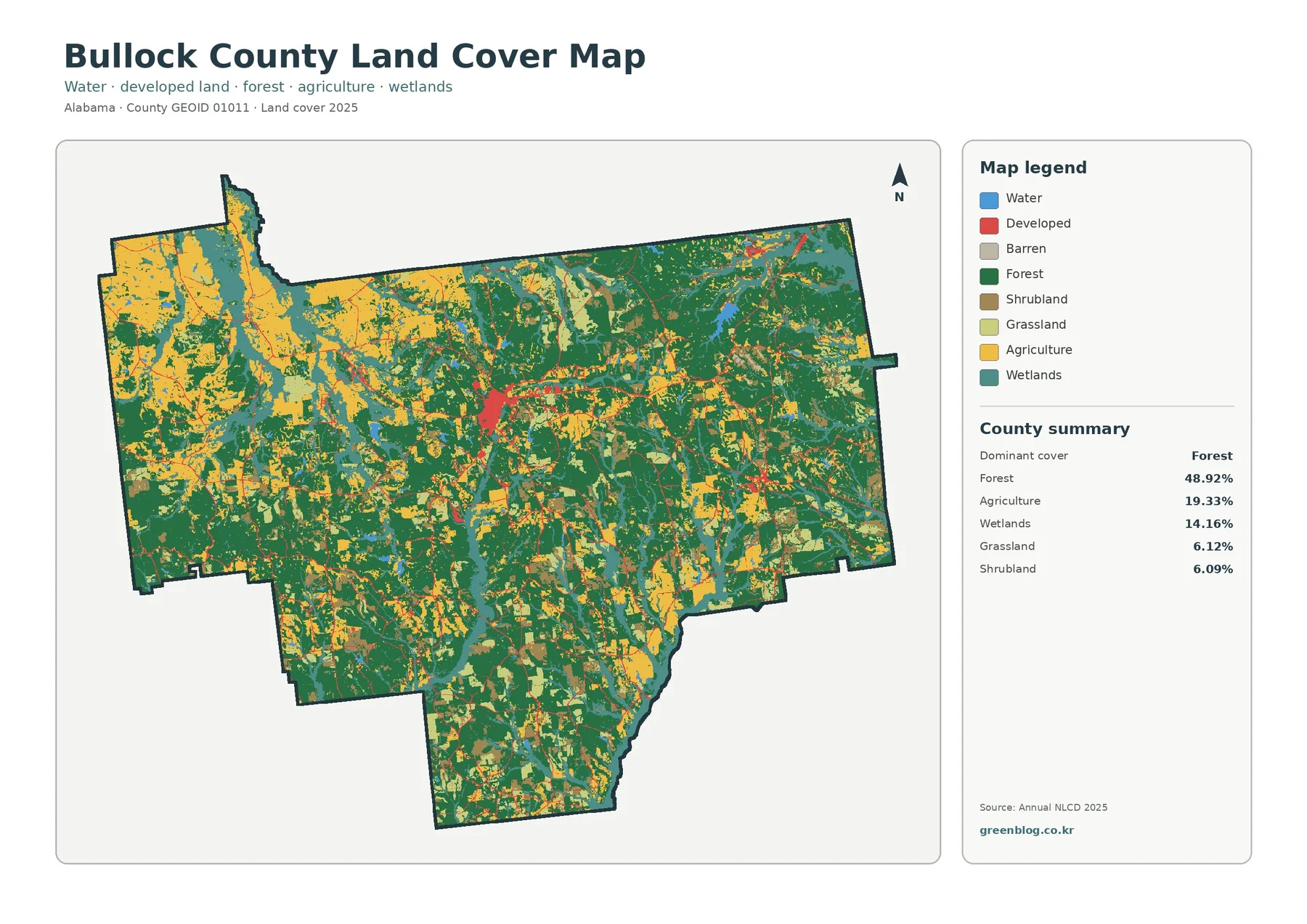
Forest accounts for 48.92% of the county in the 2025 summary, making it the dominant mapped cover. Agriculture follows at 19.33%, and wetlands make up another 14.16%. Grassland and shrubland are close in size at 6.12% and 6.09%. Water occupies only 0.99%, yet the water and wetland colors are easy to notice because they trace narrow drainage features and broader low-lying areas through the county.
The map shows a broad forest presence through the center, east, and many southern areas, but large agricultural patches are more conspicuous in parts of the west and northwest. Smaller agricultural openings also appear throughout the interior. Wetlands weave among both forest and farm cover rather than forming one isolated block. That mixture matters when reading the county because a percentage alone cannot show whether a cover type is concentrated in one place or spread through many small patches.
Land cover describes what is physically present at the surface, such as trees, crops, water, wetlands, or developed ground. It does not identify zoning, ownership, tax status, or whether a parcel can be built on. A green area should therefore be read as mapped forest cover, not automatically as protected land, and an agricultural color should not be treated as a legal farm boundary.
Forest, farmland, and open ground in one view
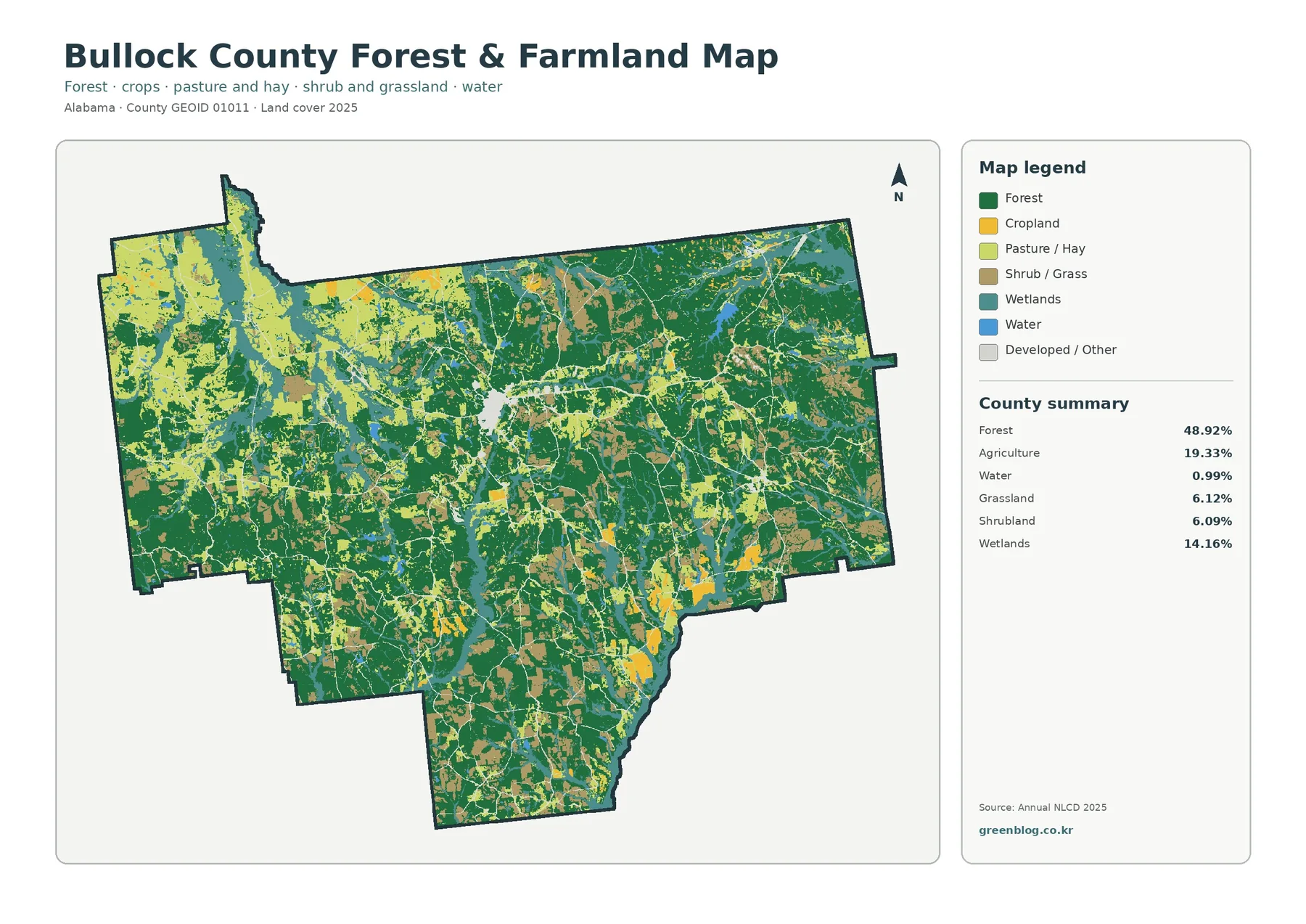
The forest and farmland map makes the county’s rural pattern easier to compare by emphasizing woodland, cropland, pasture and hay, shrub or grass cover, wetlands, and water. Dark green forest stretches across large portions of the county. Agricultural colors form broader pieces in the western and northwestern areas and appear as smaller openings elsewhere. In the southern extension of the county, forest still covers much of the land, but open patches continue to interrupt it.
The 19.33% agriculture figure is useful as a countywide measure, but the map adds the more practical question of location. Farm-related cover has many edges against forest, and those edges are visible across much of the county instead of being limited to one single agricultural belt. That makes this map useful for explaining how wooded land and open working landscapes meet, especially in presentations where the full land-cover legend would otherwise be too busy.
A separate Alabama Forestry Commission source provides helpful context without replacing the NLCD map. Its 2024 Forest Resource Report lists 323,928 acres of timberland in Bullock County. Timberland acreage and the 48.92% Annual NLCD forest share are produced for different purposes and with different methods, so they should not be treated as the same statistic. Together, however, they reinforce why forest is an important part of the county’s landscape and why a dedicated forest-farmland view is useful here.
A small developed footprint with a clear central cluster
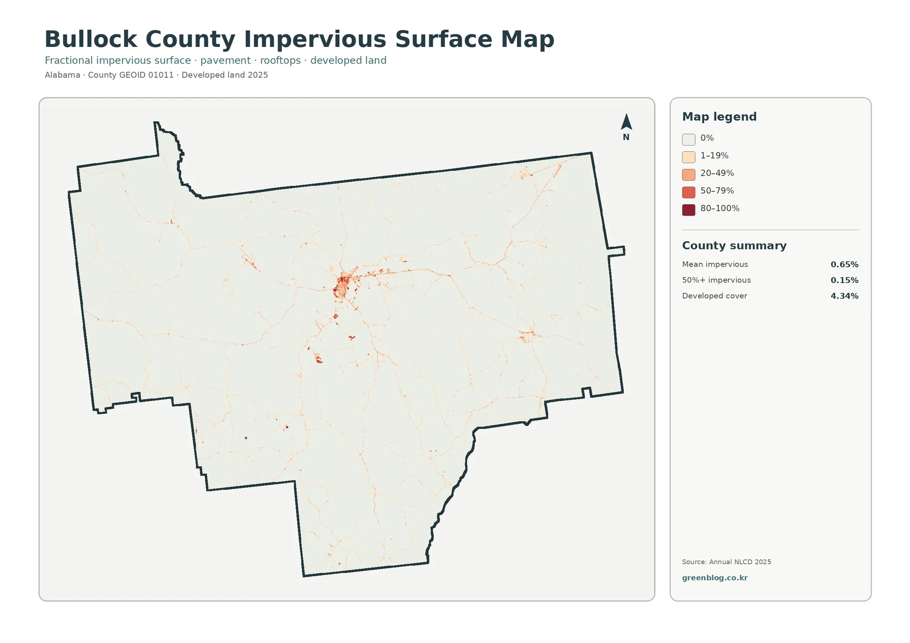
Impervious surface means hard ground such as pavement and rooftops where water cannot easily soak into the soil. Bullock County’s impervious map is mostly pale, which immediately separates it from a heavily urbanized county. Mean imperviousness is 0.65%, and only 0.15% of the county is mapped at 50% impervious or greater. Developed cover, which is a broader land-cover category, totals 4.34%.
The strongest concentration sits around Union Springs near the center of the county. Alabama’s Department of Revenue lists the Bullock County Courthouse in Union Springs, confirming the town’s central administrative role. On the map, harder surfaces cluster around that area and thin linear traces extend outward along transportation routes. Smaller developed patches appear to the east and southeast, but they are much less extensive than the central concentration.
Developed land and impervious surface should not be read as identical measures. A developed land-cover class can include lawns, scattered trees, and other surfaces that still absorb rainfall. The impervious layer focuses more directly on the fraction covered by hard material. This is why a road can appear as a thin higher-value line while nearby developed land includes a wider area with lower impervious percentages.
What the 1985–2025 comparison actually measures
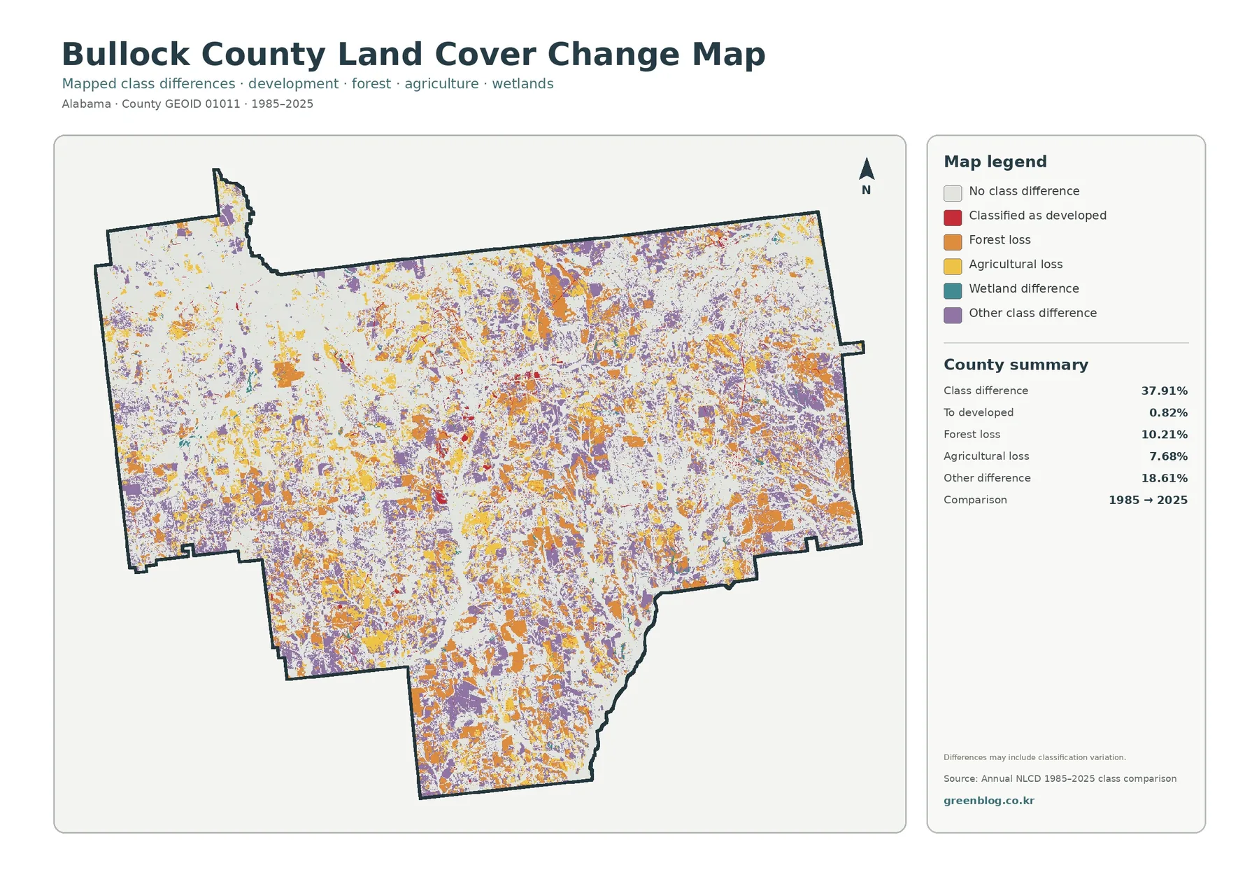
The change map compares mapped classes in 1985 and 2025. It reports class differences across 37.91% of the county. Within that total, 0.82% is labeled as changed to developed, 10.21% as forest loss, 7.68% as agricultural loss, and 18.61% as other class difference. White areas indicate no class difference under this comparison, while orange, yellow, purple, teal, and red distinguish the different categories of change.
Those numbers are not a direct statement that 37.91% of Bullock County was physically transformed in a simple one-way process. The map itself notes that differences may include classification variation. Annual NLCD is designed for consistent long-term comparison, but a class difference can reflect how satellite observations and classification methods assign a pixel at two different dates. A colored cell does not by itself prove why the surface changed.
Forest-loss and other-difference colors are scattered across many parts of the county rather than confined to one large zone. Agricultural-loss areas are also distributed in numerous patches. By contrast, the changed-to-developed share is small, which matches the limited developed footprint in the 2025 impervious view. Reading the two maps together helps prevent the common mistake of describing all long-term class differences as urban growth.
Wetlands are a major part of the county pattern
Wetlands account for 14.16% of the 2025 summary, a substantial share that can be overlooked if attention goes only to forest and agriculture. Teal wetland areas appear as winding corridors and broader patches across the county. They often sit next to forest and agricultural cover, so they help explain why the boundaries between green and yellow areas can look irregular rather than geometric.
Water itself is only 0.99%, which is much smaller than the wetland share. For watershed or habitat discussions, this difference is useful: a narrow mapped water feature may be accompanied by a wider area classified as wetland. The general land-cover map therefore gives a better first look at water-related landscapes when the water and wetland classes are considered together instead of treating blue water pixels as the entire aquatic setting.
Outdoor Alabama lists the Barbour Wildlife Management Area in both Barbour and Bullock Counties. The land-cover maps on this page are not WMA boundary maps and should not be used to locate that public-management area precisely. Still, the official WMA listing provides county-specific context for why broad forest and wetland patterns are relevant to wildlife and habitat discussions in this part of Alabama. Exact management boundaries should always come from the agency’s current WMA maps.
Choosing the right Bullock County map
Start with the general land-cover map when the goal is to explain the county as a whole. It combines the main cover classes and makes the 48.92% forest share meaningful by showing how agriculture and wetlands divide the wooded landscape. Use the forest-farmland view when a simpler rural-landscape comparison is more important than the full set of classes. It is especially effective when the audience needs to see where wooded and open areas meet without studying a complex legend.
The impervious map serves a different question. It is the clearest choice for comparing Union Springs and other developed locations with the much larger low-impervious rural area. The change map belongs in a time-based discussion, but it works best after the current maps have established what the county looks like in 2025. That order gives the reader a present-day reference before introducing a forty-year class comparison.
For classroom work, students can compare the percentages in the legend with the actual locations of each class and discuss why the same county can be almost half forest while still containing substantial agriculture and wetlands. For local research, the maps can help identify areas that deserve a closer look in aerial imagery or field observations. For presentations, using one map per question usually communicates more clearly than placing all four maps on a single crowded slide.
Download the four JPG maps
The download ZIP contains four original JPG files: the 2025 land-cover map, the forest and farmland map, the impervious surface and developed-land map, and the 1985–2025 land-cover change map. Each file is 2480×1754 pixels. The maps share the same county boundary but use different legends, so keeping all four makes it easier to switch from an overall landscape view to a more focused question without losing geographic context.
Scale, classification, and other limits
Annual NLCD is a raster dataset, which means the landscape is divided into a grid of cells and each cell receives a mapped class or value. USGS documents Annual NLCD at 30-meter spatial resolution. At that scale, a cell can contain a mixture of trees, grass, pavement, water, or buildings even though the product must summarize the surface in a consistent way. Very small features and exact property edges can therefore be simplified or missed.
This matters most when a map is enlarged beyond its intended level of detail. A narrow stream may look broken, a small road may appear wider or thinner than expected, and a field edge may not match a parcel line. The impervious surface layer is also a fractional measure rather than a building-footprint survey. Use the maps to compare countywide patterns and broad local differences, not to measure a driveway or decide exactly where a legal boundary falls.
The 2025 maps represent the classified surface for that mapping year. Logging, construction, crop rotation, storm damage, vegetation recovery, and other events after the observation period are not shown. The 1985–2025 comparison also summarizes two end dates and does not display every intermediate transition. Researchers who need a detailed time series should consult the individual Annual NLCD years rather than assuming the end-point comparison tells the complete history.
Frequently Asked Questions
What is the largest land-cover class in Bullock County?
Forest is the largest class in the 2025 county summary at 48.92%. Agriculture accounts for 19.33%, and wetlands account for 14.16%. The map is still visually mixed because farm, wetland, grass, and shrub patches occur throughout the larger forest pattern.
Does the 37.91% change figure mean that much of the county was developed?
No. The 37.91% figure is the total area with a mapped class difference between 1985 and 2025. Only 0.82% is labeled as changed to developed. Forest loss is 10.21%, agricultural loss is 7.68%, and other difference is 18.61%. The map also warns that classification variation can contribute to the differences.
Can I use these maps to check a property boundary or zoning?
No. These are generalized land-cover maps, not parcel, zoning, or ownership maps. A property question should be checked against the Bullock County public GIS or other official land-record sources. The 30-meter land-cover data are best used for landscape comparison, education, and county-scale reference.
Map File Information
Bullock County Land Cover Maps Four JPG maps covering 2025 land cover, forest and farmland, impervious surfaces, and 1985–2025 mapped change.
- Included Files: Use only the versions confirmed in the article and supplied images
- File Type: Use the confirmed download contents
- Intended Use: Printing, education, presentations, and map-based projects
Related Maps
- Autauga County Alabama Land Cover Map
- Baldwin County Alabama Land Cover Map
- Barbour County Alabama Land Cover Map
Sources and references
- MRLC Annual NLCD Data — access to annual land-cover products
- USGS Annual NLCD Collection 1.2 Land Cover — 2025 coverage and 30-meter product documentation
- U.S. Census Bureau TIGER/Line Shapefiles — county boundary reference
- Alabama Forestry Commission Forest Resource Report 2024 — Bullock County timberland context
- Outdoor Alabama Wildlife Management Areas — official listing for Barbour WMA in Barbour and Bullock Counties
Green Map creates custom-edited map images using open geographic data sources such as geoBoundaries, Natural Earth, OpenStreetMap, and government open data.
These maps are edited visual materials, not raw data files, and are provided for education, documents, presentations, and graphic reference.