Blount County has a strongly mixed forest-and-agriculture landscape in the supplied 2025 land-cover data. Forest is the largest class at 51.02%, while agriculture accounts for 33.43% and developed cover for 10.58%. Shrubland, grassland, water, and wetlands make up smaller shares. The four maps on this page separate those patterns into a complete land-cover view, a forest-and-farmland view, an impervious-surface view, and a comparison of mapped classes between 1985 and 2025.
The four original JPG maps are available together in one download after the map explanations. They work well for county-scale reference, classroom material, regional comparisons, presentations, and printed documents where a larger image is useful. Land cover describes the physical surface detected and classified from imagery. It should not be treated as a parcel map, zoning record, ownership map, development-rights map, or property survey.
Table of Contents
Forest leads the county, but agriculture is nearly as important visually
The 2025 summary lists forest at 51.02% and agriculture at 33.43%. Developed cover follows at 10.58%, with shrubland at 1.75% and grassland at 1.17%. The forest-and-farmland map also reports water at 1.02% and wetlands at 0.84%. Those figures describe a county where forest is the dominant single class but not an overwhelming one. Agricultural cover appears repeatedly across the county, and built areas form several recognizable clusters rather than one isolated urban patch.
Large forest blocks are especially easy to see in the southwest and southern parts of the county, with more broad woodland continuing through the center. Agricultural colors become more frequent toward the north and northeast, although they also appear in the central and southern sections. In many places the two classes alternate in narrow bands and irregular patches. The map therefore reads less like a simple forest-versus-farm division and more like a mosaic in which woodland and agricultural surfaces remain close to one another across much of Blount County.
The Blount County Commission describes the county as being in the foothills of the Appalachian Mountains and identifies its courthouse and county government in Oneonta. That local setting is useful background, but the supplied land-cover images do not include elevation contours or named ridges. The safest interpretation is to describe where woodland and agriculture are visible on these maps rather than claim that a particular slope, soil type, or ridge directly caused a land-cover pattern without additional evidence.
The 2025 land-cover map reveals the county’s most mixed areas
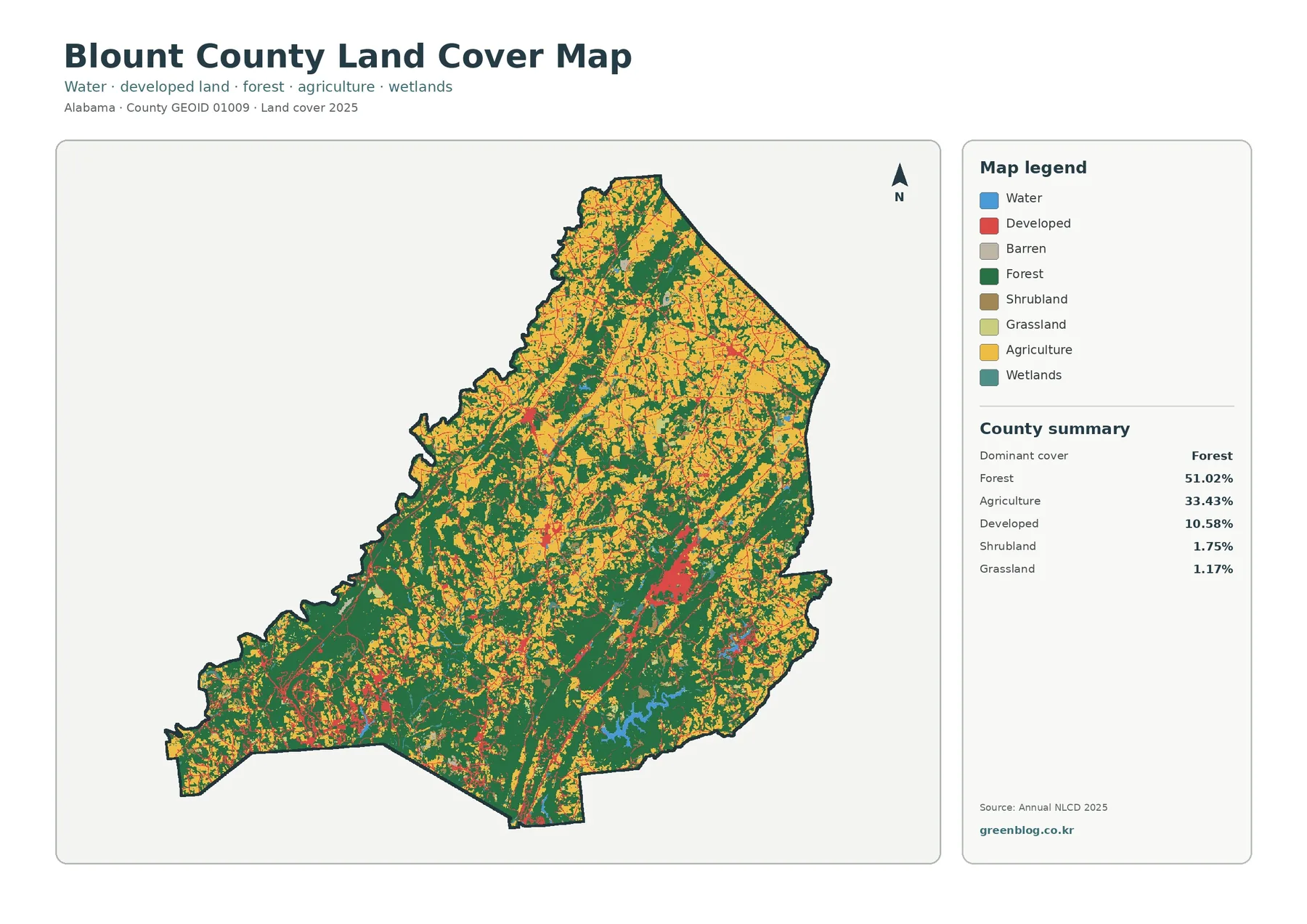
The general map is the best place to start because it preserves the main land-cover classes in one view. Dark green forest and yellow agriculture dominate the image. Red developed cover is much smaller in total area, yet its strong color makes several clusters easy to find. The largest concentration lies slightly east of the county’s center, while additional developed areas appear in the southwest, north, and along thin connecting traces. Because town boundaries are not printed on the map, these red areas should not be assigned to individual municipalities without a separate place or road map.
Agriculture covers one-third of the county and is especially conspicuous in the northern half, where many yellow patches interrupt the forest. It remains common farther south as well, so the map does not show one single farm belt separated from the wooded area. Some agricultural shapes are broad, while others are narrow or fragmented. The image does not identify crop type, farm ownership, pasture management, or field boundaries, so its value is in showing countywide surface patterns rather than the status of an individual farm.
Water accounts for 1.02% and wetlands for 0.84%. These shares are small compared with forest and agriculture, but blue and teal features remain important because water bodies and drainage-related areas can form distinctive shapes. A notable reservoir-shaped blue feature appears in the southern half of the county, with smaller water and wetland areas elsewhere. Open water and wetlands are separate classes: open water represents water surfaces, while wetlands include areas where saturated conditions and wetland vegetation are part of the mapped surface.
Inland Lake provides a useful local water reference
Outdoor Alabama documents Inland Lake in Blount County as a 1,557-acre reservoir on Blackburn Fork of the Little Warrior River, about nine miles south-southwest of Oneonta. The supplied land-cover map does not label individual water bodies, so not every blue pixel can be identified from this image alone. Still, the official Inland Lake information confirms that a substantial reservoir and the Little Warrior River system are part of the county’s landscape, giving useful context when comparing mapped water, wetland, forest, and agricultural cover.
The forest-and-farmland view makes the rural mosaic easier to read
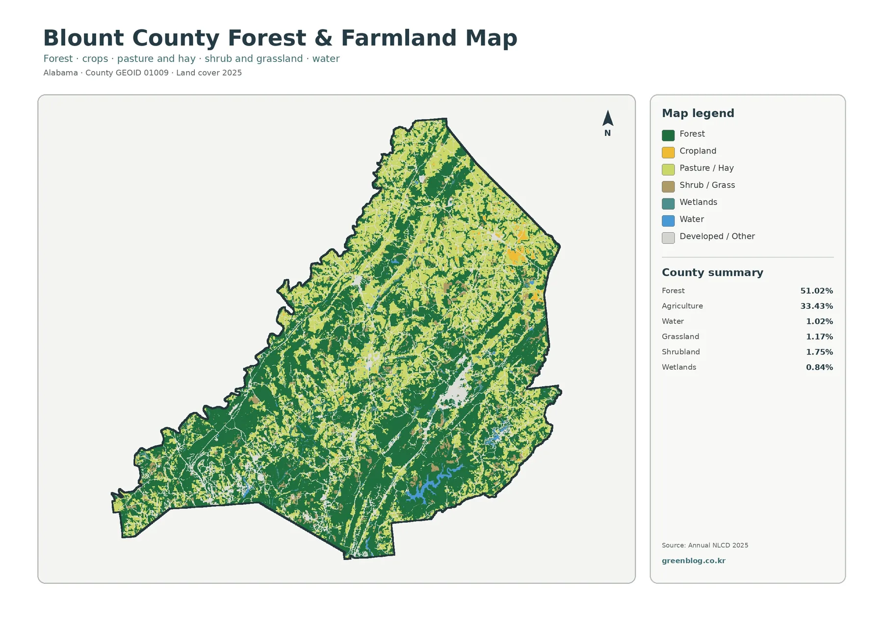
This version reduces some of the visual competition in the full legend and makes the relationship between woods and open rural cover easier to follow. Broad forest remains evident in the southwest, south, and central portions. Cropland and pasture or hay become more prominent across the northern half and in scattered central areas. Rather than forming one continuous agricultural block, the open classes repeatedly break into forest and then reappear nearby. That pattern helps explain why agriculture can represent 33.43% of the county without visually replacing the forest majority.
The legend also prevents a common mistake: not every light area is cropland. Cropland, pasture or hay, shrub or grass, wetlands, water, and developed or other land have different symbols. A reader who ignores those distinctions can easily overstate the amount of active farmland. For a classroom or presentation, one useful method is to identify a large forest block first, then trace the nearby lighter areas and check each against the legend. The exercise shows that rural land cover is more varied than a simple two-color forest-versus-farm map.
The contrast between the forest-heavy southwest and the more finely mixed north is particularly useful for county comparisons. The same countywide percentage can contain very different local patterns, including broad continuous areas, narrow strips, and many small patches. The map does not explain why those differences exist. Questions about soil, slope, farm economics, forest ownership, timber management, or historic land use require other sources. Here the map’s role is to provide a clear 2025 surface snapshot that can guide those follow-up questions.
Impervious surface is low on average but concentrated in a few corridors
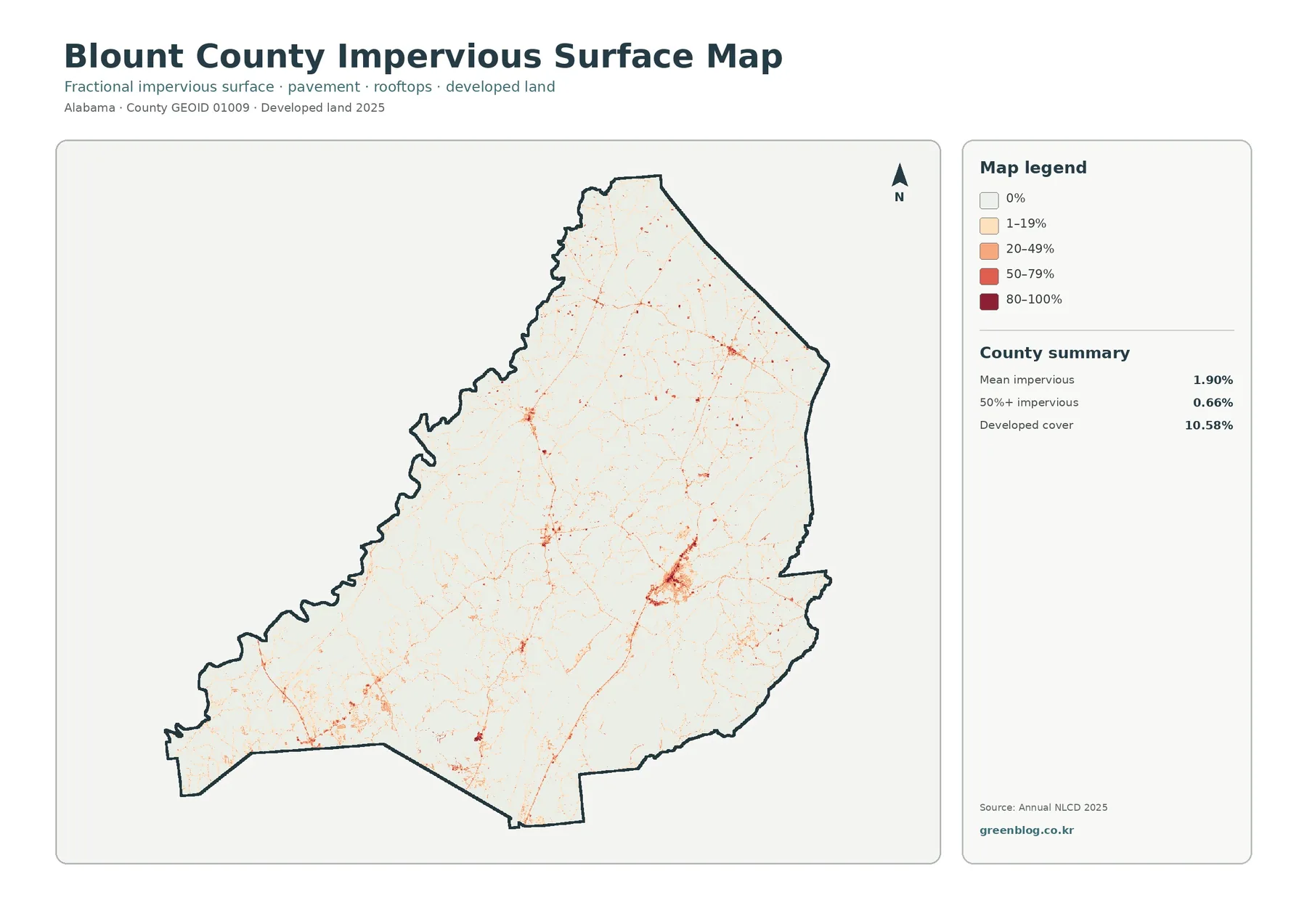
Impervious surface means pavement, rooftops, parking areas, and other hard surfaces that water does not readily soak through. Blount County has a mean impervious value of 1.90%, and 0.66% of the county is mapped at 50% or more impervious. The developed-cover figure on the general map is much larger at 10.58%. That difference is expected because a developed land-cover class can contain lawns, trees, bare soil, and other permeable surfaces in addition to roads and buildings.
The map is pale across most of the county, but several stronger concentrations stand out. The most obvious cluster lies in the east-central area, with another broad concentration in the southwest and smaller concentrations farther north. Thin linear traces connect or extend away from these clusters. Blount County’s official site lists local governments including Oneonta, Hayden, Blountsville, Cleveland, and Locust Fork, but municipal boundaries are not part of the impervious map. A separate reference layer is needed before assigning a specific colored cluster to a particular town.
This view is useful because developed land and hard surface are related without being identical. A low-density neighborhood may appear as developed cover while still containing substantial grass and tree cover, producing only a modest impervious percentage. A commercial center, large parking area, or major paved junction can show a much higher hard-surface value within a smaller footprint. The map can support broad comparisons of where built surfaces concentrate, but it cannot by itself calculate flood risk, drainage performance, or runoff volume. Those questions also require rainfall, elevation, soils, channels, and infrastructure data.
The 1985–2025 comparison records several kinds of class difference
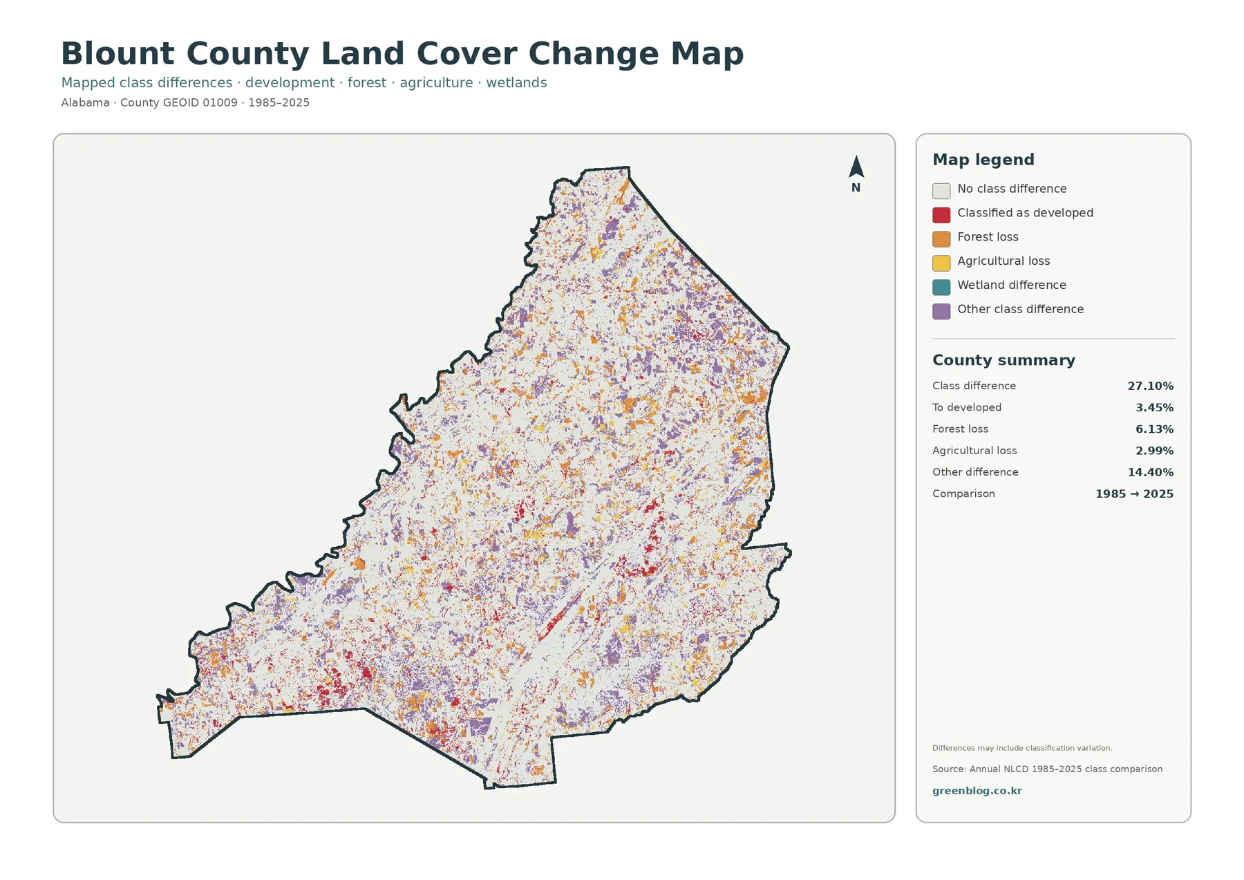
The change summary reports a total class difference of 27.10% between 1985 and 2025. The listed components include 3.45% changing to developed, 6.13% forest loss, 2.99% agricultural loss, and 14.40% other class difference. Wetland difference also appears in the legend, but the summary box does not provide a separate percentage for it. The safe approach is to use only the values printed on the supplied map rather than calculate an unstated wetland figure from the remainder.
Purple other-class differences are widely scattered across the county. Orange forest-loss pixels and yellow agricultural-loss pixels also appear from north to south, while red change-to-developed areas are more localized around existing built concentrations and linear features. The red color is visually strong, but 3.45% is only one part of the 27.10% total. The largest listed component is the 14.40% other-class category. For that reason, the map should not be summarized simply as forty years of urban growth.
Labels such as forest loss and agricultural loss indicate a difference between endpoint classifications; they do not identify a cause. The map itself notes that differences may include classification variation. A cell can also change more than once during a forty-year interval, which an endpoint comparison will not reveal. Confirming logging, farm conversion, construction, wetland change, or another local event requires intermediate-year imagery, aerial photographs, field information, or administrative records. The change map is strongest as a screening tool for locating areas that deserve closer examination.
Comparing all four maps keeps current cover separate from change
A practical sequence starts with the general map. Find the broad forest and agricultural pattern and note the largest developed clusters. Then move to the forest-and-farmland view to separate cropland, pasture or hay, shrub or grass, wetlands, and water from the wider mix. The impervious map answers a different question by showing where hard surfaces are concentrated inside and between developed areas. Only after the current 2025 pattern is clear does the 1985–2025 comparison become easy to interpret.
The east-central built concentration is a good example. It is obvious in red on the general map, but the impervious layer reveals a smaller, darker core surrounded by lighter hard-surface values and thin connections. The change map then shows several types of difference in the broader area rather than one uniform expansion color. In the southwest, large forest blocks remain prominent in the current maps and the impervious layer is mostly pale, even though scattered change pixels still occur. Using the maps together adds context without forcing one legend to answer every question.
Readers should also notice that color intensity means different things from one map to another. The general and forest-and-farmland maps use categorical colors. The impervious map uses percentage ranges from 0% through 80–100%. The change map uses categories describing different endpoint comparisons. A dark mark therefore does not carry one universal meaning across the set. When the maps are placed side by side in a report or classroom handout, keeping each legend visible prevents misleading visual comparisons.
Download the four original JPG maps
The download ZIP contains the four original JPG files: the 2025 general land-cover map, the forest-and-farmland map, the impervious-surface and developed-land map, and the 1985–2025 land-cover change map. The larger source images are convenient for documents, slides, classroom handouts, printed county references, and side-by-side comparisons with other Alabama counties. Keeping the complete set together also makes it easy to return to the same location from four different viewpoints without searching for separate files.
A larger JPG makes legends and small colored areas easier to view or print, but it does not create parcel-level accuracy. The underlying classification and spatial resolution remain the same when the image is enlarged. Use the maps for county-scale description, communication, education, and preliminary comparison. A property decision, engineering design, wetland determination, zoning check, or survey requires more detailed local records and field-appropriate data.
Thirty-meter raster cells generalize small features
Annual NLCD land cover is a 30-meter raster product derived from Landsat-based observations. Raster data divide the landscape into grid cells and assign a representative class or value to each cell. In the real world, one cell can contain trees, a yard, a narrow road, a small stream, and part of a building at the same time. The dataset must generalize that complexity. Mixed pixels are especially common near boundaries between forest, agriculture, development, water, and wetlands.
The same limitation matters in the endpoint change map. A difference between the 1985 and 2025 class for one cell does not prove that the site changed once, permanently, or for a particular reason. Boundary placement and classification conditions can also influence the result. At county scale, however, these data remain useful for identifying broad forest dominance, extensive agricultural cover, concentrated hard surfaces, and areas with many class differences. The key is to match the map scale to the question being asked.
Useful questions for education, planning context, and regional comparison
For environmental education, the maps can be used to compare the boundaries between forest and agriculture and discuss why a countywide percentage does not make the landscape uniform. For watershed context, water and wetland classes can be viewed beside forest, farms, and built areas. The impervious layer helps explain the difference between a broad developed class and the smaller fraction of land actually covered by pavement or roofs. The change layer can identify locations where additional historical imagery or local records would be most useful.
Blount County is a good example of why several map views are more informative than one headline statistic. Forest exceeds half of the county, yet agriculture is close to one-third and repeatedly interrupts the woodland. Developed cover is a smaller 10.58%, but its clusters are visually prominent. Mean impervious surface is only 1.90%, showing that the broader developed class includes much more than hard pavement and rooftops. Finally, the change map’s largest listed component is other class difference, not change to developed. Together, these observations keep the interpretation balanced.
Frequently Asked Questions
Does 51.02% forest mean half of Blount County is one continuous forest?
No. The percentage is the total share classified as forest in the 2025 map. Agricultural cover, developed land, shrubland, grassland, water, and wetlands repeatedly interrupt that forest. Some southern and southwestern areas contain broad wooded blocks, while the north and center show a finer mixture. The map also does not describe tree species, stand age, ownership, or forest-management status.
Why is developed cover 10.58% when mean impervious surface is only 1.90%?
They measure different things. Developed land is a broad land-cover category that can include buildings and roads together with lawns, trees, and other permeable surfaces. Fractional impervious surface focuses more directly on hard surfaces such as roofs and pavement. Low-density development can therefore contribute to the developed class while having a much lower impervious percentage.
Does the 27.10% class-difference value mean 27.10% of the county became developed?
No. The 27.10% value combines several types of endpoint difference between 1985 and 2025. The map lists 3.45% as changing to developed, 6.13% as forest loss, 2.99% as agricultural loss, and 14.40% as other class difference. Wetland difference also appears in the legend. Causes need to be checked with additional imagery, records, or field information rather than inferred from the endpoint map alone.
Map File Information
Blount County land cover map JPG download
- Included Files: Use only the versions confirmed in the article and supplied images
- File Type: Use the confirmed download contents
- Intended Use: Printing, education, presentations, and map-based projects
Related Maps
- Autauga County Alabama Land Cover Map
- Baldwin County Alabama Land Cover Map
- Barbour County Alabama Land Cover Map
Sources and further reading
Land-cover percentages and 1985–2025 change values in this article come from the supplied Blount County map images. The official resources below provide background for Annual NLCD classes, county boundaries, and local Blount County and Inland Lake context.
- MRLC Annual NLCD Data – official access to Annual NLCD land-cover and related products.
- USGS Annual NLCD Land Cover Classification – official description of land-cover classes and interpretation.
- U.S. Census Bureau TIGER/Line Shapefiles – official county boundary and geographic data resources.
- Blount County Commission – official county government and local-government information, including the county’s Oneonta offices.
- Outdoor Alabama – Inland Lake – official state information about Inland Lake, Blackburn Fork, and the Little Warrior River setting in Blount County.
Green Map creates custom-edited map images using open geographic data sources such as geoBoundaries, Natural Earth, OpenStreetMap, and government open data.
These maps are edited visual materials, not raw data files, and are provided for education, documents, presentations, and graphic reference.