Menard County, Illinois is overwhelmingly agricultural in the 2025 land-cover summary, but the county is not a uniform block of cropland. Forest, wetlands, and water trace a more irregular pattern through the middle and southern parts of the county, while developed land gathers around Petersburg, Athens, Greenview, and smaller road-linked settlements. The four maps on this page separate those patterns so they can be compared without treating land cover as zoning or property use.
The original JPG versions of all four maps are available together in one ZIP. Start with the general land-cover map for the countywide pattern, use the forest-and-farmland view when the river corridor and wooded areas matter most, switch to the impervious-surface map for streets and built areas, and use the 1985–2025 change map when the question is how mapped classes differ between the two dates.
Table of Contents
An agricultural county divided by a river corridor
Menard County lies in central Illinois. The county comprehensive plan identifies Petersburg as the county seat, names Athens and Greenview among the larger towns, and states that the Sangamon River bisects the county. It also describes much of the land as farmed, with corn and soybeans as the predominant crops and wheat also grown. That local description provides useful context for the broad yellow agricultural cover and the narrower wooded and wet areas visible in the supplied maps.
Agriculture accounts for 82.12% of the 2025 summary. Forest covers 9.23%, developed land 6.37%, wetlands 1.35%, and water 0.64%. Those percentages explain why agriculture dominates at first glance, yet the smaller categories are not randomly scattered. Forest becomes more continuous along the Sangamon River and associated drainage areas, while development forms distinct clusters instead of spreading evenly across the countryside.
The eastern and northeastern portions are especially continuous in agricultural cover. In the western and south-central portions, wooded patches are larger and more connected, and the central river corridor creates a visible break in the farmed landscape. Small forest fragments also occur between fields elsewhere. Reading the map by location, rather than by percentages alone, makes it easier to see where natural cover still forms connected strips within an agricultural county.
Where the 2025 land-cover classes concentrate
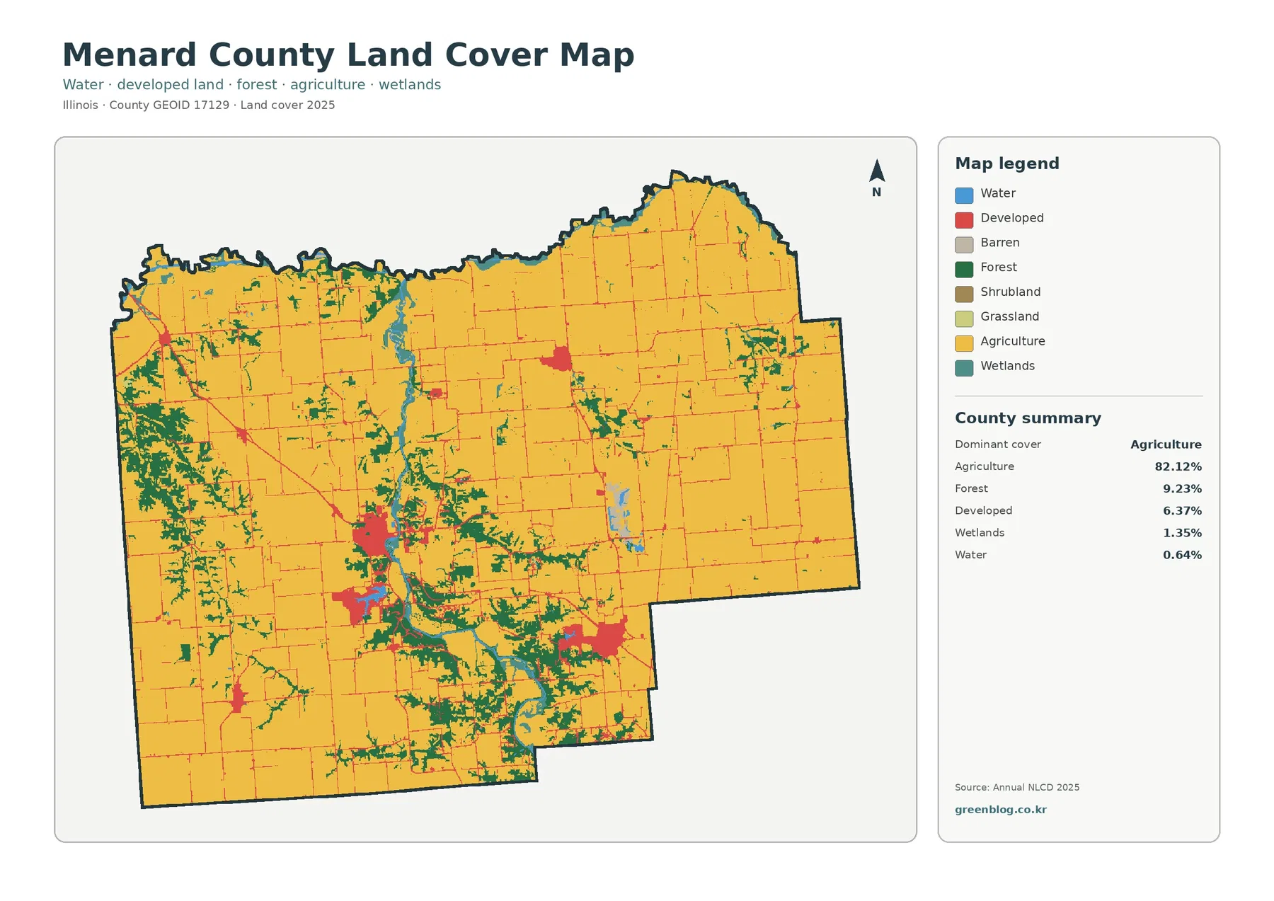
The general map is the best place to establish the overall pattern. Agriculture fills most of the county, but the Sangamon River and nearby wooded land create a winding north-to-south feature through the interior. Larger forest concentrations also appear toward the west and south-central areas. Water and wetlands occupy much less area, yet their placement along drainage features gives them more visual importance than their countywide percentages might suggest.
Developed land appears as a set of compact red clusters connected by thin road-like lines. Petersburg is the largest and most complex cluster in the central-southern part of the county. Other concentrations align with Athens toward the southeast and Greenview farther north, while smaller places contribute additional dots and short corridors. The map therefore reads as a rural county with several settlement centers rather than a continuously urbanized landscape.
The wetland and water classes require a careful reading. A blue or teal patch on this map describes mapped surface cover, not a legal wetland boundary, floodplain determination, or water-rights condition. Narrow channels and small water bodies can also be generalized by the raster classification. Use these classes to locate broader patterns and then consult dedicated hydrologic or regulatory sources when a parcel-level answer is needed.
Forest and cropland reveal the strongest internal contrast
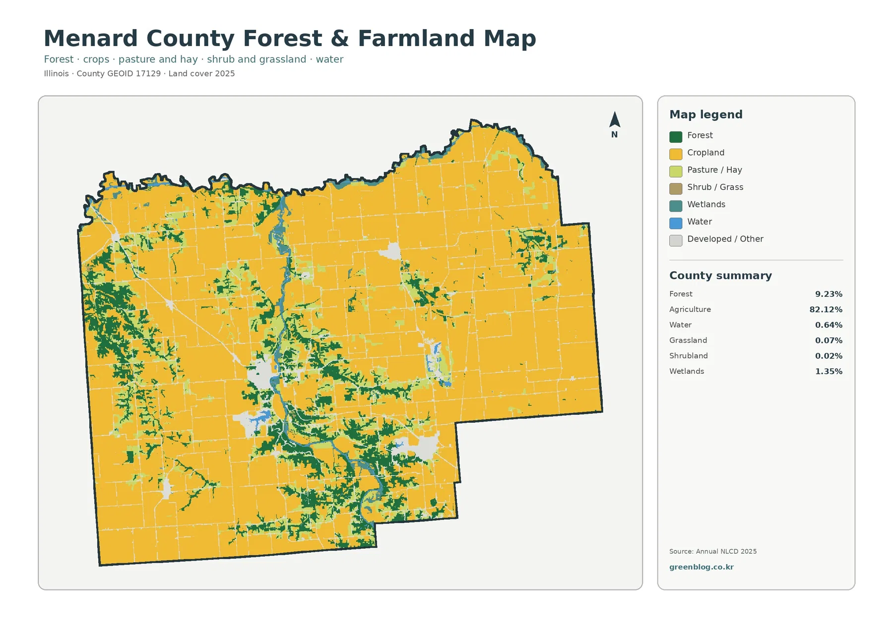
Removing most of the developed detail from the visual emphasis makes the agricultural pattern even clearer. Cropland occupies broad, connected areas across the north, east, and much of the west. Forest is far less extensive, but it is concentrated enough to form recognizable belts along the river system and in the western and southern parts of the county. This view is particularly useful when the goal is to compare open farm country with wooded drainage corridors.
The map should not be used to identify individual crops. The county comprehensive plan notes the importance of corn, soybeans, and wheat, but the supplied land-cover image groups agricultural surfaces into broader classes. A yellow field on the map is therefore evidence of mapped cropland or agriculture, not proof that a specific parcel contained corn or soybeans in the observation year.
Grassland and shrubland are minor components in the 2025 county summary, at 0.07% and 0.02% respectively. They appear in small pieces rather than large county-defining areas. Pasture and hay are also separated visually in the forest-and-farmland legend, which helps explain transitions around fields and wooded edges without turning every light-colored patch into a major land-cover zone.
This map is useful for following the wooded ribbon around the Sangamon River. In several places, forest broadens beside water or wetland cover and then narrows again as it passes through agricultural land. That repeated pattern helps distinguish a connected river environment from isolated tree patches elsewhere in the county. It is a more specific observation than simply noting that Menard County has 9.23% forest.
Built surfaces remain concentrated around towns and roads
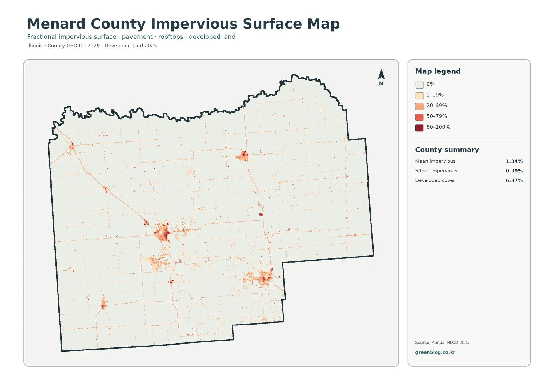
Impervious surface means pavement, rooftops, and similar surfaces that do not readily absorb rainfall. The countywide mean shown on the map is 1.34%, and cells with at least 50% impervious cover account for 0.39%. Those low values are consistent with the agricultural character of the county: most of the map remains very light, and stronger colors are limited to towns, road intersections, and a few scattered built sites.
Petersburg produces the most prominent impervious cluster. Its street network and built-up area stand out against the surrounding fields, and linear connections extend outward along roads. Athens and Greenview form separate concentrations, while a smaller cluster in the southwest corresponds to the Tallula area. The result is a useful picture of how developed surfaces are organized around several local centers instead of one continuous urban corridor.
Thin impervious lines cross the agricultural interior in a grid-like pattern. These are important because the general land-cover map can make roads blend into the broader developed category, whereas the impervious map isolates the harder surfaces more directly. A reader comparing the two maps can distinguish a compact town center from a road that simply passes through farmland.
Impervious cover is not the same as zoning, development rights, or a parcel boundary. A dark cell tells the reader that hard surface occupies a substantial share of that mapped cell; it does not say whether new construction is permitted or what the land is legally used for. Menard County maintains separate zoning and GIS resources for those questions, and Petersburg, Athens, and Greenview also have their own municipal roles in land-use administration.
What changed between 1985 and 2025
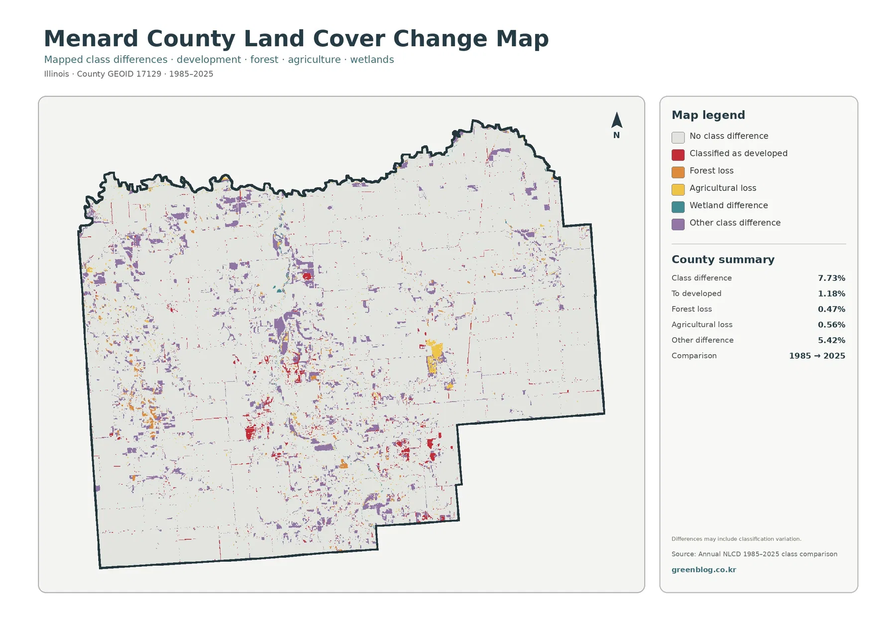
The change map compares the 1985 and 2025 classifications. Its summary reports a class difference across 7.73% of the county. Of that total, 1.18% is mapped as changing to developed, 0.47% as forest loss, 0.56% as agricultural loss, and 5.42% as other class difference. Most of the county remains in the no-class-difference background, so the colored areas are best read as selected pockets of change rather than a complete replacement of the agricultural landscape.
Red developed-change cells gather around existing settlement areas and along some transportation lines. Petersburg contains several visible concentrations, and smaller red groups appear near the other towns. This does not mean that every red cell represents a newly constructed building. The category records a difference in mapped class between the two comparison years, so it is more accurate to say that those locations were classified as developed in the later map.
Forest-loss and agricultural-loss colors are more fragmented. They occur as small patches and short strips rather than one dominant block. The purple “other class difference” category is the largest numeric component of the change summary, which is an important caution: the 7.73% total cannot be described as 7.73% urban growth or 7.73% land conversion.
The map itself notes that differences may include classification variation. Satellite observations, mixed land-cover cells, class definitions, and improvements in classification methods can all contribute to small discrepancies. Anyone studying the timing of a particular field conversion, tree removal, or development project should pair this map with dated aerial imagery, local records, or intermediate-year land-cover data.
Comparing the same place across all four views
Petersburg is a good reference point for cross-map reading. On the general map it appears as the largest developed cluster. On the impervious map, the same area breaks into streets, dense built surfaces, and lower-intensity edges. The forest-and-farmland map emphasizes the surrounding agricultural land and nearby wooded river environment, while the change map identifies only the cells whose classifications differ between 1985 and 2025.
The Sangamon River corridor tells a different story. Water, wetlands, and forest appear together on the general map. The forest-and-farmland view makes the wooded strip easier to follow through the surrounding cropland. The impervious map remains light across much of that corridor except where roads and settlements intersect it. On the change map, scattered class differences occur along and near the corridor, but they should be interpreted category by category rather than as one continuous process.
Large agricultural areas in the east and northeast show why the impervious map adds information that the other maps do not. Cropland looks continuous in the first two views, yet a fine network of roads becomes visible as linear impervious features. Small change pixels also appear near field boundaries and transportation lines. When those pixels are isolated, they should be treated cautiously; when several maps show a consistent pattern in the same place, the comparison becomes more informative.
Choosing a map for printing, teaching, or reference work
For a county profile, the 2025 general land-cover map works well as the primary figure because it combines agriculture, forest, developed land, wetlands, and water in one view. Pairing the 82.12% agriculture figure with the wooded Sangamon River corridor and the Petersburg development cluster gives readers both a countywide statistic and a clear spatial pattern.
For environmental education, the forest-and-farmland map is often the clearest starting point. Students can identify a town such as Petersburg, trace the river-associated forest, and compare that pattern with the broad cropland to the north and east. Adding the impervious map then introduces the difference between a land-cover class such as “developed” and the fractional amount of hard surface inside developed and rural areas.
For presentations about long-term change, use the change map only after the current land-cover pattern has been established. Viewers can then see where the 1985 and 2025 classifications differ without mistaking every colored pixel for a single type of development. The legend categories and the 7.73% total should stay visible when the map is reproduced because the meaning depends on those distinctions.
The ZIP contains four original JPG images at 2480×1754 pixels each. The WebP images in the article are convenient page previews, while the JPG files are better suited to local saving, slide preparation, or printing. If a page layout makes the legend too small, use one map at a larger size rather than shrinking all four into a single panel.
Limits to keep in mind before using the maps for decisions
Annual NLCD land cover is a raster classification, meaning the landscape is represented as a grid of cells. Real-world boundaries are usually more complicated than the edge between two map colors. A cell can contain more than one surface type, and narrow streams, small ponds, individual buildings, or thin roadside features may be simplified. The maps are therefore appropriate for county-scale comparison, not as a substitute for a survey.
The 2025 map is a snapshot of the classification for that year. Changes that occurred afterward are not represented. Likewise, the 1985–2025 change map compares two endpoints; it does not identify the exact year when a class changed. Intermediate datasets or aerial photographs are needed to reconstruct a sequence of events.
Land cover also differs from legal land use. Forest color does not establish protected status, wetland color does not define a regulatory jurisdiction, and agricultural cover does not determine a parcel’s zoning. Use the maps to understand visible surface patterns and to locate areas for further investigation, then consult county GIS, zoning, hydrologic, soil, or property records for decisions that require legal or site-specific detail.
Download the original Menard County JPG map set
Choose the general map when one figure must summarize the county. Use the forest-and-farmland map for the agricultural and river-corridor contrast, the impervious map for towns and roads, or the change map for the 1985–2025 comparison. The download package keeps those four purposes separate by providing one original JPG for each view.
Frequently Asked Questions
What is the dominant land cover in Menard County?
Agriculture is the dominant 2025 category at 82.12%. Forest accounts for 9.23%, developed land 6.37%, wetlands 1.35%, and water 0.64%. The smaller forest and wetland shares still form visible corridors, especially around the Sangamon River and connected drainage areas.
Why does Petersburg stand out on the impervious-surface map?
Petersburg is the county seat and the largest developed cluster visible in the supplied maps. Streets, buildings, parking areas, and other hard surfaces create a stronger impervious signal there than in surrounding farm country. Athens and Greenview form separate clusters, but they are smaller and differently shaped.
Does the 7.73% change figure mean that 7.73% of the county became developed?
No. The 7.73% figure is the total share with a different mapped class between 1985 and 2025. The map separately reports 1.18% changing to developed, 0.47% forest loss, 0.56% agricultural loss, and 5.42% other class difference. Classification variation may also contribute to the mapped differences.
Map File Information
Download four original JPG maps covering Menard County's 2025 land cover, forest and farmland, impervious/developed surface, and mapped class differences from 1985 to 2025.
- Included Files: Four original JPG land-cover maps
- File Type: JPG files in one ZIP archive
- Intended Use: Printing, education, presentations, and map-based projects
Related Maps
- Adams County Illinois Land Cover Map
- Alexander County Illinois Land Cover Map
- Bond County Illinois Land Cover Map
Sources and References
- MRLC Annual NLCD Data — annual land-cover and related datasets
- USGS Annual NLCD Land Cover Classification — classification descriptions and interpretation
- U.S. Census Bureau TIGER/Line Shapefiles — county boundary data
- Menard County Comprehensive Plan — official county context for the Sangamon River, towns, farming, topography, wooded areas, and wetlands
- Menard County Community Resources — official links to local GIS, county maps, roads, towns, and conservation resources
Green Map creates custom-edited map images using open geographic data sources such as geoBoundaries, Natural Earth, OpenStreetMap, and government open data. These maps are edited visual materials, not raw data files, and are provided for education, documents, presentations, and graphic reference.