The Wilcox County Alabama Land Cover Map set captures a county where broad forest cover meets a striking river-and-wetland corridor. Forest accounts for 51.37% of the 2025 classification, while wetlands account for 21.58%. Instead of treating Wilcox County as one uniform landscape, the four views let readers compare the current land-cover mosaic, forest and farm areas, paved and built surfaces, and mapped class differences between 1985 and 2025.
All four original JPG maps are available in one download near the end of the page. Each file is 2480×1754 pixels, which is useful for classroom handouts, slide decks, regional comparisons, and reference printing. The maps describe land cover, not parcel ownership, zoning, building rights, or official wetland jurisdiction, so they should be paired with the appropriate local or federal records when a decision depends on legal boundaries.
Table of Contents
A river-and-wetland corridor shapes the county view
The western half of Wilcox County immediately stands apart from the rest of the image. Blue water bends through broad teal wetland areas, while green forest and yellow agricultural patches occupy the surrounding uplands. Alabama Cooperative Extension describes Wilcox County as a meeting place for Coastal Plain soils, Black Belt soils, and alluvial terraces and floodplains associated with the Alabama River and its tributaries. That soil guide is not a land-cover dataset, but it gives useful geographic context for the large wetland and river pattern visible on the maps.
Outdoor Alabama describes the Alabama River as a major navigable river below Montgomery, with run-of-the-river reservoirs along its course. On the county map, the river system should therefore be read as more than a thin blue line. Water and wetlands occupy a broad corridor, and the surrounding land cover changes repeatedly along its bends. The map does not show flood zones, water depth, current velocity, or regulatory wetland boundaries, so the blue and teal colors should not be used as a substitute for flood or permitting information.
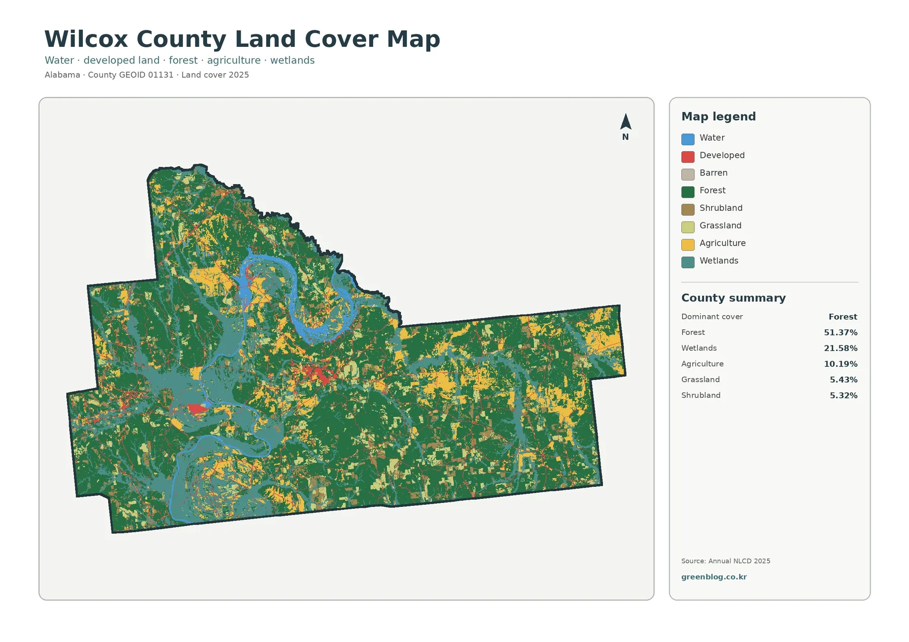
The county summary confirms what the image suggests: forest is the largest class, but wetlands are too extensive to be treated as a minor edge feature. Agriculture appears in many separate blocks rather than one continuous belt. Grassland and shrubland add another layer of smaller open or transitional areas. Developed land is present, yet it occupies only 3.91% of the 2025 cover and does not dominate the county-wide view.
Development is easier to understand through impervious cover
A land-cover class labeled “developed” does not tell the whole story of how heavily the ground is paved. The impervious-surface map focuses on roofs, pavement, and similar surfaces that keep rainfall from soaking directly into the soil. Wilcox County has a mean impervious value of 0.56%, and only 0.12% of the county is mapped at 50% or greater imperviousness. Most of the map is therefore extremely light, with a few small concentrations and thin linear traces standing out.
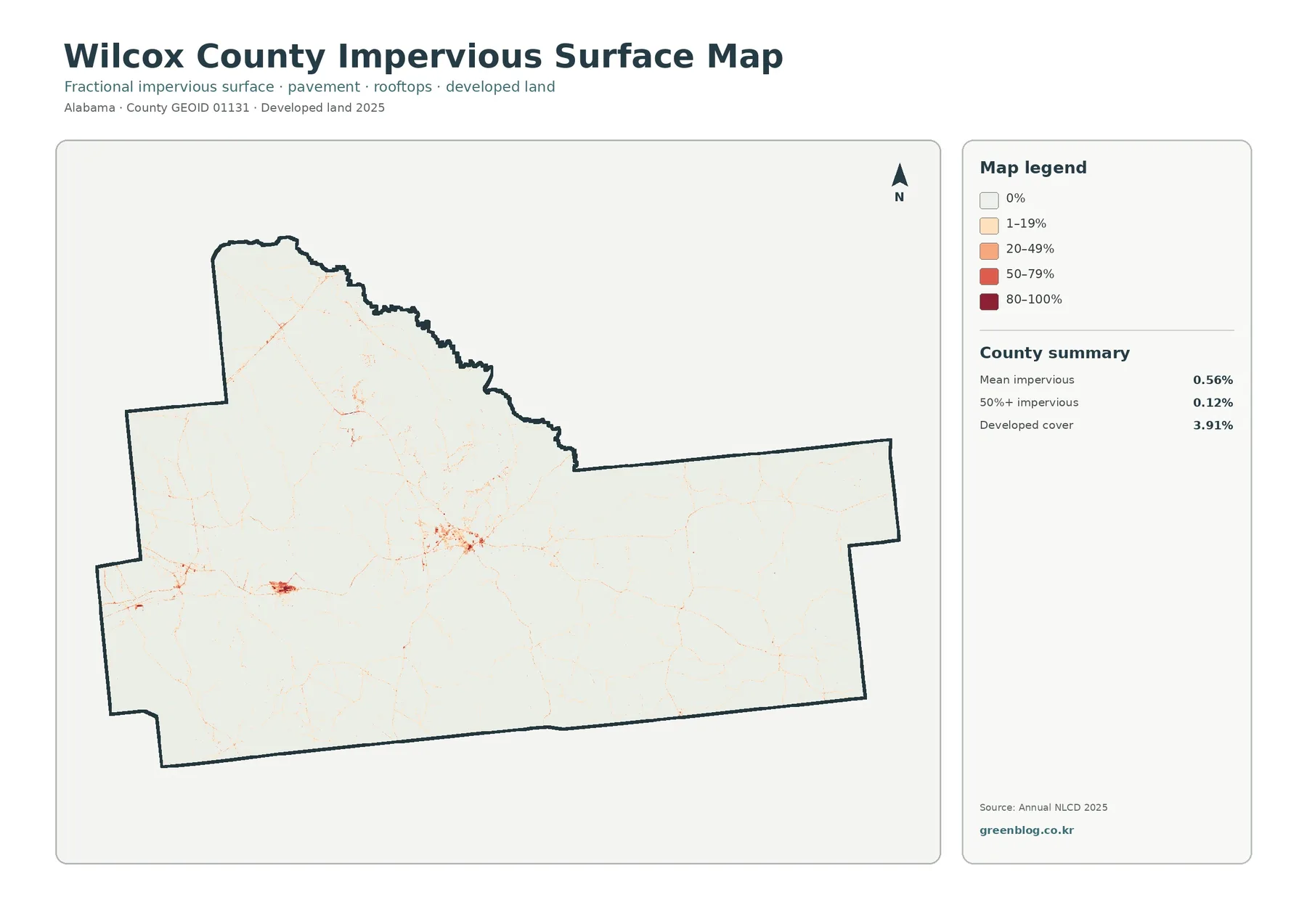
The 3.91% developed-cover figure is not supposed to match the 0.56% mean impervious value. A developed land-cover class can include lawns, scattered trees, and other pervious ground around houses or roads, while the impervious layer estimates the portion occupied by roofs and pavement. Reading the two measures together is more informative than using either alone: one identifies developed environments, and the other indicates how intensely those places are sealed by hard surfaces.
The Alabama Cooperative Extension soil guide specifically notes urban development around Camden. That local reference helps explain why a more concentrated impervious cluster appears in the west-central portion of the county, although the map itself does not draw a municipal boundary or label individual roads. For an exact boundary or transportation overlay, Census TIGER/Line data or current local mapping should be used rather than guessing from the color pattern.
Forest remains continuous while agriculture appears in separated blocks
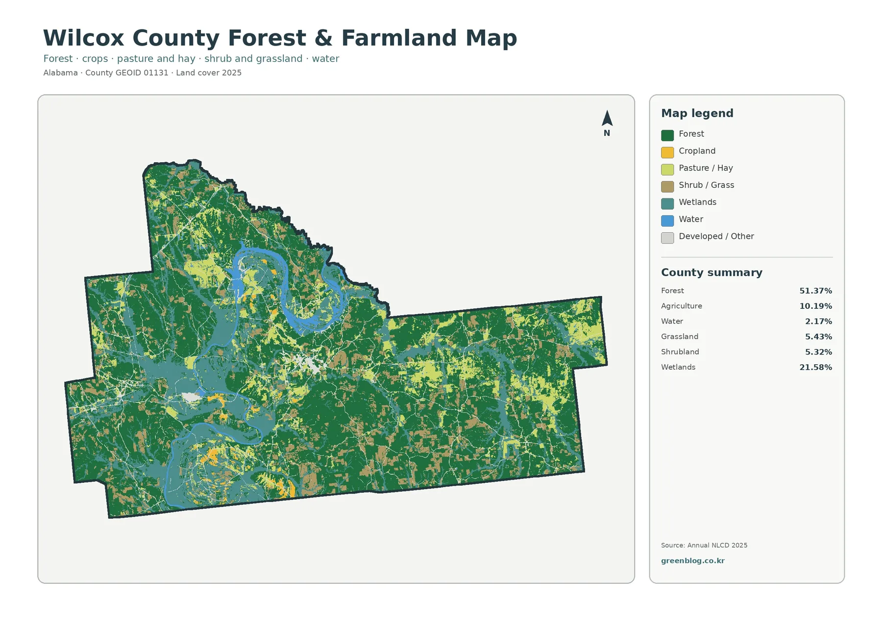
Removing most of the developed-land detail makes the county’s rural pattern easier to see. Dark green forest extends across much of the east and south and fills many spaces between agricultural patches. Yellow and light-green farm or pasture areas appear in repeated blocks, especially away from the broadest wetland corridor. In the western river area, wetland and water colors interrupt both forest and agricultural land, creating a more broken pattern than the largely forested eastern side.
The map is best read as a generalized surface classification. “Agriculture” does not mean the parcel is legally zoned for farming, and “forest” does not establish ownership, timber rights, or management status. A single classified grid cell may contain more than one real-world surface, especially near field edges, narrow roads, small ponds, or scattered homes. This is why the map works well for county-scale comparison but not for defining a property line.
Grassland at 5.43% and shrubland at 5.32% deserve attention because together they explain many of the intermediate colors between forest, farmland, and wetland. These areas are scattered rather than concentrated in one obvious district. In a classroom exercise, identifying these smaller categories can help students understand that landscapes rarely divide into only “forest” and “farm.” Transitional and open vegetation types fill many of the spaces between the major classes.
The 1985–2025 map measures class difference, not a single trend
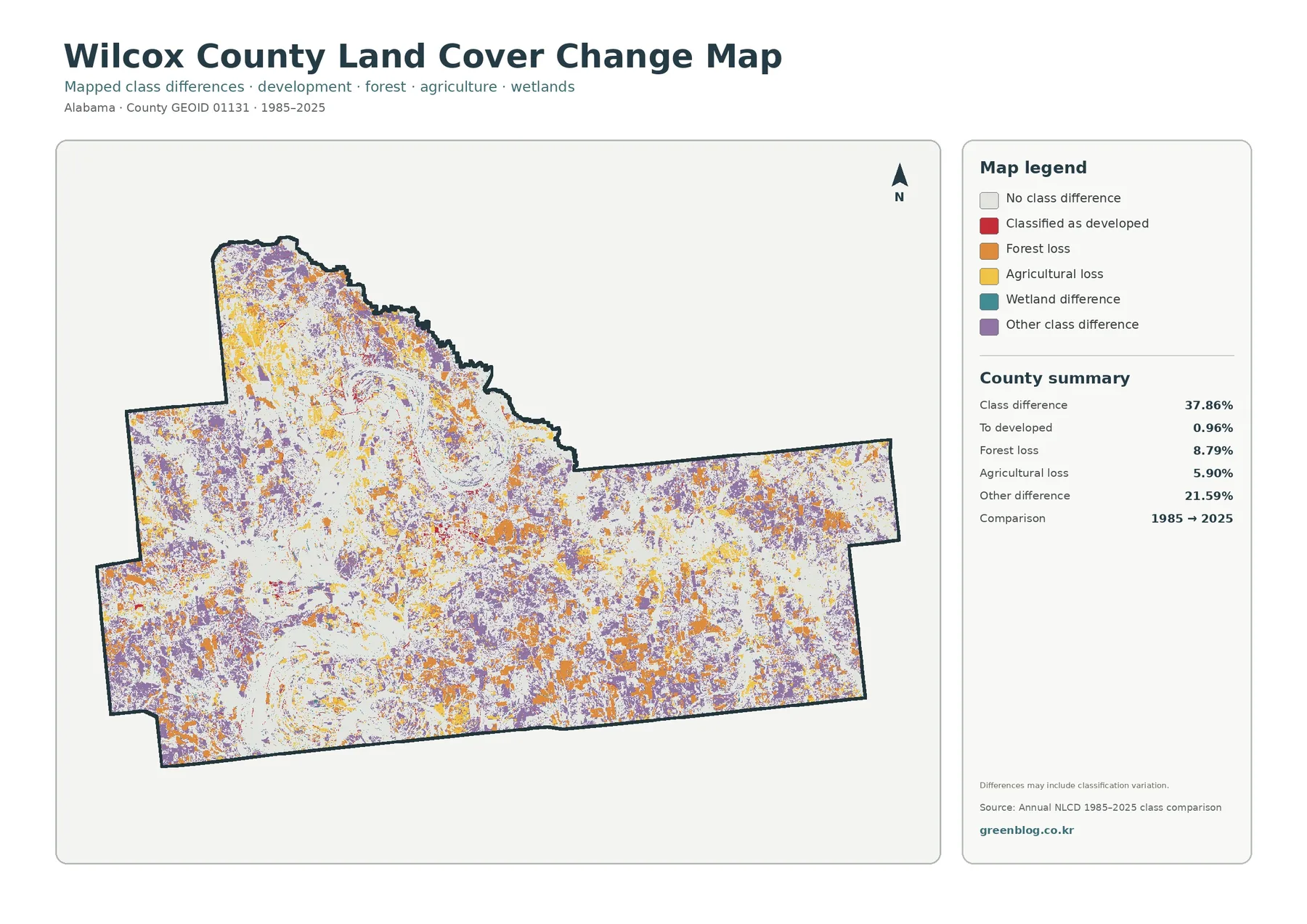
The largest number on the change map, 37.86%, can be misleading if it is read without the legend. It is the share of cells whose mapped class differs between the 1985 and 2025 comparison, not the share of the county that became developed. The map separately reports 0.96% as “to developed,” 8.79% as forest loss, 5.90% as agricultural loss, and 21.59% as other class difference. These categories need to remain separate in any chart, caption, or presentation.
Orange, yellow, purple, and wetland-difference colors are scattered across much of the county rather than forming one simple front of change. The pattern suggests that many kinds of classification differences occurred in different places. The map itself also warns that differences may include classification variation. Sensor changes, imagery dates, mixed pixels, and classification methods can all affect a long-term comparison, so a colored cell should not automatically be treated as proof of a specific land-use event.
A useful way to work with this map is to pair it with the 2025 land-cover view. First identify what a place is classified as today, then check whether the comparison map marks a difference at the same location. This separates the question “What is here now?” from “Was the mapped class the same in 1985?” If a research project needs to explain why a class changed, historical aerial photography, forestry records, planning documents, or field observations are needed before assigning a cause.
A practical four-map workflow for Wilcox County
For a quick county overview, start with the full land-cover map because it keeps water, wetlands, forest, agriculture, developed land, grassland, and shrubland in one frame. Move to the forest-and-farmland version when the question is about the rural landscape rather than settlements. Use the impervious map when the project needs a clearer view of pavement and rooftops. Save the change map for a separate step because it represents a time comparison rather than current land cover.
The four images also work well in environmental education. A student can trace the western river-and-wetland corridor, compare it with the forested east, and then look for the small developed clusters on the impervious layer. A watershed lesson can discuss why wetland mapping is not identical to flood-risk mapping. A regional comparison can place Wilcox County next to another Alabama county and ask how forest share, wetland concentration, agriculture, and hard-surface development differ visually.
For presentations, avoid shrinking all four maps into one unreadable panel. A better sequence is to introduce the 2025 land-cover pattern, zoom in on forest and agriculture, show imperviousness separately, and finish with the long-term comparison. This preserves the meaning of each legend. It also prevents the 37.86% class-difference number from being mistaken for a development statistic simply because it appears after the impervious map.
Download and print notes for the four JPG maps
The downloadable archive contains the original JPG for each map shown on the page. At 2480×1754 pixels, the files are larger and more suitable for reuse than browser screenshots of the WebP previews. The asset manifest does not mark them as meeting the package’s A3 high-resolution reference, so very large prints should be tested before final production. Keeping the original aspect ratio will also prevent the county outline and legend from being stretched.
Limits to keep in mind before using the maps
Annual NLCD is designed for consistent regional land-cover analysis, but any raster classification generalizes the ground into cells. Narrow features may be blended with their surroundings, and a cell near a boundary can contain several real surfaces even though the map assigns one class. That limitation matters in Wilcox County because water, wetlands, forest edges, roads, and small developed sites often meet within short distances.
The observation year matters as well. The 2025 map represents the dataset’s classification for that year; later timber harvests, field changes, construction, floods, or other disturbances may not appear. Current land-management questions should use current imagery and authoritative local records. Regulatory decisions involving wetlands, property ownership, permits, or building restrictions require the appropriate agency data rather than a general land-cover map.
Frequently Asked Questions
Does 21.58% wetlands mean all of that land is legally regulated wetland?
No. The 21.58% figure is a land-cover classification from the 2025 map. Regulatory wetland status depends on legal definitions, field conditions, jurisdiction, and current agency determinations. The map is useful for seeing where wetland-like cover is concentrated, especially along the western river corridor, but it cannot replace a wetland delineation or permit review.
What does the 0.56% mean impervious value tell me?
It indicates that hard surfaces such as roofs and pavement occupy a small average share of the county surface. The map also reports only 0.12% of the county at 50% or greater imperviousness. Those values are consistent with the image, where strong impervious colors appear mainly as small clusters and narrow lines rather than a large continuous urban area.
Is the 37.86% class difference a development rate?
No. It combines all mapped class differences between 1985 and 2025. Only 0.96% is specifically labeled as a transition to developed. Forest loss, agricultural loss, wetland differences, and other differences are separate categories, and some changes may reflect classification variation rather than a single physical process.
What is included in the download?
The ZIP contains four 2480×1754 JPG files: the general land-cover map, forest-and-farmland map, impervious/developed-land map, and 1985–2025 land-cover change map. The WebP images in the article are previews; the JPGs are the original download assets supplied with the county package.
Map File Information
Wilcox County Land Cover — Four JPG Maps
- Printable Size: 2480 × 1754 pixels each
Related Maps
- Autauga County Alabama Land Cover Map
- Baldwin County Alabama Land Cover Map
- Barbour County Alabama Land Cover Map
Sources
- MRLC Annual NLCD Data — official access point for Annual NLCD land-cover data
- USGS Annual NLCD Land Cover Classification — class definitions used to interpret forest, developed, agriculture, wetlands, and related cover
- U.S. Census Bureau TIGER/Line Shapefiles — county boundary and geographic reference data
- Alabama Cooperative Extension: Soil Descriptions and Plant Selections for Wilcox County — county-specific context for Coastal Plain, Black Belt, river floodplain, and wetland soils
- Outdoor Alabama: Alabama River — official background on the Alabama River system and its reservoirs
Green Map creates custom-edited map images using open geographic data sources such as geoBoundaries, Natural Earth, OpenStreetMap, and government open data.
These maps are edited visual materials, not raw data files, and are provided for education, documents, presentations, and graphic reference.