The Pinal County Arizona Land Cover Map set depicts a mostly shrub-covered county broken by large agricultural blocks and several developed clusters. Shrubland accounts for 81.38% of the 2025 summary, while agriculture reaches 8.94% and developed land 4.53%. Grassland and wetlands occupy smaller shares, and forest and open water are limited. The contrast between the broad shrub background and concentrated farm and built areas gives the four maps a clear county-specific pattern.
The page includes four related views: current land cover, forest and farmland, impervious/developed land, and a 1985–2025 class comparison. The four original JPG files are available together in one download. They work best for county-scale reference, classroom work, presentations, and broad environmental comparison. Parcel ownership, zoning, legal land use, development rights, and regulatory wetland boundaries require different official records.
Table of Contents
A broad shrub landscape interrupted by farms and built areas
The first thing to notice is the amount of uninterrupted shrubland away from the western and central clusters. Brown shrub cover fills most of the county and becomes especially continuous across the eastern side. In contrast, yellow agricultural areas form large blocks in the west and central-south, while red developed patches appear inside and around the same more varied part of the county. The result is not a gradual east-to-west color change but a strong difference between broad natural cover and localized mosaics of farms, development, and other classes.
Reading the 2025 land-cover map without turning it into a land-use map
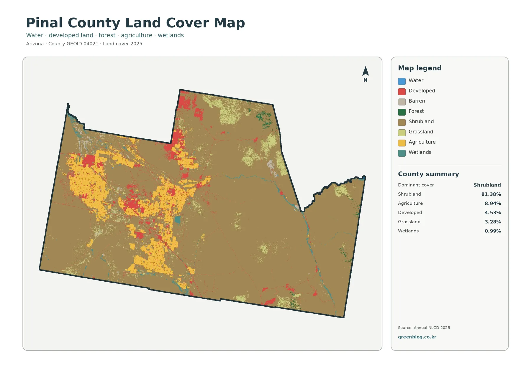
The general map combines water, developed land, barren surfaces, forest, shrubland, grassland, agriculture, and wetlands. Agricultural yellow is easiest to follow across the west and through the central part of the county, where it forms a series of large fields and blocks rather than isolated dots. Developed red appears around many of those areas and in separate clusters farther north. The eastern portion contains fewer large farm and development patches, so the shrub classification becomes visually dominant again.
Wetlands account for 0.99%, while the forest-and-farmland panel gives open water as 0.05%. Teal and blue features are therefore small in area, but some follow narrow linear or branching shapes that remain noticeable on the county map. Their mapped presence should not be confused with a regulatory wetland delineation, a flood zone, or a surveyed stream boundary. This page describes remotely classified surface cover at county scale.
The 1985–2025 comparison records several kinds of difference, not one trend
The change image marks 10.25% of Pinal County as having a class difference between 1985 and 2025. The summary separates 2.82% as changing to developed, 0.54% as forest loss, 1.78% as agricultural loss, and 4.99% as other class difference. Wetland difference is also a legend category, but its own percentage is not printed in the panel. It is therefore discussed visually without calculating a remainder from the other values.
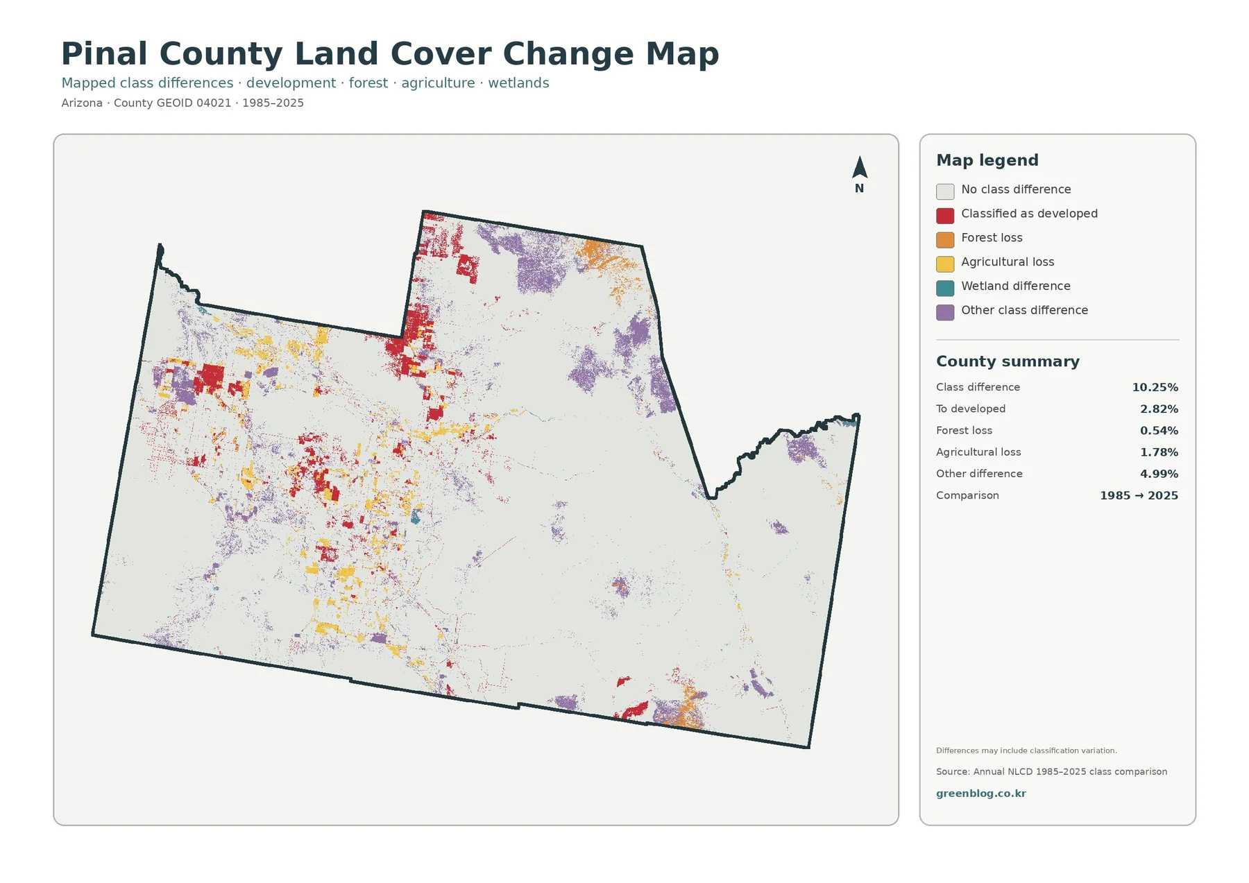
Red “to developed” patches are most visible in the western and central areas where current development is already concentrated, with additional clusters in the northern extension. Yellow agricultural-loss marks occur around and within parts of the large farming zones. Purple other-class differences are more dispersed, including patches toward the northeast and east as well as within the more heavily used western side. The colors show that different parts of the county experienced different classification outcomes.
Why the forest-and-farmland view is especially useful in Pinal County
Agriculture is large enough to shape the western and central map but small enough to be overwhelmed by shrubland in the countywide total. The specialized view removes some of the visual competition and gives cropland and pasture/hay their own legend entries. It also keeps shrub/grass, forest, wetlands, water, and developed/other areas visible, making it easier to compare farm blocks with the surrounding natural cover.
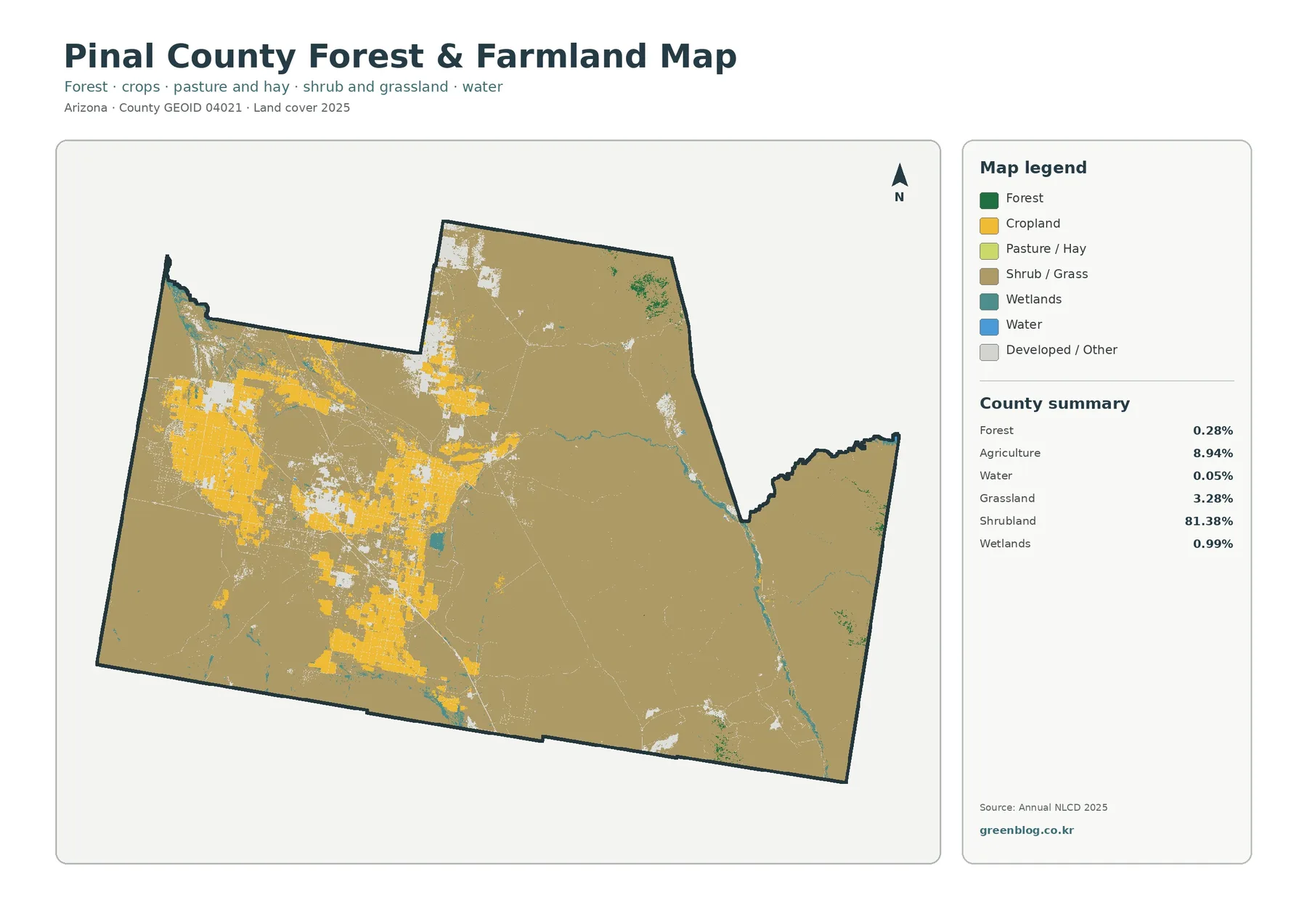
The yellow farm pattern is strongest across the western half and continues through the central and southern portions as separate blocks. White developed/other areas cut through several of those blocks, so agriculture is not one continuous belt. This arrangement is useful for teaching the difference between countywide share and local concentration: 8.94% sounds modest beside 81.38% shrubland, yet the farm class dominates particular sections of the map because it is spatially clustered.
Hard surfaces are concentrated within a much larger low-impervious county
Impervious surface means pavement, rooftops, parking areas, and other hard surfaces that shed water rather than letting it soak into the ground. Pinal County’s mean impervious value is 1.28%, and only 0.92% of the county is in cells that are at least 50% impervious. The developed land-cover share is higher at 4.53% because a developed cell can still contain soil, landscaping, vegetation, or other permeable surfaces.
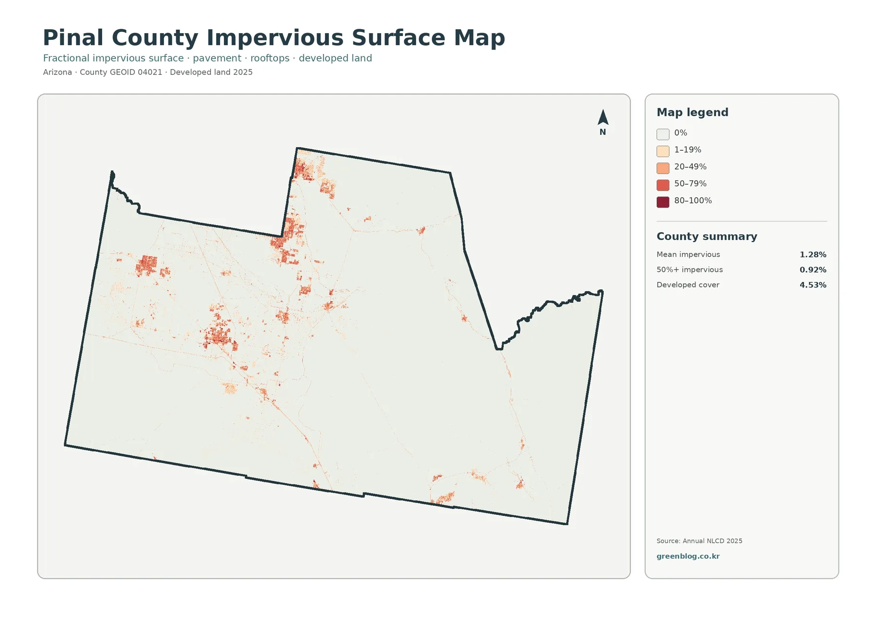
Most of the county remains very pale on this map, indicating zero or low impervious cover. Orange and red concentrations appear in several western and central clusters and in the northern extension. Fine linear traces also connect some developed areas, but the image does not label roads, so those lines should not be assigned specific route names from the picture alone. The safe conclusion is simply that hard surfaces are concentrated rather than evenly distributed.
Small wetland and water shares still create visible linear features
Wetlands cover 0.99% of the summary and water 0.05%, yet both can be easier to notice than those percentages suggest. Several teal features follow narrow lines through the eastern and southern portions of the county, while small blue areas appear at scattered locations. Linear features can remain visually important even when they occupy little total area, because they extend across a long distance while staying narrow.
Three ways to compare the four maps without repeating the same observation
For a current-condition question, start with the general map and locate the dominant shrubland, the major agricultural blocks, and the largest developed clusters. Then use the forest-and-farmland image to isolate agricultural and natural classes. This sequence works well when the goal is to explain what covers the ground in 2025 rather than how much of a cell is paved or how the classification differed from 1985.
For an urban-surface question, begin with the impervious image. Identify the limited orange and red concentrations, then compare those locations with the broader developed class on the general map. The different countywide values—4.53% developed and 1.28% mean impervious—become easier to understand when the two images are side by side. A report can use the general map for context and the impervious map for the focused evidence.
Practical uses for classes, presentations, and county-scale comparison
A classroom exercise can pair the summary percentages with the visible patterns. Students can first identify the dominant color without reading the panel, then check whether it matches the 81.38% shrubland figure. A second task can ask why 8.94% agriculture forms large visible blocks even though it is much smaller than shrubland. Comparing 4.53% developed cover with 1.28% mean impervious surface provides a clear example of two related measurements that are not interchangeable.
Presentations benefit from using one map per question instead of shrinking all four onto a single slide. The current cover map works for an overview, the farm-focused map for agricultural distribution, and the impervious map for hard-surface concentration. The change image belongs in a separate section that explicitly says it compares 1985 and 2025. Keeping the purpose of each image distinct makes the legend easier to read and reduces accidental overstatement.
Download the four original Pinal County JPG maps
The download package contains one original JPG for each map discussed on this page: current land cover, forest and farmland, impervious/developed land, and 1985–2025 land-cover change. Keeping the files separate is useful when only one subject belongs in a lesson or report. They can also be placed side by side when the purpose is to compare current cover, hard surfaces, and long-term classification differences.
Each original image is 2480 × 1754 pixels. The package preserves that source size rather than enlarging it and calling the result a higher-resolution map. For a large print, test the legend and small patches at the intended output size before final production. For slides or documents, preserve the aspect ratio so the county outline and the legend do not become stretched.
What 30-meter raster classification can and cannot tell you
Annual NLCD is a Landsat-based raster product with 30-meter cells. In practical terms, the surface is divided into small squares and each cell receives a land-cover class or related value. One cell can contain shrubs, bare soil, a narrow road, field edge, or building at the same time. The assigned class simplifies that mixture, which is why mapped boundaries should not be treated like surveyed parcel lines.
Land cover is also different from land use. Land cover describes what is physically on the surface, such as shrubland, crops, forest, water, wetlands, or developed material. Land use addresses how people use, manage, or regulate a place. A shrubland cell is not automatically protected land, and a developed cell does not by itself establish zoning, ownership, building rights, or the legal status of a property.
Frequently Asked Questions
What is the dominant 2025 land-cover class in Pinal County?
Shrubland is the dominant class at 81.38%. Agriculture is 8.94%, developed land 4.53%, grassland 3.28%, and wetlands 0.99%. The forest-and-farmland summary also lists forest at 0.28% and open water at 0.05%.
Where is agricultural cover most visible on the maps?
The largest yellow agricultural blocks are concentrated in the western and central portions of the county, with additional areas extending southward. The 8.94% summary combines agricultural cover and does not identify individual crops, farms, owners, or parcel boundaries.
Why is developed cover 4.53% while mean impervious surface is 1.28%?
Developed cover is a land-cover classification. Impervious surface measures the fraction of a cell occupied by hard materials such as pavement and rooftops. Developed cells can include soil and vegetation, so the two countywide values are not supposed to be identical.
Does the 10.25% class difference mean 10.25% of Pinal County was newly developed?
No. The total class difference is 10.25%, but only 2.82% is listed as changing to developed. The summary also includes 0.54% forest loss, 1.78% agricultural loss, 4.99% other difference, and a wetland-difference class without a separate printed percentage. Classification variation can contribute to mapped differences.
Map File Information
Pinal County Land Cover Four-Map Package
- File Type: Four JPG files in one ZIP archive
Related Maps
- Apache County Arizona Land Cover Map
- Cochise County Arizona Land Cover Map
- Coconino County Arizona Land Cover Map
Sources and further reading
- MRLC Annual NLCD Data — official access point for Annual NLCD land-cover products and related datasets.
- USGS Annual NLCD Land Cover Classification — explains the land-cover classes used in Annual NLCD products.
- U.S. Census Bureau TIGER/Line Shapefiles — official reference for county and state boundary data.
- Pinal County official website — county-specific portal for current government and local information.
Green Map creates custom-edited map images using open geographic data sources such as geoBoundaries, Natural Earth, OpenStreetMap, and government open data.
These maps are edited visual materials, not raw data files, and are provided for education, documents, presentations, and graphic reference.