Rockland County has a sharp land-cover contrast that is easy to see even before reading the legend. Developed land spreads across much of the central, eastern, and southern county, while a broad block of forest occupies the west and northwest. The Hudson River forms a wide blue edge on the east. This page uses four views—general land cover, forest and farmland, impervious surface, and 1985–2025 class change—to separate those patterns instead of treating the county as one continuous suburban landscape.
The four original JPG maps are also available together in one ZIP download. For a quick reference, start with the general map, then use the forest-focused view to isolate natural cover, the impervious map to compare paved and built surfaces, and the change layer to locate cells classified differently in 1985 and 2025. Land cover describes the physical surface observed by a classification system; it is not a zoning map, parcel survey, ownership record, or statement about what may legally be built on a site.
Table of Contents
A county divided between developed land and large forest blocks
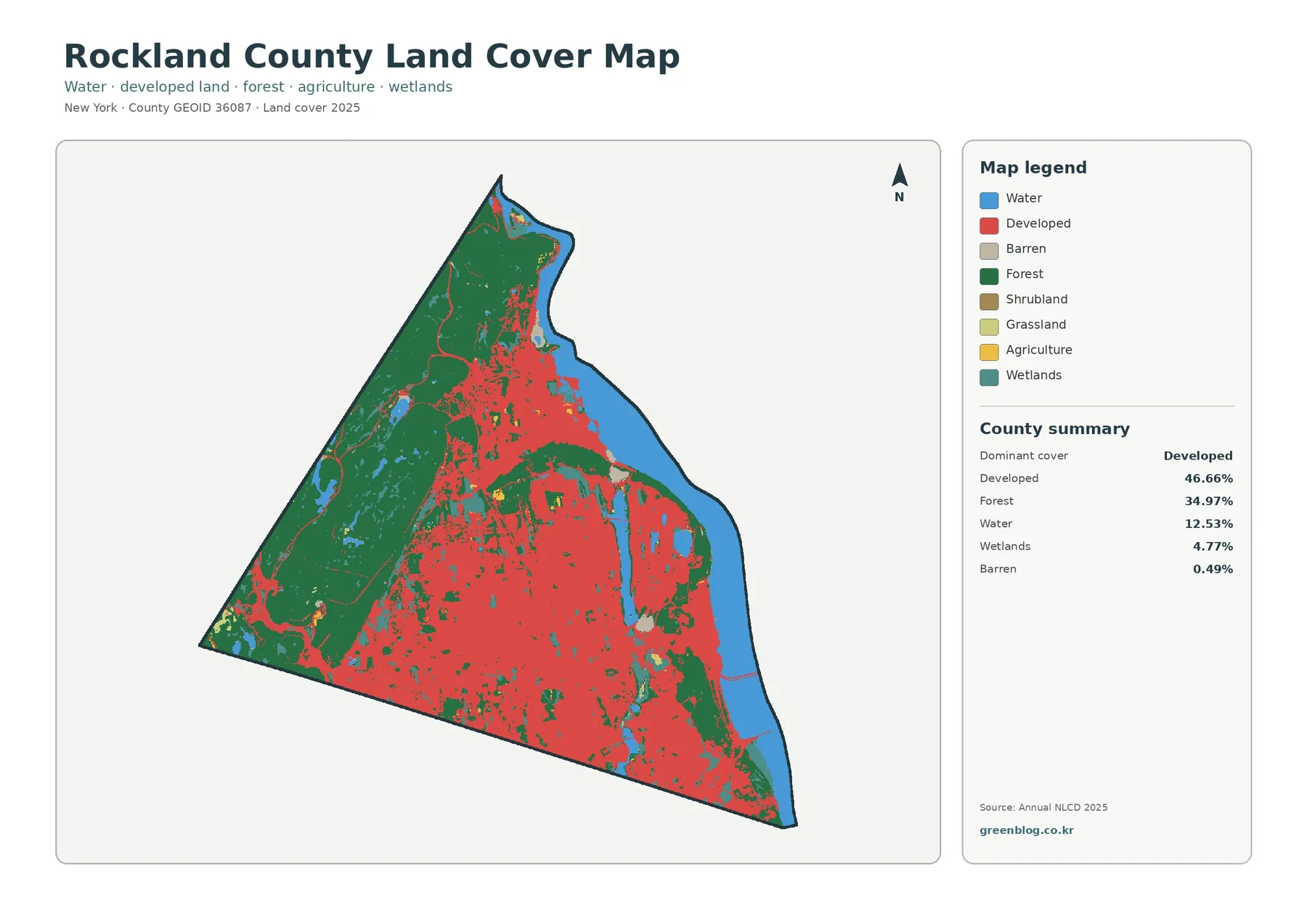
Developed cover is the largest 2025 class at 46.66 percent. It fills much of the lower half of the county and continues through the center toward the Hudson side. Forest is not a narrow fringe around that development. At 34.97 percent, it forms a substantial second landscape, especially across the western and northwestern part of the county. The boundary between the two is irregular, with small forest patches appearing inside developed areas and developed surfaces reaching into the edge of the larger wooded zone.
Water accounts for 12.53 percent of the county summary, a notably large share for a county of this shape. The broad blue band along the eastern boundary corresponds to the Hudson River setting, while smaller water bodies appear inland. Wetlands add another 4.77 percent. Barren land is only 0.49 percent, and the forest-and-farmland summary shows agriculture at 0.25 percent, grassland at 0.31 percent, and shrubland at 0.02 percent. The overall picture is therefore driven mainly by development, forest, and water rather than by broad farm or grassland areas.
The location of those classes matters as much as their percentages. A countywide average cannot tell a reader that the largest forest concentration sits on the opposite side of the county from much of the dense developed cover. It also cannot show how the Hudson River creates a long water boundary beside developed riverfront communities. The map is useful because it places those categories in relation to one another, making the contrast visible at a glance.
Rockland County’s official riverfront planning group focuses on the Hudson River and nearby parks, natural resources, scenic resources, and public access. That local context helps explain why the eastern water edge is more than a decorative background on the map. Still, the blue class is simply mapped water. It does not identify public shoreline, park ownership, municipal boundaries, or access points. Those questions require separate official maps and records.
The western forest also has a recognizable regional setting. New York State Parks describes Harriman State Park as extending through Rockland and Orange counties with numerous lakes and reservoirs, streams, wooded trails, and scenic roads. The land-cover map does not draw the park boundary, so a green cell should never be labeled as parkland solely from this image. The official park information does, however, provide useful background for understanding why large wooded and water-covered areas remain an important part of northwestern Rockland’s landscape.
Forest is substantial while agriculture barely registers
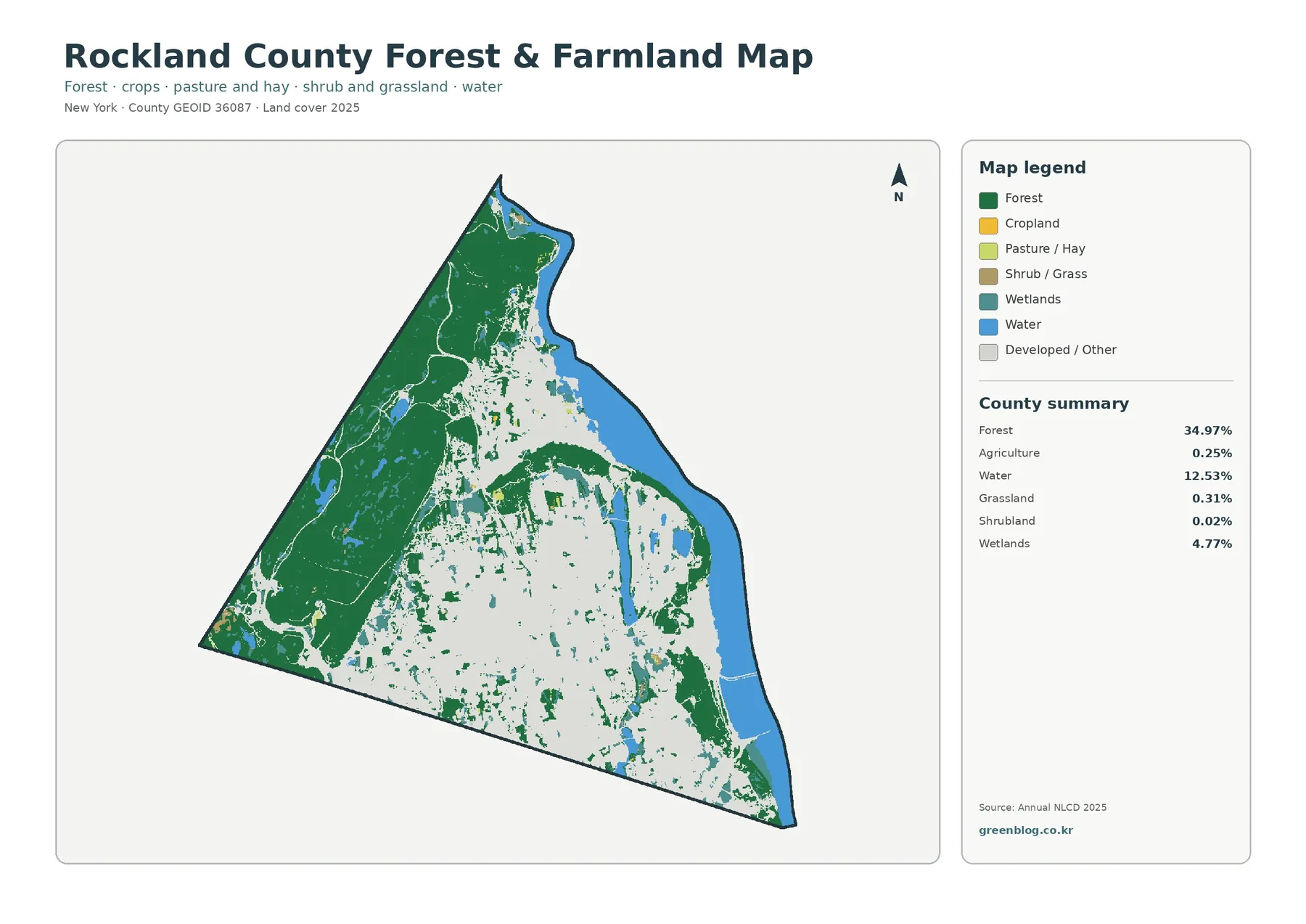
Removing the visual weight of developed land changes how Rockland looks. The western forest becomes the dominant feature of the map, stretching across a large continuous area before breaking into smaller patches toward the center and south. Those smaller patches matter because they show that natural cover is not confined to one remote corner. Wooded areas remain embedded within the more developed part of the county, although they are less continuous there.
Forest covers 34.97 percent, but agriculture is only 0.25 percent. Grassland is 0.31 percent and shrubland 0.02 percent. Small yellow or light-green areas can be found, yet they do not form the broad agricultural belts seen in many upstate New York counties. For Rockland, the useful comparison is not “farm versus forest” on a large scale. It is the contrast between extensive western woodland and a much more developed central and southeastern landscape, with only limited agricultural or open-cover pockets.
Wetlands occupy 4.77 percent and appear in several places near water and at transitions between forest and developed cover. The map is especially useful for spotting where several natural classes occur close together. An area may contain forest, wetland, and open water within a short distance rather than forming one uniform green block. That variety is easy to miss on a general-purpose map because roads, municipal boundaries, and place labels often receive more visual emphasis than surface cover.
Inland blue patches are also easier to notice in this view. Harriman State Park’s official description notes that the park contains many lakes and reservoirs, which provides regional context for the water-and-forest combination in northwestern Rockland. The map itself should not be used to name an individual lake unless that name is verified elsewhere. Its strength is the broader comparison: where water sits inside woodland, where wetlands meet developed edges, and where small forest remnants persist farther east and south.
This distinction can be useful in environmental education. A class can have a substantial countywide percentage while being highly concentrated in one part of the county, and a much smaller class can still be locally important where it occurs. Students can compare the broad western forest with smaller urban forest patches, or trace the places where water and wetlands break up the developed pattern. The map supports those observations without requiring the reader to learn a long GIS legend first.
Impervious cover reveals intensity inside developed land
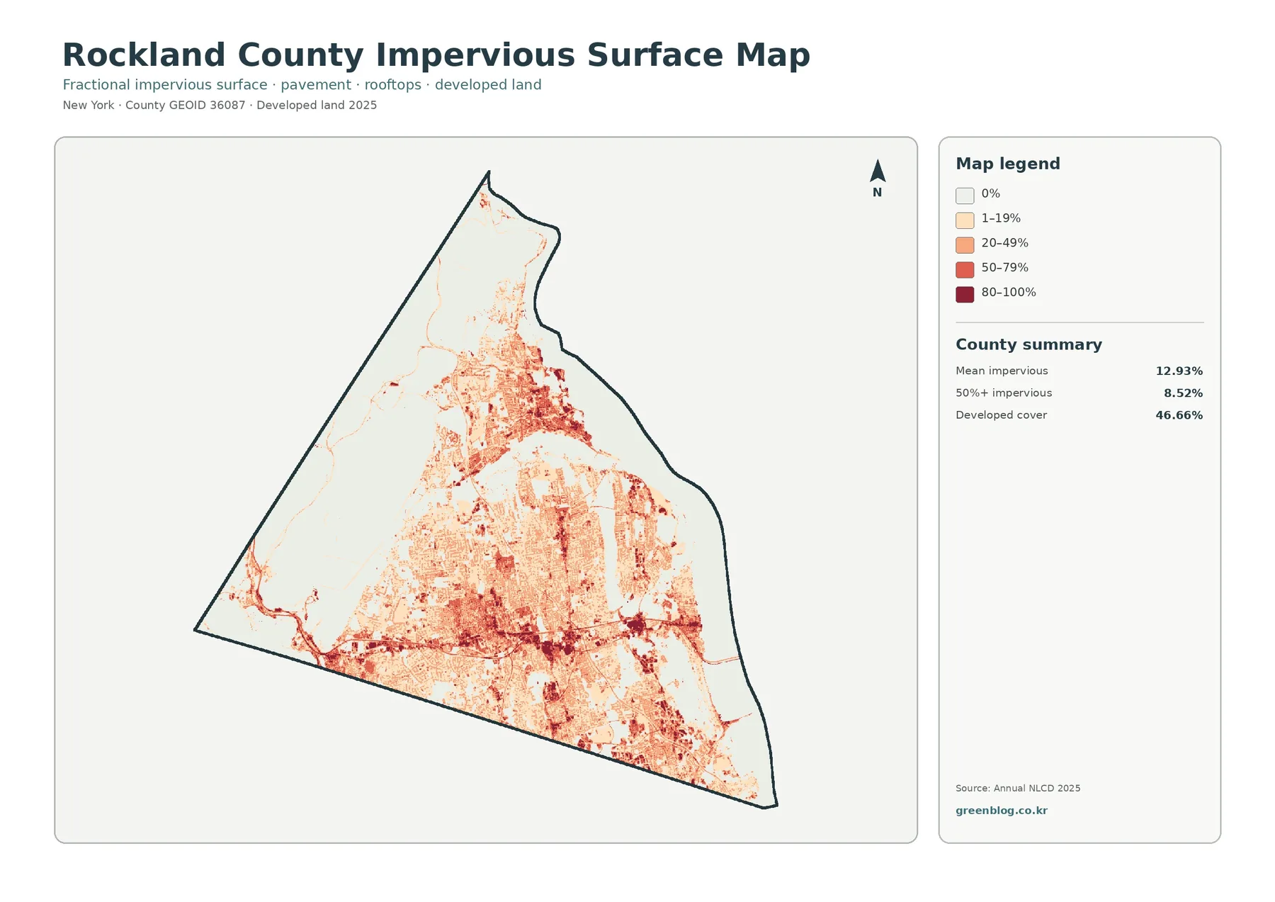
An impervious surface is a hard surface such as pavement or a rooftop where water cannot readily soak into the ground. Rockland County’s mean impervious value is 12.93 percent, and 8.52 percent of the mapped area falls in the 50-percent-or-higher impervious category. Those values are much lower than the 46.66 percent developed-cover share because a developed cell can still contain lawns, trees, soil, and other permeable surfaces.
The darkest tones cluster in parts of the south and center, with additional dense patches toward the eastern side. Linear features also stand out in places, reflecting hard-surface corridors within the broader developed landscape. By contrast, the large western forest is mostly pale, emphasizing how little impervious cover is present across much of that area. This difference makes the map more useful than a simple developed-versus-undeveloped classification when the question is how intensely the ground surface has been built or paved.
Two neighborhoods can both be classified as developed and still look very different on this map. One may contain a high share of roofs, parking lots, and roads, while another includes more yards, trees, and open ground. The impervious layer separates those conditions into percentage ranges. For presentations, placing it next to the general land-cover map is an effective way to explain that “developed” does not mean every square meter is sealed by pavement or buildings.
The layer is also a useful starting point for watershed or stormwater discussions, but it is not a flood-risk map. Flooding depends on rainfall, drainage systems, topography, soils, stream conditions, and other factors. Similarly, a high impervious value is not the same thing as a heat-risk measurement. Tree shade, building form, wind, surface materials, and proximity to water can change local temperatures. The map should be used for the variable it actually represents: the relative amount of hard, water-resistant surface.
Rockland County’s Planning Department publishes information about land use, transportation, GIS, sustainability, and the county comprehensive plan. The impervious map can complement that kind of planning context by showing where built surfaces are concentrated, but it does not replace municipal zoning, site plans, or engineering information. A reader investigating a particular project should move from this broad county view to the official local records for that site.
What the 1985–2025 change layer actually records
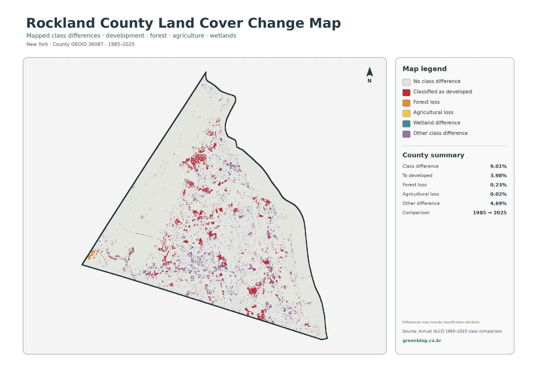
The change summary reports a class difference across 9.01 percent of the mapped area. Of that total, 3.98 percent is categorized as change to developed, 0.23 percent as forest loss, 0.02 percent as agricultural loss, and 4.69 percent as other class difference. The first number is easy to misread. It is not a statement that exactly 9.01 percent of Rockland County was physically transformed by development or another single process during the forty-year period.
Red change cells appear in clusters through several central and southern areas, with smaller patches farther north. Purple “other difference” cells are more scattered and occur in places that do not match a single development pattern. The western forest contains fewer large clusters, although small changes are visible along edges and narrow features. The map is therefore useful for finding locations where the two classifications disagree, not for assigning one cause to every colored cell.
Satellite classification can change because the land changed, but it can also differ because of image conditions, classification methods, edge placement, or mixed pixels. A mixed pixel is a 30-meter cell containing more than one real-world surface, such as trees, pavement, and lawn. Where forest meets a subdivision or wetland meets open water, a small shift in the dominant surface can move a cell from one class to another. That is one reason the legend itself warns that differences may include classification variation.
A careful workflow starts by locating a change cluster, then checking the same spot on the current land-cover map. After that, historical aerial photographs, local planning records, park documents, or other dated sources can be used to investigate what actually happened. This approach turns the change layer into a screening tool. It helps narrow the search without asking the map to prove a development history that it was not designed to document.
Small categories deserve the same caution. Forest loss at 0.23 percent and agricultural loss at 0.02 percent are mapped classification summaries, not legal or survey measurements of cleared forest or converted farms. They may point to places worth examining in more detail, but the next step should be source checking rather than a firm conclusion based on color alone.
The Hudson River and park landscape put the colors in context
Rockland’s eastern edge is visually dominated by water, while its western side contains the largest continuous forest. That pairing is one of the most useful ways to orient yourself before studying smaller details. The county’s Riverfront Communities Council describes a mission centered on protecting and using Hudson River assets and nearby parks while supporting natural, scenic, historic, and cultural resources. The land-cover map does not show those policy areas, but it does show the physical river-and-shore setting that makes them relevant.
On the opposite side, Harriman State Park provides a second piece of geographic context. New York State Parks identifies it as a major park in Rockland and Orange counties with lakes, reservoirs, streams, wooded trails, and scenic roads. A land-cover cell cannot tell the reader whether a location is inside the park, yet the park’s presence helps explain why extensive forest and inland water are important features of the broader northwestern landscape.
County planning materials also emphasize open space, sustainable development, land use, transportation, and environmental issues. Those topics are broader than land cover, but the four maps can support introductory questions about them. Where do hard surfaces become concentrated? Where does a large forest block meet developed land? Which riverfront areas combine water, wetland, and development? Where do the 1985 and 2025 classifications differ? Each question can be explored visually before the reader moves to more specialized official datasets.
Keeping that boundary between context and evidence is important. Forest color does not prove public ownership. Wetland color does not establish a regulated wetland boundary. Developed cover does not identify zoning, building permits, or population density. The maps are strongest when used to describe the surface pattern that is actually visible and then paired with the correct administrative or environmental source for a more specific decision.
Choosing the right map for a specific task
For a county overview, begin with the general land-cover map. It gives the clearest view of the 46.66 percent developed share, the 34.97 percent forest share, the 12.53 percent water share, and the smaller wetland and open classes in one frame. Once the western forest, eastern Hudson edge, and central-southern development are familiar, the other maps become easier to compare because the same locations can be recognized across different legends.
If the subject is natural cover, move next to the forest-and-farmland view. It reduces the visual dominance of developed land and makes woodland, wetlands, water, and small open-cover classes easier to find. For a built-environment question, use the impervious map instead. It answers a different question: not simply whether land is developed, but how much of the surface is covered by pavement, rooftops, and other hard material.
The change layer works best after the current condition is understood. A red cell has more meaning when the reader already knows whether the present surface there is part of a large developed area, a forest edge, or a smaller isolated patch. Comparing current cover first also makes it less tempting to treat every class difference as a confirmed land-use event.
For classroom use, one question per map keeps the lesson clear. Students can identify the largest cover classes on the general map, compare continuous and fragmented forest on the second, find high impervious areas on the third, and then locate 1985–2025 differences on the fourth. For a presentation, two large maps are usually more readable than four tiny panels. Pair the general map with the layer that best supports the topic you are explaining.
Printing can also change how a map is read. Fine color differences and narrow class boundaries may be harder to distinguish on a small page than on screen. The original JPG files give more flexibility for page layouts, slides, and handouts than the web preview. If a legend remains important to the discussion, keep enough space around the image so the class labels stay readable after resizing.
Download the four original JPG maps
The ZIP contains one original JPG for each of the four views: 2025 general land cover, forest and farmland, impervious surface and developed land, and the 1985–2025 land-cover change comparison. Each image includes its own legend and county summary, so it can be used independently in a slide deck or handout. The set is useful when a project needs the same county boundary shown with different land-cover questions rather than a single all-purpose image.
Choose the general map for a broad county introduction, the forest-focused map for natural-cover comparisons, the impervious map for hard-surface intensity, and the change map only when the two observation years are relevant to the question. Keeping all four JPGs together makes it easier to move between those views without losing the countywide frame of reference.
How to avoid over-reading a 30-meter classification
Annual NLCD is raster data, meaning the landscape is divided into grid cells and each cell receives a representative class or impervious value. At the 30-meter scale used for this type of product, one cell can contain more than one real-world surface. A road, lawn, tree canopy, rooftop, and stream edge may all fall within or across neighboring cells. The maps are therefore well suited to countywide patterns but not to survey-level decisions about individual properties.
Mixed pixels are most noticeable along complicated boundaries. A narrow wooded strip beside development may disappear into the surrounding class, while a small hard surface inside a large natural area may appear only in the impervious layer. Wetland and water edges can also shift visually from one classification to another. These effects do not make the map unusable; they simply define the scale at which it should be interpreted.
The date is another limit. The current maps in this package are labeled 2025, so construction, restoration, vegetation change, or shoreline work after that observation period may not appear. The change map compares 1985 with 2025 and cannot describe the year-by-year path between those endpoints. When recent conditions matter, use current aerial imagery or updated local data in addition to this countywide set.
Legal questions require an entirely different source. A forest cell does not establish park ownership. A wetland cell does not certify a regulated wetland. A developed cell does not reveal zoning, permitted use, or parcel boundaries. The four maps are reference graphics for physical surface cover. Property, permitting, engineering, and regulatory decisions should rely on the responsible agency’s official records.
County summary percentages should also remain county summaries. The 12.93 percent mean impervious value, for example, does not mean every town or neighborhood has the same surface condition. A particular area may be much more or much less impervious than the county average. Look at the mapped location as well as the number whenever the task is more specific than a countywide comparison.
Frequently Asked Questions
What is the largest land-cover class in Rockland County?
Developed land is the largest 2025 class at 46.66 percent, followed by forest at 34.97 percent. The map also shows that these classes are not evenly mixed: developed cover is extensive through the central, eastern, and southern county, while the largest forest block lies to the west and northwest.
Why does water account for 12.53 percent?
The mapped water class includes a broad Hudson River area along the eastern edge of the county as well as smaller inland water bodies. The percentage refers to classified water cells, not to public shoreline access, water ownership, or municipal jurisdiction.
Why is mean impervious cover lower than developed cover?
A developed area can include lawns, trees, soil, and other surfaces that still absorb water. The impervious layer measures the share of hard surface such as pavement and rooftops, so its countywide mean of 12.93 percent answers a different question from the 46.66 percent developed-cover share.
Does the 9.01 percent change value mean that much land was developed?
No. The 9.01 percent figure represents cells whose class differs between 1985 and 2025. Change to developed is listed separately at 3.98 percent. Classification variation and mixed pixels can also contribute to differences, so confirmed land-use change requires additional dated evidence.
Map File Information
Download the four original Rockland County JPG maps together: 2025 land cover, forest and farmland, impervious/developed land, and 1985–2025 land-cover change.
- Included Files: land cover, forest/farmland, impervious/developed land, and land-cover change maps
- File Type: ZIP containing four original JPG files
- Intended Use: printing, education, presentations, county comparison, and map-based reference work
Related Maps
- Albany County Land Cover Map
- Allegany County New York Land Cover Map
- Bronx County New York Land Cover Map
Sources and Reference Material
- MRLC Annual NLCD Data – official access point for land-cover and impervious-surface data used for this map series
- USGS Annual NLCD Land Cover Classification – official explanation of land-cover classes and classification terminology
- Rockland County Department of Planning – county information on land use, GIS, transportation, sustainability, and comprehensive planning
- Rockland Riverfront Communities Council – official county context for the Hudson River, nearby parks, and riverfront natural and scenic resources
- New York State Parks: Harriman State Park – official description of the large park landscape spanning Rockland and Orange counties
Green Map creates custom-edited map images using open geographic data sources such as geoBoundaries, Natural Earth, OpenStreetMap, and government open data.
These maps are edited visual materials, not raw data files, and are provided for education, documents, presentations, and graphic reference.