This Uganda map makes the country’s four broad regions legible without losing the lakes that give its outline so much character. Northern, Eastern, Central, and Western are shown inside the national boundary, while Lake Victoria, Lake Kyoga, Lake Albert, and Lake Edward provide strong geographic reference points. The collection contains a color view, a black-and-white view, and an unlabeled outline view, so readers can compare the same regional framework before selecting a version for study, display, or annotation.
The maps are deliberately regional rather than district-by-district. Uganda Bureau of Statistics currently organizes national figures through four major regions while also listing a much more detailed local-government structure, including 146 districts. That distinction matters: these images are useful for understanding large-scale orientation, but they should not be treated as current district maps or as a source for identifying a specific county, municipality, subcounty, parish, or village.
All three images use a landscape composition. Uganda fills the center, neighboring countries sit around the outside, and the southern shore opens into Lake Victoria. The labeled views name South Sudan, Kenya, Tanzania, and the Democratic Republic of the Congo; Rwanda lies beyond the compact southwestern corner but is not labeled in these particular graphics. Read what the artwork actually includes, and use a more detailed reference when a lesson depends on every international border label.
Table of Contents
What Is Included
The download brings together three treatments of one Uganda map design. The first separates the four regions with muted colors and fills major lakes in blue. The second retains regional names, lake names, neighboring-country labels, and boundary lines but removes the colored regional fills. The third keeps the national and regional outlines while dropping the geographic labels and colored water, creating the least prescriptive starting point.
These are image-based resources prepared around an A3 layout, not a live geographic information system. They do not expose selectable district polygons, coordinate data, or an automatically updating administrative database. For a handout or slide, that simplicity can be useful because each version presents the same composition. For legal, electoral, planning, navigation, or boundary-sensitive work, consult an authoritative current dataset instead of inferring detail from these broad regional lines.
Regional Layout and Lakes
Start reading the Uganda map at Lake Victoria. Its broad blue area meets the south-central edge and immediately separates the country from the Tanzania label farther southeast. Central occupies much of the shore shown here, Eastern reaches the lakeside farther east, and Western narrows toward the southwest. The shoreline is intricate, so it is a better orientation feature than the rectangular page edge.
Lake Kyoga appears within the country near the meeting area of Northern, Eastern, and Central. Its branching form interrupts what might otherwise look like simple adjoining polygons. Lake Albert follows part of the western side beside the Democratic Republic of the Congo, and Lake Edward is shown farther southwest. Small internal water shapes also appear, but only the four large lakes are named. The artwork therefore supports lake identification at a broad scale, not a complete inventory of Ugandan water bodies.
The region lines are easiest to understand as a statistical and geographic overview. Northern spans the wide upper section, Eastern occupies the right-center, Central reaches toward Lake Victoria, and Western extends down the left side. Kampala, district capitals, roads, rivers, relief, and coordinates are absent. That uncluttered approach keeps the four-part pattern visible, but it also sets a clear limit on how much location detail a reader can extract.
Color Uganda Regional Map
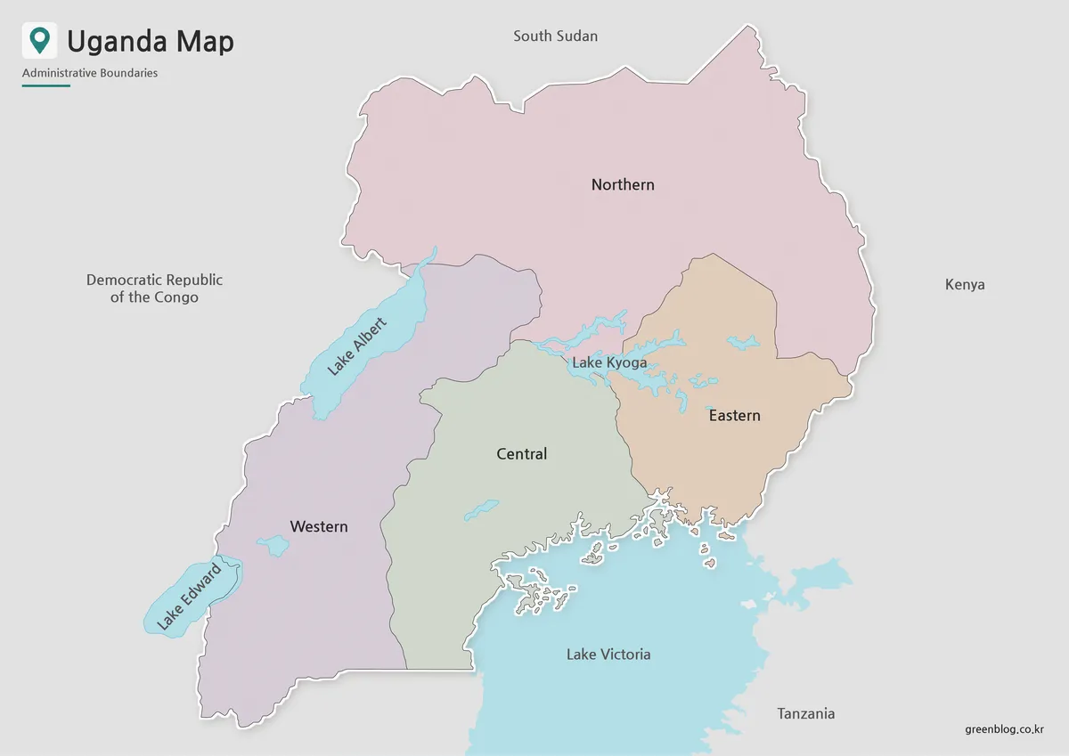
The color version assigns a soft fill to each of the four regions. Northern is pink, Eastern is tan, Central is pale green, and Western is lavender. Blue distinguishes the major lakes, while a light gray background pushes neighboring territory behind the country. The palette is restrained enough that black labels remain readable, and the white border around Uganda helps its irregular outline stand apart from the page.
Use this view when the main task is comparison. A presenter can point from Northern to Eastern without asking the audience to follow a thin boundary first, and a student can connect the names to their relative positions. The colors are categorical rather than quantitative: they do not encode population, elevation, climate, politics, or any ranking. A legend is unnecessary because the region names are printed directly on their areas.
The artwork also makes an important visual distinction between land divisions and water. Lake Kyoga’s blue branches sit over regional edges, while Lake Victoria fills the lower-right water area. If the image is inserted into a lesson, explain that these colored regions are the four broad divisions shown by the source design. Avoid implying that each color represents a single district or that the boundaries capture every present administrative unit.
Black and White Uganda Map
The monochrome Uganda map keeps almost all of the reference information from the color image. Region names remain inside Uganda, four large lakes remain labeled, and the four surrounding-country labels stay in place. White land and water shapes sit against a gray exterior, so readers rely on outlines and text rather than hue. This is the better choice when a document must remain coherent without color.
It also works as a guided worksheet. Students can shade the four regions themselves, underline the lake names, or add arrows toward the labeled neighbors. Because the water areas are white rather than blue, instructions should explicitly distinguish lakes from regional land. The printed labels make this a semi-complete reference, not a blank quiz: anyone designing an assessment should decide whether those answers need to be concealed before distribution.
When placing the image in a report, preserve enough width for the small labels around Lake Kyoga and along the western lakes. Excessive reduction may make those labels harder to read even if the national outline remains recognizable. A test print is sensible whenever the map will be reproduced on a smaller page, since the source’s A3-oriented composition does not guarantee equal legibility at every size or on every printer.
Blank Uganda Outline Map for Editing
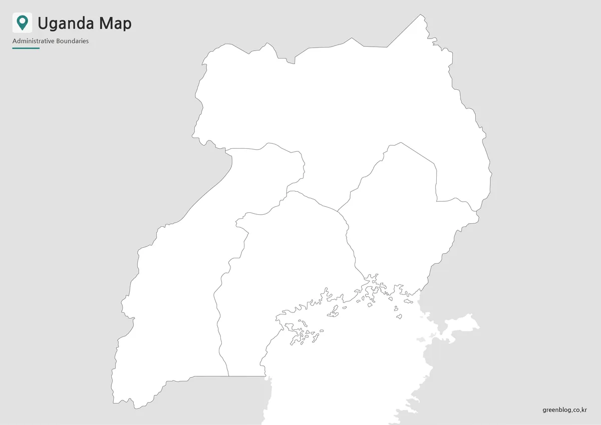
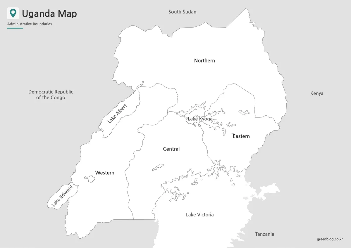
The outline version removes the region names, lake names, country names, and colored fills. It retains the outer national shape, the four broad regional divisions, the detailed Lake Victoria shoreline, and several interior water outlines. The title and “Administrative Boundaries” subtitle remain at the top left, so this is an unlabeled working map rather than a completely empty silhouette.
This image invites custom instructions. A teacher might ask learners to name the four regions, identify the large southern lake, or use separate colors for land and water. A designer might add a small legend and a limited set of thematic markers. Keep additions clearly distinct from the source lines, and provide a date and source when new data is overlaid. The base itself does not verify the accuracy or currency of information added later.
Use the labeled color or monochrome image as an answer key when accuracy matters. Lake Kyoga’s branching outline and the complicated Lake Victoria shore can help position labels, but smaller shapes may still be ambiguous without context. If a project requires districts, cities, roads, or coordinates, begin with a map built for that level of detail instead of subdividing these four regional areas by guesswork.
Practical Uses for This Uganda Map
For an East Africa lesson, show the color image first, then move to the black-and-white version for review and the outline for recall. This sequence separates recognition from production: learners see the named pattern, interpret it without color, and finally supply their own labels. Questions can focus on relative position, such as which region touches the upper border, which lake dominates the south, or where the Democratic Republic of the Congo appears.
For presentations, choose a single version that matches the message. The color view communicates the regional scheme most quickly; the monochrome view fits restrained reports; the outline supports a custom overlay. Add only information the audience needs. Dense icons, tiny place names, and long annotations can obscure the waterways and regional edges that make the base useful. A short caption should state that the image shows four broad regions rather than the full district structure.
Before publication, check three things: labels remain readable at the final size, custom marks do not resemble official boundaries, and any current administrative claim has an authoritative source. These checks are especially important when the Uganda map appears beside statistics, because readers may assume the colored areas match the geographic level used in a dataset. A Uganda map should match the data instead of forcing district-level values into four generalized shapes.
Frequently Asked Questions
What is included in this Uganda map collection?
The collection includes a color map, a black and white map, and an outline map of Uganda. Each version is designed for a different use, including printing, classroom reference, presentation design, and graphic editing.
Can I print the Uganda map in A3 size?
Yes. The map set is prepared for A3 layout printing, making it suitable for larger classroom handouts, reference sheets, and presentation materials.
Why does the map focus on larger regional divisions?
A simplified regional layout is easier to read on a printable map. Showing every smaller district can make the page too crowded, especially for classroom or presentation use.
Does the map include lakes?
Yes. The map includes selected major lakes such as Lake Victoria, Lake Albert, Lake Edward, and Lake Kyoga to help readers understand Uganda’s geographic layout.
Which version is best for editing?
The outline map is the best choice for editing. It provides a clean boundary layout that can be used for coloring, labels, data overlays, travel routes, and infographic work.
Map File Information
This download contains three image-based views of the four broad regions shown in the collection.
- Included Versions: Color, black and white, and outline
Additional Resources
- Uganda Bureau of Statistics: Uganda Profile — Check the current national and regional administrative-unit summary before using the maps with detailed statistics.
Related Maps
Green Map creates custom-edited map images using open geographic data sources such as geoBoundaries, Natural Earth, OpenStreetMap, and government open data. These maps are edited visual materials, not raw data files, and are provided for education, documents, presentations, and graphic reference.