World Bank data for 2024 contain a reported value for 105 countries and economies for the indicator “newborns protected against tetanus (%)”. Across those observations, values range from 50% to 100%. The median is 90% and the mean is about 87.61%. Sixty reporting economies are at or above 90%, while 36 are at or above 95%. At the other end, 18 are below 80% and nine are below 70%. The map therefore shows a generally high level among many reporting economies, but also a substantial lower tail.
The indicator needs careful interpretation. It is not the percentage of newborn babies who personally received a tetanus vaccine. The supplied World Bank definition describes the share of births to women of child-bearing age who are immunized against tetanus, so the measure is about protection at birth through maternal immunity. It should not be substituted for infant vaccine coverage, tetanus incidence, neonatal tetanus deaths, or a general score for a country’s health system.
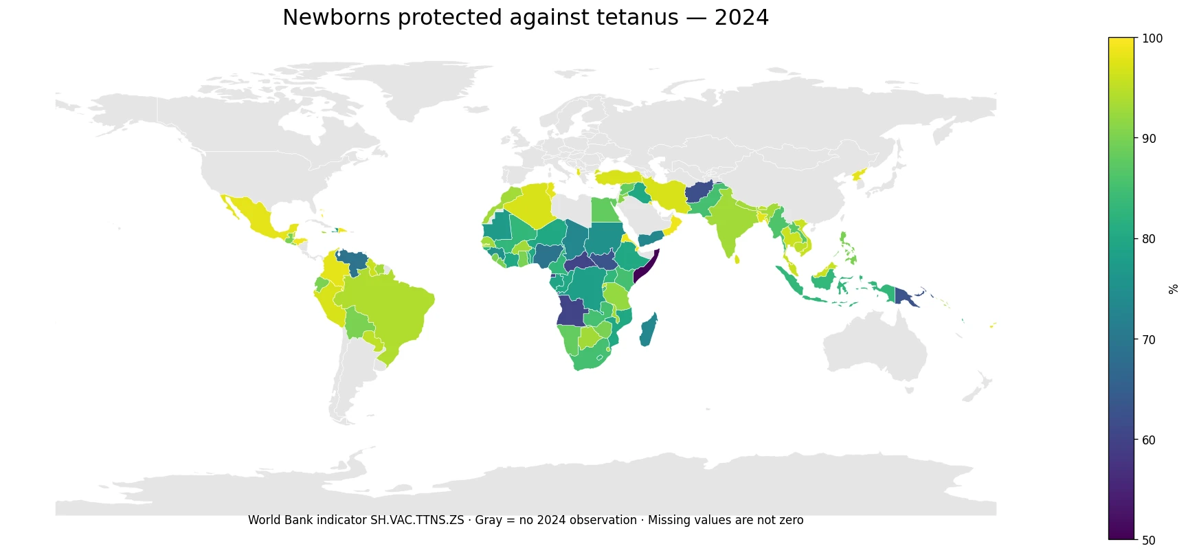
Table of Contents
What “protected against tetanus” means in this indicator
Neonatal tetanus is associated with exposure to tetanus spores around childbirth and umbilical-cord care, while maternal immunity is an important source of protection for a newborn at birth. The international indicator used here summarizes the percentage of births considered protected because women of child-bearing age are immunized against tetanus. That makes it a maternal-immunity and birth-protection measure rather than a count of injections given to newborns.
This distinction matters when values approach 100%. A reported 100% does not mean that tetanus risk in a country has literally fallen to zero, and it does not show that every delivery takes place under identical clinical conditions. It means the indicator reports all births in its denominator as protected under its definition. Likewise, a 60% value does not mean that 40% of newborns contracted tetanus. Protection status and disease occurrence are separate outcomes and require different datasets.
The 2024 distribution centers on 90%
Among the 105 non-missing observations, the first quartile is 83%, the median is 90%, and the third quartile is 96%. In other words, half of the reported values fall between 83% and 96%. The mean of 87.61% is lower than the median because a smaller set of low observations pulls the arithmetic average downward. The total observed range is 50 percentage points, from Somalia at 50% to several economies at 100%.
The upper half of the distribution is dense. More than half of the reporting economies reach at least 90%, and roughly one third reach at least 95%. That pattern could make a world map look uniformly strong at first glance. The lower tail is therefore important: 18 observations are below 80%, including nine below 70%. Those values create the clearest contrast in the geographic pattern and should not be obscured by focusing only on the many 90-plus observations.
| High reported examples | 2024 value |
|---|---|
| Bahrain | 100% |
| Bahamas | 100% |
| Seychelles | 100% |
| Djibouti | 99% |
| Honduras | 99% |
| Eritrea | 99% |
How to read the 99–100% group
Bahrain, The Bahamas and Seychelles report 100% for 2024. Djibouti, Honduras, Eritrea, Oman, Kuwait, the Dominican Republic and Maldives report 99%. These are very high values for this specific measure of protection at birth. They are not a basis for ranking the countries’ entire vaccination programs or health systems, because the indicator covers one outcome with one definition.
Differences of one percentage point within the very top group should also be treated cautiously. International health indicators are compiled from national reporting and estimation systems, and published values may be rounded. For practical interpretation, the broad cluster of observations in the upper 90s is more meaningful than a strict ordinal ranking between 99% and 100%.
The lower tail forms geographic clusters, but the regions are not uniform
| Lower reported examples | 2024 value |
|---|---|
| Somalia | 50% |
| Angola | 60% |
| Equatorial Guinea | 60% |
| Central African Republic | 60% |
| Afghanistan | 62% |
| Papua New Guinea | 63% |
| South Sudan | 63% |
| Nigeria | 69% |
| Venezuela | 69% |
Several of the lowest observations are in parts of Africa. Somalia is the minimum at 50%. Angola, Equatorial Guinea and the Central African Republic are at 60%; South Sudan is at 63%; Nigeria is at 69%; Chad is at 73%; Sudan and Guinea are at 75%; and the Democratic Republic of the Congo is at 78%. Because several neighboring or nearby economies appear in the lower bands, the map helps reveal a spatial pattern that a simple top-and-bottom ranking would miss.
Africa is not a single low-value block, however. Djibouti and Eritrea report 99%, Tunisia 98%, Algeria 97%, The Gambia 96%, Rwanda 95%, and Burkina Faso 93%. These contrasts are a reason to avoid inferring coverage from continent, income group, or geography alone. The observed indicator should be read directly, and any explanation for the differences would require additional evidence on maternal immunization services, access, health-system conditions and reporting.
South and Southeast Asia show both high coverage and clear exceptions
The Asian pattern is also mixed. Bangladesh reports 98%, Sri Lanka 97%, Malaysia, Thailand and Viet Nam 96%, Cambodia 95%, and India and Nepal 93%. Afghanistan is much lower at 62%, while Indonesia is 83%, Pakistan 85% and Myanmar 86%. The spread within a broad region is large enough that a regional average would hide meaningful country-level differences.
A similar contrast appears in the Pacific. Fiji reports 98% and Solomon Islands 93%, compared with 82% in Vanuatu and 63% in Papua New Guinea. Small-island geography also creates a visualization problem: several valid island observations are too small or absent as separate polygons in a low-resolution world boundary. Their numbers remain part of the distribution even when the map cannot display them clearly.
Latin America and the Caribbean are mostly high, with notable lower observations
Honduras and the Dominican Republic report 99%, Mexico and Colombia 98%, Peru 97%, Brazil 94%, and Bolivia, Ecuador and Guatemala 90%. Venezuela, at 69%, and Haiti, at 78%, stand well below many other observed economies in the region. This is another example of why geographic proximity does not guarantee similar coverage.
The map is most useful when it is read as a set of neighboring contrasts rather than as a league table. A country in the 90s may border one in the 80s or lower, and those discontinuities can identify where further country-specific research is worthwhile. The data used here do not contain the causal variables needed to say why those discontinuities exist.
Missing 2024 observations are not zero
The dataset retains 217 country and economy codes, but only 105 have a 2024 value for this indicator. The other 112 are source-missing for that year. Treating those missing records as zero would create a false pattern, dramatically lowering the apparent global distribution and labeling unobserved economies as having no protection. For that reason, the map leaves missing values separate and the summary statistics use only the 105 actual observations.
The absence of a 2024 value cannot be assigned a single explanation from this file. It may reflect reporting schedules, indicator applicability, estimation practices, or other data-system differences, but those possibilities would need separate documentation. A missing value should therefore remain “no 2024 observation” rather than being interpreted as either poor or excellent performance.
97 observations are drawn as country polygons on the map
Of the 105 valid observations, 97 join directly to the ISO-3 codes in the low-resolution world boundary used for the visual. Bahrain, Comoros, Cabo Verde, Kiribati, Maldives, Mauritius, São Tomé and Príncipe, and Seychelles do not appear as separate matched polygons in that boundary. Their valid values are still included in all calculations and in the accompanying data table. This distinction separates a cartographic limitation from a data limitation.
The map should therefore be used to read broad spatial structure, while the country-level values should be used for exact comparisons. Large countries occupy more pixels but do not carry more statistical weight in the median or mean. Small islands can be nearly invisible on a world map even when they have some of the highest reported values.
What this indicator can and cannot tell you
The measure can answer a clear descriptive question: among reporting countries and economies in 2024, what share of births is considered protected against tetanus through maternal immunization, and how does that share vary geographically? It can identify broad clusters, outliers, neighboring differences, and the amount of missing coverage. It is also useful alongside other immunization indicators because it highlights whether high performance is consistent across different vaccine-related outcomes.
It cannot by itself explain vaccine budgets, quality of maternity care, safety of delivery practices, neonatal tetanus incidence, or the reasons a country has a particular value. A one-year cross-country comparison is descriptive rather than causal. Factors such as access to antenatal care, immunization delivery, conflict, population movement, health infrastructure and reporting systems may matter, but none should be presented as the cause of a specific value without additional evidence.
A practical way to use the 2024 comparison
A useful first step is to treat the 90% median as a reference point rather than as a pass–fail threshold. Economies in the upper 90s form a broad high-coverage cluster, and tiny differences within that cluster are less informative than the gap to values in the 70s, 60s or 50s. A second step is to examine countries below 80% and especially below 70%, because those bands account for a smaller but clearly distinct part of the distribution.
A third step is to keep missing values visible. A world map with 112 missing observations cannot be read as complete global coverage for 2024. Finally, compare this measure with related immunization indicators without combining them into a single invented score. Measles or HepB3 coverage, for example, measures different vaccines and target groups. Their value is in showing whether patterns are consistent across programs, not in replacing the definition of tetanus protection at birth.
Frequently Asked Questions
Does this indicator mean newborns directly received a tetanus vaccine?
No. It measures the share of births protected through tetanus immunization of women of child-bearing age, so it is a maternal-immunity measure of protection at birth.
What is the median reported value in 2024?
Among the 105 economies with an observation, the median is 90%. The mean is about 87.61% and the observed range is 50% to 100%.
Were economies without a 2024 observation treated as 0%?
No. The 112 source-missing country and economy codes remain missing and are excluded from the mean, median, ranking and map color scale rather than being assigned zero.
Related Articles
Green Map creates custom-edited map images using open geographic data sources such as geoBoundaries, Natural Earth, OpenStreetMap, and government open data. These maps are edited visual materials, not raw data files, and are provided for education, documents, presentations, and graphic reference.